Category Archives: Large Format

Stieglitz Steichen Strand at the Metropolitan Museum

Over this past weekend I went up to New York to see the Steiglitz, Steichen and Strand exhibit at the Metropolitan Museum of Art. I had been hearing about the show from a number of people and wanted very much to see it based on their comments, but approached with some apprehension, as rumor had it that the show was too darkly lit and hard to see. That assertion was patently not the case – the only reason it was hard to see the show was the milling hordes in the exhibition salons. Bad for me, good for the museum, as it means attendance is at healthy levels.

The show features three seminal figures in early 20th century American photography – Alfred Stieglitz, Edward Steichen and Paul Strand. Stieglitz is the connection between Steichen and Strand, as it was through his gallery and publications such as Camera Notes and Camera Work that both other artists were launched to the public. Steichen and Strand represent opposite ends of the art photography spectrum in many ways – Steichen was very much in the photography-as-painting school of soft focus lenses and heavily manipulated prints, whereas Strand, who got his beginnings in the same theoretical approach, represents the “new” photography-as-photography idiom that declared photography should be accepted as an art form for its own merits, rather than try to emulate painting or drawing.

Stieglitz’s work in this show bridges both schools. Works ranging from his early New York street scenes and his Equivalents through his Georgia O’Keefe nudes and his late “straight” photography which returned to New York City as viewed from his gallery and apartment windows. The Strand work on display did little for me – they had a limited selection of his Mexico portfolio, which is his most interesting work to my taste.

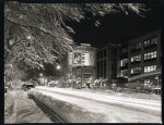
As an aspiring gum bichromate printer and quasi neo-pictorialist, the work of greatest interest to me was the Steichen segment of the exhibit. Were it not for the constant need to evade elbows and heels, I could easily have spent an entire day looking at just the Steichen room, studying the prints. On one wall, they had Steichen’s “The Pond – Moonlight”, and three variations of the Flatiron building, representing the descent into twilight and nightfall. I had only ever seen these prints reproduced in books before, and so no book reproduction can do them justice. Previously, I had no idea the scale of the originals – I envisioned them to be at most 8×10 inches in size. In fact, the “Pond – Moonlight” and Flatiron prints were something in the 12×15 to 14×17 inch size range – quite dramatic. Not only is the paper surface wrong, but the subtlety of the color palette is lost to the printers’ inks. I have yet to figure out how Steichen did it, but the gum image itself had a surface to it that was as if they had in fact been lacquered, not formed from multiple exposures in sensitized chemicals. In other images, notably some nudes, brush strokes were clearly visible, adding texture and movement to the figures. It made me wish that Steichen were still alive or that I could go back in time to interrogate him about his gum materials and techniques.

Unlike the Steichen work, Paul Strand’s images were very much in the scale I was used to seeing them reproduced. However, the majority of his work whether silver gelatin or platinum/palladium was a rich brown color, printed dark and low in contrast. Most reproductions tend to boost the contrast and render his work in black/white/gray tones, which gives a very different impression of his work.It is perhaps the Strand work at the show that made people feel that the exhibit was under-lit, as his work is printed dark enough that it is hard to view in anything other than brilliant illumination. The rationale for this difference between original prints and reproductions I can guess at – people are expecting “black-and-white” photography to look, well, black-and-white, and even vintage work is expected to be somewhat contrasty. It is entirely possible that Strand went on to print his work with more modern silver-gelatin papers that have the cool-tone black-and-white look we think of today, and this was merely a sampling of his early prints from early images, therefore the book reproductions are not deliberate manipluations of his work – I have not seen enough vintage Strand prints to know.

One last aside – I saw a number of Stieglitz prints marked “Silver-Platinum prints”. I’ve never seen or heard of this particular medium before, so if any of the assembled ears here have any input on what makes a “Silver-Platinum Print”, please pass that along!

The John Dugdale School

In doing a bit of browsing around today in response to a Facebook posting, I came across a link for the John Dugdale School. I once had the opportunity to take a two-day seminar with him at his studio in New York City. The experience of studying with him was transcendent – I count that weekend as one of the greatest influences ever on my photographic trajectory. The fact that his VISION is so strong even with his sight almost entirely gone is just one of the inspirational things about working with him. He’s also the only person I’ve ever felt comfortable enough with as a photographer that if he asked me to pose nude for him, I would. He’s such a brilliant, gentle soul, full of searing honesty, that being around him brings out the same in you, and helps you make more revealing, connected photographs. My intent is to find out if the school is still operating, and take another seminar with him when the weather is warmer. John, you see, is a bit like John Coffer – he prefers to live a 19th century life, with minimal trappings and intrusions of the electronic world. His farmhouse in upstate New York has no central heat or air conditioning, most likely no phone and definitely no internet. I wouldn’t be surprised if the road is dirt, for that matter. I’ve posted a link to his website for the school in my links. In any case, here’s to you, John, may you make many more photos for many decades to come!

Why I do this stuff

So far this blog has been long on pictures and short on words. Lucky you. I figured it was time to actually write something, and now was as good a time as any to explain how I got into all this giant cameras and funky antique process stuff. The story of it kind of mirrors the story of how I got in to photography to begin with- almost by accident.

I started doing photography after college, as something to do while looking for a job. I originally thought I would learn JUST enough to use it to record subject matter for painting and drawing. It was a means to an end. That plan went out the window when I saw my first negatives come out of the developing tank, and was even more firmly convinced that this was the thing for me when that first print appeared in the red-lit tray on a rack in my bathtub.

Back maybe six or eight years ago, there was this big scare that Ilford might go bankrupt and that silver gelatin paper might go away, and maybe even film too. Well, I was so much in love with wet darkroom printing that I figured it was time to learn how to do hand-coated processes so I could keep using my 4×5 that I liked so much. I didn’t realize what a Pandora’s box this would open. Prior to this epiphany, I was only vaguely conscious of the existence of antique/alternative processes. I knew cyanotypes existed, and someone in a class I took once did some VanDyke Brown prints on fabric. I saw a handful of platinum prints at the View Camera conference, but that was about it.

That event was I think the turning point for me because it was there that I also saw people working in wet plate collidion. My eyes were opened to the possibility of what could be done without commercially manufactured products. After seeing some more prints,
I decided I would try platinum printing. I was mostly shooting 2 1/4 inch square roll film with some 4×5 mixed in at the time, and 4×5 negatives were big enough to learn on, but platinum like almost all other alternative/antique processes is mostly insensitive to non-UV light. This means that you can’t enlarge an image to whatever size print you want from a small negative- you have to work from a negative the size you want the finished print to be.

Realizing the limits of 4×5 prints rather quickly, an 8×10 camera ensued. 8×10 is a beautiful size print but a pain in the ass of a camera. Along came my Argentina trip and a 5×7 joined the family. And so on. Platinum printing became my mainstay as I grew to love the medium for itself, to the point that I have all but retired my enlargers, and only work in contact printed alternative processes. I’ve dabbled in wet plate and I’ve even learned how to make daguerreotypes.

This is my medium, these are my processes, and this is the how and why I make my photos.

DC Streetscapes

Here are a few excerpts from my DC at Night series. All shot in whole plate (6.5 x 8.5 inch) format, printed in palladium.

W. Watson & Sons 12×15 “field” camera restoration project – step 1

Well, here’s a piece of ambition for you- getting this 12×15 W. Watson & Sons 12×15 inch “field” camera restored and up and running again. The W.Watson & Sons dates to around 1880. Once it is up and running, I’m planning on putting a nice 16″ (405mm) Kodak f4.5 Portrait meniscus lens on it.

The biggest hassle will actually be getting new film holders made for it, since it’s a bit of an exotic size to begin with, and it was originally designed for glass dry plates, not film. I’ve got someone lined up for the film holders – it’s just a matter of negotiations and finding the time to have them made.

I’m shopping around for new bellows for it because I’m just too damn lazy to make my own – this would be a simple case to do because the bellows are square and not tapered (I had a fragment of the original bellows but they were too rotted to use for anything, and they stank something awful).

Making the new ground glass will be easy – I just have to get some reasonably accurate measurements from the ground glass frame, go to the hardware store and have them cut me a piece, then get busy with the valve grinding compound. By the time I’m done with it, I’ll have a very buff left arm.

I was very lucky really, that the camera was in as good a shape as it is – when it arrived from the UK, it was quite filthy and looked like it needed a complete stripping and rehab. With a bit of cleaning and some olive oil, the mahogany came back quite nicely, and I was pleasantly surprised to discover that the brass hardware was originally gilded, and that much of the gilding remained.

Recent Gum Work

Three recent gum bichromate prints. Gum bichromate is perhaps the most labor-intensive photographic process because it involves building an image, one layer of pigment at a time. Most gum images need at least two layers, but often three or four are a minimum. Even working rapidly, you can only do about two layers a day. Gum is one of those processes that is all about the choices you make adding up to a finished product. All three images are whole-plate size images, 6.5 by 8.5 inches. Whole plate is the original photographic format, having been designed by Louis Daguerre for his first camera. Whole plate has a long and varied history, having come in and out of fashion repeatedly. It is enjoying a small modern-day renaissance not only for its historical echoes but for its aesthetically pleasing proportions and relative size.

This first image is a gum over Ziatype. Ziatype is a printing-out version of Palladium. A printing out process is one where the image is fully formed during exposure, and does not need a chemical developer to produce a final image. Ziatypes are really neat because they offer a very wide range of contrast, color and tonality depending on how you mix the chemistry. I do the Ziatype under the gum to start with a sharp base image with well-defined shadows and midtones.  The gum builds on top to add physical texture and create color.

The second image is a pure gum image, with only two layers, black and blue. As you can see, it is possible to create a successful gum image with only two layers of pigment. I manipulated the layers to bring out the blue color and the detail in the hair.

The final image is a four layer gum bichromate. It is a pretty accurate representation of the model’s actual skin color, but it is made from a single black-and-white negative. I worked it over with a watercolor brush during the printing process to bring out the highlights on the model’s back.