The last two weekends, I’ve been teaching an Intro to Platinum/Palladium Printing class. In the past, I’ve only taught it from film negatives, but this time I did it with a module on making digitally enlarged negatives as well. It was a rousing success- I had a great time teaching it, and I had some very enthusiastic students, all of whom were very seriously interested in continuing with the medium.
Last week, we started out learning basic coating technique, talked a bit about paper selection, and the importance of a good negative to work from. To expedite the process, I provided students with negatives that were already processed for platinum/palladium printing.
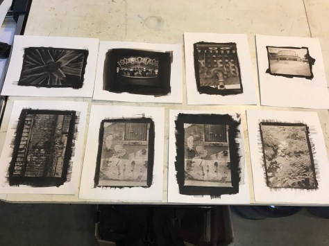
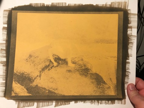
Prints from week 1 – in-camera film negatives5×7 palladium print – steam locomotive
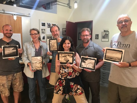
This week we covered making images from digitally enlarged negatives. I had students bring in a selection of images on thumb drives and we picked one or two to make negatives with. Here are my assembled students with finished prints from our digital negative printing session. The prints are much warmer in color in this photo than they are in real life because I took this on my iPhone in mixed lighting.
Students holding prints
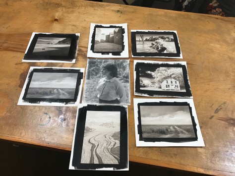
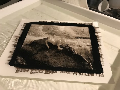
A better representation of some student prints. We also tried doing Ziatypes (a variation on palladium printing that is a printing-out process rather than a developing-out process, and by default has a much cooler, silvery tone to it than a pure palladium print does). The two images in the center row – left center and dead center – are Ziatype variations. The woman’s portrait was from a 40+ year old in-camera 8×10 negative not specifically developed for alt-process printing, but it worked quite well. The soft edges are from the fact that the negative was not processed archivally and is starting to silver out.
A selection of prints from digital negatives – the two left-center and center prints are Ziatypes, a variation on Palladium printing
OK- well, the title is a tad misleading – my class WAS sold-out with a wait list. I added additional slots to accommodate the wait list, and there is ONE additional spot left. If you’re interested, now’s the time to grab it before it’s gone. I will NOT expand the wait list again for this session. The class is my perennially popular Introduction to Platinum/Palladium Printing class, this time with an expanded digital negative how-to session. Based on the response, I’m also planning a fall Platinum/Palladium Printing Extended Project course that will provide a six-to-eight week guided seminar in printing.
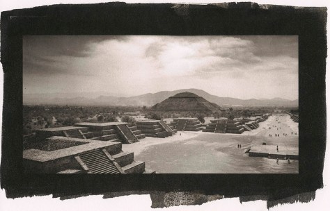
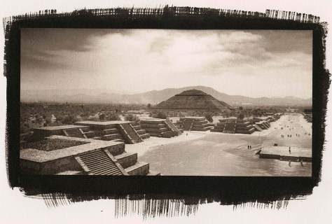
Pyramids, Teotihuacan, Mexico
The pyramids at Teotihuacan in Mexico was originally shot on a 2 1/4 x 4 1/4 inch roll film negative from my Lomo Belair X/6-12, then scanned and printed on Pictorico Premium OHP to make a 4 x 8 inch print.
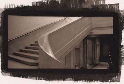
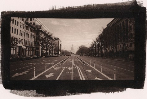
Stairs, National Gallery of Art, Washington DC
Ditto the above with this shot of the National Gallery of Art staircase in Washington DC.
Making a print is fun and easy.
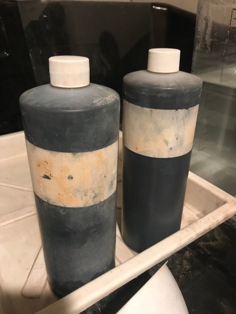
Potassium Oxalate Developer – 15 years old and going strong!
A frequently asked question: what about your developer chemistry? You mix up your Potassium Oxalate, replenish it as needed, and filter it periodically. But you keep on using the same batch of developer forever, unlike silver gelatin paper developers which have a finite lifespan, regardless of usage.
Digitally enlarged negative
Here’s a digital negative printed on the Pictorico OHP transparency medium. Other printers will work, but the industry standard seems to be Epson Stylus Photo printers with Ultrachrome K3 inks (or newer). I’m using an Epson 3880 at the moment.
Exposed, undeveloped print
Here’s an exposed print from the negative shown above. An exposed but undeveloped print will show a “ghost image” of the finished print. The development process happens VERY fast, as you can see in the video below.
And the finished print, washing in the final wash.
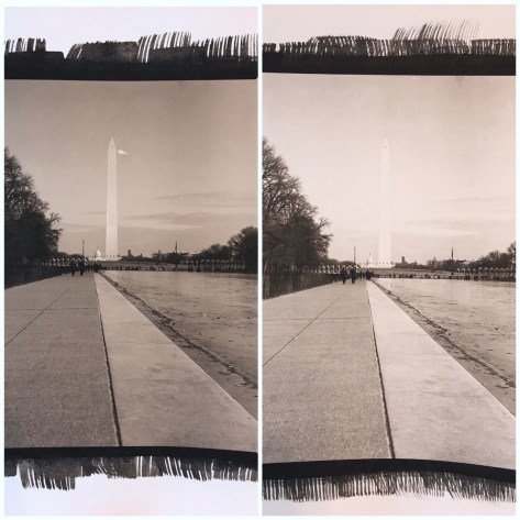
I’m sharing these two images as demonstration of the effect of NA2 on contrast, and how a little goes a VERY long way. NA2 is shorthand for Sodium Platinum, a restrainer/contrast boosting agent. It affects the color tone of the print as well as the contrast, giving an overall more neutral/cold color to an otherwise warm chocolatey brown palladium print. What many beginning pt/pd printers don’t get is how little NA2 you need to effect contrast and tone shifts in your prints. This post illustrates that impact.
NA2 is only useable with pure palladium prints- if you want to include platinum as a blend, or make a pure platinum print, you have to use dichromate or something else as a contrast booster because the platinum in the NA2 binds with the platinum in the solution and primarily affects the highlights, not actually increasing overall contrast, and the net effect is flushing expensive platinum down the drain.
Both prints were made with 9 drops palladium/9 drops Ferric Oxalate, on Hahnemuhle Platinum Rag paper, exposed for 15 minutes. Image size is 8×10 inches. The print on the left had no NA2. The print on the right had 1 drop of 5% NA2 added. Obviously this is way too powerful. I’m going to re-print trying a 1% and a 2.5% concentration to see which gets me where I want (still retaining detail in the Washington Monument, but brighter highlights and more tonal separation in the trees on the left).
Apologies for the quality of the reproduction photo- it was shot on my phone and collaged using a phone app, but it does reasonably accurately replicate the contrast differences between the prints. The tonal shift is less obvious because the phone is not so good at color temperature correction.
For those who haven’t seen the palladium printing process end-to-end, I thought I’d share a moment from the process to let you see the magic happen. It’s a much faster process than silver printing, in the development stage. The image, when exposed but not yet developed, is a “ghost” image. You can generally see the form, but not the fine details, nor the overall tonality. Depending on the overall image tonality, you may see very little at all inside the exposed borders of your print. This is why it is a good idea to coat outside the borders of your image (but not too much- every drop of emulsion costs money!) – you can judge proper exposure by looking at your borders if you’re not used to printing.
Then, pour on the developer, and WHOOSH! Magic!
And the finished print:
This was from a 35mm infrared shot, scanned and enlarged on Pictorico transparency media.
If you’re curious what a digital negative even is, or what it looks like, here’s the negative for that shot:
I have two upcoming classes this spring at Glen Echo Photoworks, Introduction to Large Format Photography, and Introduction to Platinum/Palladium Printing. I’ve scheduled them so that students of Intro to Large Format can have somewhere to go with their new camera skills. Intro to Large Format runs March 11th – April 22. The course covers what you need to know to take advantage of the medium – we start with the basics of the cameras themselves – different camera types, their parts and how they work, why to choose one type over another, lenses and lens selection. We move on to film selection and film handling, loading film and developing it. There are modules on portraiture, still life/tabletop, landscape and architecture. For the Architecture module we’ll do a field trip down to the National Cathedral.
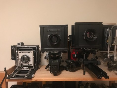
The Family – my set of student cameras (L to R): Speed Graphic, Sinar F, Sinar A1. The 5×7 Sinar Norma you see peeking in on the right is a personal camera.
Due to student interest, I’ve acquired several cameras for student use in-class. If the popularity continues, I’ll look into getting one or two more and setting up a rental program to allow students to check out cameras for the duration of the class.
The next class is Introduction to Platinum/Palladium Printing. I will be including a module on making and using digitally enlarged negatives for platinum/palladium printing with this course. This class runs May 5th and May 12th. This course covers the history of the medium, materials and techniques. We discuss the various tools for making prints – brushes vs coating rods, UV light sources (the sun, black-light fixtures, other options). We go over paper selection and paper handling. In this intro class we will make palladium prints because palladium is the easier medium to work with, but we will discuss and demonstrate the differences between platinum and palladium. Contrast control techniques will also be covered, and developer chemistry as well. We will work from both in-camera negatives that we make that weekend, and from digital files students bring and/or create from scans.
Pyramids, Teotihuacan – palladium print 4″ x 8″ enlarged on Pictorico OHP using an Epson 3880 printer with Ultrachrome K3 inks from a 6cm x 12 cm in-camera negative
To register for the classes, click on the links below:
I felt the need to get back into the darkroom and do some printing lately. And I was inspired by watching an instructional video from Bostick & Sullivan on making digitally enlarged negatives for alternative processes, specifically Platinum/Palladium.
I was familiar with the basics of the process, having read multiple books and web tutorials on the subject. What has always tripped me up was the process of creating my own adjustment curve. Well, the generous folks from B&S have put the curve they use on their website to download and use after running the video tutorial. I figured I would give their curve a try.
Pyramids at Teotihuacan, Mexico
This is the first print I made with their curve. The original is a 6x12cm negative shot on Ilford FP4+ black and white film using my Lomo Belair X/6-12 camera. I followed their instructions in the video to the letter, including using a quantity of NA2 contrast agent.
They also mentioned adjusting the ink density down a bit to keep contrast under control. Well, I like the idea of printing pure palladium without adding any NA2 because the NA2 alters the color tone of the prints and makes them cooler.
Pennsylvania Avenue, looking east
I made the negative for this image (and the following image of the National Gallery of Art) without reducing the black ink, and not using any NA2. I think the balance worked out well – the contrast is where it needs to be, and the color tone remains nicely warm.
Staircase, West Wing, National Gallery of Art
This staircase was a true test of the capability of digital negatives to render the subtlety of tone possible in a palladium print. I’d say it passed with flying colors. The tone remains rich, warm chocolate, the highlights are delicate and creamy, and there’s surprising detail down into the shadow tones.
My apologies for the image scans – they’re direct scans of the prints, and my scanner picks up paper texture to a degree not visible to the unaided human eye (I can see texture only under a loupe that may be visible in the scan).
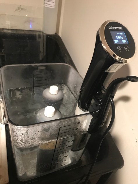
So where does the sous-vide in the title come in? Another long-standing issue with the process is that the Potassium Oxalate (PotOx) developer is happiest at around 130 degrees F. I can get water close to that hot out of my tap to use as a tempering bath, but within a short while it returns to room temperature. I found this sous-vide machine and the 18 quart bucket on Amazon for under $100. I put them to use this morning and if the above three prints are anything to judge by, they’re staying in my darkroom! The prints are amazingly consistent from print to print (it took me about 3 hours this morning to get all three prints done, but the developer remained at a constant temperature throughout).
Sous-vide machine heating developer
Something interesting about developer for platinum/palladium printing – unlike film or paper developer, this stuff never really goes bad. Your total volume will drop with use, but that is solvable by replacing lost developer with additional fresh developer. The bottle on the left is the first ever bottle of Potassium Oxalate I bought – I’ve just been replenishing it and filtering it as needed for over a decade now.
Old developer – old but still good!
Technical notes:
Prints are 100% palladium, 6 drops each Palladium / Ferric Oxalate #1. Developer is Potassium Oxalate, 130 F, 2 minutes. Paper is Bergger COT320. Negatives are enlarged onto Pictorico OHP ultra-premium transparent inkjet medium on an Epson 3880 with K3 Ultrachrome inks. All three prints are 4″ x 8″.