What do you do at 2:30 AM when you’re stricken with a bout of insomnia? Why you tackle a prototype matting job for a very large triptych (3x 10×13 images in a 20×40 mat/frame). Which of course you mis-measure the windows in the horizontal dimension, ending up cutting them 1/4″ too wide.
At least I didn’t screw it up prototyping with 8 ply mat board (which I’ve been known to do before). I think the sequence and the tonal values works for the series, which I’m titling “Head, Heart, Hand”. Or something to that effect.
I think sometimes (perhaps most of the time? All of the time?) presentation can make or break an image. Its success is the culmination of many decisions that begin with the decision of what camera and film to pick up before heading out the door in the morning, following through to what to point the camera at, on to what developer, paper, process, cropping… it doesn’t end until the framed print is hung on a wall, sequenced with the rest of the prints in the show. They all build on each other.
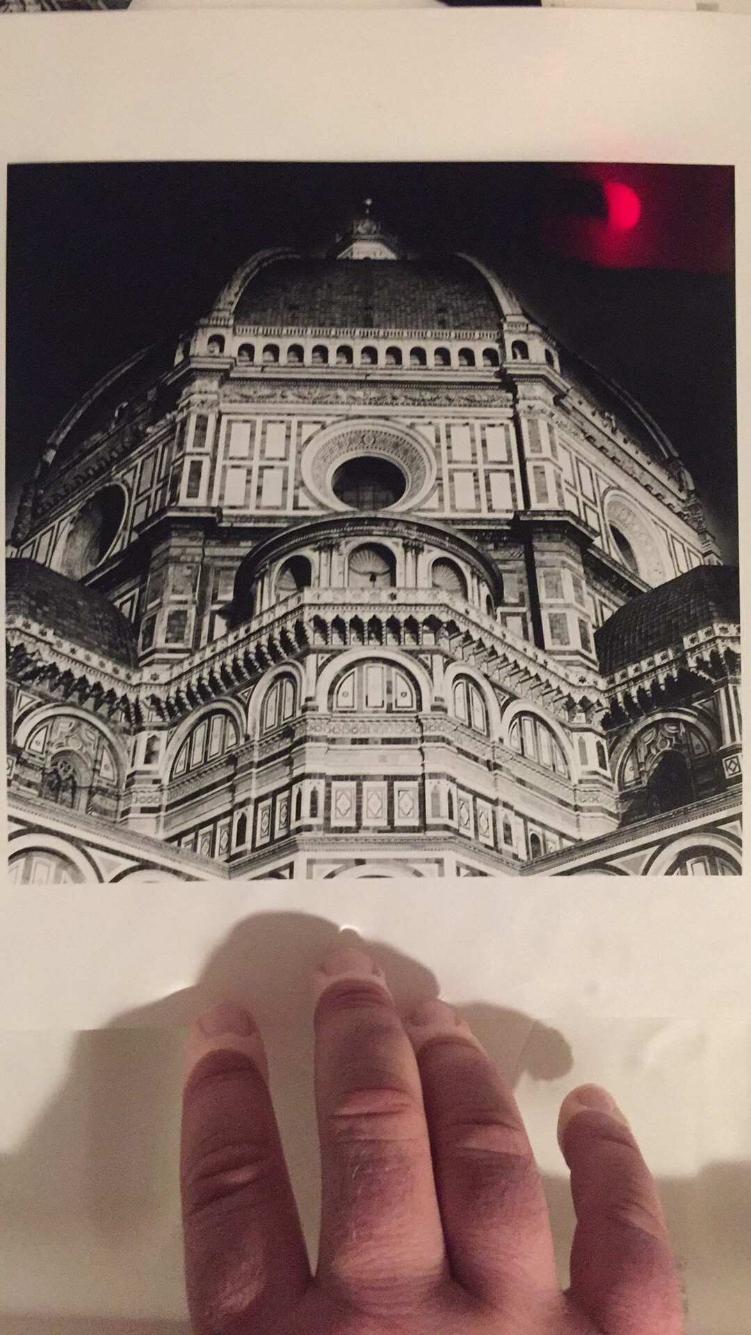
Head, Heart, Hand – Capitoline Museum, Rome
What do you all think of the sequencing of this triptych? Head, Heart, Hand, or the other way round? Any other critique/feedback is welcome.
All three images were shot on Kodak Tri-X, in my 1956 Rolleiflex 2.8E. Film developed in Pyrocat HD, printed on Ilford Warmtone MG fiber paper processed using Ilford Warmtone developer.
When doing enlarging of silver gelatin prints, it is often a prerequisite to a finished print that you do some burning and dodging to get the finished image exactly the way you envisioned it. And to compound the challenge, the area you want to burn or dodge is seldom neatly covered by an out-of-the-box tool like an oval, circle, or a straight line. That’s when you have to get creative and make some custom burn cards. This image I made was a perfect example. In a straight print, the sky is merely gray, and has a wisp of cloud on the right side that unless burned in looks like a bad printing mistake.
To get the sky burned in, without losing details in the roof, I had to make a custom burn card. I took a stack of paper boxes, placed them on the easel, then my burn card on top. I projected the negative onto the card, traced my outline, then cut it out. When doing my burning passes, I held the card at approximately the same height as it was when I cut it. You can see it in the second photo in action. The only way to get more precise with burning and dodging is to make a contrast mask and sandwich it with the negative in the carrier during exposure. That technique presents a whole new set of challenges because you have to get the mask in absolute register with the negative, and deal with dust on four surfaces, not to mention the possibility of newton rings.
Saturday
February 21
8-10 PM
Photoworks Gallery @ Glen Echo Park
Silent Auction and Photography Raffle
Champagne and Desserts
Black and White Attire Suggested
Come Celebrate the Photoworks Community!
Step 1: RSVP lgmphotoworks@gmail.com
Step 2: Purchase your Gala Ticket
2 Ticket Options
Platinum Gala Ticket
$150 ticket admits 1 and includes SIGNATURE PHOTOGRAPH
Silver Gala Ticket
$50 ticket admits 1 person to the event
Click Here for Ticket Purchase
Final Notes:
1. Space is limited!
2. We recommend that you purchase your tickets before Feb 7th
3. Visit www.glenechophotoworks.org to purchase tickets
4. RSVP lgmphotoworks@gmail.com to save your spot
Questions? lgmphotoworks@gmail.com
Visit us on facebook at glenechophotoworks
I just completed my contribution to the Signature fundraiser for Photoworks. Here is the description of the event:
We are celebrating Photoworks 40th Anniversary by collecting “Signature Prints” from 40 of the best fine art photographers we know. And then we are throwing a party with one hell of a “goody bag” for our guests to take home!
On Saturday, February 21, we will honor the vision that inspired our founders 40 years ago and we’ll celebrate the many individuals who have helped us become a true arts community. And it is only fitting that on the occasion of our 40th anniversary, we will look ahead to ensure that we can continue to inspire and nurture a new generation of emerging artists by teaching, mentoring, and exhibiting their work. Our 40th Anniversary “Signature Auction” will help us raise funds to support programming, outreach, and new investments that will enrich our community in the years to come.
The raffle tickets will be $150 each, which isn’t cheap, but you’ll get the chance to acquire some incredible photos.
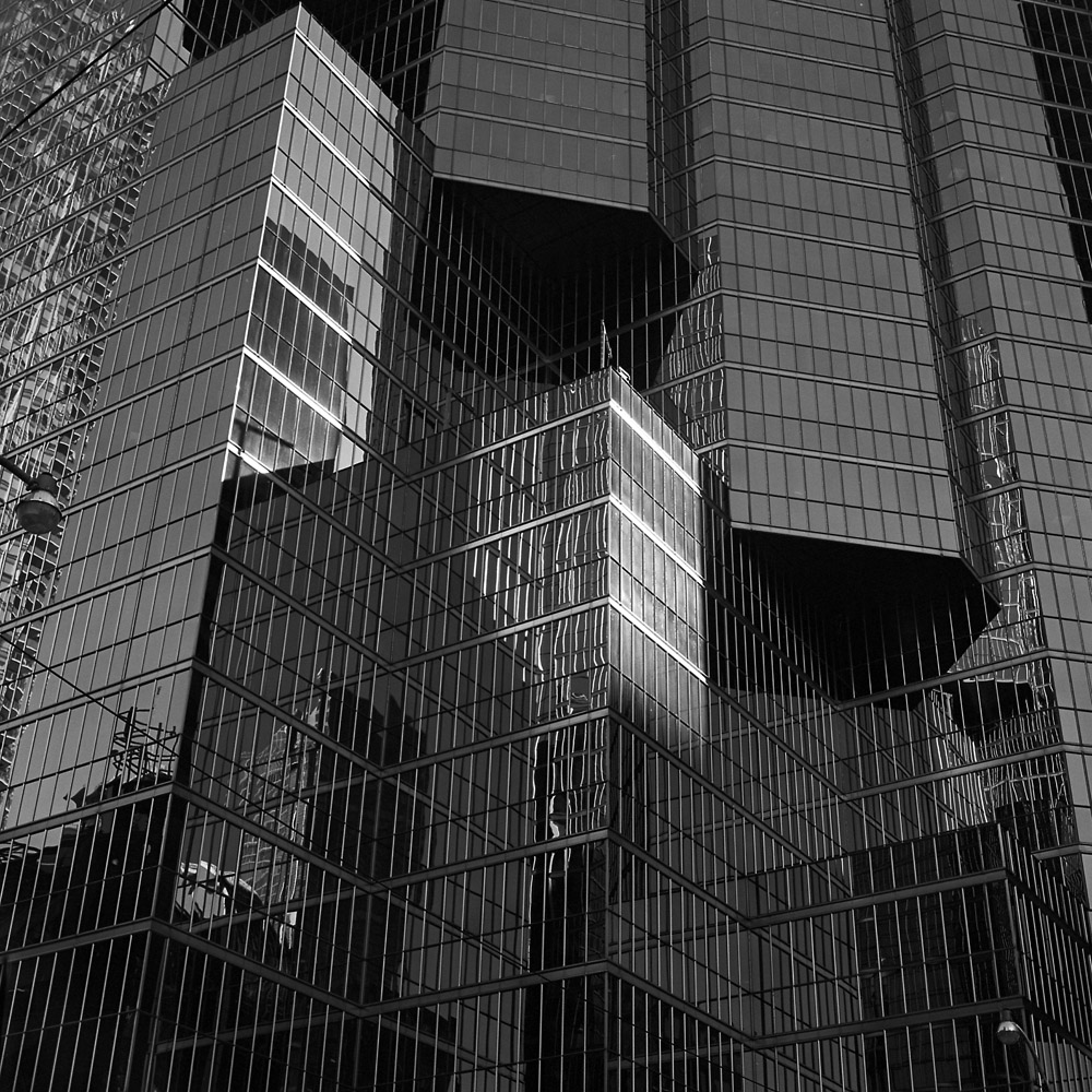
My contribution is a 10×10 inch print of a Toronto street scene. It’s titled “Romeo & Juliet”. Look carefully and see if you can tell why:
Two Streetlamps, Reflections, Glass and Steel
And now for the geeky bits:
The print is a silver gelatin print from a negative made on Kodak Tri-X, shot with my 1956 Rolleiflex 2.8E. The paper is Ilford Warmtone Multigrade fiber paper, developed in Ansco 130, which is a classic all-purpose developer. I prefer it over other paper developers because it lasts seemingly forever, even in an open tray, and it produces a very nice neutral/cool tone without the greenish sheen in the shadows you can get from Dektol.
I actually do make silver gelatin prints. I’ve been away from the medium for a while, mostly concentrating on alternative processes. I needed a break from alt process work so I cleaned up my workspace, fired up the enlarger, and started printing my Paris images you might remember from earlier blog posts. With my new (to me) Oriental VC-CLS variable contrast cold light head (a lot of jargon for a light source that allows you to adjust the contrast in your print by changing the ratio of blue and green light exposing the paper), I’ve been having a blast cranking out prints, and the Oriental head makes it a lot easier to do split-grade printing.
For those unfamiliar with the idea, instead of making a single exposure at one contrast grade, and then doing a lot of burning and dodging to make up for it, with split-grade, what you do is make two base exposures, one using a very soft contrast (in my case, most likely grade 0) and a second using a very hard contrast (grade 5). What this does is the soft exposure lets you get your highlights with detail, and the hard brings the shadows in to snap. You still need to burn and dodge for specific things, but you can refine the overall look as the image requires, without getting frustrated at why a certain area always comes out too dark or too bright. You can refine this technique to include your burning and dodging cycles, so that you might burn an area in with the grade 0 filter to put detail back in the highlights but not blocking up the shadows, or with the grade 5 filter for putting deep black in a shadow without muddying up the whites in the same area.
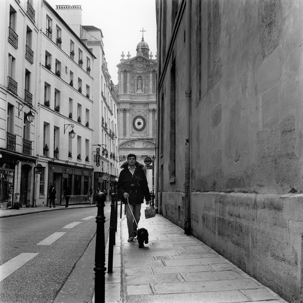
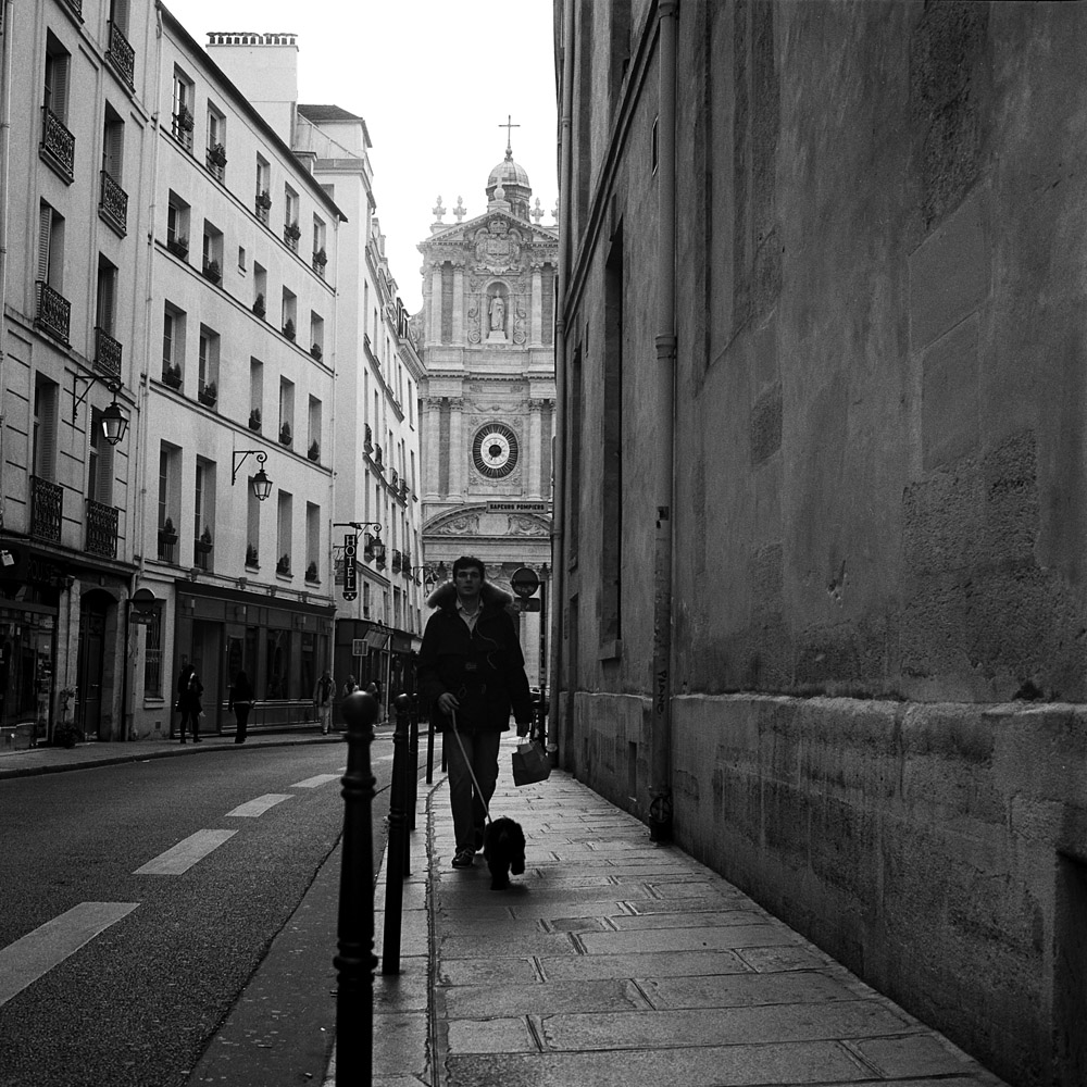
I’ll give an anatomy of a split-grade print here so you can better understand what I’m talking about. This is a real challenge to print “straight” – it’s a high contrast scene, with the dog-walker being somewhat backlit, and the upper left corner a lot brighter than the rest of the scene. This is the finished print here:
Dog Walk, Rue Sevigny, Paris
Here is the scan I made from the negative, which also had a fair bit of manipulation. Less successful, wouldn’t you say? The dog walker is still strongly backlit.
Dog Walker, Rue Sevigne, Le Marais
To make this print, I gave it a base exposure of 20 seconds using the grade 0 filter. I dodged the dog walker for 10 of those. Then I burned in the upper left corner for an additional 20 seconds. I gave a final overall exposure of five seconds at grade 5, to put a little snap in the general scene and specifically to firm up the shadows on the dog walker without losing tonal separation for his buttons, the cords of his iPod earbuds, and the hair of the dog. Were I making this print larger, I’d go back in and burn the sidewalk between his legs and the dog back down a bit, but in a 7×7 inch print, accurately wielding a burning card with a hole that small is tough!
This was printed on Ilford Warmtone variable-contrast fiber paper, using Ilford Warmtone developer. I’m not applying any fancy tricks to the developer like playing around with developer dilution or split warmtone/cooltone developers. That’s a trick for another day.
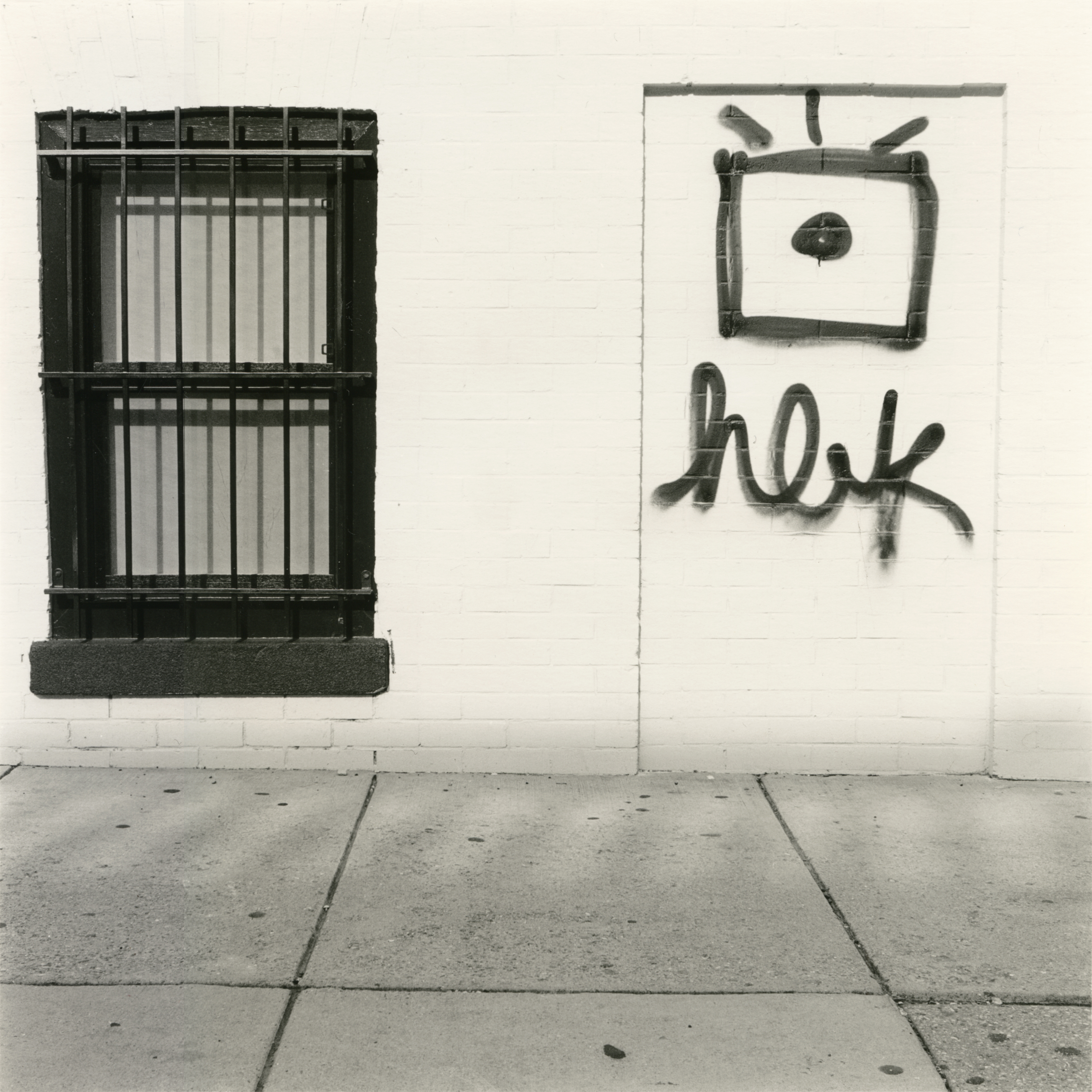
I’ve gotten back into doing a little sliver gelatin printing and enlarging since I’ve been shooting the Rolleiflex like a madman. I wanted to try something out with my printing, so I was doing split development of my prints with both warmtone and cooltone developer. The way it works is I have two developer trays, one for each kind of developer. I’m using the Ilford Warmtone and Ilford Cooltone (a now-discontinued product that I was given a case of some years ago). I want the shadows cool but the mids and highlights warm, so I start my development cycle with 30 seconds in the cooltone developer, then move to the warmtone developer for the remaining minute and a half. The below examples are printed on Ilford Warmtone paper (if you want a warmtone image, you have to use a warmtone paper – you can make a warm paper go cool with a cool developer, but you can’t warm up a coldtone paper short of sepia toning).
Window, Graffiti, 15thStreet
This is the warmest I can get in my highlights and mid tones using this process. The Ilford warmtone paper doesn’t seem to get very warm at all.
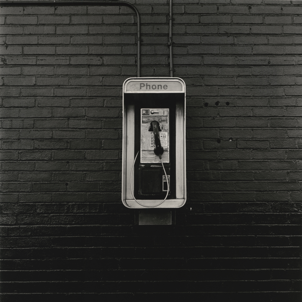
Here’s another in my series of Everyday Objects – the near-apocryphal payphone. In trying to find one, it actually took some looking! They’re not completely vanished from the landscape, but you actually have to go looking in somewhat rougher neighborhoods now to find one because anyone living above the poverty line these days has a cellphone, and nobody wants to carry around a pocketful of quarters AND dimes to make a call.
Everyday Objects – Payphone
I was getting a little nervous about making enlargements as it has been forever and a day (at least five years) since I last made an enlargement. Turns out it’s a skill like riding a bike – once you learn, you never really forget.
Both shots were taken with my Rolleiflex 2.8E, on Ilford HP5+, developed in Pyrocat HD. I think I’ve mentioned it before, but Pyrocat is my go-to developer, even for small and medium-format negatives to be enlarged (or scanned!). Pyro developers in general have great built-in contrast masking from the stain, so it is possible to retain detail in highlights in images that would require burning and dodging were they processed in another developer.