I’ve been doing a LOT of printing lately, in preparation for the shows in Mexico City. I did some serious darkroom cleaning too, getting my print washers disassembled and scrubbed clean of all the mineral deposits that accumulate from using DC city water, and got all the stuff out of the sink that was cluttering it up so I could print big. I’ll be doing some copy photos of the big prints I did shortly, and have them posted here. But all that work inspired me to not only do more printing, but to be adventurous in my artistic endeavors, and push out of my comfort zone.
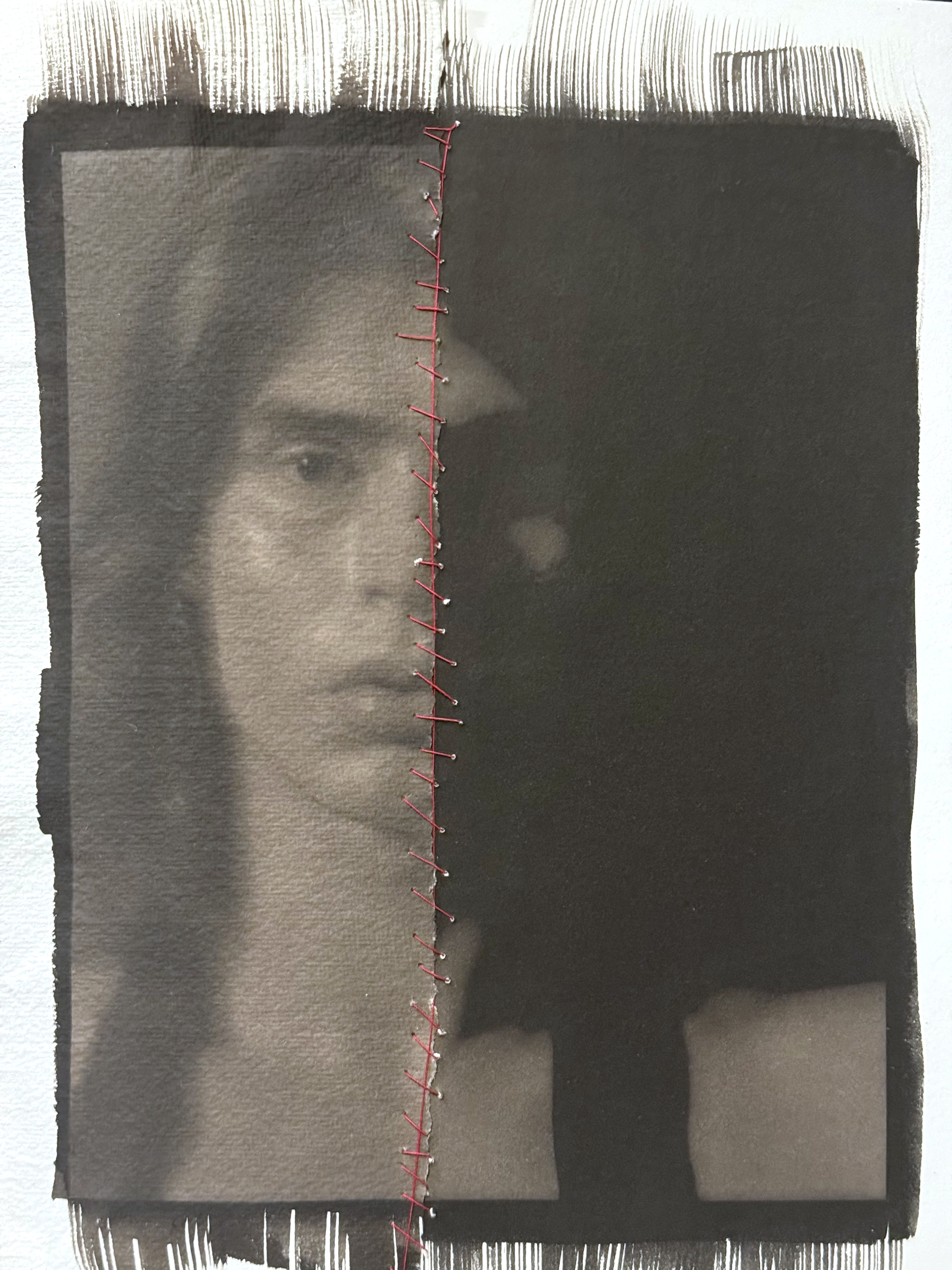
I have thought for quite some time about trying this, and thanks to a little push from my friend Jeremy Moore who lives down in Texas, I took the plunge last night and did some interventions on my prints that many would consider heretical. I made two different digital negatives from the same image, one with high contrast and one with normal contrast. The one with normal contrast I printed on Velke Losiny Prague, which is a light-weight cold-press paper with lots of texture. The high-contrast/dark print is on Revere Platinum, which is a heavy-weight hot press smooth paper. I then tore the print on the Velke Losiny paper in half, and then stitched the two prints together with red thread.
This is an exciting change for me, getting more experimental and risk-taking with my photographs. I’m going to do a lot more with the “destructive/reconstructive” mode of working – I think it opens up the work to being less literal and more visually and psychologically explorative.
As a photo educator, I want to make sure I have the best information to pass along to students when it comes to troubleshooting processes. A friend of mine and one of the best platinum printers out there today wrote this excellent pair of articles on a common problem – the dreaded “black spots”.
Ian does an excellent job of explaining the chemistry behind the issue in a simple, straightforward manner that even a non-chemist like me can understand.
When doing enlarging of silver gelatin prints, it is often a prerequisite to a finished print that you do some burning and dodging to get the finished image exactly the way you envisioned it. And to compound the challenge, the area you want to burn or dodge is seldom neatly covered by an out-of-the-box tool like an oval, circle, or a straight line. That’s when you have to get creative and make some custom burn cards. This image I made was a perfect example. In a straight print, the sky is merely gray, and has a wisp of cloud on the right side that unless burned in looks like a bad printing mistake.
To get the sky burned in, without losing details in the roof, I had to make a custom burn card. I took a stack of paper boxes, placed them on the easel, then my burn card on top. I projected the negative onto the card, traced my outline, then cut it out. When doing my burning passes, I held the card at approximately the same height as it was when I cut it. You can see it in the second photo in action. The only way to get more precise with burning and dodging is to make a contrast mask and sandwich it with the negative in the carrier during exposure. That technique presents a whole new set of challenges because you have to get the mask in absolute register with the negative, and deal with dust on four surfaces, not to mention the possibility of newton rings.
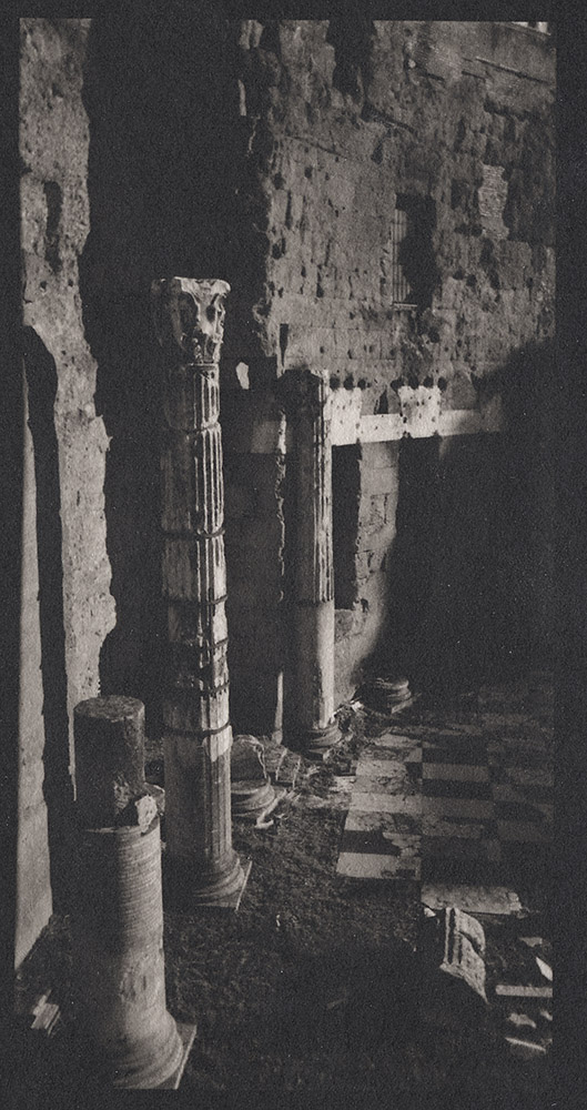
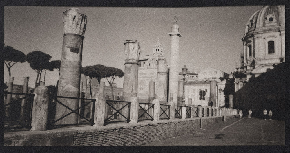
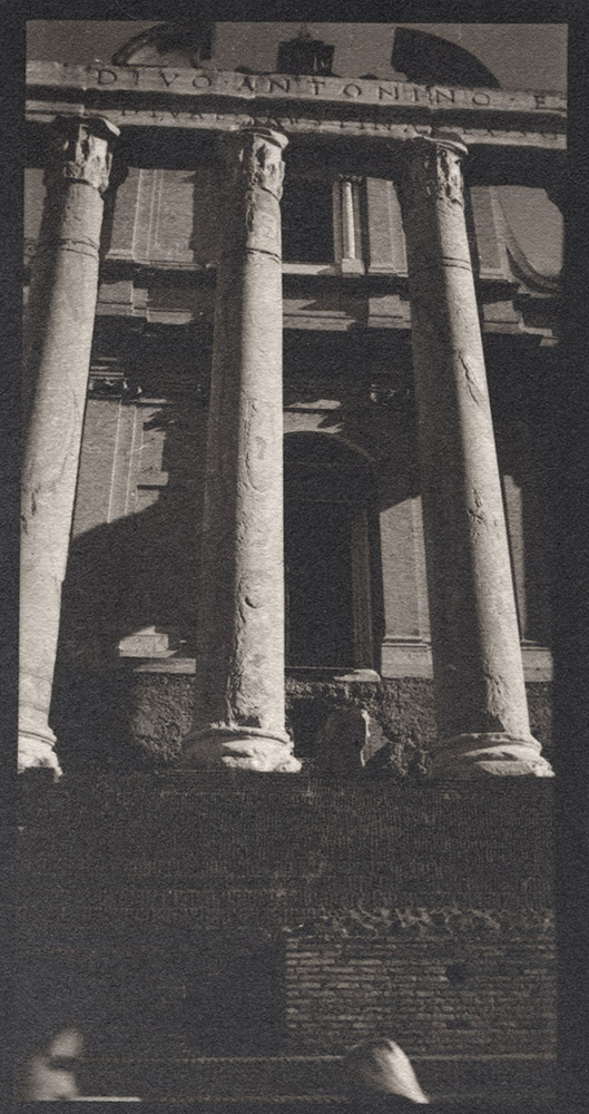
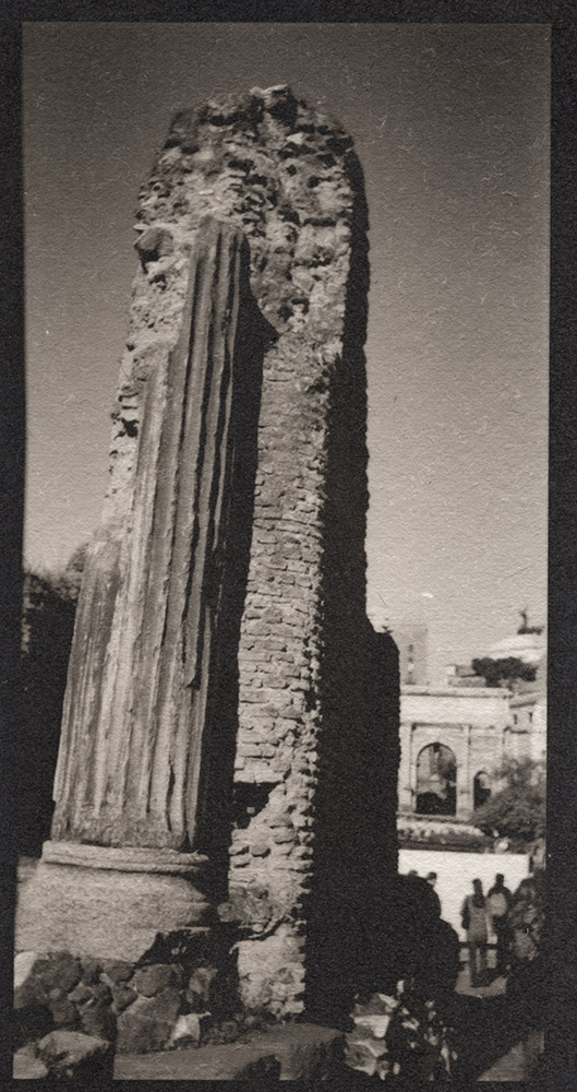
After printing a few of these panoramas from Rome, I was so taken by the intimacy of the miniature format of the 2 1/4″ x 4 1/4″ contact print, I went and made a whole series of them. I’m at fourteen of them now, but that number will fluctuate a little as I finish printing and edit down from there. I’m going to go out shooting this weekend and make some more images in the format and perhaps build a full show’s worth.
Columns, Marble Floor, Trajan’s Market
I took the portfolio to the Sunday morning critique we have at Glen Echo, and instead of presenting them as raw prints, I matted them with 8-ply mats with oversize margins (11×14 inch mat boards, so roughly 4-6 inch margins around the 2 1/4 x 4 1/4 inch window). I also cut the windows such that all the mats could be viewed in landscape orientation regardless of whether the image was in portrait or landscape orientation.
Trajan’s Column, Via Fori Imperiali
Presentation is very important when considering your work. It should be the first thought on your mind when planning a show – of course you need to edit the body of work, but how it will look on the wall is just as critical to successful reception as the work itself. Good presentation will focus the viewer’s attention on the work and block out the distractions of everything else going on around it.
Temple of Antoninus and Faustina
Also, if you’re at all concerned with selling your work, makes a huge difference in the sales price – poorly presented, someone would pay a poster price for an original Ansel Adams, if they bought it at all. Properly presented, your work will fetch premium prices even though nobody has really heard of you outside your own city.
Column Fragment, Imperial Forum
This webpage is a prime example of the issue of presentation – showing these images here in this size on this medium is a complete and utter failure to represent the scale, quality and impact of the images. You’re looking at them on your monitor, in a size well beyond their actual physical size in reality. And because they’re scans of the prints, the paper texture is exaggerated as are any minor flaws due to the handmade nature of the prints.
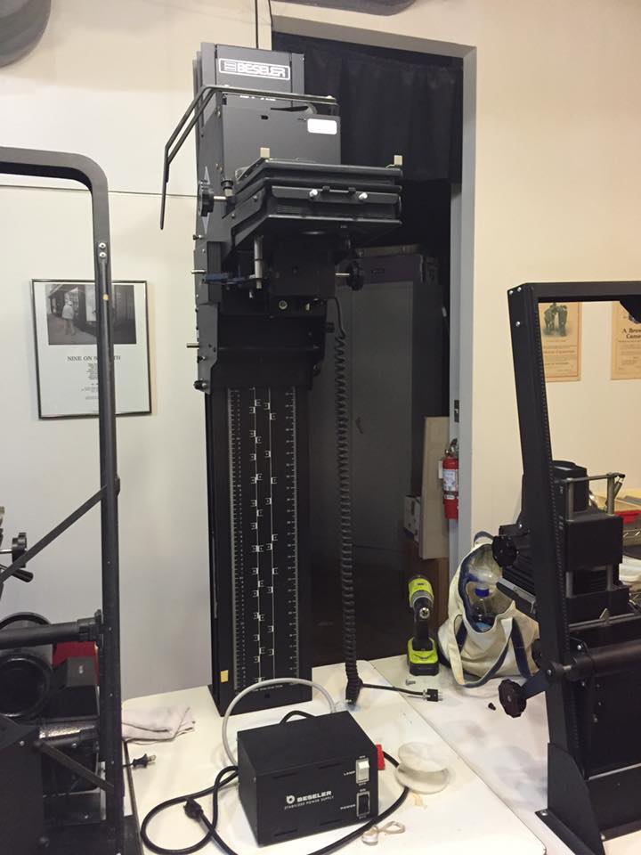
Just in case with all my recent postings about the Fuji X-T1 you all thought I was converting over to the binary side, here is a photo of my newest darkroom treasure. It’s a Beseler 45V-XL enlarger chassis (I already have a light source to mount on it). It’s really my dream enlarger. I currently have a 45 MX(? – not entirely sure of the model number. It’s the older style Beseler 45 M-series with the blue finish), which while very good, is a little cantankerous and it has a problem – when I try to print small, because of the design of the columns (they’re angled) I can’t print small on it with my easels – the head is too close to the column and I can’t move the easel far back enough to center the image.
Beseler 45V-XL
This baby solves that problem. The head sticks out far enough that it is ALWAYS centered on the baseboard. Now the challenge will be to fit it in the darkroom because the column is taller than the 45MX by a good 8-9 inches, and my ceilings are tragically low. Oh, and the best part? It was free. Photoworks was de-accessioning some enlargers and if I hadn’t taken it, it would have gone to the scrap heap. Yay recycling!
I just completed my contribution to the Signature fundraiser for Photoworks. Here is the description of the event:
We are celebrating Photoworks 40th Anniversary by collecting “Signature Prints” from 40 of the best fine art photographers we know. And then we are throwing a party with one hell of a “goody bag” for our guests to take home!
On Saturday, February 21, we will honor the vision that inspired our founders 40 years ago and we’ll celebrate the many individuals who have helped us become a true arts community. And it is only fitting that on the occasion of our 40th anniversary, we will look ahead to ensure that we can continue to inspire and nurture a new generation of emerging artists by teaching, mentoring, and exhibiting their work. Our 40th Anniversary “Signature Auction” will help us raise funds to support programming, outreach, and new investments that will enrich our community in the years to come.
The raffle tickets will be $150 each, which isn’t cheap, but you’ll get the chance to acquire some incredible photos.
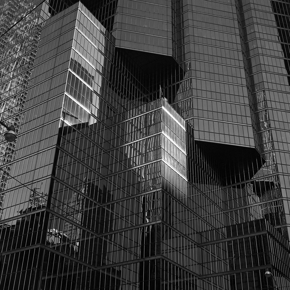
My contribution is a 10×10 inch print of a Toronto street scene. It’s titled “Romeo & Juliet”. Look carefully and see if you can tell why:
Two Streetlamps, Reflections, Glass and Steel
And now for the geeky bits:
The print is a silver gelatin print from a negative made on Kodak Tri-X, shot with my 1956 Rolleiflex 2.8E. The paper is Ilford Warmtone Multigrade fiber paper, developed in Ansco 130, which is a classic all-purpose developer. I prefer it over other paper developers because it lasts seemingly forever, even in an open tray, and it produces a very nice neutral/cool tone without the greenish sheen in the shadows you can get from Dektol.
I actually do make silver gelatin prints. I’ve been away from the medium for a while, mostly concentrating on alternative processes. I needed a break from alt process work so I cleaned up my workspace, fired up the enlarger, and started printing my Paris images you might remember from earlier blog posts. With my new (to me) Oriental VC-CLS variable contrast cold light head (a lot of jargon for a light source that allows you to adjust the contrast in your print by changing the ratio of blue and green light exposing the paper), I’ve been having a blast cranking out prints, and the Oriental head makes it a lot easier to do split-grade printing.
For those unfamiliar with the idea, instead of making a single exposure at one contrast grade, and then doing a lot of burning and dodging to make up for it, with split-grade, what you do is make two base exposures, one using a very soft contrast (in my case, most likely grade 0) and a second using a very hard contrast (grade 5). What this does is the soft exposure lets you get your highlights with detail, and the hard brings the shadows in to snap. You still need to burn and dodge for specific things, but you can refine the overall look as the image requires, without getting frustrated at why a certain area always comes out too dark or too bright. You can refine this technique to include your burning and dodging cycles, so that you might burn an area in with the grade 0 filter to put detail back in the highlights but not blocking up the shadows, or with the grade 5 filter for putting deep black in a shadow without muddying up the whites in the same area.
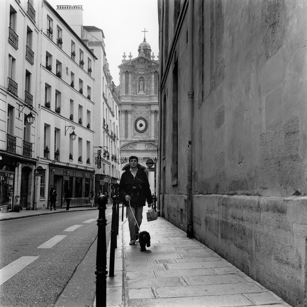
I’ll give an anatomy of a split-grade print here so you can better understand what I’m talking about. This is a real challenge to print “straight” – it’s a high contrast scene, with the dog-walker being somewhat backlit, and the upper left corner a lot brighter than the rest of the scene. This is the finished print here:
Dog Walk, Rue Sevigny, Paris
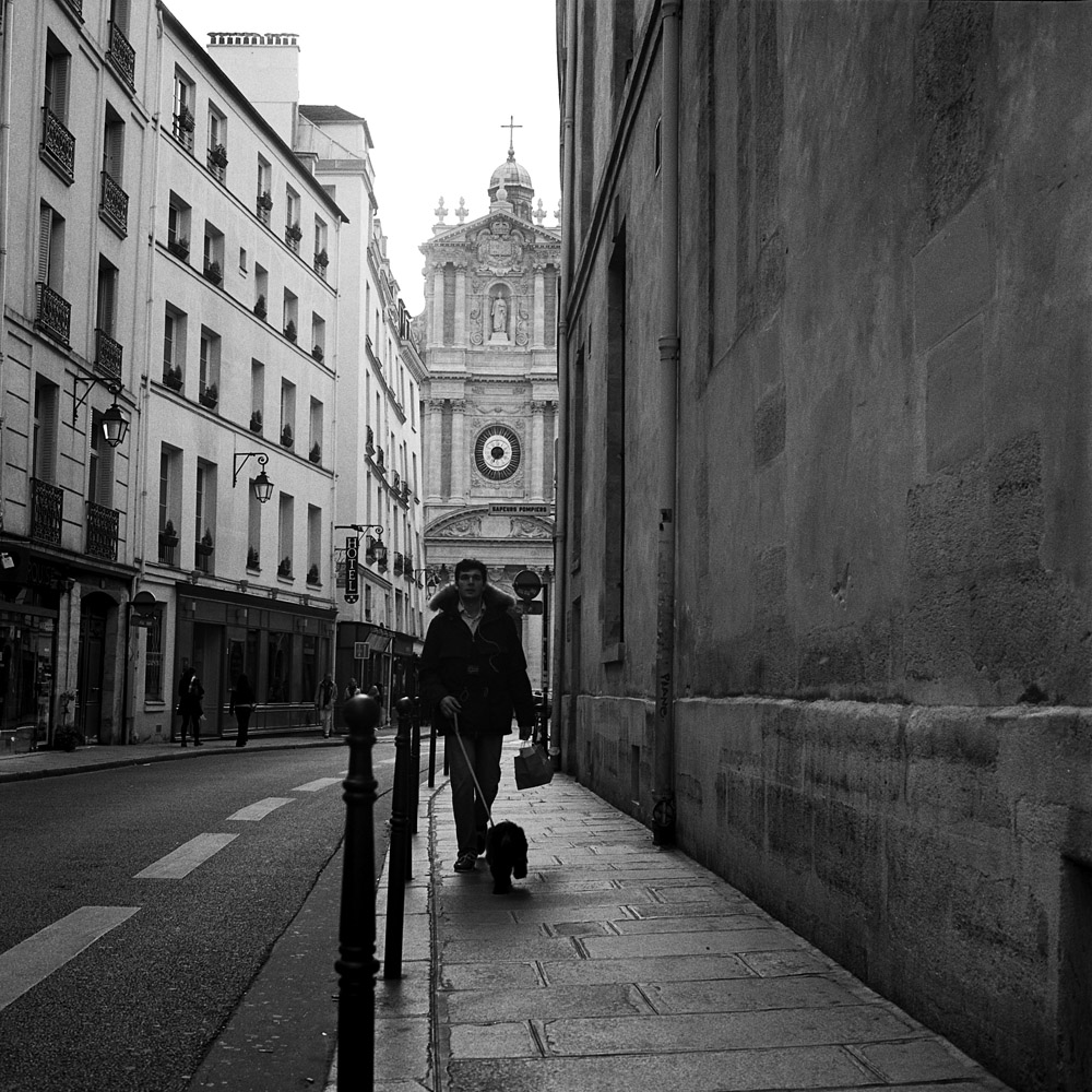
Here is the scan I made from the negative, which also had a fair bit of manipulation. Less successful, wouldn’t you say? The dog walker is still strongly backlit.
Dog Walker, Rue Sevigne, Le Marais
To make this print, I gave it a base exposure of 20 seconds using the grade 0 filter. I dodged the dog walker for 10 of those. Then I burned in the upper left corner for an additional 20 seconds. I gave a final overall exposure of five seconds at grade 5, to put a little snap in the general scene and specifically to firm up the shadows on the dog walker without losing tonal separation for his buttons, the cords of his iPod earbuds, and the hair of the dog. Were I making this print larger, I’d go back in and burn the sidewalk between his legs and the dog back down a bit, but in a 7×7 inch print, accurately wielding a burning card with a hole that small is tough!
This was printed on Ilford Warmtone variable-contrast fiber paper, using Ilford Warmtone developer. I’m not applying any fancy tricks to the developer like playing around with developer dilution or split warmtone/cooltone developers. That’s a trick for another day.
I’m running a quick impromptu by-the-seat-of-the-pants version of my Intro to Platinum/Palladium printing class this weekend. It’s a bit of a hash because we had scheduling conflicts of varying types to deal with, but we did manage to meet today. My normal plan with students is to take them out into Glen Echo park and have them shoot a bunch of negatives with my 5×7, then come back and process them. WELL… today, the daytime high was still below freezing, so we scratched that idea. Instead, we shot some self-portraits indoors using my Hermagis Eidoscope soft-focus portrait lens, a 1000-watt hot light (a VERY welcome hot light given the weather today!) and an improvised guillotine shutter composed of a pair of dark slides, held in a V-formation. The “shutter” starts with the lower dark slide completely covering the lens, and to allow exposure to happen, the pair are swung past the lens so that the gap between them briefly allows light to strike the film. Exposures can be a little variable, but these are forgiving media.
Here is one shot of one of my students:
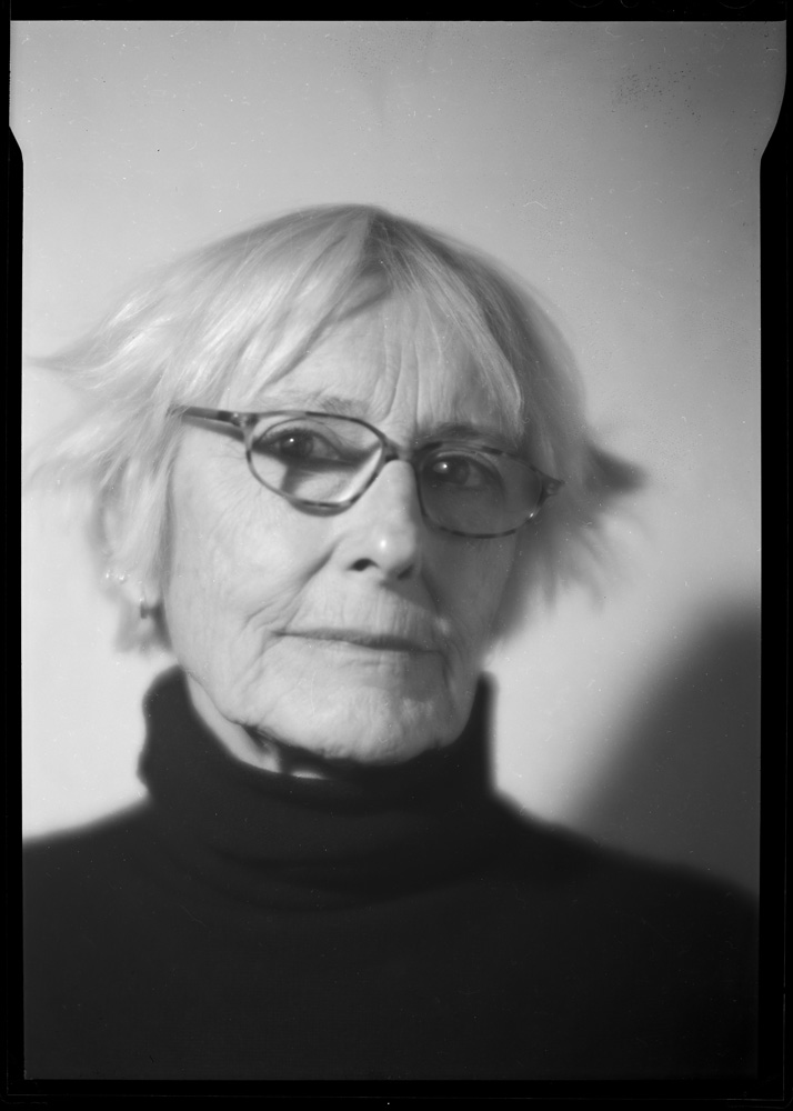
Barbara, Hermagis #1
and here are two of me:
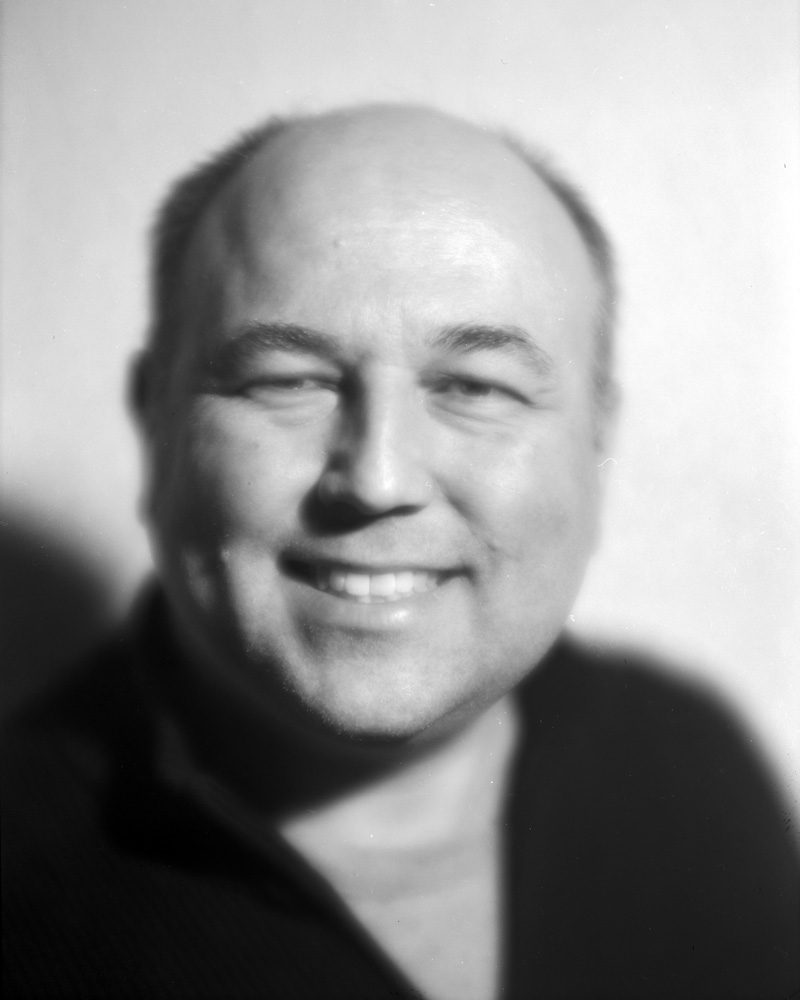
Scott, Hermagis #2
Scott, Hermagis #1
I brought the Hermagis to class to give the students a little something special to play around with, since they both had past experience in working with large format, and I think the soft-focus lens fits very well with the alternative process print look.
Of the two of me, which do you all prefer? I know which one I like better, but I’ll wait to get some feedback before I offer my opinion. All three of these are scans from the negatives, not from prints. We will be meeting again tomorrow to do the actual printing.
In my practice of all kinds of photography, problems arise that you don’t always expect. I’m used to humidity issues with antique and historic processes like gum bichromate and platinum. Of course, any light-sensitive material has to be treated with respect or you’ll ruin it. But digital photography was billed as a sort of end-all solution to everything that plagued wet darkroom photography. You just insert the paper in the printer, hit ‘print’ and a couple minutes later, out comes your perfect print, all in room light, no odor, no chemistry, no fuss.
Well… it turns out humidity (something unavoidable in Washington DC for 2/3 of the year) which is a big plus for antique and historic processes and a non-issue for silver-gelatin and RA-4 wet color printing, is a major enemy for inkjet printing. I had a box of Brilliant Museum SilverGloss White paper which I had been using to print my big exhibition prints. It turns out that over time, the paper had swollen from what I can only assume was moisture absorption and would not go through my printer without head strikes and smeared ink in the corners of the prints. I was trying to finish up a print job for a sale I made of four prints, and I ruined the remaining sheets of Brilliant I had. I was in a bad jam because Brilliant was Calumet’s house brand, and Calumet is no longer a serious player in the US (two remaining stores in Chicago, and an absolutely worthless single-page web page saying “call us for what you want!”). Ordering from Calumet UK, who does carry it, is a really bad idea as the shipping cost would probably equal the cost of a box of paper, AND in the UK and the rest of Europe, their paper sizes are all based on the A notation instead of inches.
I loved the paper, but it is effectively no longer available here. So off to B&H Photo I went (virtually) and found the new Harman by Hahnemuhle Gloss Art Fibre paper. It’s virtually identical in weight (a gorgeous 300gsm heavy-weight fiber paper) and paper brightness. Another upside- a 30 sheet box is cheaper than a 25 sheet box of Brilliant! After having made two prints on it this morning, I can rest happy that I can keep printing my existing series of prints with it without any loss of quality. I’m also glad I can support a major player in the analog market (Ilford/Harman) with my digital purchases.