Latest Mexico Trip – black and white

I just got back from my most recent trip to Mexico City. This trip was very art-centric – I went to two different photography exhibit opening receptions. I also brought along a new-to-me camera to try out – I recently acquired a 3 1/4 x4 1/4 inch Graflex RB Super D (in layman’s terms, a large format SLR that uses 3×4 inch sheet film). It’s quirky to say the least, but there are things that it does that it does so well (I particularly love the quality of the Kodak lens it has on it) that the benefits outweigh the quirks.
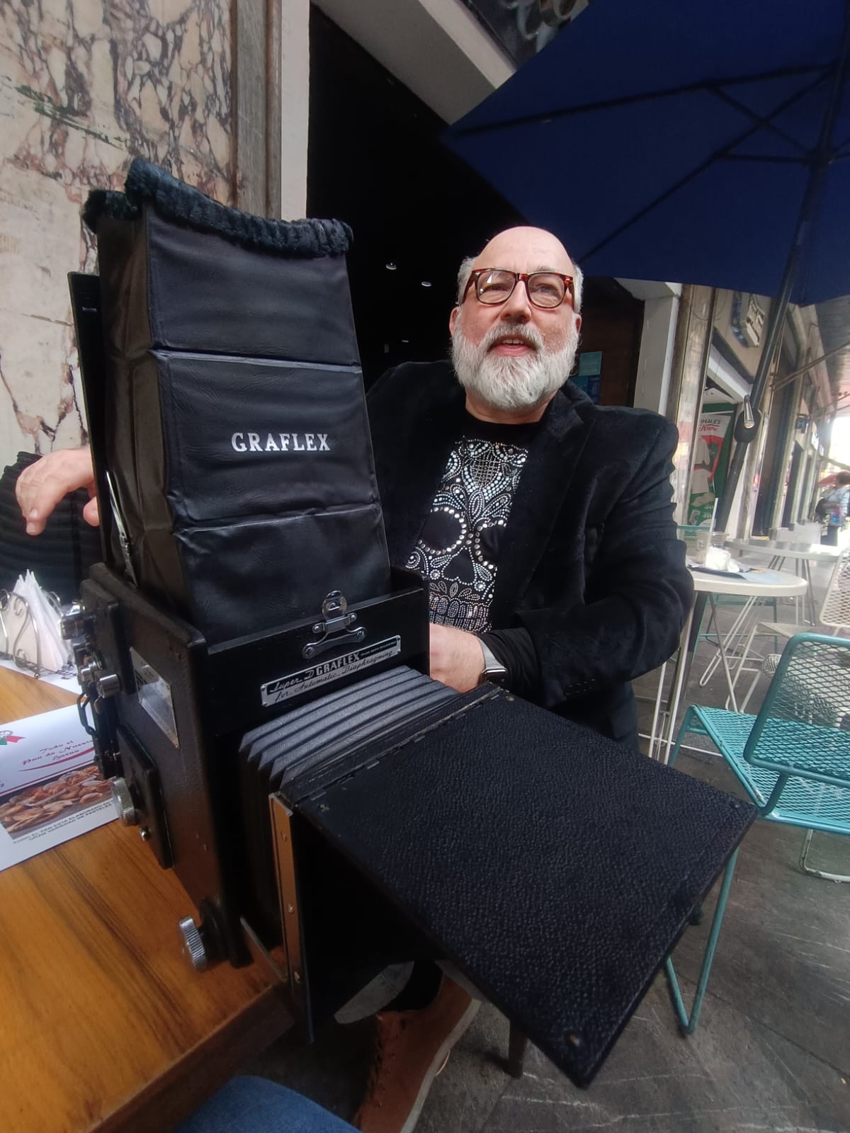
That’s me with the camera. My friend Gabriel Barajas took that of me with the camera using my iPhone.
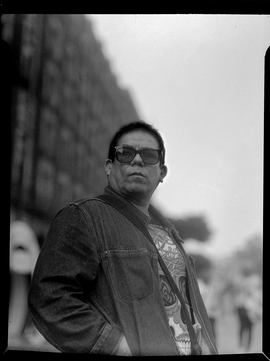
That’s Gabriel, taken using the Graflex.

I used it for some street photography around the neighborhood where I was staying. This time I rented an apartment in Condesa instead of staying at my usual hotel the Hotel Geneve in the Zona Rosa. The reasons were multiple: first and foremost because this trip was in time for the Day of the Dead ceremonies AND the Mexican Grand Prix Formula 1 races, hotels in the central parts of the city were outrageously overpriced (Hotel Geneve, which is normally in the $100/night range, was asking almost $400/night that week). Second, when I made the bookings, I was thinking I would need to be close to a gallery in the San Miguel Chapultepec neighborhood where we thought we would be having activities for our conference. The gallery changed their mind and rescinded the offer of hosting an exhibition, at which point we had to cancel the conference (no exhibit, no presenters at the conference, as this was a major part of their compensation).

Since I had already booked the apartment and the plane ticket, and finding alternate lodging would have been difficult and increasingly more expensive the closer I got to the trip, I kept the apartment. Condesa is a very nice neighborhood, but it has fallen victim to gentrification in the worst way- a large number of housing units in the neighborhood are now short-term rentals, and so many locals have been priced out of the neighborhood. The cute cafes, bistros, and boutiques? If I closed my eyes and only listened to my wallet, I’d be forgiven for thinking I was in Greenwich Village or the Marina District. Breakfast one morning was almost $20 for a petite breakfast sandwich and a coffee.

Also, while it is not unreasonable that not every tourist should speak the local language, it was particularly galling as someone who goes to Mexico for the purpose of keeping up his Spanish language skills to find myself the only person speaking Spanish to the wait staff at said breakfast joint for the entire duration of my meal. The gringos were walking in and speaking in English as if it were to be expected the staff would all speak it, not even making a gringo high school Spanish attempt to ask if they spoke English first.

This didn’t used to be a frequent topic of conversation in Mexico City- on previous visits, nobody would bring it up. This trip, almost anyone I talked to for more than 15 minutes was talking about the transformation of Condesa and Roma neighborhoods into overpriced Gringolandia.

Enough about that, and on with the pictures, which is what y’all are here to see!
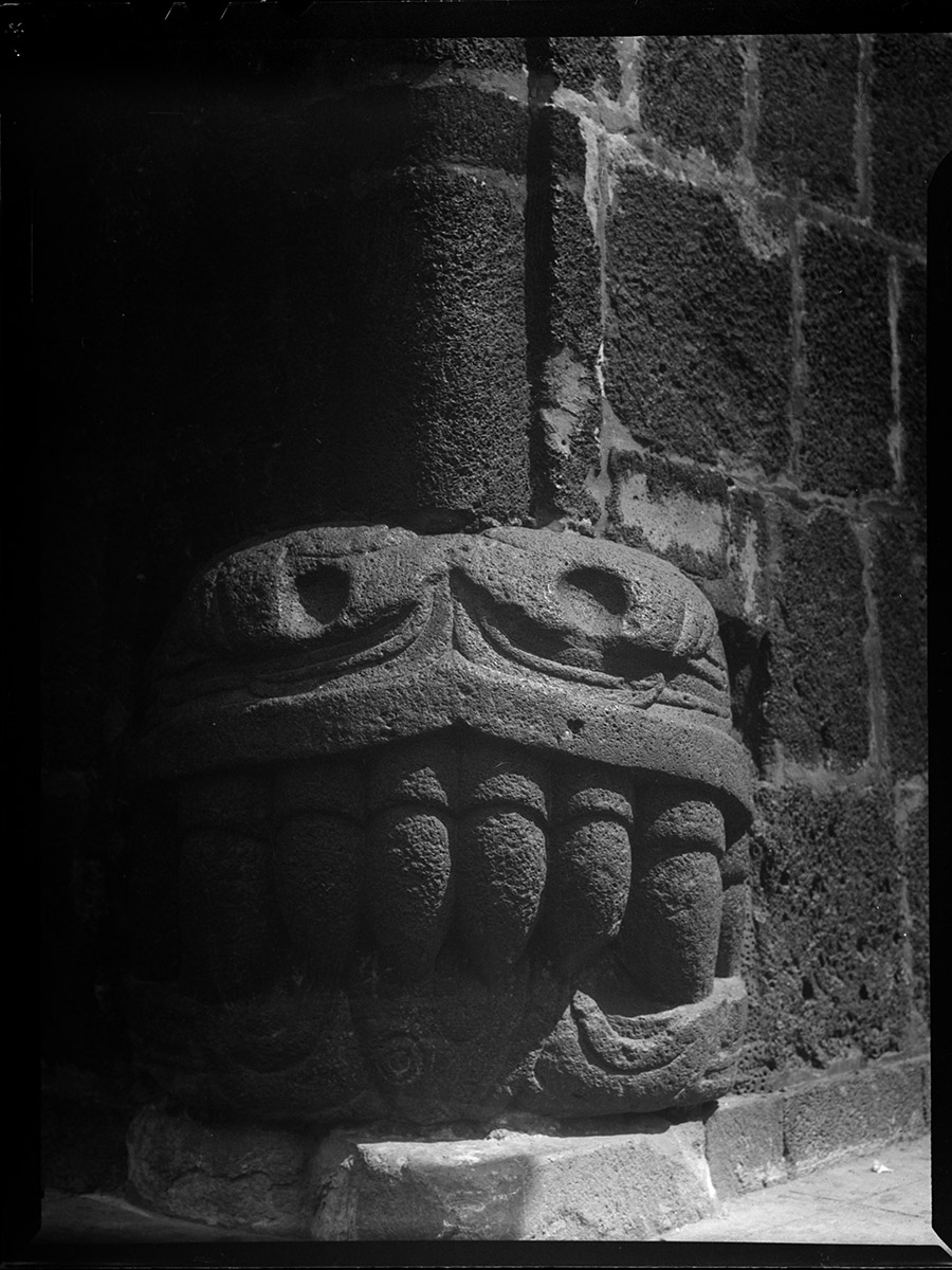
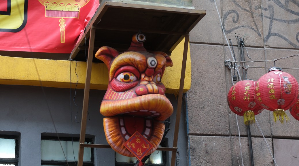
We’ll start off with a banger – this is the head of a serpent taken from the Mexica Templo Mayor on the Zocalo, and re-used as a cornerstone of a palace built by one of Hernan Cortez’s lieutenants. The palace remained in the hands of the family that built it until the 1980s. It now houses the Museo de la Ciudad de Mexico.
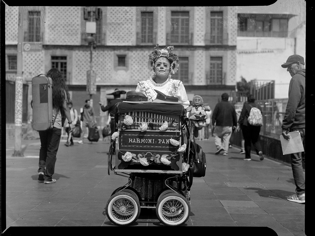
Throughout the Centro Histórico, you’ll find organ grinders busking for spare change. This woman organ grinder had gotten herself dressed and coiffed and painted for Day of the Dead. Behind her is the Museo Archivo de la Fotografía, where I was headed to see the opening reception for my friend Alejandro Sanchez Mociños’ exhibit Muerteadas, about the traditions around the Day of the Dead in the Valle de Etla in Oaxaca state.
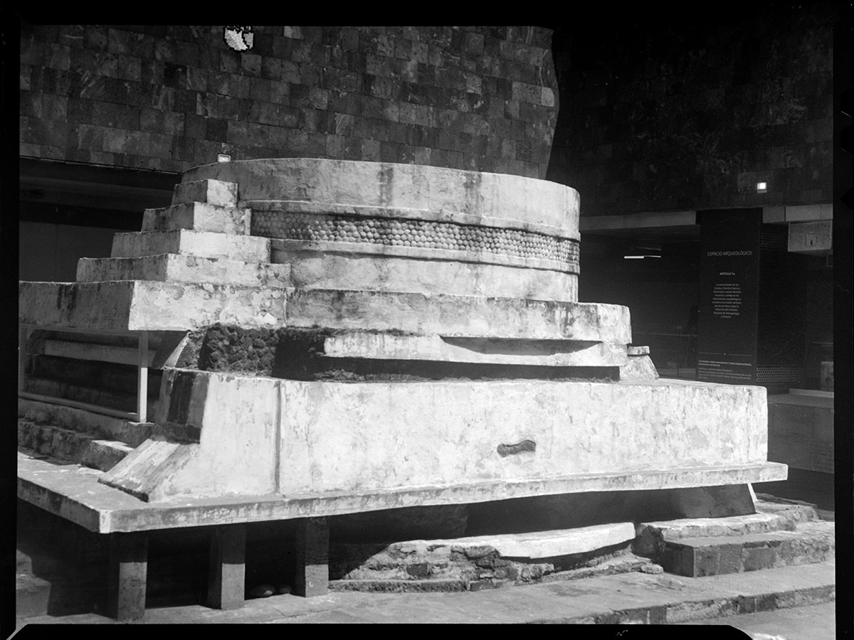
How often do you find a Mexica temple in the middle of a subway station? During the excavations to build the Pino Suarez station of the Mexico City Metro system in the 1970s, this temple to Ehecatl the god of the winds, was discovered. The station was built around it and it serves as a miniature archaeological museum in the middle of a public transport system.
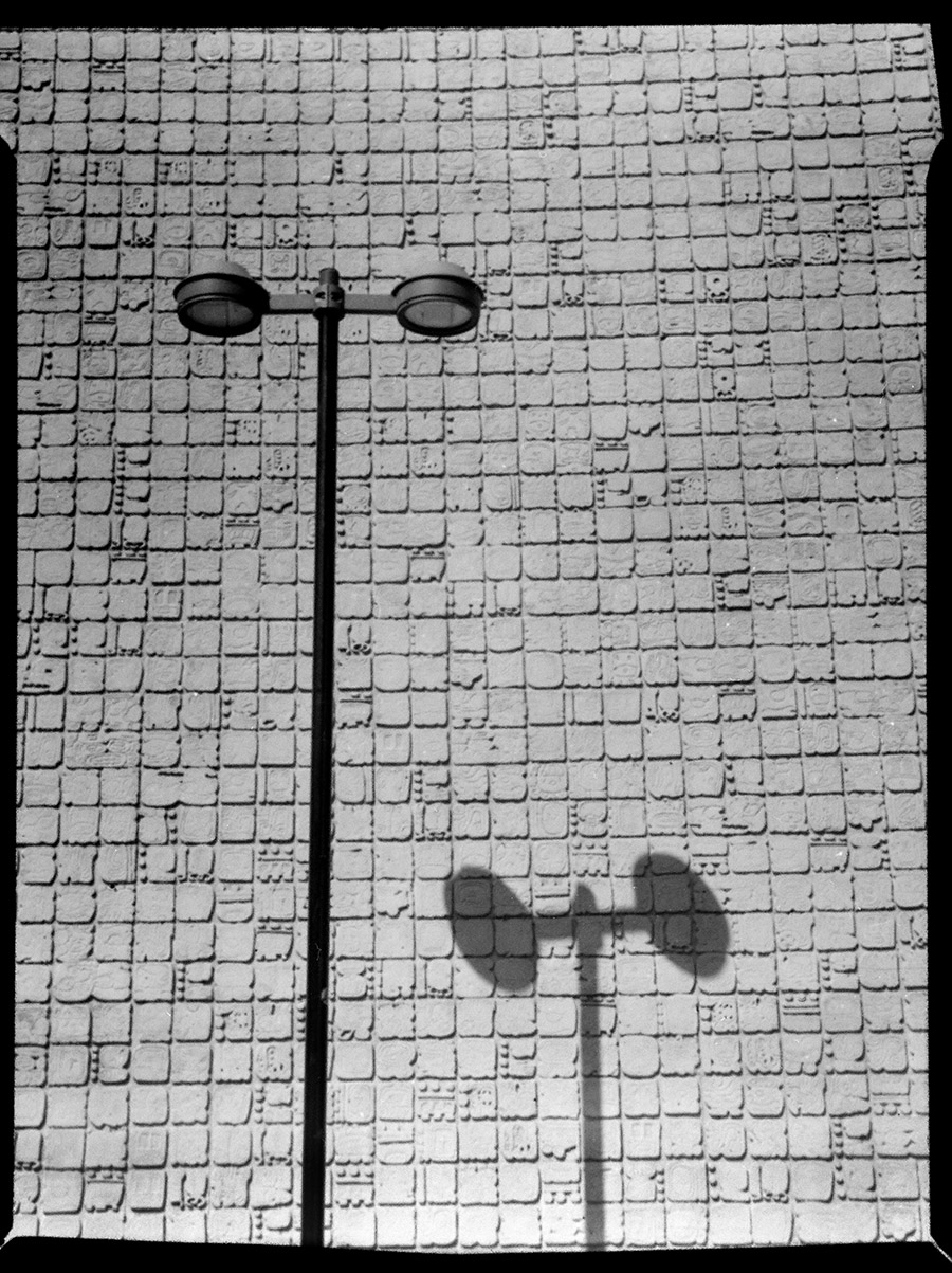
Bridging the gap between ancient and modern, we have this scene outside the Insurgentes metro station. A modern street lamp casts its shadow on the metro station wall, stylized to look like ancient glyphs.
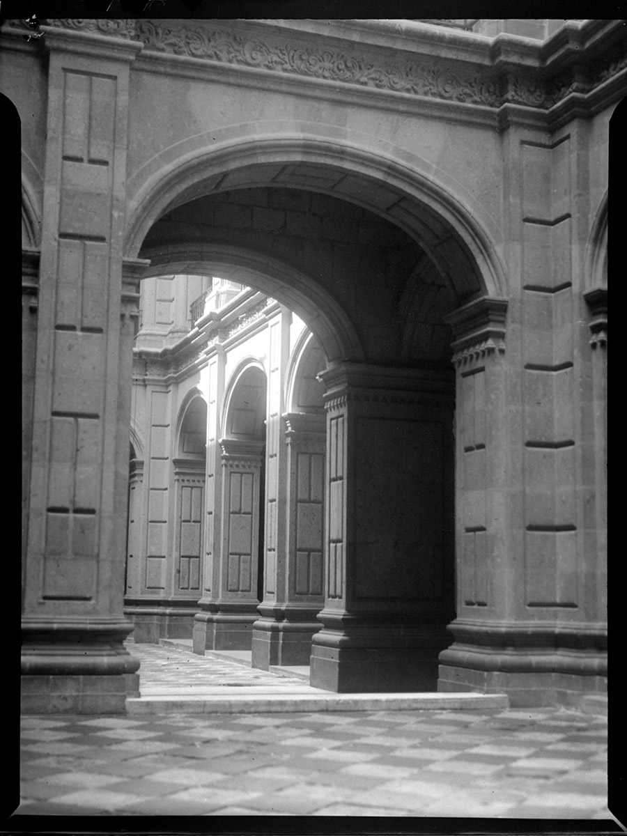
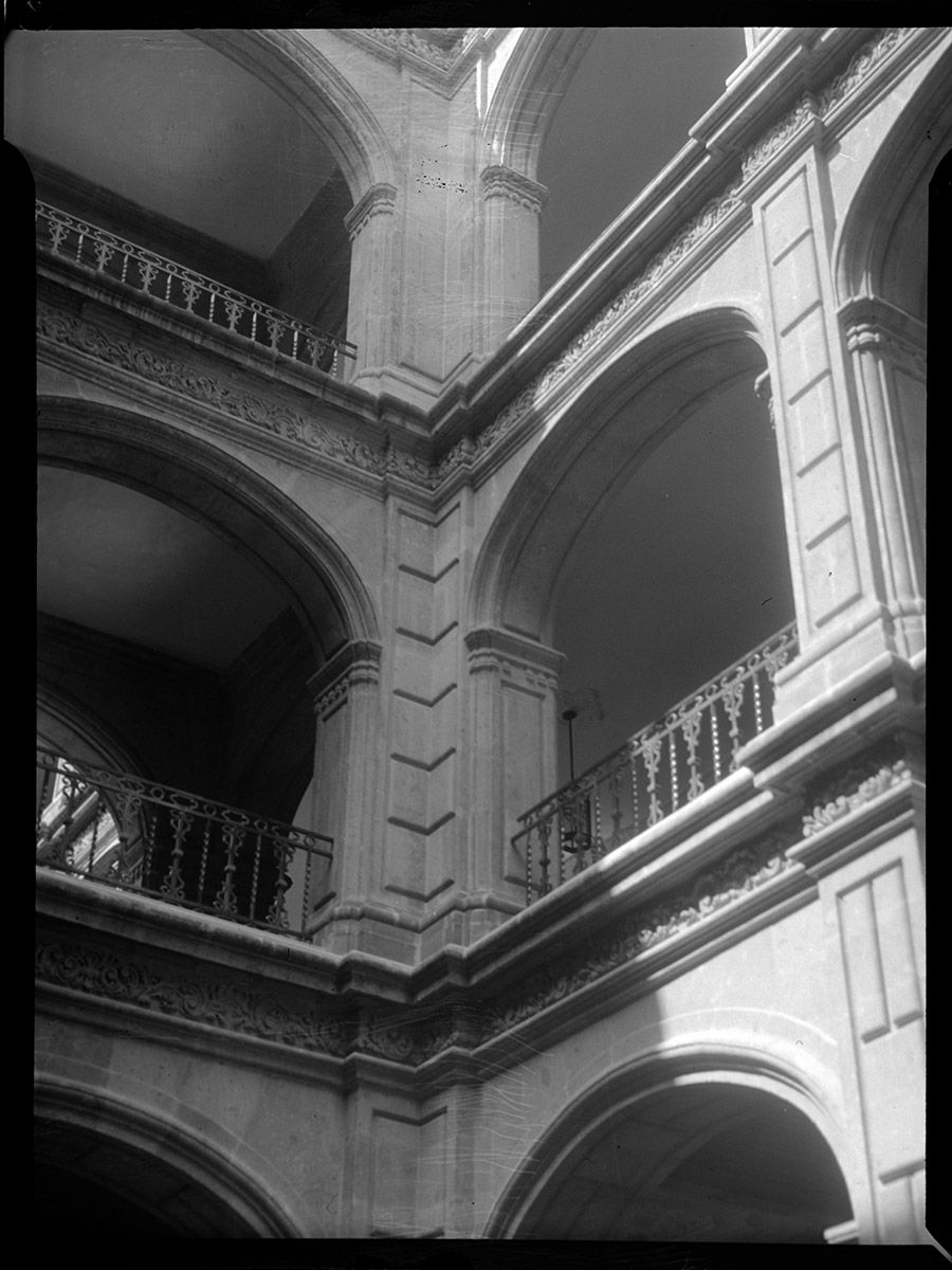
Two views of the courtyard of the Antiguo Colegio de San Ildefonso. The school itself dates back to 1588 as a Jesuit preparatory school, but the buildings we see here today are from the 1720s. It has been a preparatory school, a military academy, a judicial center, and a medical center. Today it serves as an art museum, best known for the murals on the staircase and around the courtyard painted by the masters of 20th century Mexican Muralism including Diego Rivera, David Alfaro Siqueiros, Jose Clemente Orozco, Fernando Leal and Fermin Revueltas.
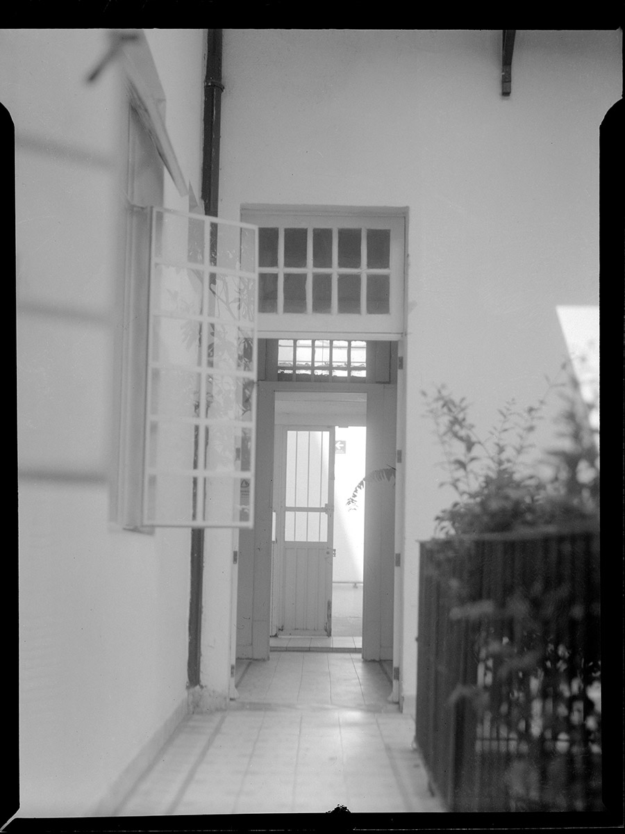
Waxing more modern, this is a view across a second-story balcony in a courtyard of a house in Condesa. The house has been converted into an art gallery, design store, and photography bookshop, and it overlooks Parque España.
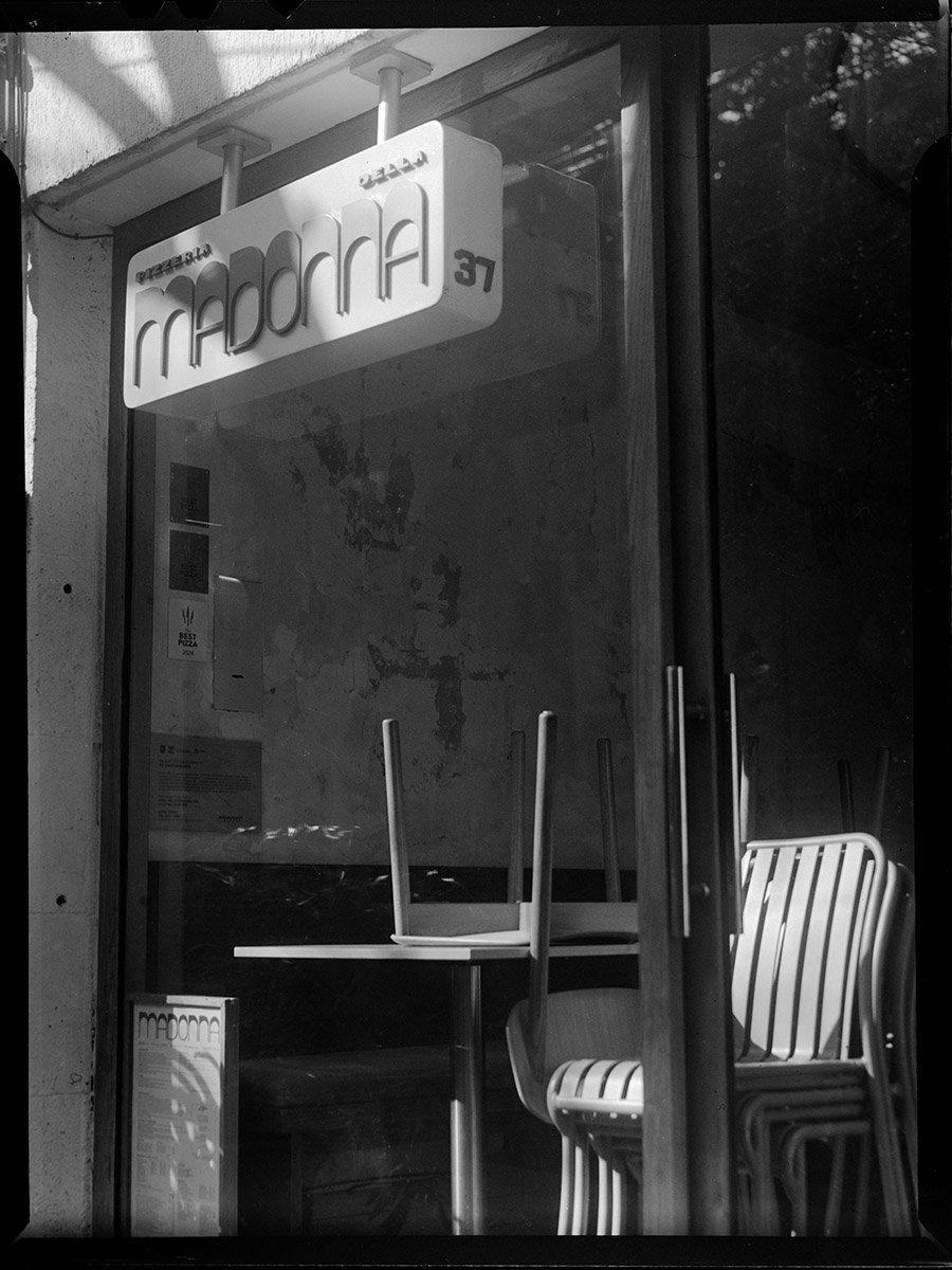
In keeping with the design thought, I came across this view of a pizzeria in Roma Norte and just had to stop and take a shot of the morning light pouring through the window into the shop. I just loved how the light pooled on the stack of chairs, and gave just enough to keep the background from turning into a black cave.

All these shots were not only taken with a 70-ish year old camera that is 100% manual, but they were taken on 40 year old film, and developed at home.
Solo Exhibition and Critical Review

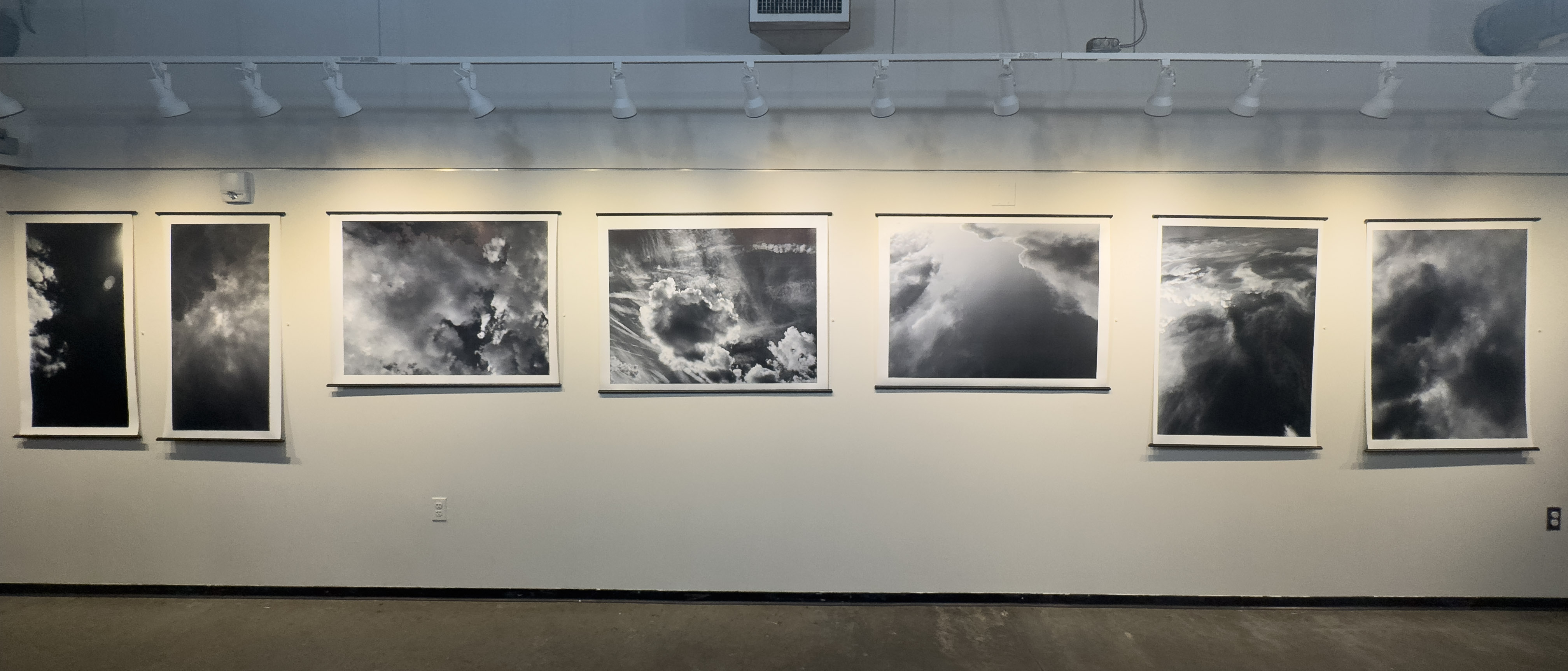
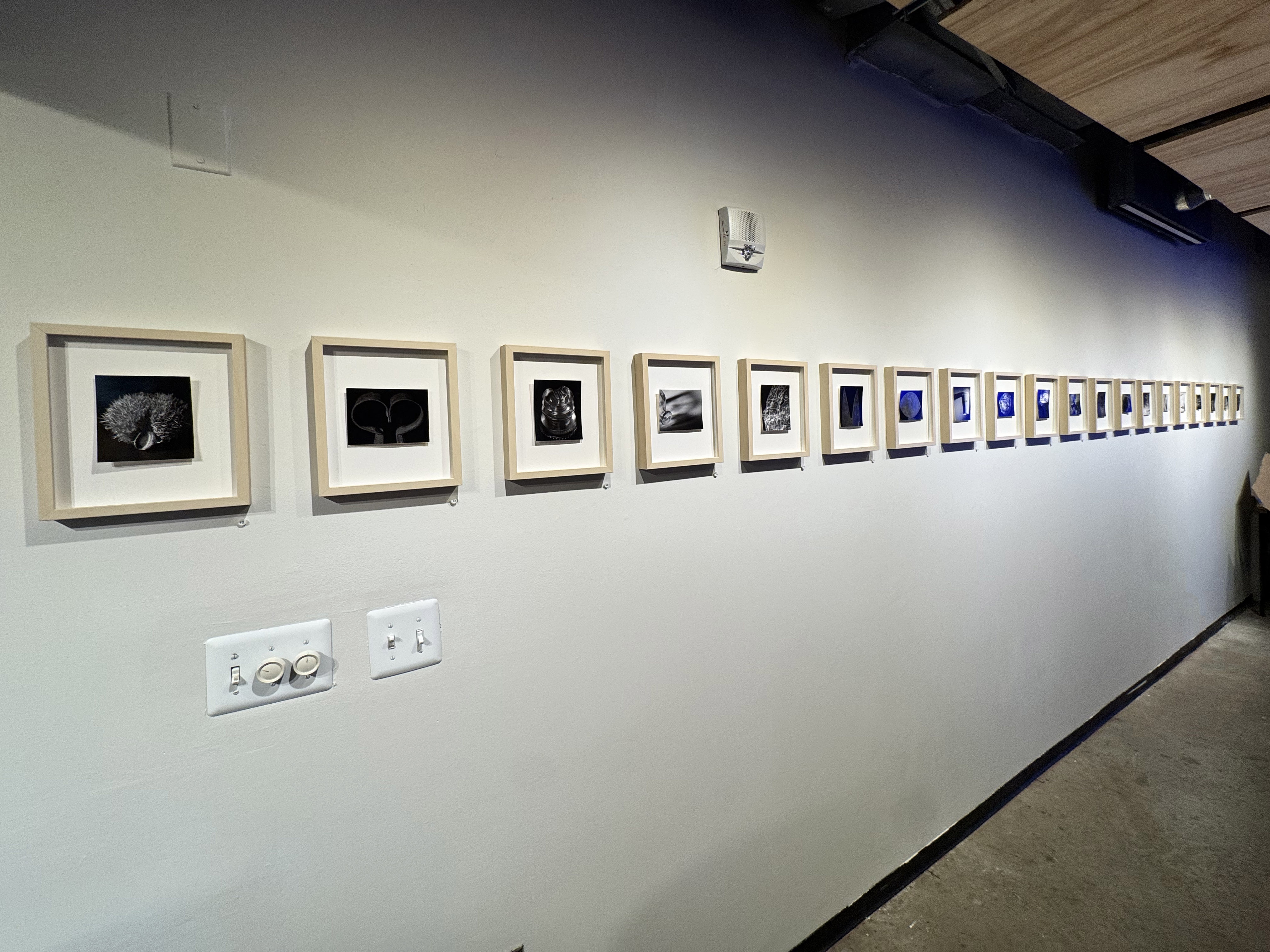
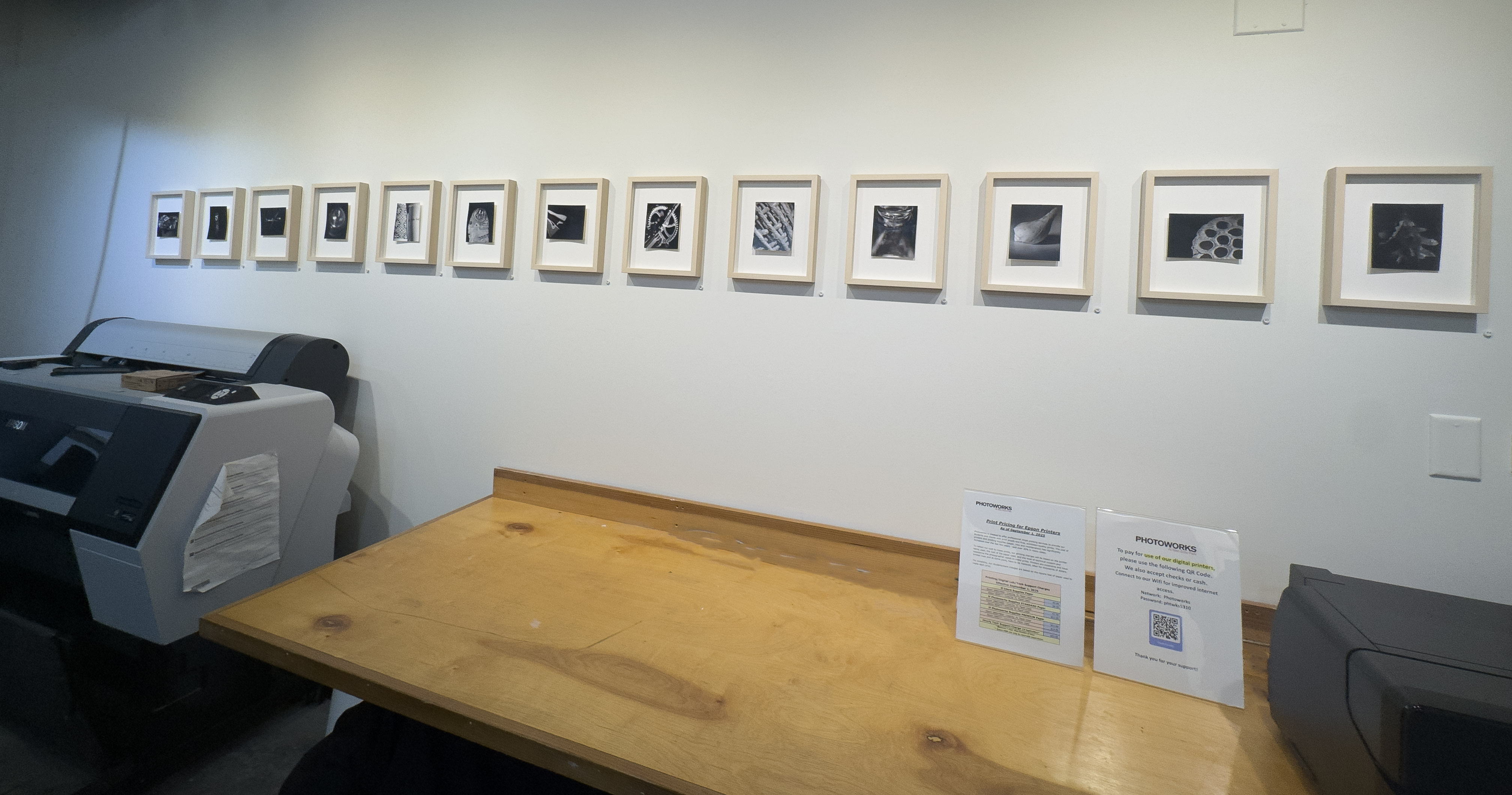
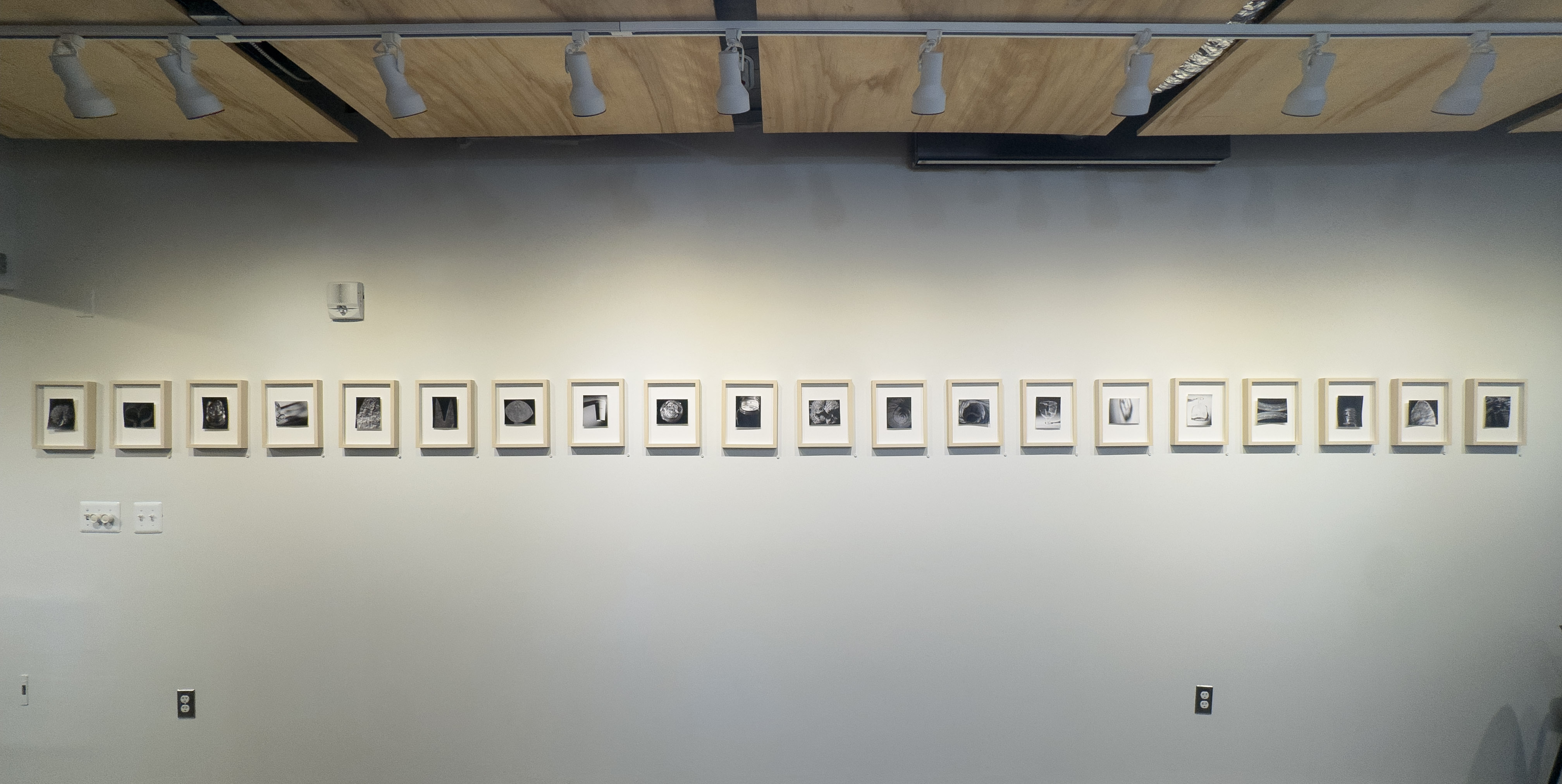
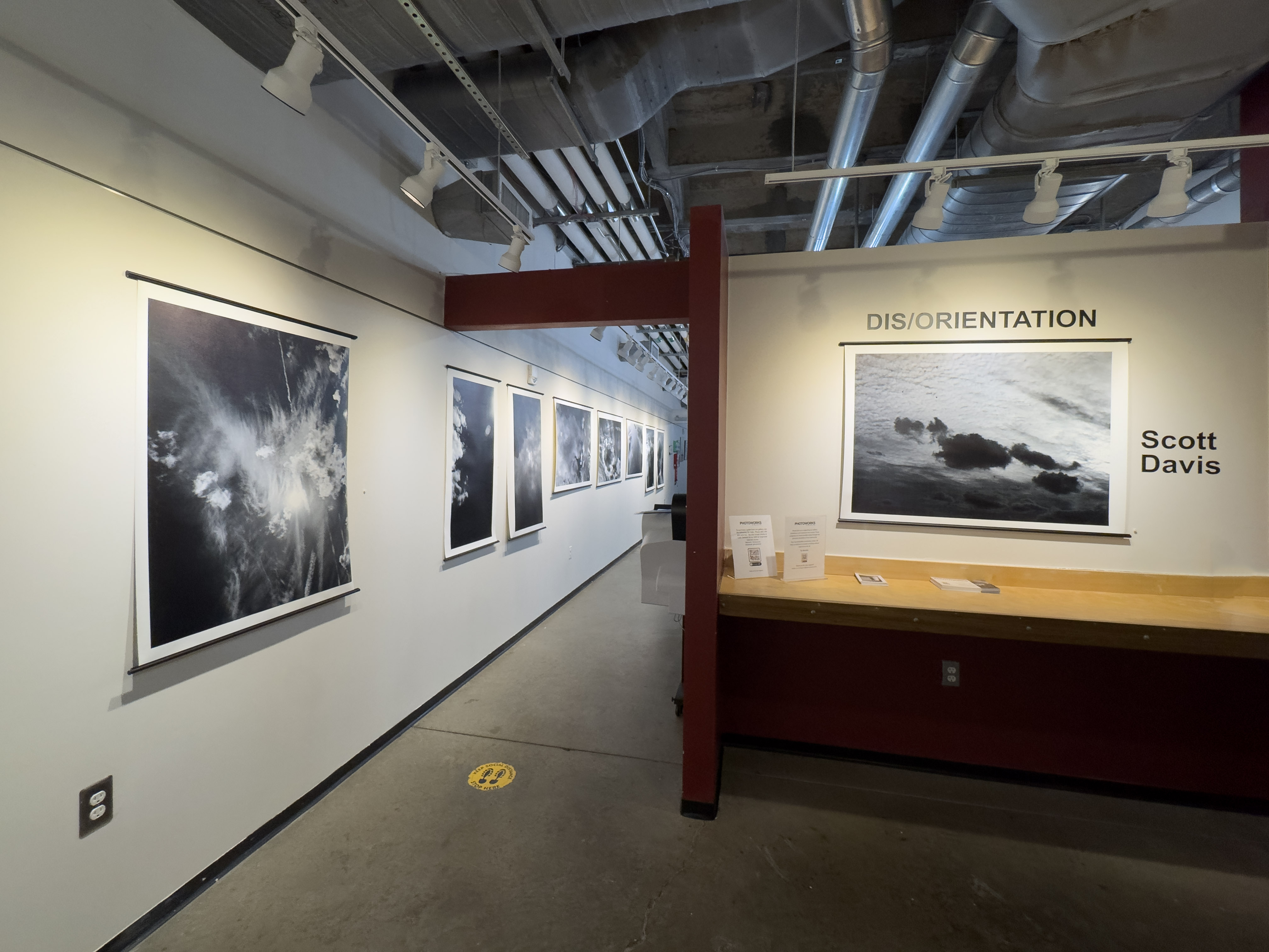
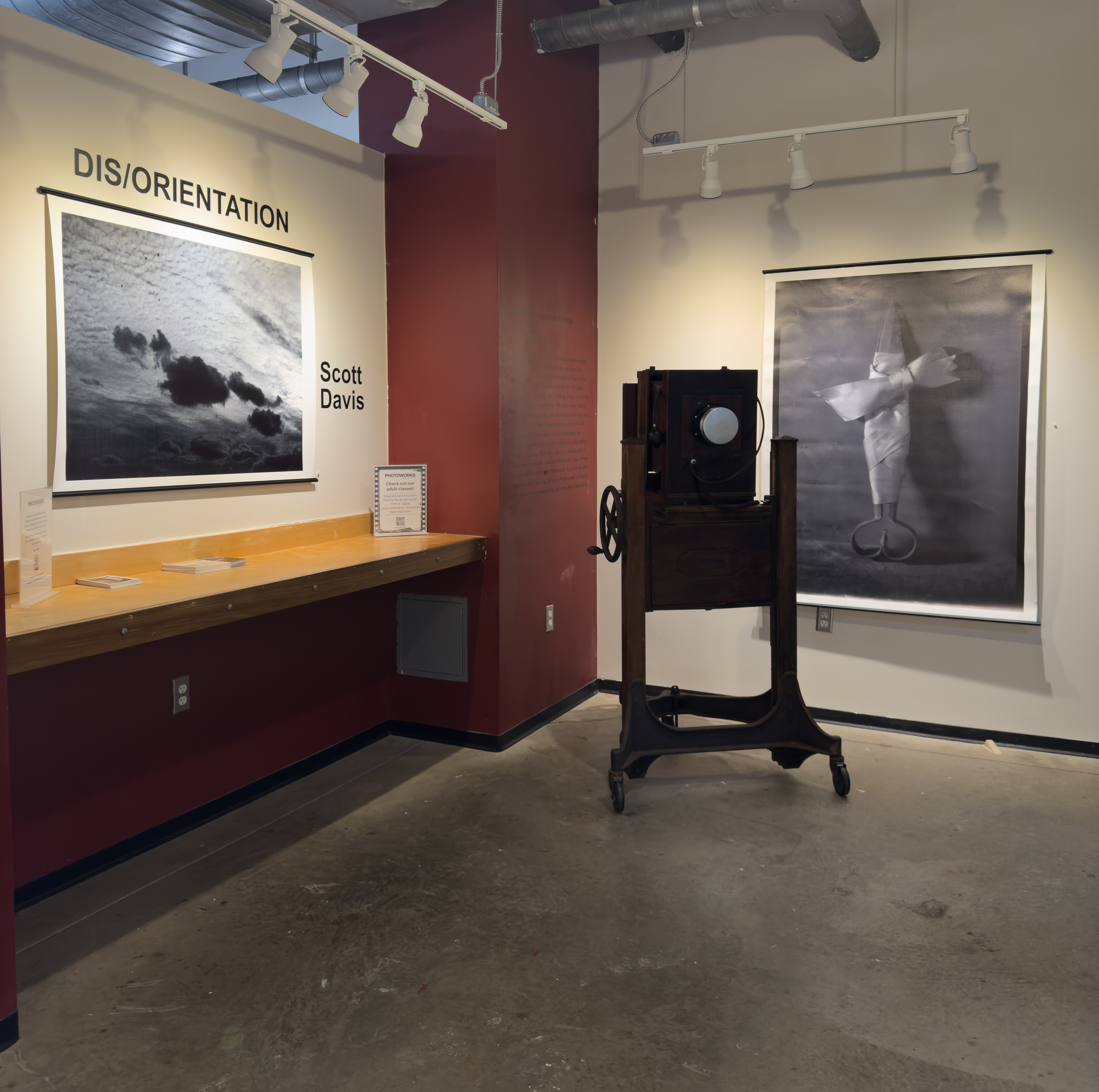
I currently have up on display through March 8th at Glen Echo Photoworks a solo exhibition entitled “Dis/Orientation”. The exhibit consists of 45 images in three rooms. Two rooms are devoted to very large format (20×40, 30×40 and 40×50 inch prints) of images of clouds without horizons or other reference points. The other room is the opposite extreme – 4×5 inch prints of still life images of objects shot on a seamless backdrop, also removing reference points for size, direction, or other context.

The Washington City Paper reviewer Louis Jacobson had this to say about the show:

In his new photography exhibition, Dis/Orientation, Scott Davis doesn’t leave the small things to chance. His exhibit comes in two halves: large, decontextualized images of clouds, and small black-and-white still lifes of common objects. Davis’ clouds have a free-floating approach that owes a clear debt to Alfred Stieglitz’s famous series of “equivalents,” which Davis acknowledges in his artist’s note. Less obviously, Davis credits Chinese and Japanese scroll paintings, a connection evident in the images’ scroll-style hanging. For the second grouping, the presentation also matters: Davis mounts his low-key still lifes without mattes or glass, allowing their natural curling to break the wall of three dimensionality and remind the viewer that photographs are objects, too. Davis’ strongest cloud images leverage high-contrast shades of black and white to play with what the viewer might expect clouds to look like; one of his small still life images, featuring the shadow of an object, channels the same vibe. Of the still life grouping, the most memorable image features what may be the humblest item in the lot: a throwaway latte cup. What makes the image stick is the fact that the cup seems to be hanging from its lid, subverting all visual and gravitational expectations. Scott Davis’ Dis/Orientation runs through March 8 at Photoworks, 7300 MacArthur Blvd., Glen Echo. (Open Saturday and Sunday.) glenechophotoworks.org. Free. — Louis Jacobson

More thoughts on the nature of photography

In trying to understand the nature of photography, and more specifically trying to come up with a single unifying theory of photography, I think it helps to break it down into two broad overarching categories of photography, specifically as it relates to the notion of “truth”. There is what I would term “informational” photography – photographs whose purpose is to convey information, and any aesthetic considerations are purely secondary, and “aesthetic” photographs where informational content is secondary, if not irrelevant, to the aesthetic/artistic considerations of the image. There is a fluidity between the two, of course – binaries are never absolute – but I think it still helps to have that general categorization to understand an image when looking at it .

We can look at certain genres of image and understand that they provide clear-cut if not extreme examples of each of these categories – a forensic photograph showing a failed machine part, or a crime scene photograph documenting the state of a room where a murder victim was encountered would be clear-cut examples of photographs where aesthetic concerns are not just in the back seat, they’re in the very last row of the bus when it comes to the priorities of the photographer taking the image.

This is not to say that there cannot be aesthetically pleasing images of failed machine parts or crime scenes; it is just that in these cases, aesthetic qualities are accidental, subconscious, or even generated by the perception of the viewer in an attempt to establish a relationship with the image.

An example of the extreme of an aesthetic image would be something like a chemigram, where no lens has even been involved in the making of the image, the content is purely abstract, and any information gleaned from the photograph is the product of the viewer’s attempt to establish a relationship with the image. Yes, a chemigram may be used clinically to evaluate chemical interactions between light, silver, and developing agents, but that is not the intent.

We can start to spiral the drain toward the middle of these two positions looking at other genres of photographs and see that very quickly they take on some aspects of each. You can look at vernacular photographs – “indigenous images made for indigenous purposes”: photographs made for personal consumption, and whose intended audience is purely domestic. Aesthetic concerns, while not the back row of the bus, are still secondary behind conveying basic information (“I was in this place at this time”, “Cousin Sally graduated high school”, or even “there was something about that tree/rock/dent in the car fender that I want to recall in the future”). The “something about this tree/rock/dent” images are so personal that the image functions like Proust’s Madelines; that information is utterly lost to anyone outside the photographer. I can look at a picture of a rock that I took and it immediately brings me back to the summer day in 1975 when I tripped on that rock and chipped a tooth, but anyone else looking at it will be oblivious to that event and wonder why I took that picture of that rock because it has no perceptible aesthetic qualities.

However, it is possible to take that photograph of the same rock with aesthetically pleasing qualities for the same Madeline-esque purpose to trigger my personal memory. At that point though, it begins to cross the line out of an anonymous vernacular – intentional aesthetics imply the intent of a non-domestic audience.

This also relates to the question (which I will deposit here and only briefly touch upon, and return to at a later date) of when does one become a photographer? The term itself is sufficiently broad as to allow for a wide range of photographic activities, from the completely casual (the only photos one takes are family vacation snaps and the dent in the fender of the car to send to the insurance company), the amateur (vacation photos that include more than just record shots of the family in front of various landmarks), the professional (photographs that have commercial value, and therefore are driven by informational AND aesthetic concerns), to the artistic (aesthetic concerns are foremost). Once one starts down the road of photography beyond the completely casual, picking up a camera with intent, that is the moment I would posit that the label “photographer” applies. Of course, once one becomes a photographer of one sort or another, that does not mean that ones role and relationship to photographs is fixed. A professional photographer can take a record shot of their breakfast to show a friend, or some tchotchke in a gift shop to ask their partner about a potential purchase, without involving aesthetic concerns.

The beginnings of a project

If you haven’t yet read the book, Photo Work: 40 Photographers on Process and Practice, I highly recommend it. In the course of interviewing 40 different photographers with an identical set of questions about their creative process and how they conceive and execute long-term photographic projects, the book outlines several common approaches. It serves as a useful tool for self-reflection on how you as a photographer can approach your own projects, and encourages you to analyze your own working methods to better understand not only how but why you undertake a long-term photo project.

There has been over the course of the last 50 or so years a mythologizing of the photographer as a lone wolf, stalking the ever elusive Cartier-Bresson-esque magical ‘decisive moment’ image and somehow creating a body of work that will wow galleries and collectors and art historians through a catalog of utterly disjointed found moments on the street. While there certainly is potential to create a body of work this way, and there are a few famous photographers who have done this, to say that it is an uphill struggle would be putting it mildly.

Where the book Photo Work comes in is in pointing the reader to taking a more methodical, structured approach to creating images, especially a cohesive body of work that has a message. While it does not try to draw any definitive conclusions on photographic methodology, one observable trend amongst the artists interviewed is that they start out with a concept, work to produce images that support that concept, and if in the course of making those images, the images tell them that their original concept was flawed, or in need of refinement, or that the way they were making the images does not support the concept, they revise and adapt either the concept or the image-making process to refine the project.

This does not mean that they stop shooting images that don’t fit – in fact, the act of going out and photographing, of seeing through a camera, often informs the genesis of a project.

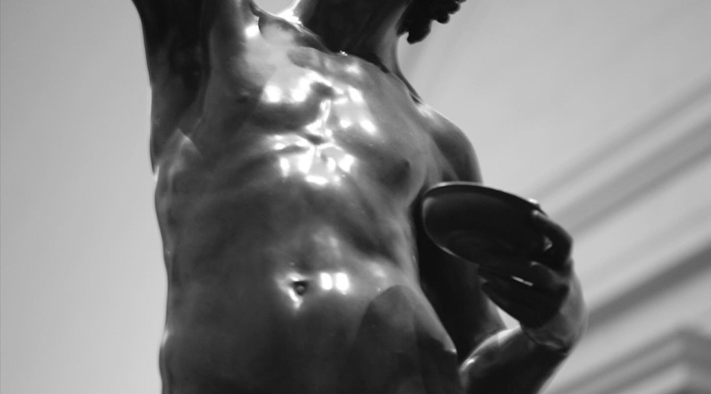
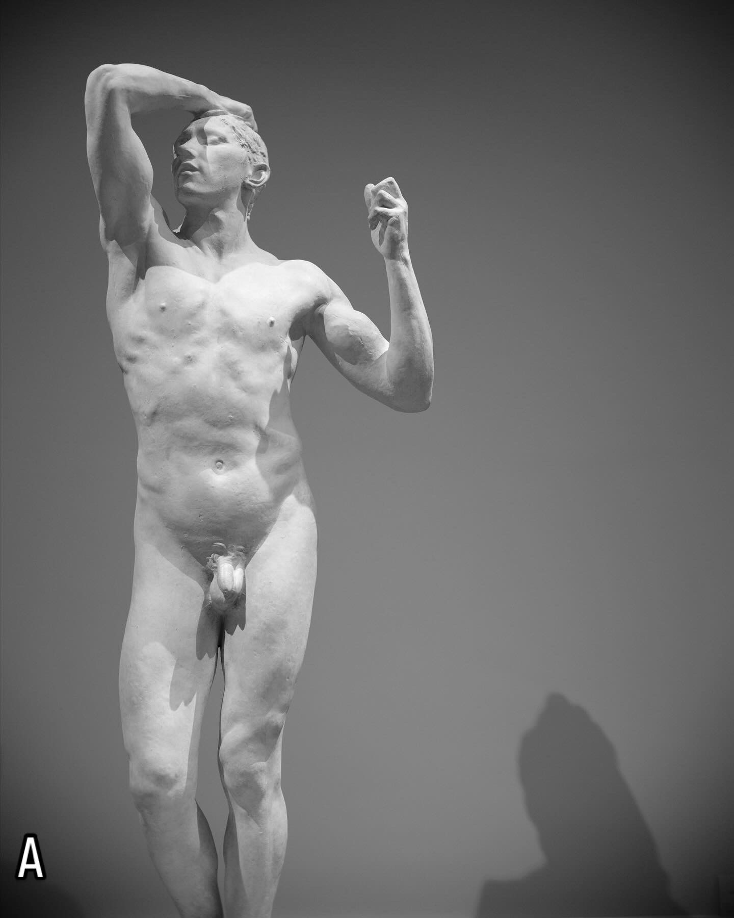
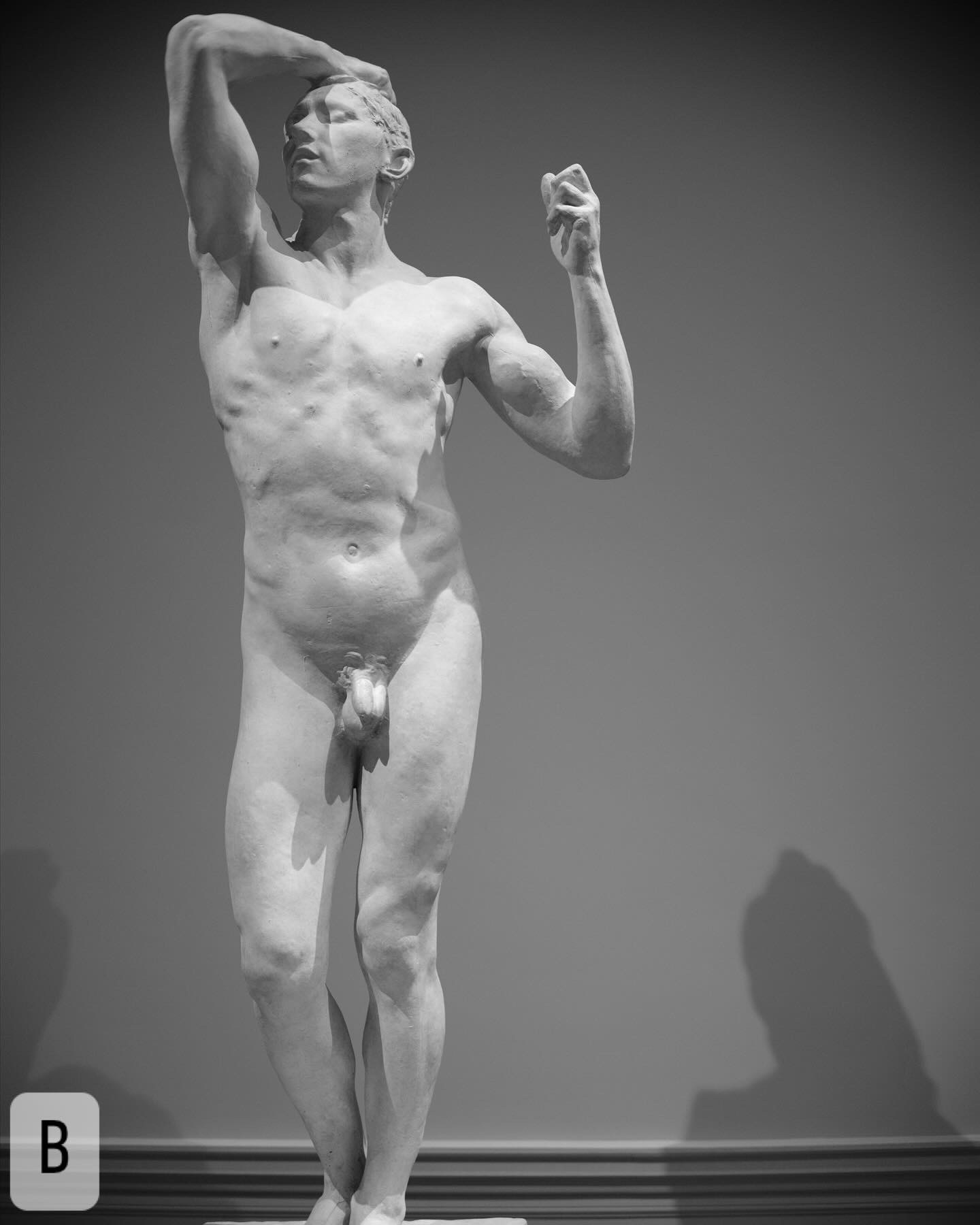
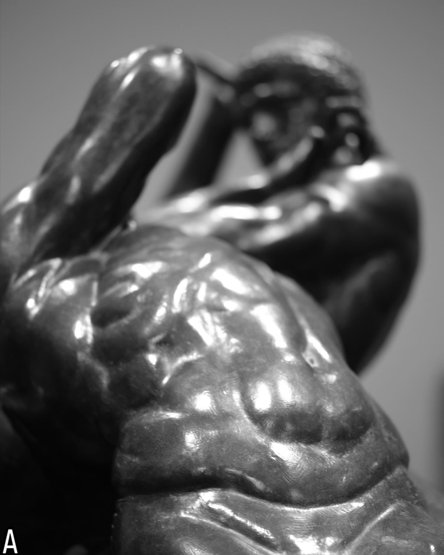
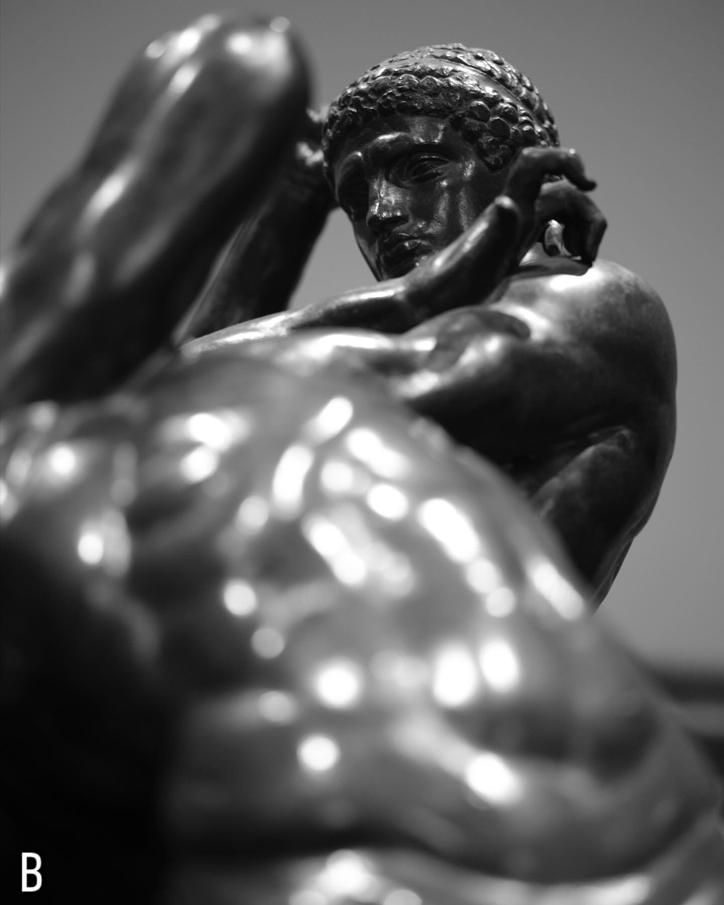
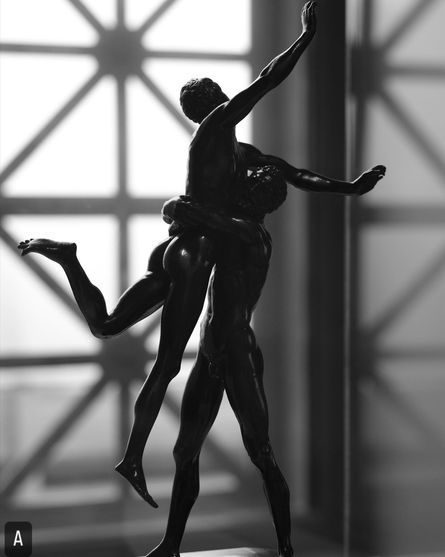
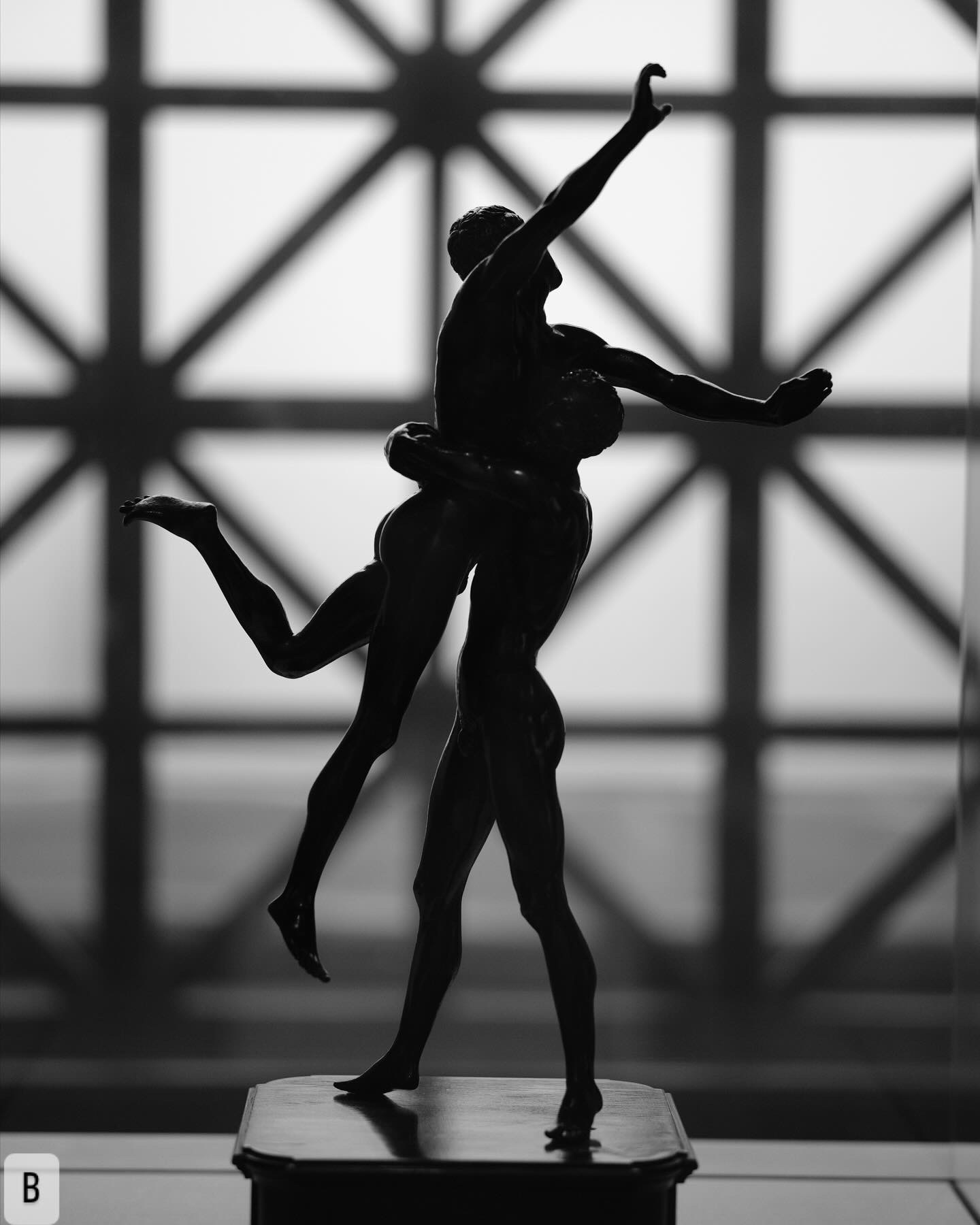
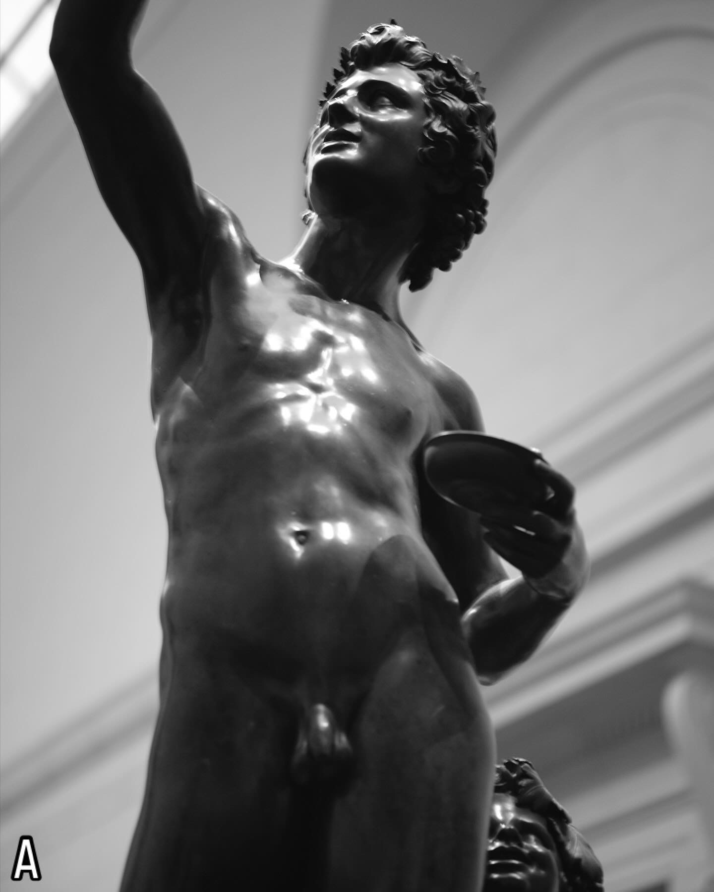
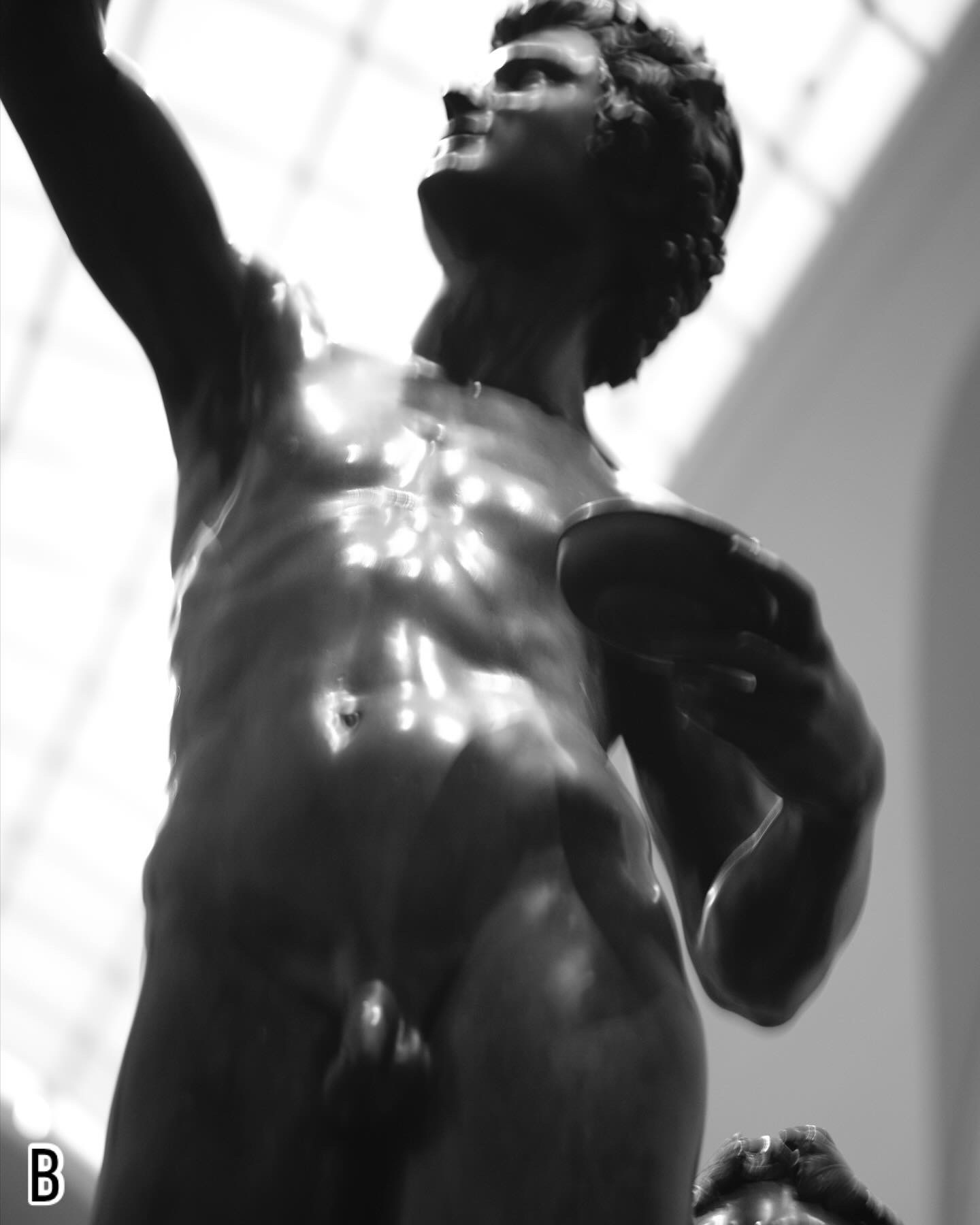
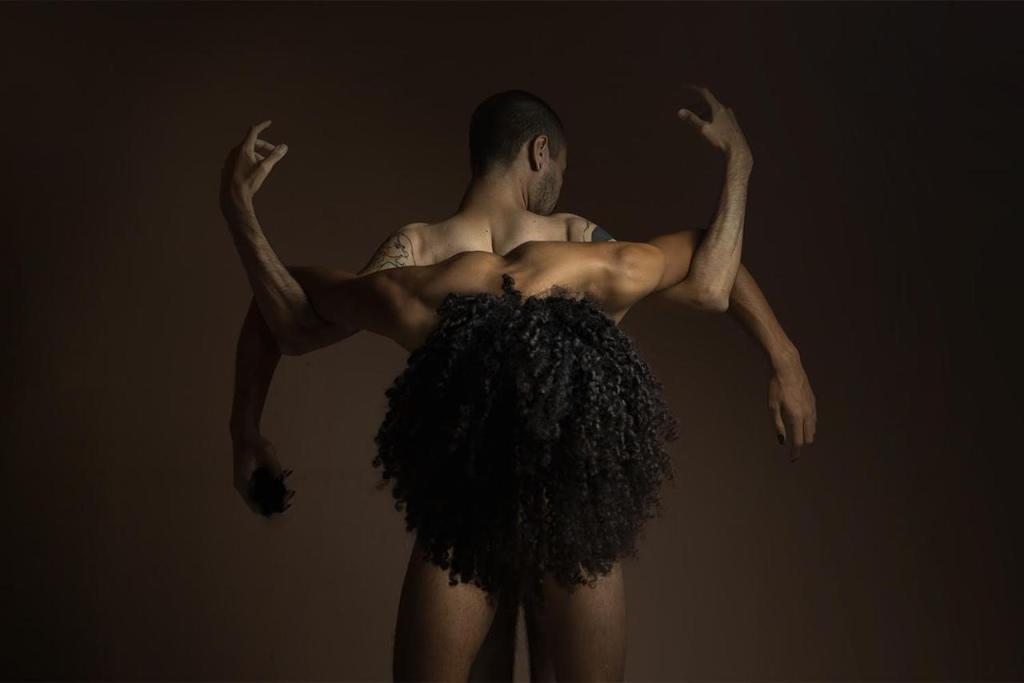
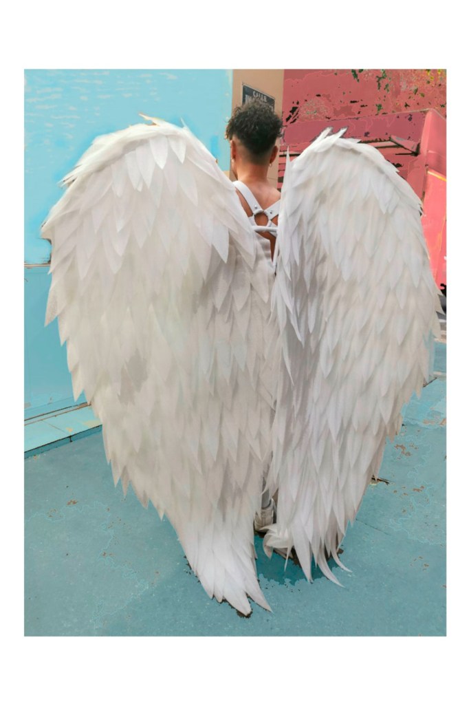
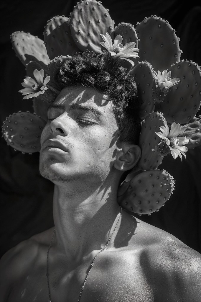
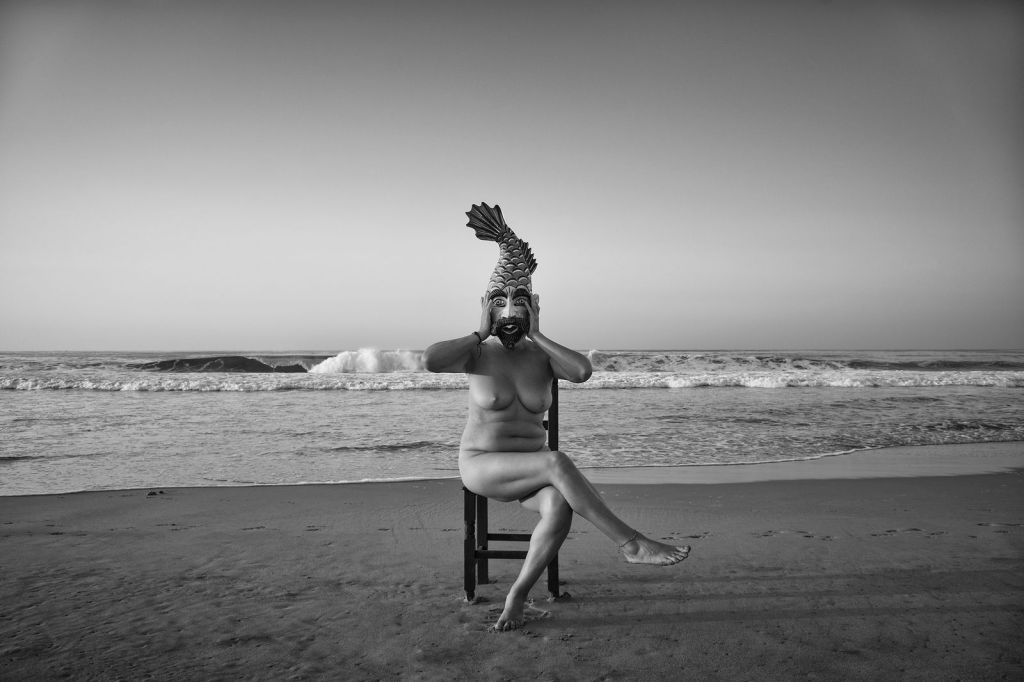
I’ve had a project idea burbling around in the back of my brain for a year now – I got started thinking about this after a trip to Richmond, Virginia to the Virginia Museum of Fine Art, and looking at the ancient bronze and marble sculptures, the Greek pottery, and even more modern artwork that carries an erotic subtext (or even overt eroticism). I wanted to do something that speaks to the role museums play in simultaneously preserving that and in whitewashing it – having work that has queer context in a museum permits the preservation and transmission of the queer gaze AND allows non-queer viewers to dismiss that quality of the work.

I have several theories as to how I am approaching this concept, so I’m going to just put some images out there for you all to respond to, if anyone is so inclined. I’m not going to articulate those concepts because I don’t want to prejudice the jury pool – just react to the A-B pairings and let me know your thoughts on them. There is no right or wrong answer, just react. I will block/delete any homophobic/hateful comments.

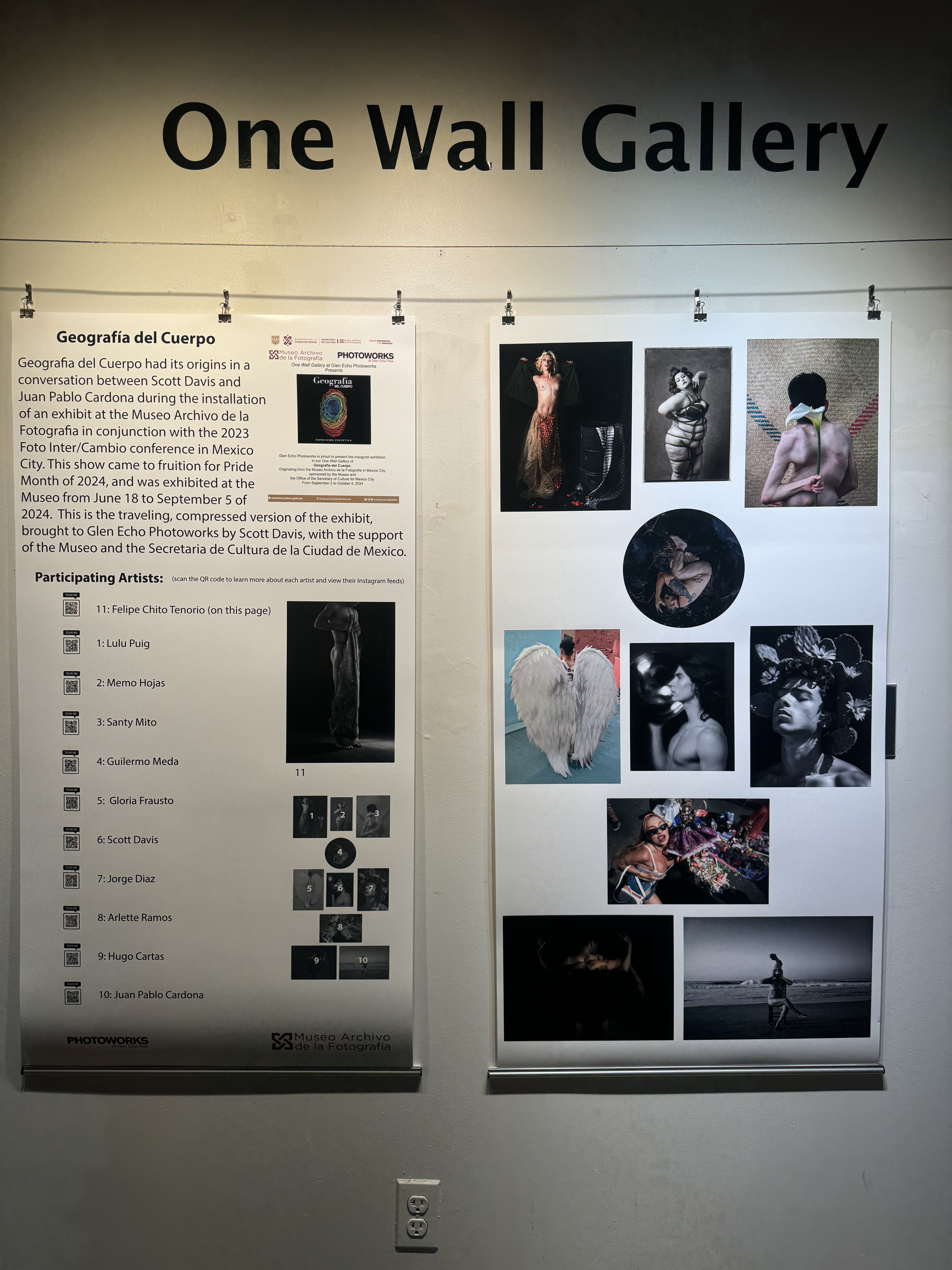
Geografia del Cuerpo comes to Washington DC

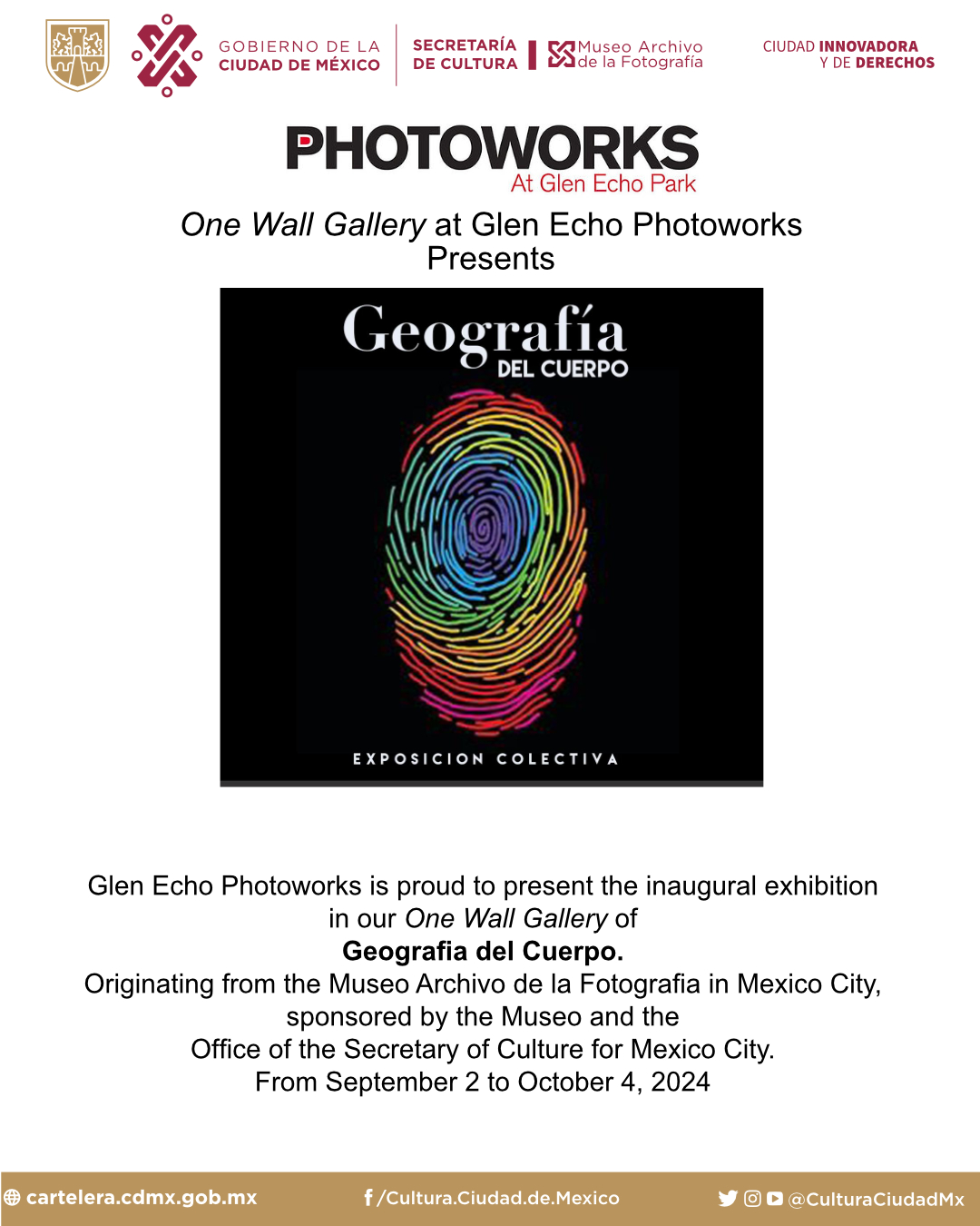
In conjunction with the Secretaria de Cultura del Ciudad de México, the Museo Archivo de la Fotografia, and Glen Echo Photoworks, I have brought a condensed version of Geografia del Cuerpo to inaugurate the One Wall Gallery at Glen Echo Photoworks. One Wall Gallery is a pop-up gallery space by the front door, designed to provide flexible exhibitions of shorter duration and bring life to an otherwise under-utilized space.

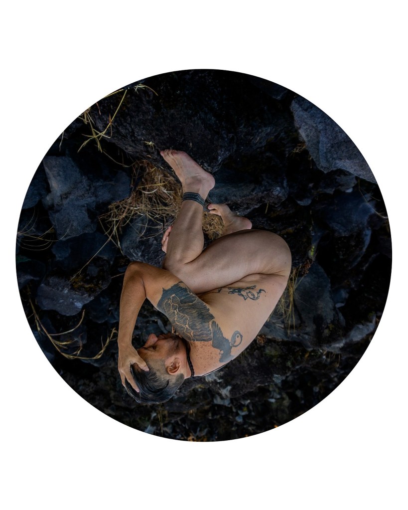
Given the time constraints and the space constraints, the exhibit was limited to one piece each from 11 of the 13 artists participating in the original exhibit in Mexico City (two were unable to participate). The form of presentation had to be re-interpreted to fit the space, and I think it turned out nicely.

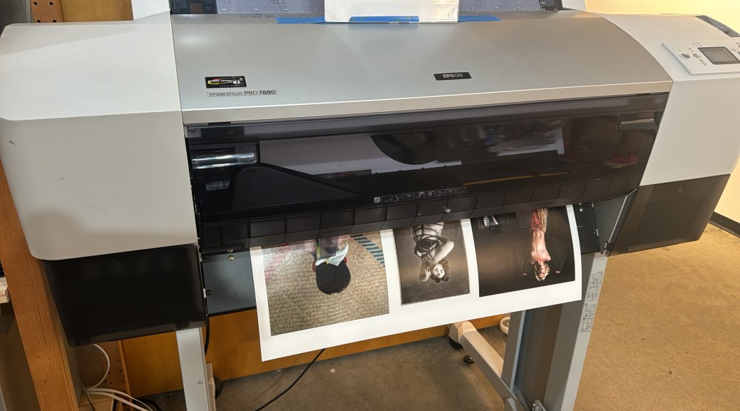
The banners were printed on our 24″ Epson wide-format printer. The original concept was going to be mounting each image on a 12″x12″ backing board and hang them in three rows from curtain wires (like the one you can see at the top of the photo). This, unfortunately, is one of IKEA’s worst products – the metal feet that you screw the posts into that attach to the wall do not fit the threads on the posts a significant amount of the time. I do have a tap-and-die set I can (and will, when I get around to it) fix the threads with so we will be able to use the hanging wire in the future, but that in the moment necessitated the re-envisioning of the exhibit into what you see here today.

The artists represented in the show are, in alphabetical order (names will be linked to their Instagram accounts):

Juan Pablo Cardona (also here)

Hugo Cartas

Scott Davis

Jorge Diaz

Gloria Frausto

Memo Hojas

Guillermo Meda

Santy Mito

Lulu Puig

Arlette Ramos

Felipe Chito Tenorio

The show opened September 2 and will remain up through October 4 on the One Wall Gallery at Glen Echo Photoworks, 7300 MacArthur Boulevard, Glen Echo, Maryland. Photoworks is located inside the ground floor of the Arcade Building.

Opening Reception for Geografía del Cuerpo, Museo Archivo de la Fotografía, Mexico City, June 26, 2024

I am still trying to find words to describe how absolutely overwhelmingly wonderful last night was. I had previously shown some work in a group exhibit at the Museo as part of the Foto Inter/Cambio conference, and even then they treated me as some kind of photographic rock star – I was part of the ribbon-cutting ceremony to open the exhibit, they asked me to speak publicly, and I received a certificate of recognition for helping to organize the conference.

I had brought additional personal work in a portfolio that I was planning to share with attendees of the conference. This included a bunch of my male nudes. One of the staff members saw that work, and was very interested in it. He asked me to show it to one of their curators, Juan Pablo Cardona. Juan Pablo was very taken with the work, especially the four-color gum bichromate prints I had made of an African-American model.

At the opening reception for the Foto Inter/Cambio show, he asked if I would be willing to show that work to the museum director. Not being an idiot, of course I said yes. We stepped off the floor of the reception and into the museum’s framing lab where my portfolio had been stored for the day, and Lizbeth Ramirez, the director, along with Juan Pablo and another museum staffer, had me go through my portfolio.

Everyone was excited by my work, and at that time Juan Pablo asked if I would be interested in participating in a show for this year’s Pride celebrations. Of course I said YES! And thus began the journey to yesterday’s opening.

I got to the museum a bit before 6 PM – the opening was scheduled to start at 7, and they had asked all of us artists to be there an hour ahead of time. That was my first glimpse of the installed exhibition:

panoramic view of the gallery
My wall in the gallery

The museum staff did an absolutely amazing job of preparing the space – I love the way they used color blocks on the walls to break up the space and give the work a flow and a rhythm around the room. This gallery is on the first floor of the museum immediately off the entrance, so public visibility is excellent. I had expected this would be in their upstairs gallery where we had the show last year for the conference, but this is the big deal.

Also to my surprise, I was selected to be one of three of the fourteen artists to speak at the opening. They also listed my name first on the list of participating artists, which to me was a very high honor.

When organizing the event, the museum staff indicated it was limited to 100 people. I think over the course of the evening, significantly more than that came. When I turned around to look at the crowd waiting to be admitted, I was absolutely stunned at how many turned up.

I’ve never had a crowd this big or this enthusiastic at an opening before. This exhibit, and especially this opening night reception, has been the absolute high point of my career to date and quite possibly the most incredible night of my life.

I realize I am incredibly tardy in posting this, on the cusp of the closing of the show (the museum very generously extended the show through September 2!). I wish I could be there in person for the take-down and to collect my work (I have a friend who will be picking it up and storing it for me until I am back in CDMX next), but that wouldn’t be practical.

Until next time, Mexico City, thief of hearts!

The Importance of Play in Making Art

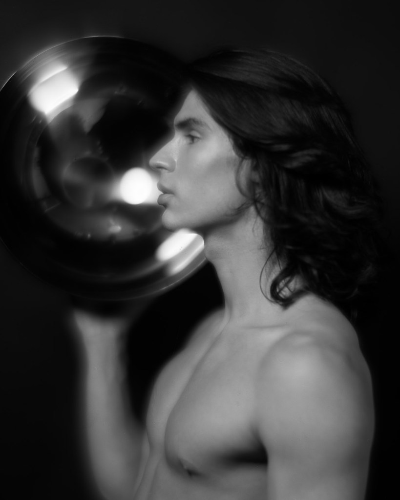
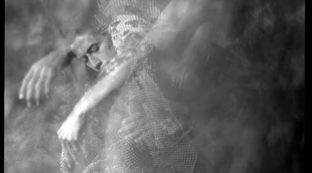
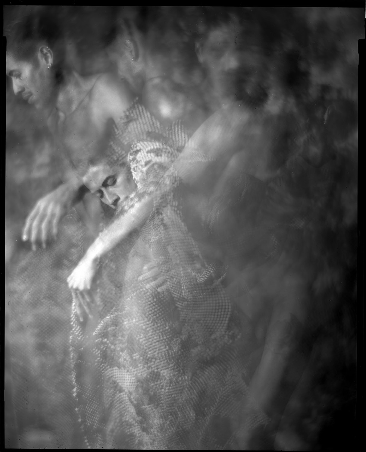
I’m getting started on a new series of human figure studies to go along with still life images. I arranged with a friend who is a professional dancer to be my model. One of the things he wanted to do was to try some movement studies. I had some pre-conceived shots I wanted to make, but I thought it would be good to push my comfort zone and try to do something different. I’m very much a collaborative photographer when it comes to working with models – I know I do NOT have all the ideas, and I love being inspired by and learning from the people I work with to create images.

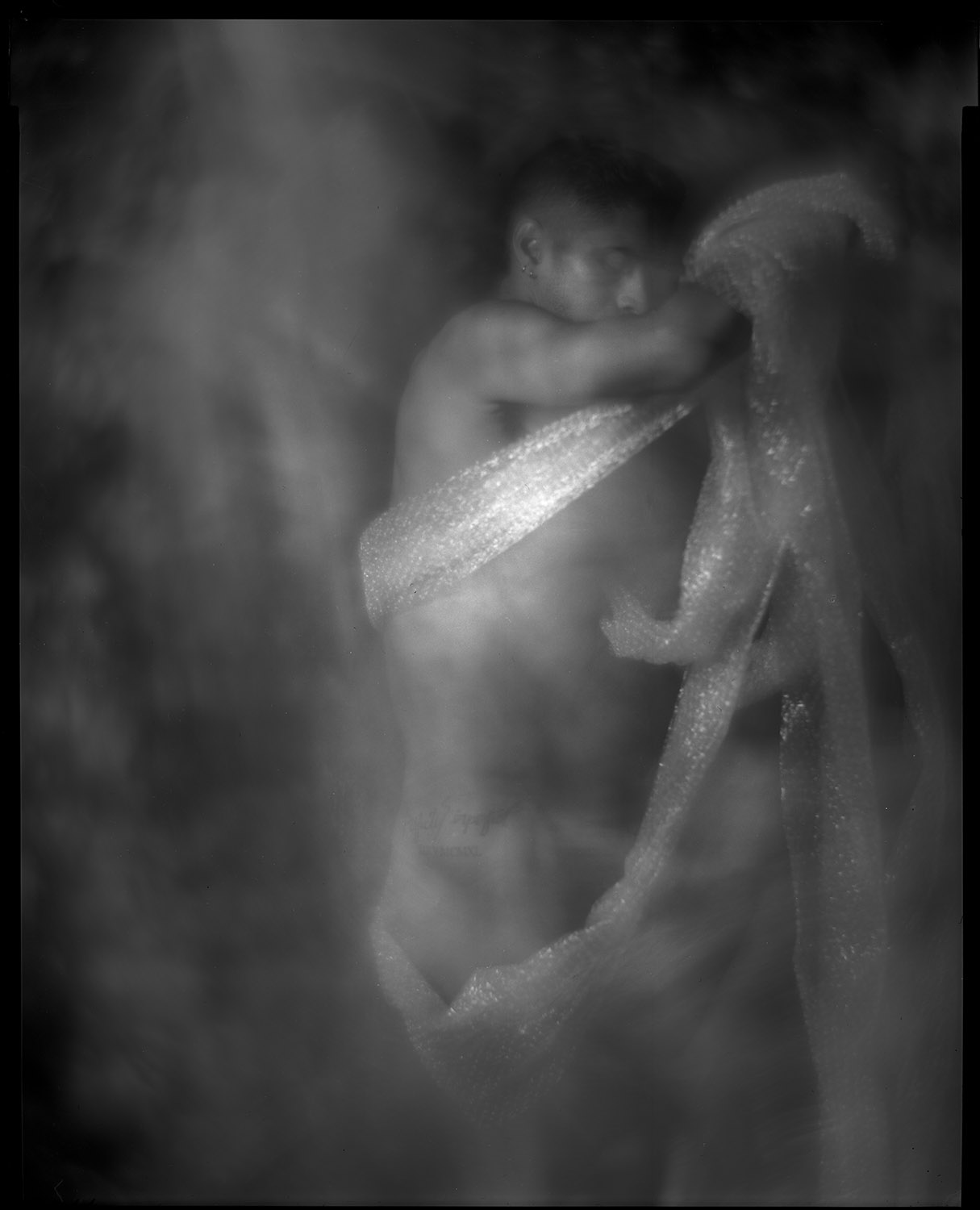
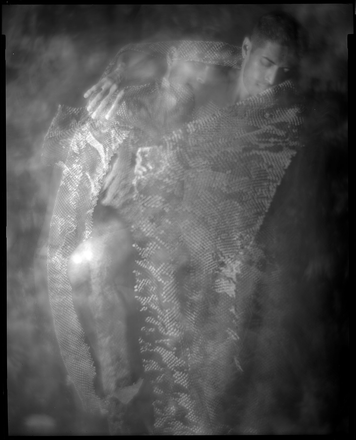
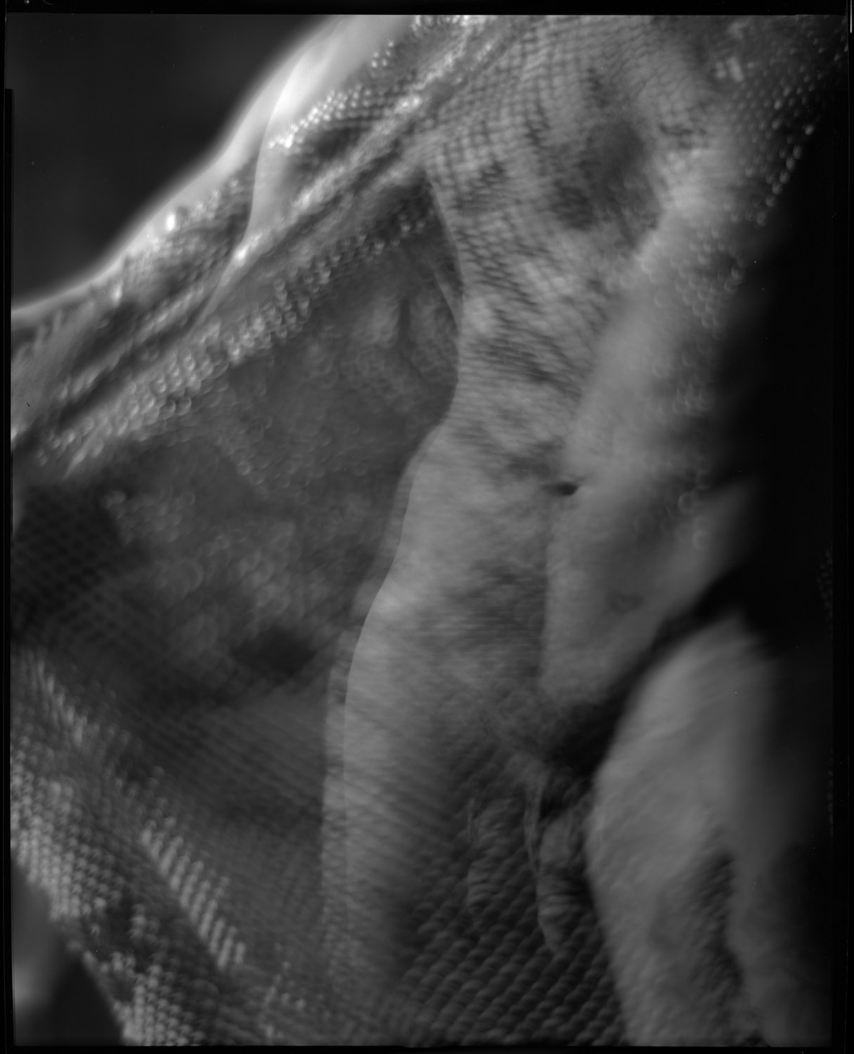
I also enjoy using the limitations of my tools creatively and making them do things they aren’t necessarily intended for. We did this series with my 8×10 inch studio portrait camera, which is a big, heavy, relatively immobile beast. It has a Packard shutter to control exposure, which is a fairly crude, imprecise device (top speed is 1/30th-ish of a second). But what it does do is allow me to keep the shutter open for an extended period with the pneumatic squeeze bulb. So for these motion study shots, I opened the shutter, let Gabriel my model dance, and randomly popped my flash multiple times during the exposure. Very imprecise, very guesstimate, very subject to the whims of serendipity or disaster.

To make things more interesting, I had him dance with a piece of perforated craft paper that came in a box as packing material for something I bought online. The combination of the paper plus the swirly backdrop we worked in front of plus the use of a soft-focus lens on the camera gave the images an etherial, smoky look.

We also did some with bubble wrap.

We only did a few shots like this as it was experimental and I had no clear idea how it was going to come out. Having seen these, now I wish we had shot a whole bunch more of them! But that is the clarity of hindsight. Now, at least, I am inspired to try more of the same, and have a foundation of what to expect.

The great risk of course is, now that I have these shots, in trying to replicate them I will end up dissatisfied with the results because they will be too thought out and the element of serendipity will be lost, or I’ll go too far the other direction in trying to compensate for the serendipity loss and make a godawful mushy mess. But these are the risks we take when we make art – connecting with something emotionally is always risky.

The beginnings of something

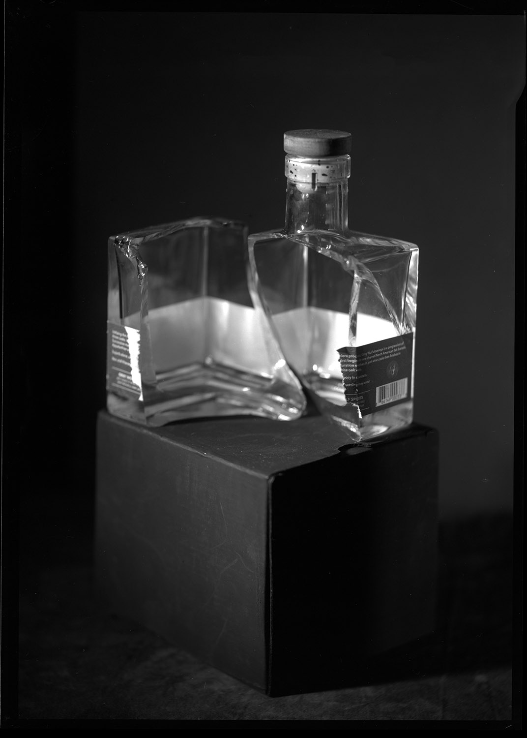
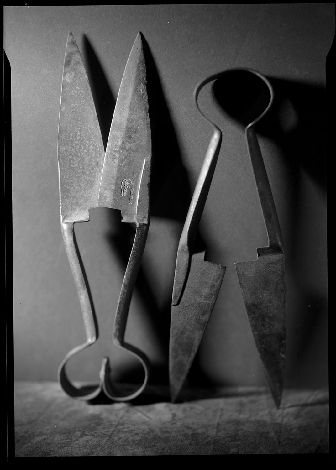
I’m starting on a new series that will be playing still life against human figure work. The human figure work will involve the objects used in the still life images as props, or at least relate to them in form and pose.

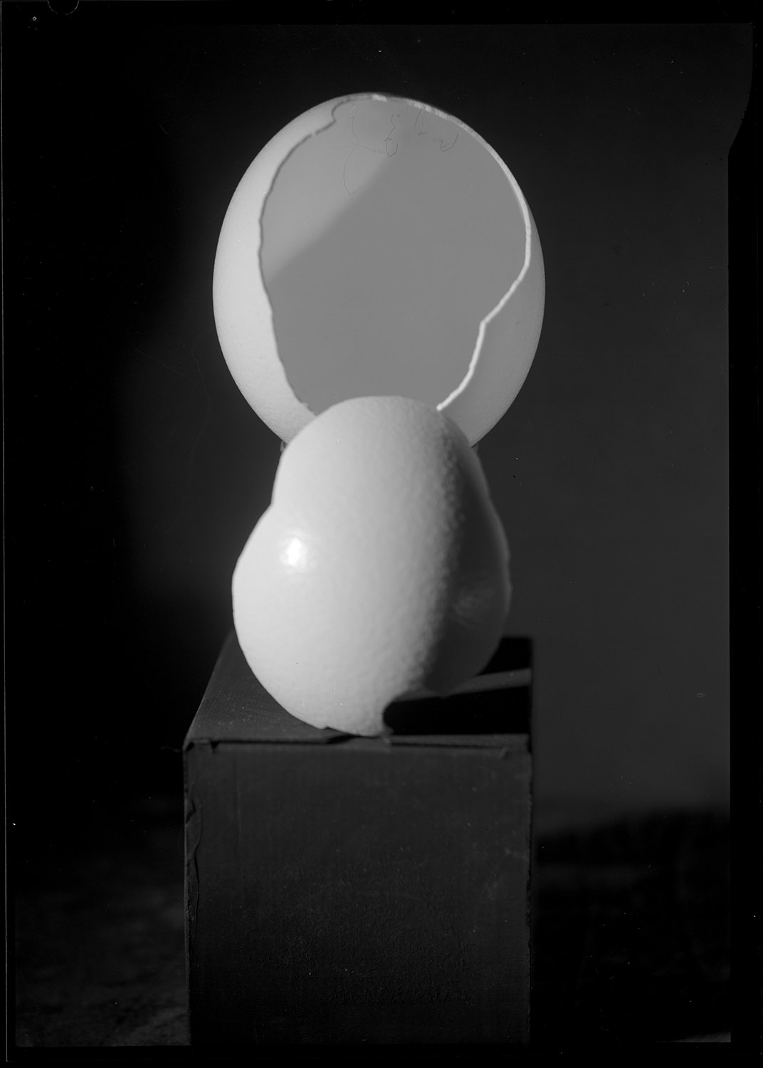
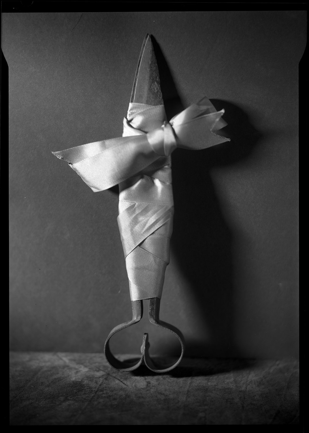
Here are a few examples of first images from the series.

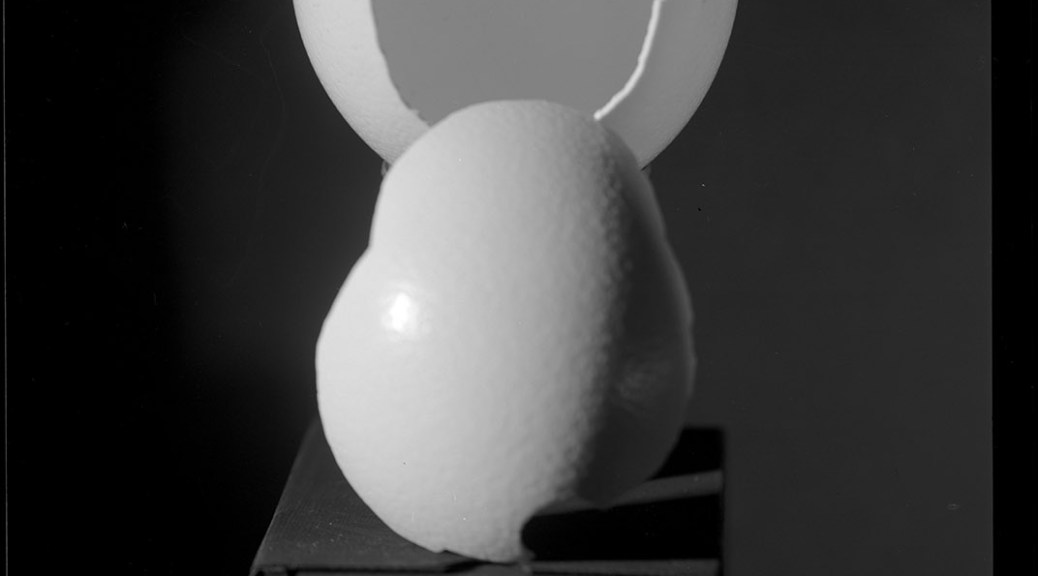
Broken Ostrich Egg
Binding What Cuts – Antique Garden Shears Bound With Purple Ribbon
Broken Whisky Bottle
Two Pair of Garden Shears, unbound

I’ve got a general theme going of things that are broken or things that can do the breaking. Upcoming images will involve things like a coffee mug, some unbroken Ostrich eggs, an orange juicer, and an antique brass candlestick phone. And yes, the one set of garden shears is very definitely what it looks like, but it isn’t, so nobody can really take offense at it unless they absolutely lack a sense of humor and they have a burning desire to be offended.

Updated information – Mexico City shows

Show #1: Corporalia

Show dates and times: Saturday June 22- Sunday August 18, 2024. Opening reception June 22 at 6pm. Artists Talk June 25th at 5pm (I will be participating in the artists’ talk and showing some additional work from my portfolio).

James, Land’s End, 2003

For more information about Eucalipto20, check out their website at https://eucalipto-20.ueniweb.com

and their Instagram is https://www.instagram.com/eucalipto_20

Show #2: Geografía del Cuerpo

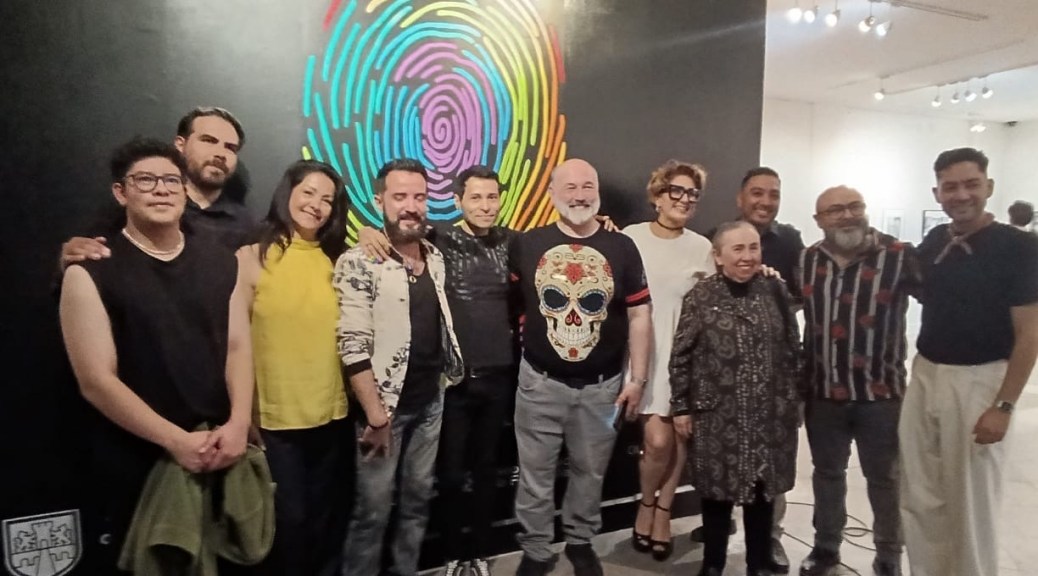
Geografía del Cuerpo is at the Museo Archivo de la Fotografía, and runs from June 26 to July 18. The opening reception is July 26 from 7-9pm, and is limited to 100 persons in attendance. I will be there as well (In case you’re wondering, I’m the one in the hat with the gray beard and glasses).

For more information about the museum, their website is: https://cultura.cdmx.gob.mx/recintos/maf

and their Instagram is: https://www.instagram.com/mafmuseo/

New Work – Experimentation

I’ve been doing a LOT of printing lately, in preparation for the shows in Mexico City. I did some serious darkroom cleaning too, getting my print washers disassembled and scrubbed clean of all the mineral deposits that accumulate from using DC city water, and got all the stuff out of the sink that was cluttering it up so I could print big. I’ll be doing some copy photos of the big prints I did shortly, and have them posted here. But all that work inspired me to not only do more printing, but to be adventurous in my artistic endeavors, and push out of my comfort zone.

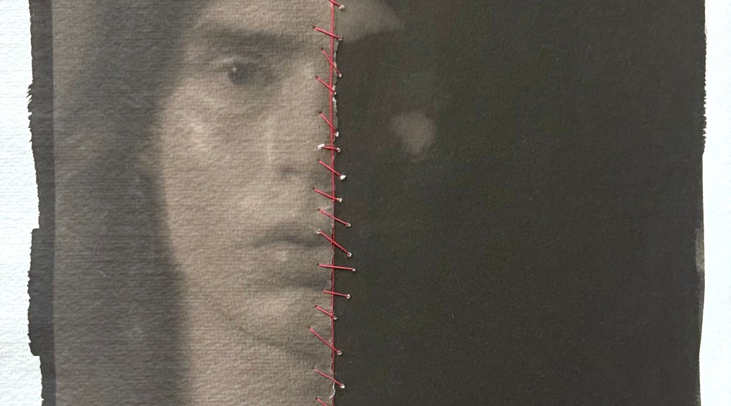
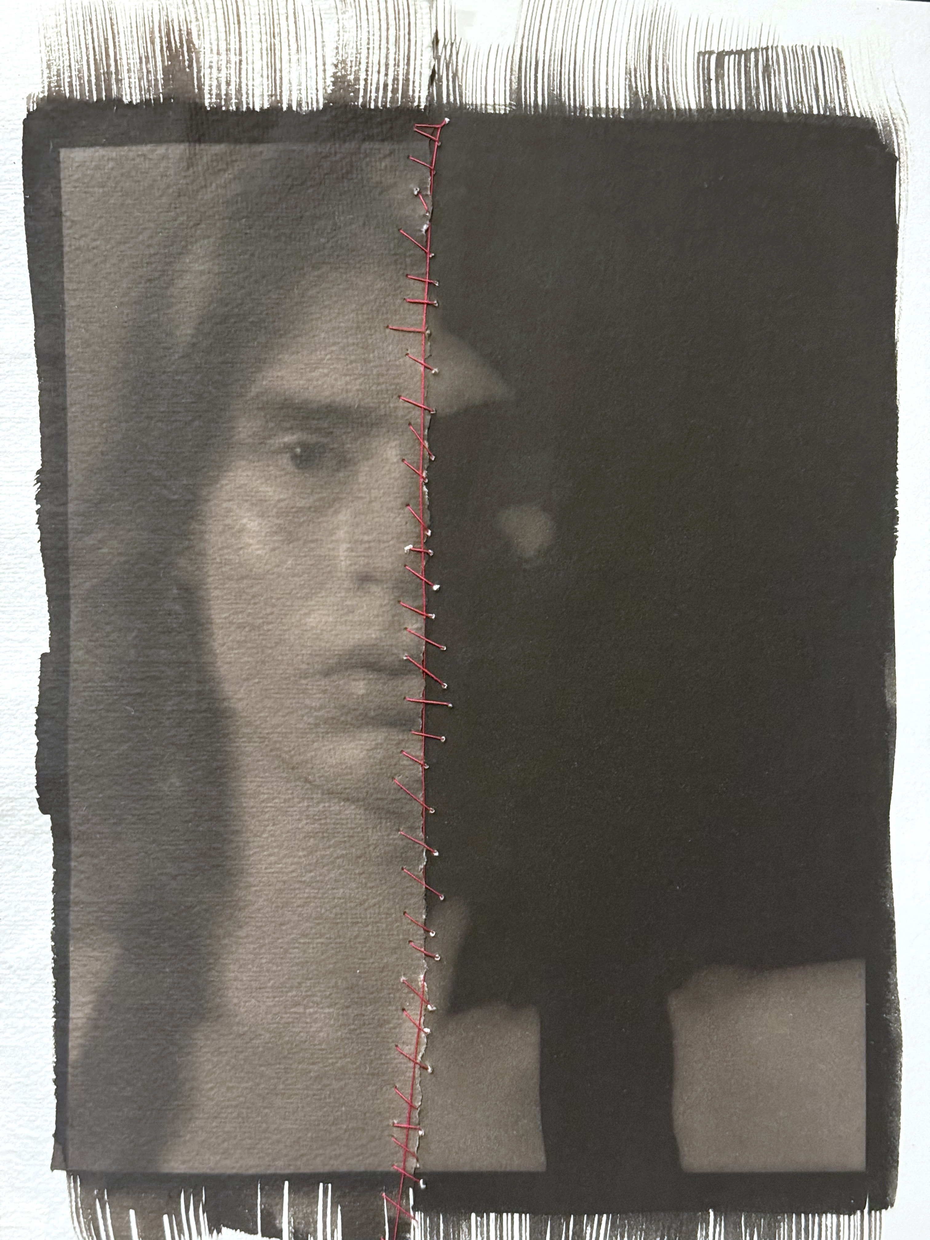
I have thought for quite some time about trying this, and thanks to a little push from my friend Jeremy Moore who lives down in Texas, I took the plunge last night and did some interventions on my prints that many would consider heretical. I made two different digital negatives from the same image, one with high contrast and one with normal contrast. The one with normal contrast I printed on Velke Losiny Prague, which is a light-weight cold-press paper with lots of texture. The high-contrast/dark print is on Revere Platinum, which is a heavy-weight hot press smooth paper. I then tore the print on the Velke Losiny paper in half, and then stitched the two prints together with red thread.

This is an exciting change for me, getting more experimental and risk-taking with my photographs. I’m going to do a lot more with the “destructive/reconstructive” mode of working – I think it opens up the work to being less literal and more visually and psychologically explorative.

Photography, Alternative Processes, Really Big Cameras, and other cool stuff