What do you do at 2:30 AM when you’re stricken with a bout of insomnia? Why you tackle a prototype matting job for a very large triptych (3x 10×13 images in a 20×40 mat/frame). Which of course you mis-measure the windows in the horizontal dimension, ending up cutting them 1/4″ too wide.
At least I didn’t screw it up prototyping with 8 ply mat board (which I’ve been known to do before). I think the sequence and the tonal values works for the series, which I’m titling “Head, Heart, Hand”. Or something to that effect.
I think sometimes (perhaps most of the time? All of the time?) presentation can make or break an image. Its success is the culmination of many decisions that begin with the decision of what camera and film to pick up before heading out the door in the morning, following through to what to point the camera at, on to what developer, paper, process, cropping… it doesn’t end until the framed print is hung on a wall, sequenced with the rest of the prints in the show. They all build on each other.
Head, Heart, Hand – Capitoline Museum, Rome
What do you all think of the sequencing of this triptych? Head, Heart, Hand, or the other way round? Any other critique/feedback is welcome.
All three images were shot on Kodak Tri-X, in my 1956 Rolleiflex 2.8E. Film developed in Pyrocat HD, printed on Ilford Warmtone MG fiber paper processed using Ilford Warmtone developer.
When doing enlarging of silver gelatin prints, it is often a prerequisite to a finished print that you do some burning and dodging to get the finished image exactly the way you envisioned it. And to compound the challenge, the area you want to burn or dodge is seldom neatly covered by an out-of-the-box tool like an oval, circle, or a straight line. That’s when you have to get creative and make some custom burn cards. This image I made was a perfect example. In a straight print, the sky is merely gray, and has a wisp of cloud on the right side that unless burned in looks like a bad printing mistake.
To get the sky burned in, without losing details in the roof, I had to make a custom burn card. I took a stack of paper boxes, placed them on the easel, then my burn card on top. I projected the negative onto the card, traced my outline, then cut it out. When doing my burning passes, I held the card at approximately the same height as it was when I cut it. You can see it in the second photo in action. The only way to get more precise with burning and dodging is to make a contrast mask and sandwich it with the negative in the carrier during exposure. That technique presents a whole new set of challenges because you have to get the mask in absolute register with the negative, and deal with dust on four surfaces, not to mention the possibility of newton rings.
I recently completed a one-on-one private tutorial in Platinum/Palladium printing with Mat Marrash, who you may know of if you listen to The Film Photography Podcast. I’ve known Mat for several years now, having met him at Photostock in 2013. He’s an extremely gifted photographer who mostly works with an 8×10 view camera, and does a lot of work with infrared film. Mat knows a lot of the same folks I know in the alternative process field, including people I’ve learned from, so I was deeply flattered that he chose me to learn from.
Mat With First Print
Yes, Mat is a very talented photographer in his own right so a lot of what we did in this session was easy for him. BUT, he did make it challenging by starting off working from 8×10 inch negatives, instead of starting with 5×7 (the smaller size is easier to coat evenly when you’re new to the process, and costs 50% less per print). I want to show this as this was his first ever (!!!!) palladium print. We hit the first one dead on, out-of-the-ballpark, ready to frame and go up on the wall. This extremely beautiful process is quite easy to learn and should not be intimidating to anyone interested.
And here is his second ever print, which added another wrinkle – the negative he used was one he had previously shot, not planning to make a palladium print with it. We developed all his film, the negatives we made that weekend along with some other negatives he had made previously, using the development regimen I use for my work, and we were able to produce some excellent prints even from those other negatives.
Mat’s Second Print
Private one-on-one tutoring can be arranged at any mutually convenient time, and can cover a wide range of topics either specialized for fine-tuning your process or just a deep hands-on introduction to the process. Contact me for details on pricing and scheduling – as this is an a-la-carte arrangement, I need to know what you are looking for in order to give a quote. Tuition will include your own set of chemistry and any paper we use in the class.
I’m offering my group class at Glen Echo Photoworks next weekend, December 10-11, if you are interested in getting your feet wet without committing to a one-on-one workshop, This is the perfect opportunity. Tuition is a very modest $250 plus $50 materials fee (chemistry, paper, and all instructional materials). The class runs from 10 AM – 4 PM Saturday and Sunday. You can register here at the Glen Echo Park website.
Just a real quick video of an exposed print being developed. This is what a develop-out print looks like, and how quickly the developer works. The print is almost fully realized in the first twenty seconds of the development cycle, but you still need to give the full two minutes to let the highlights fully develop.
This is what the raw, unexposed double-coated emulsion looks like. I double-coat to get better shadow depth and highlight separation. You can see the two coatings on the lower left. The reason I’m willing to double-coat is that I’m making such small prints that the extra cost isn’t prohibitive.
And the finished print. I think the end result justifies the added labor and expense.
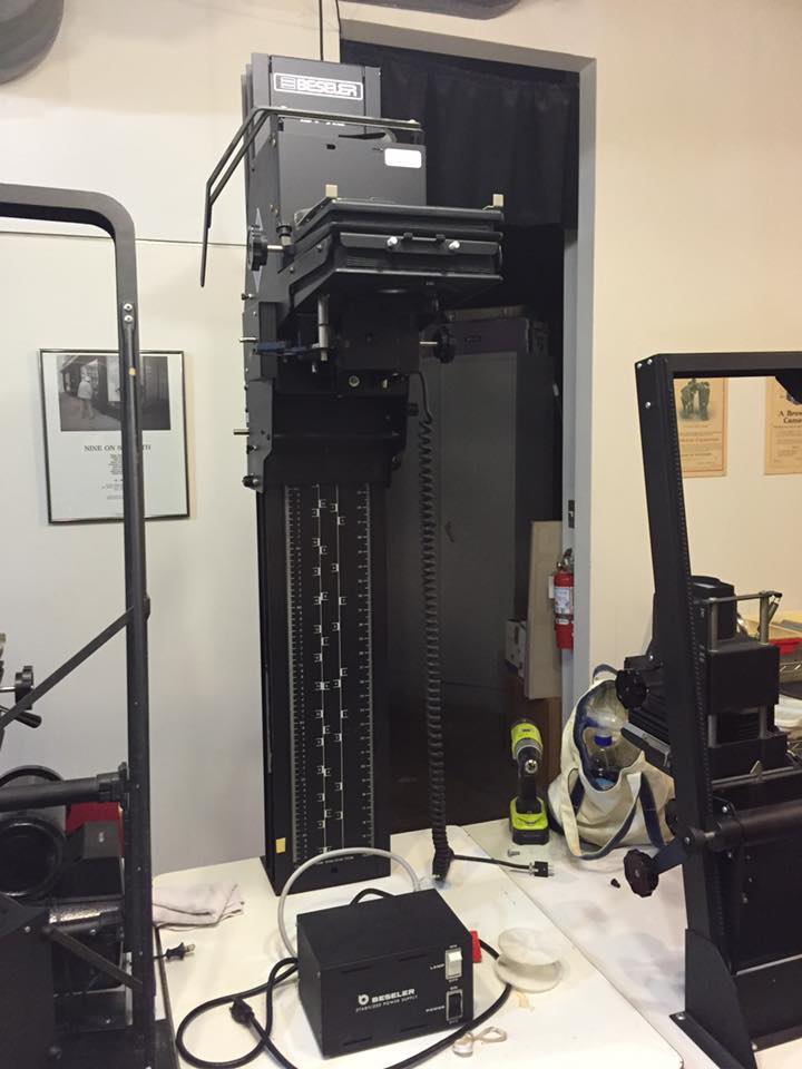
Just in case with all my recent postings about the Fuji X-T1 you all thought I was converting over to the binary side, here is a photo of my newest darkroom treasure. It’s a Beseler 45V-XL enlarger chassis (I already have a light source to mount on it). It’s really my dream enlarger. I currently have a 45 MX(? – not entirely sure of the model number. It’s the older style Beseler 45 M-series with the blue finish), which while very good, is a little cantankerous and it has a problem – when I try to print small, because of the design of the columns (they’re angled) I can’t print small on it with my easels – the head is too close to the column and I can’t move the easel far back enough to center the image.
Beseler 45V-XL
This baby solves that problem. The head sticks out far enough that it is ALWAYS centered on the baseboard. Now the challenge will be to fit it in the darkroom because the column is taller than the 45MX by a good 8-9 inches, and my ceilings are tragically low. Oh, and the best part? It was free. Photoworks was de-accessioning some enlargers and if I hadn’t taken it, it would have gone to the scrap heap. Yay recycling!
I actually do make silver gelatin prints. I’ve been away from the medium for a while, mostly concentrating on alternative processes. I needed a break from alt process work so I cleaned up my workspace, fired up the enlarger, and started printing my Paris images you might remember from earlier blog posts. With my new (to me) Oriental VC-CLS variable contrast cold light head (a lot of jargon for a light source that allows you to adjust the contrast in your print by changing the ratio of blue and green light exposing the paper), I’ve been having a blast cranking out prints, and the Oriental head makes it a lot easier to do split-grade printing.
For those unfamiliar with the idea, instead of making a single exposure at one contrast grade, and then doing a lot of burning and dodging to make up for it, with split-grade, what you do is make two base exposures, one using a very soft contrast (in my case, most likely grade 0) and a second using a very hard contrast (grade 5). What this does is the soft exposure lets you get your highlights with detail, and the hard brings the shadows in to snap. You still need to burn and dodge for specific things, but you can refine the overall look as the image requires, without getting frustrated at why a certain area always comes out too dark or too bright. You can refine this technique to include your burning and dodging cycles, so that you might burn an area in with the grade 0 filter to put detail back in the highlights but not blocking up the shadows, or with the grade 5 filter for putting deep black in a shadow without muddying up the whites in the same area.
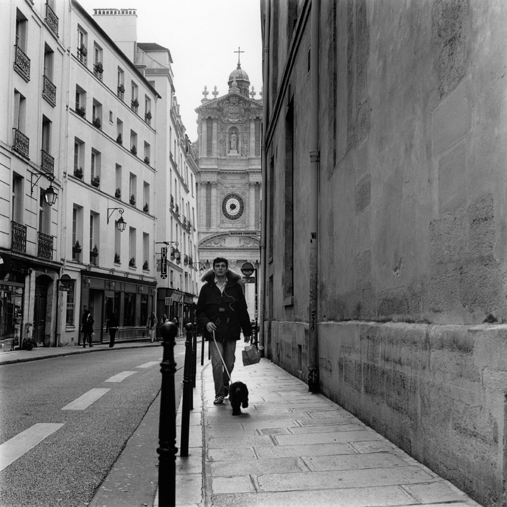
I’ll give an anatomy of a split-grade print here so you can better understand what I’m talking about. This is a real challenge to print “straight” – it’s a high contrast scene, with the dog-walker being somewhat backlit, and the upper left corner a lot brighter than the rest of the scene. This is the finished print here:
Dog Walk, Rue Sevigny, Paris
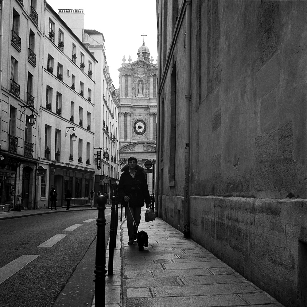
Here is the scan I made from the negative, which also had a fair bit of manipulation. Less successful, wouldn’t you say? The dog walker is still strongly backlit.
Dog Walker, Rue Sevigne, Le Marais
To make this print, I gave it a base exposure of 20 seconds using the grade 0 filter. I dodged the dog walker for 10 of those. Then I burned in the upper left corner for an additional 20 seconds. I gave a final overall exposure of five seconds at grade 5, to put a little snap in the general scene and specifically to firm up the shadows on the dog walker without losing tonal separation for his buttons, the cords of his iPod earbuds, and the hair of the dog. Were I making this print larger, I’d go back in and burn the sidewalk between his legs and the dog back down a bit, but in a 7×7 inch print, accurately wielding a burning card with a hole that small is tough!
This was printed on Ilford Warmtone variable-contrast fiber paper, using Ilford Warmtone developer. I’m not applying any fancy tricks to the developer like playing around with developer dilution or split warmtone/cooltone developers. That’s a trick for another day.
I think I mentioned this previously – there was a man here in DC who was getting rid of his darkroom and contacted the school where I teach about donating it. He also sent the inquiry out to all the faculty. One of the items he was disposing of was an Oriental Seagull VC-CLS variable contrast cold light head that fit a Beseler 45Mxx series enlarger. I happen to have a Beseler 45-series enlarger, so I told him I would be interested in the head. At the time he delivered it to me, he didn’t have the owners manual with it, but said he thought he still had it and would get it to me if he found it. Being the skeptic that I am about such things (I know myself and my best of intentions), I started searching online for a copy. Nobody had one. I had several requests, though, from folks saying “if you do get it, could you please please pretty please with sugar on top make me a copy”. A few days later, I got an email from the man asking me for my mailing address – he found the manual and would mail it to me. Now I have it and I’ve made a PDF file out of the manual. I’m posting it here for folks who need a copy.
As a side note, I spent half of Saturday this past weekend unpacking and cataloging the darkroom equipment he donated to my school – 16 boxes in all, including some beautiful enlarging easels, a 16×20 print washer, an Omega D-series enlarger with 35mm, 2 1/4 square, 2 1/4 x 2 3/4, and 4×5 negative carriers, and a Beseler 45-series enlarger complete with Adjus-table (a specialized table made to fit the enlarger that would allow you to drop the baseboard so you could make bigger (20×24 or even larger) prints without having to flip the head and do wall projections). Every darkroom accessory you could think of was in this bundle, including the empty 1 gallon and 1/2 gallon chemical storage bottles. The bottles, and the darkroom trays, and everything else for that matter, was packed in styrofoam peanuts and bubble wrap sufficient to protect it from a nuclear apocalypse. If I don’t see another styrofoam peanut for a year, it will be too soon.
Some of you may be aware of the recent calamity that was the Chapter 7 bankruptcy filing of Calumet Photo. This hit particularly hard as they were the primary photo retailer in the Washington DC area, and my go-to shop for everything from film to lighting equipment to low-volume c41 film processing for 35mm and 120. Well, with the utterly unplanned, un-announced overnight shuttering of their stores, I was left without a convenient, quick source for processing my 120 film (there’s an excellent pro-lab here in town but between their schedule and mine, it takes about a week to turn around a roll of 120!).
As a result of that calamity, I decided it was time and invested in a film processing drum and a set of reels for my Jobo CPP2. Now I’ll not have to worry – I can run a batch whenever I feel like it, from as little as one roll up to six at a time, and it will cost me less per roll than outsourcing it. The reels are the 2502 series reels, and the tank is a 2563 tank. Jobo has a rather involved numbering scheme for their components, so I sometimes get confused trying to match everything up, especially on Ebay where you have to source your components separately. But no matter – I got all the pieces put together last night and everything matches, so I’m a happy camper. Next stop, YouTube, for some videos on how to load those 2502 reels!
I was just developing some film in my darkroom (only two rolls left from Photostock… they will be done tonight!) and while loading the rolls onto the reels in the dark, I thought about the fact that I close my eyes while loading the film, and I picture the movements in my mind’s eye. Never you mind that it is pitch black in the darkroom at that moment, so it makes no difference if my eyes are closed or not. The room’s not getting any darker with my eyes closed. It also made me think about how someone who is blind from birth perceives things like that- I KNOW what my gestures look like because I’ve seen them – I have a definite sense of the space they use and the way they form my body even with my eyes closed. But what is someone who is blind’s perception of such things? I’ve only ever talked with blind folks on a couple of occasions, and I don’t recall them using gestures when talking. If it is something they’ve never experienced, would they even be able to describe it to someone who is sighted?
Dupont Circle bus stop, Palladium over Fumed Silica
Here’s another of my 5×12 panoramics of Dupont Circle here in Washington DC. This was several exposures on the same negative, yielding an approximate minute and thirty seconds or thereabouts. We were printing from this negative in my Advanced Topics in Platinum/Palladium Printing class out at Photoworks Glen Echo this past weekend. The print I scanned for this image was printed on Bergger COT320 pre-treated with fumed silica. The fumed silica yields a definite boost in dmax.
The next print is of the same negative, but printed as a Ziatype. Ziatypes are a variation on palladium, but they use either Lithium Palladium or Cesium Palladium and Ammonium Ferric Oxalate instead, which yields a neutral-to-cool tone image more like platinum in color, and they are a printing-out process developed in water as opposed to a develop-out process that requires Potassium Oxalate or Ammonium Citrate as a developer.
The distinction between printing-out and developing-out, in addition to the chemistry variations, is the fact that a printing-out print’s final exposure is judged by visual inspection – what you see when you pull the print from the contact frame is pretty much what you’re going to get when it is washed, cleared, and dried, but a developing-out print will have some kind of ghost image that is anywhere from almost imperceptible to a partial rendition of the final image prior to development. Neither one is better than the other, except that the Ziatype is easier for beginners until they gain confidence in their coating and printing skills. Ziatypes also have a wide range of contrast controls that will also affect image color in addition to contrast.