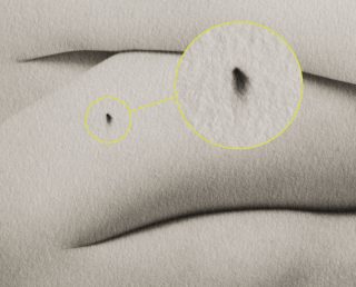
As a photo educator, I want to make sure I have the best information to pass along to students when it comes to troubleshooting processes. A friend of mine and one of the best platinum printers out there today wrote this excellent pair of articles on a common problem – the dreaded “black spots”.
Ian does an excellent job of explaining the chemistry behind the issue in a simple, straightforward manner that even a non-chemist like me can understand.
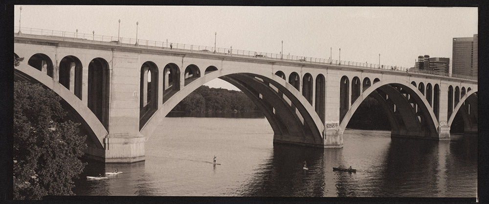
Another print I made this weekend – Key Bridge, in palladium. This is a 5×12 negative from my Canham. For the technically minded, I used a circa 1949 Kodak Commercial Ektar 12″ lens for the shot. It’s a very sharp lens with pleasant rendering, and a good match for the subject matter. I also want to talk for a second about the printing – this is a pure palladium print, with a touch of NA2 added for contrast. Sodium Platinum (NA2 for short) is a contrast agent you can add to a palladium print to boost the contrast if required. NA2 is very powerful stuff – a tiny bit goes a long way. In this case, I needed just one drop of 2.5% NA2 added to the 12 drops of Palladium and 12 drops of Ferric Oxalate sensitizer. NA2 comes from the manufacturer in a 5% strength solution, so you can see how little was needed to give the print some snap.
If you are using blended platinum and palladium, or trying to do a pure platinum print, and are in need of a contrast boost, you cannot use NA2 as a contrast agent – the platinum in it binds with platinum in your paper and what ends up happening is you reduce your highlights, blowing out detail, without actually increasing contrast. If you are using a blend, or pure platinum, you have several options – you can boost the contrast with a different additive, such as gold chloride, you can pre-coat your paper with fumed silica, or you can use a dichromate infused developer. I prefer adding a contrast agent into the emulsion rather than in the developer, because to do the infused developer route, you’ll need to have six or eight bottles of developers with different concentrations of contrast agent, and then you’ll have to play with chemistry to mix up replenisher for each developer concentration as it gets used. That realistically means keeping twelve to sixteen bottles of developer around. The downside to additives to the emulsion is that most of them will alter the color of the print. Gold Chloride will do anything from slightly cooler gray tones to eggplant/aubergine tones, depending on how much of it you use. Sodium Tungstate will actually reduce contrast in the print, and give you reddish brown tones. You can use dichromate in the emulsion as an alternative to the developer, but you must be careful in handling the undeveloped print as dichromate is toxic.
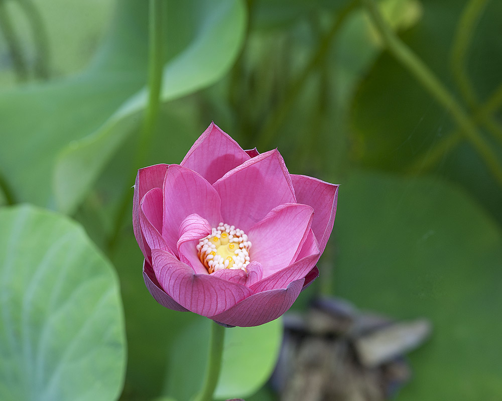
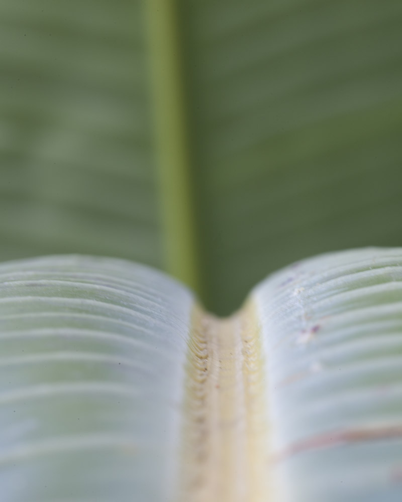
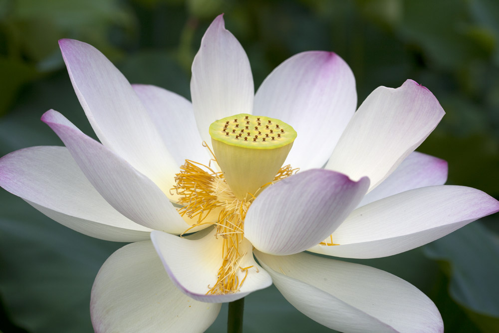
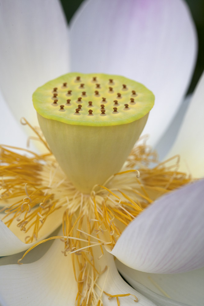
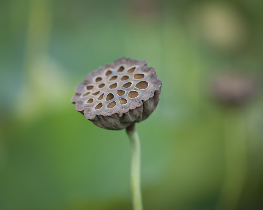
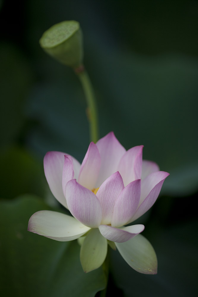
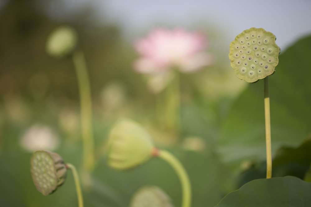
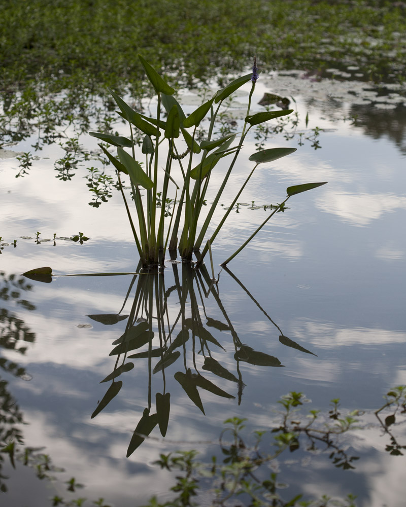
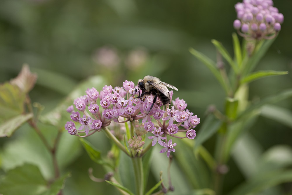
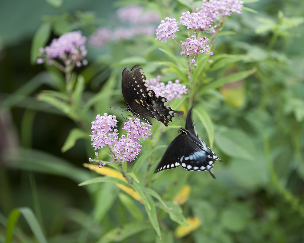
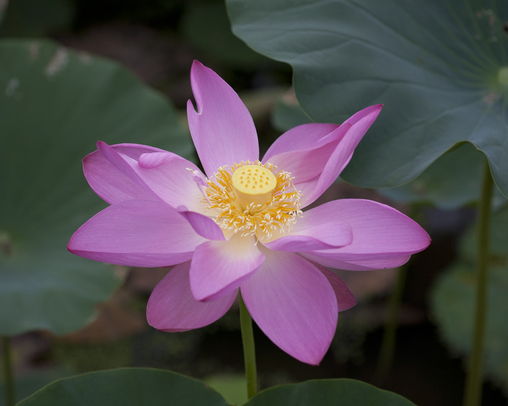
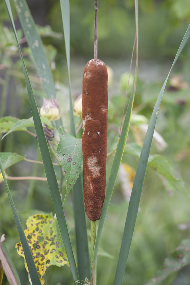
I’m feeling incredibly lazy this morning so I’m just going to let these photos speak for themselves. These are various scenes from around Kenilworth Aquatic Gardens, which as I mentioned in an earlier post, are a 30-ish acre park on the eastern bank of the Anacostia River in Washington DC. Part of the National Park system, Kenilworth is a generally un-heralded and underutilized public park, a true hidden gem of Washington. Part of what I like about visiting is the psychological tension of knowing that just outside the gates of the park is a truly rough urban environment in one direction, and major hustle and bustle in the other, but while you are in the park you have zero awareness of this – a veritable oasis of calm and quiet.
I wanted to put in a good mention for Richard Sullivan’s new blog, CarbonWorks. Richard is a brilliant photographer and photo chemist, co-founder of Bostick & Sullivan, the premier source for all things alt-process. I found his blog today and was reading up on some innovations he has discovered and published, including the Athenatype (a silver-based printing technique that yields a near-platinum print look) and a fumed silica treatment for alt process printing that helps boost dmax (maximum black density) a common shortcoming of many antique processes. Richard has been honored as a Fellow of the Royal Photographic Society for his work in reviving alternative/antique photographic processes and for inventing new variations on the same, specifically the Ziatype, a printing-out process variant on Platinum/Palladium. He is a master carbon printer (thus the blog title). He also teaches non-silver processes at Santa Fe Community College. Give the blog a read, and follow it if you’re interested in anything antique photo process related!
Well, my experiment with pre-acidification of Rives BFK for doing palladium/platinum/Ziatypes was a success. I got a flawless Ziatype over which I will now try several gum layers. My pre-acidification consisted of a 5 minute bath in 5% Oxalic Acid. I sized the paper AFTER the acidification bath. Image to follow.
Here is the image with the first two layers of gum over Ziatype. Colors are Alizarin Crimson and Sepia. I’m planning on doing at least two more layers, probably another sepia or burnt Sienna and then another red, maybe something deeper red.Heart In Hand