Category Archives: Gum Bichromate

Alternative Process Revolution – Philip Jessup

Another artist interview from the Alt Process Revolution series – this one with Philip Jessup, another Canadian photographer. One of the great things about this touring show is that it brings greater visibility of Canadian photographers to the US audience – I think many US photographers are aware of many other photographers from their own country, but with the possible exception of Yusuf Karsh, most could not name a single Canadian photographer living or dead.

Philip Jessup

Tell us a bit about your photographic work:

  • How did you get interested in photography?

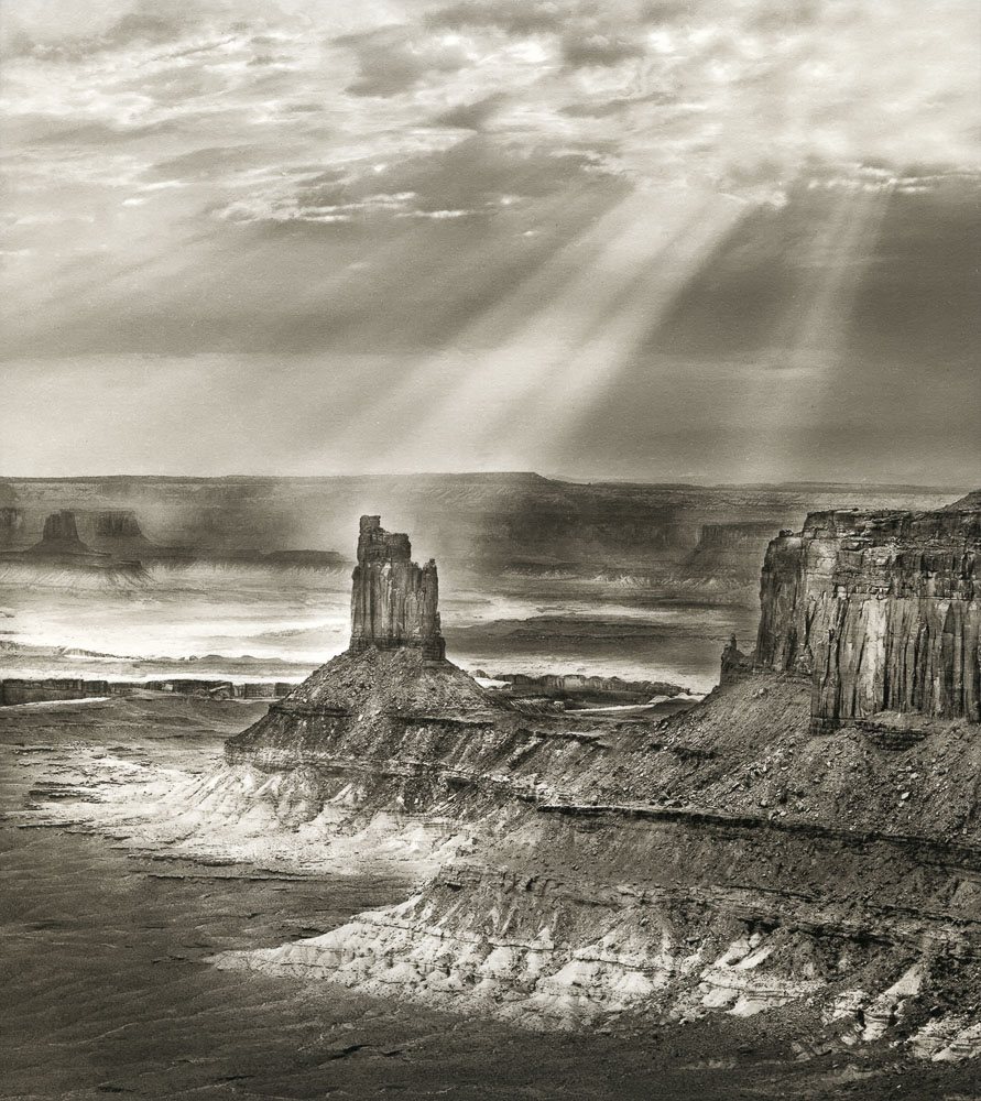
My landscape photography is an extension of my professional work over the years advocating solutions to climate change. Many of the effects of climate change—rising sea levels, warming global temperatures, increasingly erratic precipitation patterns—are placing wilderness and communities that depend on them under unbearable stress. Many of these areas are likely to vanish, like low-lying atolls in the Pacific. I see my job as documenting such areas, so that if they do vanish or change in some unrecognizable way, humankind will remember them.

  • Do you feel your work is influenced by other media/periods/genres? If so, which ones, and why?

I’ve been influenced stylistically by other landscape photographers whose work I love. Eliot Porter, who was the first landscape photographer to work extensively in color, has always inspired me, his ability to find the abstract in the real. Other photographers who work I admire include: Fay Godwin, Harry Callahan, Brett  Weston, Toshio Shibata, Wynn Bullock, and the Canadian Edward Burtynski, who has taught us to find beauty even in the devastation being inflicted on the environment.

  • What is your experience with analog photography? Digital photography?

All of my early work dating from 2003 was shot with medium format film, Fujifilm’s Velvia 50. I love its wide color gamut and detail. From the start, however, I had my reversal film images scanned at high resolution and then printed on a Lambda using Cibachrome and later Fujiflex media. Today I shoot with a digital camera, process the images myself, and print on my own Epson P7000. I’ve been able to achieve rich, long lasting color prints this way. I would go back to Cibachrome if the media were available. Today, I occasionally shoot using film just for the pleasure and self-discipline, but in Canada availability and processing is limited and quite expensive.

  • What brought you to participate in the APR show? 

I’m always interested in exploring new ways to create an image that deepens the experience of my work with the viewer. Multiple gum over palladium produces a highly subjective final print that feels to me like a memory or a remembrance of something that is past or lost. The theme of my own work, which is trying to capture the beauty of landscapes and communities that may vanish, is a good match for this process. I also like the extreme longevity of these images. Again, it is a good match for my own goal, which is to memorialize imperiled landscapes so future generations won’t forget.

  • Do you see a continuing role in your photography practice for alternative processes?

I’m keen to explore the potential of alt processes to emotionally charge the images I place in front of the viewer. The exhibit at Glen Echo is the first step.

Rendering The Spirit: Interview with Erik Larsen

Could you tell me your name?

Erik Larsen

Where are you from?

Grand Junction, Colorado

How did you get into photography as an art medium (as opposed to casual or professional use)?

My interest in using photography as an art medium was sort of chosen for me. I cannot paint or draw very well at all, hence I took to photography to satisfy my creative needs. I enjoy the varied and beautiful geography that surrounds me in Colorado and I want to try
to put what I feel and see in the landscape onto a print that the viewers will connect with.

Which alternative processes do you practice?

I’ve got a little A.D.D. when it comes to the different alternative processes. I use platinum/palladium, kallitype, albumen and gum printing as my “go to” methods, but if I feel the image warrants a different process or if I just want to see what a print looks like in another process I’ll use cyanotype, gumoils, carbon.

What attracted you to alternative processes in general?

Flexibility in appearance of the print is what the interest in alternative processes is for me. So much can be done to influence the final look of a print it is almost limitless. I also really enjoy spending hours in the darkroom, it is very satisfying for me. Being able to print on many different papers types with all the textures and tones available is a big plus in my attraction to alternative processes.

What drew you to the specific media you practice?

Sort of similar to the above question, it is very flexible in what can be achieved in the look and feel of an image. You can get a straight platinum/palladium look, or if you add a little gum over the print it can totally change the character of the print. I enjoy the gum over process (platinum/palladium or kallitype) because if all I want to do is enhance the shadows without affecting the rest of the print it is a good solution. On the other hand, I might change the whole tone of a platinum print with a deep gum printing over the top. The flexible nature I guess would be reason for the processes I use.

How does the choice of media influence your choice of subject matter (or vice versa)?

I am primarily a landscape photographer. I have never been into printing large prints, rarely over 11×14 inches in size. I want the viewer to get close to the print, study it for all it glory and flaws. I don’t know if it is a conscious decision for me to choose my media based on the subject matter, but I prefer for my images an intimate up close experience and I feel the processes I use are what fits my style best.

In today’s mobile, electronic world of instant communication and virtual sharing of images, how important is it to you to create hand-made images?

It’s paramount! We are saturated with images all day long. There is a certain satisfaction for me to spend countless hours printing and reprinting and image until I get what I want and I hope viewers will appreciate the effort involved, sometimes that hope is in vain but it means something to me to make a hand made image.

Is your choice to practice alternative, hand-made photography a reaction to, a complement to, or not influenced by the world of digital media?

I’m not influenced by digital media really at all. It doesn’t interest me as a tool as I enjoy using film and am comfortable with it’s attributes and limitations. If I’m honest I guess I kind of enjoy being one of a few alternative printers versus being one in a billion digital photographers.

Do you incorporate digital media into your alternative process work?

Not in a serious way. I may use a digital negative if the film negative is unsuitable to use for the given process I wish to print in.

If so, how do you incorporate it? Is it limited to mechanical reproduction technique, or does it inform/shape/influence the content of your work?

It’s just making a digital negative, my photoshop skills render me unable to go much further than that unfortunately.

What role do you see for hand-made/alternative process work in the art world of today? Where do you see yourself in that world?

I believe in the photography art world, the alternative processes will continue to be valued and appreciated for both it’s aesthetic appeal as well as for the craft involved. That being said, a good photograph is a good photograph regardless of how it was made. As for myself in that world, that is for others to judge. I will keep doing what I enjoy doing and let the chips fall where they may.

Candlestick Butte, by Erik Larsen

Reminder – Deadline for Submissions February 21 for Rendering The Spirit

This is a reminder that the submission deadline for Rendering The Spirit: The Personal Image in Alternative Media is less than a week away, on February 21.

Photoworks is a non-profit photographic arts and education center in Glen Echo, Maryland. Last year was their 40th anniversary, and as part of the ongoing celebrations and future vision for Photoworks, we are launching a new program to provide visibility and accessibility to historic/alternative processes and artists working in these media. Rendering The Spirit is the kickoff event to highlight this programming.

More of the Good Stuff
© 2008 Scott Davis
Gum Over Palladium

Submissions:

Works to be considered must be made using an alternative/historic process, including but not limited to lumen prints, daguerreotypes, gum bichromate, tintypes/ambrotypes/melainotypes, platinum/palladium, kallitypes, Van Dyke Brown, cyanotypes, carbon prints, calotypes, salt prints, albumen prints, bromoil, gumoil or some combination of the above. Silver Gelatin prints on machine-made commercial papers are not accepted. Original capture of the image can be from in-camera negatives or digital capture or some combination thereof, but the final image must be a physical object made using one or more historical processes.

Also include an artists statement, brief bio and an explanation of the work(s). All required documents (JPEGS, Artist statement/bio/explanation of works) should be emailed to photoworks.gallery@gmail.com no later than February 21st. Notifications will be sent by email to all selected artists by March 1. Works must be received by March 14. The opening reception will be held on March 26.

Render (v): to distill, to cook down to its essence, to translate, to represent.

Rendering: an act of bringing into being, of distillation, of translation, of representation.

By aiming our gaze at works created using “alternative” processes, we aim to show the diversity of work being created at this nexus of the 19th and 21st centuries and engage in a dialog about what it means to create work using anachronistic techniques.

Call for Entries: Rendering The Spirit

Curators: Scott Davis and Malcolm Cosgrove-Davies

Scott Davis is a faculty member at Photoworks where he teaches alternative processes, portraiture and studio lighting. He received formal training at Maryland Institute, College of Art. His specialty is platinum/palladium printing, and he is an avid collector of 19th century photography. He has exhibited his personal work locally, nationally and internationally, and has served as curator at the former Art Reactor Gallery in Hyattsville.

Malcolm Cosgrove-Davies is a self-taught photographer who since 1978 has been practicing historic photographic processes including gum bichromate, cyanotype, VanDyke, palladium, and carbon printing. Mac’s images derive from his extensive travel to developing countries as well as everyday life. Using antique and hand-made film cameras in various large & panoramic formats he seeks to match the image to the beauty and elegance of the selected photographic process. In addition to building the occasional camera, printing frame or other useful photographic gadget, he also creates books and presentation portfolios for his prints. He is represented in various collections such as the Smithsonian American Art Museum, Library of Congress, Maier Museum, and Lehigh University Art Galleries.

Katherine Thayer memorial exhibit and call for entries

Lightbox Gallery call for entries – Katherine Thayer memorial Gum Bichromate show

Regular readers of my blog will probably remember the notice I posted last year about Katherine Thayer’s passing. Katherine was a tremendous gum bichromate printer and an extremely generous teacher of the process. Lightbox gallery in Astoria, Oregon is organizing a commemorative exhibit and has put out a call for entries for the show (link above).

To reprint the notice on the LightBox web page,

LIGHTBOX PHOTOGRAPHIC GALLERY CALL FOR ENTRIES
Two Friends Who Never Met

An Exhibit of Gum Bichromate Prints
In Memory and in Honor of Katharine Thayer
featuring the work of Katharine Thayer and Diana Bloomfield

with a juried exhibit of Gum Bichromate Prints
Juror – Diana Bloomfield
Diana’s bio

We welcome you to share in the beauty of the hand-made print, and specifically, the gum bichromate print,
with a juried exhibit as part of this memoriam for Katherine.
This exhibit serves to illuminate Katharine’s artistry— her admiration for, dedication to, and mastery of gum printing.
This exhibit also celebrates her legacy and her years-long friendship with Diana.

I had a mental picture of the kind of photograph I wanted to make. I had never seen any photographs like them, but I was determined to find a way to make them, these pictures I saw in my head. Their colors were soft and relatively unsaturated, but with a kind of glow about them . . . I set out first to teach myself to print in gum, then to adapt the method to produce the kinds of pictures I wanted to make, and have been making them ever since – Katharine Thayer – katharinethayer.com

Katherine Thayer was a long-time resident of Oregon and a masterful gum bichromate printer. She was also a generous teacher to those who struggled to learn this ultimately rewarding, yet often challenging, 19th century printing process. In Katharine’s words, “learning gum printing involves some trial and error, and there’s no short cut to mastery; a person successful in mastering the process will have some staying power and possess a sense of humor and some tolerance for failure.”
Katharine was also a decades-long member of “The List” , an Alternative Process listserv— a free and open online discussion list related to all things ‘alternative’ in the photographic printing world. For Katharine, of course, this meant gum printing. Currently, over 600 people world-wide are members of this List, and this is where Diana Bloomfield, a native North Carolinian, photographer and printer, first met Katharine. In the middle of teaching herself to make gum prints, Diana gleaned invaluable bits of information from those on the List, but she learned the most from Katharine and from her website (KatharineThayer.com). In the midst of all the questions, and in-between Katharine’s tireless mentoring, the two became good friends. They corresponded via email almost daily, and they were once in a group pinhole exhibit together in the Seattle area. Diana was also in a group exhibit at LightBox, where Katharine was a frequent visitor. Still, they never met.

Upcoming Fall Classes at Glen Echo Photoworks

I’m teaching more classes at Glen Echo Photoworks this fall and winter. I’ll be offering Advanced Topics in Platinum/Palladium, Intro to Platinum/Palladium, and a lecture/presentation on Identifying and Collecting Antique Photos.

Advanced Topics in Platinum/Palladium runs September 15-October 6 (Saturdays 9am-4pm), and covers advanced contrast control techniques, paper choices, troubleshooting techniques, and gum-over platinum. Although I did not have making digitally enlarged negatives in the original curriculum design, I’m going to make it an option at student’s request.

Intro to Platinum/Palladium will be held the weekend of October 20-21 from 9am-4pm each day. Topics covered include history, technical basics (chemistry, equipment, paper), major process controls (negatives, exposure, processing) and fine controls (contrast, process variations).

On the evening of Wednesday, November 17 from 7-9 pm, I’ll be teaching a mini-workshop on Identifying and Collecting Antique Photographs. The course will be a mini-photo history class from the Daguerreotype to silver-gelatin and color, and will be illustrated with examples from my personal collection. Which, if you’ve been following my blog for any length of time, you know is pretty cool.

Gum over Ziatype
Advanced Pt/Pd Topics
Monarch Novelties, 14th Street (palladium print) – Intro to Pt/Pd
Gentleman With Top Hat, dated October 15, 1849
Gentleman With Top Hat, 10/15/1849 – Intro to Collecting

A Non-Silver Manual now available for free

I just needed to put in a good plug for this book. It’s what I learned gum printing from, and contains some very useful information on other alt processes. The book is “A Non-Silver Manual: Cyanotype, Vandyke Brown, Palladium & Gum Bichromate with instructions for making light-resists including pinhole photography”. It was available for sale for many years in a soft-cover spiral bound edition directly from the author, Sarah Van Keuren. Mrs. Van Keuren has decided that she no longer wants to maintain the book and deal with the printing and shipping, so she is making it available chapter by chapter for free to download on www.alternativephotography.com If you want a hard copy, you can contact the publisher of AlternativePhotography.com and see about remaining stock.

Katherine Thayer passes away.

Katherine Thayer passed away this week. She was a major figure in the alternative process photographic community, and a great source of wisdom and knowledge when it comes to gum bichromate printing. Her loss will be felt around the world. I never met the great lady myself, but we did have several exchanges online and via email about alternative process printing, and I know that I miss the opportunity to have met her. Fortunately, her website is still up, and so even though she is gone, her knowledge does not vanish with her. It can be found at http://pacifier.com/~kthayer/.

Stieglitz Steichen Strand at the Metropolitan Museum

Over this past weekend I went up to New York to see the Steiglitz, Steichen and Strand exhibit at the Metropolitan Museum of Art. I had been hearing about the show from a number of people and wanted very much to see it based on their comments, but approached with some apprehension, as rumor had it that the show was too darkly lit and hard to see. That assertion was patently not the case – the only reason it was hard to see the show was the milling hordes in the exhibition salons. Bad for me, good for the museum, as it means attendance is at healthy levels.

The show features three seminal figures in early 20th century American photography – Alfred Stieglitz, Edward Steichen and Paul Strand. Stieglitz is the connection between Steichen and Strand, as it was through his gallery and publications such as Camera Notes and Camera Work that both other artists were launched to the public. Steichen and Strand represent opposite ends of the art photography spectrum in many ways – Steichen was very much in the photography-as-painting school of soft focus lenses and heavily manipulated prints, whereas Strand, who got his beginnings in the same theoretical approach, represents the “new” photography-as-photography idiom that declared photography should be accepted as an art form for its own merits, rather than try to emulate painting or drawing.

Stieglitz’s work in this show bridges both schools. Works ranging from his early New York street scenes and his Equivalents through his Georgia O’Keefe nudes and his late “straight” photography which returned to New York City as viewed from his gallery and apartment windows. The Strand work on display did little for me – they had a limited selection of his Mexico portfolio, which is his most interesting work to my taste.

As an aspiring gum bichromate printer and quasi neo-pictorialist, the work of greatest interest to me was the Steichen segment of the exhibit. Were it not for the constant need to evade elbows and heels, I could easily have spent an entire day looking at just the Steichen room, studying the prints. On one wall, they had Steichen’s “The Pond – Moonlight”, and three variations of the Flatiron building, representing the descent into twilight and nightfall. I had only ever seen these prints reproduced in books before, and so no book reproduction can do them justice. Previously, I had no idea the scale of the originals – I envisioned them to be at most 8×10 inches in size. In fact, the “Pond – Moonlight” and Flatiron prints were something in the 12×15 to 14×17 inch size range – quite dramatic. Not only is the paper surface wrong, but the subtlety of the color palette is lost to the printers’ inks. I have yet to figure out how Steichen did it, but the gum image itself had a surface to it that was as if they had in fact been lacquered, not formed from multiple exposures in sensitized chemicals. In other images, notably some nudes, brush strokes were clearly visible, adding texture and movement to the figures. It made me wish that Steichen were still alive or that I could go back in time to interrogate him about his gum materials and techniques.

Unlike the Steichen work, Paul Strand’s images were very much in the scale I was used to seeing them reproduced. However, the majority of his work whether silver gelatin or platinum/palladium was a rich brown color, printed dark and low in contrast. Most reproductions tend to boost the contrast and render his work in black/white/gray tones, which gives a very different impression of his work.It is perhaps the Strand work at the show that made people feel that the exhibit was under-lit, as his work is printed dark enough that it is hard to view in anything other than brilliant illumination. The rationale for this difference between original prints and reproductions I can guess at – people are expecting “black-and-white” photography to look, well, black-and-white, and even vintage work is expected to be somewhat contrasty. It is entirely possible that Strand went on to print his work with more modern silver-gelatin papers that have the cool-tone black-and-white look we think of today, and this was merely a sampling of his early prints from early images, therefore the book reproductions are not deliberate manipluations of his work – I have not seen enough vintage Strand prints to know.

One last aside – I saw a number of Stieglitz prints marked “Silver-Platinum prints”. I’ve never seen or heard of this particular medium before, so if any of the assembled ears here have any input on what makes a “Silver-Platinum Print”, please pass that along!

This gum bichromate thing…

This morning I started another gum print. Got two layers on today. I think I’m being deviled by that constant enemy of all hand-coated processes, low humidity. When my paper dries between coats, it dries out so much that when you apply a second layer, the paper starts to buckle even when you have the paper taped down to mask the borders because the gum emulsion is so much wetter than the paper. This means you have an uneven coat with some areas in the valleys between the buckled areas on the paper that get too much pigment, no matter how carefully you work the coating. I’m still getting the kinks out of the mixing process, as getting the right amount of pigment for any given color is a long cycle of trial and error.

Pre-acidification of Rives BFK

Well, my experiment with pre-acidification of Rives BFK for doing palladium/platinum/Ziatypes was a success. I got a flawless Ziatype over which I will now try several gum layers. My pre-acidification consisted of a 5 minute bath in 5% Oxalic Acid. I sized the paper AFTER the acidification bath. Image to follow.

Here is the image with the first two layers of gum over Ziatype. Colors are Alizarin Crimson and Sepia. I’m planning on doing at least two more layers, probably another sepia or burnt Sienna and then another red, maybe something deeper red.

Heart In Hand