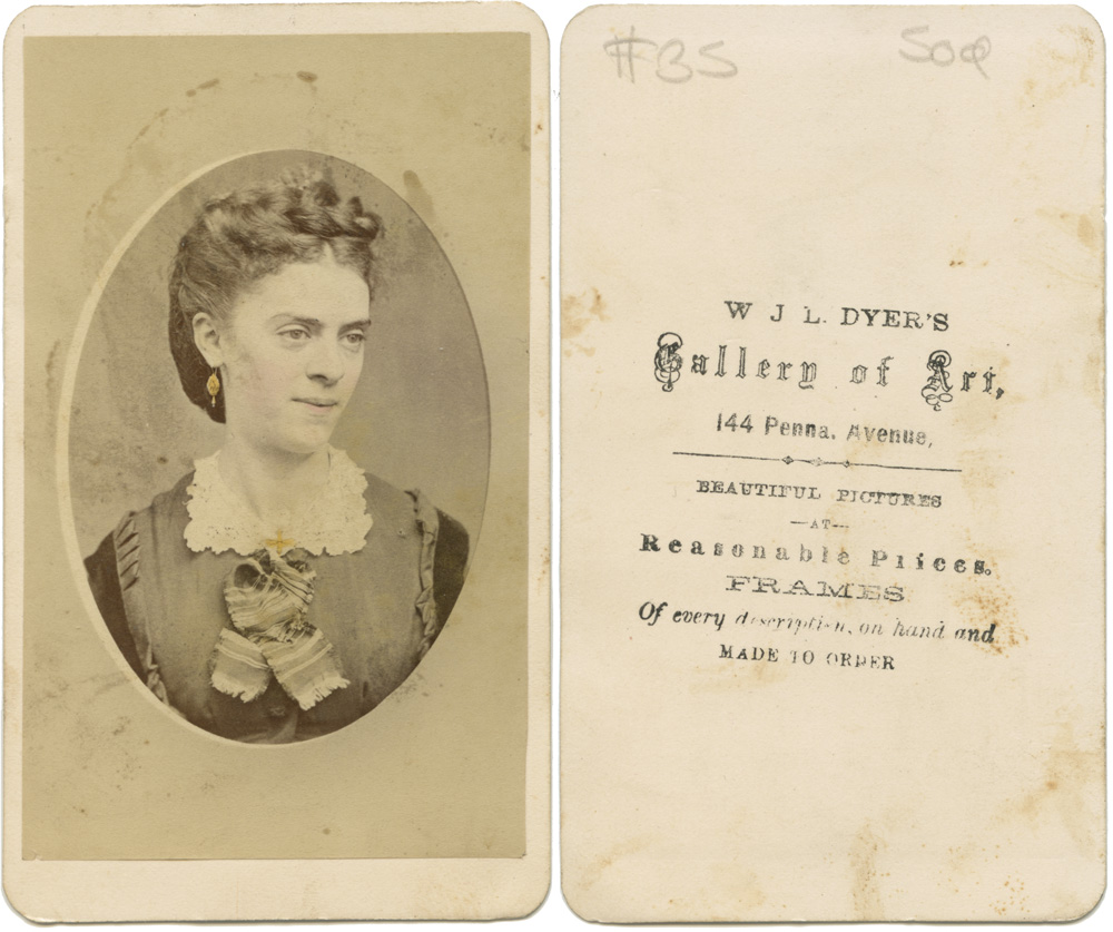
An anonymous CDV by WJL Dyer of Washington DC. Gotta love the advertising pitch on the verso:
W J L Dyer’s Gallery of Art, 144 Pennsylvania Avenue, Beautiful Pictures at Reasonable Prices, Frames of every description, on hand and Made To Order
Also note the hand-coloring of her jewelry and the faintest touch of rouge on her cheek. This is not bad, but I’ve definitely seen better quality hand-coloring on CDVs. Mr. Dyer’s studio, while in the same neighborhood, must not have been a direct competitor to Gardner and Brady. I was reading about the Brady studio in the immediate antebellum years and the first year or two of the Civil War, and it was a highly organized operation employing a wide range and large number of people. Their pay ranged from $8/week for the women who did the finishing work of pasting the photos onto the cartes and other similar tasks up to the specialists who retouched and hand-colored his Imperial prints who got between $11-$16.66 a day (the bonus was paid for working on a Sunday). I doubt Mr. Dyer’s hand-colorists were making that kind of money.
I got this one to add yet another address to my DC photographers’ map collection. I’ll have to look into making the map interactive with representative CDVs from each studio pop up when you mouse over the address. But that’s a programming feat for another day, and something to tackle relative to my day job (believe it or not, I do have a day job to pay for all this insanity – I do software developing). It would actually make a pretty cool portfolio piece for my development career.

Dear Mr. Davis,
In searching for information on the works of Henry Ulke, I came across your site. It’s wonderful! Ulke and Brady photographed several members of my family. I believe the daguerrotype you have in your collection of the unidentified young man with the following description, is my great uncle. Would you consider selling the item? Many thanks, Linda
Daguerreotype, Anonymous Young Man, 1/6th Plate
I’m still trying to figure out how to post my Brady clear glass ambro – when I can get a little table-top studio set configured in my dining room, I’ll take photos of it to post here. The trick with it is that the image is viewable from both sides. There is no black backing paper, and the case is in three pieces – a front cover, a center panel with the image, and a rear cover, all hinged together like a little book. I’ll have to do some creative posing of the piece to demonstrate this and to display the image clearly. I’ve seen very few ambrotypes presented this way, and the few I have were also Mathew Brady images. I’m far from a fount of knowledge on this subject, so I don’t know if this was a uniquely Brady thing to do, or if I just haven’t seen enough images yet to know how widespread the practice actually was.