Two versions of the same scene- which do you think works better?
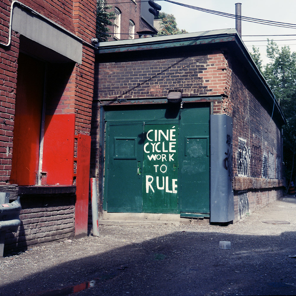
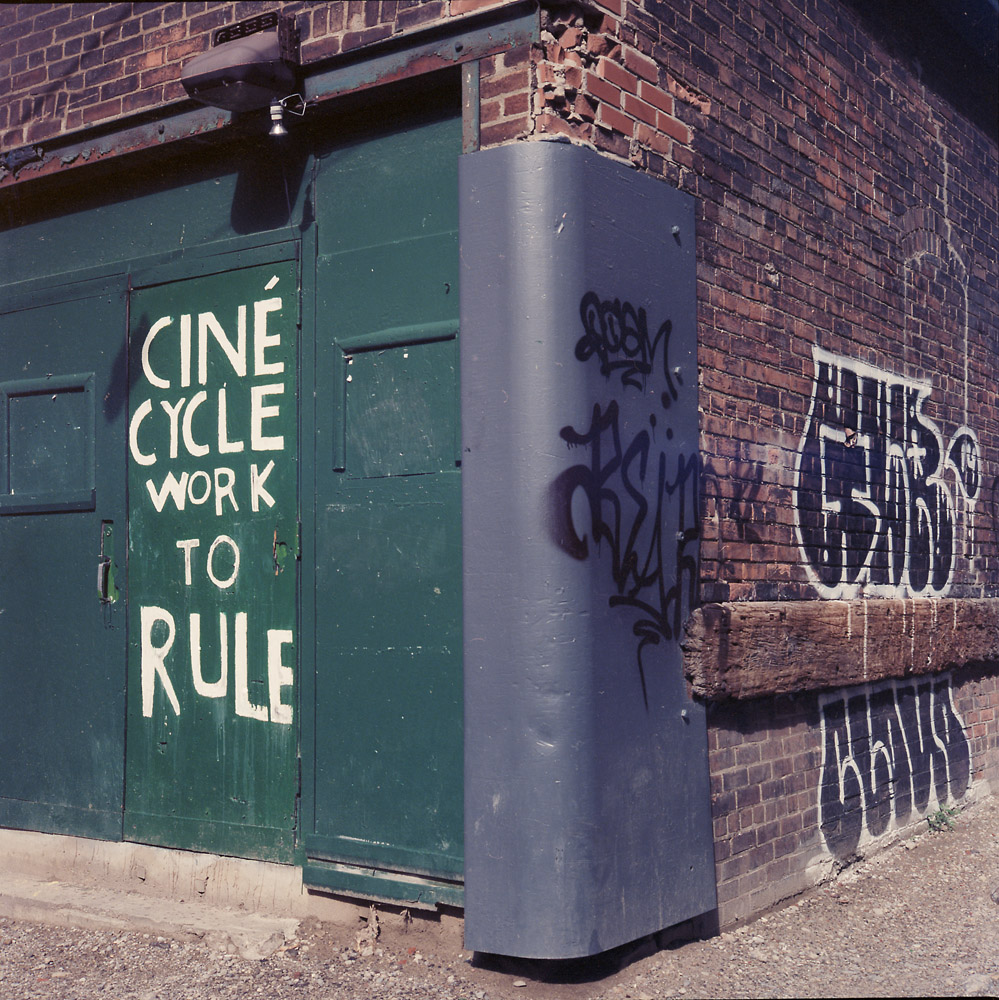
I’m still on the fence – the wide shot has that extra splash of color from the door on the next building, and the visually leading lines, but the tight shot pulls your attention to the sign.

I like both, but the wide version has so many stories in it. Who is in the windows above the green door? What is in the trees behind? The red door has something behind it waiting or maybe not.
Nice choices — both are good for different reasons. Overall, I like the pop of red and the composition in the wider angle version.
I think I prefer the tight shot a bit better, for it draws me to focus on a single item and not to wander around the image so much.