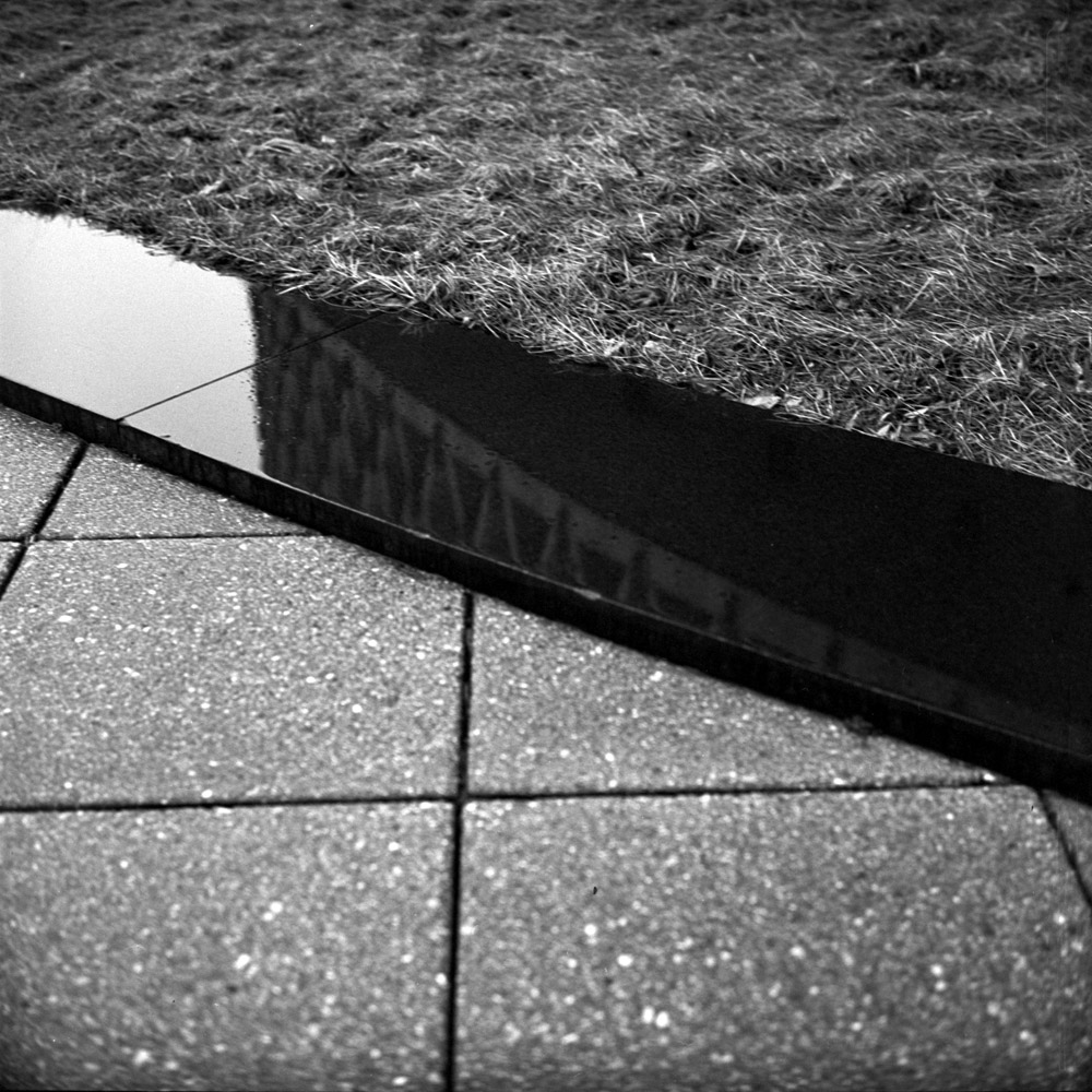
Tangentially related to my commuter diary in that it’s something I pass frequently, here are some shots of the World Health Organization’s offices in DC. The mid-century design lends itself extremely well to composing abstracts.
At the edge of the lawn, there is a ring of black polished marble creating a border with the concrete pavers of the plaza. It was raining that day, and the marble was particularly reflective, so I composed a frame that shows the cylindrical drum structure reflected at a tangential curve running through the marble band bisecting the frame. It’s a presentation of contrasts in textures, organic vs man-made, structure and chaos.
Many people feel that you can only take photos in certain weather/lighting conditions. Except for the getting wet/cold bit, I like photographing in the weather – it’s a different kind of light, creating different textures and volumes from the same subjects. I plan on heading back with my camera on a nice sunny day and shooting the building again with deep, long shadows making the structure much more abstract and contrasty. I like being versatile in my photographic style, and I like recording light on subjects as I see it when I see it – if that means photographing at noon on a bright sunny day, so be it. Now, I may be out somewhere at noon on a cloudless sunny day and see something and say, wow- that’s an interesting subject, but I can’t get the shot I want because the contrast is too harsh. If that’s the case I won’t waste the film and I’ll come back another day. But by the same token, I’m not going to play refusenik and leave my camera at home between the hours of 9 am and 5 pm because the light is ‘too harsh’. Ditto cloudy days, rainy days, snowy days… there’s something to be seen and photographed 24 hours a day, 7 days a week, and you can’t do it if you don’t have your camera.
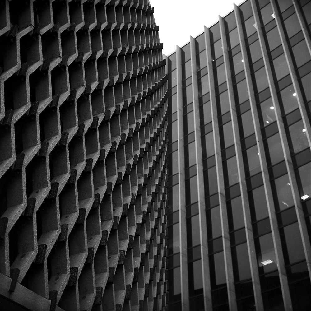
Here are two different crops of the drum and tower structures of the WHO building.
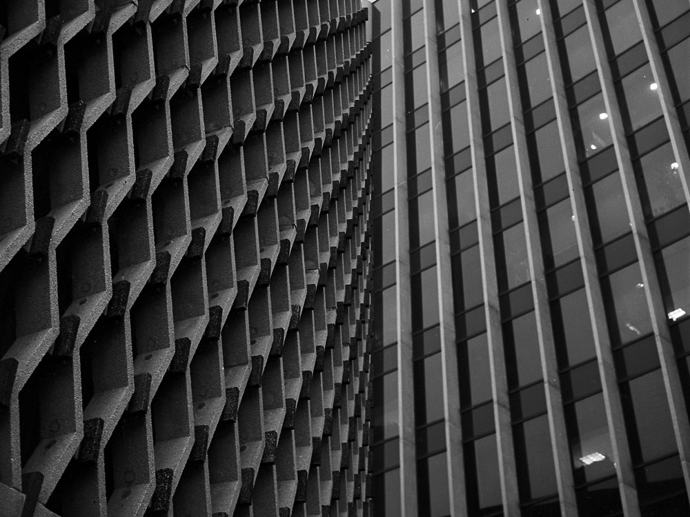
On the one hand, the tighter crop is more abstract, being only about contrasts of pattern and texture, sharp focus and soft-focus, but the square uncropped image has more breathing room and gives you more of a sense of what you’re looking at. I don’t know that you need to be able to read the buildings as buildings in order to get the most out of the image – it could even be distracting/attenuating because you stop thinking about what you’re seeing once you KNOW what you’re looking at.
Which do you like, and why?

I prefer the cropped image. Maybe I am more used to looking at the “landscape” format, but somehow it seems less jarring to my eye and lets me enjoy more easily the contrast between the curves sweeping in from the left and the straight lines on the right.