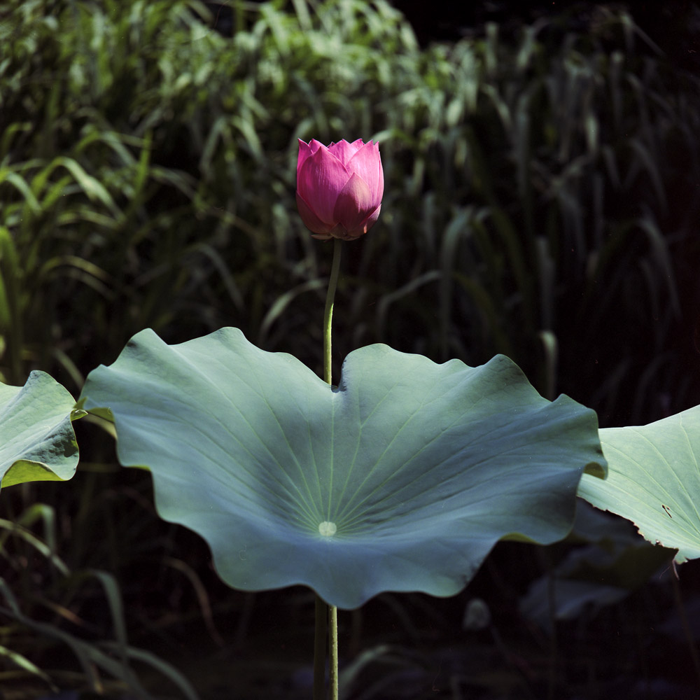
I don’t think much needs said – it’s a lotus blossom at peak season, with full and unbuttered leaves.
I don’t think much needs said – it’s a lotus blossom at peak season, with full and unbuttered leaves.
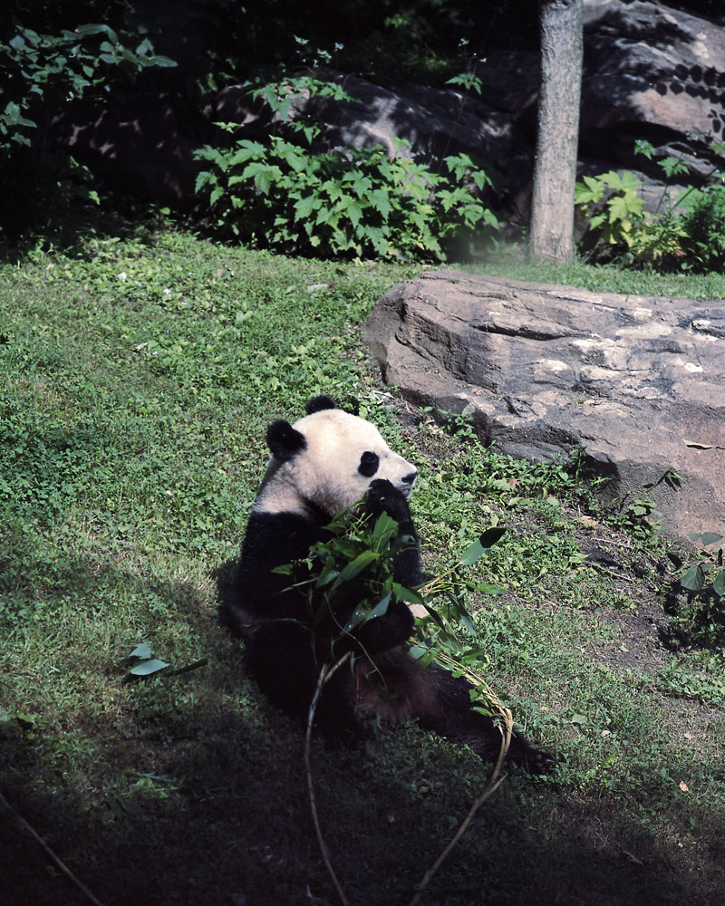
I took the Tele-Rolleiflex with me to the zoo the other weekend. I didn’t know quite what I would be able to get good shots of and not, but I tried anyway. The one animal I could get close enough to get a good shot of while still outdoors in good light was, fortuitously enough, the Giant Panda – I think this one is Tian Tian, the male panda.
Enjoy!
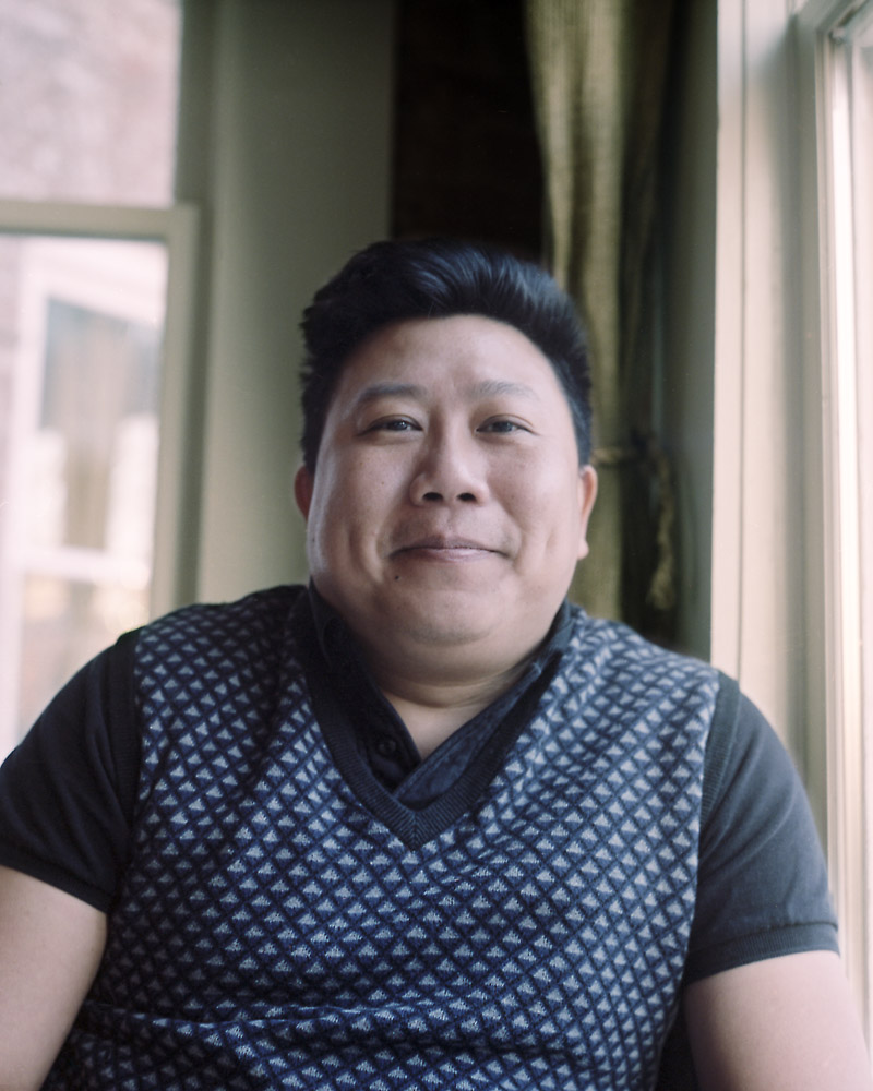
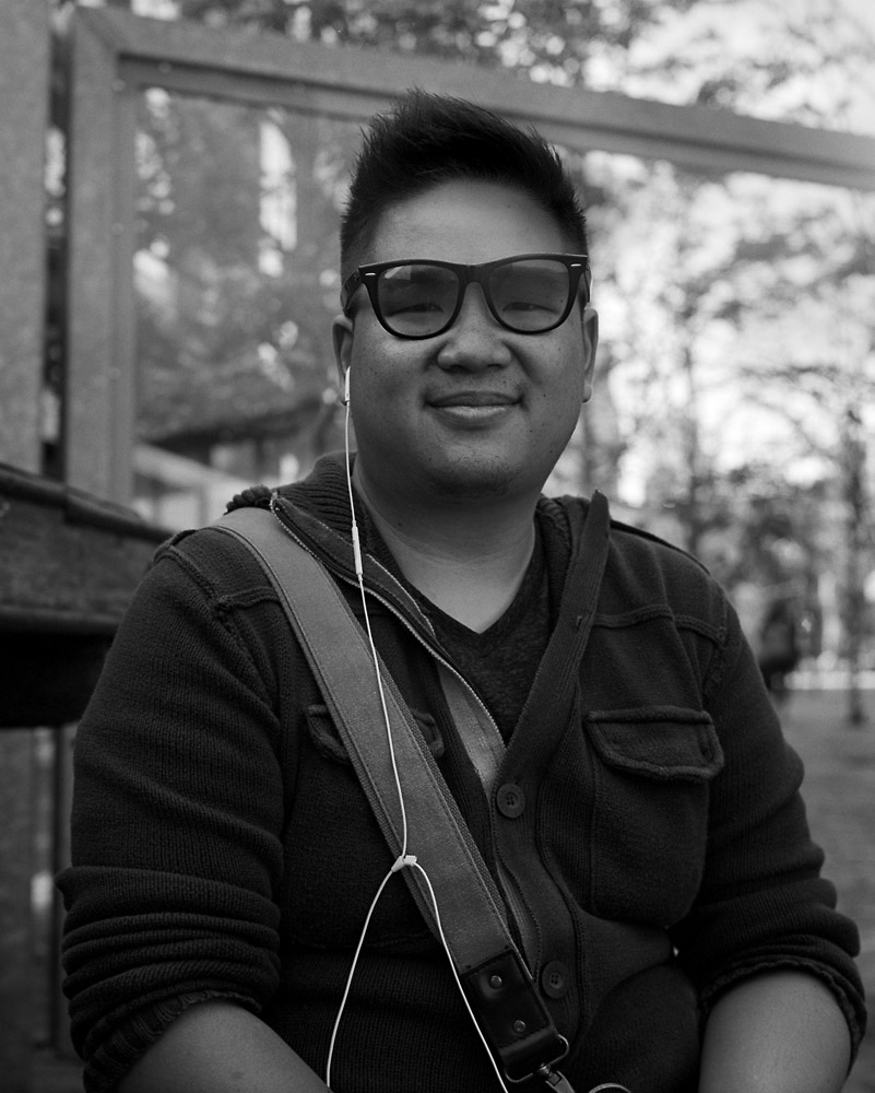
This is a very dear old friend of mine who I’ve known for close on 20 years now. We originally met on an IRC chatroom (that’s really dating me – how many of you out there even remember what that was?) and stayed in touch long after. Simon came to visit me when I was living in Baltimore, then I ran into him again several years later at Chatuchak Market in Bangkok, quite unplanned and unexpectedly. Several years after that, he returned to Baltimore, this time as a graduate student. Now he lives outside DC and we get together periodically to keep up with what’s going on in our lives. We were having dinner the other night at a newish Italian restaurant in my neighborhood when I took this- he was just perfectly lit by the setting sun coming through the window. I think this perfectly captures his jovial inner spirit.
I had the Rolleiflex sitting on the table next to me after taking this picture, and the women at the table next to us saw it and remarked on it. We ended up having a good fifteen minute conversation with them about photography and using film and old cameras. This is why I call the Rollei “the happy camera” – it gets so many people talking with you about photography, and always in a positive way. Everyone has good feelings about this camera.
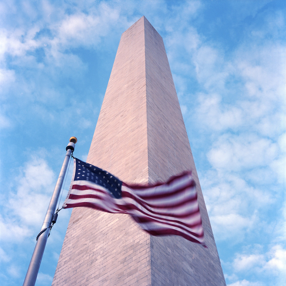
The World War I memorial, taken toward evening in early spring. The grass is obviously getting green but the trees haven’t come into leaf yet. Once the trees have gotten their leaves, the memorial is all but invisible from the road behind it.
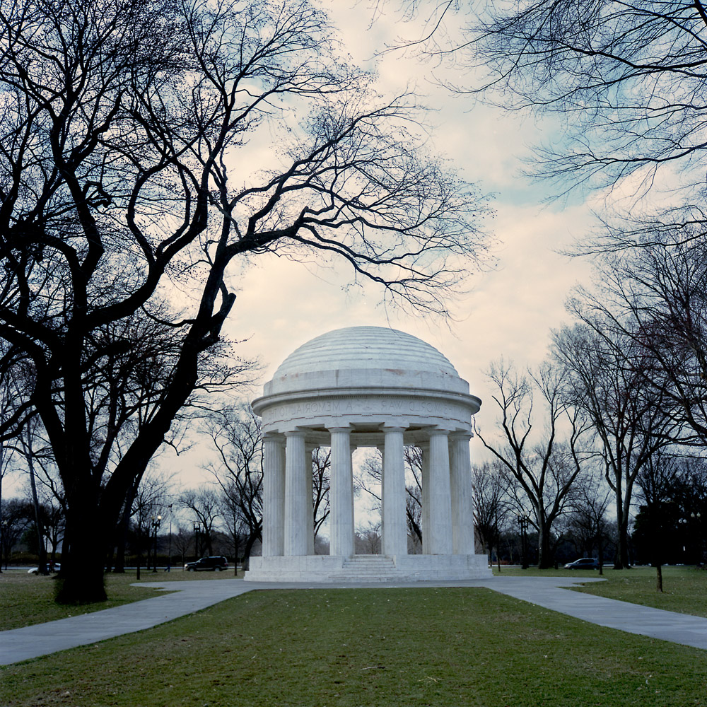
This is still one of my favorite monuments on the Mall because of its simplicity, and because it is doing double-duty – there is no national World War I monument, so this monument to the fallen from the District of Columbia stands for all the soldiers and sailors of that conflict.
I don’t think this one needs much introduction or commentary.
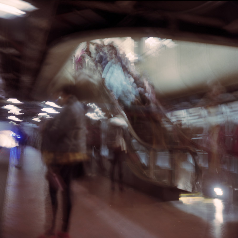
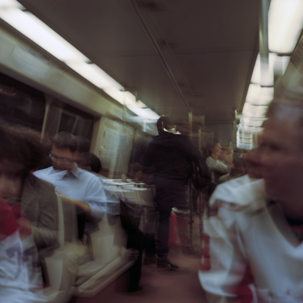
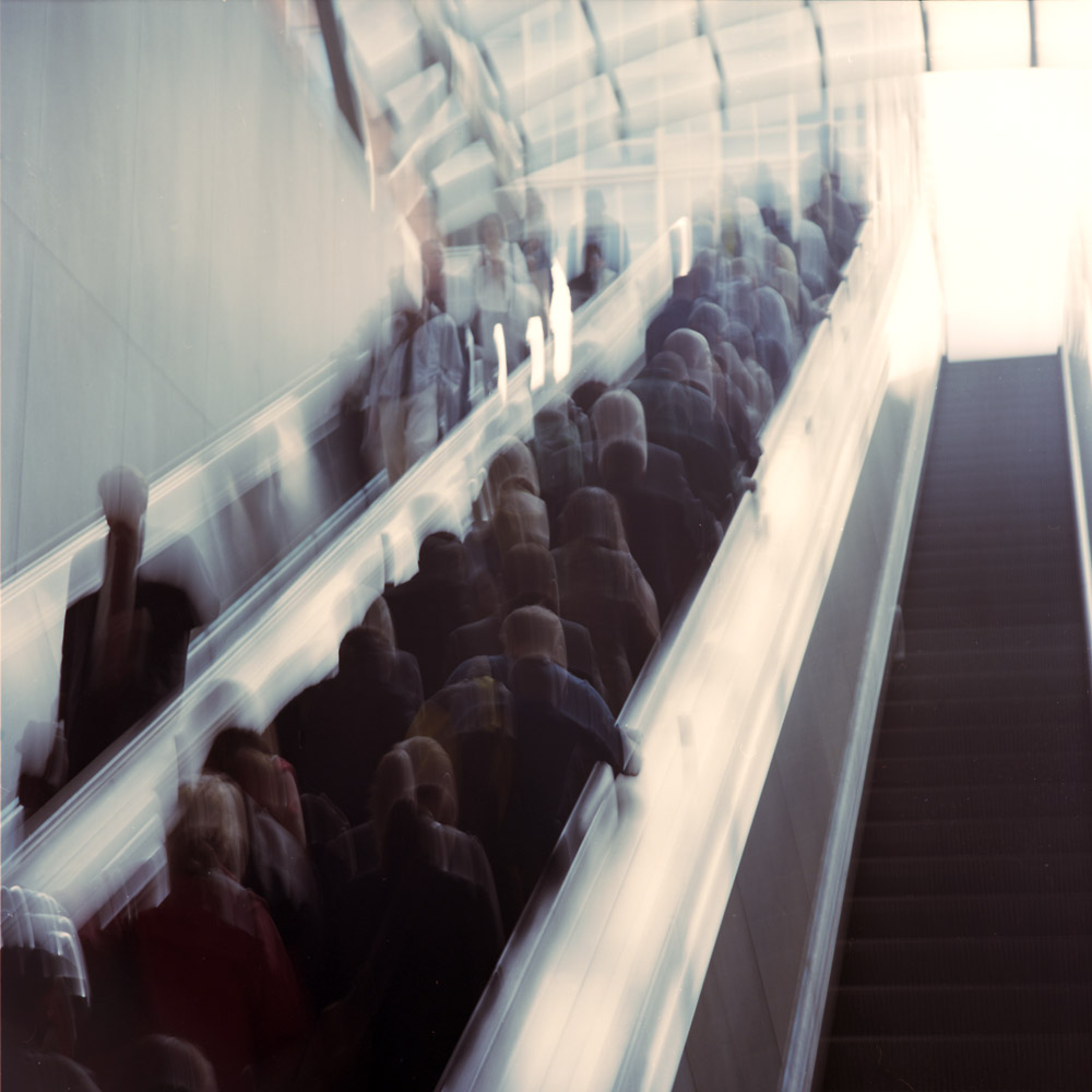
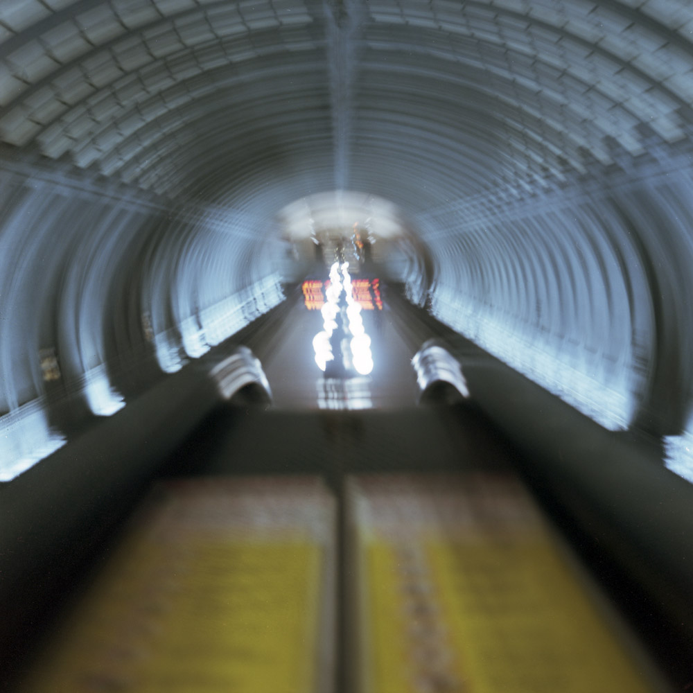
This time, instead of being so infrastructure-focused, I thought I’d try being a bit more people-focused in my Commuter Diary. It’s one of the hardest things about this project – adding in the human element, getting a little less first-person in the experience and showing the other people using public transportation, while keeping it abstract. There’s a natural tendency when photographing people to want them to be absolutely sharp, clear, and obviously the main subject of the image. Well, when you’re throwing sharp, clear and objective out the window, how do you photograph people?
Riding the subway always involves a descent, a passage, and a re-emergence. It’s a normally terribly un-heroic journey that bears a very vague passing resemblance to the hero narrative of Joseph Campbell. Unless of course you’re claustrophobic and/or agoraphobic, whereupon riding the subway is an anxiety attack waiting to happen, and surviving the ride is a transformative experience.
Here is the descent into the underworld:
The passage through:
Emerging on the other side, returning to the daylight and the world of mortal men, the escalator ride up is both salvation and alienation, because who would understand or even believe your having done battle with a steel dragon and survived?
These are some first attempts at bringing the “experiential” style of photographing that I’ve been doing to bear on people. There have been a few attempts at doing pictures of individuals this way but they, at least to me, really don’t work. Maybe I’m being too rigid in my thinking, or maybe I’m dead on the money. Time will tell.
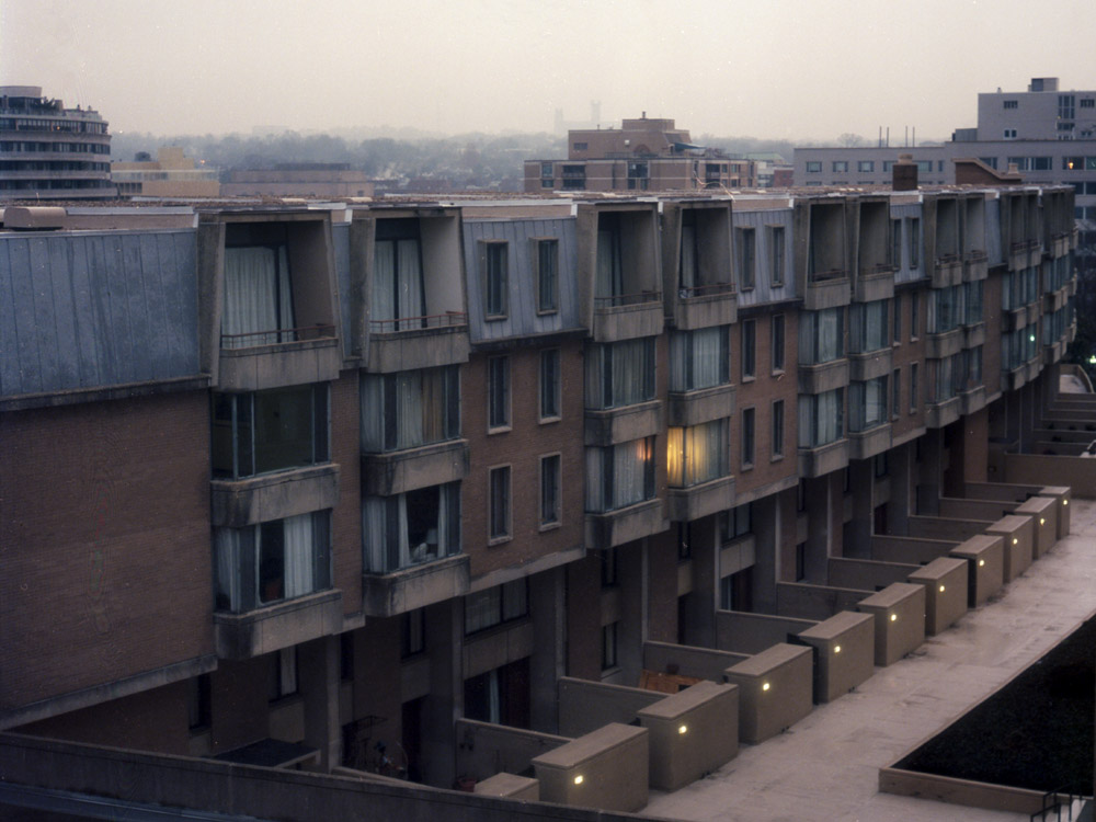
Another scene I see near my office every day. Easier to capture in the wintertime when it gets dark early.
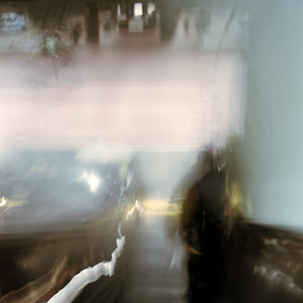
Looking down on the platform from the top of the escalator feels like you’re about to plunge over a precipice into an unknown below – will it be a deep pool, or full of jagged rocks? Will there be minnows, or will there be sharks?
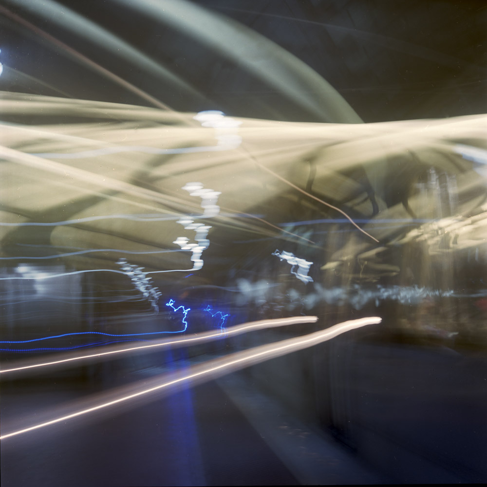
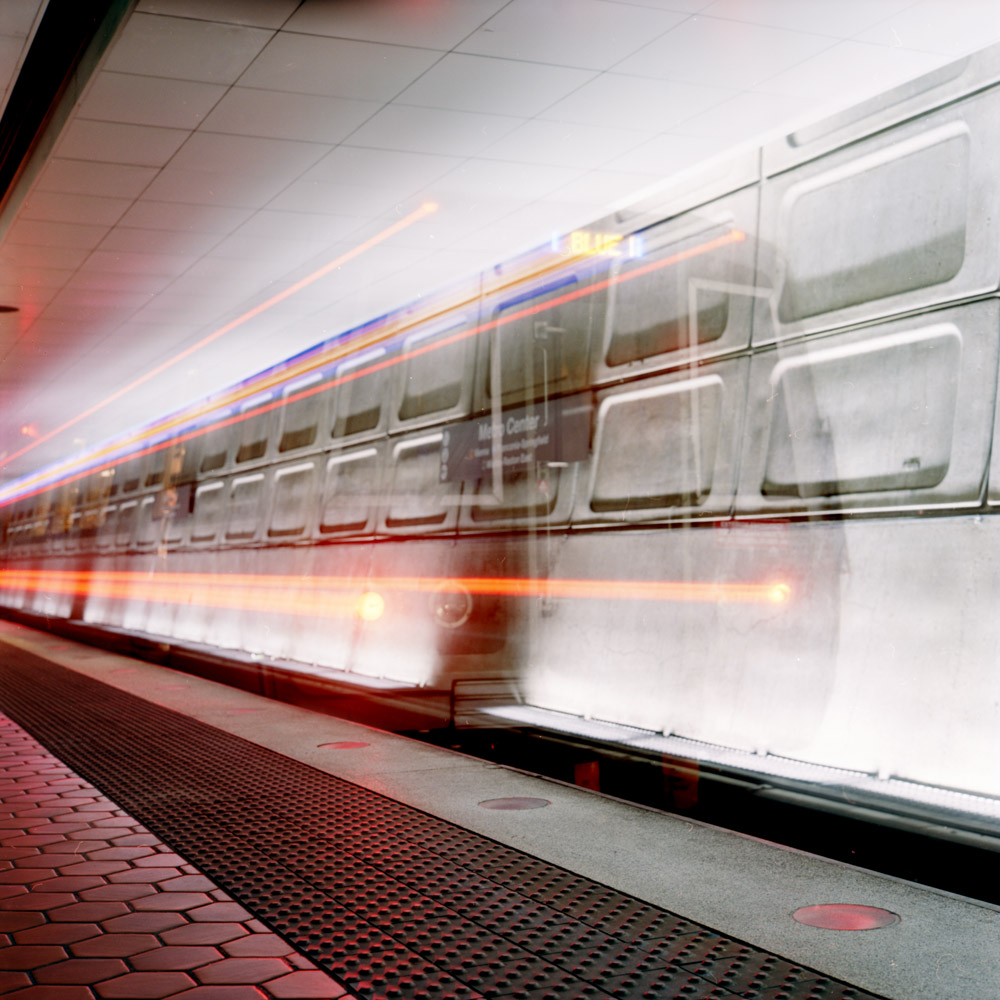
Perhaps the most interpretive, impressionistic image of my commuter diary so far. Another long exposure where I panned the camera along with the train as it pulled in to the station. The panning along with the motion blur and the different lengths of time moving vs still give a uniquely layered image that requires you to engage and investigate to understand. I’m getting more and more intrigued by this style of exposure – the truly non-literal photograph.
Riding the down escalator with the shutter held open leaves nothing constant except the passenger in front of me. The changing perspective of the descending escalator puts the station entrance above where you would expect it to be.
a far more literal, sharp, precise image of a departing train. This is the first image in this series I’ve done with a tripod, because I wanted to catch the back of the train with some clarity before it departed. I’ll try it again later handheld and see which I like more. This has its charms even with the sharpness because the lights moving in a straight line are in some ways more forceful and direct.
I’m not normally a landscape photographer. In a conversation on Facebook, I had posted this image and said that I didn’t normally think of the Rolleiflex as a landscape camera, mostly because that’s not the way I use it (street scenes, portraiture and architecture are what I shoot 99% of the time). Several people responded that it is a great landscape camera, and they’re right- no general-purpose camera is defined by/limited to one specific genre. I wouldn’t try and shoot landscapes with a Yashica Dental Eye, but it’s an extreme example of a specialist camera built to do one thing and one thing only. A Rolleiflex is NOT a Dental Eye, so it can, and does, do perfectly serviceable landscapes. In fact, as with most things photographic, the limiter is the operator of the camera, not the device itself.
This is a winter landscape, looking from a rest stop along Route 15 toward Emmitsburg, Maryland. If you look carefully, you’ll see two church steeples peeking over the tree line in the middle distant background. While I don’t know that those specific churches were there at the time of the Civil War, the landscape still looks and feels much as it would have in 1863 as soldiers marched to and from the Battle of Gettysburg, a scant 14 miles away.
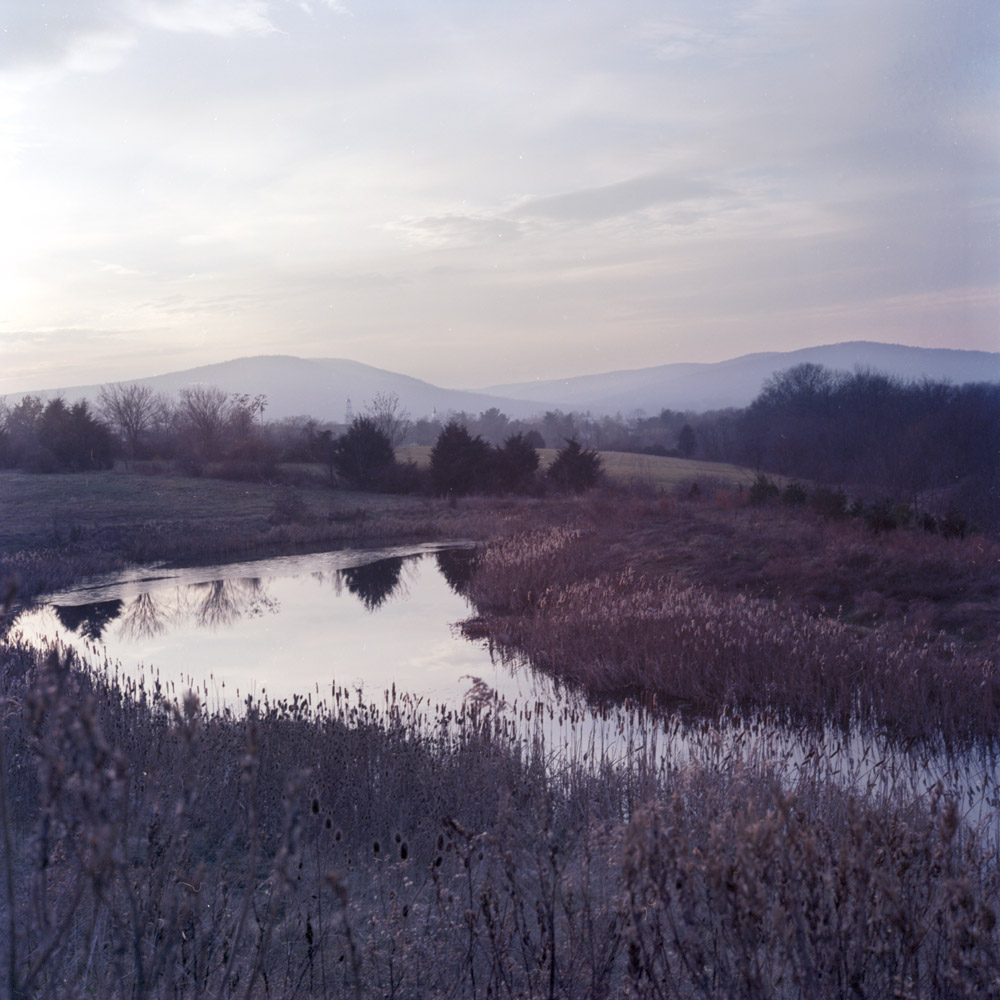
I had someone else comment that the image looks “washed out”, and asked if I was using outdated film. No, I’m using in-date film, properly processed. It’s a winter landscape, with just a few tones in the scene, and a color palette of grays and browns. That’s pretty much exactly how it looked that evening.
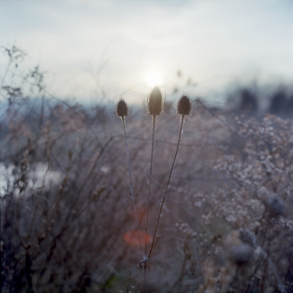
These thistles were part of the field you can see on the near edge of the pond. I saw the sun backlighting them and got up close to give them that silhouetted rim-light, with the lens flare from the sun coming directly into the lens. It would have been nice to actually get MORE lens flare, but that’s a testament to the lens design that it doesn’t.
Two different portraits I took of my friend William, who toured me around Toronto on Sunday of my weekend visit. Both were taken at the Distillery District, one black-and-white, the other, color. I cropped the black-and-white one because there was some lens flare in the upper corner, and I think the vertical crop is not only complimentary to a portrait in general, it is flattering to the sitter.
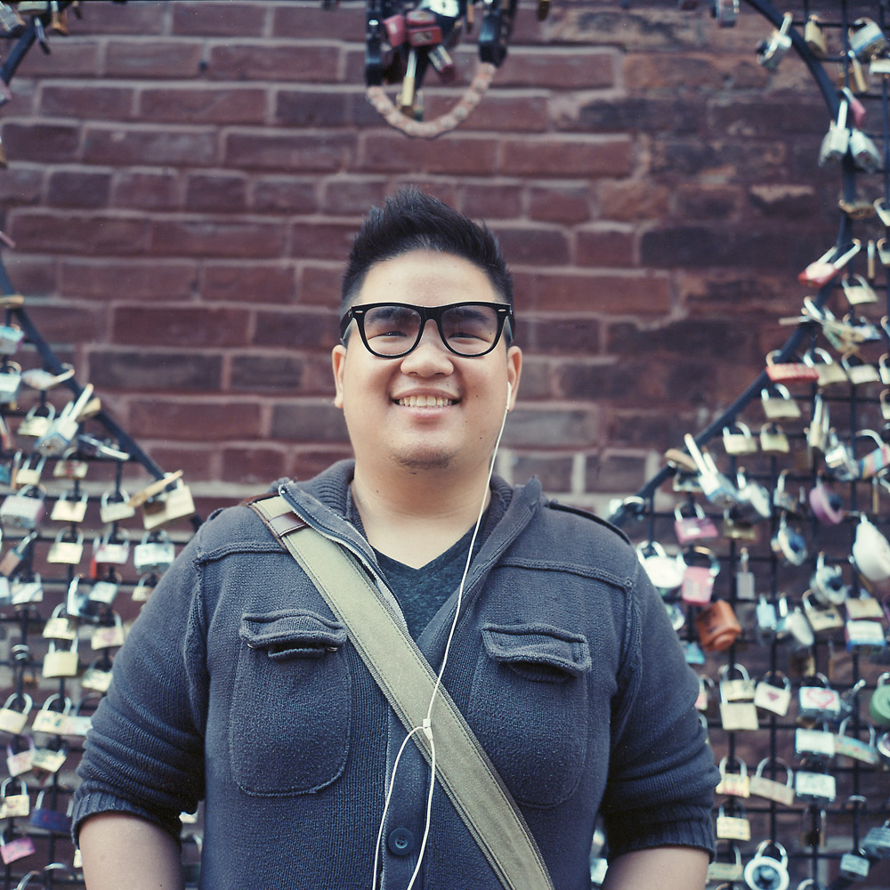
Both images, of course, were shot on my Rolleiflex. It makes for a great environmental portraiture camera. One of these days I’m going to get the Tele-Rollei to do some tighter head shots, but for now, this is just fine. The b/w image was shot on Kodak Tri-X, and the color on Kodak Ektar 100. I’m normally brand agnostic when it comes to film – I shoot whatever produces the look I like. For a slower b/w emulsion, I’m happy with Ilford FP4+, and for a really slow emulsion, Ilford PanF. For years, until they discontinued it, I was a huge fan of Fuji Reala when it came to color. Since it went away, I’ve shot Kodak color emulsions almost exclusively, though. I used to like the super-saturated colors in Fuji slide films, but now I prefer a somewhat more subtle palette, which I get from Ektar (which is still a saturated, contrasty emulsion) or even moreso from Kodak Portra (mostly Portra 160, but the 400 and 800 also have their uses).


