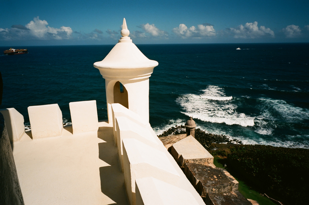
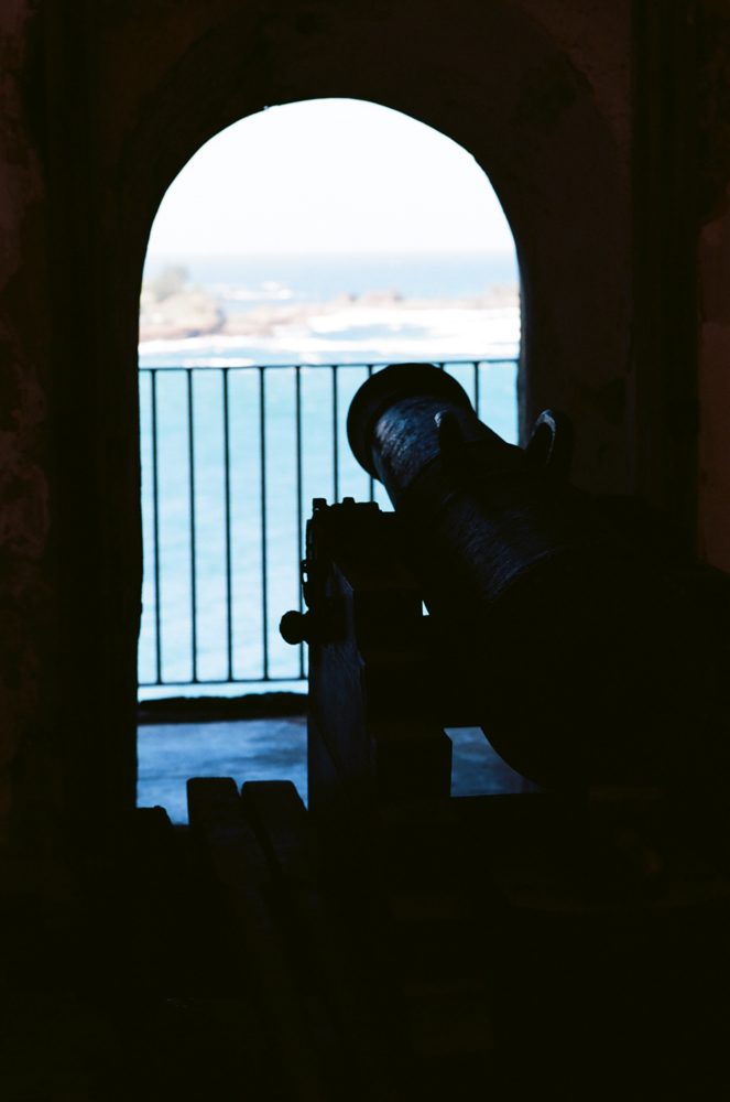
Just a few better images from the trip to Puerto Rico. Definitely NOT with a view camera – everything was shot with a Contax G2, mostly with the 21mm and 90mm lenses, with a couple of 45mm grabs in there. As always, working with the G2 is a joy, and it produces incredible results. Even though it isn’t “as silent as a Leica”, I enjoy the whirring of gears of the auto-focus, and the snick-snick of the shutter.
I’m some kind of obvious when taking photos, as even when I’m using the G2, which is a pretty inconspicuous camera, I seem to attract attention. My father and I were coming back from dinner and I stopped to take a photo, and this panhandler approaches me. He asks, “How much does that camera cost”? I can tell he’s not a photography enthusiast, so I reply, “I don’t remember, I’ve had it for a while. It takes film” – hoping that will discourage any thoughts of taking it. He then states, “I guess you have a relationship with your camera”. DUH. I do, but don’t even THINK about trying to end that relationship non-consensually. I do have a love affair with my cameras, and I’ll happily share that with anyone interested, but I’ll smack you to the moon if you try to mess with that.
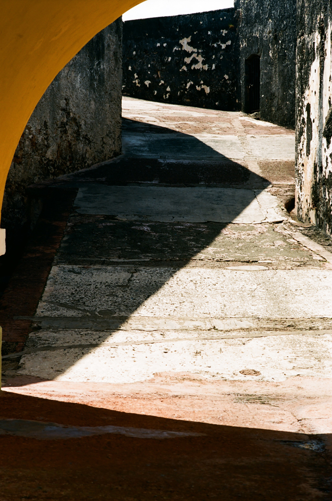
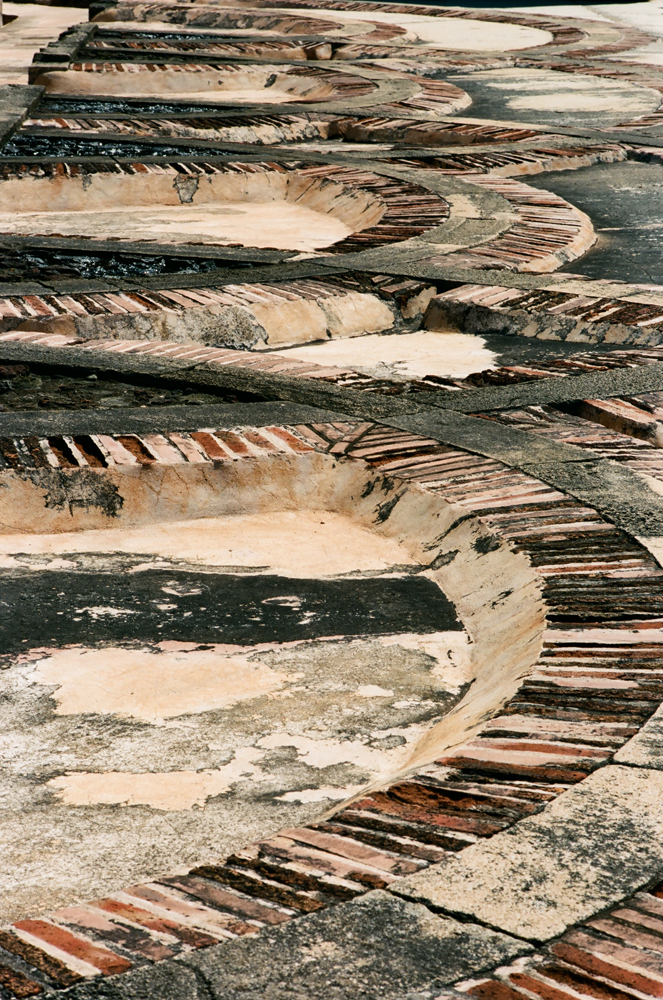
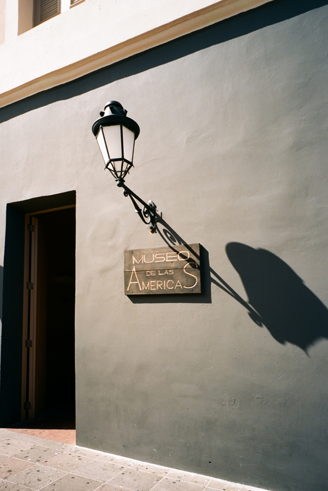
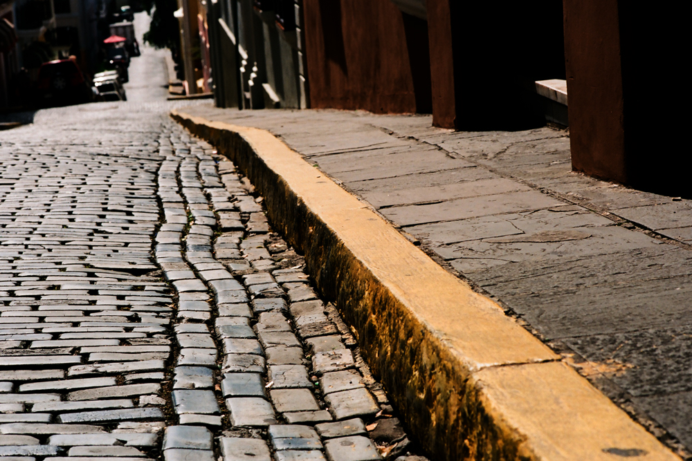
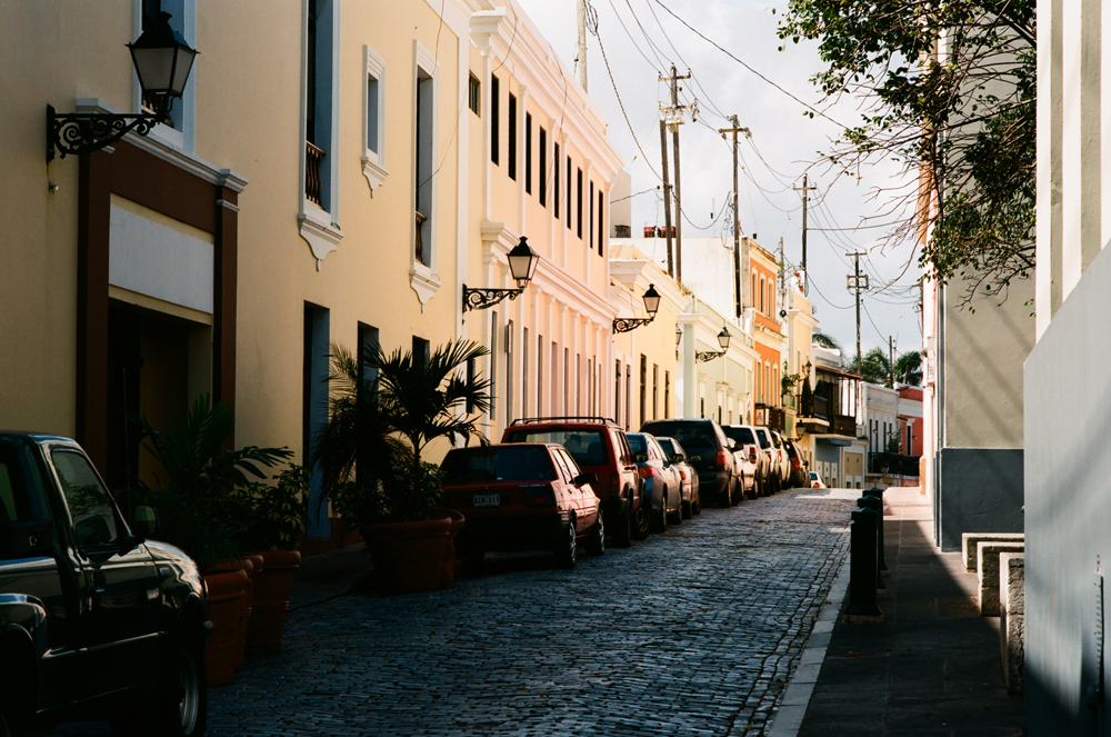
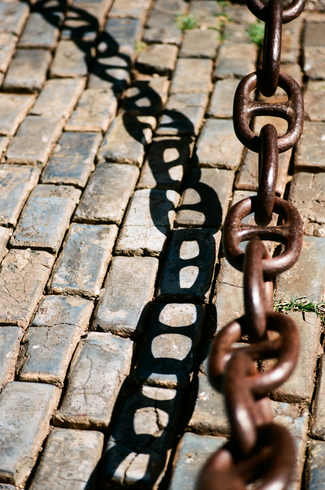
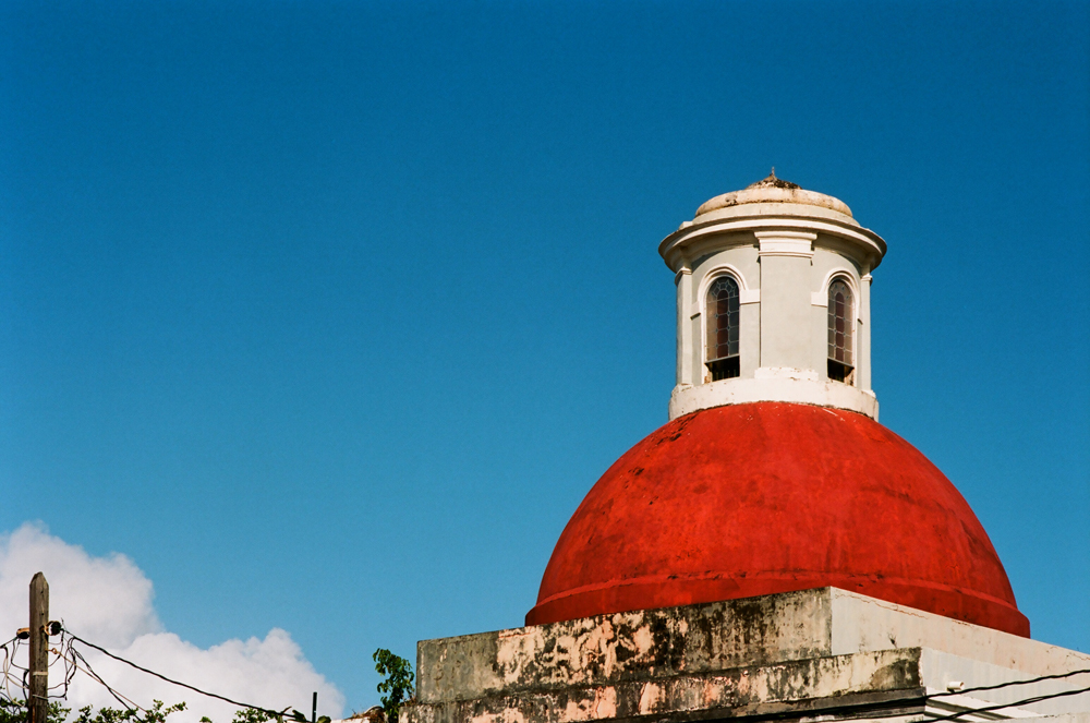
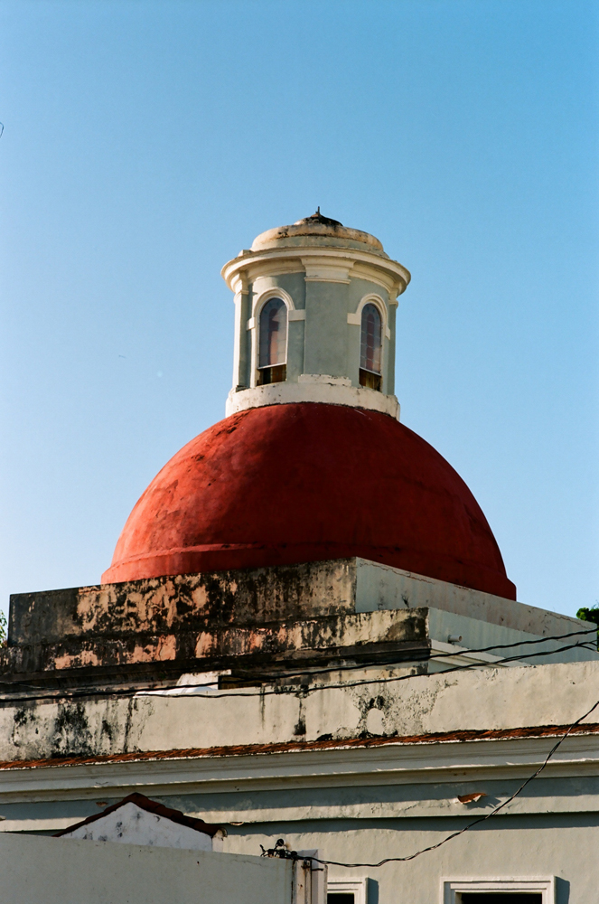
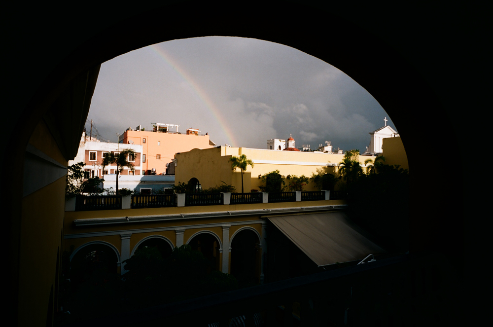
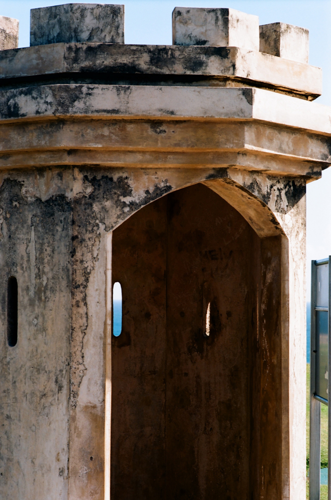
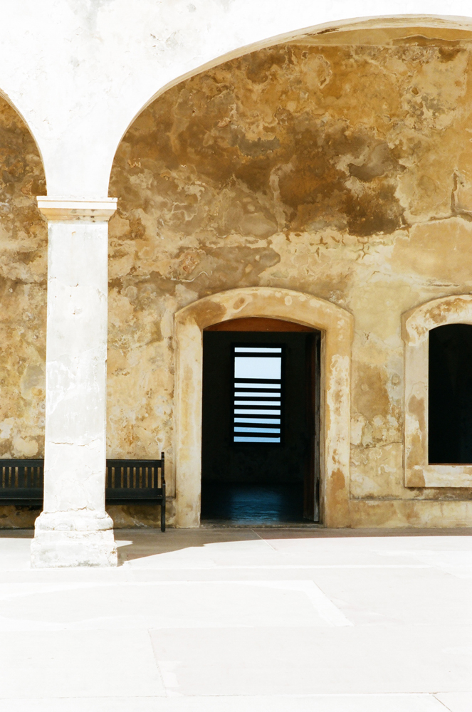
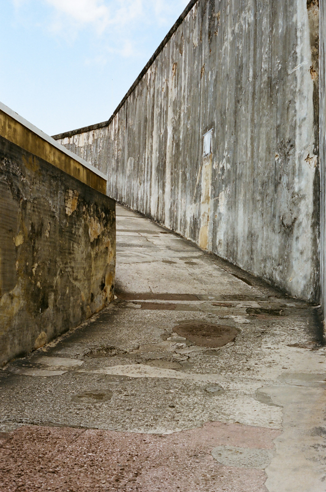
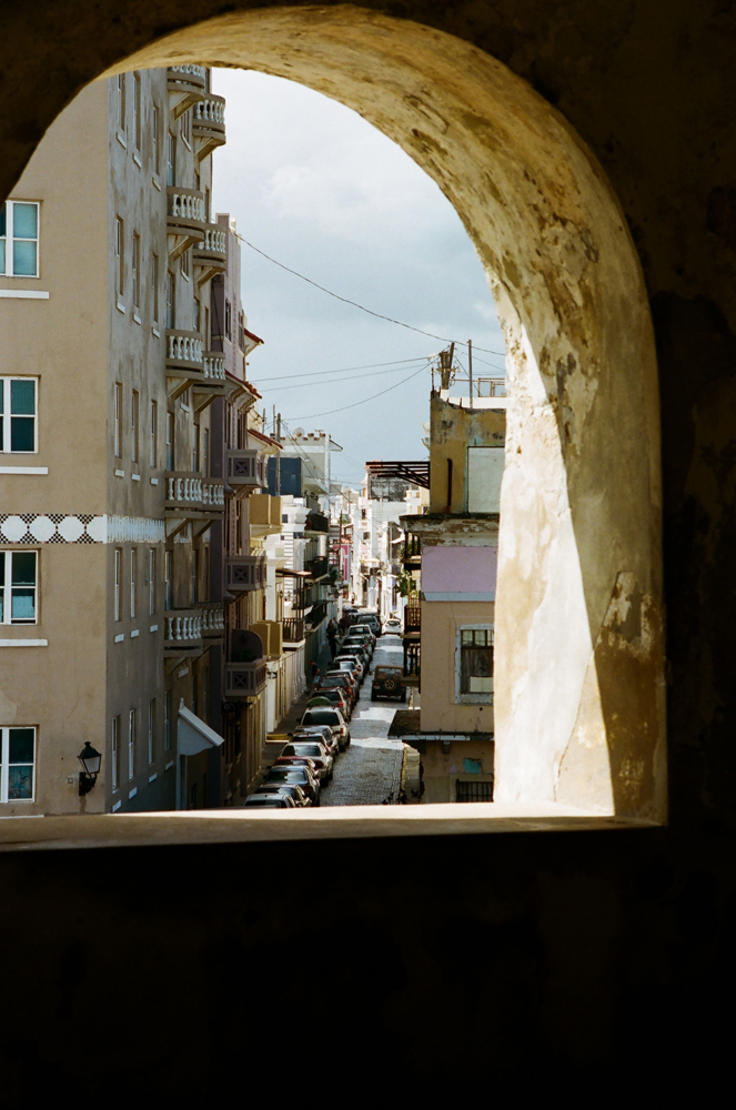
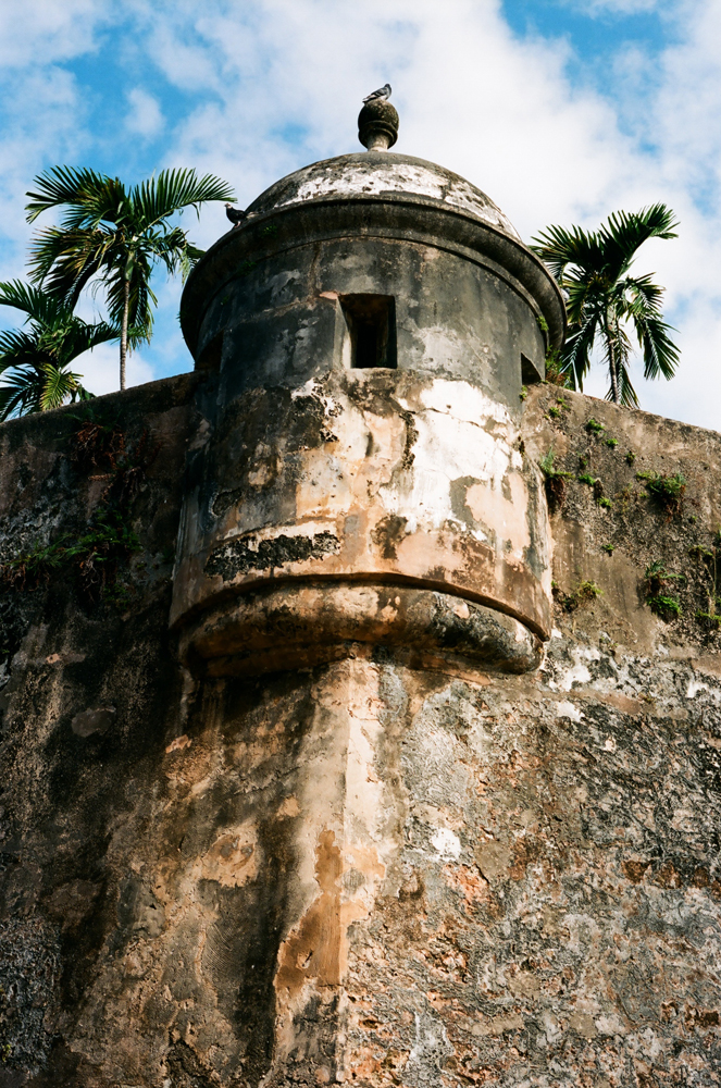
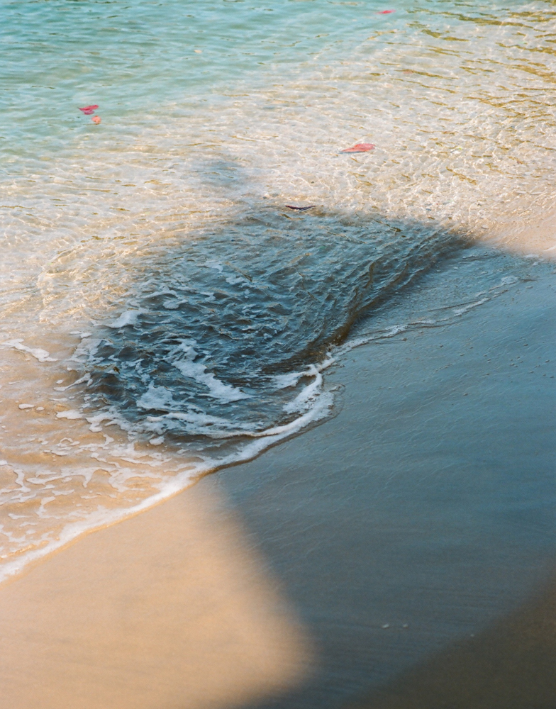
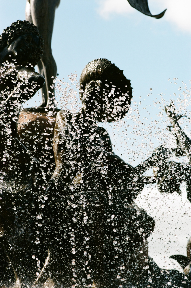
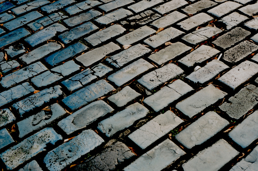
This time, I was paying attention to creating abstract compositions, which is easy in some ways because the tropical light is so strong, even early and late in the day you get powerful shadows and directional light, unless you’ve got profound overcast. The wrinkle is color- because our natural perception of the world is color, working with color film tends to emphasize our connection to the reality of the subject and distract from perceiving it as just line and form. I hope I’ve managed with a few images to challenge that limitation. I know for myself as a predominantly black-and-white photographer that switching gears to see and think in color is hard – some of the photos I took on this trip I can look at and see very clearly that they would be better as black-and-white images. Sometimes color creates contrast that we don’t see when we are used to thinking only of tone and reflectiveness, and sometimes what looks good as contrast between light and shadow looks god-awful in color because it’s too harsh and the color is overwhelmed.
For those who are interested, all these were shot on Kodak Ektar 100 (with a few using the new Kodak Portra 400). I think it is my new go-to 35mm film, displacing even my beloved Fuji Reala. I like the palette of Ektar better now- the Fuji’s greens are a little too strong, the blues and reds a little weak compared to the Ektar. I’m also highly impressed with the Portra 400. I brought along two rolls of it thinking I might use it for some night photos. Dummy me didn’t segregate it from general population in the film pocket of my camera bag, and I accidentally grabbed a roll and loaded it thinking it was still the Ektar 100 (BAD Kodak – the design for the canister is identical except for the text label, so you can’t tell easily through the plastic tube which is which). The upside is, I can almost not tell any difference between them, at least in a scan and a 4×6 print. I’ll let you look through the gallery and decide for yourselves which is which. I’m not telling.