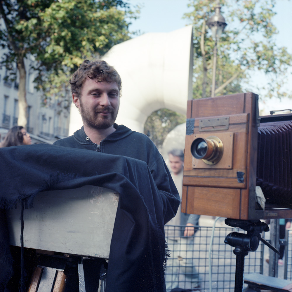
Meet Hans Zeeldieb, the street photographer working outside the Pompidou Centre. He was set up with his vintage 5×7, paper negatives, and portable darkbox doing portraits for 15 Euros a pop. He shot and developed them on the spot in 15 minutes. We struck up a friendly conversation when I saw his camera and he saw mine and talked a lot about photography. He sent me down the street a few blocks to the Centre Iris to go see an exhibit of wet plate collodion images by Jacques Cousin and several of his students, as well as some work by my friend Quinn Jacobson. Several years ago, I was involved in a gallery space in Hyattsville, Maryland called Art Reactor, where I curated a show of photographs made using the whole plate format*, and Quinn was one of the artists I selected. I think I made Hans a little nervous, as he overexposed the image of me. He did capture a good expression of me though, so I was happy to support a fellow working photographer.
In the first photo, I caught Hans with his hands in the darkbox, processing a print. The way it works, he exposes a paper negative in the camera, then develops it in the box. After the negative is developed, he sandwiches it with another piece of paper, opens a window in the dark box to expose it again, and processes the second paper, which now has a positive image. There are several advantages to this process – by working with paper, the development and fixing is much faster than with film, and you can use the same chemistry for both your negative and your finished print. I’ve seen or read about other itinerant photographers using much the same technique around the world, from Madrid to Kabul.
Hans with his camera, processing a photo
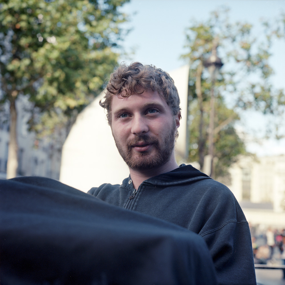
Here is a portrait of Hans outside the Pompidou Centre, just a close-up this time without the camera in the frame. He seems a little lost in thought – I think he was counting time for the print he was developing.
Hans, at the Pompidou Centre
* Whole Plate format is the original photographic format, defined today as 6 1/2 x 8 1/2 inches. It is not entirely certain how this size was chosen by Daguerre as the plate size he wanted to use, but reasonable speculation ties it to book printer’s printing plates. It has varied in its specification over time, but it settled on the 6 1/2 by 8 1/2 size by the late 19th century.
Around 1832 Parisian-born Charles-François Bossu (1813–1879) shed his unfortunate last name (bossu means hunchback in French) and adopted the pseudonym Marville. After achieving moderate success as an illustrator of books and magazines, Marville shifted course in 1850 and took up photography, a medium that had been introduced 11 years earlier. His poetic urban views, detailed architectural studies, and picturesque landscapes quickly garnered praise. Although he made photographs throughout France, Germany, and Italy, it was his native city—especially its monuments, churches, bridges, and gardens—that provided the artist with his greatest and most enduring source of inspiration.
By the end of the 1850s, Marville had established a reputation as an accomplished and versatile photographer. From 1862, as official photographer for the city of Paris, he documented aspects of the radical modernization program that had been launched by Emperor Napoleon III and his chief urban planner, Baron Georges-Eugène Haussmann. In this capacity, Marville photographed the city’s oldest quarters, and especially the narrow, winding streets slated for demolition. Even as he recorded the disappearance of Old Paris, Marville turned his camera on the new city that had begun to emerge. Many of his photographs celebrate its glamour and comforts, while other views of the city’s desolate outskirts attest to the unsettling social and physical changes wrought by rapid modernization. Taken as a whole, Marville’s photographs of Paris stand as one of the earliest and most powerful explorations of urban transformation on a grand scale.
By the time of his death, Marville had fallen into relative obscurity, with much of his work stored in municipal or state archives. This exhibition, which marks the bicentennial of Marville’s birth, explores the full trajectory of the artist’s photographic career and brings to light the extraordinary beauty and historical significance of his art.
I went this weekend with my parents to see this exhibit. It is a wonderfully presented exhibition, and proof positive that when the National Gallery tries hard to do a good photography show, they can. The exhibition had special resonance for my father and I as we have just been to Paris, and trod the same streets documented in these photographs.
The exhibition has over 100 prints of Charles Marville’s work on display, ranging from early salt-paper portraits made from calotype negatives (negatives made on paper) to large albumen prints of architectural studies from glass collodion negatives. His architectural works have a significant sociological aspect as they document neighborhoods in transition from medieval warrens of twisted streets and cantering buildings flung up haphazard against one another, populated by the Parisian working class, to the modern, wide boulevarded, sanitized, luxurious Paris created by Baron Haussmann that we think of today.
Among the modernizations he documented were the new gas street lamps being installed, and the public urinals Haussmann designed to improve public sanitation (a major obsession of his). While many of the street lamps were preserved with electrification and can still be seen today, only one of Haussmann’s urnials still stands on Parisian streets.
Marville even includes himself in this transition, as he frequently used himself or an assistant as a stand-in for scale and emotional impact amidst the tumult and construction/destruction he photographed. He even photographed his prospering studio in a location that a scant few years later would also fall victim to Haussmann’s ‘modernizations’.
At the peak of his career he was the official photographer of Paris, but by the time of his death, he had faded into obscurity, his work ending up stored in state and city archives, and not a single obituary was published to mark his passing. He may have died in obscurity, but his work survived and preserved the city in transition, sometimes with his images being the sole record of the city that was.
The exhibit will be traveling to the Metropolitan Museum of Art in New York in January. If you can make it, it will be well worth your while.
Since Photostock is all about photography, I thought I’d lead off this post with photos about cameras and taking pictures. The first photo is Jaime Young’s 9″ Cirkuit panoramic camera. A Cirkuit is just an ordinary Graflex field camera, but with some special modifications – it comes with a giant geared wheel and a series of reducing gears and flywheels to make it rotate up to 360 degrees and a special back that holds a 9″ tall roll of film. You can change the speed of rotation and the amount of rotation through changing gears and flywheels and adding stops to the large geared wheel. Jamie did a big group shot with the Cirkuit at the workshop facility dedication ceremony, where we had almost 70 people. The Cirkuit was absolutely needed this year to get the whole group shot done. One of the cool things about the Cirkuit is that because it rotates at a relatively slow speed, once the lens passes you, you can get up, run around, and get back in the picture, so you appear twice (or more). I’m itching to see the final print from the Cirkuit – some folks did just that, the run-around, and so they will be in the photo two, three, or in the case of one or two jokesters, even four times.
Cirkuit Graflex Panoramic Camera
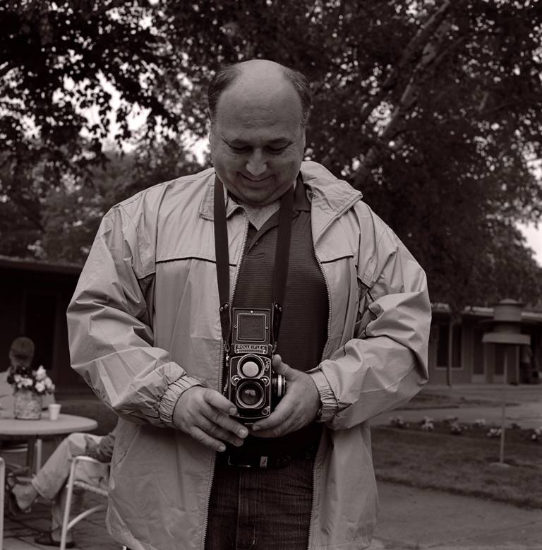
This is Steve Zimmerman, with his Rollei. We shot dueling Rollei photos of each other in a fit of silliness. His Rollei has a great story – he was out photographing in downtown Minneapolis, and some guy walked up to him and struck up a conversation about cameras and photography. The guy then pulls a BRAND NEW, IN ORIGINAL BOX Rolleiflex 2.8E, AND an equally brand new Leica M3 with the Summicron f2 lens out of a bag, and gives them to Steve for $100 each. Steve tried to pay him more (each of them was worth about 10x what he paid for them!) but the guy insisted on the cheap price, because “I know you’ll enjoy and appreciate them”.
Steve Zimmerman, Dueling Rolleis
Here’s Steve’s shot of me… why couldn’t he have photoshopped a full head of hair onto me? It would have helped compensate for the double chin…
Me, in a Rolleiflex Duel with Steve Zimmerman
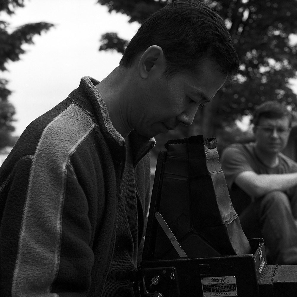
Someone (I forget who) brought a beautiful RB Graflex Super D 4×5 SLR to the event. Here is Dan Lin, a fantastic photographer who I’ve done a print trade with before, playing with the Graflex. Alex L is in the background.
Dan Lin, Trying Out A Graflex
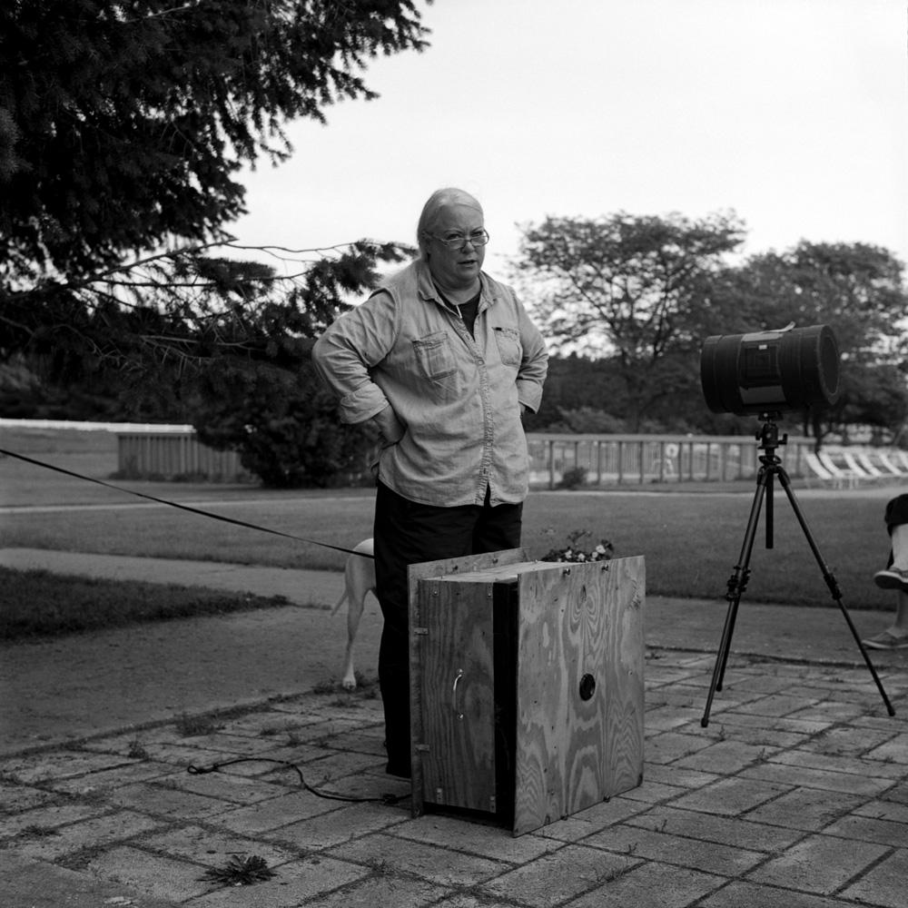
And here’s Judy Sherrod again, with her pinhole cameras. The one in front of her is the first version of her 20×20 wet plate pinhole box camera, made of plywood. It has since been retired and replaced with a new, better built one. The drum on the tripod behind her is an anamorphic pinhole. The pinhole is in the end of the tube, but the paper or film goes around the inside, instead of on the opposite wall of the camera. This works because of the way a pinhole works. The pinhole projects light in a very wide circle, not just a cone like a lens does. Doing so allows you to make some very different images.
Judy Sherrod, Pinhole Camera Demo
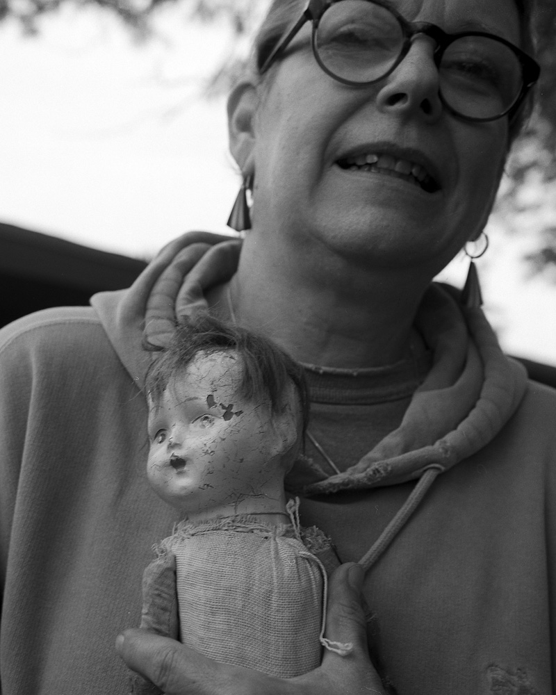
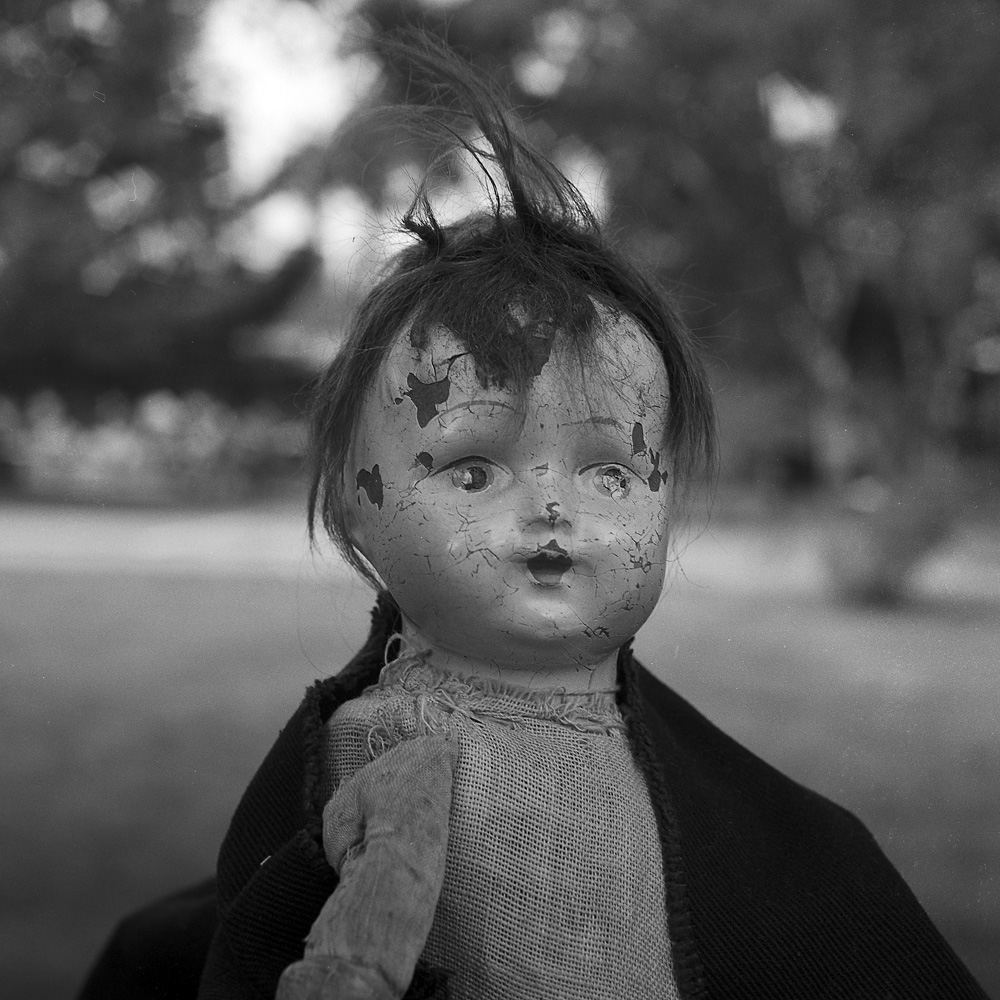
Here’s Dorothy Kloss with her creepy doll. She likes collecting antique dolls, and the creepier the better.
Dorothy and her Creepy Doll
It seems everyone has a Rolleiflex story somewhere or other. I was playing around with my Rollei and it reminded Dorothy that in some boxes of her father’s stuff, she has his old Rolleiflex, and maybe the Rolleinar close-up filters like I have and was using for the shot of her with the doll and this photo of the doll by itself. It inspired her to go dig through her dad’s stuff and find it when she got home.
Dorothys Creepy Doll
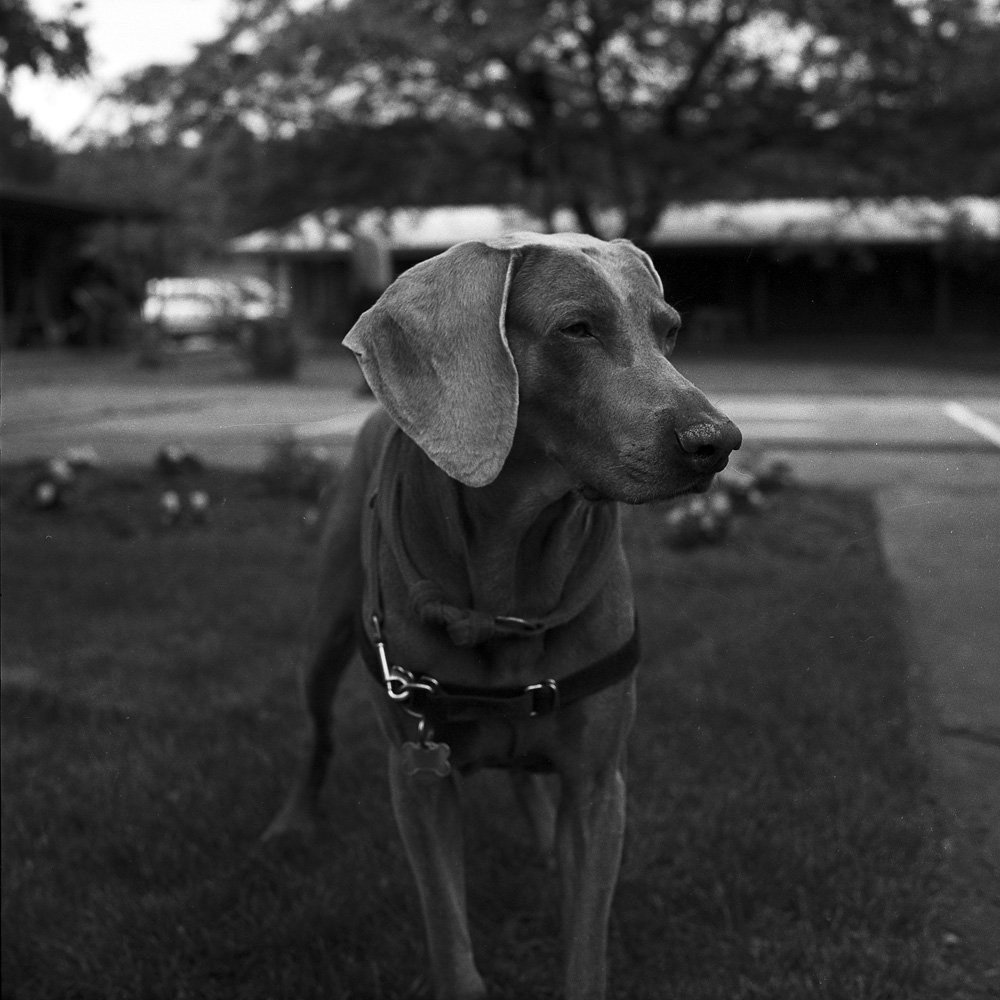
Pele the Weimeraner. Pele was a great dog and a fine addition to the Photostock community. He is very attentive and friendly, and you can see in the subsequent photo of him with Arnaldo, his owner, very fixated on his ball.
Pele
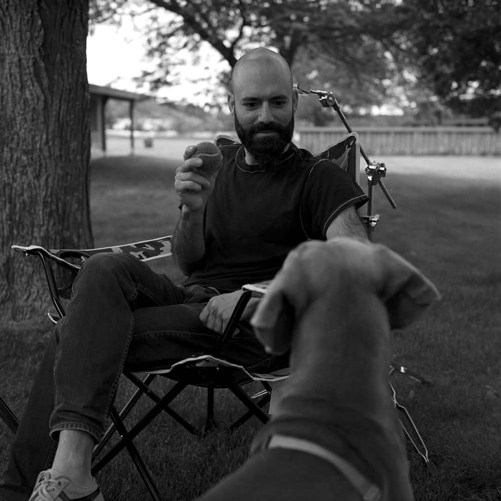
Arnaldo, in the posing chair with head clamp, waiting for the wet plate collodion portrait that Andrew Moxom took of him to develop, playing with Pele.
Arnaldo and Pele
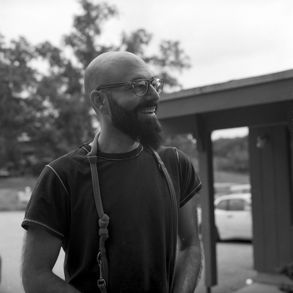
Arnaldo. Arnaldo is a photographer from New York City. He drove to Photostock from New York in a 1980s vintage Porsche 944, and continued on to the Southwest (New Mexico and Arizona if I’m not mistaken) afterward.
Arnaldo Vargas
Mat Marrash. Mat runs the Film Photography Project podcast, and does AMAZING 11×14 Infrared (!!!) photographs. Yes, I said 11×14, as in 11×14 inch film. He has a stock of Efke 11×14 infrared film that he’s working through – the Efke is no longer made, so once his stash is gone, that’s it.
Mat Marrash
Here’s a portrait of Dan Lin, without the Graflex, but with his pipe. I don’t think I got one of him wreathed in smoke from it, but I might have one like that on one of the remaining rolls from the trip I still have to develop.
Dan Lin
And in the closer for this post, is Evan Schwab, the son of Bill Schwab, our host and organizer for the event. Evan is a terrific little guy, very smart and a good conversationalist. A kid even WC Fields could like.
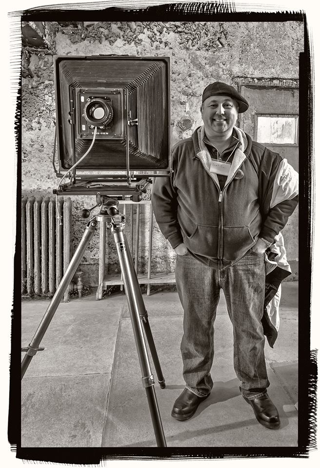
Here’s a photo of me at Eastern State Penitentiary with my Canham 14×17, courtesy my friend, Tom Finzel. He does a lot of HDR stuff and does it with subtlety (well, most of the time 🙂 ). I really like the image he made – I look good in this shot, which is all the more amazing since I smiled and held steady through about 15 seconds worth of HDR multiple exposures. I would have made a good model for a daguerreotypist!
Tom was trying to make an image that looked like platinum/palladium. While the color’s too neutral, it’s not a bad likeness.
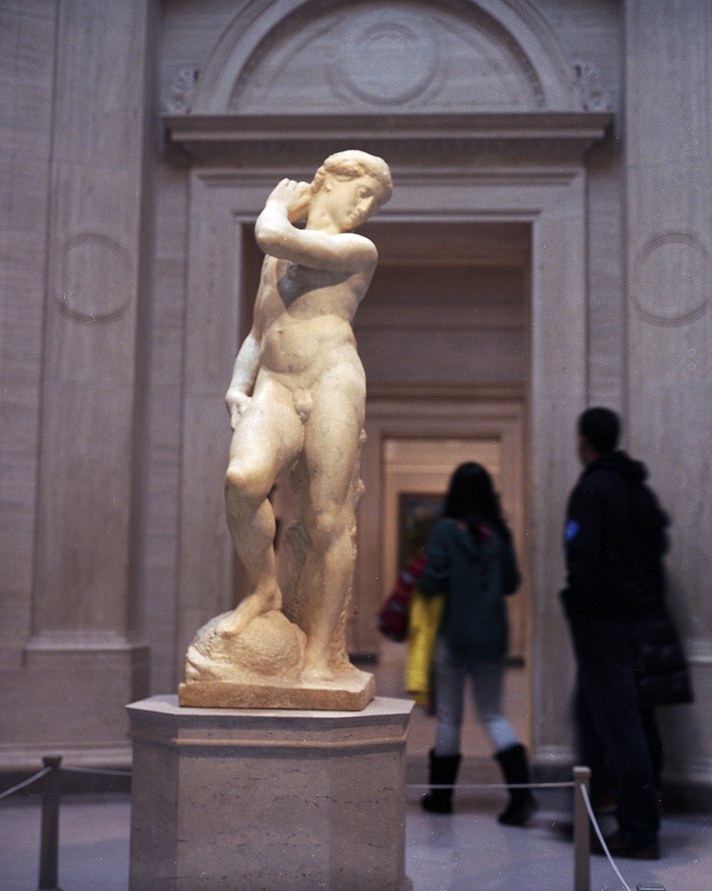
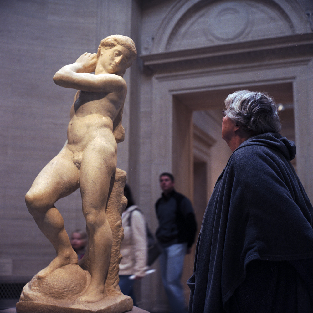
From January to March of this year, Michelangelo’s David/Apollo, normally resident in the Bargello museum in Florence, was on loan to the National Gallery of Art in DC. Being a huge Michelangelo fan, I had to go see it. The last time it was exhibited here in the US was during Harry Truman’s presidency. In fact, there are only three known or attributed works by Michelangelo in the United States (a drawing and two sculptures, one of which is in a private collection), so it’s a rare day when you can get to see something from his hand.
One of Michelangelo’s “unfinished” sculptures, much speculation exists around the entire series of the “unfinished” carvings – were they unfinished because Michelangelo was always biting off more than he could chew and didn’t have time, or did he deliberately leave them “unfinished” because he was making an artistic statement about the relationship between the image, the stone and the carving? Either way, they make for a tantalizing insight into the mind and the technique of one of the world’s greatest sculptors.
David/Apollo Admirer
I’m almost as fascinated by the people who come to look at art as I am the art itself. Sometimes (frequently, actually) I’m very annoyed with museum patrons because they’ll blithely traipse right between you and a work or the wall label for it that you’re trying to look at, rented headset on, completely oblivious to the fact that you now cannot read or see the exhibit. But when they’re not blocking your view, the way they look at art is endlessly interesting. Some will point, some will stand back and appraise, some will “print-sniff” and get close enough the guards have to warn them off. Some will ingest silently, others will pontificate to their audience of friends (and anyone else within earshot), often as not with art history textbook opinions and/or not entirely accurate “facts” about the artwork and/or the artist.
Regular readers of my blog will probably remember the notice I posted last year about Katherine Thayer’s passing. Katherine was a tremendous gum bichromate printer and an extremely generous teacher of the process. Lightbox gallery in Astoria, Oregon is organizing a commemorative exhibit and has put out a call for entries for the show (link above).
To reprint the notice on the LightBox web page,
LIGHTBOX PHOTOGRAPHIC GALLERY CALL FOR ENTRIES
Two Friends Who Never Met
An Exhibit of Gum Bichromate Prints
In Memory and in Honor of Katharine Thayer
featuring the work of Katharine Thayer and Diana Bloomfield
with a juried exhibit of Gum Bichromate Prints
Juror – Diana Bloomfield Diana’s bio
We welcome you to share in the beauty of the hand-made print, and specifically, the gum bichromate print,
with a juried exhibit as part of this memoriam for Katherine.
This exhibit serves to illuminate Katharine’s artistry— her admiration for, dedication to, and mastery of gum printing.
This exhibit also celebrates her legacy and her years-long friendship with Diana.
I had a mental picture of the kind of photograph I wanted to make. I had never seen any photographs like them, but I was determined to find a way to make them, these pictures I saw in my head. Their colors were soft and relatively unsaturated, but with a kind of glow about them . . . I set out first to teach myself to print in gum, then to adapt the method to produce the kinds of pictures I wanted to make, and have been making them ever since – Katharine Thayer – katharinethayer.com
Katherine Thayer was a long-time resident of Oregon and a masterful gum bichromate printer. She was also a generous teacher to those who struggled to learn this ultimately rewarding, yet often challenging, 19th century printing process. In Katharine’s words, “learning gum printing involves some trial and error, and there’s no short cut to mastery; a person successful in mastering the process will have some staying power and possess a sense of humor and some tolerance for failure.”
Katharine was also a decades-long member of “The List” , an Alternative Process listserv— a free and open online discussion list related to all things ‘alternative’ in the photographic printing world. For Katharine, of course, this meant gum printing. Currently, over 600 people world-wide are members of this List, and this is where Diana Bloomfield, a native North Carolinian, photographer and printer, first met Katharine. In the middle of teaching herself to make gum prints, Diana gleaned invaluable bits of information from those on the List, but she learned the most from Katharine and from her website (KatharineThayer.com). In the midst of all the questions, and in-between Katharine’s tireless mentoring, the two became good friends. They corresponded via email almost daily, and they were once in a group pinhole exhibit together in the Seattle area. Diana was also in a group exhibit at LightBox, where Katharine was a frequent visitor. Still, they never met.
Over my lunch break today I caught a wonderful exhibit at the National Gallery of Art entitled Faking It: Manipulated Photography Before Photoshop. The exhibition opened in mid-February and runs through May 5th. It moves to Houston in July to October. One of the singular points the exhibit drives home is the fact that photography has always been subject to manipulation even from its earliest days when daguerreotypes were hand-colored to make them more ‘realistic’, and skies were printed in via multiple negatives to compensate for the shortcomings of early emulsion formulas. One of the coups of the exhibition is the inclusion of Steichen’s “The Pond – Moonlight” from the collection of the Metropolitan Museum of Art. Most people familiar with the work know it as a multi-layered gum bichromate over platinum print. What most don’t realize, however, is that the image may in fact be a composite with the moon having been added, and may also never have been photographed by moonlight (a feat that would have been difficult to achieve with the emulsions available even in 1904). The moon in the image may be an addition or otherwise a manipulation of the print, and the nighttime feel of the image merely an effect of the color choices in the gum layers of the print.
Images have been manipulated for a whole host of reasons, from a desire to make them more real (hand-colored daguerreotypes) to conveying an inner reality (surrealist photography) to evoking an emotional resonance (The Pond, Moonlight) to suggesting a reality that could exist (a Zeppelin docking at the docking tower of the Empire State building) to creating something that never existed (giant crickets consuming giant produce on the back of a wagon) to re-shaping reality for political ends (Nazi and Soviet propaganda posters and publicity photos). All of the above are represented in this exhibit, and placed in an historical and artistic continuum.
There has been much controversy lately over questions of photojournalistic integrity with regards to digital manipulation to include/exclude details to tell a story, from the Iranians photoshopping additional rockets into a picture of a missile test to Edgar Martins getting caught claiming his work was unmanipulated when in fact he was heavily altering his images. This is not new, but in fact the question of manipulative ethics is far more unsettled for far longer than most people realize. In 1906, Horace Nichols was photographing the Epsom Derby on a rainy day. There were gaps in the crowd, so to convey the feeling of the event he wanted to convey, he spliced in a whole sea of additional umbrellas. This was common practice for Mr. Nichols, and he rarely cited it in the captions of his images, but he sustained a career as a serious photo-journalist. It makes you think long and hard about your assumptions of photographic verissimilitude and the historical moment in which photography ‘ceased to tell the truth’.
The exhibition is well worth the visit if you have an interest in the history of photography and questions of honesty and integrity of the photographic medium.
I’ll be up in New York in April for a weekend and so I’ll try to catch it then and see the two shows as brackets for one another. The comparison should be very interesting.
I found a new blog today from a fellow WordPress-ian (is that even a word?) who has a beautiful style, very Sugimoto-esque without being a copycat. It’s entirely in German, so I’ve had to go on images alone, but I thought it was worth relaying.
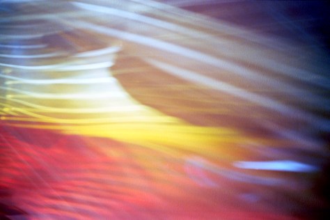
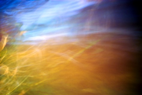
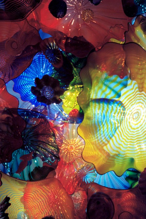
This was taken over the Thanksgiving weekend at my visit to Richmond, Virginia and the Dale Chihuly glass exhibit at the Virginia Museum of Fine Art. There was a passageway between rooms where the ceiling had been filled with all these marine-inspired glass forms and then lit from above. The glass forms (seen in the last image) then projected these really abstract color and light patterns on the walls. These were interesting enough that I tried to capture some of the effect of it.
Shot with my Contax G2, 21mm lens, and Kodak Ektar 100 film – hand-held.
This is a blended platinum/palladium print (60% platinum, 40% palladium) print, on Bergger COT320 paper. This was by a student from my Intro class, but I reprinted it for this session (the student left the negative behind after the Intro class, and I happened to really like the shot anyway). This one was coated using a glass rod as opposed to a brush, to demonstrate the difference in the coating technique, and the final appearance of the print.
Crystal Pool, by Patrick Brown
This is a palladium print on light Kozo paper, by Patrick Brown, one of my students in Advanced Topics. He was also in my Intro class. It’s so nice to get follow-on students so you can see their progress!
Kozo paper is a Japanese paper made from tree bark, and it is surprisingly strong for as delicate as it is – this is perhaps a 90 lb paper. It does have a tendency to dissolve in aqueous solutions, but if properly masked when developing, the image area can be preserved, even if the edges do get fringed a bit. This is a perfect example. I included the paper margins to show more clearly what the paper texture looks like.
We had some challenges this class session – the original idea was to try out some different paper types, and I had obtained a sampler of several kinds. We started the morning with Stonehenge, which was supposed to be a good paper, but something was dramatically wrong with the batch we got, as we were making 30 minute exposures and still coming up weak and flat. After this is over, I’ll get a little more for myself and try pre-acidifying it to see if that helps, but no mention of acidification was made in the sample kit and I couldn’t find any reference to acidifying it online. Fortunately we didn’t waste too much time before figuring out it was the paper at fault and not the chemistry, and life moved on.