I’m going to have work in not one, but TWO shows in Mexico City the end of June. Show number one is at the Museo Archivo de la Fotografía. The show is called “Geografía del Cuerpo” and features work by eleven photographers creating work dealing with gender, sexuality, identity and politics.
This show will be a minor retrospective for me as it includes work I’ve made across the last 20 years. I’m including some unique gum bichromate prints that I made in the 2000s, some infrared shots of male nudes in the landscape printed in palladium on kozo paper (a Japanese paper made from kozo bark which is almost tissue-like) that were shot in the 2010s and printed recently, and some studio nudes I did just last year. Pensive (Kodak HIE, palladium on Awagami Platinum kozo paper, unique print)Torso Moreno (four color gum bichromate, unique print)Narcissus (palladium on Saint Armand Frobisher paper, edition of three)
The opening reception will be held on Wednesday June 26 from 5-7 pm, and the show will be up through the end of July. I will be in attendance at the opening reception, so if you’re in the neighborhood please stop in and say hi!
The second show also features images dealing with gender, sexuality, identity and politics, this time at Eucalipto 20, an independent art center in the Santa Maria Ribera neighborhood. The gallery is a short walk from the Buenavista bus/metro/train station. The building is somewhat nondescript on the outside, so watch carefully for the street numbers.
James, Rocks, San Francisco 2001 (platinum print, edition of 5)James, Tree, Lands End Beach, San Francisco 2001 (platinum print, edition of 5)
The opening reception will be June 22, so I will not be in attendance, but we will have an artists talk during the week, dates and times to be announced.
I’ve got a class coming up soon – Thursday evenings starting September 27, co-taught with Mac Cosgrove-Davies. It’s an alternative process survey course, covering platinum/palladium, gum bichromate and cyanotype. We will be starting out by going through the process of making digital negatives for the platinum/palladium process, and then printing using platinum/palladium. I will be walking students through the process of how to create your own correction curve so that they will have the tools handy for making appropriate correction curves for their own personal environments and for whatever process(es) they want to work in. We will cover basic techniques, preferred materials and digital hardware.
In subsequent weeks, Mac Cosgrove-Davies will be teaching working with cyanotype and gum bichromate. Mac has been working with alternative processes, most specifically gum bichromate and cyanotype, for over 40 years.
This will be my first time co-teaching with Mac, who is an outstanding instructor as well as a meticulous artist and technician with historic photo processes.
You can register at the link below. Course meets for five sessions on Thursdays from 7-9:30 PM, starting September 27, and runs through October 25. Tuition is $350.
Photography has been my passion for more than 50 years, first with silver printing, and for the last 40 years with the historic processes.I still delight in the hand-crafted uniqueness of gum bichromate, cyanotype, carbon, and oil printing, all printed from in-camera negatives (i.e. film).I also enjoy making the equipment, and sometimes the cameras, that I use.Working with large cameras feeds the more contemplative side of me, especiallyin the solitary space under the dark cloth where the bright image is my entire perception of the world.A successful photograph conveys the artist’s emotional, aesthetic statement in an engaging manner.For me this turns out to be in images small by today’s standards.I prefer to think of them as an intimate discussion with the viewer.It pleases me to pull a 5×5 inch portfolio box from my pocket to respond to the frequently asked question of what I do for fun.
Artist Statement – Scott Davis
Scott Davis is a large format photographer working with antique and historic photographic processes. His work has been exhibited across the United States and internationally. He is a published author on platinum/palladium printing, and teaches classes in platinum/palladium. His personal work includes the DC cityscape, the human figure, and wherever he happens to be with a camera. He is currently developing an exhibition plan for Sinister Idyll: Historical Slavery in the Modern Landscape, his documentary series about how the landscape of Maryland, Virginia and Washington DC have been marked by the impact of African slavery and its echoes that reverberate today.
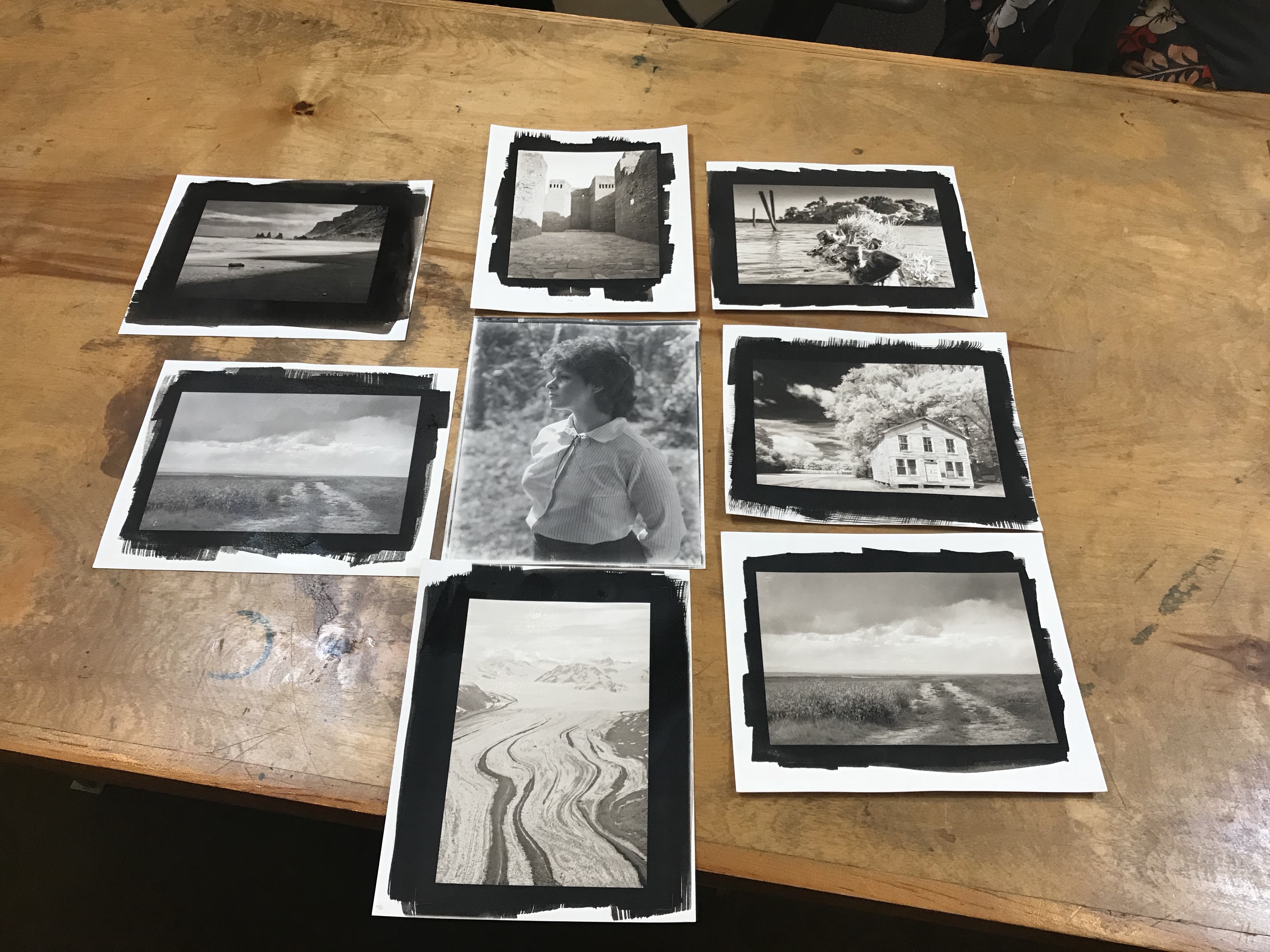
Examples of past student work from digitally enlarged negatives:
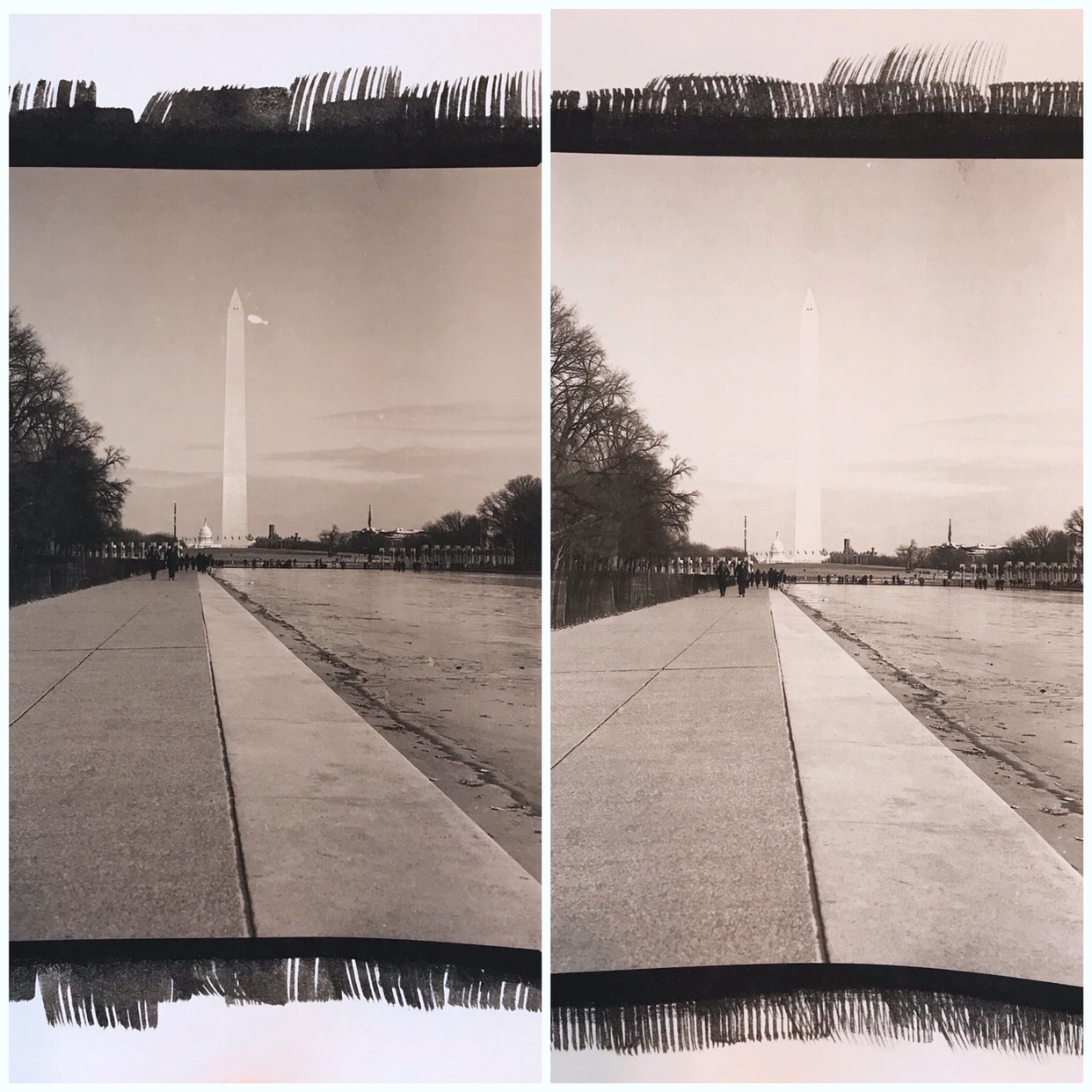
I’m sharing these two images as demonstration of the effect of NA2 on contrast, and how a little goes a VERY long way. NA2 is shorthand for Sodium Platinum, a restrainer/contrast boosting agent. It affects the color tone of the print as well as the contrast, giving an overall more neutral/cold color to an otherwise warm chocolatey brown palladium print. What many beginning pt/pd printers don’t get is how little NA2 you need to effect contrast and tone shifts in your prints. This post illustrates that impact.
NA2 is only useable with pure palladium prints- if you want to include platinum as a blend, or make a pure platinum print, you have to use dichromate or something else as a contrast booster because the platinum in the NA2 binds with the platinum in the solution and primarily affects the highlights, not actually increasing overall contrast, and the net effect is flushing expensive platinum down the drain.
Both prints were made with 9 drops palladium/9 drops Ferric Oxalate, on Hahnemuhle Platinum Rag paper, exposed for 15 minutes. Image size is 8×10 inches. The print on the left had no NA2. The print on the right had 1 drop of 5% NA2 added. Obviously this is way too powerful. I’m going to re-print trying a 1% and a 2.5% concentration to see which gets me where I want (still retaining detail in the Washington Monument, but brighter highlights and more tonal separation in the trees on the left).
Apologies for the quality of the reproduction photo- it was shot on my phone and collaged using a phone app, but it does reasonably accurately replicate the contrast differences between the prints. The tonal shift is less obvious because the phone is not so good at color temperature correction.
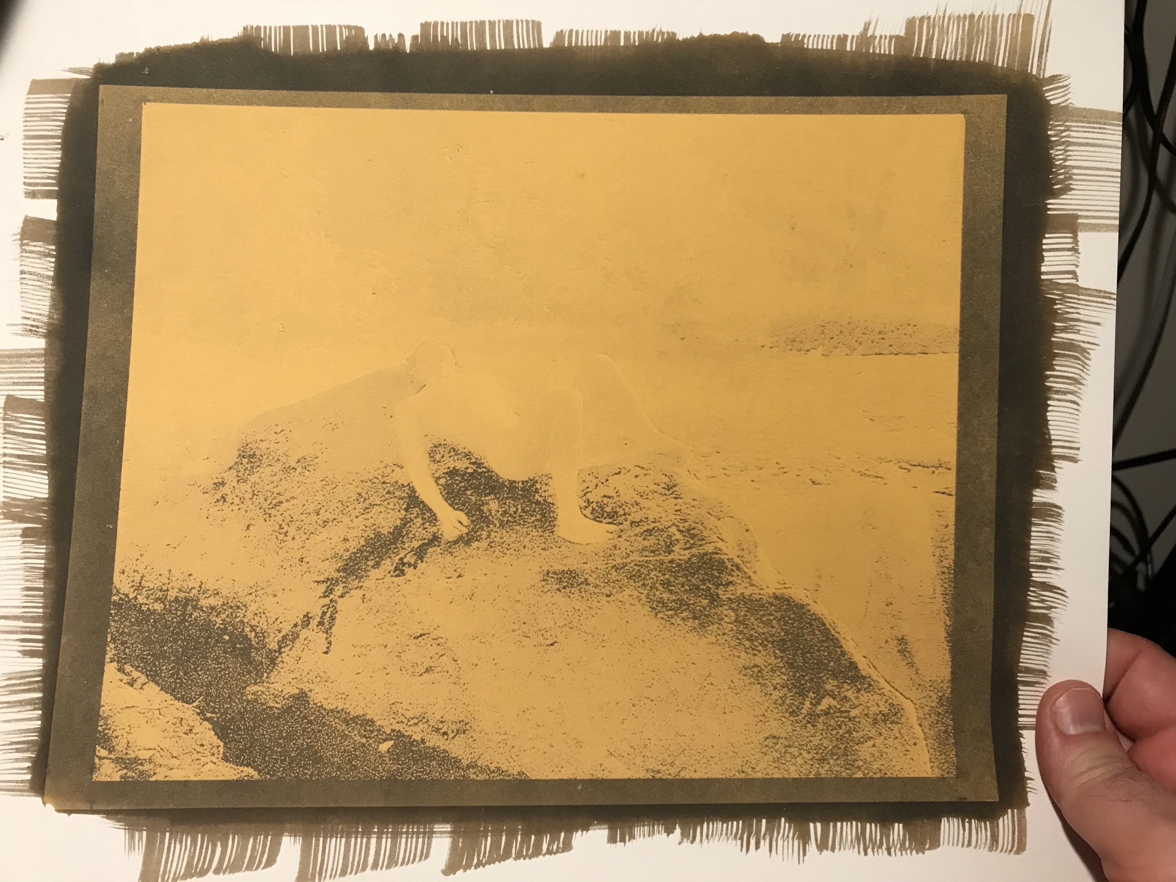
For those who haven’t seen the palladium printing process end-to-end, I thought I’d share a moment from the process to let you see the magic happen. It’s a much faster process than silver printing, in the development stage. The image, when exposed but not yet developed, is a “ghost” image. You can generally see the form, but not the fine details, nor the overall tonality. Depending on the overall image tonality, you may see very little at all inside the exposed borders of your print. This is why it is a good idea to coat outside the borders of your image (but not too much- every drop of emulsion costs money!) – you can judge proper exposure by looking at your borders if you’re not used to printing.
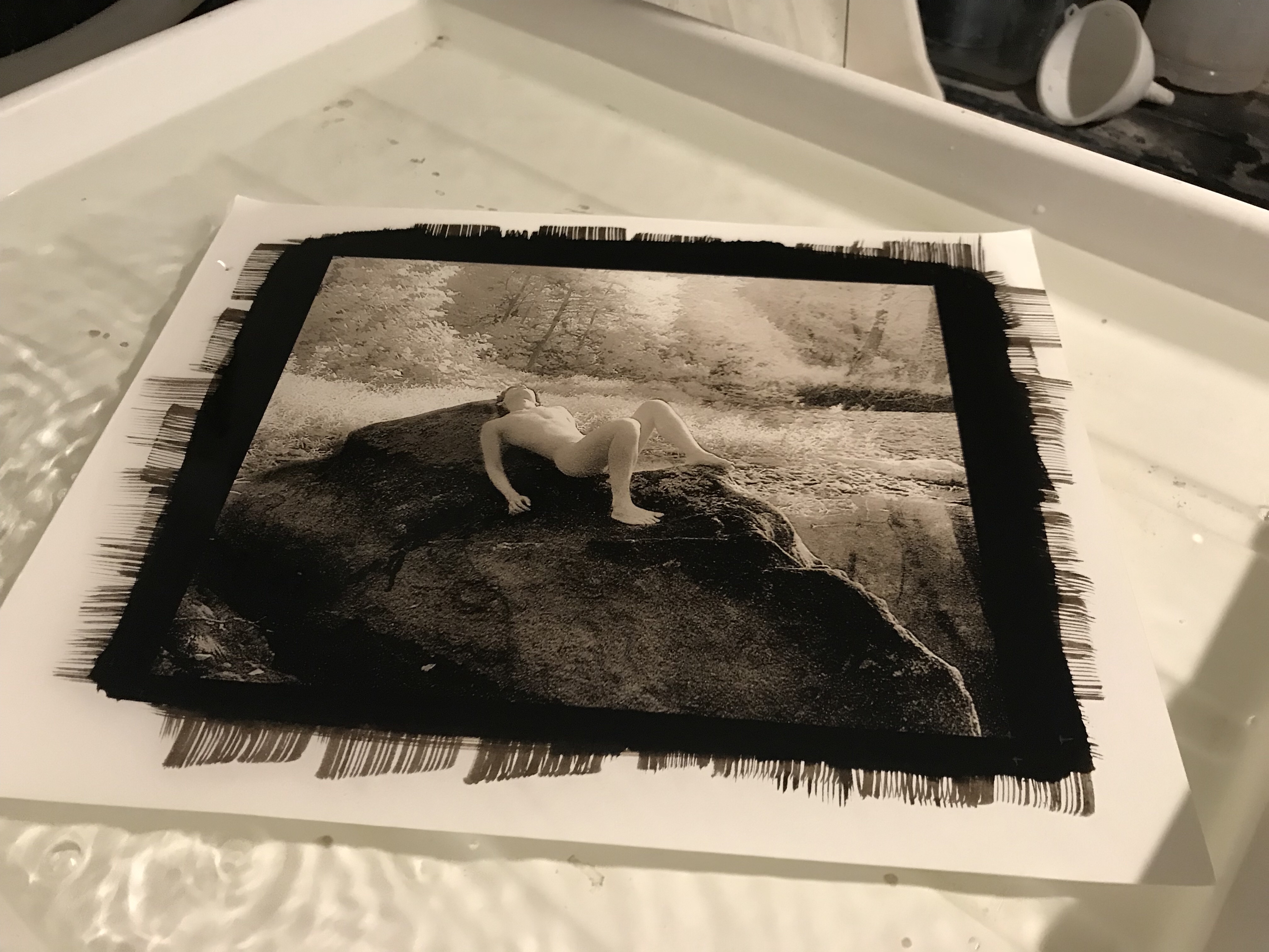
Then, pour on the developer, and WHOOSH! Magic!
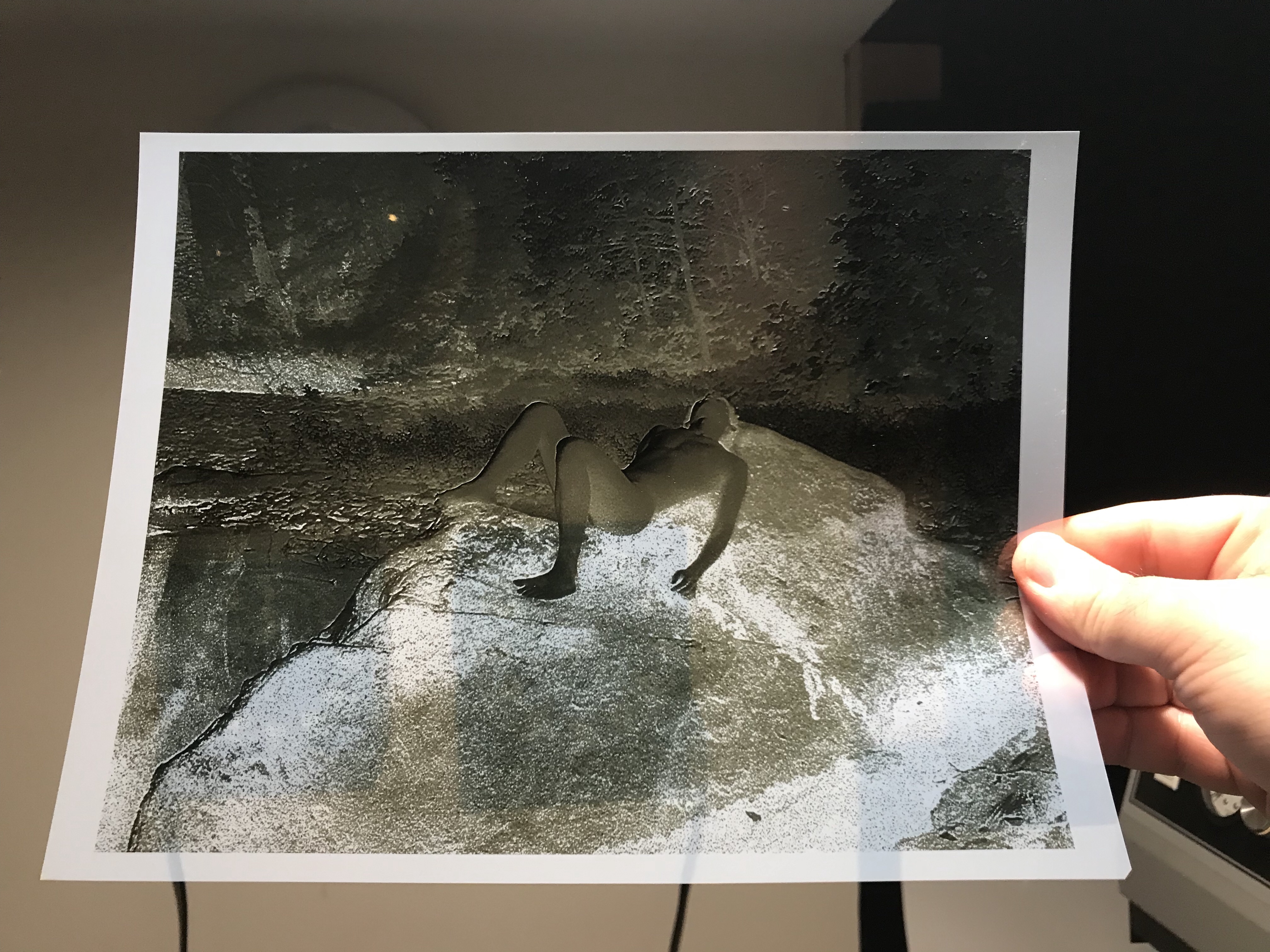
And the finished print:
This was from a 35mm infrared shot, scanned and enlarged on Pictorico transparency media.
If you’re curious what a digital negative even is, or what it looks like, here’s the negative for that shot:
I have two upcoming classes this spring at Glen Echo Photoworks, Introduction to Large Format Photography, and Introduction to Platinum/Palladium Printing. I’ve scheduled them so that students of Intro to Large Format can have somewhere to go with their new camera skills. Intro to Large Format runs March 11th – April 22. The course covers what you need to know to take advantage of the medium – we start with the basics of the cameras themselves – different camera types, their parts and how they work, why to choose one type over another, lenses and lens selection. We move on to film selection and film handling, loading film and developing it. There are modules on portraiture, still life/tabletop, landscape and architecture. For the Architecture module we’ll do a field trip down to the National Cathedral.
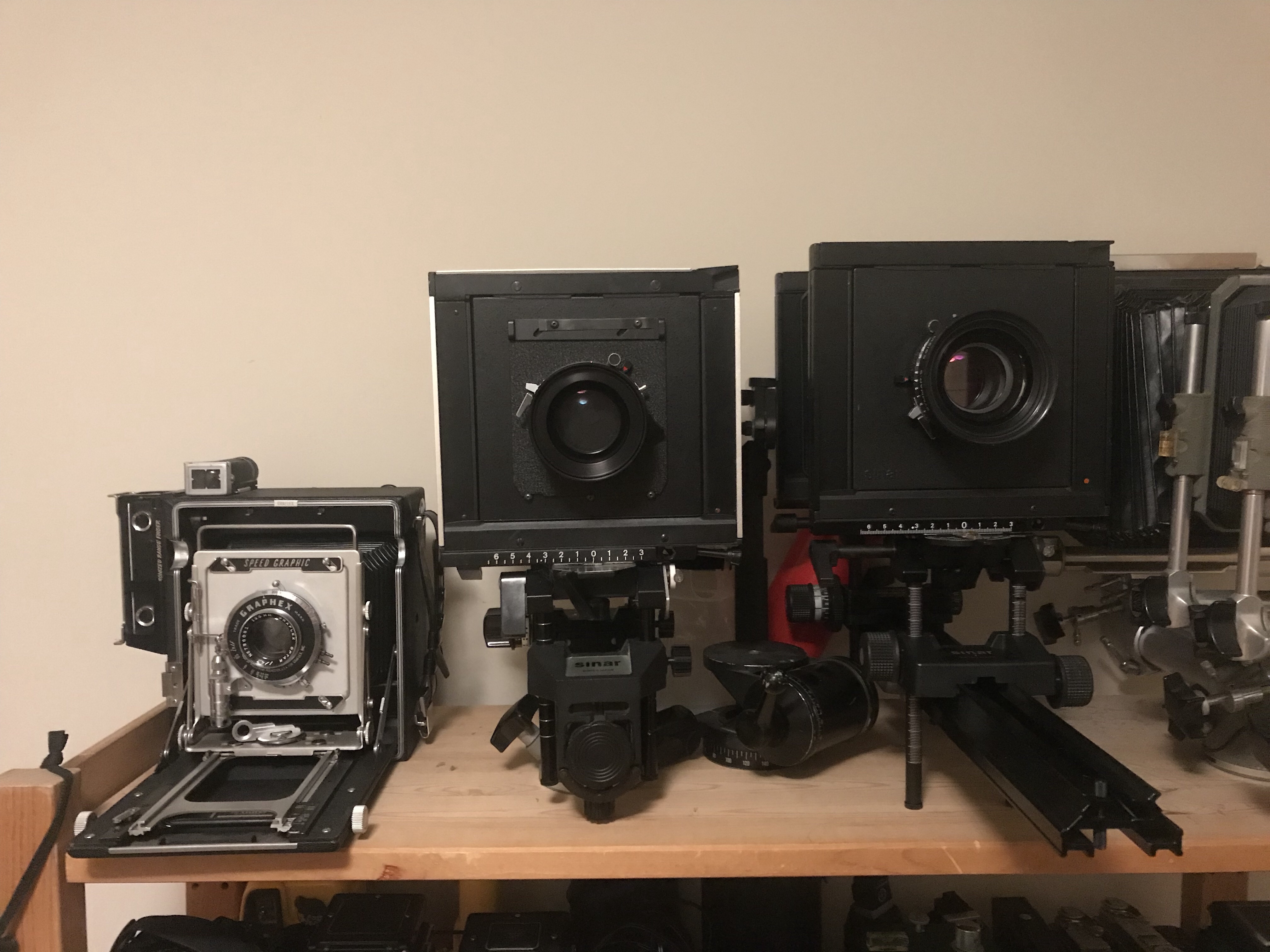
The Family – my set of student cameras (L to R): Speed Graphic, Sinar F, Sinar A1. The 5×7 Sinar Norma you see peeking in on the right is a personal camera.
Due to student interest, I’ve acquired several cameras for student use in-class. If the popularity continues, I’ll look into getting one or two more and setting up a rental program to allow students to check out cameras for the duration of the class.
The next class is Introduction to Platinum/Palladium Printing. I will be including a module on making and using digitally enlarged negatives for platinum/palladium printing with this course. This class runs May 5th and May 12th. This course covers the history of the medium, materials and techniques. We discuss the various tools for making prints – brushes vs coating rods, UV light sources (the sun, black-light fixtures, other options). We go over paper selection and paper handling. In this intro class we will make palladium prints because palladium is the easier medium to work with, but we will discuss and demonstrate the differences between platinum and palladium. Contrast control techniques will also be covered, and developer chemistry as well. We will work from both in-camera negatives that we make that weekend, and from digital files students bring and/or create from scans.
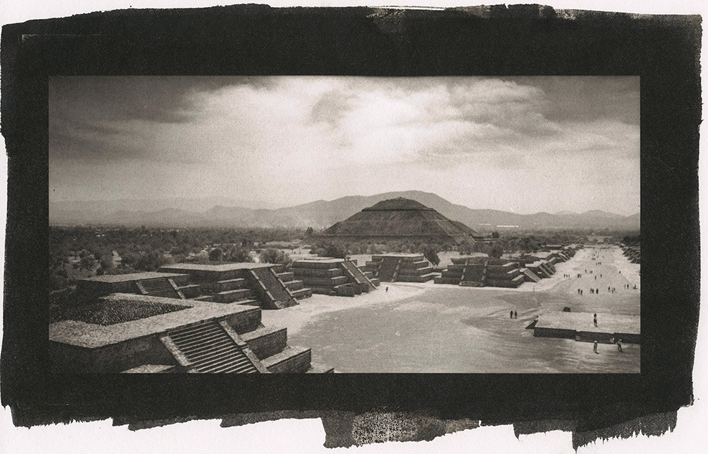
Pyramids, Teotihuacan – palladium print 4″ x 8″ enlarged on Pictorico OHP using an Epson 3880 printer with Ultrachrome K3 inks from a 6cm x 12 cm in-camera negative
To register for the classes, click on the links below:
I recently completed a one-on-one private tutorial in Platinum/Palladium printing with Mat Marrash, who you may know of if you listen to The Film Photography Podcast. I’ve known Mat for several years now, having met him at Photostock in 2013. He’s an extremely gifted photographer who mostly works with an 8×10 view camera, and does a lot of work with infrared film. Mat knows a lot of the same folks I know in the alternative process field, including people I’ve learned from, so I was deeply flattered that he chose me to learn from.
Mat With First Print
Yes, Mat is a very talented photographer in his own right so a lot of what we did in this session was easy for him. BUT, he did make it challenging by starting off working from 8×10 inch negatives, instead of starting with 5×7 (the smaller size is easier to coat evenly when you’re new to the process, and costs 50% less per print). I want to show this as this was his first ever (!!!!) palladium print. We hit the first one dead on, out-of-the-ballpark, ready to frame and go up on the wall. This extremely beautiful process is quite easy to learn and should not be intimidating to anyone interested.
And here is his second ever print, which added another wrinkle – the negative he used was one he had previously shot, not planning to make a palladium print with it. We developed all his film, the negatives we made that weekend along with some other negatives he had made previously, using the development regimen I use for my work, and we were able to produce some excellent prints even from those other negatives.
Mat’s Second Print
Private one-on-one tutoring can be arranged at any mutually convenient time, and can cover a wide range of topics either specialized for fine-tuning your process or just a deep hands-on introduction to the process. Contact me for details on pricing and scheduling – as this is an a-la-carte arrangement, I need to know what you are looking for in order to give a quote. Tuition will include your own set of chemistry and any paper we use in the class.
I’m offering my group class at Glen Echo Photoworks next weekend, December 10-11, if you are interested in getting your feet wet without committing to a one-on-one workshop, This is the perfect opportunity. Tuition is a very modest $250 plus $50 materials fee (chemistry, paper, and all instructional materials). The class runs from 10 AM – 4 PM Saturday and Sunday. You can register here at the Glen Echo Park website.
Just a real quick video of an exposed print being developed. This is what a develop-out print looks like, and how quickly the developer works. The print is almost fully realized in the first twenty seconds of the development cycle, but you still need to give the full two minutes to let the highlights fully develop.
This is what the raw, unexposed double-coated emulsion looks like. I double-coat to get better shadow depth and highlight separation. You can see the two coatings on the lower left. The reason I’m willing to double-coat is that I’m making such small prints that the extra cost isn’t prohibitive.
And the finished print. I think the end result justifies the added labor and expense.
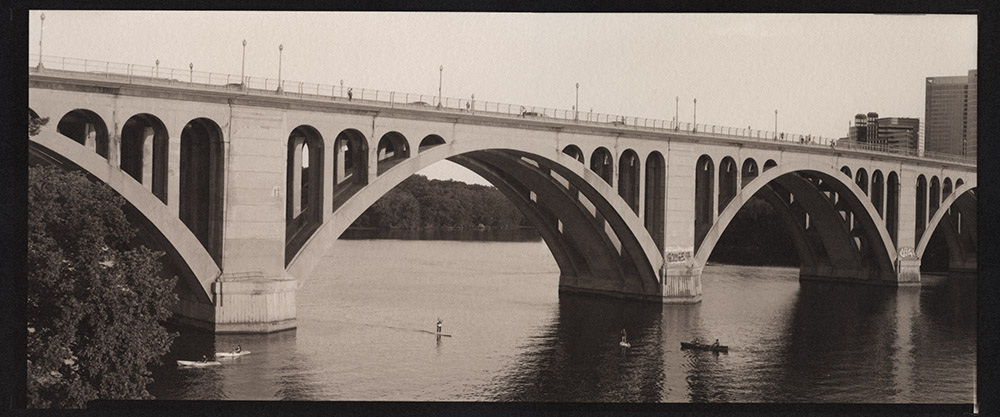
Another print I made this weekend – Key Bridge, in palladium. This is a 5×12 negative from my Canham. For the technically minded, I used a circa 1949 Kodak Commercial Ektar 12″ lens for the shot. It’s a very sharp lens with pleasant rendering, and a good match for the subject matter. I also want to talk for a second about the printing – this is a pure palladium print, with a touch of NA2 added for contrast. Sodium Platinum (NA2 for short) is a contrast agent you can add to a palladium print to boost the contrast if required. NA2 is very powerful stuff – a tiny bit goes a long way. In this case, I needed just one drop of 2.5% NA2 added to the 12 drops of Palladium and 12 drops of Ferric Oxalate sensitizer. NA2 comes from the manufacturer in a 5% strength solution, so you can see how little was needed to give the print some snap.
If you are using blended platinum and palladium, or trying to do a pure platinum print, and are in need of a contrast boost, you cannot use NA2 as a contrast agent – the platinum in it binds with platinum in your paper and what ends up happening is you reduce your highlights, blowing out detail, without actually increasing contrast. If you are using a blend, or pure platinum, you have several options – you can boost the contrast with a different additive, such as gold chloride, you can pre-coat your paper with fumed silica, or you can use a dichromate infused developer. I prefer adding a contrast agent into the emulsion rather than in the developer, because to do the infused developer route, you’ll need to have six or eight bottles of developers with different concentrations of contrast agent, and then you’ll have to play with chemistry to mix up replenisher for each developer concentration as it gets used. That realistically means keeping twelve to sixteen bottles of developer around. The downside to additives to the emulsion is that most of them will alter the color of the print. Gold Chloride will do anything from slightly cooler gray tones to eggplant/aubergine tones, depending on how much of it you use. Sodium Tungstate will actually reduce contrast in the print, and give you reddish brown tones. You can use dichromate in the emulsion as an alternative to the developer, but you must be careful in handling the undeveloped print as dichromate is toxic.
You may recall I recently posted some triptychs I did with my Lomo Belair X/6-12. I had been postponing printing them because I was A: being lazy, and B: I knew that they would be challenging to print because 1: lining up two negatives is hard enough, but getting three is even harder, and these are three pieces of roll film which doesn’t want to lay flat, and 2: I was concerned that there would be too much space between the frames because of the size of the image area vis-a-vis the negative size.
Inertia being the greatest of obstacles, it took me until now to get around to printing them. The challenges of registering the negatives to map my coating area, then re-registering them so they would align properly when exposing were substantial, but not as bad as I thought they would be. I guess there was enough humidity in the room that they cooperated for the most part and didn’t act as dust magnets or tensioned leaf springs while trying to place the cover glass in the contact frame.
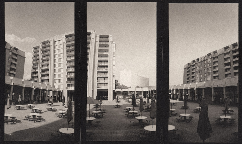
Columbia Plaza, Horizontal Triptych
I think of this first one as a panorama of panoramas – it’s a horizontal panorama in the end, made of three vertical panorama shots. It’s the more conventional of the two in that it shows a fairly straightforward interpretation of the scene.
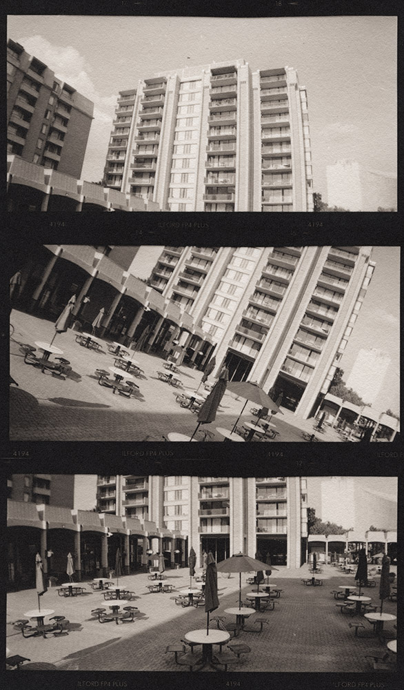
Columbia Plaza, Vertical Triptych
The vertical triptych I got a bit more creative in my interpretation, showing the middle frame askew, and each frame is not discreet in what it depicts – if you look carefully, they overlap in their subject matter, and you could almost do the top and bottom frames as a square-isn diptych.
Both images were printed on #Hahnemuhle #PlatinumRag in pure #palladium. No contrast agent was used, and they were developed in #PotassiumOxalate.
I’m going to be running my Intro to Platinum/Palladium Printing class again this fall, with an expansion into making digitally enlarged negatives. The new class will be a two-weekend course, September 19th & 20th, 26th & 27th. The 26th will be from 1-5 pm due to a morning scheduling conflict, but the rest of the sessions will be from 10 am – 4 pm.
Platinum/palladium is the catchall term for two chemically interchangeable but visually distinct printing processes first pioneered in the 1870s by William Willis. As the names imply, they use platinum and palladium as their primary metal salt in image formation. A platinum print will be more of a cool gray tone with higher contrast, and a palladium print will be more of a rich chocolate-brown tone with lower contrast. They are capable of producing very long tonal scales, rendering very fine gradations, therefore needing very little if any manipulation during printing. Platinum/Palladium are also among the most archivally stable printing processes – when properly processed and displayed, your prints will last as long as the paper underneath them.
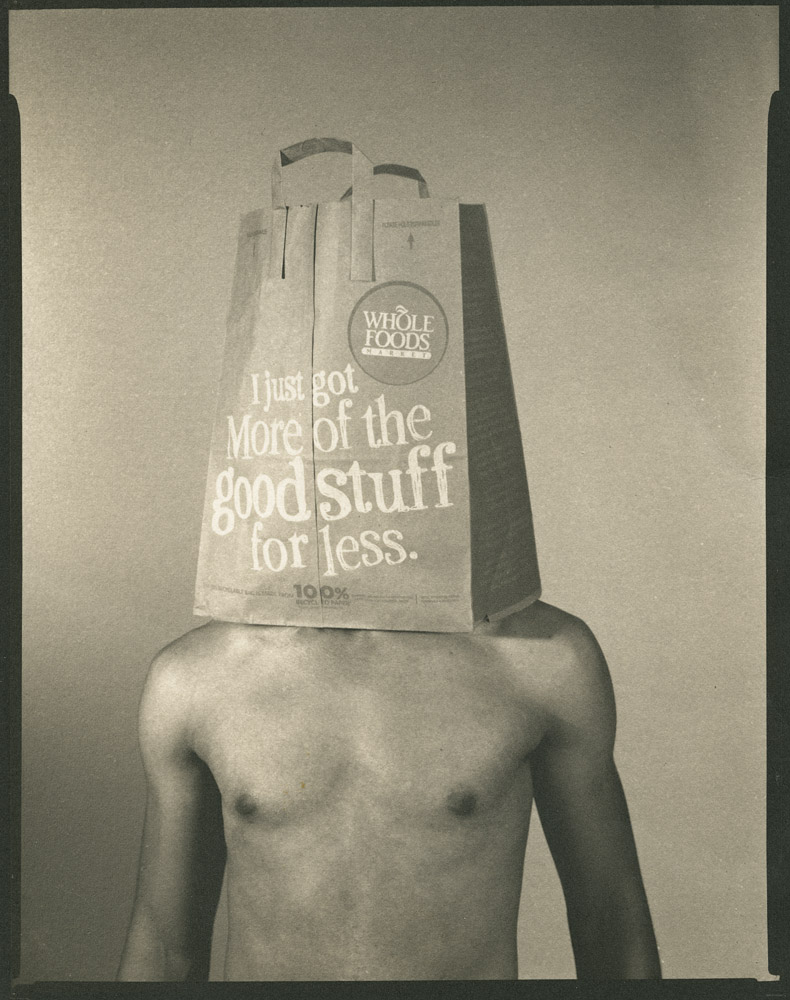
More of the Good Stuff
I traditionally have limited the class to working from in-camera negatives because I want to give people the best possible opportunity to start by making successful prints. As a friend of mine, Ian Leake, puts it in the new edition of his book on Platinum/Palladium printing, “it is possible to make a successful print from a problematic in-camera negative, but it is extremely difficult to make an even marginally successful print from a problematic digital negative” (I’m paraphrasing here).
The addition of making digitally enlarged negatives opens up the process to a whole new range of photographers, as shooting large format is both an encumbrance and a cost that is not for everyone. We will still begin the class with a full weekend of making in-camera film negatives and printing from those negatives. For that class, I will supply the camera and the film. We’ll make our images in and around the park, process the film, and then spend the next day printing.
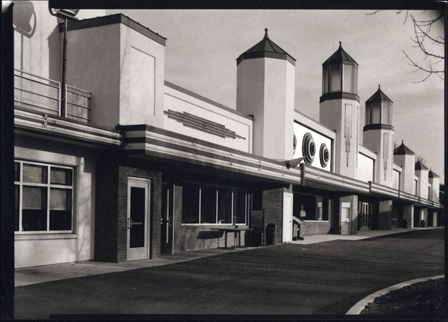
Glen Echo Midway
The second weekend will be devoted to making digitally enlarged negatives and printing from them. We will cover scanning, preparing your file, and printing the negative. I have a required text for the course, Ron Reeder’s “Digital Negatives for Palladium and Other Alternative Processes” which you can order on Amazon. Ron gives a very concise, clearly illustrated and explained step-by-step for how to produce a proper digitally enlarged negative, tailored to the process you want to print with. His technique is not limited to platinum/palladium, but once learned can be applied to any and all alternative processes.


 I’ve got a class coming up soon – Thursday evenings starting September 27, co-taught with Mac Cosgrove-Davies. It’s an alternative process survey course, covering platinum/palladium, gum bichromate and cyanotype. We will be starting out by going through the process of making digital negatives for the platinum/palladium process, and then printing using platinum/palladium. I will be walking students through the process of how to create your own correction curve so that they will have the tools handy for making appropriate correction curves for their own personal environments and for whatever process(es) they want to work in. We will cover basic techniques, preferred materials and digital hardware.