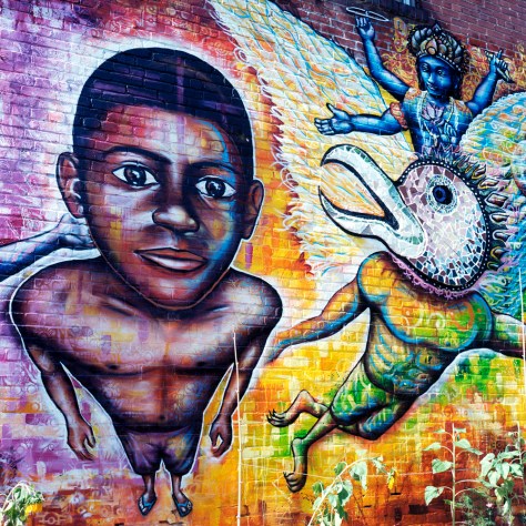
Here are two images of the same scene, one in color, one in black and white. I’m sharing them together to demonstrate how the change from one to the other totally changes the way we feel about the image.
First, the black and white:

Notice the visual emphasis – how the tones draw your eye to specific parts of the scene. What do you find yourself looking at, and relating to? What compels you? What emotions does this evoke?
Now the color:

This has a very different balance. The colors change the emotional timbre of the image, as well as the focus point for the viewer, even though both photos were taken from essentially the same vantage point. I think it’s fair to say that in the black and white version, your eye and attention keep coming back to the boy. The image has a more stark, somber feel to it whereas the color image is much more lively, and balanced – it’s easier to view both sides equally. To be entirely fair, some of the impact of the black and white version is due to the way in which it was exposed and processed. This version is fairly high contrast, which makes the dark areas very rich and the whites very pure white. Were it done differently, there would be a greater balance between the boy and the garuda in terms of tones, and it would have a different resonance.