
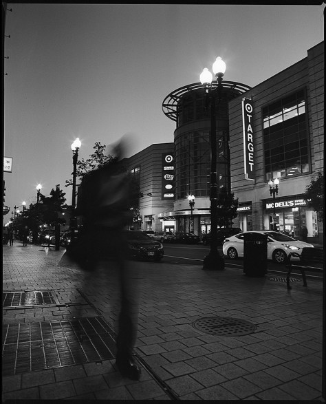
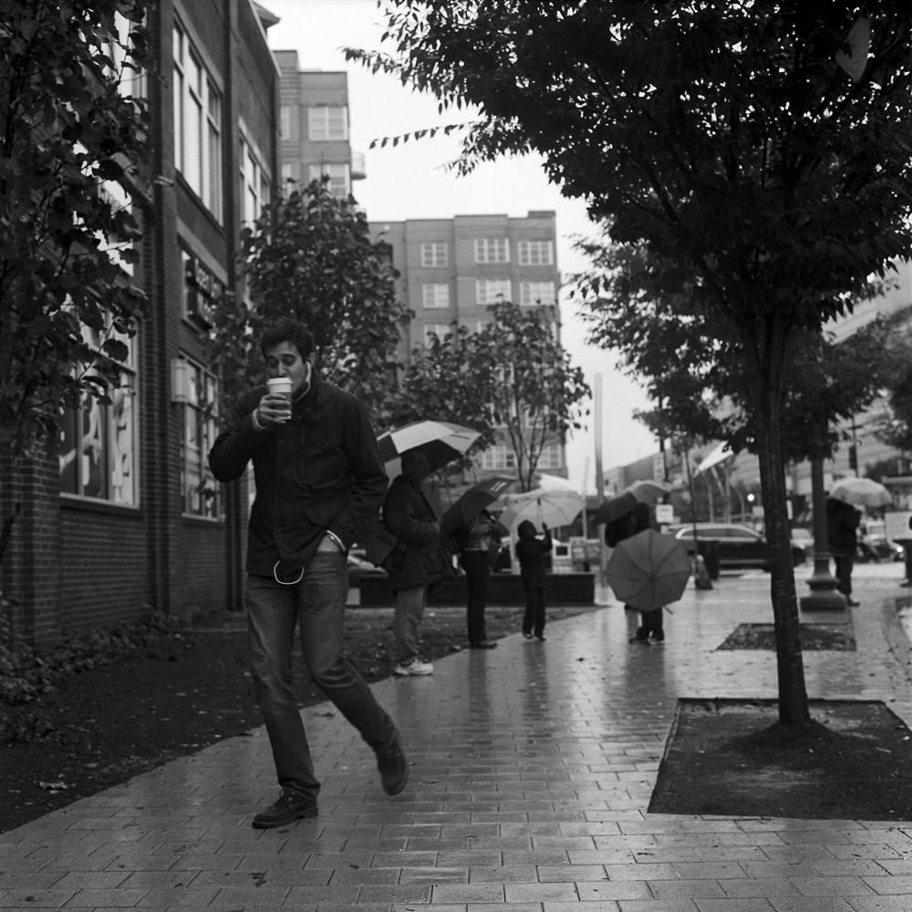
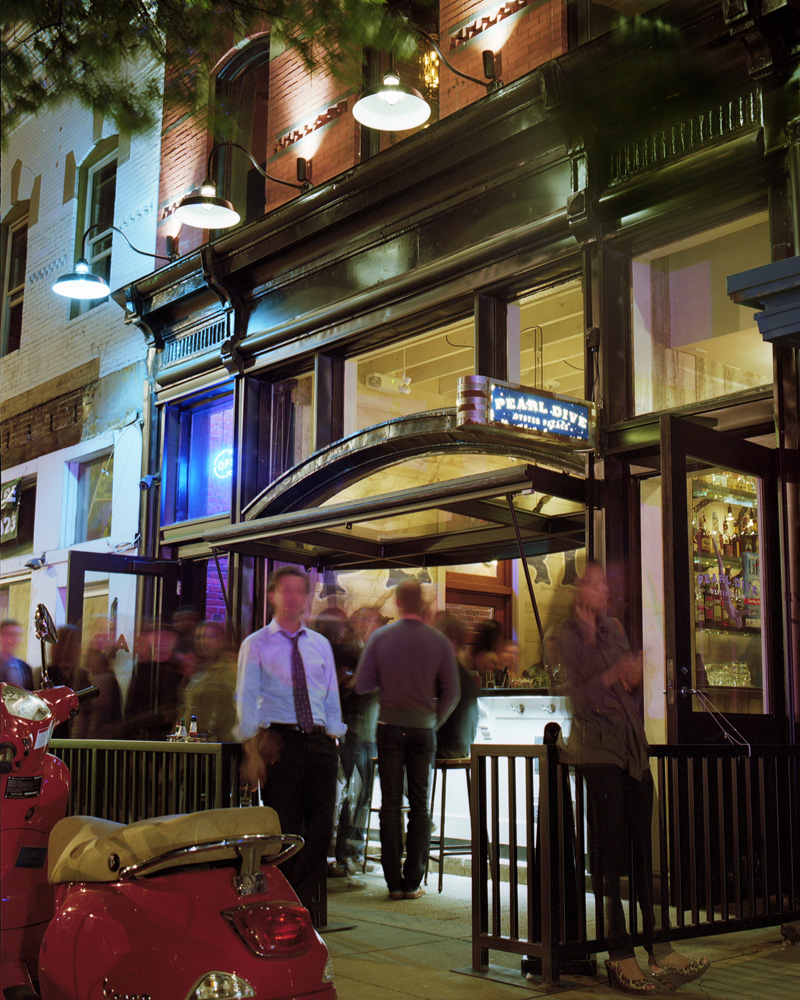
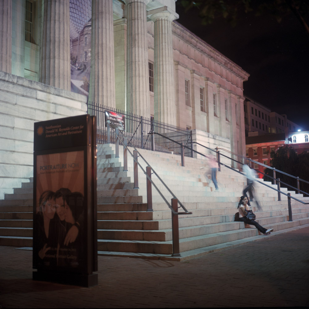
This is a case of where the mechanics of photographing lead to something emotionally resonant in a powerful way – the blurred moving man under other circumstances could be considered a flaw, but here becomes a metaphor.
This is a case of where the mechanics of photographing lead to something emotionally resonant in a powerful way – the blurred moving man under other circumstances could be considered a flaw, but here becomes a metaphor.
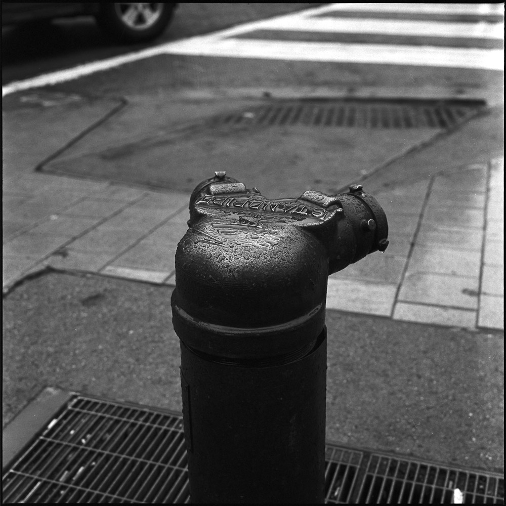
This was the result of a rainy-day walkabout in my neighborhood.
Yet another style of Siamese stand-pipe – this time beaded with rain water. It will go into my collection of ordinary objects.
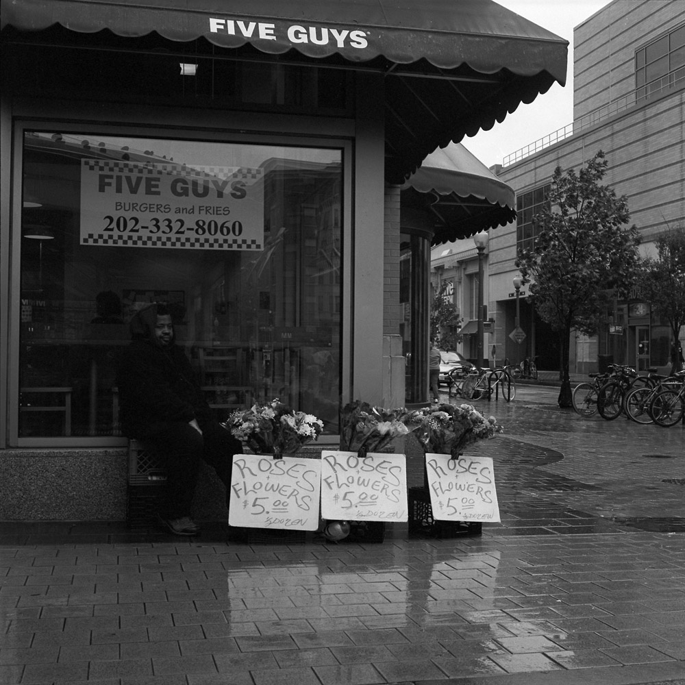
The flower vendor was sheltering from the rain under the awning of a Five Guys burger joint.
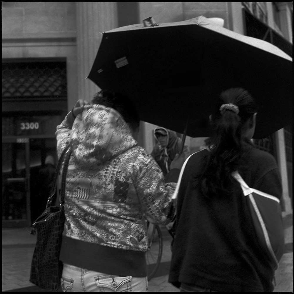
A whole family, waiting for something (there’s not a bus stop where they were standing – maybe they were waiting for someone else to come along in a car). The little boy was playing with his umbrella and the mom kept telling him to put it up or put it down, but stop swinging it around or he might poke someone with it.
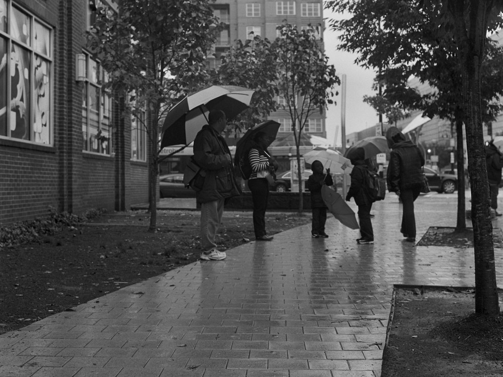
While the kid didn’t hit the guy with the Starbucks cup, that’s exactly what the mom was talking about with the little boy.
A mom and her daughter out running an errand in the rain.
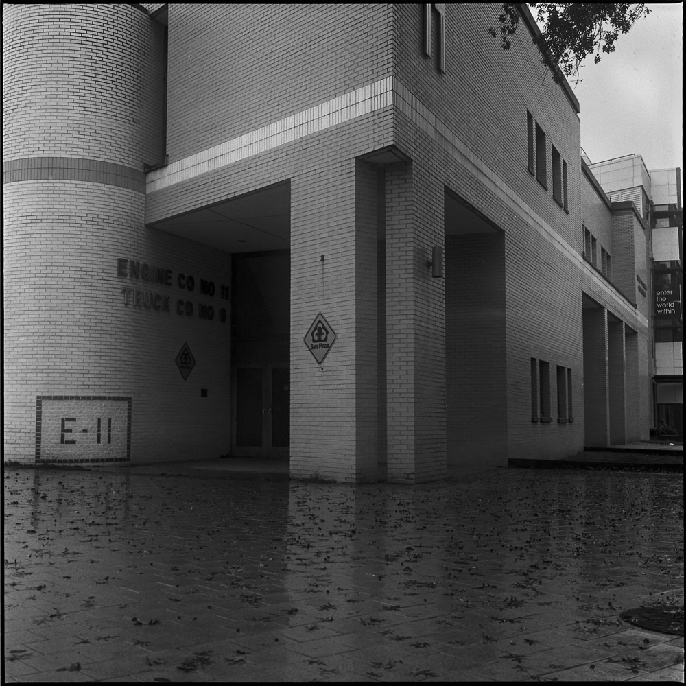
I liked how the columns of the fire station were reflected faintly in the rain-slick sidewalk.
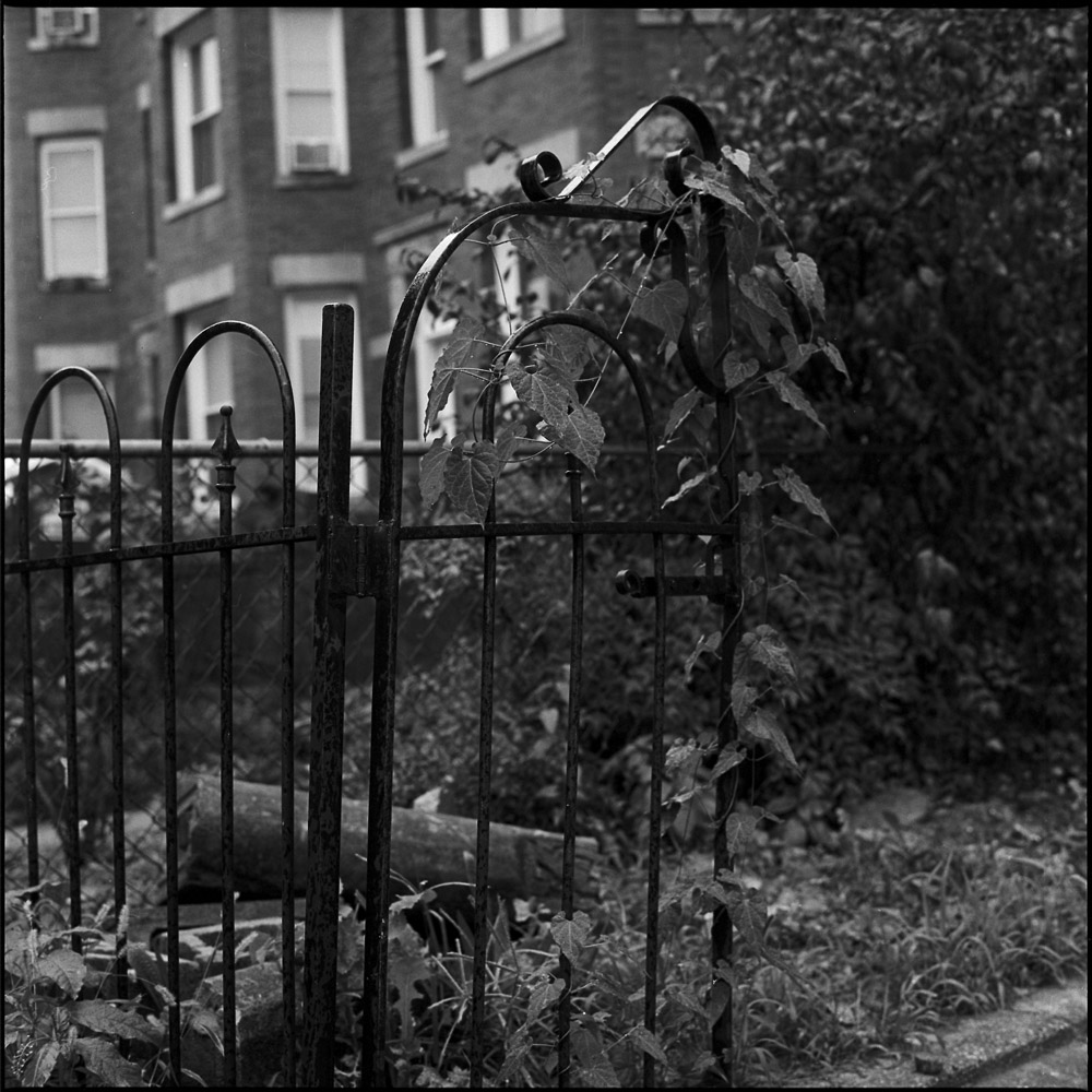
This half-gate stands in front of a house under renovation. I think one of the construction workers thought I was strange for wanting to take a picture of this.
I’ve been past the PanAm Market for years and wanted to photograph the outside, but never got around to it. Several times I’ve walked past and been on the verge of taking a photo but gotten the hairy eyeball from patrons or folks just hanging out on the sidewalk in front, so I’ve moved on and not taken the shot. This time there were not so many folks around and I was able to get a clean picture of it.
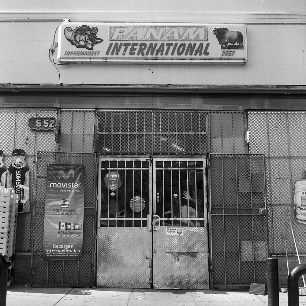
After scanning the negative I noticed that there’s a kid’s hand on the window that looks somewhat disembodied. All the security bars on the windows and doors make it look like a prison rather than a store, which was certainly NOT my intent. But it is what it is, and there’s no changing that. The kid was sitting by the door and holding it open for people with full carts trying to get out to their cars.
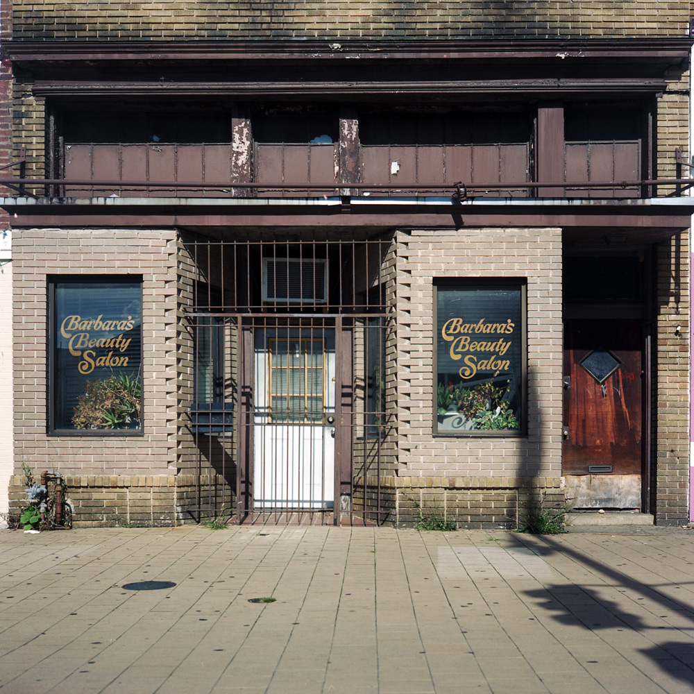
I’ve photographed Barbara’s Beauty Salon before, close up. This time I shot from across the street, to include the crosswalk stripes and more of the context of the neighborhood. I think you can really see the “Ajax Was Here” phenomenon in this shot. The Premium Title company to the right is brand new and spiffy looking, Gloria’s Pupusas to the left is cleaner, newer and bright and busy. Barbara’s, I still can’t tell if they’re even in business.
Here’s the older photo I posted of Barbara’s for comparison:
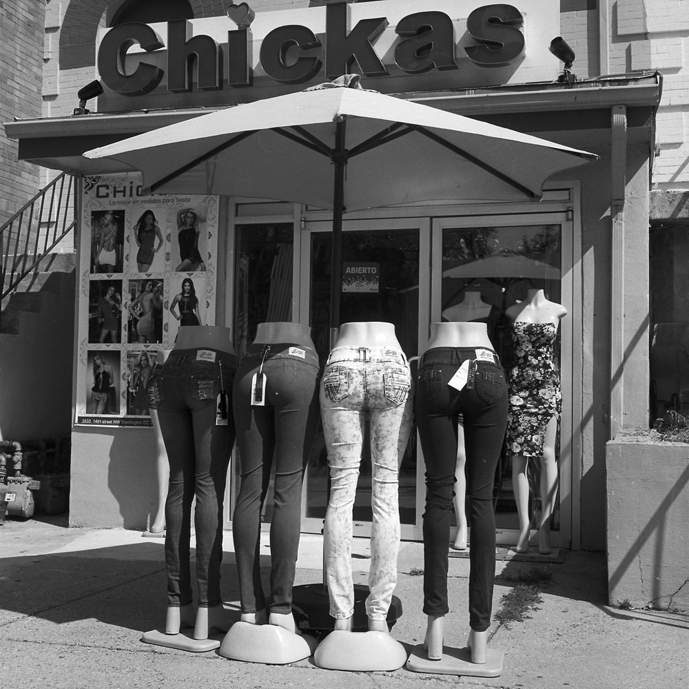
A sign of the times? A year and a half ago, I ran across this display of mannequin bottoms outside Chickass Jeans. The name was highly politically incorrect, and the mannequins seemed equally so. For those not conversant in Spanish, “chica” is the word for girl (or young woman). The store is in a heavily Latino neighborhood and caters primarily to young Latina women.
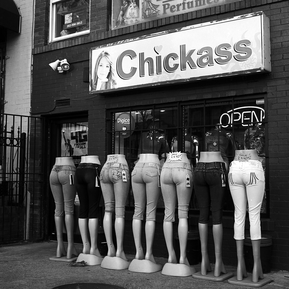
In the intervening year, they’ve renovated the shop, and changed the name. It’s now Chickas Jeans. I have mixed feelings about the name change- there was something amusing about the blatantness of the sexual pun in the name. Amusing in the same way that Hitler jokes in “The Producers” are amusing – seeing the old sign was just so jarring to the sensibilities that you couldn’t help but chuckle at it from discomfort. Perhaps it’s a sign that Latina feminism is starting to take hold and the message is getting through that women don’t want to be objectified.
Ok- here are some twosies I did, still with the Rollei and the panorama adapter.
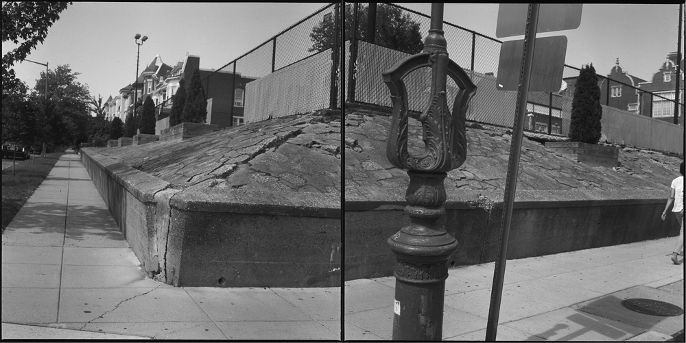
The first one is a shot of a street corner with the skeletal remains of a police call box from the first decade or so of the 20th century. The building behind it is now a charter school. I’ve often thought of how to photograph the wall around the playground fence behind the school. This is the first shot I’ve done that really does it justice.
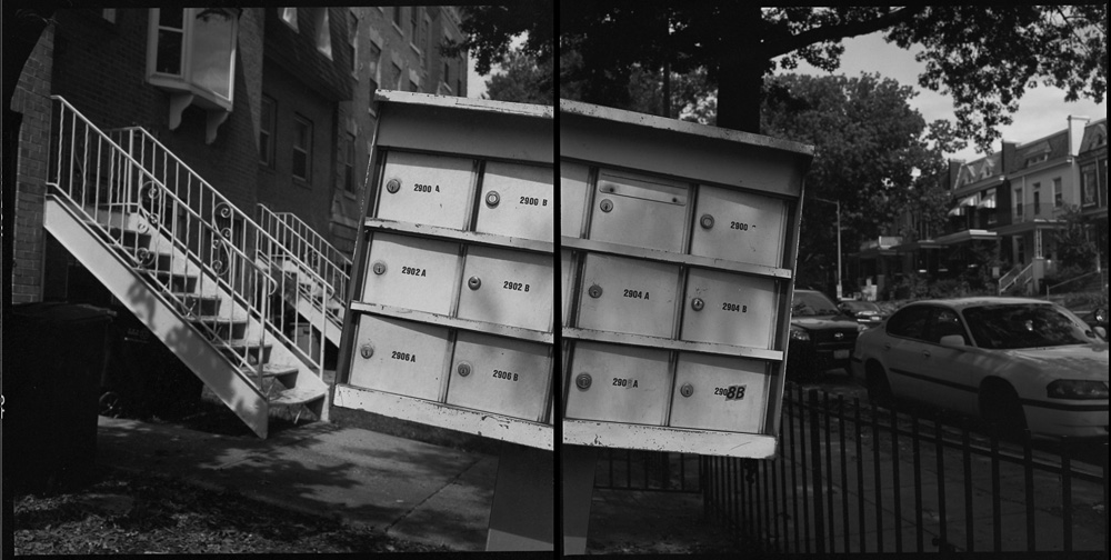
I came upon this mailbox leaning at its crazy angle and decided it would make a good subject for a diptych that emphasized and even exaggerated the tilt of the mailbox. What is it with me and mailboxes?
Both of these scenes are in my neighborhood – I walk past them regularly on my way to run errands or get some dinner. I’m really starting to appreciate the advice of Edward Weston, “There’s no good photos to be made more than 50 feet from the car”, although I’m expanding the perimeter and rephrasing it a little: “There are plenty of good photos to be had within a mile of your house”.
I’ve got this really cool little toy that goes with my Rolleiflex – a panoramic head adapter. It’s basically a little plate with a disc in it divided into twelve segments, and an integrated bubble level. The plate goes between the Rolleiflex and the tripod head. The disc has a locking mechanism and click stops that allow it to be rotated a fixed number of degrees, corresponding to 1/12th of a circle (30 degrees) which is also more or less the field of view of the lens on the Rolleiflex. This would allow you to photograph a 360 degree panorama on a single roll of 120 film.
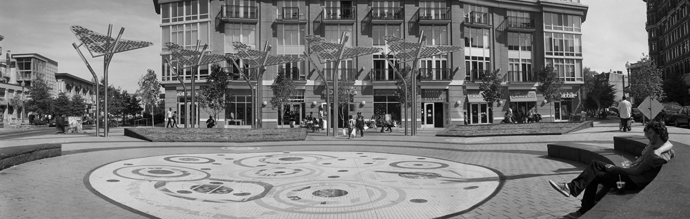
A 360 degree panorama is a bit much, and pretty tough to pull off. I’ve been playing with doing two-frame and three-frame panoramas, which seem plenty wide already. Here is one I took this afternoon at the little plaza in front of the Tivoli Theater in Columbia Heights.
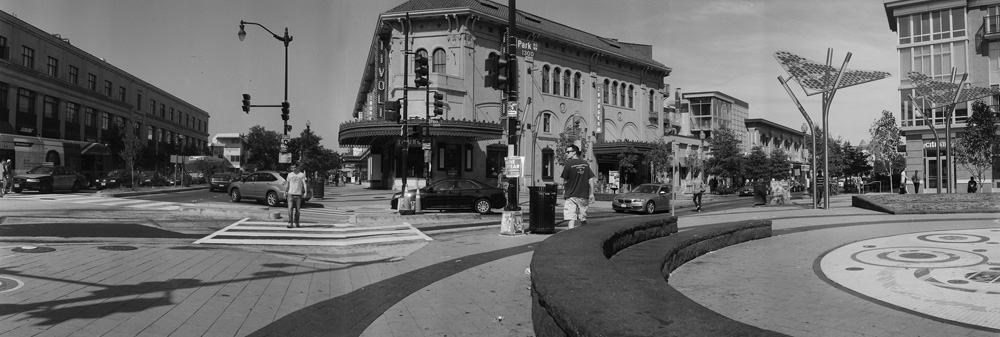
It does a pretty good job of matching up the frames, with just a few degrees of overlap, enough to make the blending and alignment relatively easy. If you’re paying attention you can see the seams where some things just don’t match up angle-wise, and where the car gets cut off between exposures.
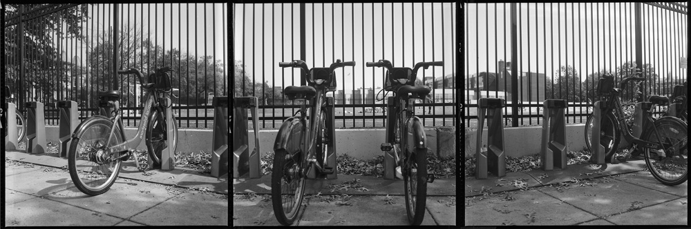
This one I composed a little differently – in selecting what to include, I left a little bit of film border in between each frame because I think it compliments the overall image – the black borders echo nicely the black bars of the fence in front of the bikes. Although I have two bikes in the center frame, and one each in the left and right frames, each frame does feel distinctly different.
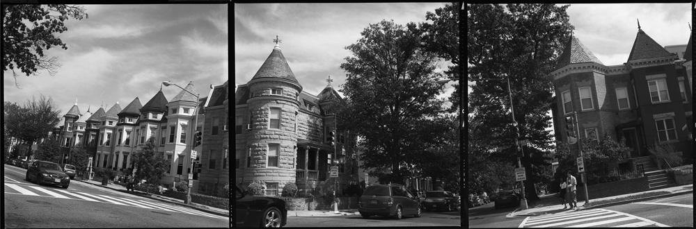
I decided to get a little playful and have fun with the crazy angles you can get from a panorama when you aren’t level to the horizon. I wanted all of the conical roof of the turret on the house on the corner in the picture, so I tilted the camera up (the other option would have been to go home and bring a step-ladder, and raise the tripod to its maximum height, and even then I might not have gotten the shot I was looking for).
And last but not least, back to the fully merged panorama. This one I didn’t get the horizon quite as straight as I should have, and so the outside images were a little crooked, and the center one was definitely not level, so I had to play with how I aligned them and cropped them to make it look relatively normal. I like the look of this one despite its flaws.
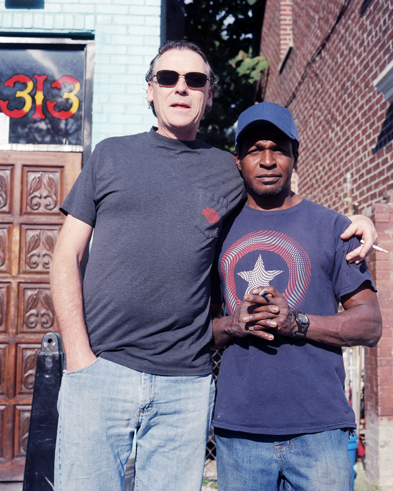
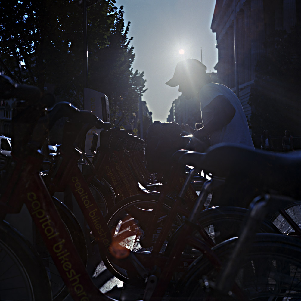
Truth be told, I’m a bit of an anxious street photographer: I’m not terribly good at asking total strangers to pose for me. So I’m getting started as an exercise by setting a new rule: if you see me out and ask me about my Rollei, you have to pose for me. We’ve already broken the ice by talking about the camera, so now we’re not total strangers anymore. This is the very first in that series. These two guys saw me out with the camera, and started asking about it. They even asked me to photograph them, which made it easier. The black guy was interesting; even though he was smoking, he asked if he should get rid of his cigarette for the photo. I told him to keep it.
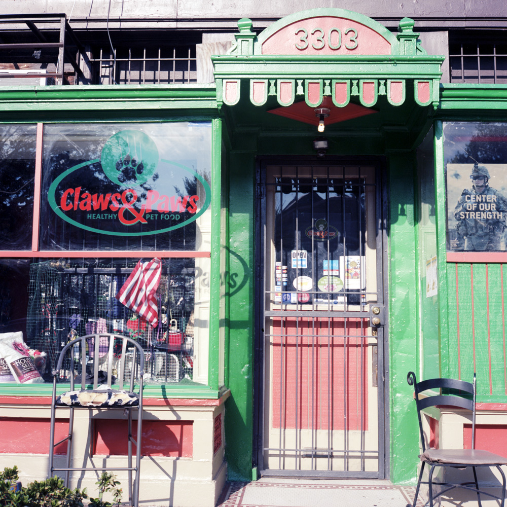
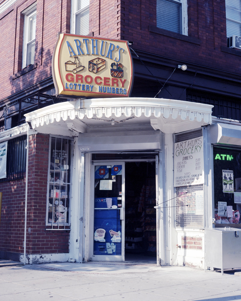
Just four random shots from around the neighborhood. These first three are small local businesses managing to hang on in the face of growing gentrification.
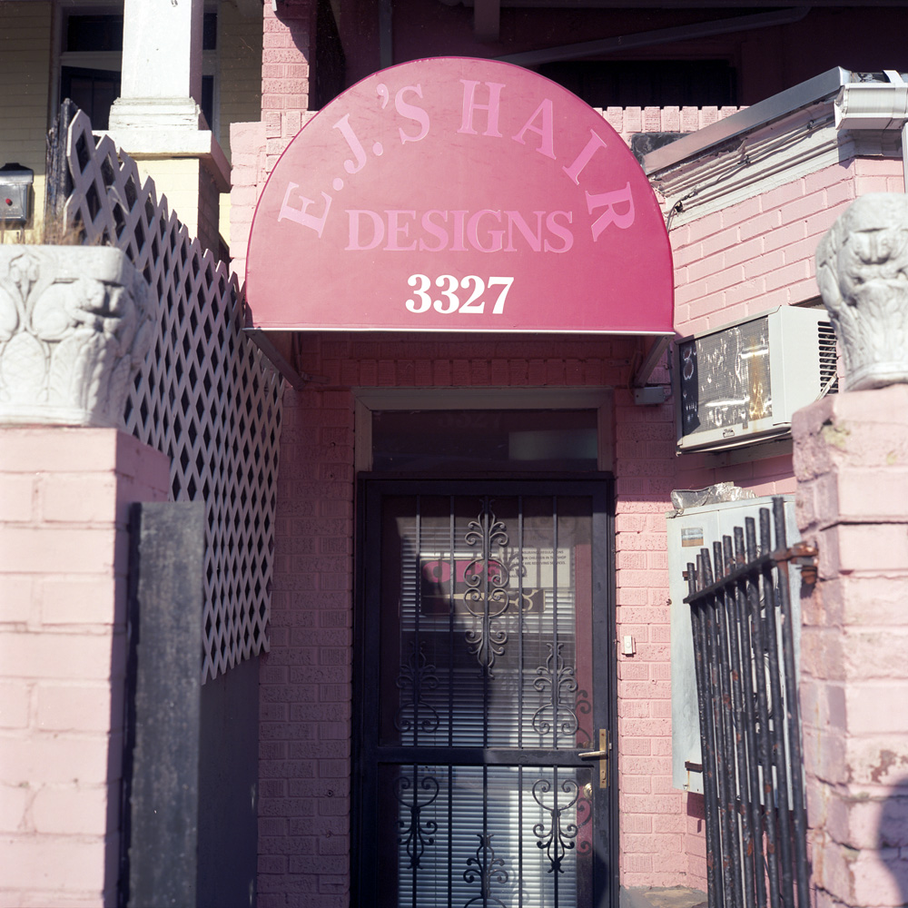
I don’t know what’s going on with EJ’s. Every time I walk past (which may be heavily influenced by when I’m going by – weekday evenings and/or weekends) it appears closed. I know the sign says “open” in the door, but you tell me what closed miniblinds means… I love the sign on the door (which is probably too small to read in the JPEG version of this shot): “We love children. However, insurance regulations do not allow children in the shop unless they are receiving services. Thank you, The Management”.
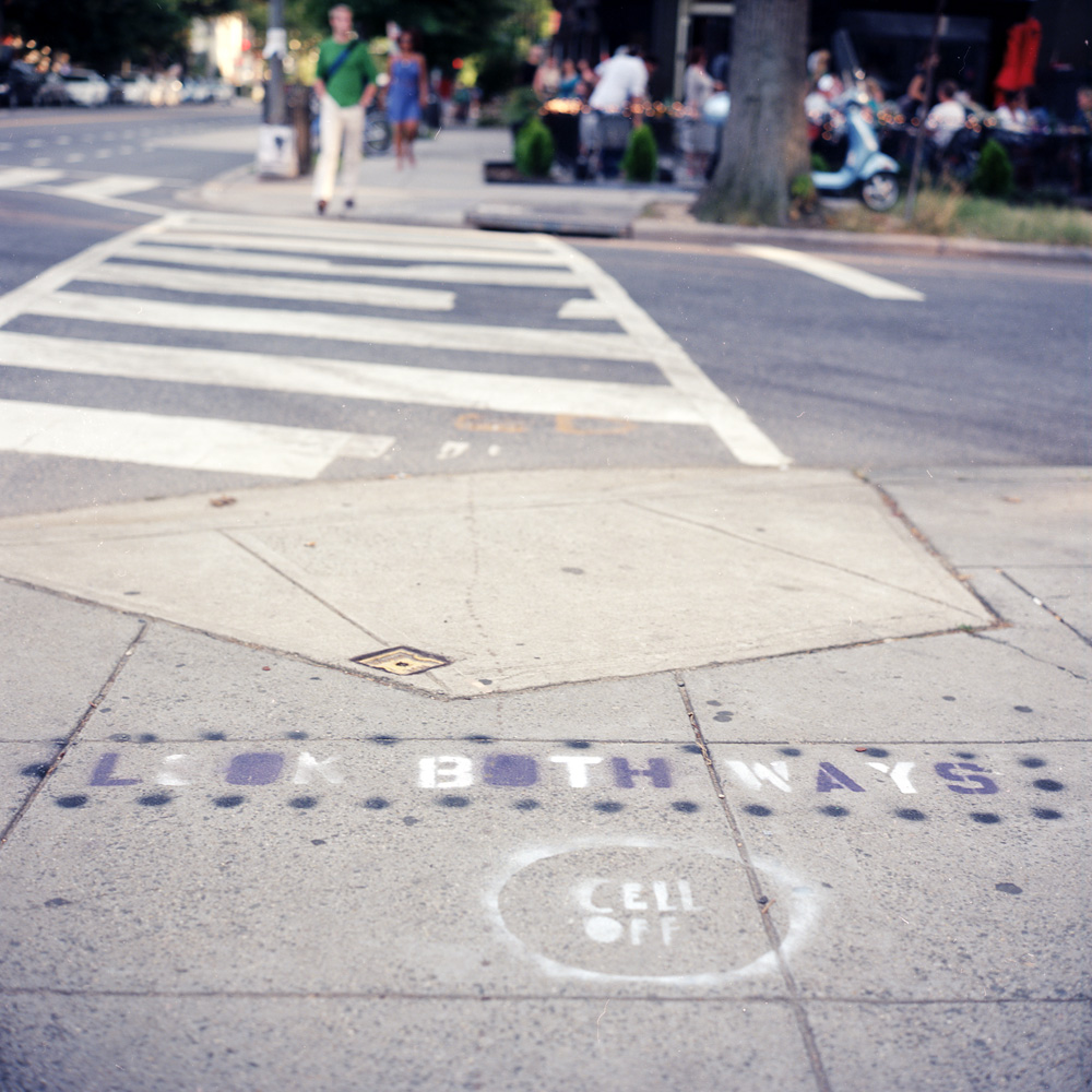
A sign of the times. General hipsterization plus the general trend of people being so absorbed by their mobile devices that they do stupid stuff like walk into traffic has inspired these signs spray-painted at the crosswalks of a number of intersections in the Upper 11th Trend Strip (don’t know what else to call it- North-East Columbia Heights Business District? NoECoHiBD? …that stretch of 11th where all the new restaurants have proliferated amidst old-time bodegas and coin laundries? How about just Hipster Velcro? (can’t call it a hipster magnet because that would imply something about hipsters that’s just not true. Velcro sounds about right because it sticks well to things like scruffy beards and ironic flannel). Of course, it NEEDS to be painted on the sidewalk, for it to stand a chance of registering with the phone-focused.
Here are two images of the same scene, one in color, one in black and white. I’m sharing them together to demonstrate how the change from one to the other totally changes the way we feel about the image.
First, the black and white:

Notice the visual emphasis – how the tones draw your eye to specific parts of the scene. What do you find yourself looking at, and relating to? What compels you? What emotions does this evoke?
Now the color:

This has a very different balance. The colors change the emotional timbre of the image, as well as the focus point for the viewer, even though both photos were taken from essentially the same vantage point. I think it’s fair to say that in the black and white version, your eye and attention keep coming back to the boy. The image has a more stark, somber feel to it whereas the color image is much more lively, and balanced – it’s easier to view both sides equally. To be entirely fair, some of the impact of the black and white version is due to the way in which it was exposed and processed. This version is fairly high contrast, which makes the dark areas very rich and the whites very pure white. Were it done differently, there would be a greater balance between the boy and the garuda in terms of tones, and it would have a different resonance.
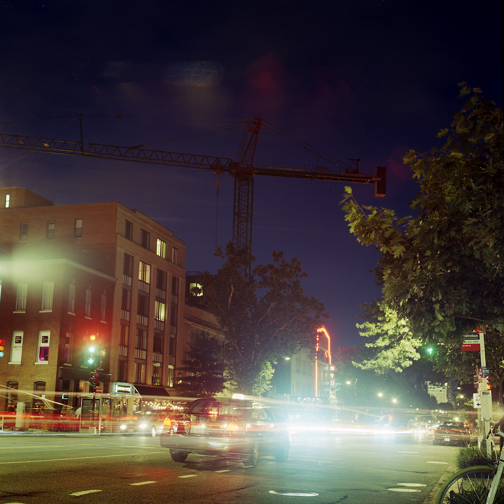
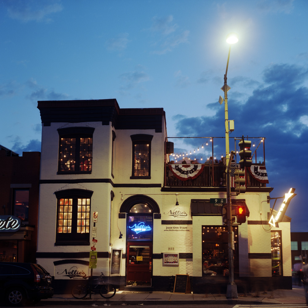
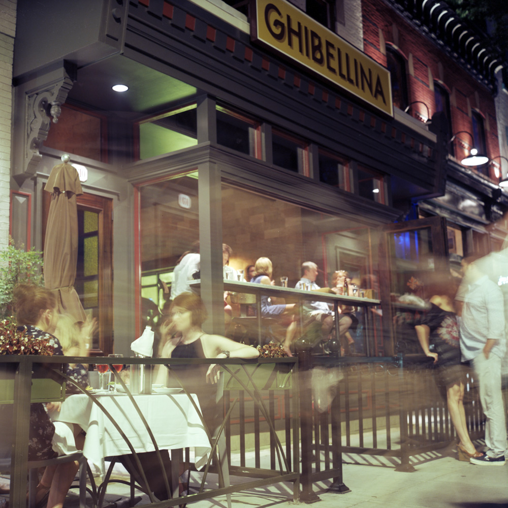
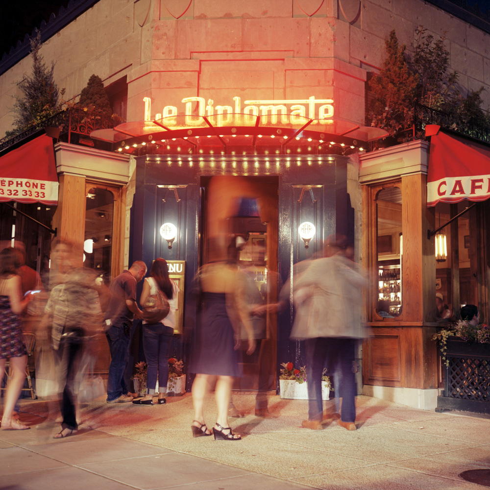
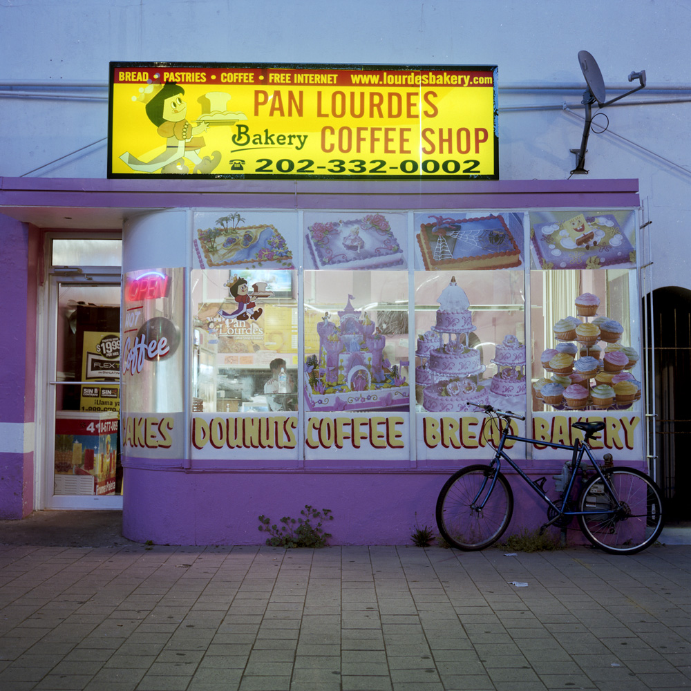
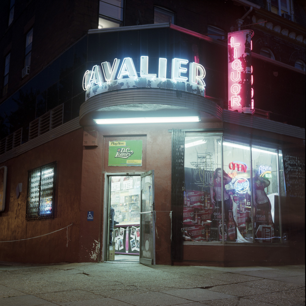
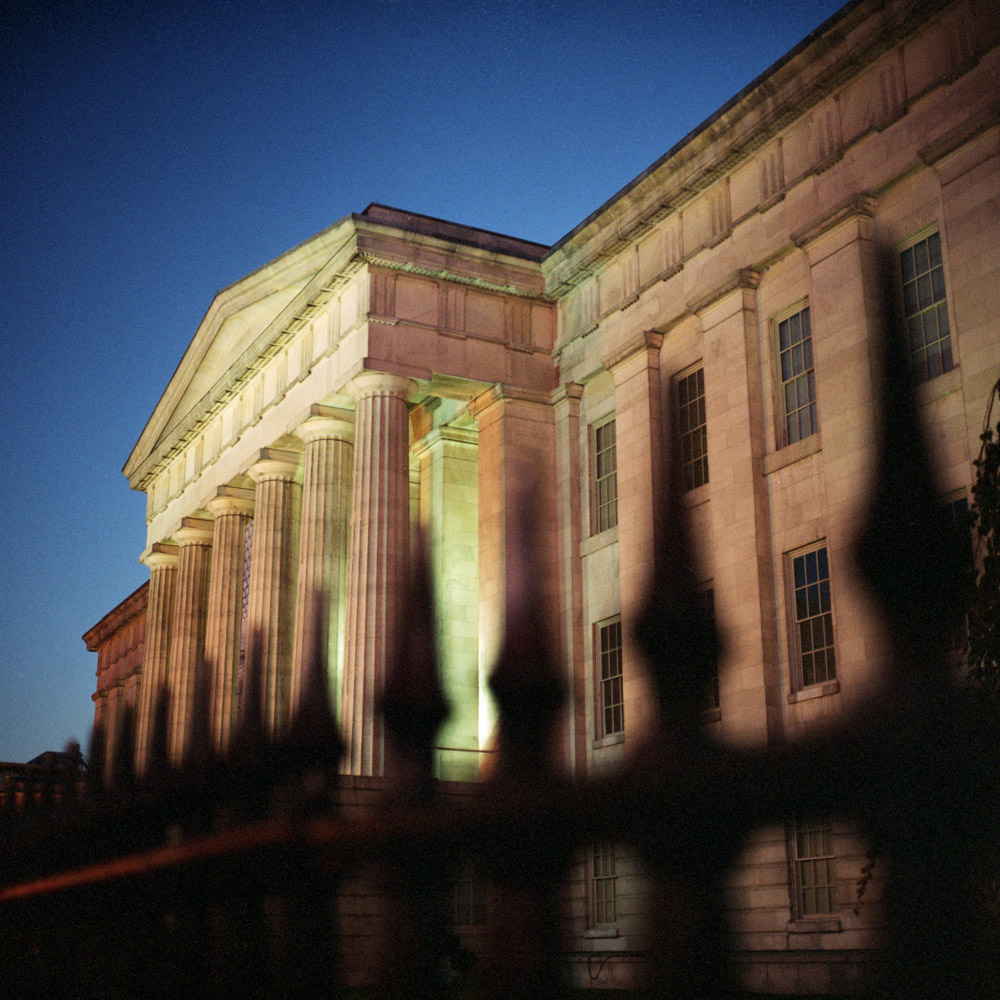
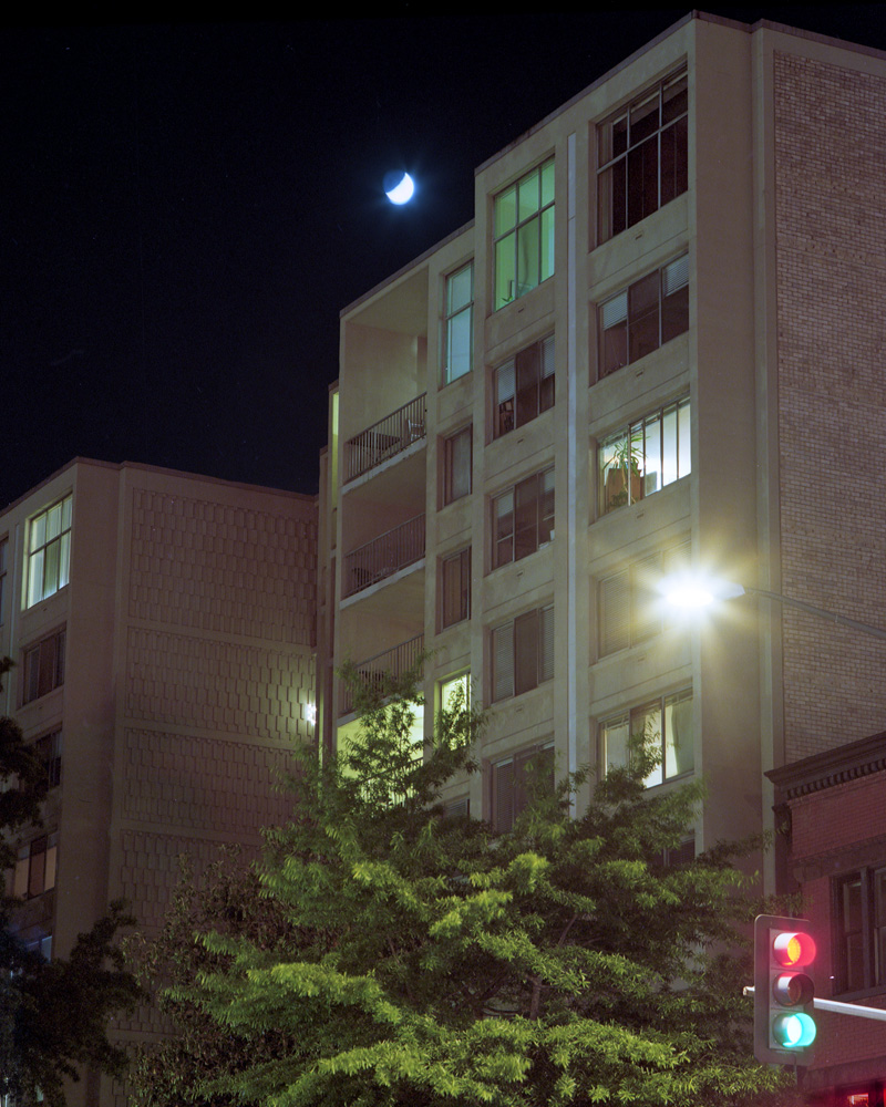
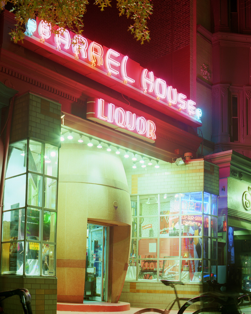
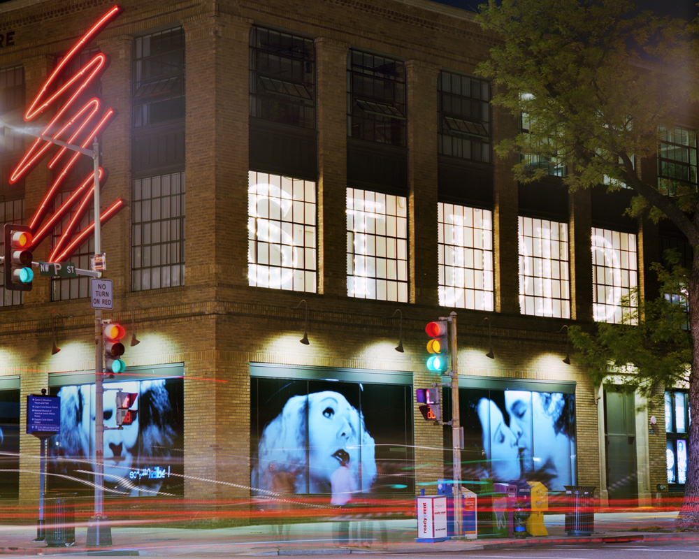
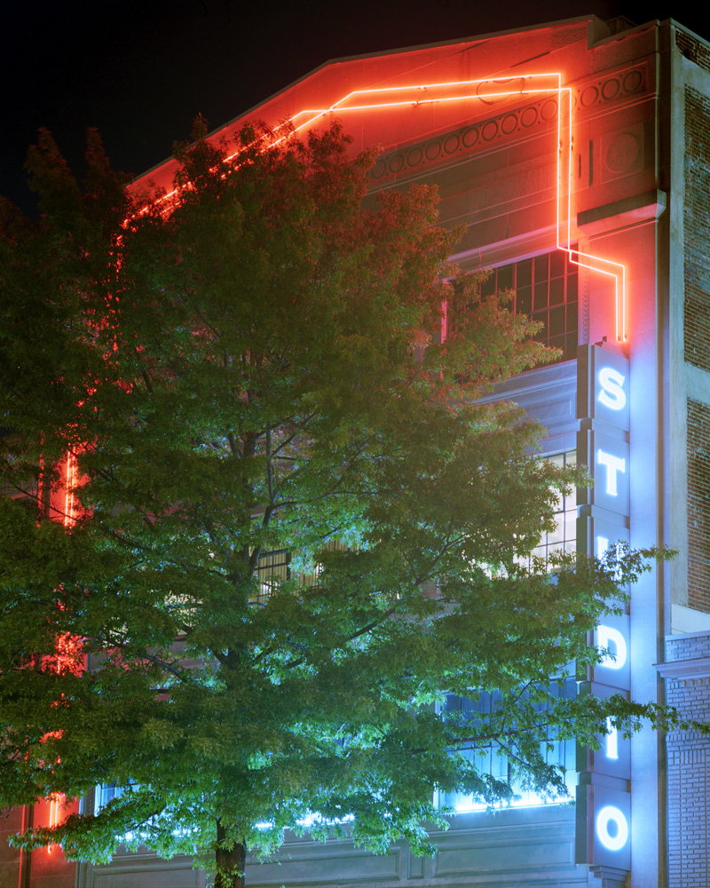
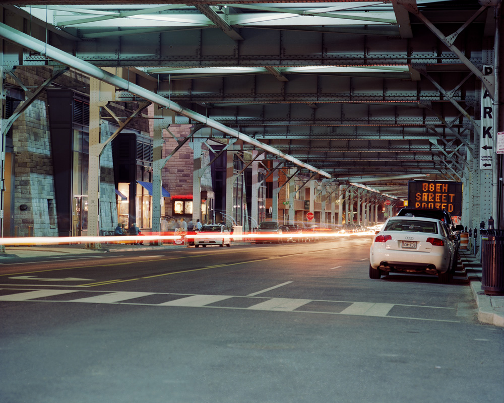
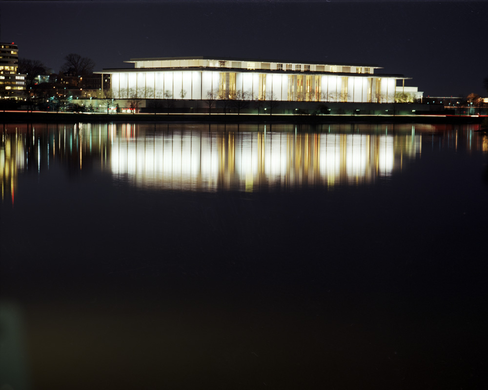
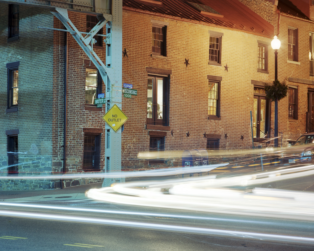
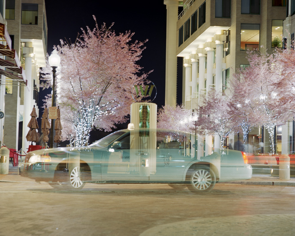
After a LOONG weekend of playing with my printer to get it to cooperate (running out of four different inks @ $60/cartridge, figuring out how to solve problems with head strikes on my prints, running out of paper at $115/box thanks to the aforementioned ink shortages and head strikes), I now have my show completely printed. Eight prints are already framed and ready to go, the remaining 12 are going to be framed tomorrow, and the show hung on Tuesday after work. I’ve done shows before, and of course it’s always hard work, but this is the biggest show I’ve done in terms of volume. Even my biggest past Artomatic was probably 12 prints. I’m very psyched about the show. Here’s a recap for those who can’t make it to the opening (REMINDER: August 2, 7-10 PM, Mad Momos Restaurant, 3605 14th Street NW, Washington DC). This exhibit pays tribute to the parts of Washington I pass through on a regular if not daily basis. I want to show what this town looks like to a resident, as well as showing it in an unfamiliar way even to those folks who do see these things all the time. As I mentioned in my blurb about the reception, I love the way color distorts and transforms at night because we no longer have a single, unidirectional light source of uniform color and quality. I’ve started these photos with late evening/sunset/twilight and progress into deep night to capture the feeling of that time of day. I hope these photos express that sense of drawn out time and transformed space, be it through blurred motion or the interplay of lights.
If any of you have ever produced a photography exhibit, or any other art exhibit for that matter, you’ll have an understanding of just how complicated an effort this is. I’m lucky in that I am able to do my promotional work online for the most part (this blog, email blasts, internet forums, etc), and I already have promotional postcards printed from the last time I exhibited some of this work. It would not surprise me if I did a truly serious accounting of what it cost to put this show up on the wall and the bill came in somewhere north of $2500. I know the framing bill alone is in the region of $1100-$1200. Postcards? about $200 for good quality printing from Modern Postcard. Paper and ink? $300. And that’s just the obvious, not counting the two years it took to shoot the images, the film and processing, the editing process, the dinner bribe for my friend who helped with the editing, and all the hardware and software (21.5″ iMac, Epson V750 scanner, Epson 3880 printer, Photoshop CS5, SilverFast AI 8, Gretag-Macbeth EyeOne calibration software and hockey-puck). To say nothing of 20 years of accumulated experience required to produce images like these.
