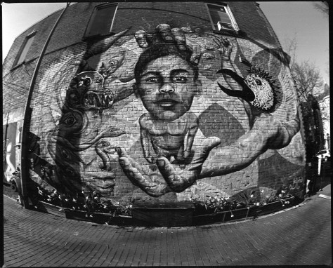
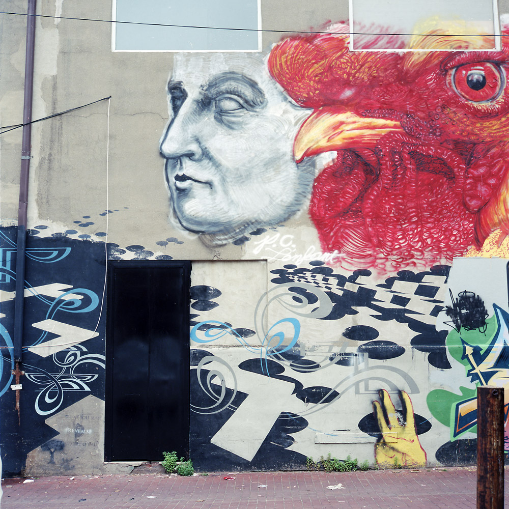
I’ve walked past this mural for years, and they re-do it every so often. The primary change from visit to visit is the color palette, but over time, major compositional elements change as well. I’m showing the previous version (circa 2013) and now both in black and white just to keep the comparison visually fair.
Black Boy, Garuda, B/W
The bird’s head on the right is a mosaic, originally including mirror fragments, now painted. I think the fisheye treatment in the first image works well because the mural already has a bit of a fisheye perspective to begin with.
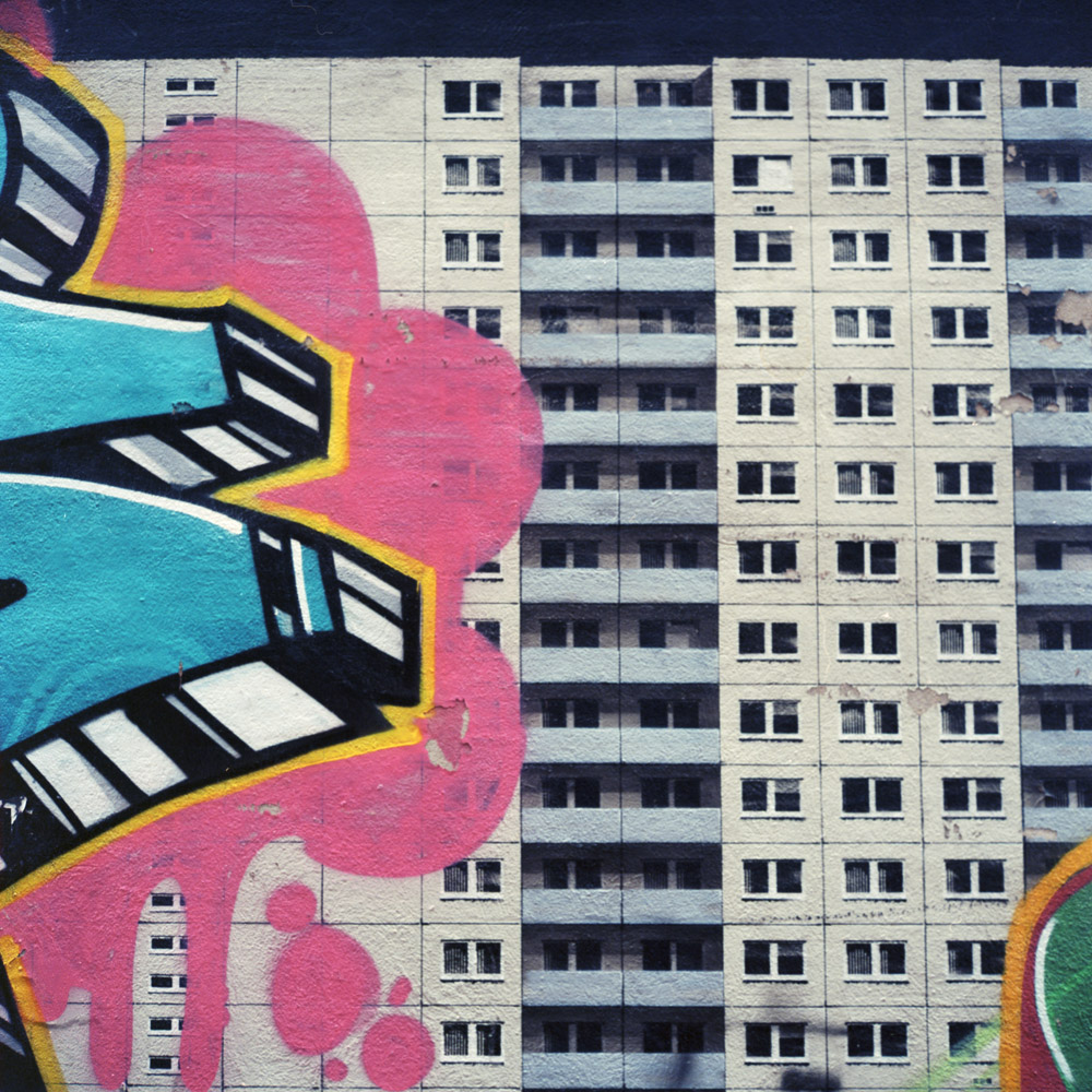
I often go on walkabouts on my way home from work with the Rollei in tow. I’m always impressed by the array of graffiti that’s been put up, and how it is becoming an accepted art form, with entire murals done in “graffiti style”. Here are some finds, most of them in a single alley off 14th Street.
I’m particularly taken with this segment of the mural, because of the optical illusion. If you de-focus just a little bit so you lose the texture of the stucco, it really looks like someone has made a GIANT tag on top of an actual apartment building.
Optical Illusion
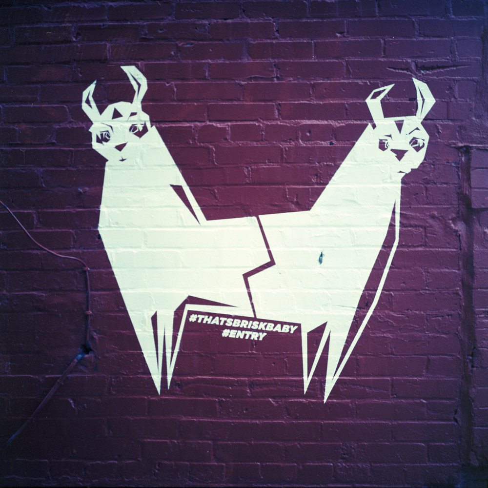
I forget exactly where the two-headed Llama is located, but it’s near the alley mural. Very different texture and style, obviously not the same artist (the Llamas are a stencil, whereas the mural is almost entirely freehand). But Llamas are always cute.
Two Llamas
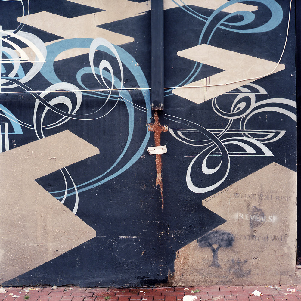
I don’t know if the stencil is an add-on to the mural by the artist, or if someone else came along and tagged it on top of the mural. But the statement is both enigmatic and profound: “What you risk reveals what you value”.
What You Risk
Another M.C. Escher-esque optical illusion in the mural- when you first look at it you see a redhead with long, flaming hair streaming behind. Then you realize it’s a head with a chicken next to it. But it’s hard to keep seeing the chicken, and easy to go back to seeing the redhead alone.
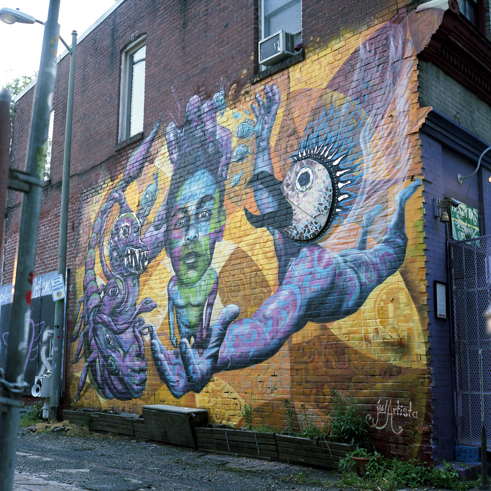
I had photographed this mural before. The other day I was doing a walkabout in my neighborhood and passed it again, to see that the artist had re-worked the mural in new colors with new designs.
here are the original photos I took, in color and black-and-white.
Black Boy, Garuda, ColorBlack Boy, Garuda, B/W
The artist came back and re-worked the piece, keeping only the head of Garuda and the head of the black boy as compositional elements, and completely re-working the color palette.
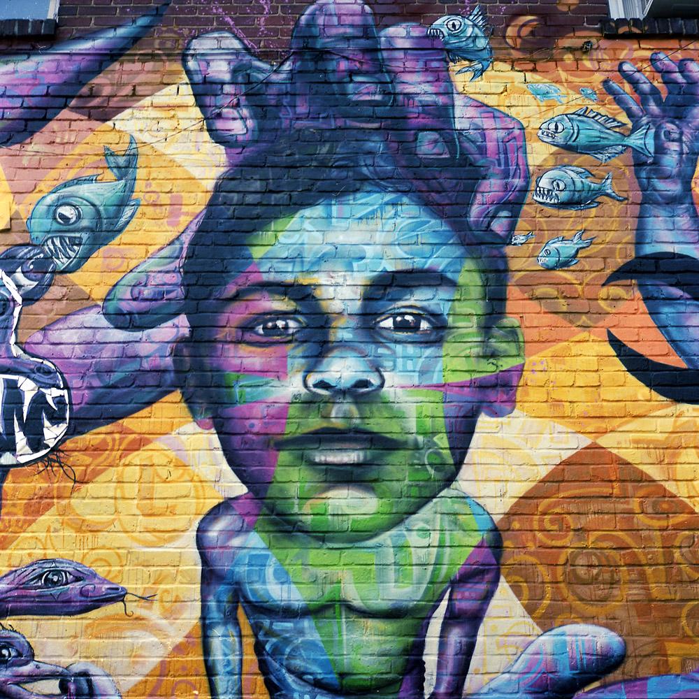
Black Boy, GarudaBlack Boy, Garuda (Detail)
This is one thing a traditional photograph can’t do – it can’t evolve over time being reworked into a totally different yet fundamentally similar image. At the point you transform a photograph this much, it’s no longer a photograph. It’s figurative and not literal. Part of the intrinsic quality of a photograph that makes it valuable and meaningful as a photograph as opposed to a painting is its relative immutability and the appearance of a binary 1:1 relationship with reality. We know of course that photographs CAN lie, and that they have figurative, non-literal properties, but the descriptive quality of a photograph is so powerful that we WANT to view them as purely, literally descriptive and non-figurative – “Photos don’t lie” and the visual equivalent of “if it wasn’t true, they couldn’t print it”.
So the question to you is, is this the same mural, or is it a different mural entirely, now that it’s been reworked?
Here are two images of the same scene, one in color, one in black and white. I’m sharing them together to demonstrate how the change from one to the other totally changes the way we feel about the image.
First, the black and white:
Black Boy, Garuda, B/W
Notice the visual emphasis – how the tones draw your eye to specific parts of the scene. What do you find yourself looking at, and relating to? What compels you? What emotions does this evoke?
Now the color:
Black Boy, Garuda, Color
This has a very different balance. The colors change the emotional timbre of the image, as well as the focus point for the viewer, even though both photos were taken from essentially the same vantage point. I think it’s fair to say that in the black and white version, your eye and attention keep coming back to the boy. The image has a more stark, somber feel to it whereas the color image is much more lively, and balanced – it’s easier to view both sides equally. To be entirely fair, some of the impact of the black and white version is due to the way in which it was exposed and processed. This version is fairly high contrast, which makes the dark areas very rich and the whites very pure white. Were it done differently, there would be a greater balance between the boy and the garuda in terms of tones, and it would have a different resonance.