First and foremost this was a test of my new toy, my Tele-Rolleiflex. I wanted to see what it could do in terms of depth-of-field compression and the look of out-of-focus areas. Then I noticed something in the photo itself – the repetition of a gesture. There are three hands holding cellphones in this scene, all in the middle of the same activity.
Cacophony of the Modern World
This inspired the title for this piece – The Cacophony of the Modern World – because it’s somewhat ironic. There is an entire civilization living vicariously through their smartphones, wandering through beautiful spring days staring and pecking at screens not much bigger than a business card, never stopping to look up, never engaging the people around them, staggering zombie-style through life. Except for cars and machinery, the world is becoming eerily silent.
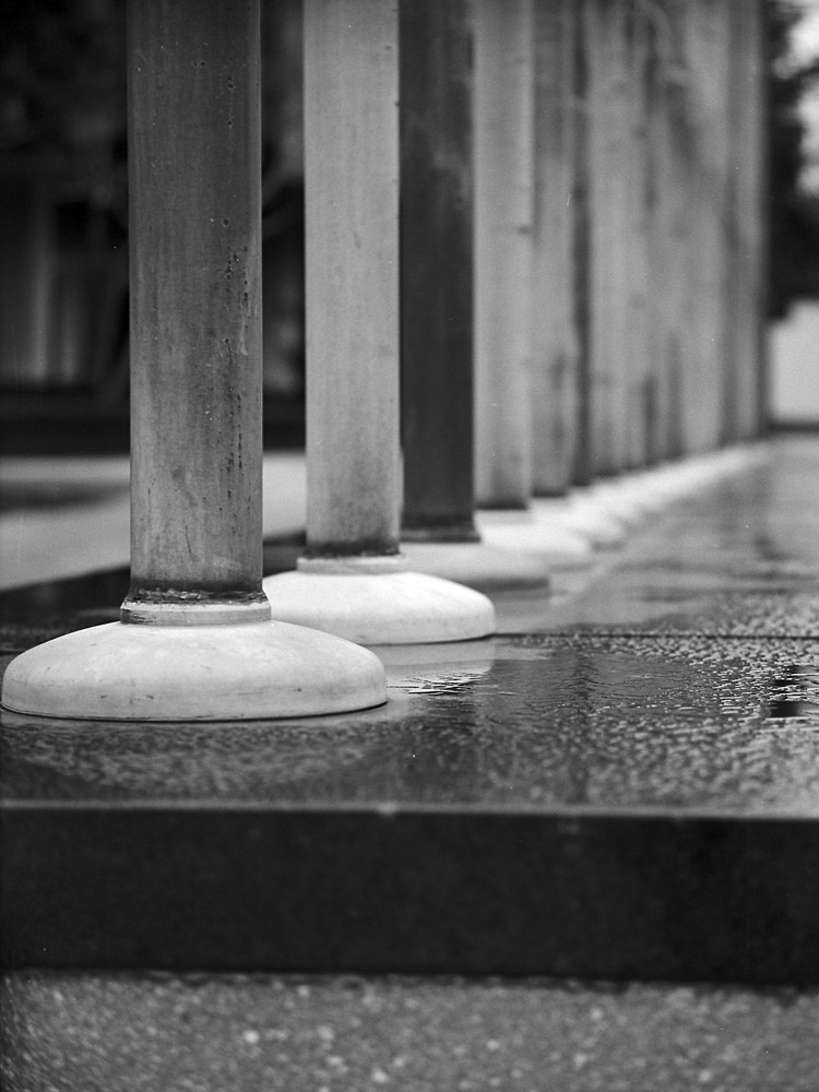
Outside the WHO building, there is a series of flagpoles, most in bronze, with a few at the far end that appear to be bronze-ish aluminum (probably modern replacements). I wanted to capture something of the receding-to-infinity effect of the line of them. All winter they’ve been barren, but yesterday for the first time I’ve seen them flying flags of all the American nations (from the US and Canada through the Caribbean nations to Argentina). I will have color images of that coming soon.
Flagpoles
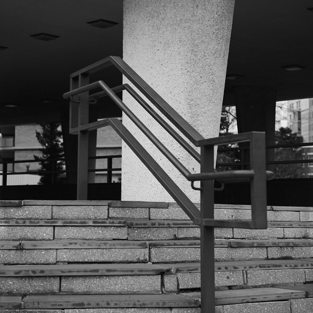
I think I need to go back and re-shoot the handrail, as the near end seems a touch out-of-focus when it should be totally sharp. Part of the reason for this is that I’m still getting used to my new-to-me Tele-Rolleiflex (it has a 135mm Zeiss Sonnar f4 lens on it, as opposed to the normal 80mm Planar f2.8 on my standard Rolleiflex). The Tele has a shallower depth-of-field, and it also has a relatively far minimum focus of about 7.5 feet.
Handrail
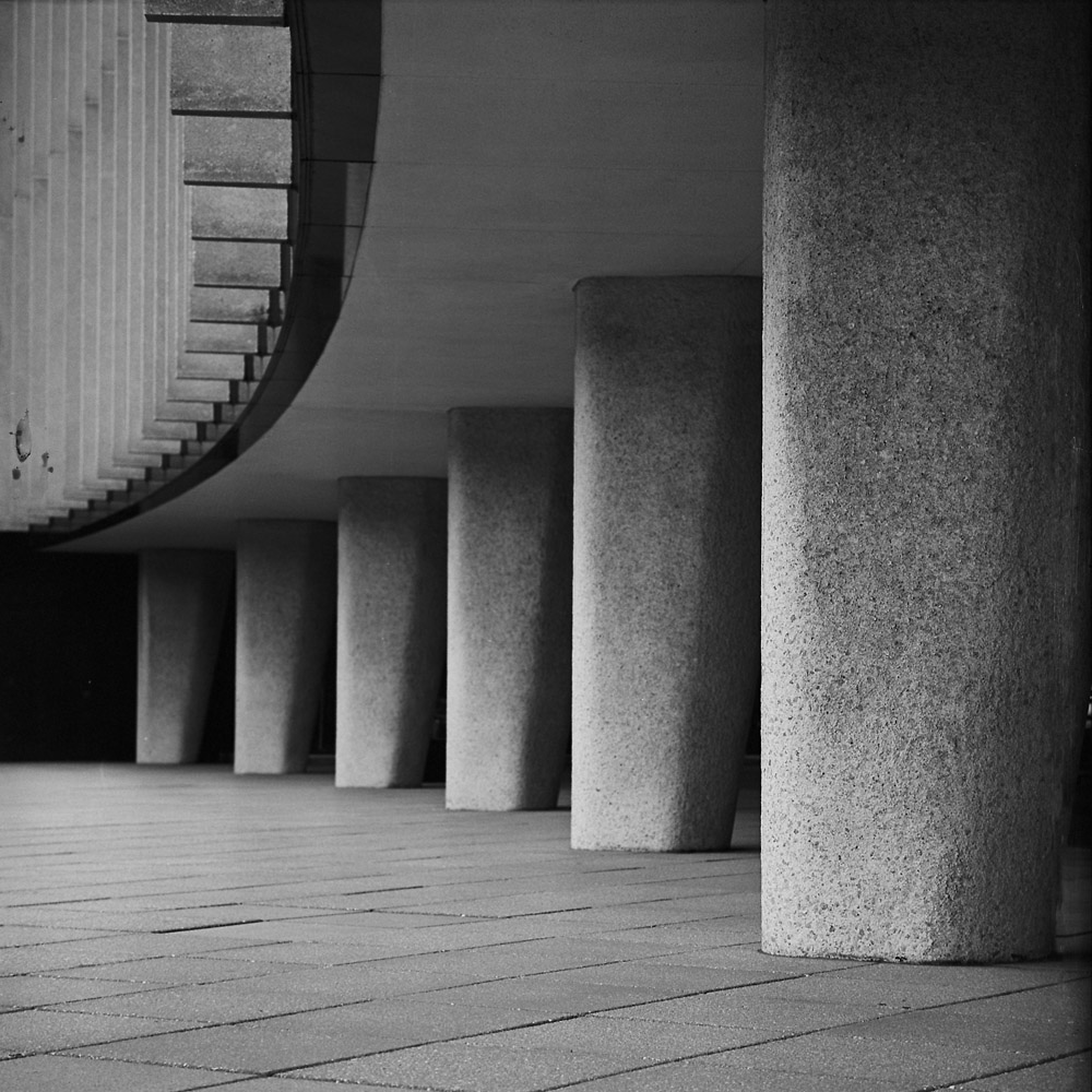
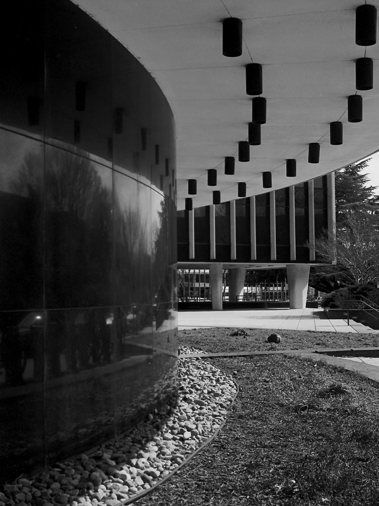
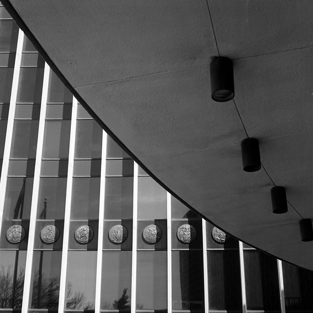
Perhaps my favorite shot of this series- I love the repetition of the columns and the arc of the building with the related but contrasting vertical stripes.
Columns
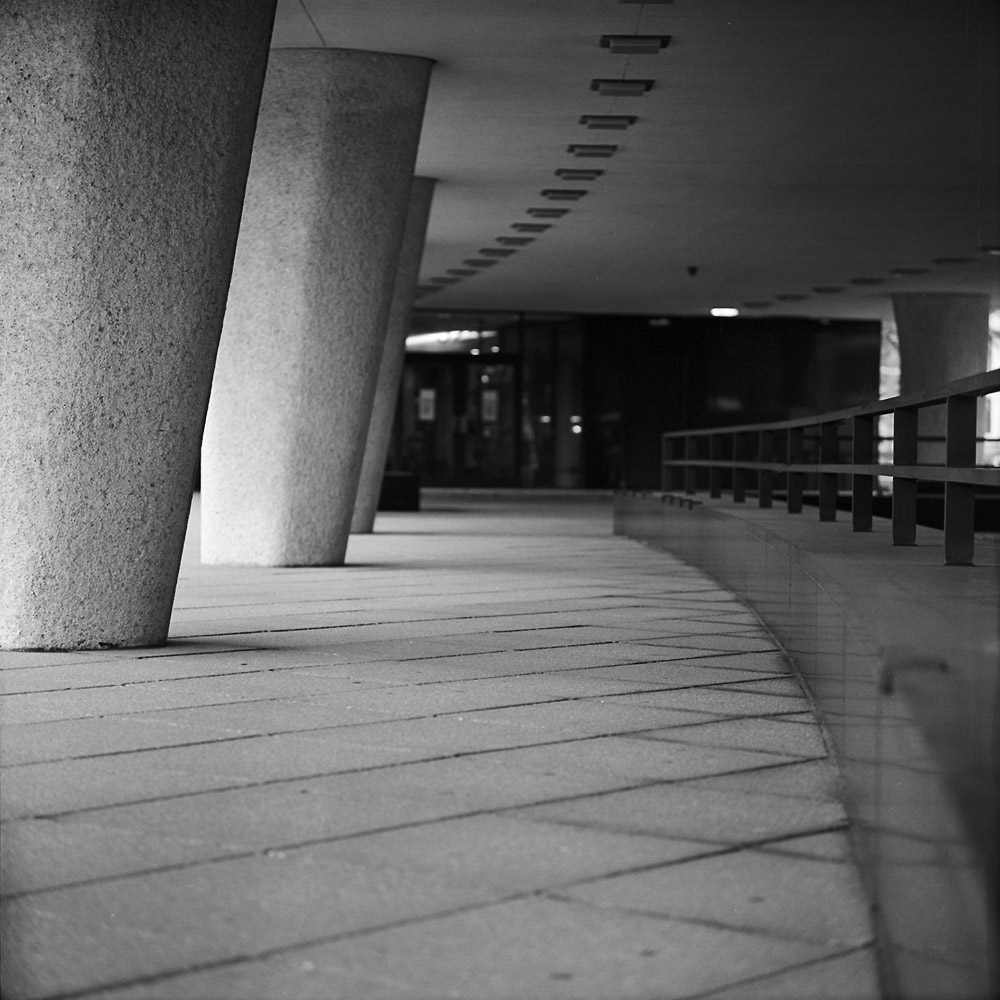
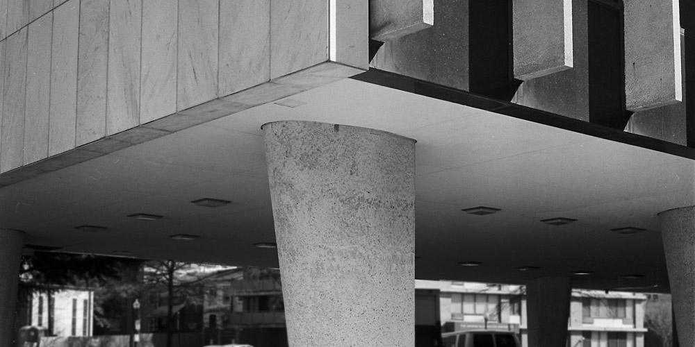
A different view of the columns, from behind.
Underneath the WHO
As a side note, I keep short-handing the name of the building to the World Health Organization, but in reality it is the World Health Organization/Pan-American Health Organization building, but WHO/PAHO is a bit unwieldy, and the full name even moreso.
This time, instead of being so infrastructure-focused, I thought I’d try being a bit more people-focused in my Commuter Diary. It’s one of the hardest things about this project – adding in the human element, getting a little less first-person in the experience and showing the other people using public transportation, while keeping it abstract. There’s a natural tendency when photographing people to want them to be absolutely sharp, clear, and obviously the main subject of the image. Well, when you’re throwing sharp, clear and objective out the window, how do you photograph people?
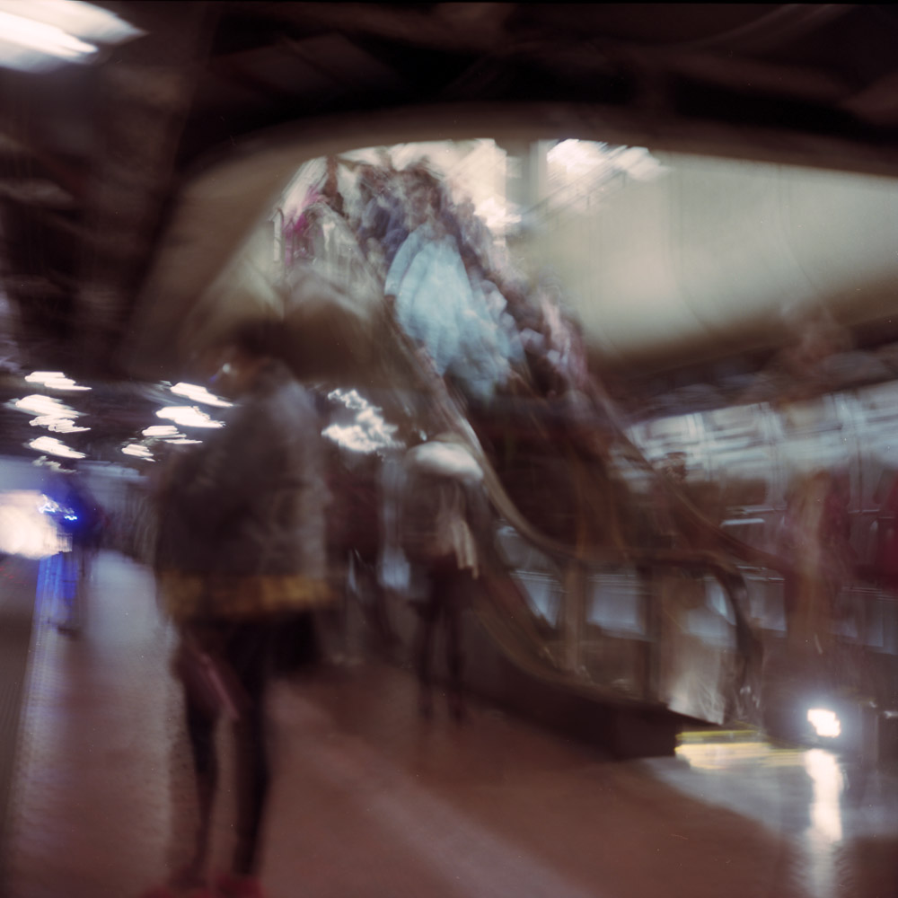
Riding the subway always involves a descent, a passage, and a re-emergence. It’s a normally terribly un-heroic journey that bears a very vague passing resemblance to the hero narrative of Joseph Campbell. Unless of course you’re claustrophobic and/or agoraphobic, whereupon riding the subway is an anxiety attack waiting to happen, and surviving the ride is a transformative experience.
Here is the descent into the underworld:
Crowded Escalator
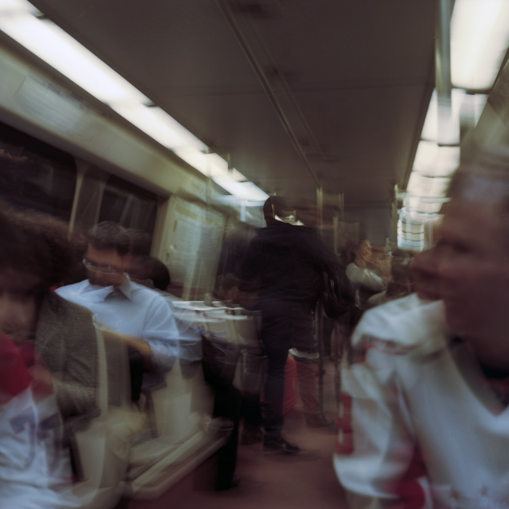
The passage through:
On The Train
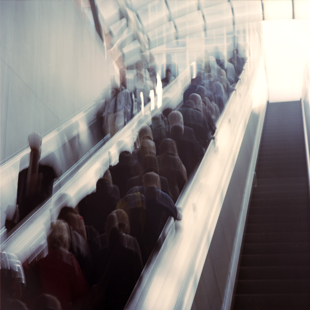
Emerging on the other side, returning to the daylight and the world of mortal men, the escalator ride up is both salvation and alienation, because who would understand or even believe your having done battle with a steel dragon and survived?
Morning Emergence
These are some first attempts at bringing the “experiential” style of photographing that I’ve been doing to bear on people. There have been a few attempts at doing pictures of individuals this way but they, at least to me, really don’t work. Maybe I’m being too rigid in my thinking, or maybe I’m dead on the money. Time will tell.
A few more from the World Health Organization building. These I cropped more than I normally do for compositional purposes. I mostly compose and print full frame, but in these cases, including everything the camera saw didn’t match what I was thinking and feeling when I shot the image.
With the Curves image, I wanted the reflection of what’s across the sidewalk from the building showing in the black granite slabs, but I didn’t want much of the vegetation in the background to intrude and directly conflict with the geometry of the building. The grass in the foreground stays in because it is bordered and bounded by the curved lines that echo the shape of the building and the can lights above.
World Health Organization Curves
I was mostly interested in the organically shaped column supporting the building, and the dynamic angles of the superstructure it points to. Keeping in too much foreground robs the energy of the image, and including more of the superstructure overweights the top.
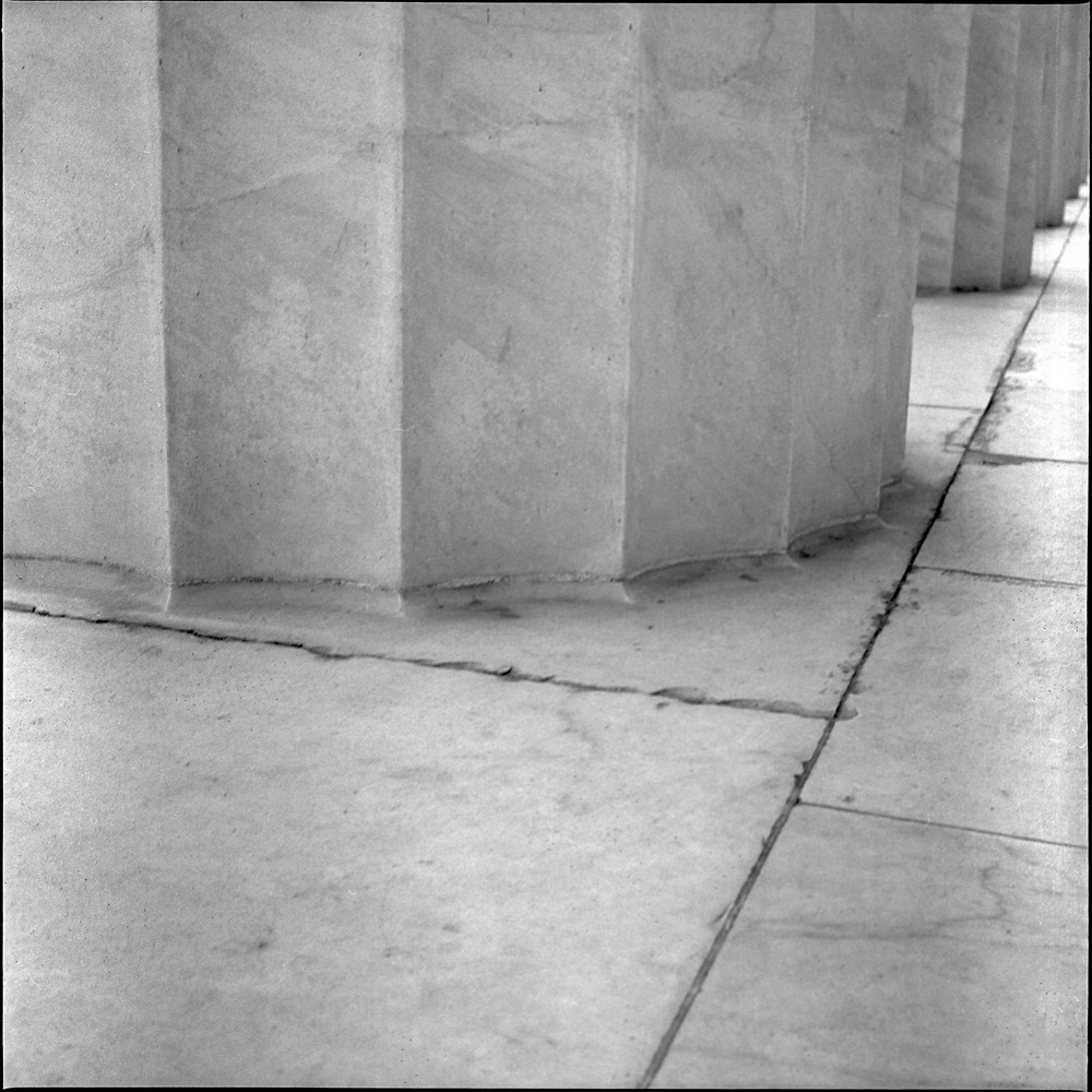
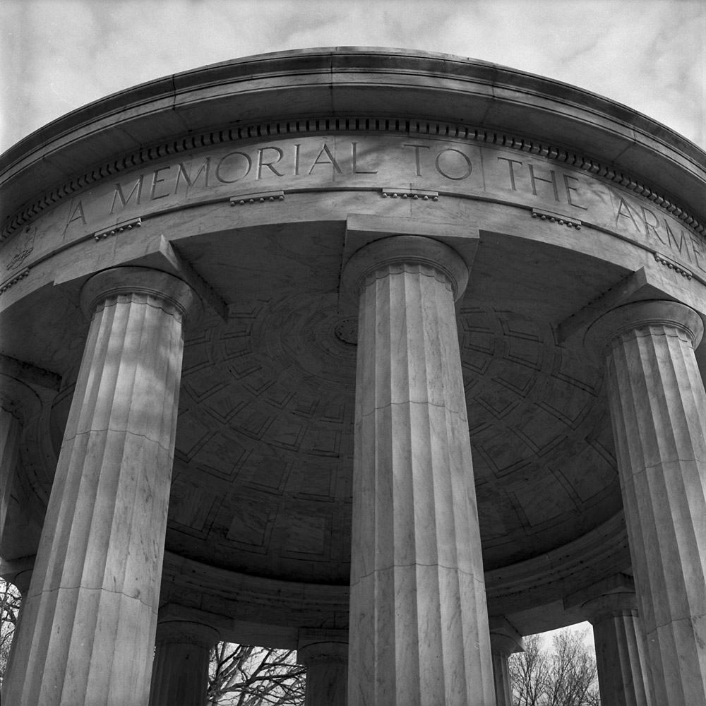
As part of a monthly (well, bi-monthly, in reality) group photography exercise, I and the other participants go out and take pictures on a theme. Whoever picks the theme judges the submissions, and the winner gets to pick the next theme. The current group theme is “Stone”. Therewith, here are two entries I submitted. I still have until the end of the month of April to submit, so I may get out and take a few more that are perhaps more literal.
Lincoln Memorial Column
My first submission is this column and the plaza beneath it on the side of the Lincoln Memorial. I went for a challenge of the white marble because white-on-white is tough to photograph well.
WW I Memorial, Washington DC
This is a tight shot of the Washington DC World War I memorial. Did you know that there is NO national WW I memorial? There is a national Korean War memorial, a national Vietnam War memorial, and a national World War II memorial, but the WW I memorial on the National Mall is for veterans and the dead of WW I from the District of Columbia. It is on the south side of the National Mall, between the Korean and WW II memorials, tucked back in the trees, and overlooked by most tourists and visitors, and probably even most natives of Washington DC. I like the elegant simplicity of the WW I memorial – none of the architectural and symbolic bombasticism of the WW II or the stilted drama of the Korean War monument. I hold this one up with the Vietnam wall as one of the best. It is very much a piece of its time – the end of a psychological era when death could still be dignified.
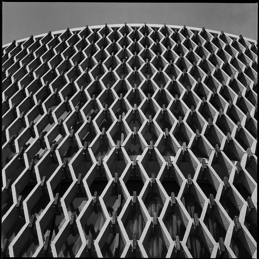
A different perspective on the World Health Organization building, looking up from under the cylinder at the tower. Not quite as abstract as the other two, but nonetheless.
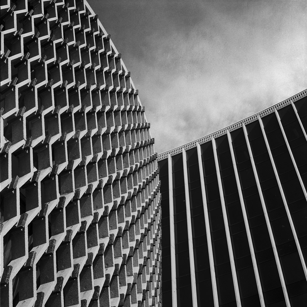
Two different takes on the WHO building downtown DC. This time shot in bright, strong, contrasty sunlight. Due to the geometry of the building I was aiming for geometric abstractions, composing so the context of the structure was absent and what is visible has to be taken non-literally.
World Health Organization, Cylinder
Pointing the camera vertically to create these images really pushes the perception into unreality – you’re dealing with three texture sets, not anything particularly identifiable. Mid-century architecture like this is a rare commodity in DC – most buildings are either glass-and-steel cubes, neoclassical faux-palaces, or Art Deco boxes of varying degrees of interest and value, so this really stands out.
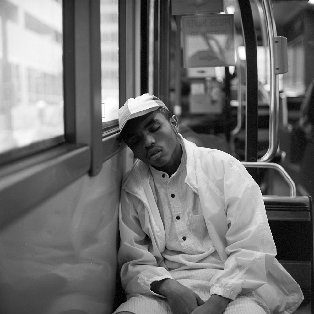
This is a one-off, as it stylistically doesn’t really fit with the rest of the Commuter Diary series. But it’s a really great image, so I’m posting it. I saw this young man dozing off on the bus on my way home from work the other day. It’s very representative of that kind of moment all of us have had when riding public transit – you’re tired, in need of a rest, and hoping you won’t oversleep your stop.