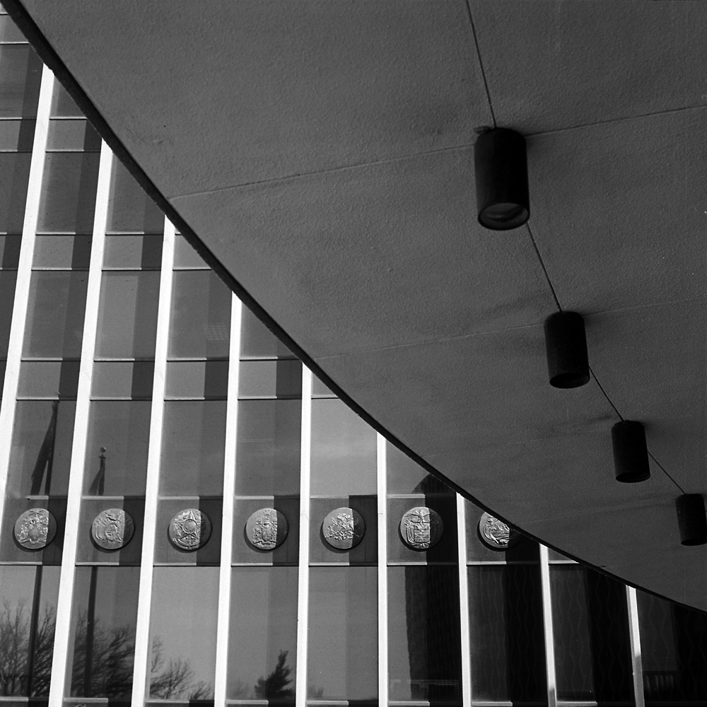
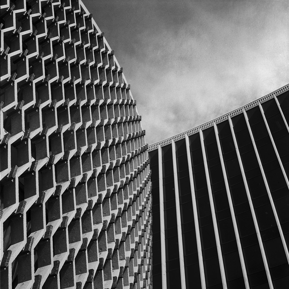
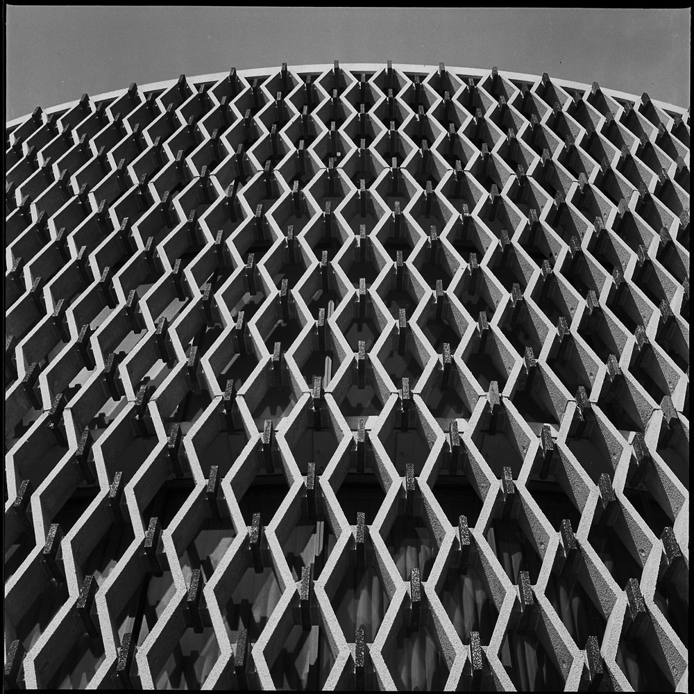
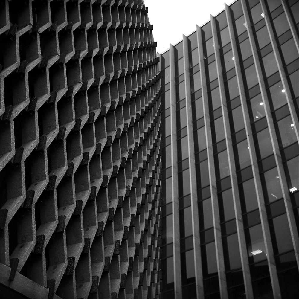
I’ve been doing a LOT of printing lately, in preparation for the shows in Mexico City. I did some serious darkroom cleaning too, getting my print washers disassembled and scrubbed clean of all the mineral deposits that accumulate from using DC city water, and got all the stuff out of the sink that was cluttering it up so I could print big. I’ll be doing some copy photos of the big prints I did shortly, and have them posted here. But all that work inspired me to not only do more printing, but to be adventurous in my artistic endeavors, and push out of my comfort zone.
I have thought for quite some time about trying this, and thanks to a little push from my friend Jeremy Moore who lives down in Texas, I took the plunge last night and did some interventions on my prints that many would consider heretical. I made two different digital negatives from the same image, one with high contrast and one with normal contrast. The one with normal contrast I printed on Velke Losiny Prague, which is a light-weight cold-press paper with lots of texture. The high-contrast/dark print is on Revere Platinum, which is a heavy-weight hot press smooth paper. I then tore the print on the Velke Losiny paper in half, and then stitched the two prints together with red thread.
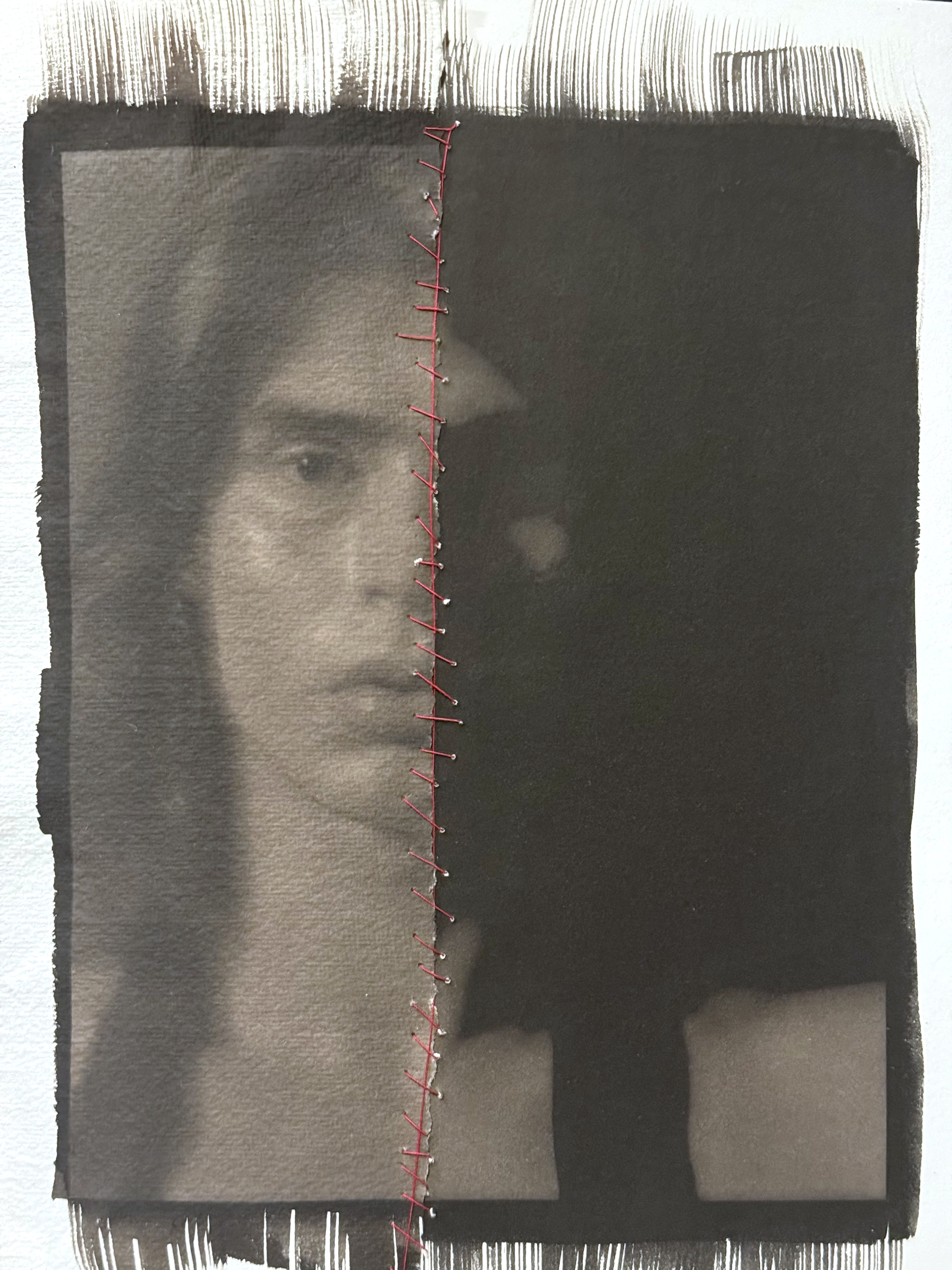
This is an exciting change for me, getting more experimental and risk-taking with my photographs. I’m going to do a lot more with the “destructive/reconstructive” mode of working – I think it opens up the work to being less literal and more visually and psychologically explorative.