Apologies all for the long pause from my last posting – I just needed a little break, and to recharge my creative juices after getting the show up on the wall. Perhaps this weekend I’ll post the pictures from the opening reception.
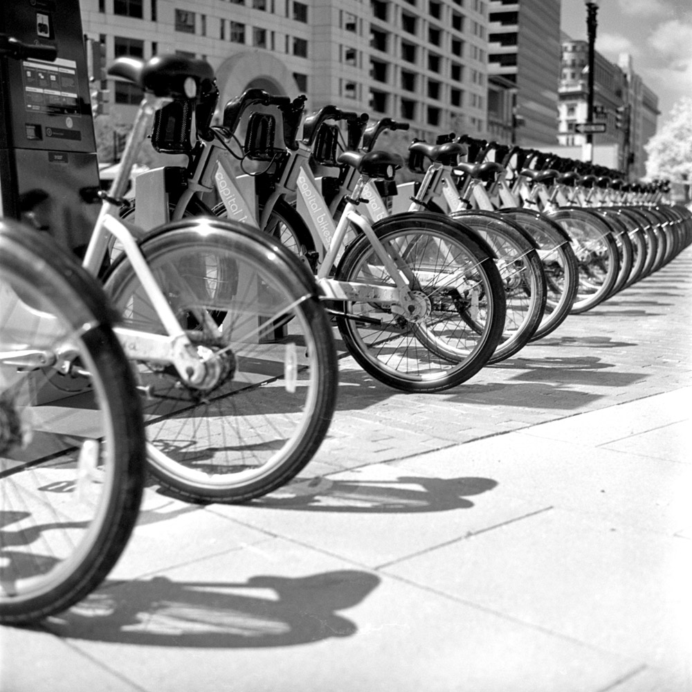
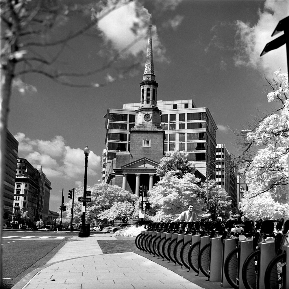
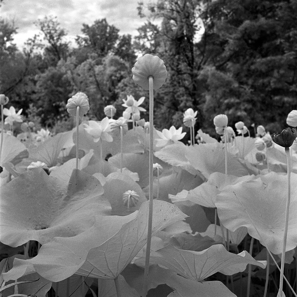
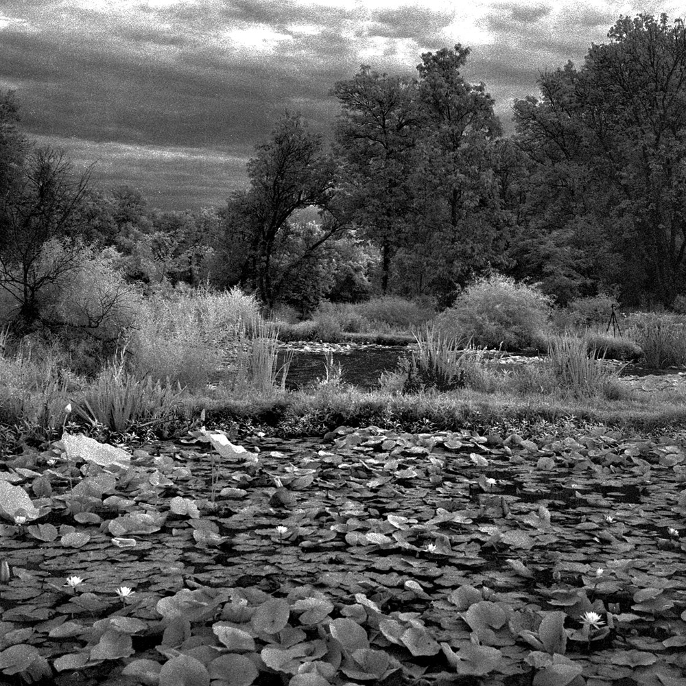
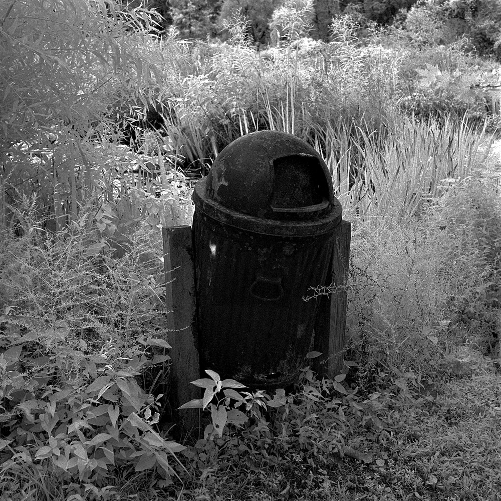
Anyway, here’s some stuff I shot last weekend and earlier this week. I lucked into a modest stash of Konica Infrared film, which hasn’t been made in probably 8-10 years. The stuff I have is older than that. I needed to find out how well it had kept in the meantime – IR films in general seem to age much faster than regular b/w film, and for all I knew, the IR-sensitizing dyes had faded and it would be just another slow b/w emulsion with tons of base fog, but grainy from the degradation (I shot some Kodak HIE 35mm that was from the last batch they did, and it had degraded to horribly foggy and grainy, despite the fact that it was only perhaps 4-5 years out of date). The results are in – while they do have noticeable base fog, the negatives are still quite fine-grained and do exhibit the infrared effect nicely, with very little overall degradation.
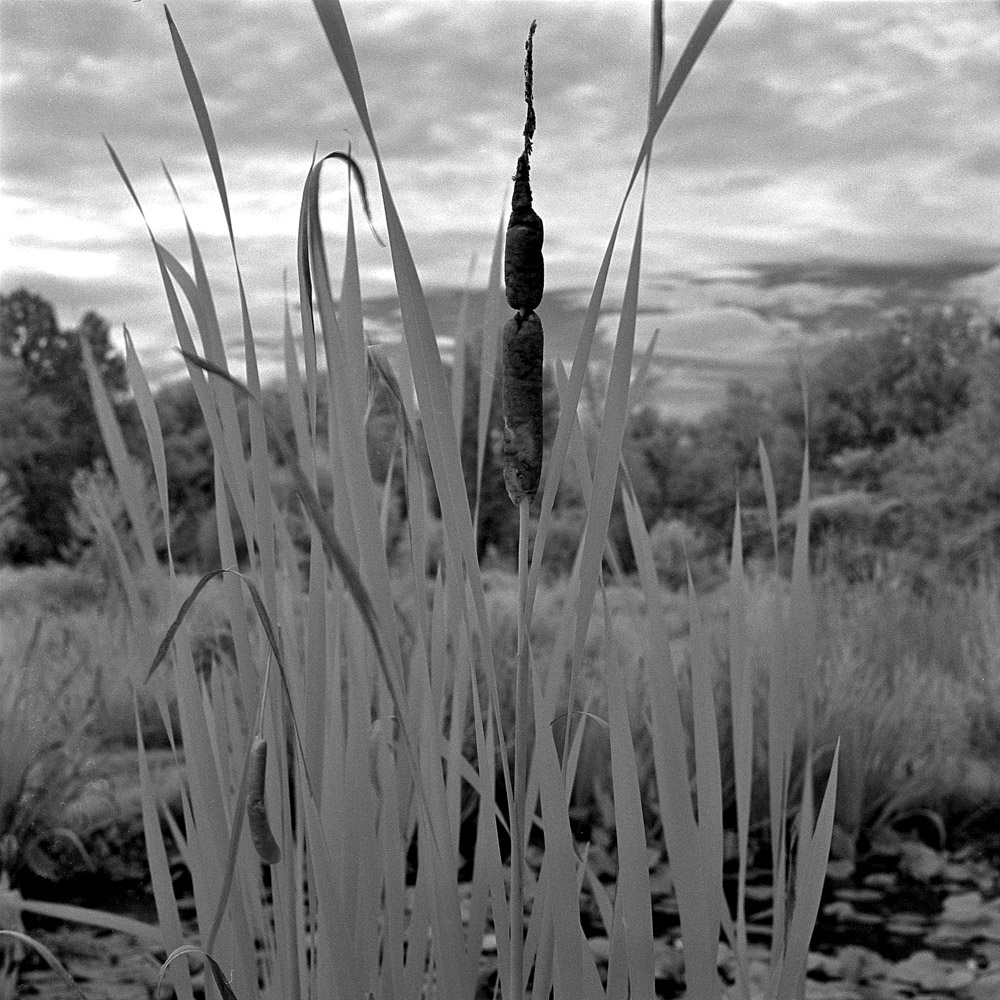
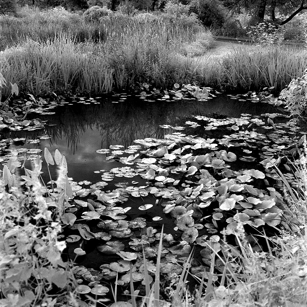
Here are results from two rolls worth, shot on a lunchtime walkabout near my office, and on an early saturday morning excursion to Kenilworth Aquatic Gardens.
Capital Bikeshare – Konica InfraredNew York Avenue Baptist – Konica Infrared
The infrared effect is somewhat subtle in these first two – the foliage is white, but the sky is not particularly black or contrasty. The red bikeshare bikes though are much lighter than they appear on regular b/w or color film. Also the wheel guards on the back wheels are completely translucent, but in real life they are dark smoked and/or black plastic.
The Rollei is a perfect camera for Infrared photography because you can focus and compose your images with the unfiltered viewing lens, so you don’t have to keep taking the filter on and off (the strong infrared filters like the Hoya RM72 I used are anywhere from nearly to completely opaque to the visible spectrum, making it very difficult at best to operate the camera with the filter installed on a single lens reflex camera).
Kenilworth Aquatic Gardens is a 37 acre plot on the east/south bank of the Anacostia River which runs through Washington DC. Owned and operated by the US Park Service, it is one of the hidden gems of Washington DC. The neighborhood around it is still quite rough, which deters casual visitors not familiar with the area. I went looking for the giant lily pads they usually have, but they were nowhere to be found. One of the park rangers informed me that they had to skip the Victoria Lily pads this year due to budget cuts – they normally import them from the Amazon fresh each year.
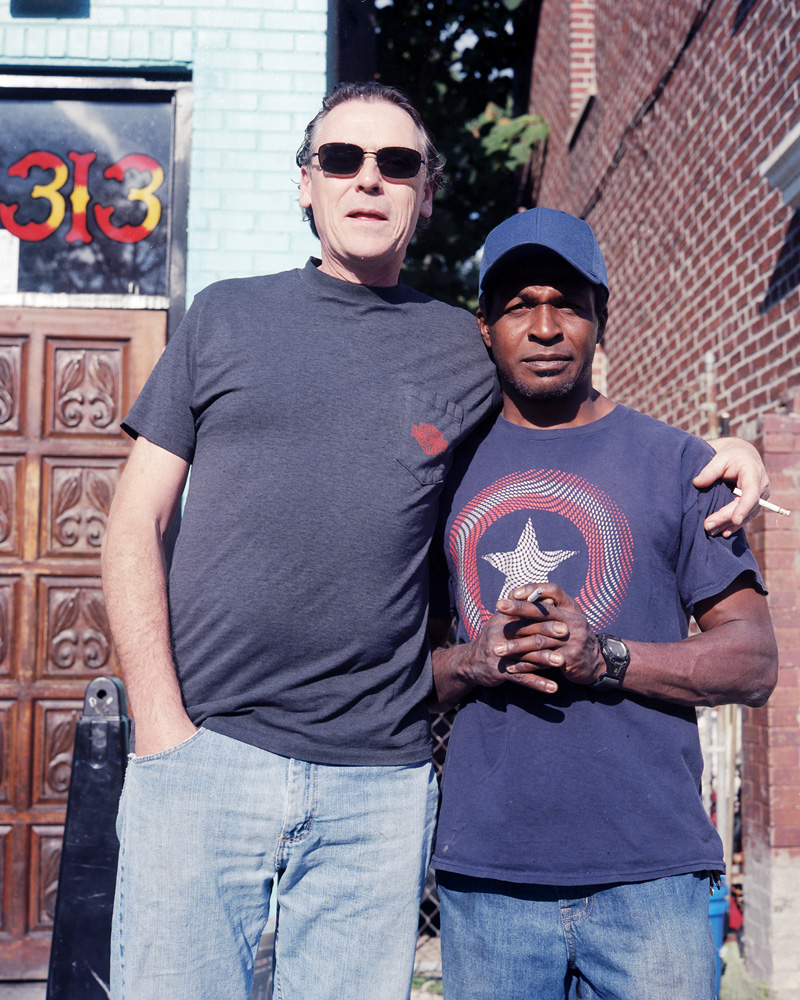
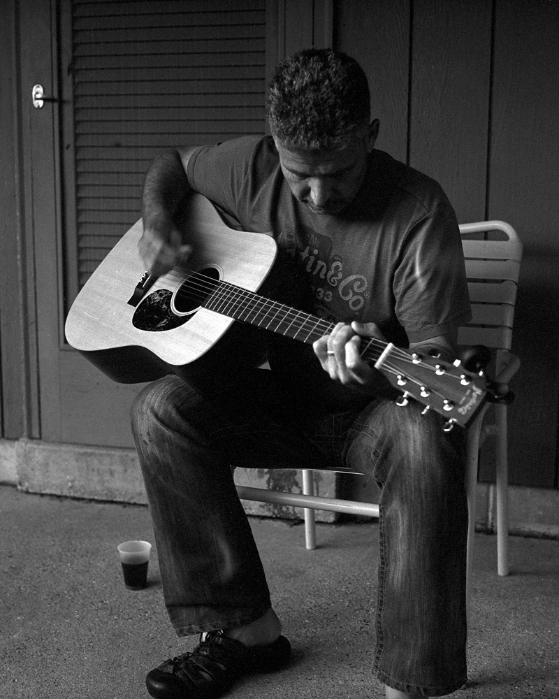
Truth be told, I’m a bit of an anxious street photographer: I’m not terribly good at asking total strangers to pose for me. So I’m getting started as an exercise by setting a new rule: if you see me out and ask me about my Rollei, you have to pose for me. We’ve already broken the ice by talking about the camera, so now we’re not total strangers anymore. This is the very first in that series. These two guys saw me out with the camera, and started asking about it. They even asked me to photograph them, which made it easier. The black guy was interesting; even though he was smoking, he asked if he should get rid of his cigarette for the photo. I told him to keep it.
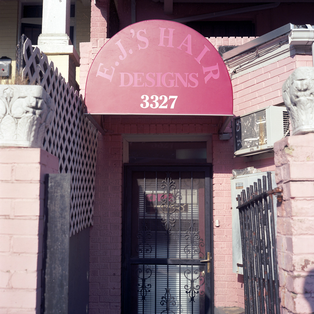
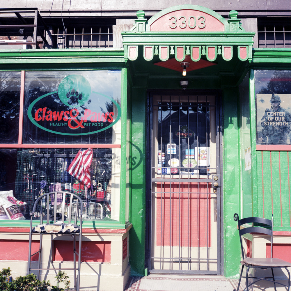
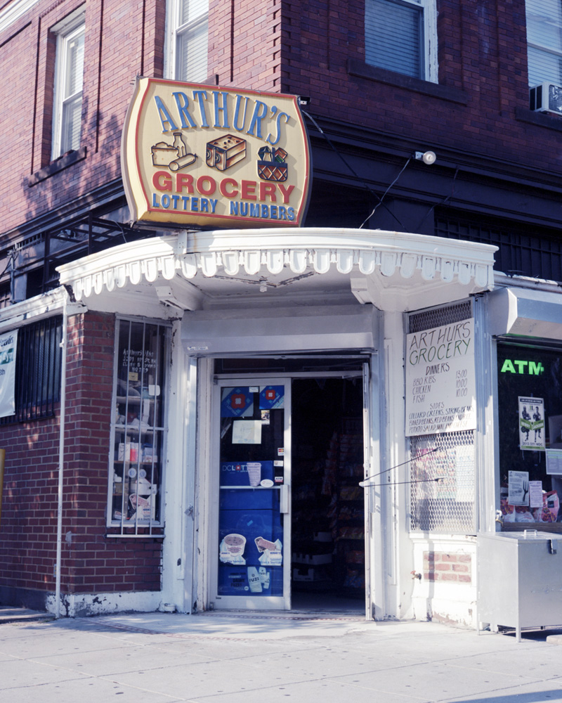
Just four random shots from around the neighborhood. These first three are small local businesses managing to hang on in the face of growing gentrification.
EJ’s Hair Designs
I don’t know what’s going on with EJ’s. Every time I walk past (which may be heavily influenced by when I’m going by – weekday evenings and/or weekends) it appears closed. I know the sign says “open” in the door, but you tell me what closed miniblinds means… I love the sign on the door (which is probably too small to read in the JPEG version of this shot): “We love children. However, insurance regulations do not allow children in the shop unless they are receiving services. Thank you, The Management”.
Claws N’ PawsArthur’s Grocery
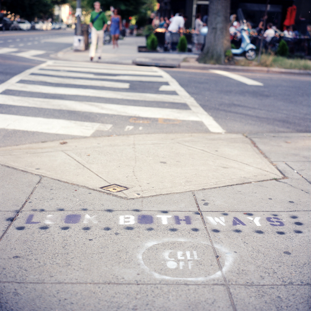
A sign of the times. General hipsterization plus the general trend of people being so absorbed by their mobile devices that they do stupid stuff like walk into traffic has inspired these signs spray-painted at the crosswalks of a number of intersections in the Upper 11th Trend Strip (don’t know what else to call it- North-East Columbia Heights Business District? NoECoHiBD? …that stretch of 11th where all the new restaurants have proliferated amidst old-time bodegas and coin laundries? How about just Hipster Velcro? (can’t call it a hipster magnet because that would imply something about hipsters that’s just not true. Velcro sounds about right because it sticks well to things like scruffy beards and ironic flannel). Of course, it NEEDS to be painted on the sidewalk, for it to stand a chance of registering with the phone-focused.
Here are two images of the same scene, one in color, one in black and white. I’m sharing them together to demonstrate how the change from one to the other totally changes the way we feel about the image.
First, the black and white:
Black Boy, Garuda, B/W
Notice the visual emphasis – how the tones draw your eye to specific parts of the scene. What do you find yourself looking at, and relating to? What compels you? What emotions does this evoke?
Now the color:
Black Boy, Garuda, Color
This has a very different balance. The colors change the emotional timbre of the image, as well as the focus point for the viewer, even though both photos were taken from essentially the same vantage point. I think it’s fair to say that in the black and white version, your eye and attention keep coming back to the boy. The image has a more stark, somber feel to it whereas the color image is much more lively, and balanced – it’s easier to view both sides equally. To be entirely fair, some of the impact of the black and white version is due to the way in which it was exposed and processed. This version is fairly high contrast, which makes the dark areas very rich and the whites very pure white. Were it done differently, there would be a greater balance between the boy and the garuda in terms of tones, and it would have a different resonance.
Here are some color shots I took on my neighborhood walk around, last weekend. I noticed a theme of small businesses in the shots I was taking, so I decided to make a grouping out of them for this post. The areas I was photographing are actually very bustling and vibrant, but A: this was on a Sunday afternoon, and B: it was about 93 degrees Farenheit outside, so it looks far more desolate than it actually is, but that allowed me to focus on the appearances of the businesses themselves. My interest in photographing them without people is not to portray an economic state that may or may not be true, but rather the overall feel of small businesses that are in a neighborhood in transition – these are businesses, mostly minority-owned, that have not yet been gentrified in an area experiencing rapid gentrification.
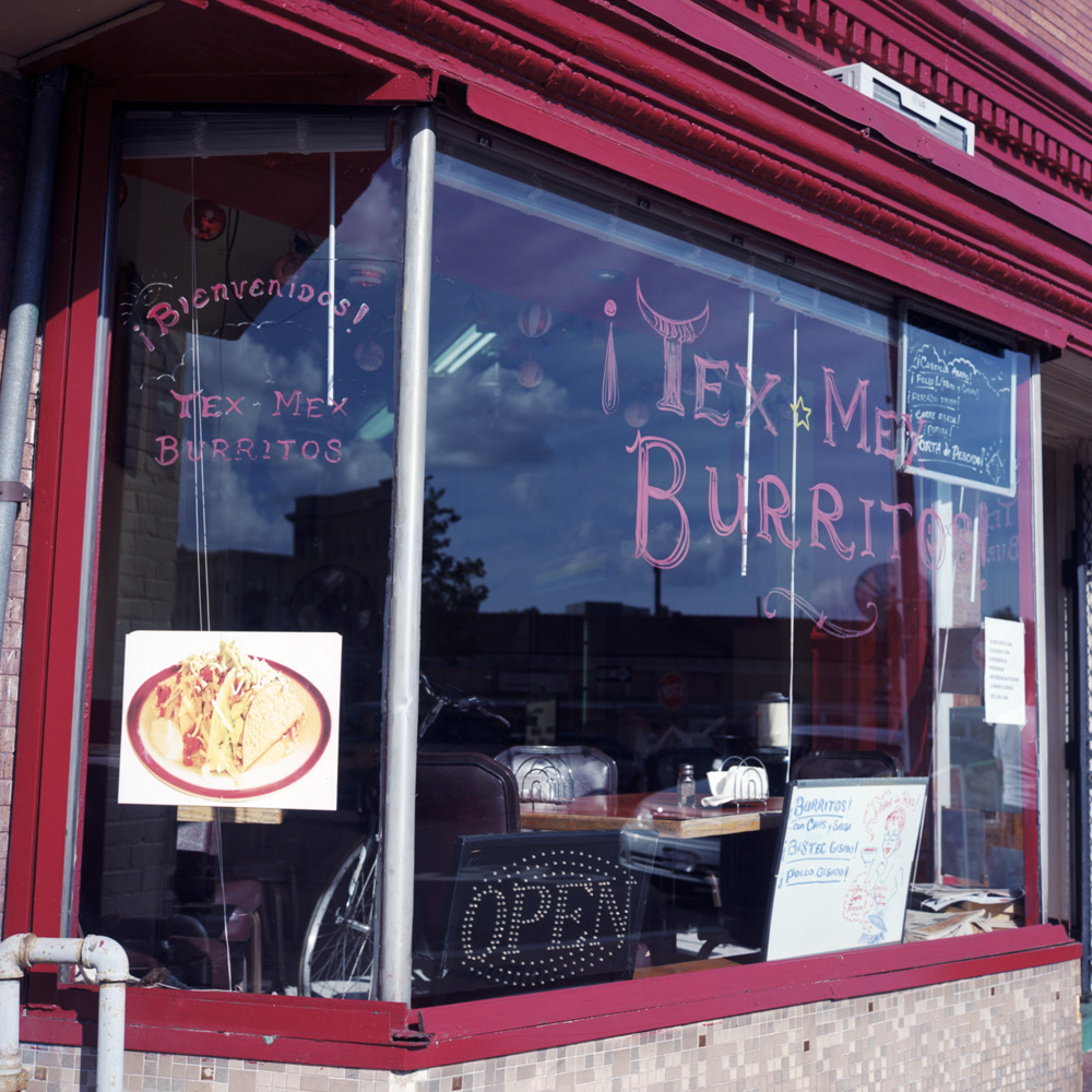
To me, the loss of these businesses to gentrification is the biggest downside to the process. They are what makes up the character of the neighborhood, and why all those gentrifiers moved there in the first place. I will be very sad when Tex-Mex Burritos is displaced for yet another Chipotle.
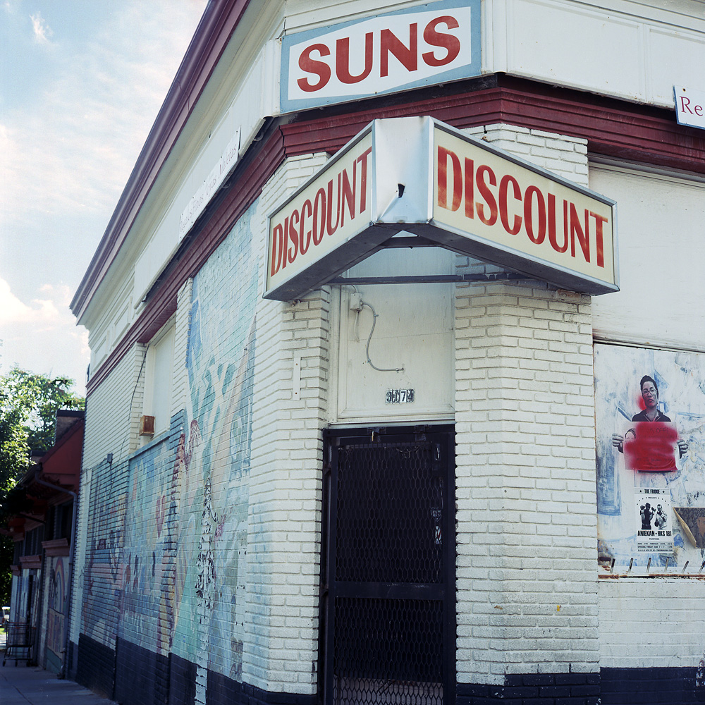
Suns Discount
Sun’s Discount is obviously shuttered. I don’t know how big a space it is on the inside, or what kind of (probably insane) rent the landlord is asking for, but I love the murals on the wall and the protest/message posters plastered on the whitewashed windows. It reflects the character of the neighborhood, and particularly its past – the small ethnic “discount” store that would have carried a hodge-podge of inexpensive products, primarily catering to the Latino community, which has adopted the small business strip along Mount Pleasant Street. Historically a mixed race, upper-middle class neighborhood, after the 1968 Martin Luther King riots, the neighborhood experienced a significant turnover and transformed into a poor Latino barrio in the 1970s. It is in the process of changing back into a largely white, upper-middle class neighborhood, as the housing stock off the business district consists of large, elegant rowhomes and single familys that are being snatched up, fixed up and turned into two and three unit condos.
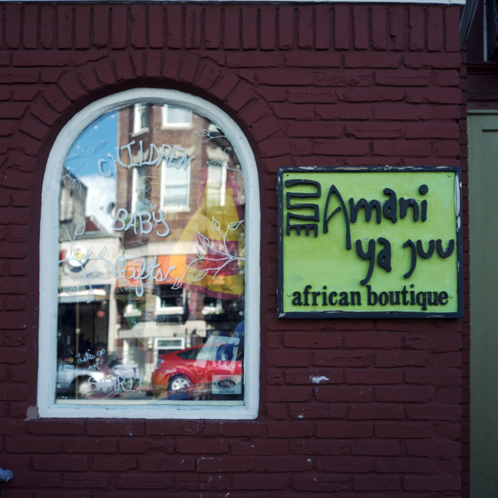
Amani African Boutique
There is still an African-American presence in the neighborhood – a touch of soul remains amidst the sazón. The neighborhood was always multi-ethnic, but the blend has changed over the years.
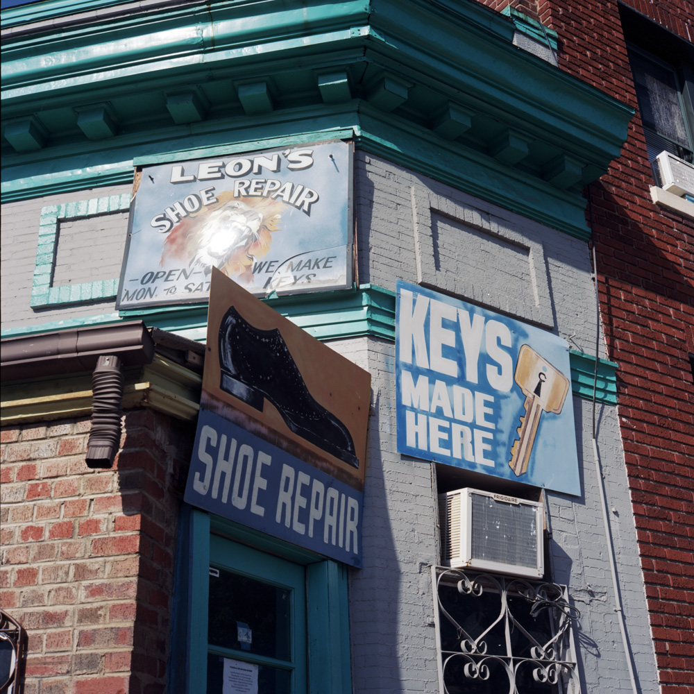
Leons Shoe Repair
Another one of those small businesses that when a real estate developer sets their sights on the block will be one of the first to go. Leon’s operates out of a space not much bigger than a coat closet. In the land of big-box stores and franchises, there’s no room for a 200-sq ft retail operation. And signage like that would never fly in a homogenized shopping mall.
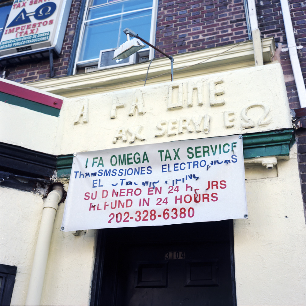
Alfa Omega Tax Services
Here’s one that has been around for decades – witness the missing letters and the layers of paint applied to the original Alfa Omega Tax Service on the wall. Having them there in the 1970s and 80s when this was one of the police patrol beats officers dreaded to be assigned would have been a huge deal to the residents, as there would have been few legitimate businesses willing to provide quality services of any kind in the area.
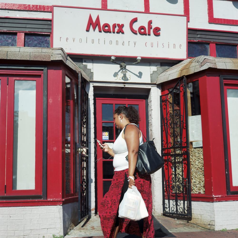
Marx Cafe
The bohemian precursor to gentrification – Marx Cafe (“Revolutionary Cuisine”) brought a little touch of culture and chic.
Tex-Mex Burritos
A typical neighborhood mom-and-pop eatery. This one is newer, keeping within the theme of the neighborhood but brightened up and appealing to the incoming Anglos as well as the long-time residents.
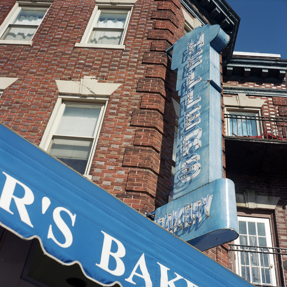
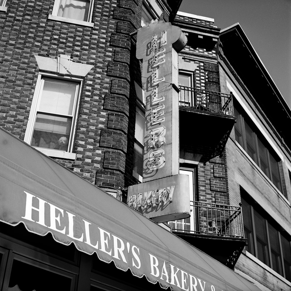
Hellers Bakery
Heller’s Bakery has been here forever, witness the neon sign, from back when the neighborhood was originally an upper-middle-class, white/jewish/African-American neighborhood. It stuck around through the hard times. If you saw the movie, State of Play, starring Russell Crowe, you’ll recognize this as being from outside his apartment.
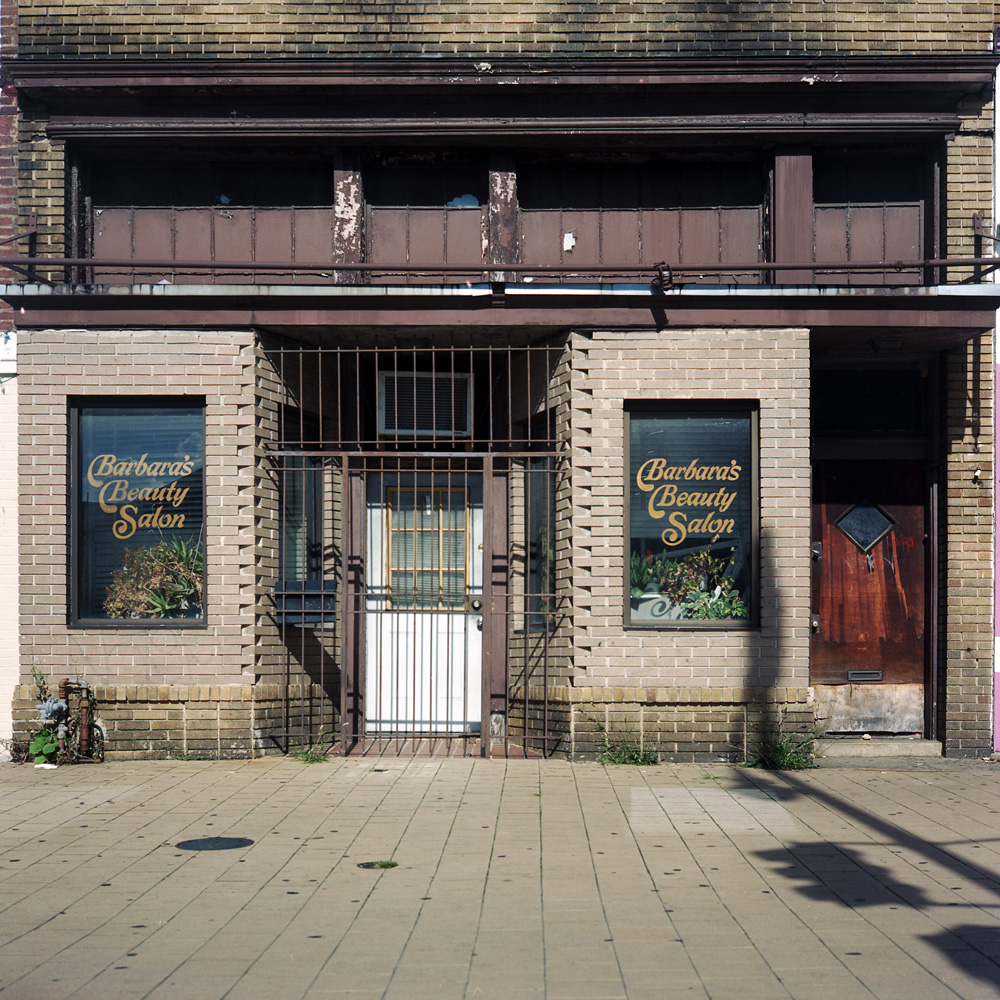
Barbaras Beauty Salon
I’m not sure Barbara’s is still in business – granted I usually never walk by it during the work day mid-week, so it might in fact operate then, but whenever I see it, it’s shuttered, blinds pulled, and half-dead plants in the window. I don’t know if they were a victim of shifting demographics, or just sloppy management – I don’t know that I’d want to trust what little hair I have left to someone whose plants look like that!
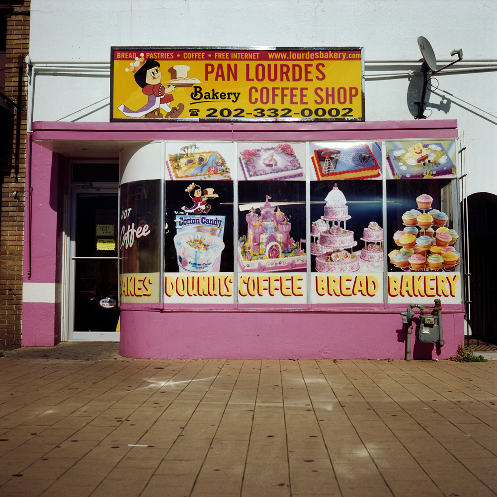
Pan Lourdes, Afternoon
Another small business that will probably be driven out by gentrification in the next ten years. Massive re-development of the neighborhood has happened a few short blocks down the street, with upscale restaurants and pubs, a shopping center with Target, Best Buy, Marshalls, Staples, Radio Shack, GNC, a Washington Sports Club gym, and across the street is Chipotle, a wine store (not a liquor store, but a WINE store), and a FedEx outlet. Like I said earlier, no room in that for a riot of pink selling Central American baked goods. And the neighborhood will be poorer for it.
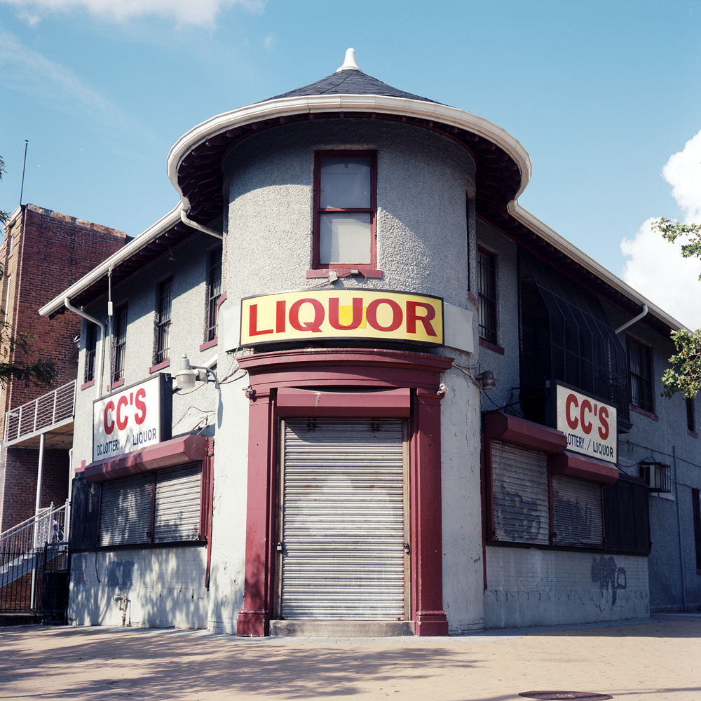
CCs Liquor
In contrast to the wine store down the street, this is a good old-fashioned ghetto liquor store. This one, I could let go, but the Colony Liquor up the street I’d like to see stay around if for no other reason than the fantastic Deco facade and neon sign (see previous posts of mine for pictures).
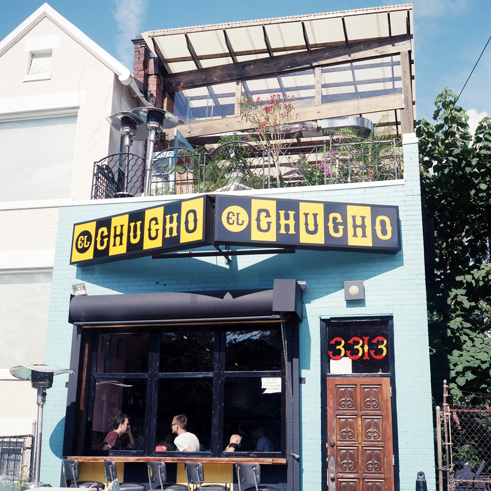
El Chucho Roof Deck
Part of the gentrification wave in my own segment of the neighborhood- its ethnic cuisine by hipsters. Don’t get me wrong, they have very delicious and authentic tacos (and insanely cheap happy hour prices – you can get three tacos and a beer for $10-11!!!), but the truly authentic taquerias don’t have roof decks, bar seating reclaimed from former diners, and waiters wearing plaid flannel, sporting a well-maintained three-days stubble.
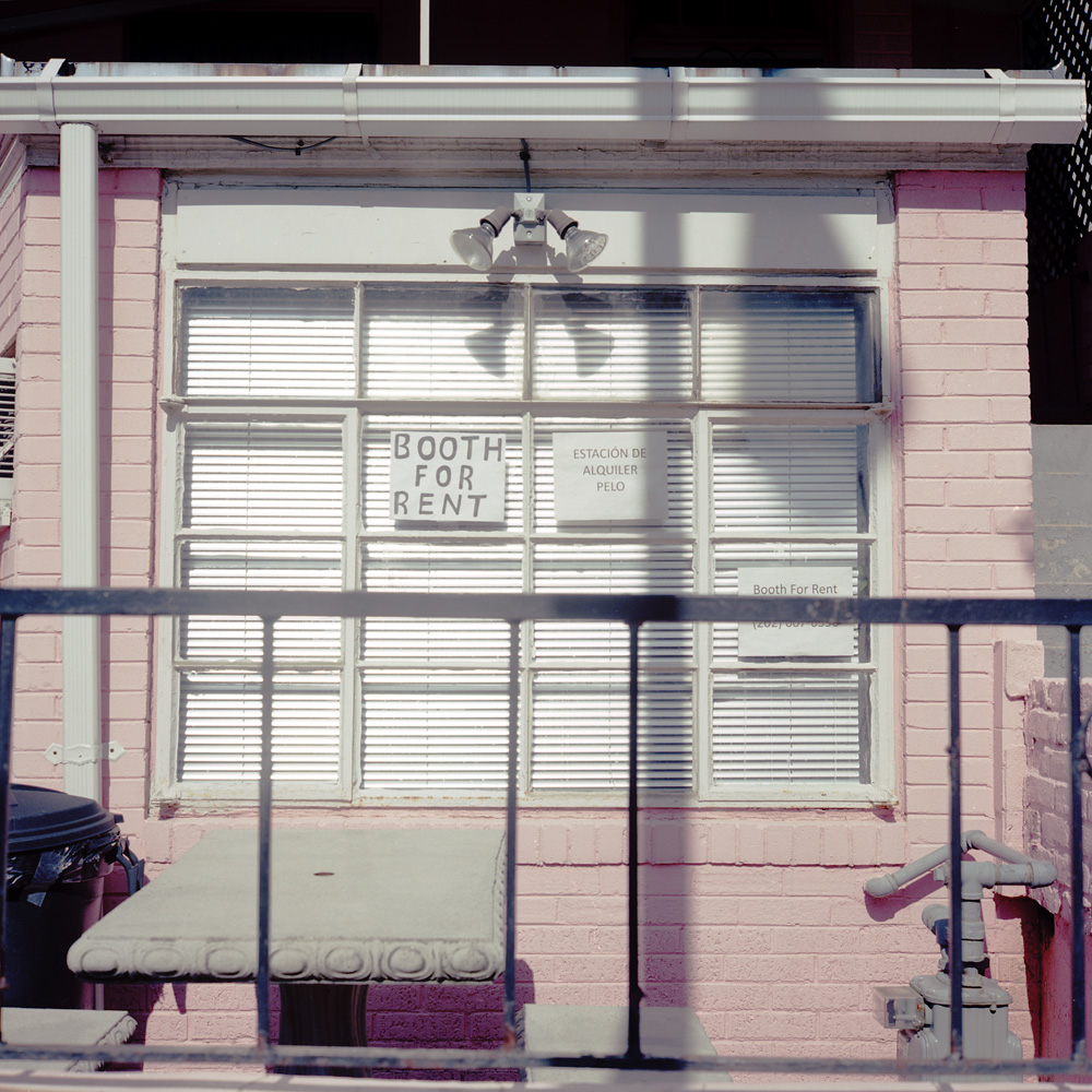
Booth For Rent
Alongside the hipster taqueria you have the basement beauty parlor, which you’d never know was a beauty parlor if not for the booth for rent sign in the window.
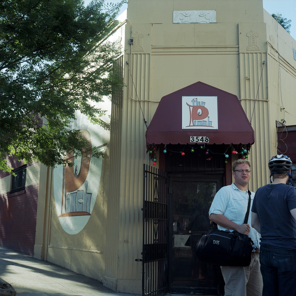
The Pinch Front Door
The Pinch is a neighborhood dive bar featuring live music on the lower level. The graphics outside scream 1970s blaxploitation movie, the patrons now scream suburban white kids who moved to the city to have an “authentic” experience. But it’s good to have a venue that provides space for local live music, where up-and-coming bands needing a break can perform, as there are definitely not enough performance spaces in this town to adequately support the creative talent here.
For wont of anything better to do on Sunday afternoon, I went out for a stroll in the 90+ degree heat (what was I thinking!!!) with the Rolleis for company. I wanted to do a little film and development test to see how well my results would come out. I’d say I nailed it based on these shots. The film I was testing is Ilford PanF, a very slow, fine-grained emulsion. The film speed Ilford recommends for this film is ISO 50. Quite a few folks I know recommend giving it a more generous exposure and rating it at EI 12. I shot some before at EI 25 and got good but not knock-your-socks-off results, so I thought I’d try the 12 and see what difference it makes. I took a risk and changed two variables at once – film speed and development technique. Normally I use Rodinal at a 1:50 dilution and develop for 14 minutes, agitating the chemistry for five seconds out of every 30 seconds. This time, I used Pyrocat HD for my developer, gave it twice the normal dilution (I usually use it diluted 1:1:100, but this time I used 1:1:200) for 45 minutes, with 5 seconds of agitation every 15 minutes.
This development technique is known as semi-stand development. Semi-stand uses highly dilute developers for greatly extended periods of time, with minimal agitation. What this does is it allows micro-contrast areas to form on the film where byproducts of the development process accumulate on the edges of light and shadow. These byproducts serve as a mask and lead to a boost in contrast at that edge, increasing the appearance of sharpness. If you look at the emulsion side of a negative that was developed using semi-stand, stand, or extreme minimal agitation technique (variations on a theme), the emulsion will actually appear in relief as if it had been etched.
This technique is also useful for managing high contrast situations because it allows for greater adjustment of the length of development to manage highlights. When you develop a roll of film, the shadow areas develop first, and once they have reached their maximum recorded density, they stop. Highlights will continue to develop long after the shadows have finished. This is one of the primary means for controlling contrast in an image- if the highlights are known to be too bright before developing the film, you can simply reduce total development time to keep the highlights from becoming unprintable.
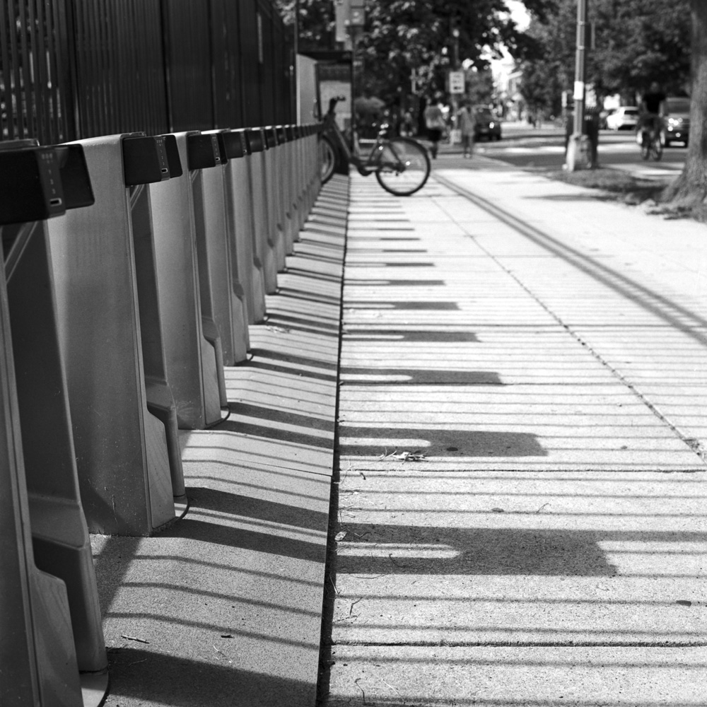
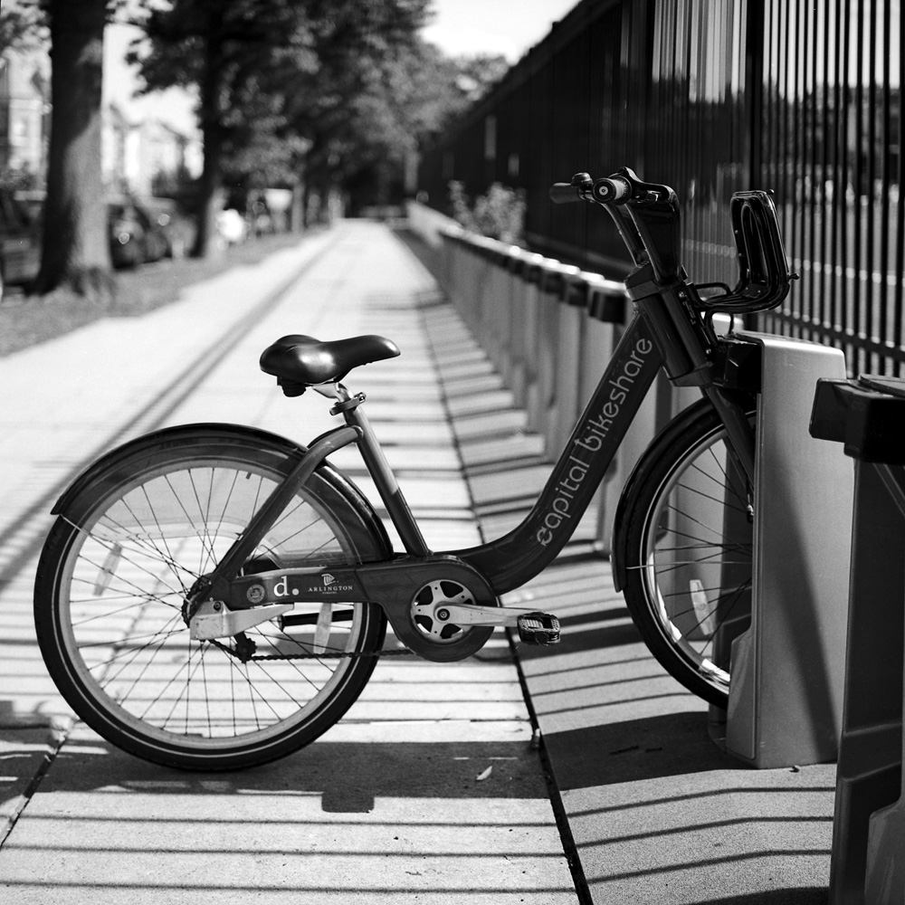
Bike Rack, 11th St. NorthboundBike Share Rack, 11th Street
These first two images are of the Capitol Bikeshare rental rack near my house. I’ve photographed the Bikeshare racks before, with full racks of bikes, to capture the receding perspective of the bike wheels. This time, I shot the bike rack with only one bike in it, to work with the late afternoon shadows created by the rack itself, and also to demonstrate the popularity of the Bikeshare, at least in my neighborhood. As you can see, on a Sunday afternoon, with the heat rising to over 90 degrees F, all but one of the bikes from this rack are in use.
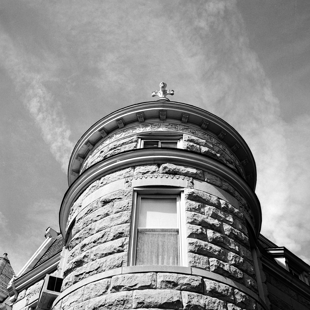
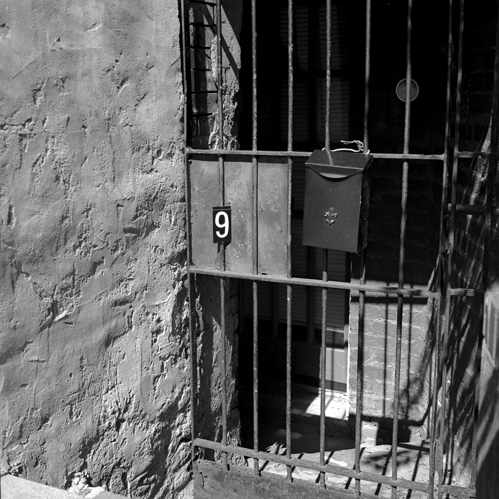
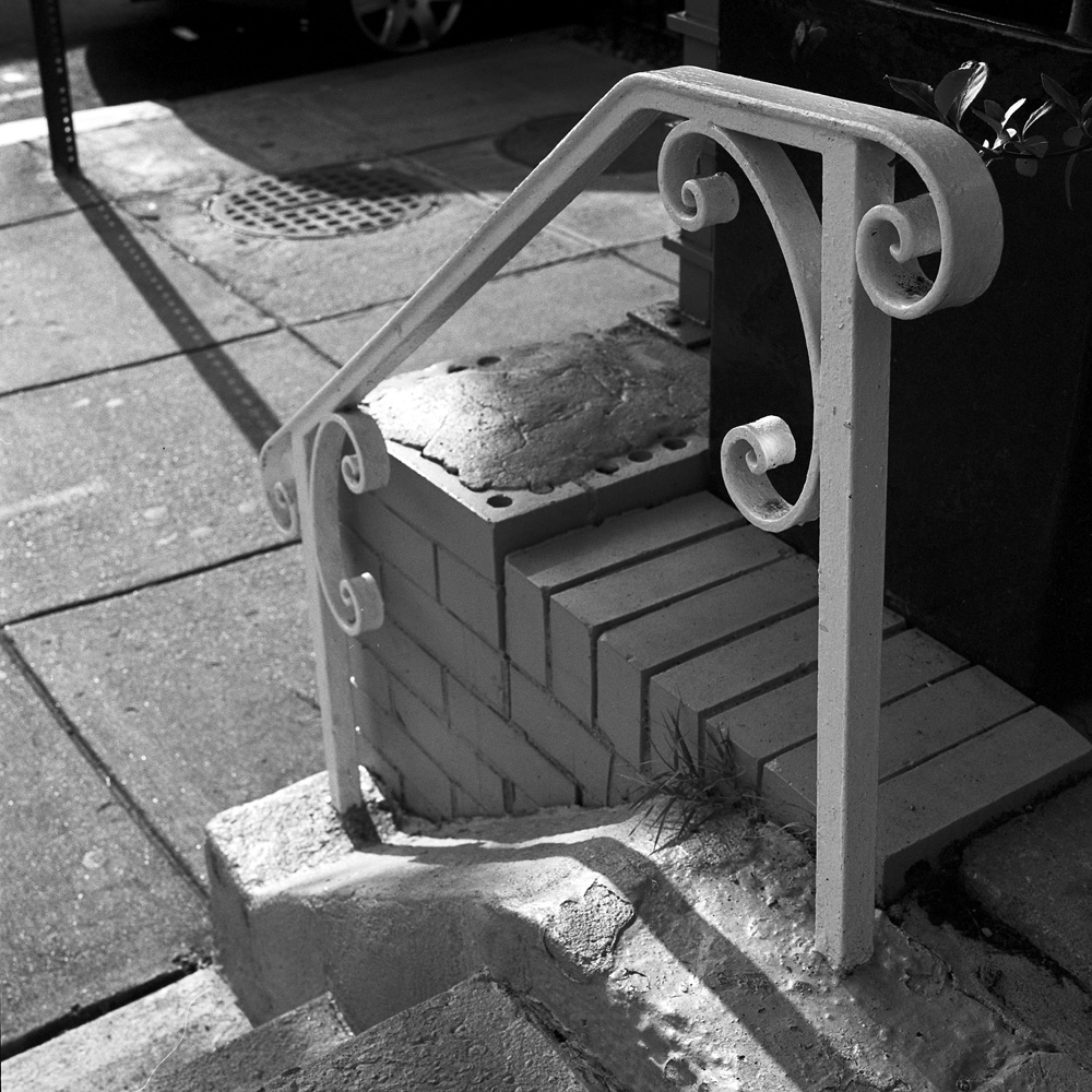
Stone Turret, 11th StreetNumber 9, Basement Door
Very much in the same stretch of 11th Street as the bike rack is where these two scenes can be found. The stone house is a bit of a neighborhood landmark – there are maybe half a dozen or less in the neighborhood with similar facades, and the rest (hundreds of houses) are varying types of brick or stucco over brick. The basement door photo was taken as part of this exercise, not only because I like wrought iron, but because the scene had extremes of contrast that I wanted to see if I could tame with the semi-stand development.
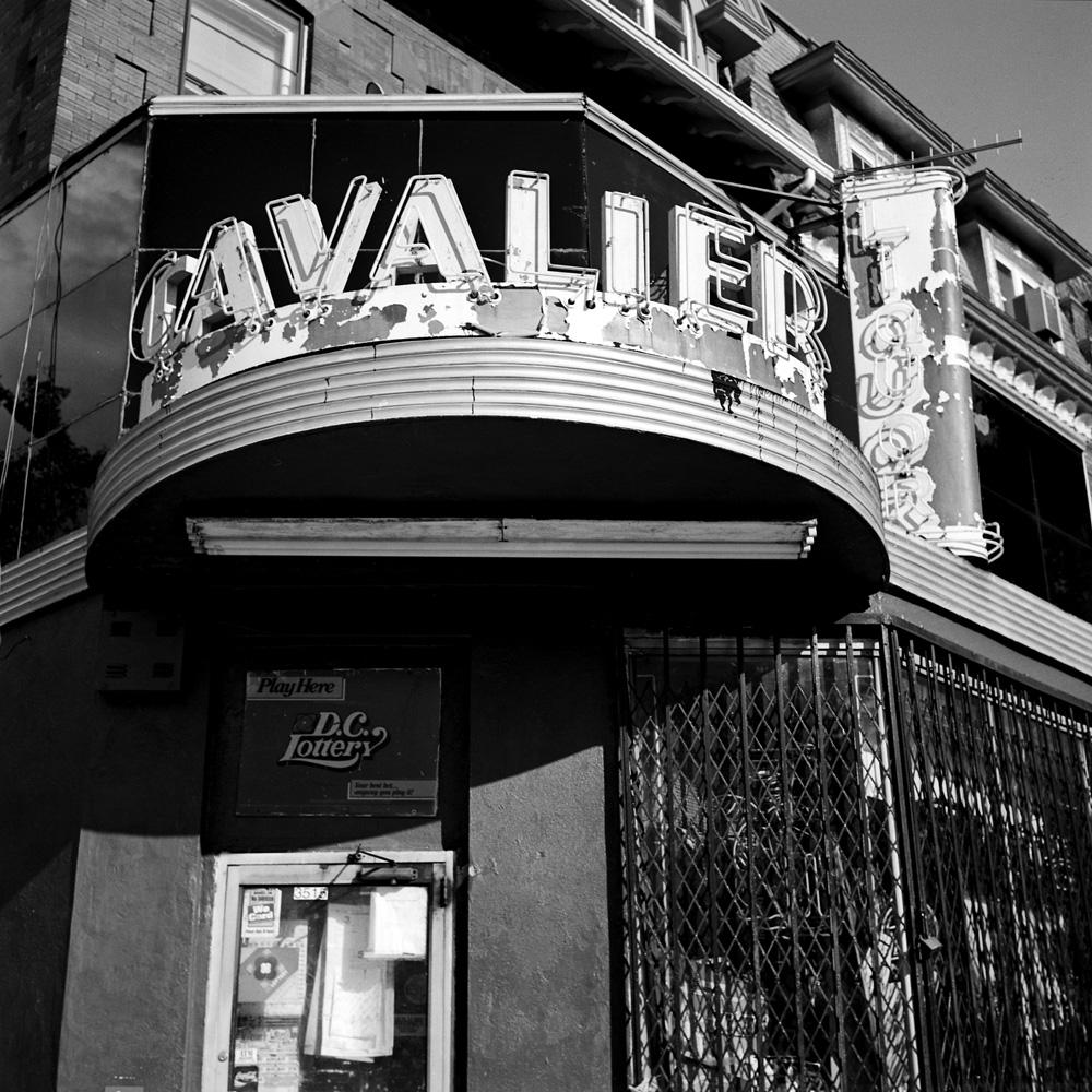
Cavalier Liquor Sunday AfternoonHellers Bakery
These two photos are of neighborhood icons – you’ve seen my color photo of Cavalier Liquor at night before. It has been the subject of many a photograph by fans of urban texture, neon, and Deco architecture. Hellers Bakery has been in their current location for many many years, and if you saw the movie “State of Play” starring Russell Crowe as Cal McAffery, a hard-luck, hard-boiled reporter who uncovers a Washington conspiracy, you’ll recognize their neon sign from below his apartment window. I’m very annoyed with Hellers that they don’t illuminate their sign very often, so it makes it very hard to get a good photo of it after dark!
And last but not least, an appropriate sign to end the post with:
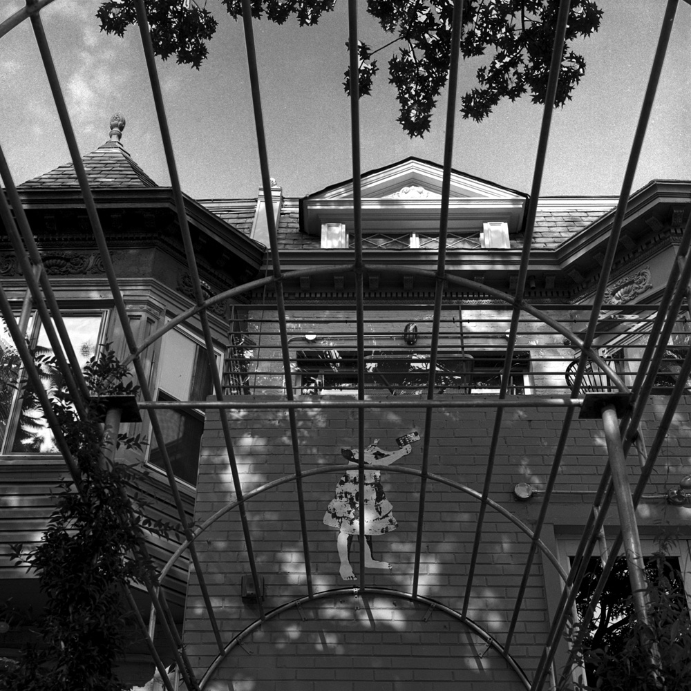
Here are the outside shots of Mad Momos Restaurant and Beer Deck.
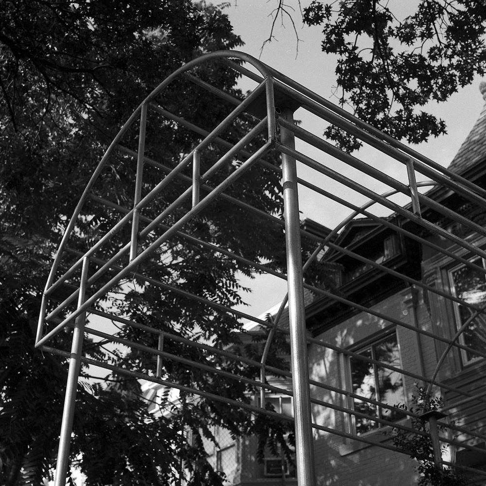
This is the entrance, as viewed from under the awning. When they bought the building, the structure was partially renovated with the intent to turn it into a restaurant. They followed through and finished it out, leaving the awning frame up but not getting a canvas/vinyl cover. Instead, they are training a vining plant in barrels, which will take a couple years to fill in (visible in the second photo of the awning). I just liked the structure of the awning and thought it would be an interesting frame to contrast its geometric structure against the decoration of the building behind it.
Mad Momos Entrance
I don’t recall if the paper cutout figure over the door ever had a head or not, but in any case, it’s a little girl holding an iPhone like a handgun.
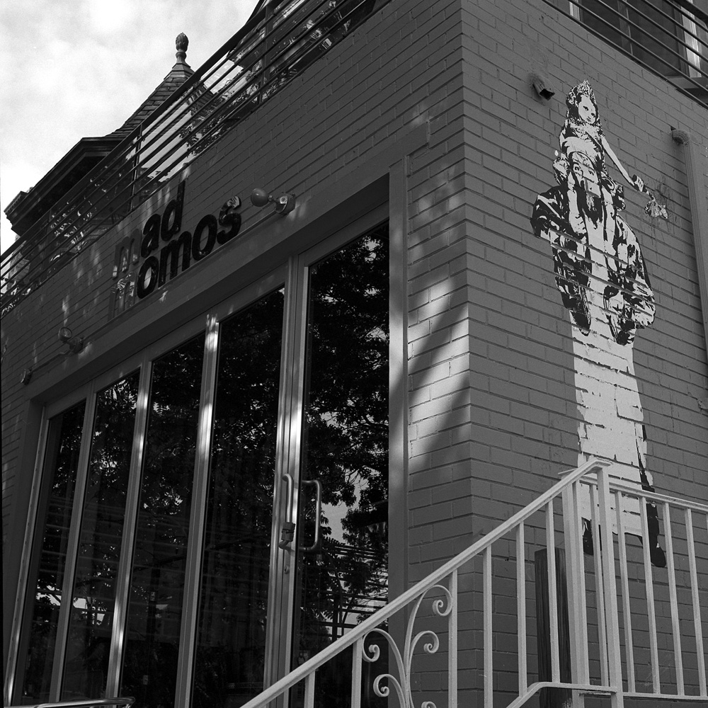
Here is the facade of the building. In case you’re wondering, the paper figures plastered to the wall are Osama Bin Laden giving Honey Boo-Boo a piggy back ride, whilst she’s holding a molotov cocktail. Yeah, the guys have a quirky sense of humor.
Mad Momos
Another view of the awning structure, dappled with sunlight filtered through the tree above.
Awning, Mad Momos
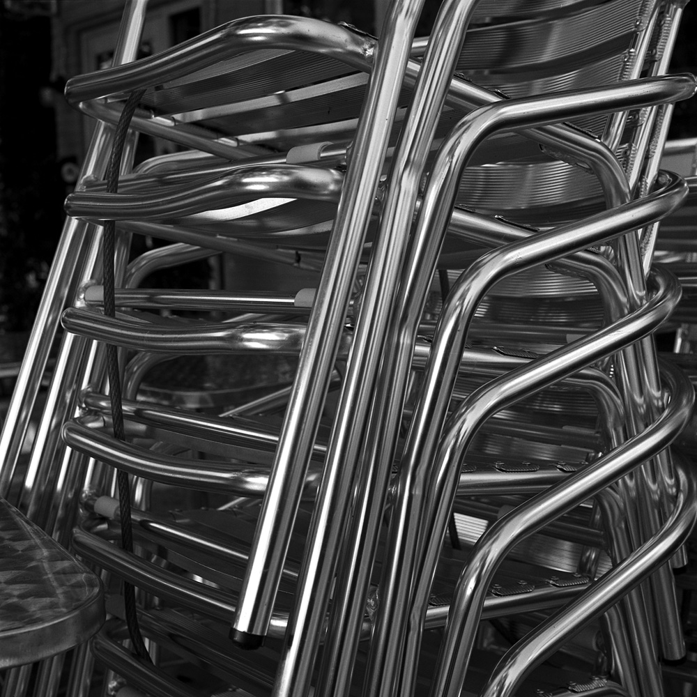
Chrome chairs on the patio at Mad Momos:
Patio Chairs, Mad MomosPatio Chairs #2
The chairs were still stacked from having been stored the night before. I loved the repetition of the shapes of the chairs.
In contrast to the modern awning frame and handrail around the front patio, this 1910s/20s wrought iron hand rail frames the steps on the house next door to their building.
All these photos were taken on a Tuesday – the slowest day of the week, thus the absence of customers. I’m going back there tomorrow after work with some color film to take some night shots – the place gets packed!
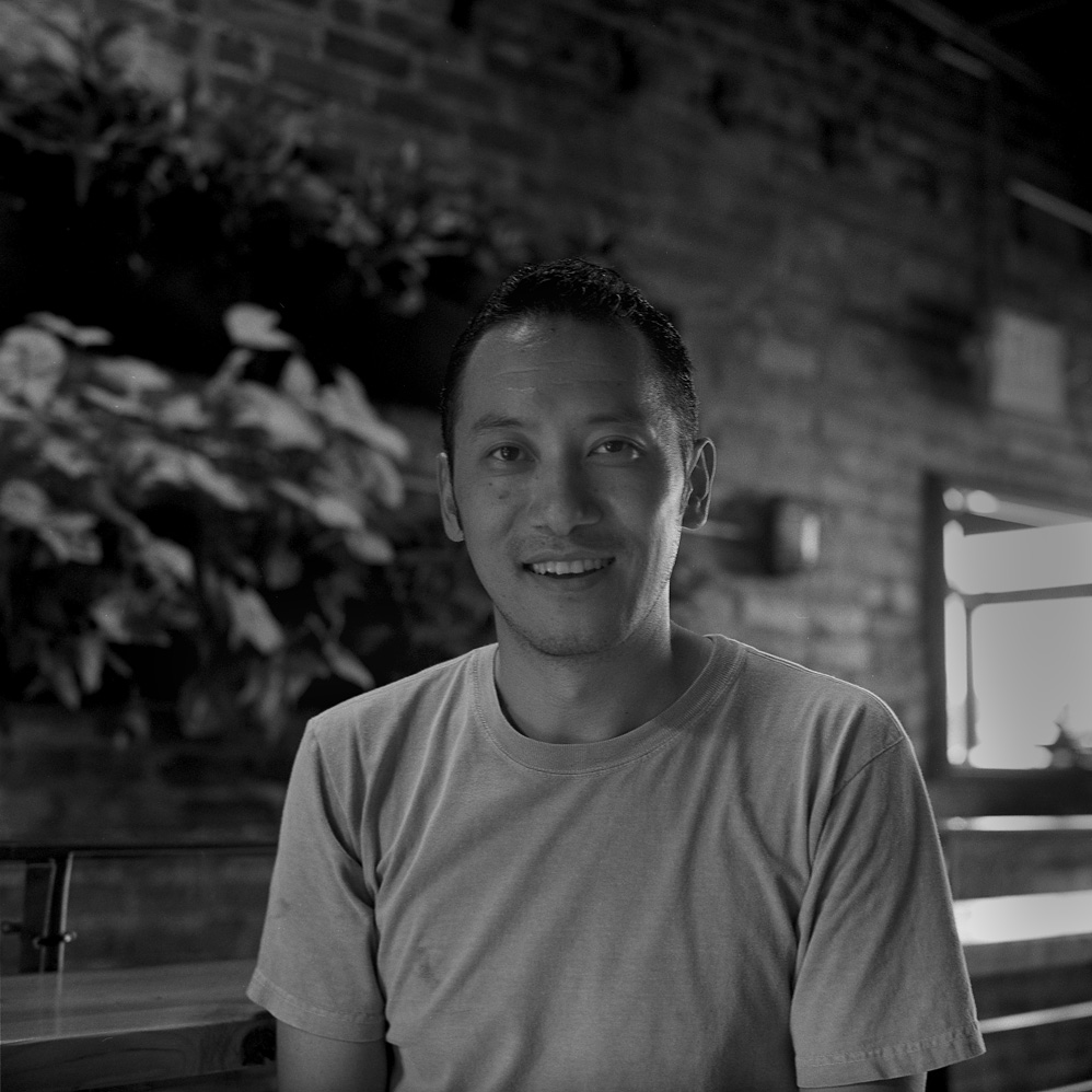
Here are two portraits I took of my friend Wanchuk, who is co-owner with Sam Huang (photo posted previously) of Mad Momos Restaurant & Beer Deck. I’ve known Wanchuk for nearly a decade. He’s from Sikkim, which is now a province of India in the Himalayas between Nepal and Bhutan, but used to be an independent kingdom with close ties to Bhutan.
Wanchuk T., at Mad MomosWanchuk T., Close-up
We met through a common love of photography – at the time he was still in post-college bum-around-the-world mode, and wanted advice on how to take better pictures in the places he was going. Now he’s running a restaurant and giving me a show of my photos. The exhibit will open on August 2nd and run through the end of October. Details about the opening reception will be posted separately.
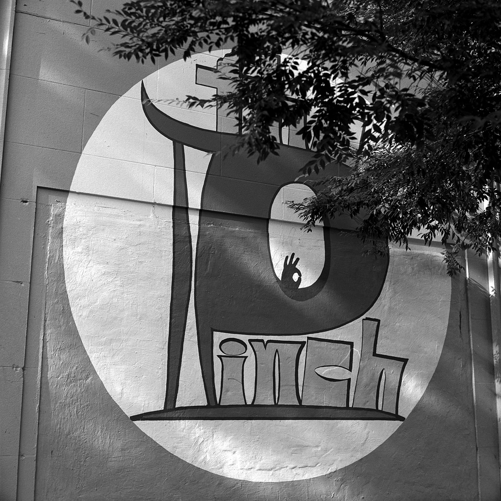
I took those photos of him after we finished a meeting about the exhibit, then went for a 15 minute walkabout in the neighborhood around the restaurant to see what I could find. There’s an old bar/club across the street called “The Pinch” – I so want to photograph the front door because it has cool architectural detailing and some nifty graffiti, but from the looks of the folks hanging out by the front door, I may have to come back and shoot that early in the morning when they’re closed -their patrons may not take too kindly to being photographed.
Here’s their logo on the wall facing the side street – it has a very 70’s look to it, but the paint seems very recent.
The Pinch
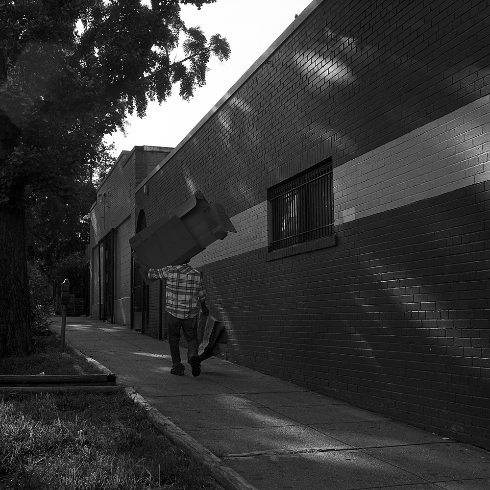
Pivoting to the left of the Pinch logo, I saw this lovely vanishing-point perspective of the building walls, dappled in evening sunlight. As I was composing the shot, this man hauling a gigantic cardboard box over his shoulder walked into the frame. Taking advantage of the serendipitous perspective-giving presence of the man, I waited until he was about 2/3 of the way in the frame before shooting.
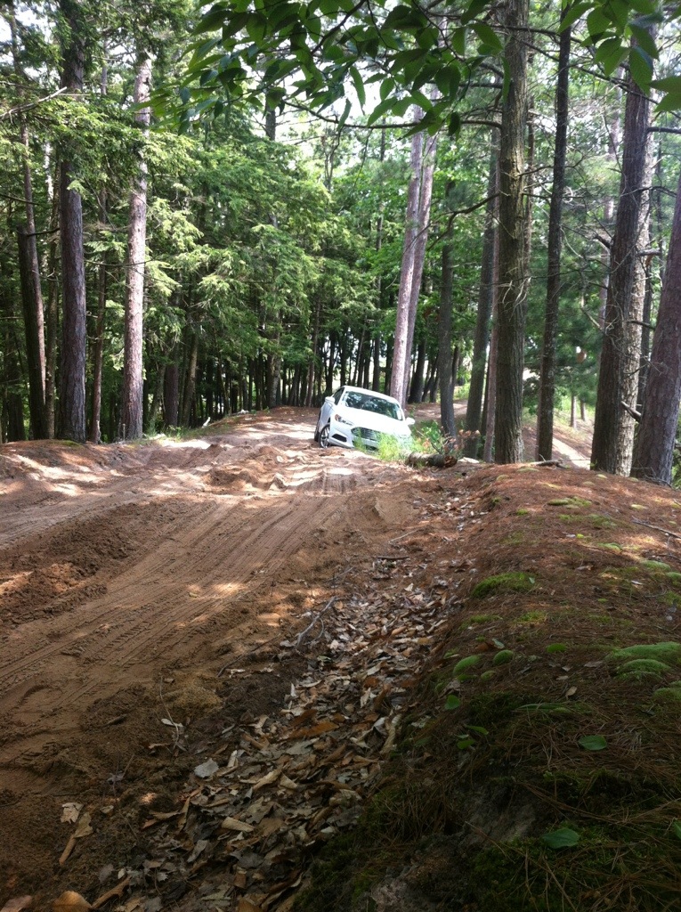
I don’t recall if I regaled you all with the saga of my stuck rental car. I had heard from some other folks at Photostock about Lake Oneal, which they said was absolutely beautiful, but really needed to be photographed in foggy conditions. Something was mentioned about the road to it being challenging, but that kinda got lost in my memory at the time. On my last day at Photostock, I decided to drive around on my own and take some photos. I had stopped in the general store in Good Hart and the owner gave me a map of Emmett County and marked a number of photogenic sights on it. I headed out, map in hand, stopping at the boat launch in Cross Village to get my shots of Lake Michigan. Carrying on, I saw the road to Lake Oneal marked on the map. At the end of the road there was a symbol for a boat launch. I thought, “how bad can the road be if there’s a boat launching ramp at the end?”. So, naive as I was, I drove back there. The road had some sandy spots in it, but nothing I couldn’t navigate around in my Ford Fusion. Then, at the very end of the road, there was a tall uphill, and on the downslope to the parking/unloading area, a VERY sandy stretch. I managed to get down the slope fine, so I figured I could follow the same track back up. NOT. I tried, several times, and ended up getting the car stuck on the side of the road. Long story short, two and a half hours and $300 later, my car was back on a hard surface road.
The Sandy Uphill
While I was stuck there, in the bright beautiful sunlight of a fog-less afternoon, I decided I would take on the challenge thrown down by the other photographers of getting a good shot of the lake with no fog. Here are the results:
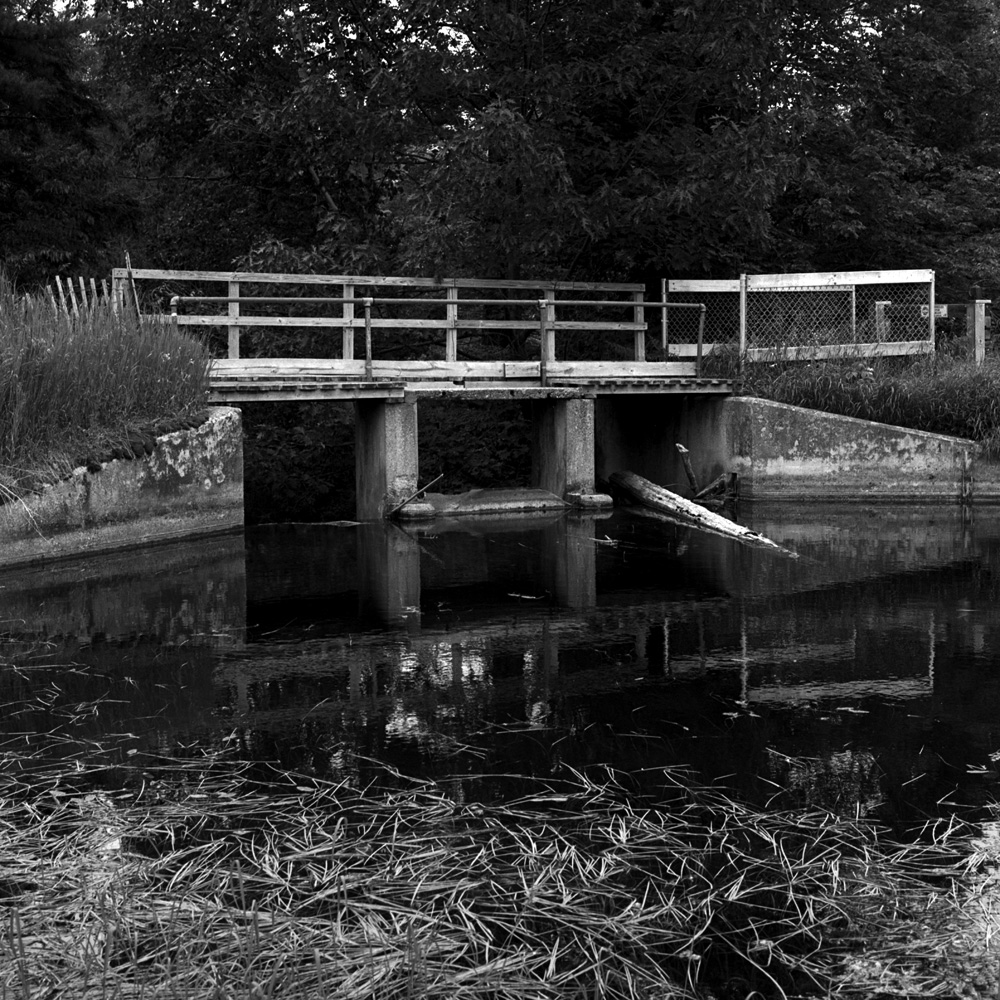
Bridge, Oneal Lake
The bridge is over a sluice/runoff drain for the lake. Judging from the stands of dead trees sticking out of the lake waters, the lake was an artificial lake. Why it was created I’m not sure, but I’m not about to complain.
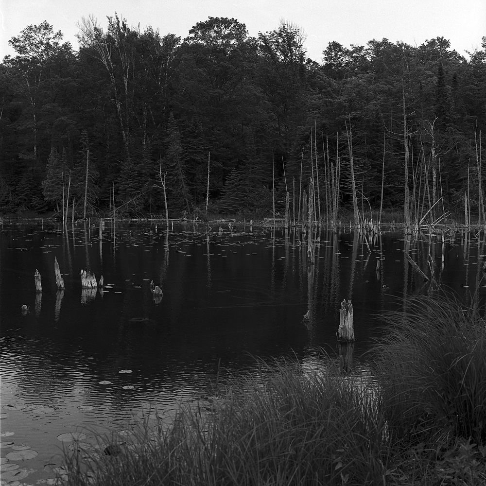
Oneal Lake
Here you can better see the snags of dead trees reflected in the waters. Other than the leaden white sky (there was a little overcast, but still bright sun), I’d say challenge met.
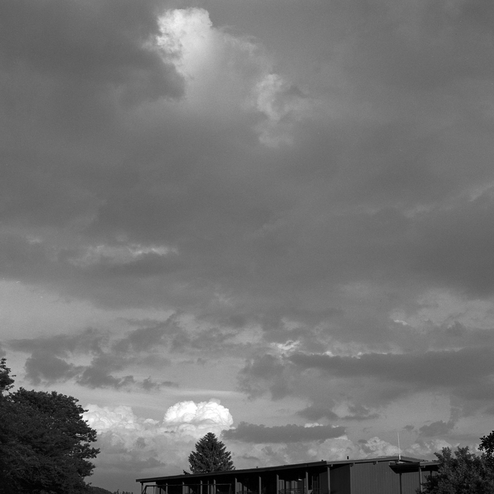
These next two photos are of/at the Birchwood Inn, our headquarters for Photostock. The first one is of some magnificent clouds we had one evening. The roof of the annex to the inn is just visible at the bottom.
Clouds, Birchwood Inn, Evening
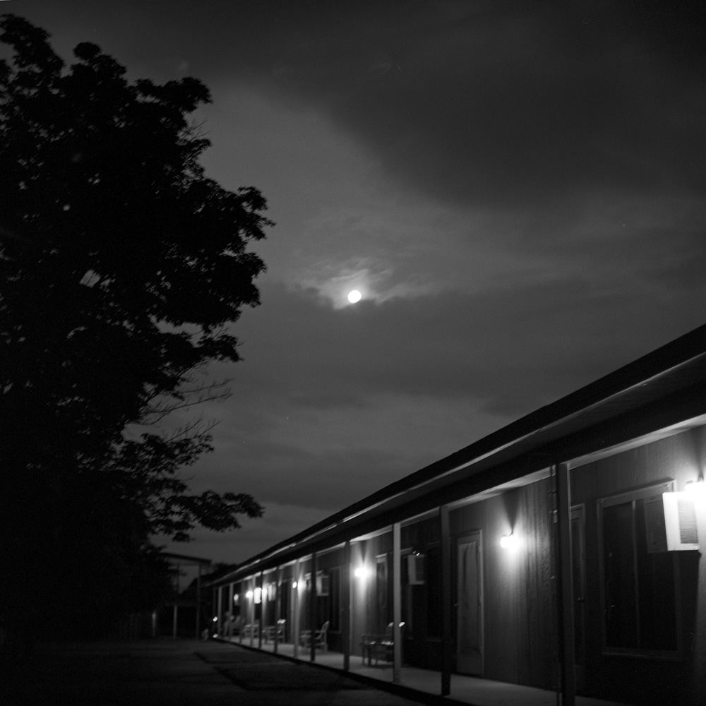
The last photo of this post is the Birchwood Inn’s patio illuminated by the full moon. This was I believe the night of the “super-moon”, but late enough it no longer appeared larger than normal. But it sure was bright and beautiful.
The Birchwood, Moonlight
All the black and white images were taken with my Rolleiflex 2.8E, on Ilford Delta 400 film. The color shot was from my iPhone. Which was my lifeline to getting un-stuck, but barely – signal at Lake Oneal was so bad, I kept dropping my calls to AAA. So two words of caution should you ever want to visit Lake Oneal yourself – ONE: bring your own 4-wheel drive/offroad vehicle, preferably with a bumper-mounted winch, and TWO: a satellite phone would not be a bad investment. I watched two different 4wd vehicles go up that hill, and both had trouble, although one fared better than the other. The first one was only technically 4wd, because his front transfer case was acting up and so the power was only going to the rear wheels. His knobby tires and high clearance were what enabled him to get out. The other one spun and sputtered and wallowed through the sand but made it out in one pass.
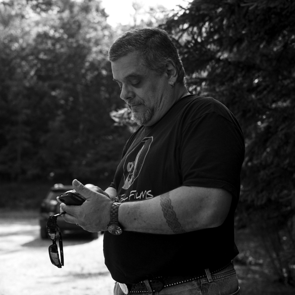
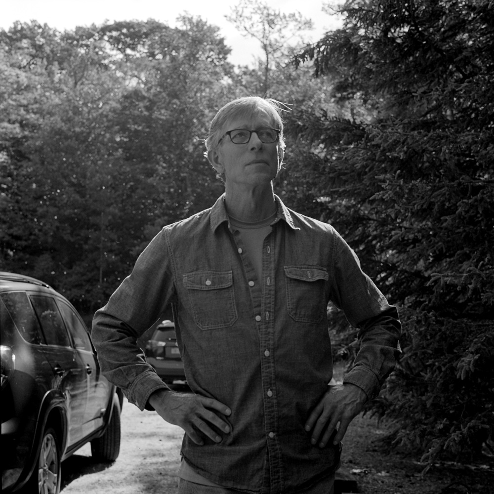
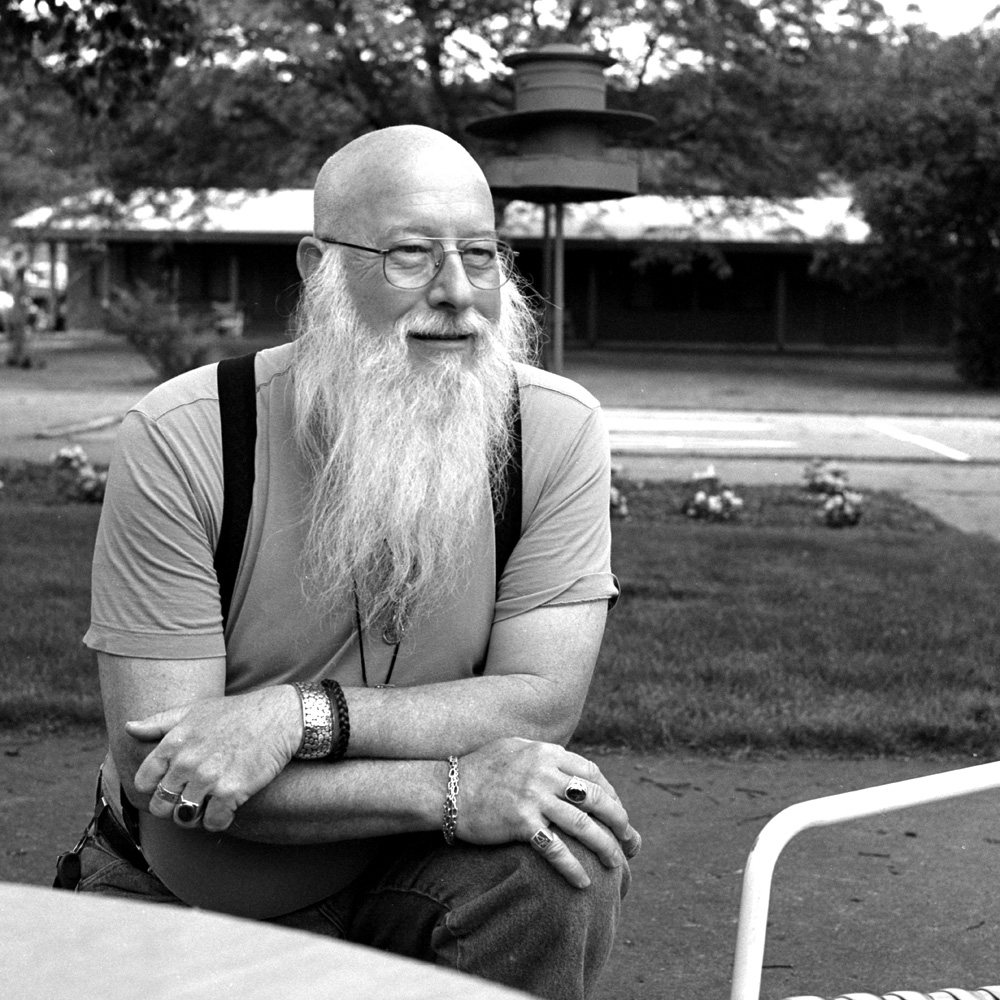
Well, no particular order other than I bracketed the series with folks not looking directly at the camera. I’m including these shots for sentimental reasons more than for the quality of the portraits.
All shots taken with my Rolleiflex 2.8E, on Ilford Delta 400 developed in Pyrocat HD. That Rollei is a fantastic portrait camera, considering it has a fixed “normal” lens on it, isn’t it?