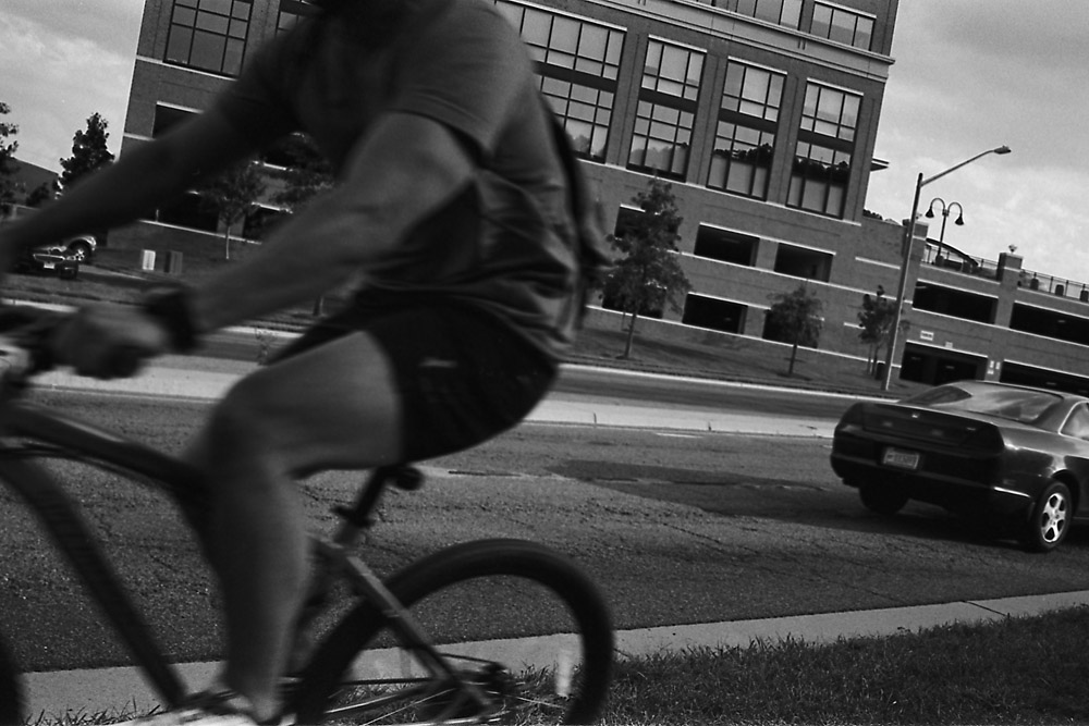
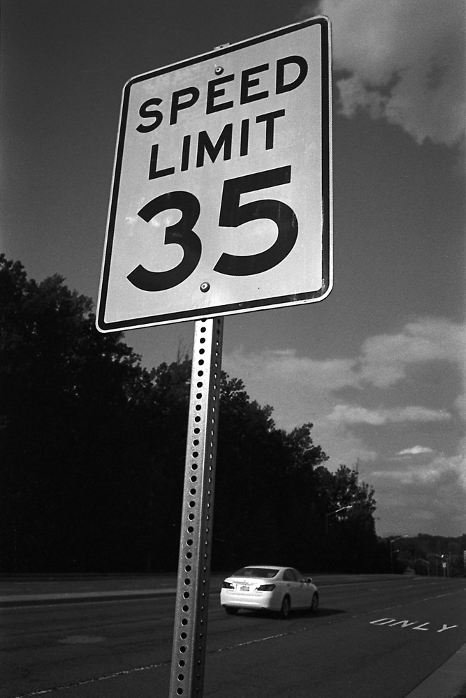
Most of you know me as a medium format and/or large format photographer. But, every once in a while, I do like to break out my ‘toy’ format stuff and use my Contax G2. I was asked to take some photos for the office picnic as a second shooter, so I popped a roll of Tri-X in the G2, put on the 35mm f2 Planar lens, and shot a dozen or so shots. For whatever reason, they decided to have the picnic INSIDE the garage instead of on the top deck of the garage, and it was painfully dim, thus the lack of volume on the photos. I had two thirds of a roll left, so I went for a walk and burned some film. These are two shots that came from that quick walkabout by my office, and I think are very much in keeping with the general themes of my work, even if they’re shot on tiny film 🙂
Passing CyclistSpeed Limit 35
The 35mm lens for the G2 has this odd reputation – by all standards, it is an outstanding lens. However, its siblings are so much better that when compared to the 45mm f2 Planar, or the 28mm f2.8 Biogon, it comes up a little lacking, and doesn’t get much love from the Contax aficionados. After shooting with it for the picnic/walkabout, I’m re-evaluating how I feel about it, and it might get more use from here on out.
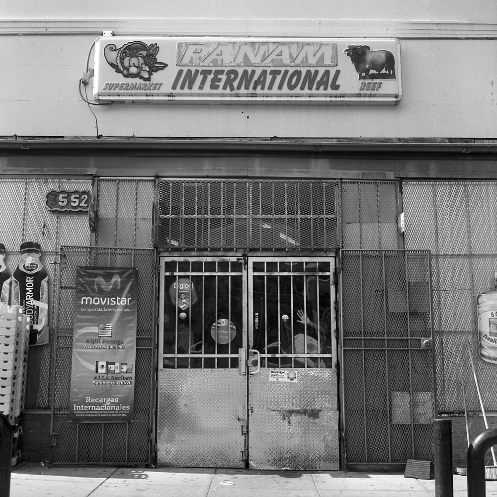
I’ve been past the PanAm Market for years and wanted to photograph the outside, but never got around to it. Several times I’ve walked past and been on the verge of taking a photo but gotten the hairy eyeball from patrons or folks just hanging out on the sidewalk in front, so I’ve moved on and not taken the shot. This time there were not so many folks around and I was able to get a clean picture of it.
Panam Market
After scanning the negative I noticed that there’s a kid’s hand on the window that looks somewhat disembodied. All the security bars on the windows and doors make it look like a prison rather than a store, which was certainly NOT my intent. But it is what it is, and there’s no changing that. The kid was sitting by the door and holding it open for people with full carts trying to get out to their cars.
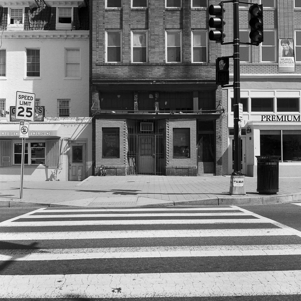
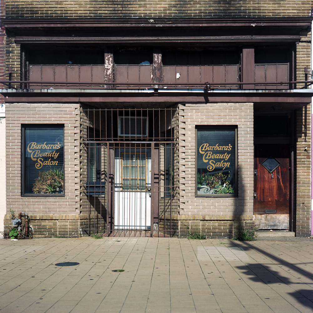
I’ve photographed Barbara’s Beauty Salon before, close up. This time I shot from across the street, to include the crosswalk stripes and more of the context of the neighborhood. I think you can really see the “Ajax Was Here” phenomenon in this shot. The Premium Title company to the right is brand new and spiffy looking, Gloria’s Pupusas to the left is cleaner, newer and bright and busy. Barbara’s, I still can’t tell if they’re even in business.
Barbaras Beauty
Here’s the older photo I posted of Barbara’s for comparison:
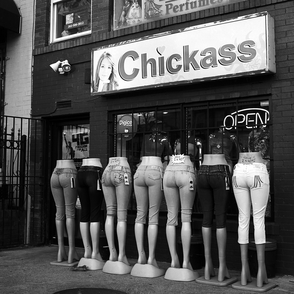
A sign of the times? A year and a half ago, I ran across this display of mannequin bottoms outside Chickass Jeans. The name was highly politically incorrect, and the mannequins seemed equally so. For those not conversant in Spanish, “chica” is the word for girl (or young woman). The store is in a heavily Latino neighborhood and caters primarily to young Latina women.
Chickass Jeans
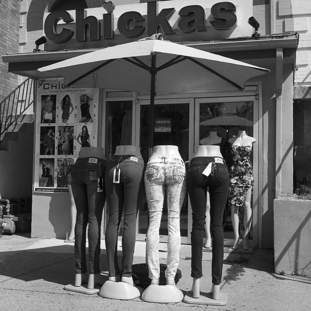
In the intervening year, they’ve renovated the shop, and changed the name. It’s now Chickas Jeans. I have mixed feelings about the name change- there was something amusing about the blatantness of the sexual pun in the name. Amusing in the same way that Hitler jokes in “The Producers” are amusing – seeing the old sign was just so jarring to the sensibilities that you couldn’t help but chuckle at it from discomfort. Perhaps it’s a sign that Latina feminism is starting to take hold and the message is getting through that women don’t want to be objectified.
Ok- here are some twosies I did, still with the Rollei and the panorama adapter.
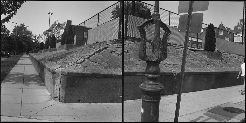
The first one is a shot of a street corner with the skeletal remains of a police call box from the first decade or so of the 20th century. The building behind it is now a charter school. I’ve often thought of how to photograph the wall around the playground fence behind the school. This is the first shot I’ve done that really does it justice.
Police Call Box
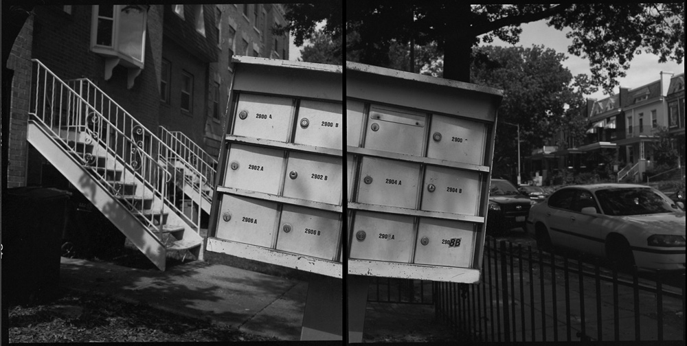
I came upon this mailbox leaning at its crazy angle and decided it would make a good subject for a diptych that emphasized and even exaggerated the tilt of the mailbox. What is it with me and mailboxes?
Mailbox Diptych
Both of these scenes are in my neighborhood – I walk past them regularly on my way to run errands or get some dinner. I’m really starting to appreciate the advice of Edward Weston, “There’s no good photos to be made more than 50 feet from the car”, although I’m expanding the perimeter and rephrasing it a little: “There are plenty of good photos to be had within a mile of your house”.
I’ve got this really cool little toy that goes with my Rolleiflex – a panoramic head adapter. It’s basically a little plate with a disc in it divided into twelve segments, and an integrated bubble level. The plate goes between the Rolleiflex and the tripod head. The disc has a locking mechanism and click stops that allow it to be rotated a fixed number of degrees, corresponding to 1/12th of a circle (30 degrees) which is also more or less the field of view of the lens on the Rolleiflex. This would allow you to photograph a 360 degree panorama on a single roll of 120 film.
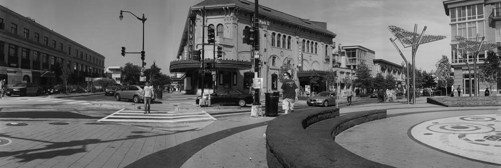
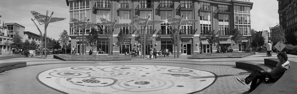
A 360 degree panorama is a bit much, and pretty tough to pull off. I’ve been playing with doing two-frame and three-frame panoramas, which seem plenty wide already. Here is one I took this afternoon at the little plaza in front of the Tivoli Theater in Columbia Heights.
Tivoli Theater
It does a pretty good job of matching up the frames, with just a few degrees of overlap, enough to make the blending and alignment relatively easy. If you’re paying attention you can see the seams where some things just don’t match up angle-wise, and where the car gets cut off between exposures.
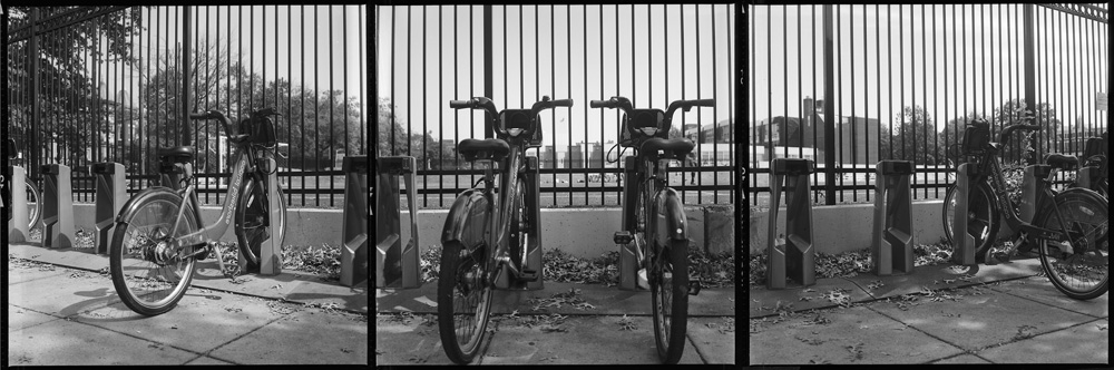
This one I composed a little differently – in selecting what to include, I left a little bit of film border in between each frame because I think it compliments the overall image – the black borders echo nicely the black bars of the fence in front of the bikes. Although I have two bikes in the center frame, and one each in the left and right frames, each frame does feel distinctly different.
Bikeshare Panorama
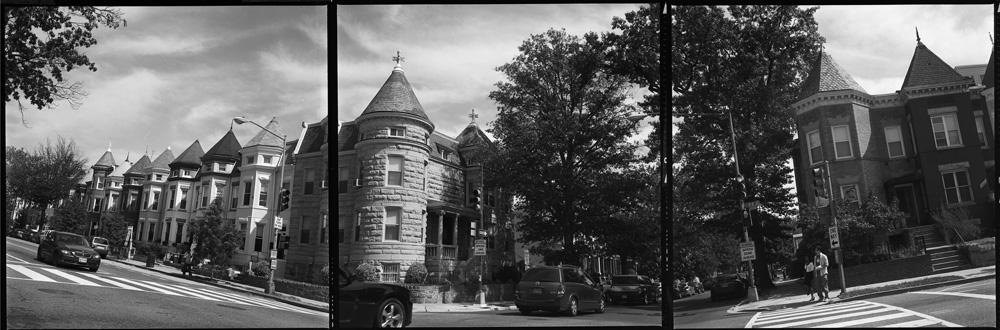
I decided to get a little playful and have fun with the crazy angles you can get from a panorama when you aren’t level to the horizon. I wanted all of the conical roof of the turret on the house on the corner in the picture, so I tilted the camera up (the other option would have been to go home and bring a step-ladder, and raise the tripod to its maximum height, and even then I might not have gotten the shot I was looking for).
11th Street
And last but not least, back to the fully merged panorama. This one I didn’t get the horizon quite as straight as I should have, and so the outside images were a little crooked, and the center one was definitely not level, so I had to play with how I aligned them and cropped them to make it look relatively normal. I like the look of this one despite its flaws.
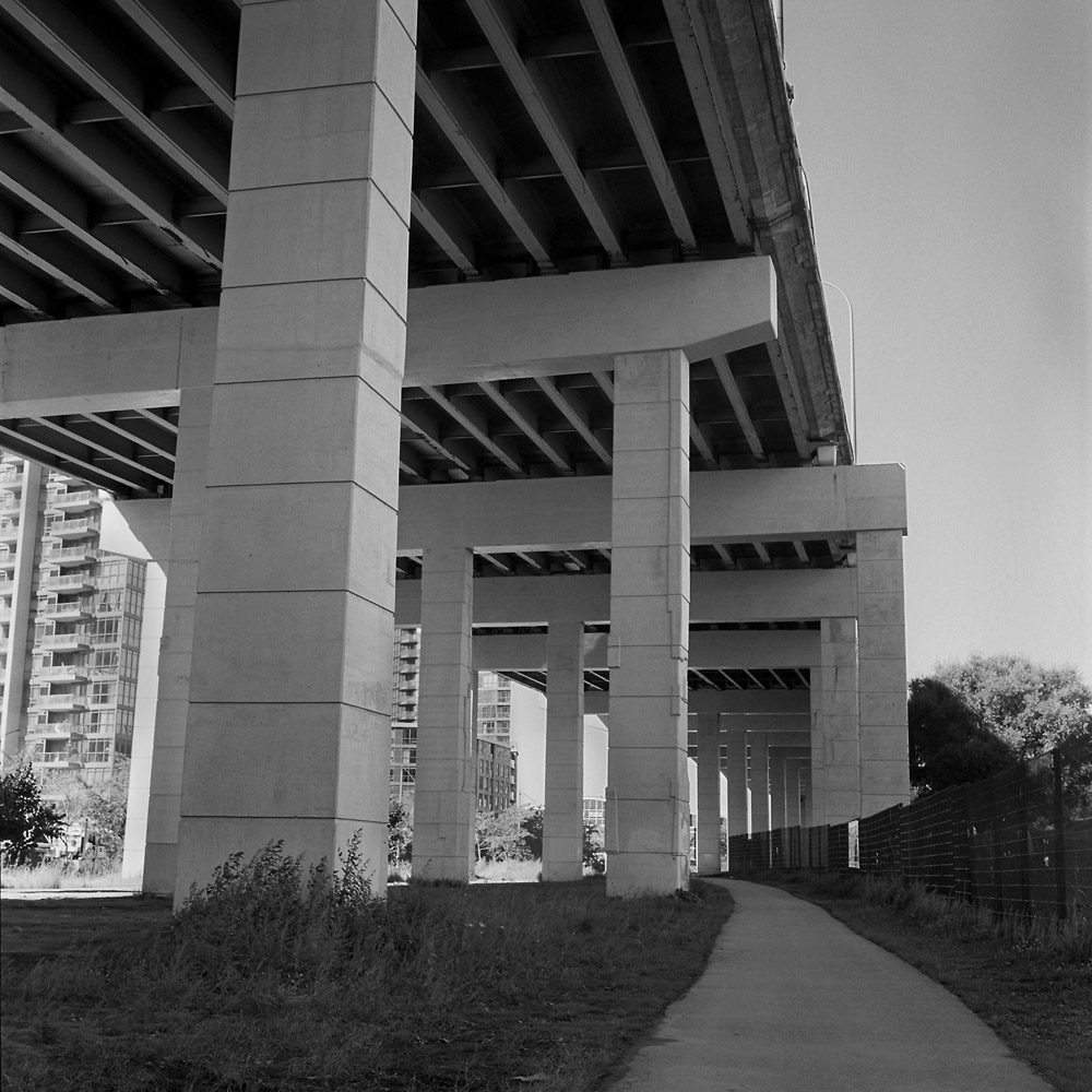
The Gardiner Expressway separated my apartment complex from Fort York. It’s particularly ugly in what it does to the urban landscape, driving a wedge through it, but it serves an essential purpose, to move through traffic past the city center without tying up city streets. Viewed from underneath, it becomes a ribbon of patterns in concrete. Goes to show you that you can find beauty in even the most utilitarian of things.
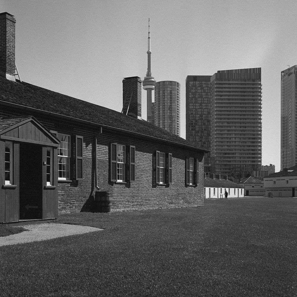
As you can probably tell from my past postings, I love historic buildings. Especially old military buildings. Medieval city walls, castles, forts, palaces, you name it, if it’s stone and old, I like visiting. There is a small chunk of 18th century history in the middle of downtown Toronto. Fort York was the original master defense for Toronto, perched as it was on the shoreline of Lake Ontario and guarding the mouth of the harbor of York (as Toronto was then known). Today it sits a good three hundred yards or more from the shoreline, landfill having been created to expand the salable real estate in the city.
Fort York Skyline
As you can see, the city has considerably encroached upon the fort.Today it is hemmed in by rail yards on the north and an elevated expressway to the south. A typical 18th century fort, it has low walls of stone on the interior and rammed earth on the exterior, in response to the changing military technology of the period. Before, you wanted tall walls made out of stone to make it hard for enemy infantry to get over them. With the advent of more powerful, accurate cannon, tall stone walls made for a very easy target that became a weapon itself when struck by cannon balls.
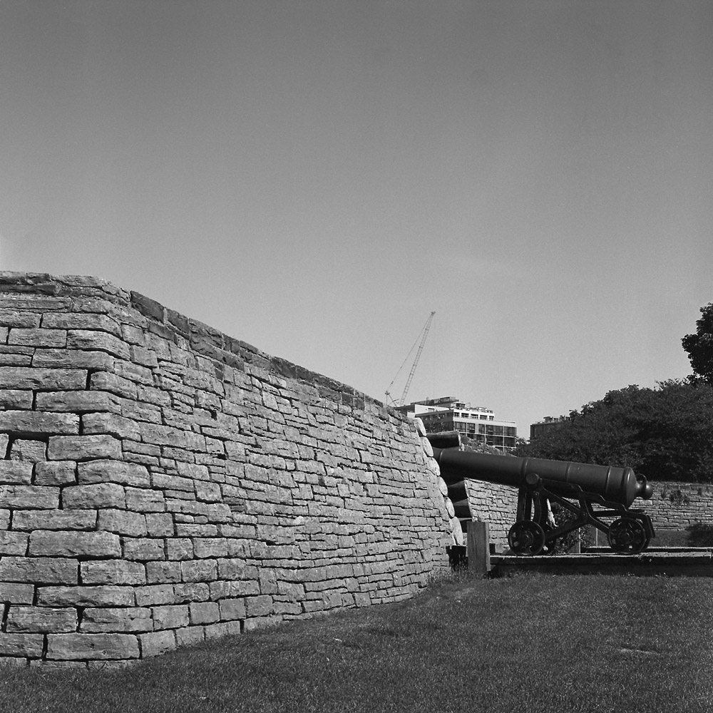
Fort York Wall
The fort itself is remarkably well preserved, given all it has been through. It was the site of a major engagement in the War of 1812, when several thousand Colonial troops took on the British Army units stationed at the fort. Ultimately, the colonials defeated the British, who, in a forced retreat, blew up the stone powder magazine to prevent the gunpowder from falling into Yankee hands. The powder magazine as it stands today was built in 1815, otherwise all the buildings on the property are from the late 1790s/first decade of the 1800s.
Fort York Magazine
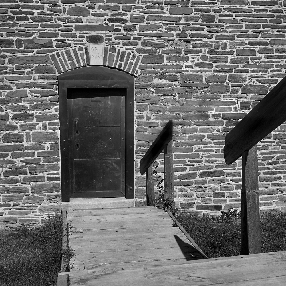
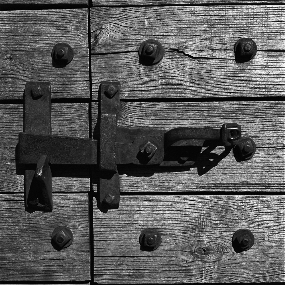
Here is a photo of the front gate to the fort, through which visitors enter today. I’m assuming that the wood is (relatively) modern, but the ironwork is original. The gate has a door within a door, large enough for a single soldier to stoop through, or to point a canon out of. This is the latch to that door-within-a-door.
Fort York Door
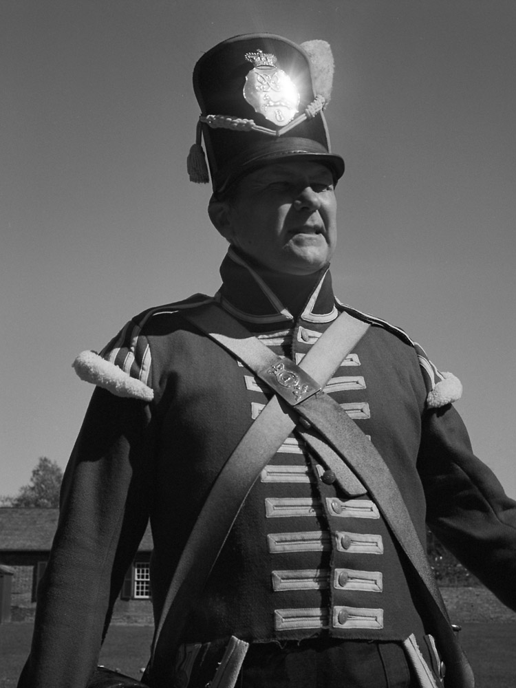
I took the guided tour of the fort, which largely focused on the enlisted and officers living quarters. There was a vast difference in quality between life as an enlisted man and life as an officer. The enlisted men were shacked up two to a bunk, roughly 100 to a room. If you were married, you and your wife could share a bunk, and when the kids came, they could sleep on the floor under the bunk. Officers had suites of rooms to themselves, a parlor and a dining room with catered food service and a bar.
The guide was excellent and very knowledgeable, and he came complete with early 19th century period uniform. He was one of the few people I met in Toronto who had even a hint of a “Canadian” accent – he spoke with the characteristic rounded vowels, and had a little bit of a lilt to his speech pacing. Regardless, he painted a very clear picture of what life was like in the fort for someone in the army.
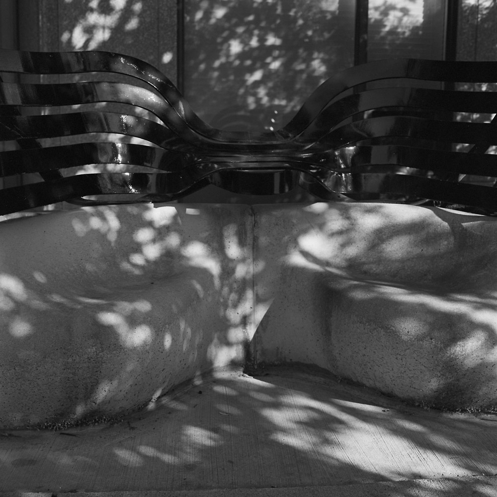
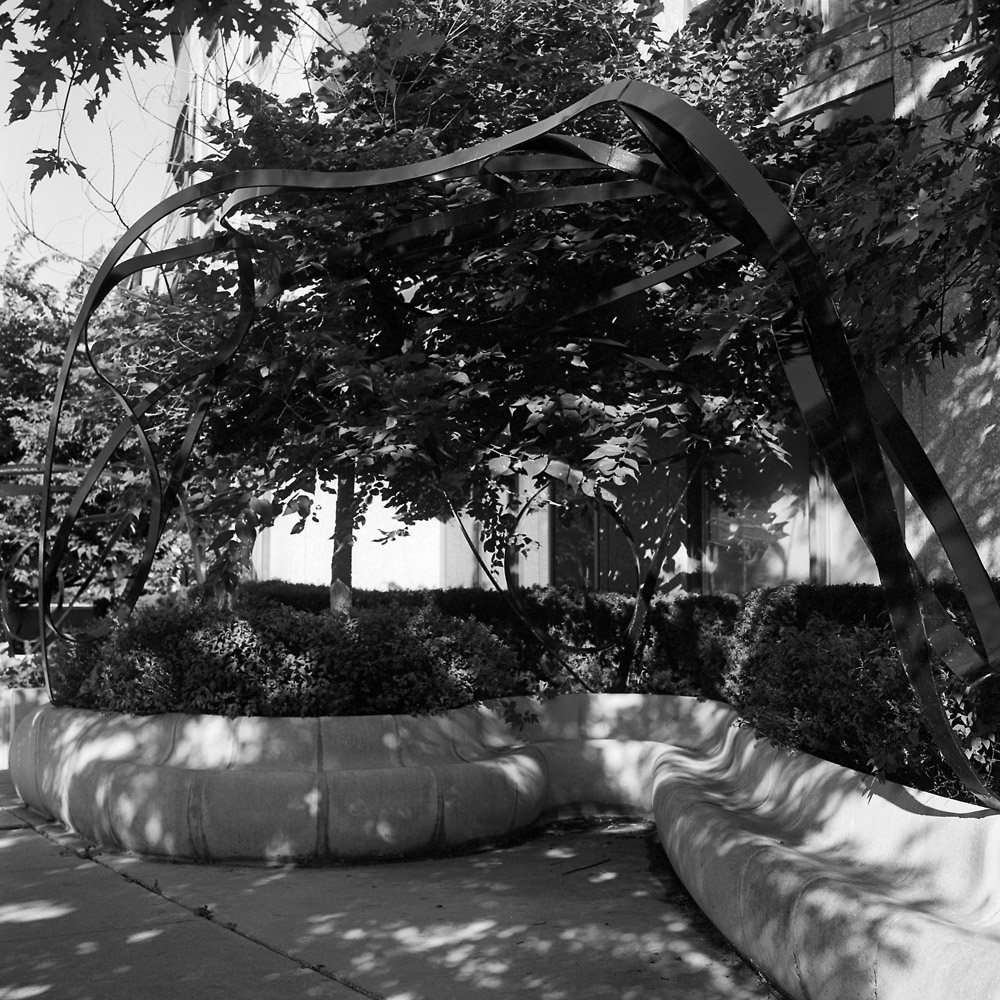
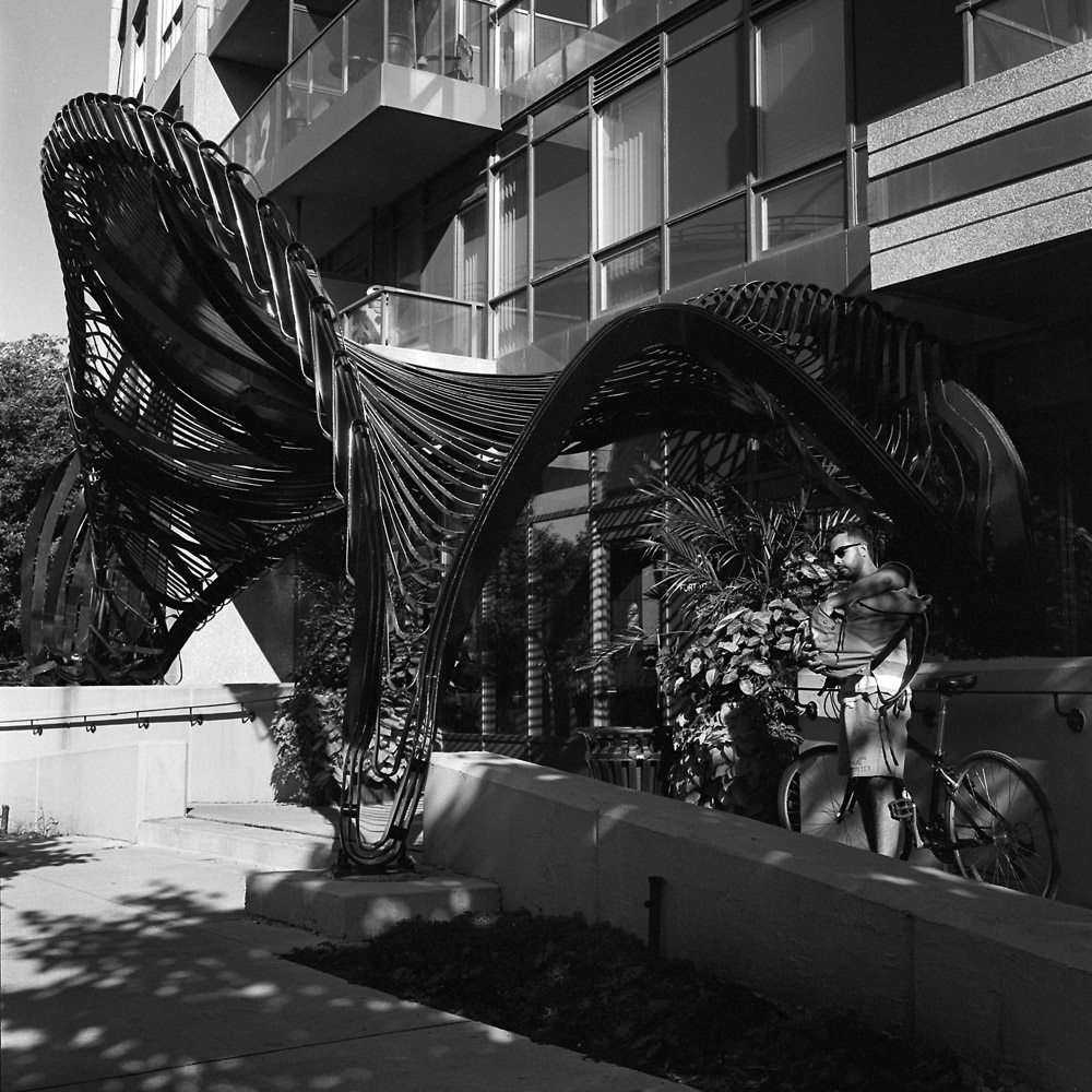
The building I stayed in at 231 Fort York Boulevard is a thoroughly modern 28-story high rise, composed of glass and steel. At street level, however, the architects softened the impact with a still thoroughly modern, but decidedly more organic, approach. Twisting ribbons of blackened steel, undulating concrete, and dense vegetation combine to give it an almost Antoni Gaudi feel.
A loveseat style bench, formed out of an undulation in the concrete:
Bench
A canopy formed out of steel ribbons and the branches of trees shade another larger seating area:
Arbor
The building entrance is a riot of steel ribbons, twisted into organic shapes that bring to mind ocean waves and seashells:
Entrance
As an architectural critic, I question the use of these shapes because they really don’t relate to the building at all – they’re found only on the street side, and only at street level. The courtyard entrance where vehicle drop-off and pickup occurs has nothing at all like this, and nowhere else at any higher level is this style repeated. None of the upper balconies have ribbon-like railings, just typical glass and steel flat planes.
As a pedestrian, though, I’m quite pleased that it exists – it certainly makes the sidewalk level more interesting and in the summertime, more pleasant!
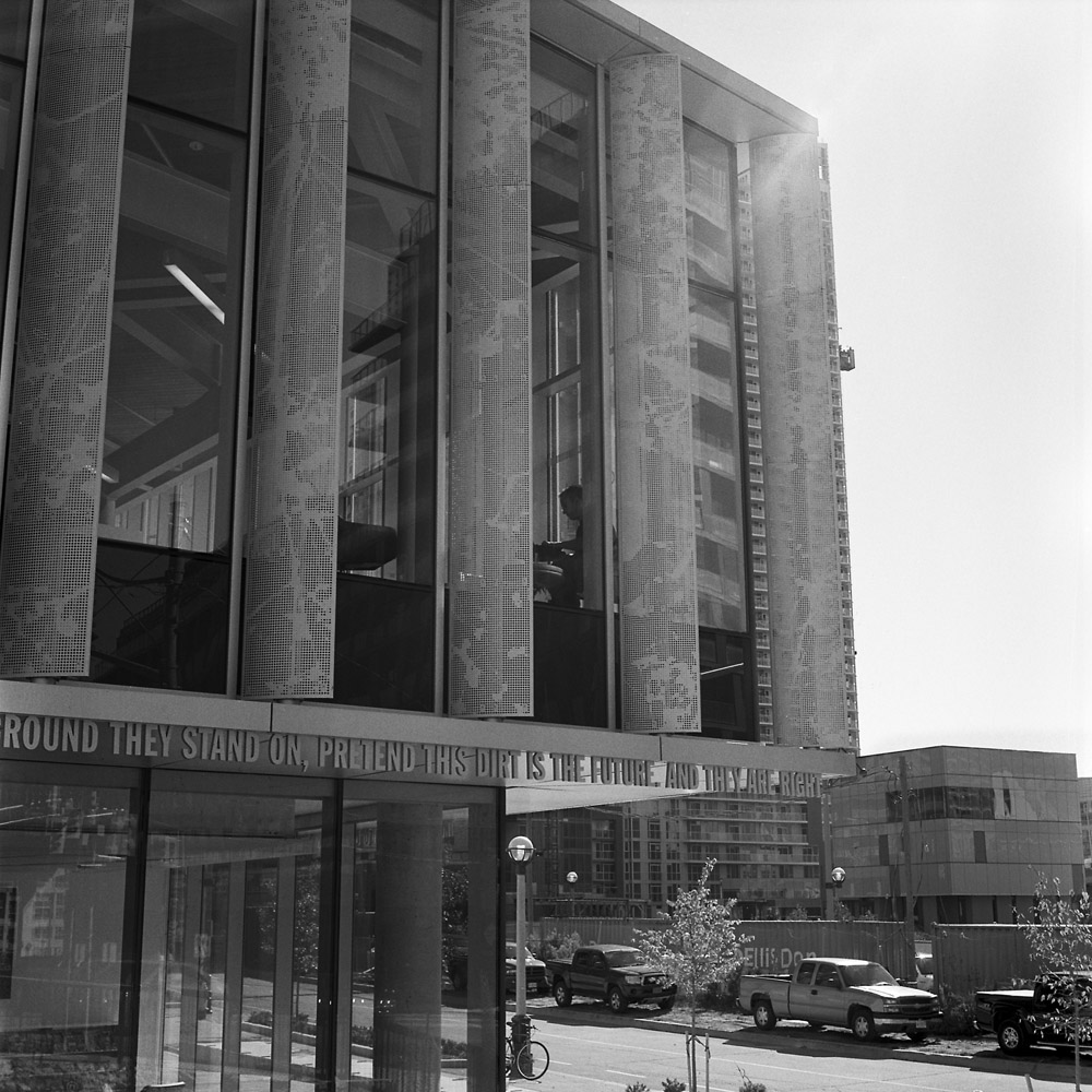
Just around the corner from my apartment, on Bathurst Street, there is a branch of the Toronto Public Library. As I was passing it, I saw this scene of a lone reader, sitting by the window, deeply engaged in his book. There isn’t any real “action” going on here, and the subject of the photo is actually a very small part of the total image, but I think sometimes that kind of subtlety is important and beautiful, and actually makes for a stronger image – you have to think about it a little and really examine the image.
Reading, Toronto Library
This scene struck a chord with me as I remember doing much the same as a kid, going to the public library and finding a corner in which to curl up with a book. While I don’t go to the public library as much any more, the love of reading is still very much alive, and I have my own personal library now- over 2000 volumes and growing.
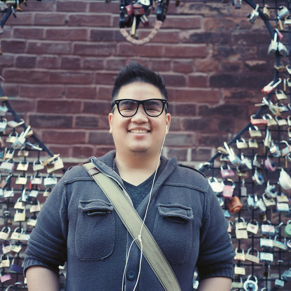
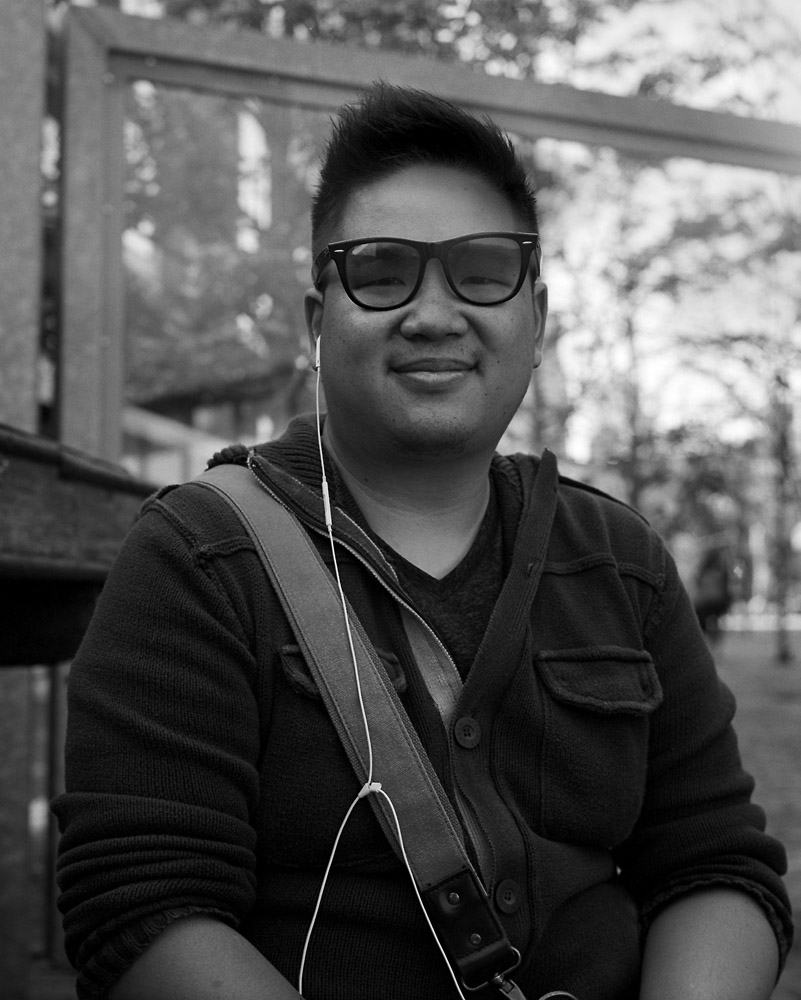
Two different portraits I took of my friend William, who toured me around Toronto on Sunday of my weekend visit. Both were taken at the Distillery District, one black-and-white, the other, color. I cropped the black-and-white one because there was some lens flare in the upper corner, and I think the vertical crop is not only complimentary to a portrait in general, it is flattering to the sitter.
William QuachWilliam Quach
Both images, of course, were shot on my Rolleiflex. It makes for a great environmental portraiture camera. One of these days I’m going to get the Tele-Rollei to do some tighter head shots, but for now, this is just fine. The b/w image was shot on Kodak Tri-X, and the color on Kodak Ektar 100. I’m normally brand agnostic when it comes to film – I shoot whatever produces the look I like. For a slower b/w emulsion, I’m happy with Ilford FP4+, and for a really slow emulsion, Ilford PanF. For years, until they discontinued it, I was a huge fan of Fuji Reala when it came to color. Since it went away, I’ve shot Kodak color emulsions almost exclusively, though. I used to like the super-saturated colors in Fuji slide films, but now I prefer a somewhat more subtle palette, which I get from Ektar (which is still a saturated, contrasty emulsion) or even moreso from Kodak Portra (mostly Portra 160, but the 400 and 800 also have their uses).