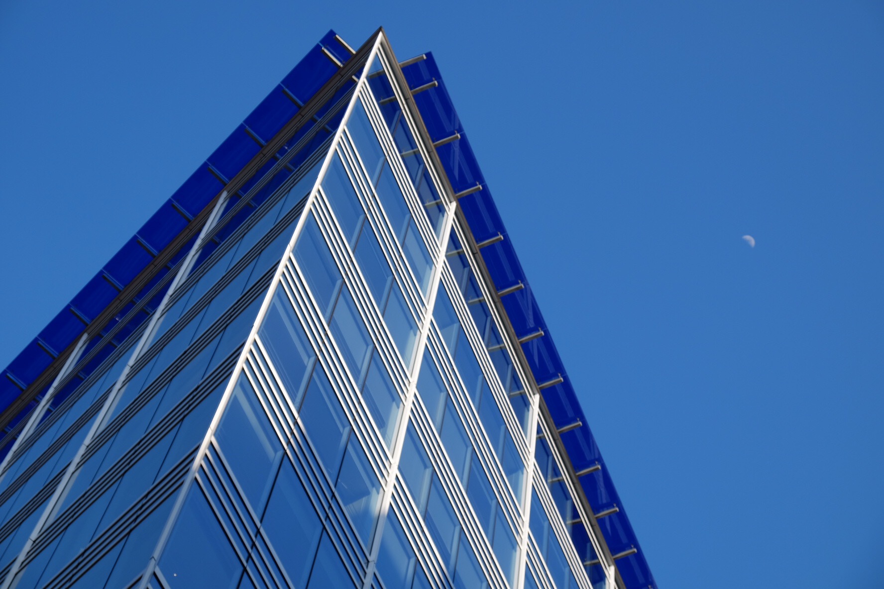
I’ve been having so much fun lately with my photography. As it should be – it should never be WORK – it should be fun. And the Lomo Belair X/6-12 is part of the reason. Yeah, it’s lo-fi, it has a plastic fantastic lens, it’s auto-exposure with virtually no feedback (you never have any idea what shutter speed you’re using). But you’re shooting medium format panoramics! And for $250!! Where are you going to find a (useable) Brooks Veriwide or a Horseman 6×12 for $250? Even a 6×12 roll back for a 4×5 will set you back $400. So there’s a lot to like about it for the money.
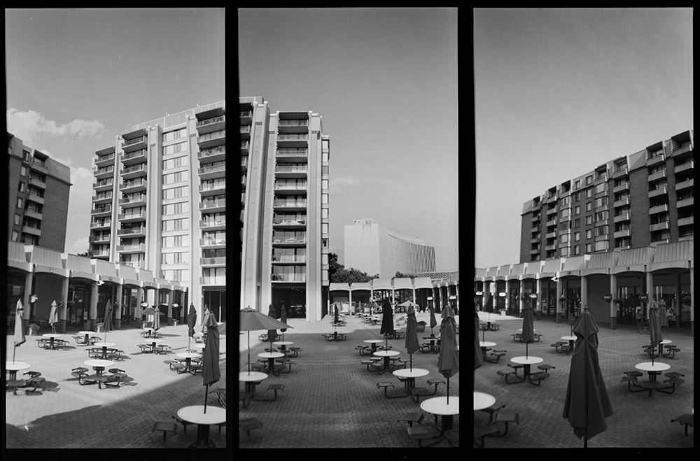
And although the negatives themselves are, shall we say, less than razor-sharp, they do make awesome contact prints (witness my Roman panoramics and my recent Sinister Idyll series). This triptych was inspired by a vertical panorama series I saw someone else do. Theirs was a landscape, but I thought this office/apartment/retail complex in Washington DC would make a good urban subject to try it out on.
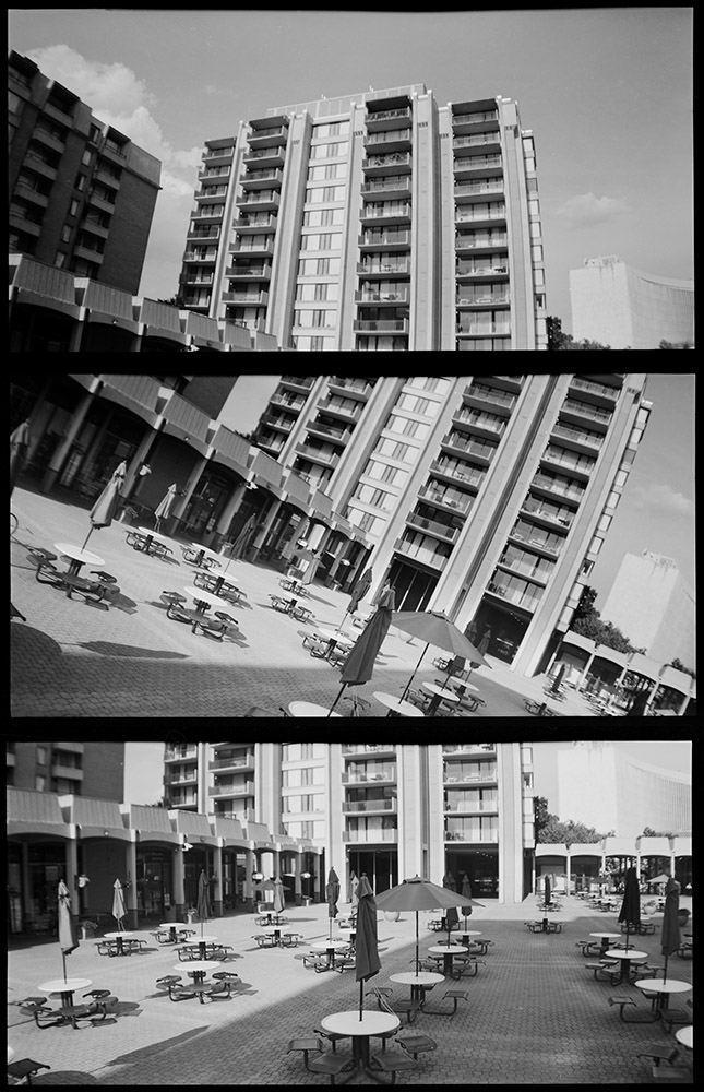
Columbia Plaza
Another fun experiment with my Lomo. This time a vertical panoramic triptych. I intentionally skewed the middle panel to give what is otherwise a very static subject some visual movement and dynamism.
I have some very exciting news to announce – my upcoming Introduction to Platinum/Palladium Printing class is now sponsored by Hahnemuhle, makers of fine art printing papers since 1584. They recently introduced a new paper specially formulated for alternative process printing, specifically platinum/palladium, and are graciously supplying the class with a very generous stock of paper for the students to use. I hope this will be the beginning of a long and fruitful partnership.
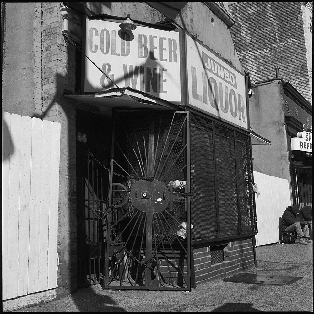
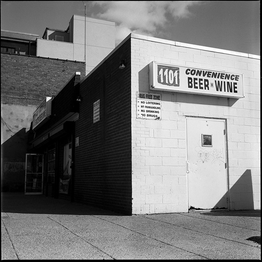
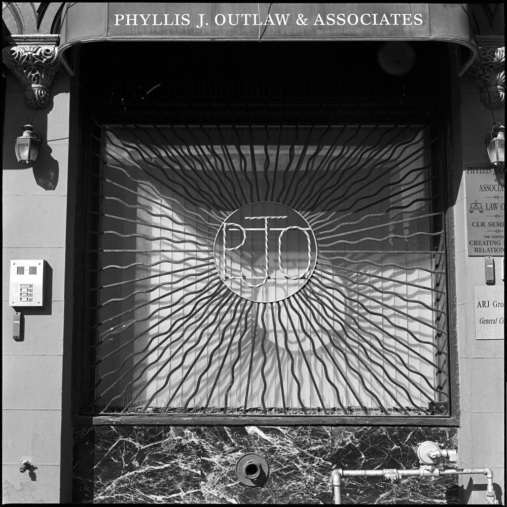
H Street Northeast is a neighborhood in major transition. It was in the 1950s and 60s an important retail and entertainment corridor for the African-American community in DC, along with the U Street corridor in Northwest. Along came the 1968 Martin Luther King riots, and then in the 1970s and 80s the rise of the drug epidemics, and H Street turned into pawn shops, liquor stores, and abandoned buildings. In the early 2000s, property developers turned their eyes toward the area for the relative abundance of cheap real estate as the next new place they could revitalize and get rich in the process.
These first four shots here represent the old side of the neighborhood – liquor stores, barred windows and businesses that clung to life through the lean years.
Cold Beer & Wine1101 ConveniencePhyllis J OutlawS and S Shoe Repair
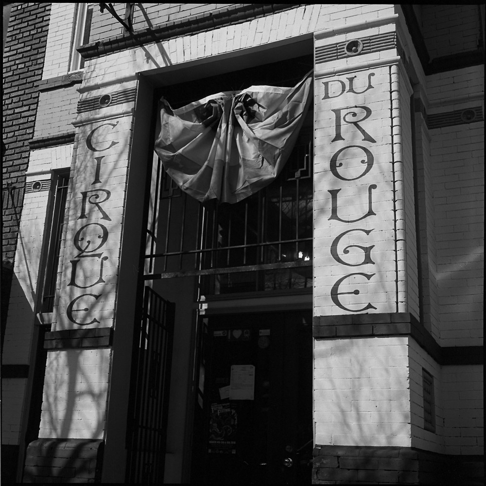
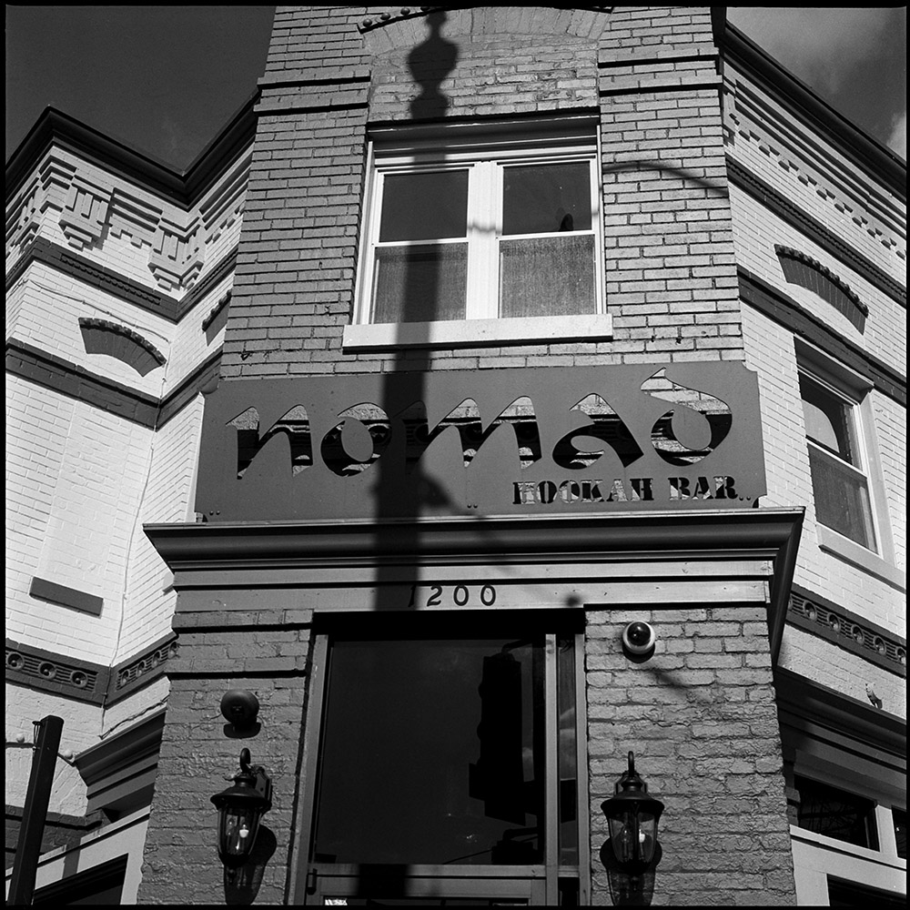
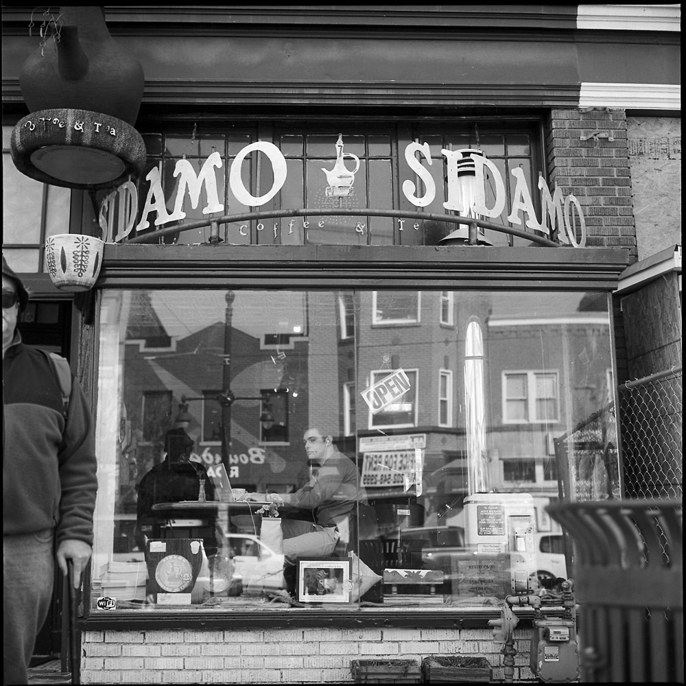
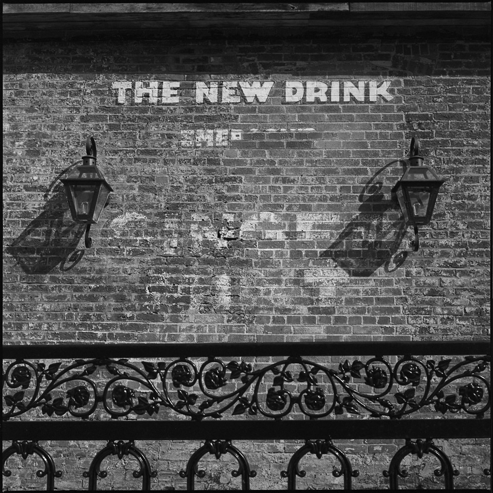
This set are the changing face of H Street – fresh paint, new entertainment venues, coffee shops and chic pubs.
Cirque Du RougeNomad Hookah BarSidamo Coffee & TeaThe New Drink
The not-so-visible dark underside to this is that the past residents (lower and middle income African-Americans) and the businesses they used to operate are being pushed out not only by the housing redevelopment that is driving real estate prices up by several hundred percent over the span of a decade or less, but by the changing retail landscape – when enough businesses on your street have gone from selling fifty-cent cups of coffee and five dollar lunch deals to six dollar cappuccinos and thirty dollar tasting menus, your old clientele aren’t coming around anymore. If you were already operating on a shoestring, it can be cost-prohibitive to reinvent yourself.
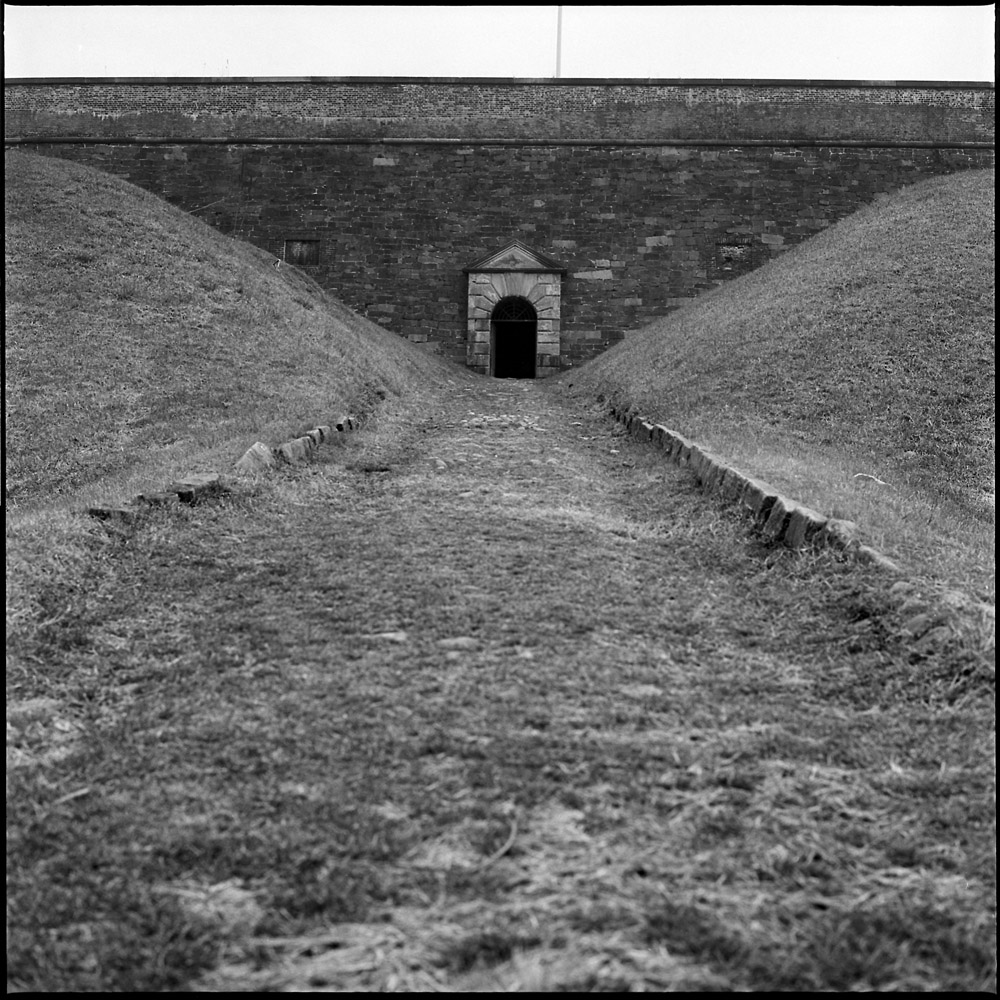
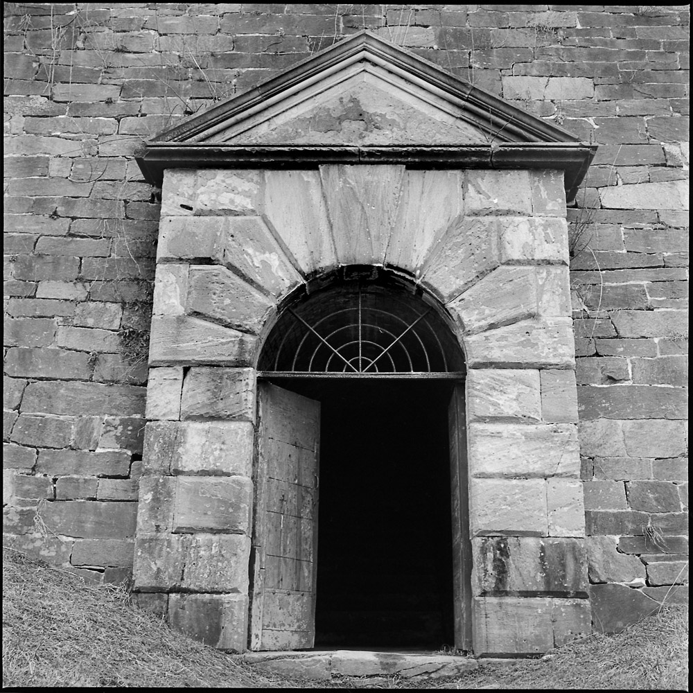
On the same day I went to Fort Foote, I kept on driving south into Maryland until I got to Fort Washington, proper. Fort Washington the fort is located in Fort Washington, the town, and to arrive there you drive through some rambling suburban tracts. Like Fort Foote, Fort Washington sits on the banks of the Potomac River atop a peninsula formed by Piscataway Creek’s entrance into the Potomac River. It, however, was not intended to be a temporary site but rather has been occupied and fortified since before the War of 1812. Its use as an active military base ended after World War II, but most of the structures you see were built between 1800 and 1918.
These first two images are of the gate in the early 19th century fortifications. This was the entrance that connects the hilltop fortifications to the water battery at river level.
EarthworksWater Gate
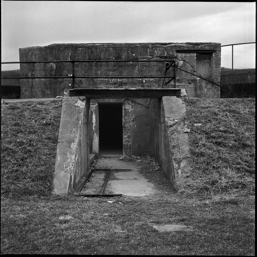
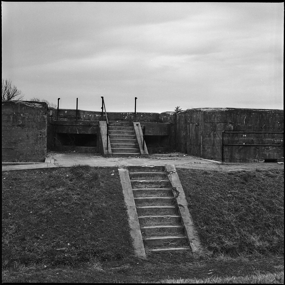
The water battery structures date to the first decades of the 20th century. You can see they are much lower, made of steel and concrete. The front side is protected by an earthen berm. The bunkers would have held the troops manning the now-dismounted cannon and communications equipment to control the batteries from within the fort.
There is something both ominous and at the same time hopeful about these structures, viewed from the land side. The bunker doorway looks like an entrance to the underworld.
Water Battery Entrance
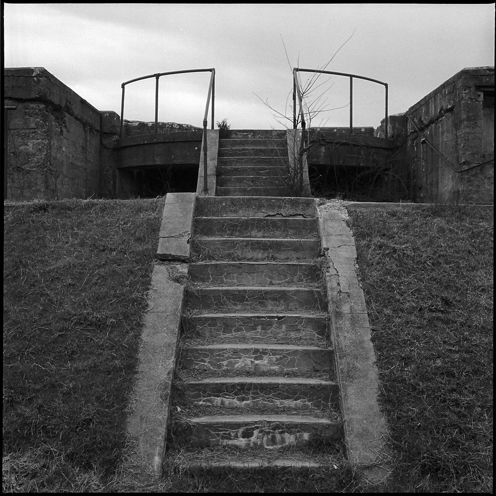
The stairs, however, now stripped of their weaponry, point to an upward journey, facing the unknown. They’re the prow of a ship, a pathway to adventure, or perhaps a Mayan temple at whose top great mysteries will be revealed.
Water Battery Stairs
The clouds above tease the possibility of rain, but it will be a gentle rain, not a thundering downpour. They’re the gateway to the horizon.
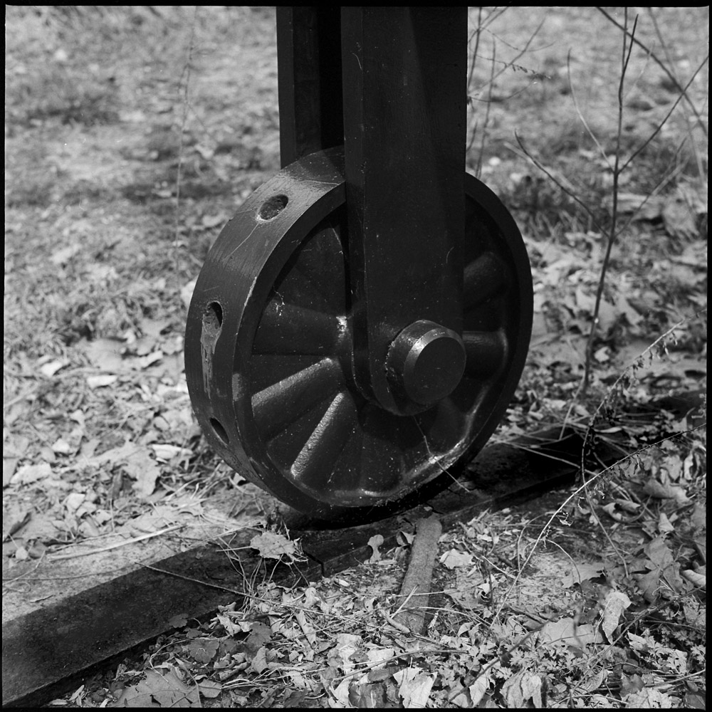
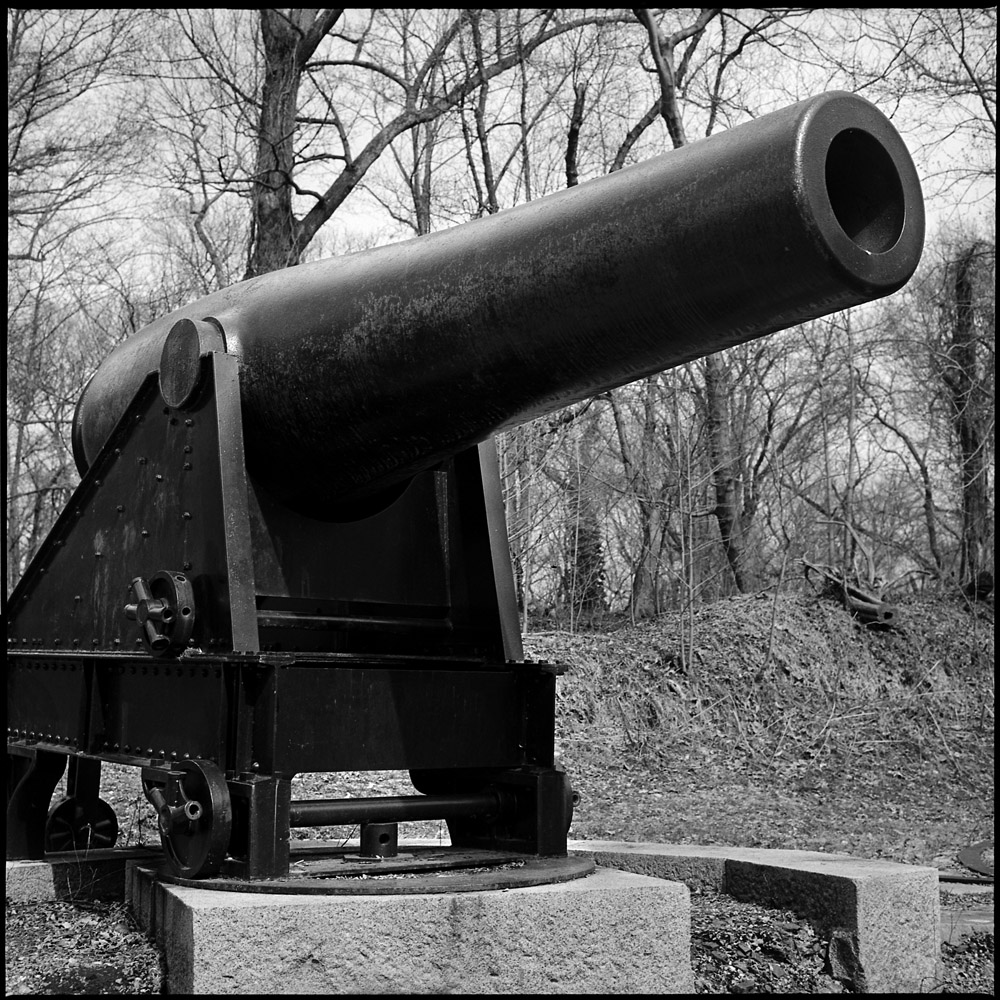
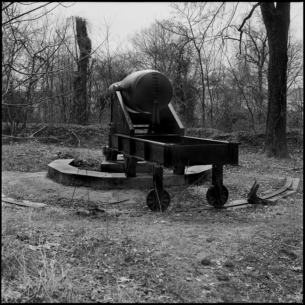
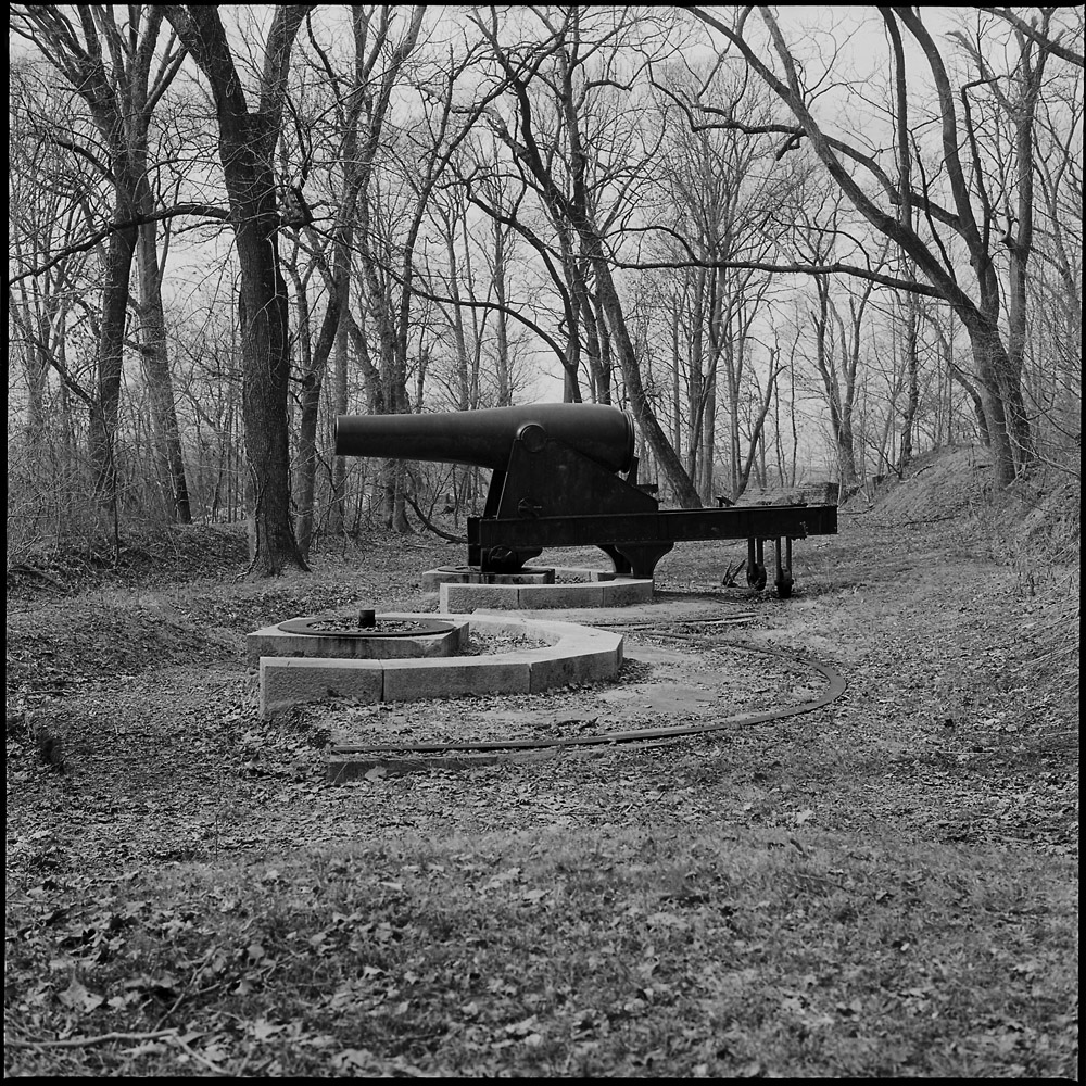
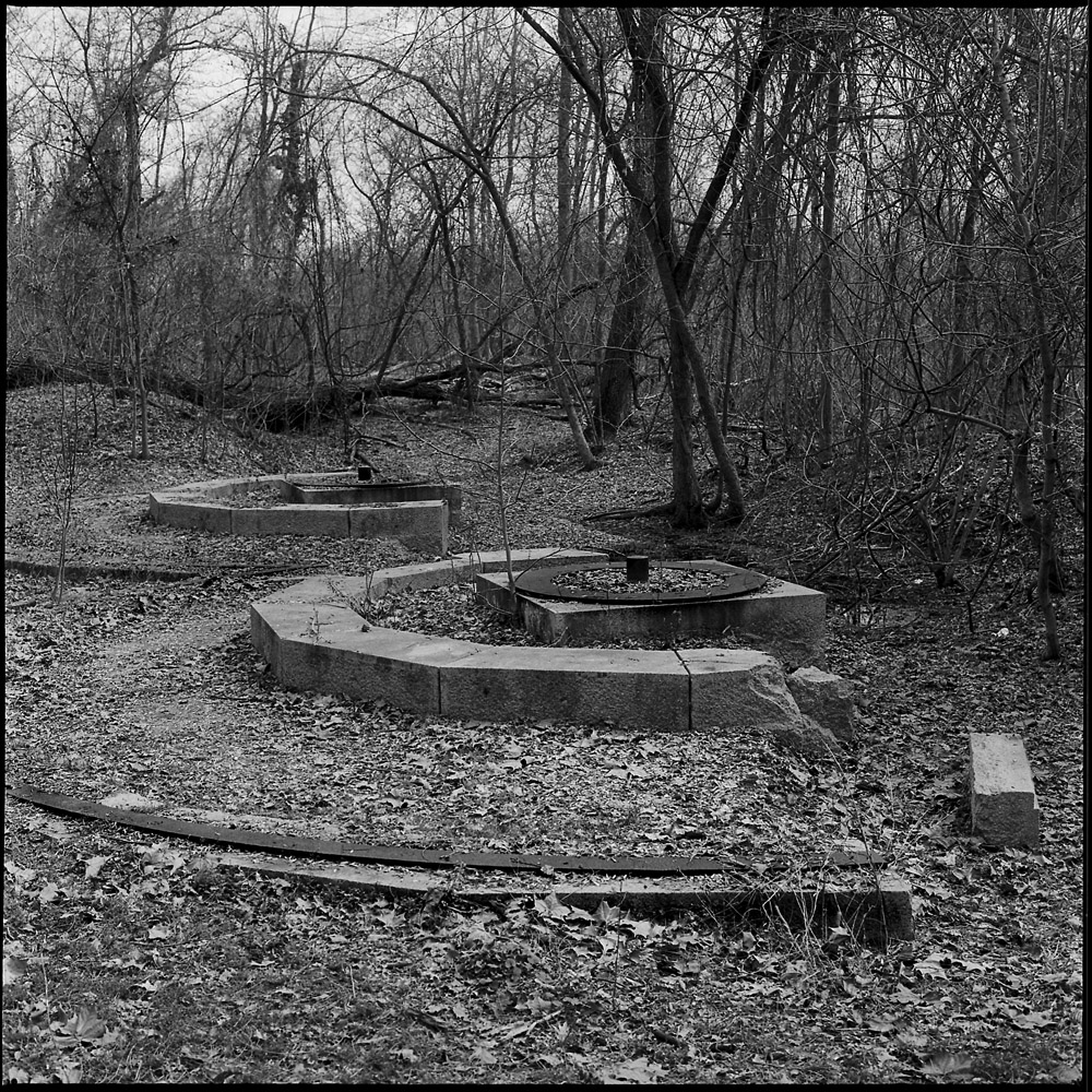
These are details of the fifteen inch Rodman guns and their emplacements at Fort Foote. I apologize for the delay in posting this second round. In this set of images I was focusing on the textures of the ironwork and the geometric patterns and repetition in the gun emplacements. There are endless circles and semi-circles repeating throughout, from the barrel of the gun itself to the wheels to the tracks to guide the traverse. They take on a bit of a crop-circle kind of feel: looking at the remnants makes you wonder if they’re the leftovers of an alien civilization.
Gun Carriage WheelRodman Gun, Fort FooteStanding SentryLone Rodman, Fort FooteGun Placements, Fort Foote
Because these are in the (encroaching) natural environment, I’ll grudgingly classify them as landscapes, but I think of them more as documentary work given the subject matter.
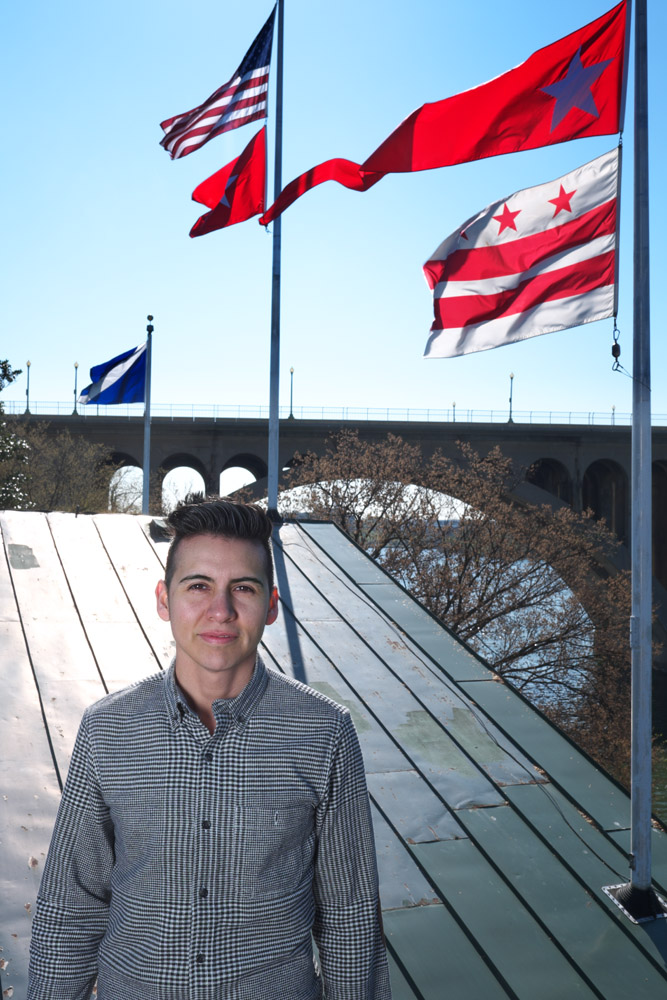
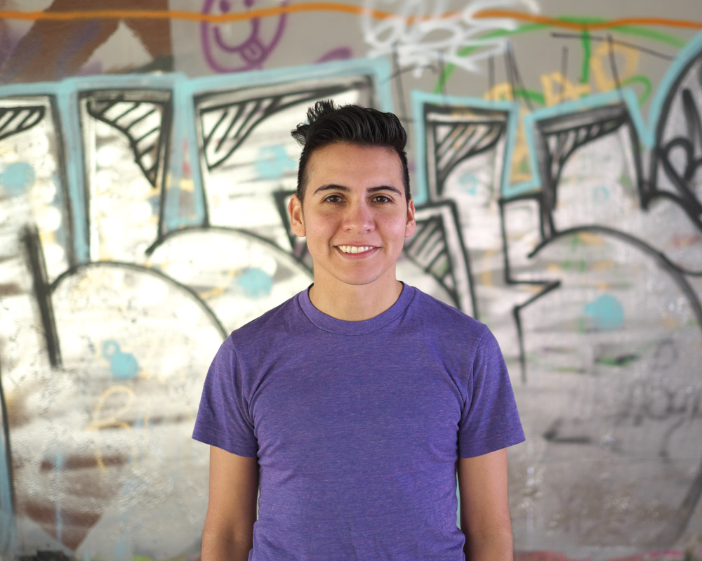
These are some portraits I took of my friend Alexander last weekend out in Georgetown. We went out to create some work for a fundraiser benefit in Toronto for Sprott House, a youth shelter run by the YMCA specifically aimed at providing housing for gay, lesbian, bisexual, transgender and two-spirit (the native American term for LGBTQ) teens and young adults. Alexander is a Latino trans man and open and proud, and I thought some portraits of someone living an out, proud life as transgender would be inspiring for kids struggling to deal with their own identities and the impact of being “other” on their futures.
The first couple images are pretty serious and straight images (pardon the pun).
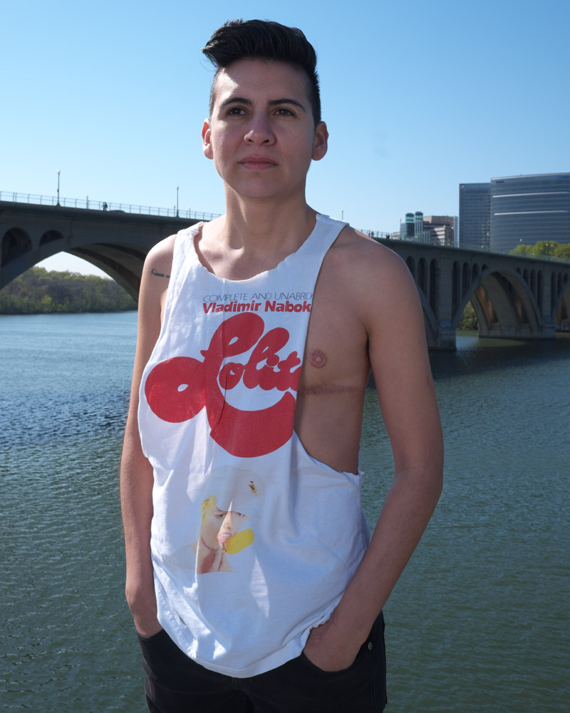
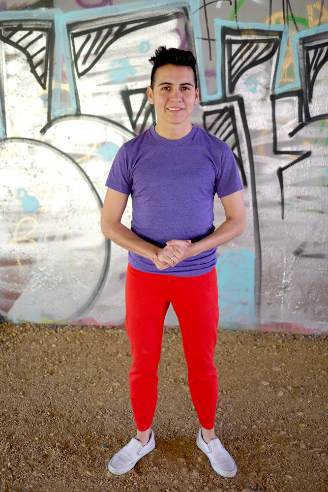
A little bit of humor – this is Alexander’s club-hopping t-shirt. I teased him about the mixed message of serious literature on a clubbing shirt. But it is Lolita, so I guess it qualifies 🙂
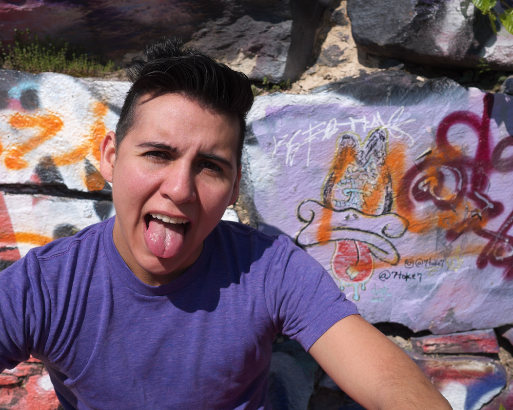
Just because a photo has a serious purpose and carries with it a political statement doesn’t mean it has to be serious. While I was posing Alexander in front of the wall of graffiti, he spotted the duck with its tongue sticking out and imitated it. It was a great spontaneous moment and shows his personality.
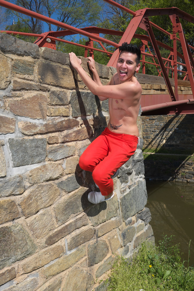
Alexander wanted to do some shots to show off his growing muscle definition, so he went and climbed the stone pier for the ramp over the canal…
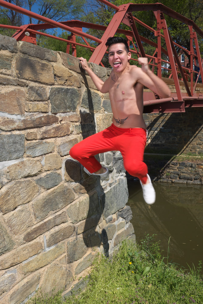
And then jumped off of it…
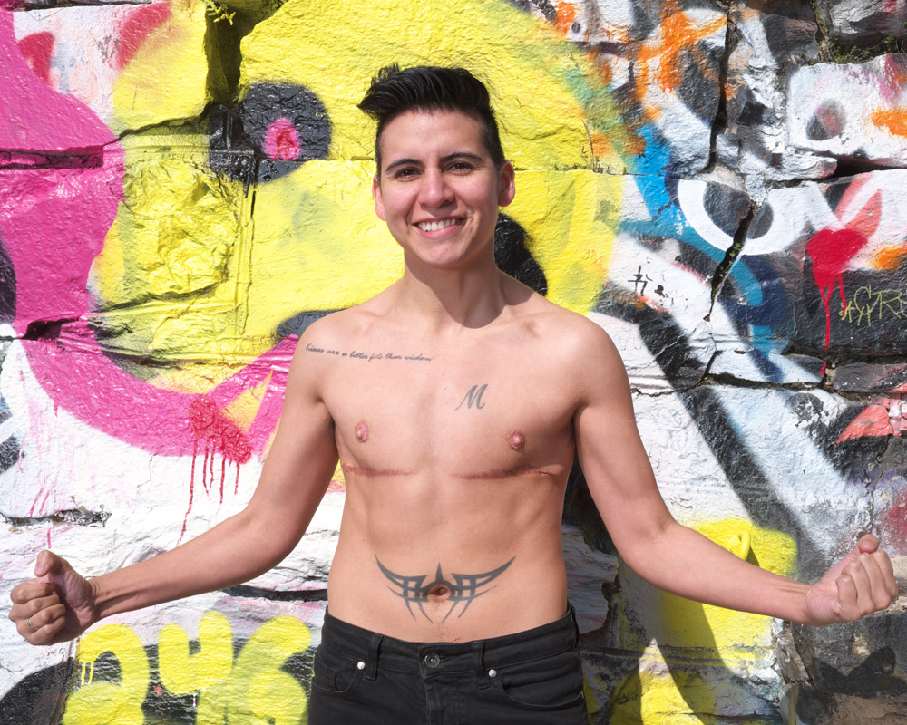
His script tattoo says “it is better to have kisses than wisdom”. I haven’t made up my mind about whether I agree with the sentiment, but it definitely suits his personality.
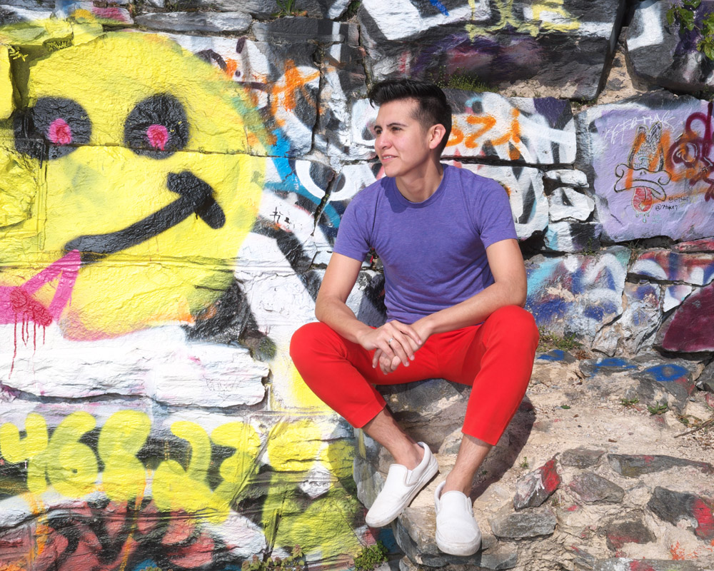
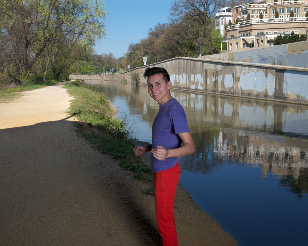
Under the ramp to the freeway that passes over the C&O Canal there’s always some interesting graffiti, and right now it’s tagged with this beautiful silver metallic paint that really complemented Alexander’s red and purple outfit.
The last image I feel makes for a great closer for the series – Alexander’s gesture seems to be saying “come with me and we’ll have a fun time!”.
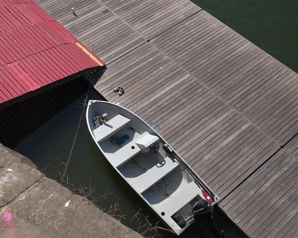
This is a view I’ve seen a number of times but wasn’t ever sure how to capture it until yesterday. I’ve always had the wrong camera with me, either from the focal length, the aspect ratio, or both, perspective. This is an outtake in the sense that I was doing a model shoot with a friend of mine on the pier of the old C&O Canal bridge that used to cross the Potomac River in Georgetown, so taking this photo was not the purpose of the shoot. This is the view looking straight down at the dock for the boathouse.
Boathouse Dock, Georgetown
I was particularly drawn to the geometry and angles formed by the decking on the boat dock, with the red decking running perpendicular to the unpainted deck, and all the triangles formed by the perspective you have to take to see the scene in the first place. Even the boat, which has a totally different shape and texture to the decking, creates more triangles with its prow, and provides visual tension running the opposite direction so you move your eye around the image.
There are times when you want to capture something delicate in backlit lighting – a translucent flower for example. Going strictly with the natural light you end up with either the translucent parts blown out to get detail into the front, or you have a dark blob in the middle to keep the delicate highlights under control. This is where fill flash comes in handy.
Normally I loathe little pop-up or shoe-mounted flashes because they’re about useless when trying to light anything more than a couple feet away, and they’re so close to the lens that they give people red eye and make pets look like demons. But as a fill flash, they really shine (shine, get it? pun!). They put out just enough light to take the edge off backlit shadows and add a little catchlight into people’s eyes. When used this way redeye isn’t a problem because in daylight people’s pupils are closed down enough that their retinas don’t reflect (the cause of red eye in photos).
Fortunately, flowers don’t have retinas, so we can dismiss the concern altogether.
Pink Blossoms
I was using my Fuji X-T1 and had the tiny little toy-like pop-up flash that comes with the camera as an accessory. I took one shot of the blossoms without the flash. I knew right away that the blossoms would be too dark and not have detail; the little flash was exactly what I needed. I popped it up and let it put in a little kick. Voila!
If you’ve never curated a group show before, especially one with international reach, it’s hard to imagine the level of effort that goes into putting on an art exhibit. You have to put out the call for entries, manage the publicity to make sure you get enough work submitted to fill the walls even after reviewing and editing, and then handle the acceptance emails and collect the accepted work.
Oh, and be prepared for things not working out as planned. I feel extremely lucky we had only two hiccups with submitted work. One was minor – one piece of work came off its mounting in transit. With a quick email to the artist, I got his permission to open the frame and re-mount the work properly so it would present well on the wall. In the process, I also replaced the source of the problem (gummy adhesive squares that were NOT archival) with water-activated linen tape loops using acid-free wheat paste for adhesive. No artist’s work is going to be damaged by me on my watch!
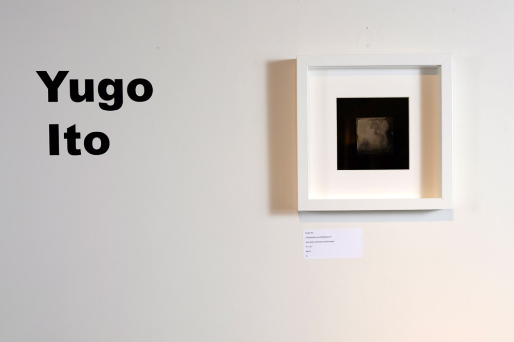
The second hiccup was totally beyond anyone’s control, which is what made it so maddening. Yugo Ito’s photograph coming from Japan was shipped in plenty of time to arrive at the gallery. However, it got stuck in customs in New York for almost two weeks. There was nothing to be done but to wait, as customs is a black hole into which things enter and exit at their own pace and there is no transparency or communications possible beyond checking the tracking number on the USPS website. Creativity saved the day, though – since the actual work was not in the gallery for the opening, I took the JPEG of the work from the submission and printed it, mounting it to the wall with a sheet of glass and some L-pins. It would be represented in spirit even if not in actuality.
Once all the work has arrived, you have to plan how you’re going to hang it. You can look at JPEGs all you want, and generally gauge which artist’s works should hang next to which other artist, but the actual sequencing and spacing can’t really be figured out until you have the actual framed work in hand at the gallery. Next it’s measure, measure, measure, and then plan, and re-measure, before driving the first nail into the wall. Having gallery interns to help with the hanging makes life so much easier (Shout-out to my interns! Thank you!!).
Now the work is all hung, you can relax, right? NO. Then it’s plan the reception, send out the invites, send out the press releases, buy too much cheese and crackers at Costco, and then throw a party. There’s the curator’s remarks to prepare, and handouts about the work to write. Oh, and blogging about it all the while!
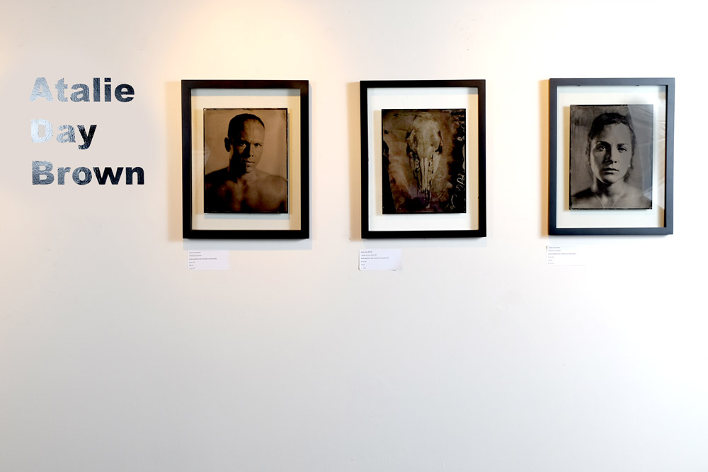
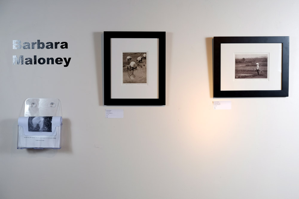
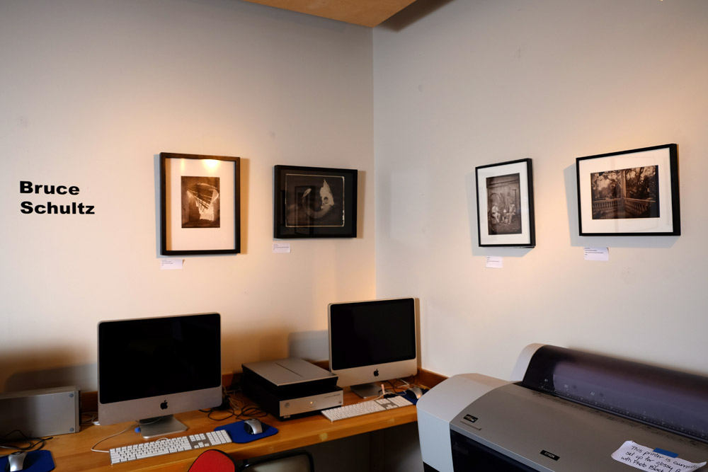
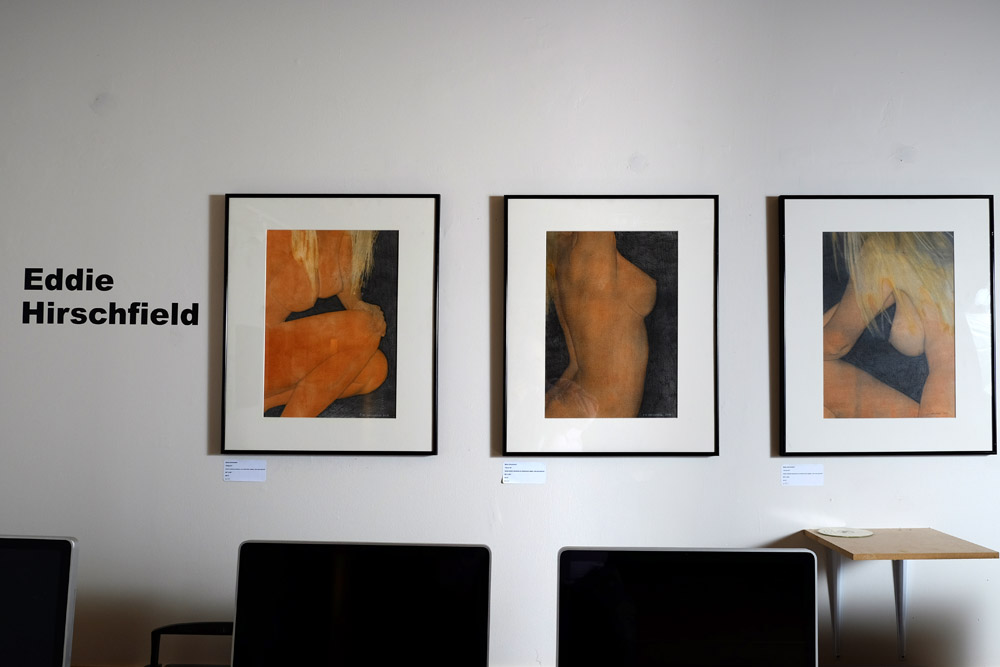
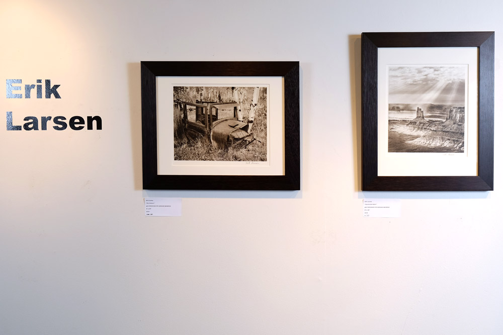
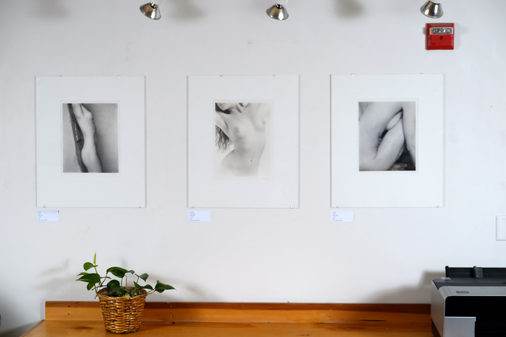
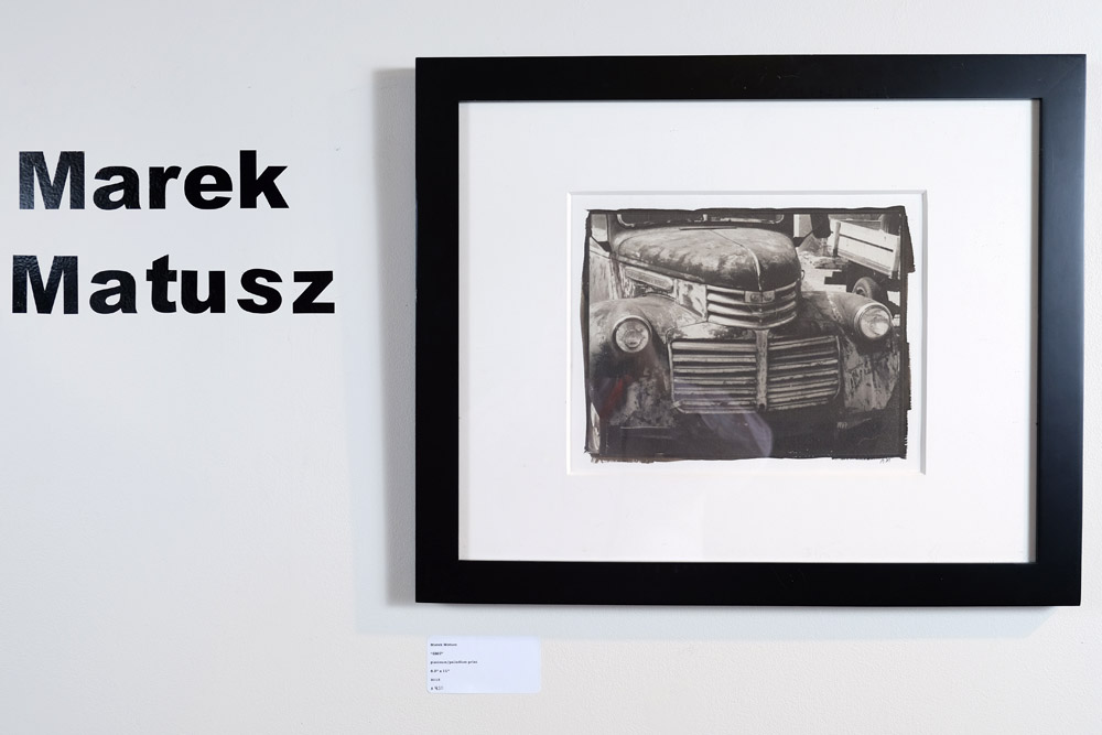
At some point during the show, ideally right after you’ve hung the work but before the public comes in to see it, you document the exhibit. Below are a few excerpts from the show as hung. One of the great challenges of curating a show is that once you have it up on the wall, what might look good in the space presents a wicked challenge to document. Trying to photograph pieces in corners where you can’t get a light on them from the other side means that you’ll either have dramatic falloff in the scene from one side to the other, or you’ll have a hideous reflection of your umbrella or other diffuser in the picture glass. I opted for a bit of falloff rather than reflections where possible because the falloff can be compensated for to a degree in Photoshop – a big blinding white reflection of an umbrella cannot.
Atalie BrownBarbara MaloneyBruce SchultzEddie HirschfieldErik LarsenIan LeakeMarek MatuszYugo Ito
You’re not done until the show is over, the work taken down, and the artists have picked up their work or you’ve shipped it off to hither and yon. Then you get to relax for a day or two, and if you’re a busy curator, it’s back to the process all over again!