
I felt the need to get back into the darkroom and do some printing lately. And I was inspired by watching an instructional video from Bostick & Sullivan on making digitally enlarged negatives for alternative processes, specifically Platinum/Palladium.
I was familiar with the basics of the process, having read multiple books and web tutorials on the subject. What has always tripped me up was the process of creating my own adjustment curve. Well, the generous folks from B&S have put the curve they use on their website to download and use after running the video tutorial. I figured I would give their curve a try.
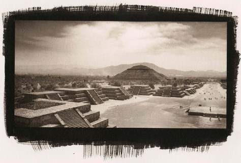
This is the first print I made with their curve. The original is a 6x12cm negative shot on Ilford FP4+ black and white film using my Lomo Belair X/6-12 camera. I followed their instructions in the video to the letter, including using a quantity of NA2 contrast agent.
They also mentioned adjusting the ink density down a bit to keep contrast under control. Well, I like the idea of printing pure palladium without adding any NA2 because the NA2 alters the color tone of the prints and makes them cooler.
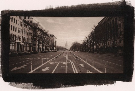
I made the negative for this image (and the following image of the National Gallery of Art) without reducing the black ink, and not using any NA2. I think the balance worked out well – the contrast is where it needs to be, and the color tone remains nicely warm.
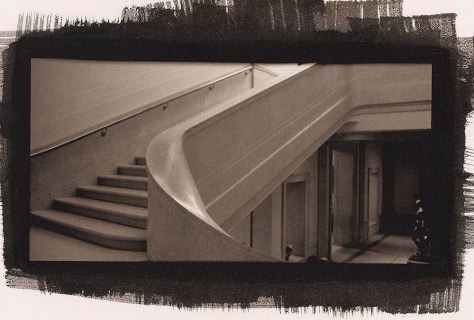
This staircase was a true test of the capability of digital negatives to render the subtlety of tone possible in a palladium print. I’d say it passed with flying colors. The tone remains rich, warm chocolate, the highlights are delicate and creamy, and there’s surprising detail down into the shadow tones.
My apologies for the image scans – they’re direct scans of the prints, and my scanner picks up paper texture to a degree not visible to the unaided human eye (I can see texture only under a loupe that may be visible in the scan).
So where does the sous-vide in the title come in? Another long-standing issue with the process is that the Potassium Oxalate (PotOx) developer is happiest at around 130 degrees F. I can get water close to that hot out of my tap to use as a tempering bath, but within a short while it returns to room temperature. I found this sous-vide machine and the 18 quart bucket on Amazon for under $100. I put them to use this morning and if the above three prints are anything to judge by, they’re staying in my darkroom! The prints are amazingly consistent from print to print (it took me about 3 hours this morning to get all three prints done, but the developer remained at a constant temperature throughout).
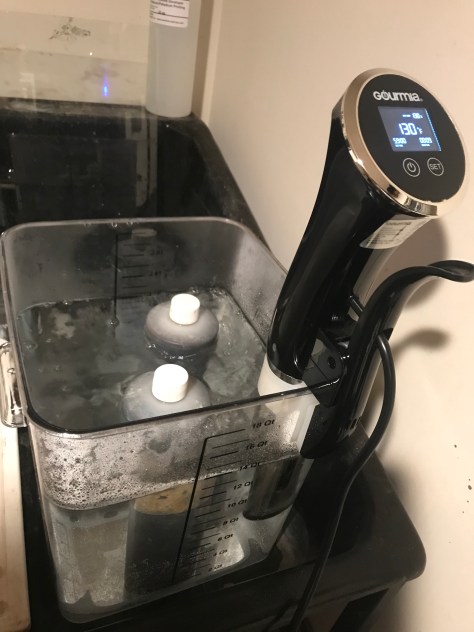
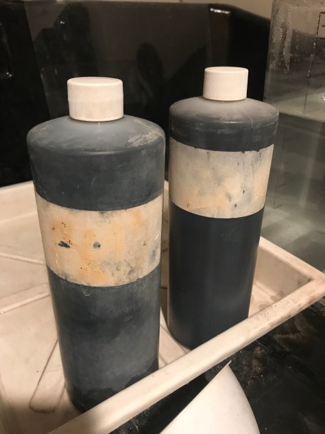
Something interesting about developer for platinum/palladium printing – unlike film or paper developer, this stuff never really goes bad. Your total volume will drop with use, but that is solvable by replacing lost developer with additional fresh developer. The bottle on the left is the first ever bottle of Potassium Oxalate I bought – I’ve just been replenishing it and filtering it as needed for over a decade now.
Technical notes:
Prints are 100% palladium, 6 drops each Palladium / Ferric Oxalate #1. Developer is Potassium Oxalate, 130 F, 2 minutes. Paper is Bergger COT320. Negatives are enlarged onto Pictorico OHP ultra-premium transparent inkjet medium on an Epson 3880 with K3 Ultrachrome inks. All three prints are 4″ x 8″.
