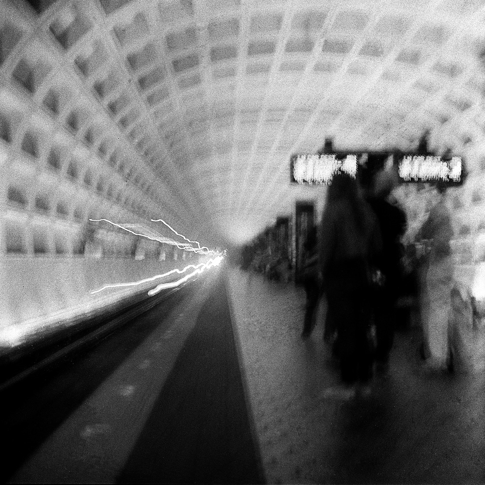
Look at these which are very similar to some I’ve done in black and white and note how different they feel for one being in color the other monochrome.
Pulling In, GWUMetro Train Arriving, Archives Station
Don’t you relate to them differently?
Another example of the emotional effect of color- outside the train is dark, cold, and muted color, whereas inside is warm, glowing, alive and inviting. Wouldn’t you rather be inside the train than outside?
More of my Commuter Diary, this time in color. I like to go back and forth with the same subject in color and in black-and-white to see how they change both stylistically and emotively. As Edward Weston once said, “you can say things in color that you can’t say in black-and-white”. Truer words were never spoken – color photography has a totally different feel than black-and-white. I think black-and-white is more intellectual whereas color is more intuitive and emotional. Black-and-white, because it is an abstraction from reality, makes us look at a scene with a kind of detachment, whereas color draws us in and makes us experience the scene in a more visceral, less vicarious way.
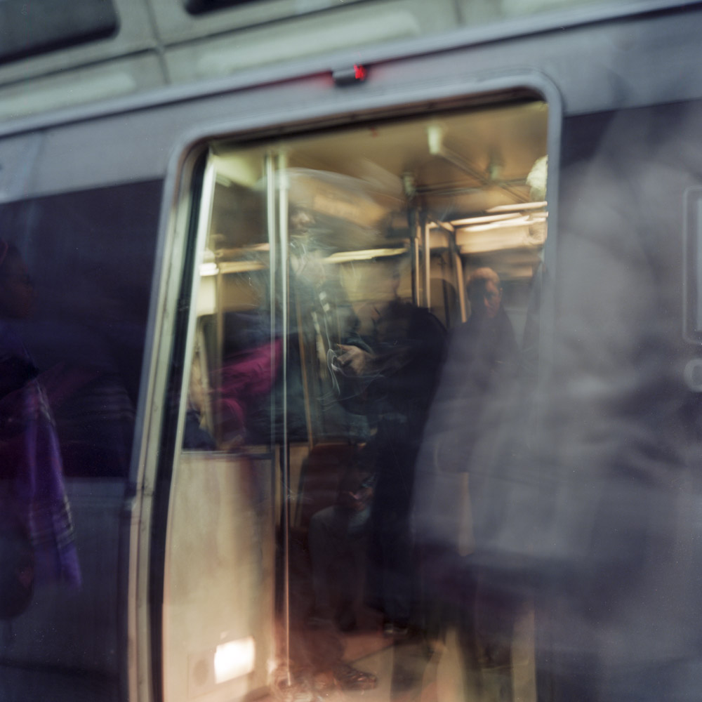
This shot is, quite frankly, a bit of a mystery to me as to how I took it – I THINK it was one I panned with the train as it pulled into the platform, then held the camera still while the doors opened, but certain aspects of it feel like a multiple exposure (which I know I didn’t do, certainly not intentionally).
Train, Arriving
Using color implies or alleges reality (although as photographers and photo-savvy people we know that photographs can and do lie about the subjects they represent, especially as regards to the accuracy of color), so we identify more closely with color images and accept them as “more real”, to the point that we experience cognitive dissonance when we see color represented/manipulated as “different” from what we “know”. Some of this comes from a clash of expectation vs reality, and some of it comes from the way our brains work – we sit down in a room lit by fluorescent light and after the briefest of adjustments, we see “normal” colors despite the fact that we can objectively prove that the fluorescent light source is missing certain portions of the visible spectrum.
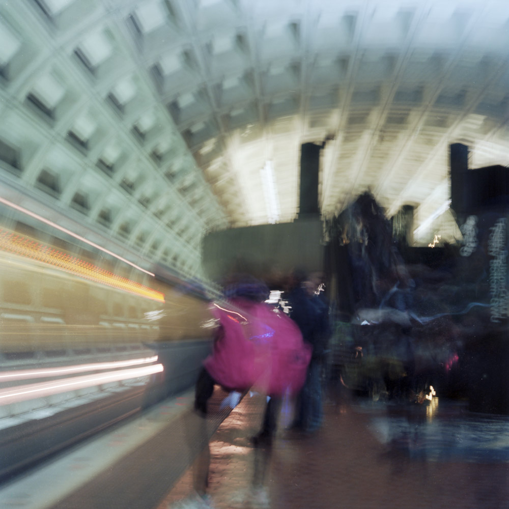
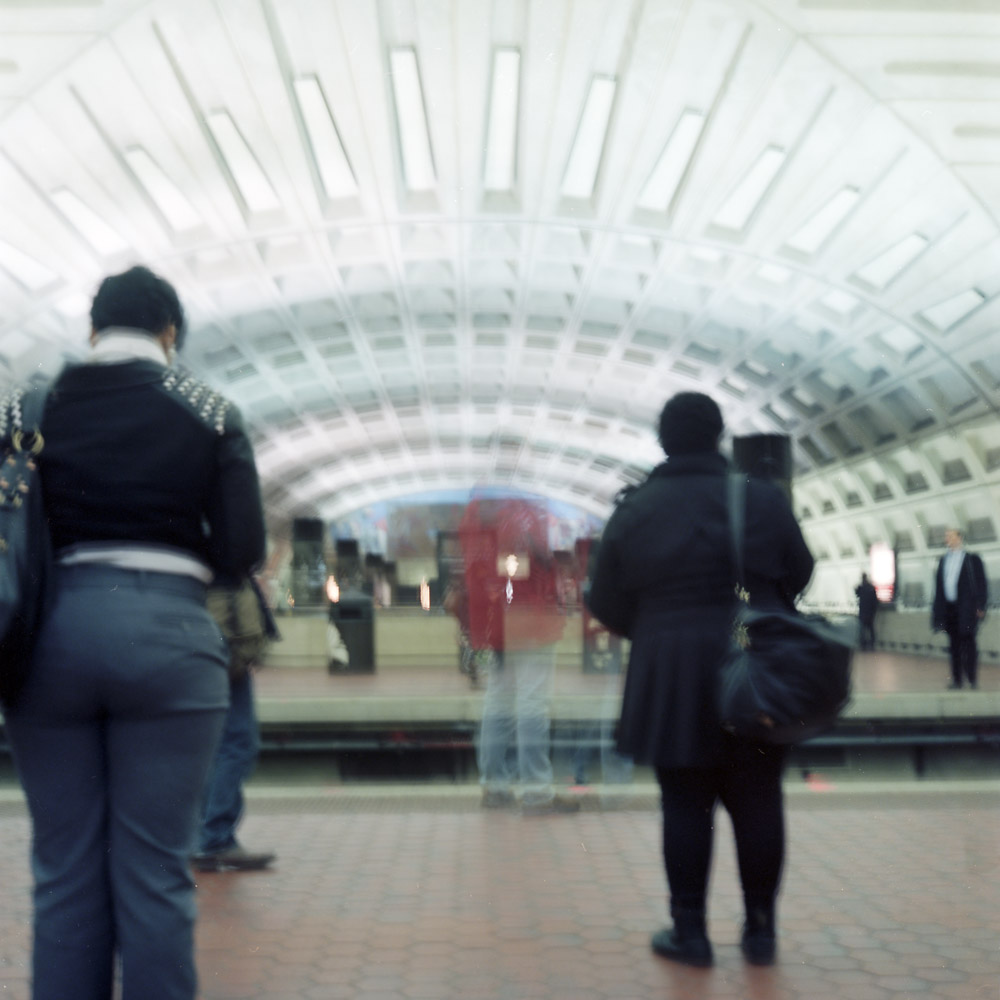
The commuting experience, especially on public transit, is as much about waiting as it is about traveling. Here is a view of Metro Center, one of the major transit hubs on the subway system in Washington DC. Four different rail lines pass through this station, so there is always activity. The two people standing mostly still in dark clothing frame the blurry person in the red jacket. The touch of color draws your eye to the center of the frame as much as the leading visual lines do, and it gives the scene an energy and intensity that would be missing in black-and-white.
Awaiting Train, Metro Center
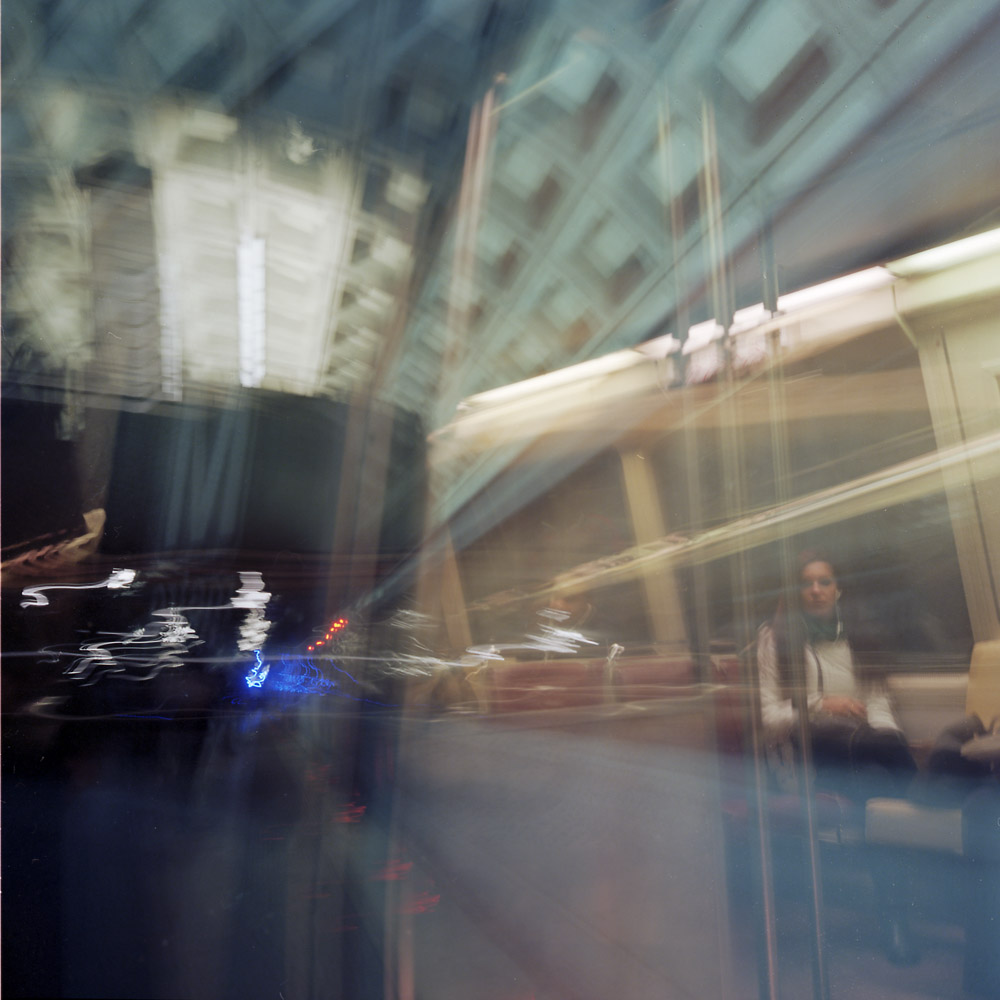
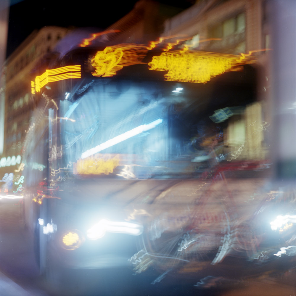
Riding the bus is a very different experience from riding the subway. For the most part, one is indoors and the other is outdoors. Even if they do run with comparable frequency, waiting for the bus feels like it takes longer than waiting for the subway, perhaps because in certain parts of the city, many bus routes visit the same stops, so there may be a bus coming every five minutes but it might be twenty-five before your bus arrives.
The S2, to SilverSpring
One of the things I’ve always liked about night photography is the effect of multiple color-temperature light sources in the same scene. The impact is thrown into high relief in a scene like the bus, where the background is lit with yellow incandescent lights, the streets are orange/pink from sodium vapor, and the bus interior is bluish-white from most likely LED lamps. The colors and their cognitive dissonance bring out emotional dissonance as we read back and forth between elements of the scene – the emptiness of the darkness, the warmth of the background, the alien color of the near-ground, the inviting orange of the bus signage, and the ghostly hospital white of the interior of the bus.
Ok, well, two duos and a single. I couldn’t leave well enough alone and stick strictly to the article title, as there was one image left that needed to be used.
Trevor, GraysonTrevor, Grayson
At least the odd single is in the same location, same lighting, same film. So it kinda-sorta fits. All three are, as tradition, shot on my Rolleiflex 2.8E, with Kodak Ektar 100.
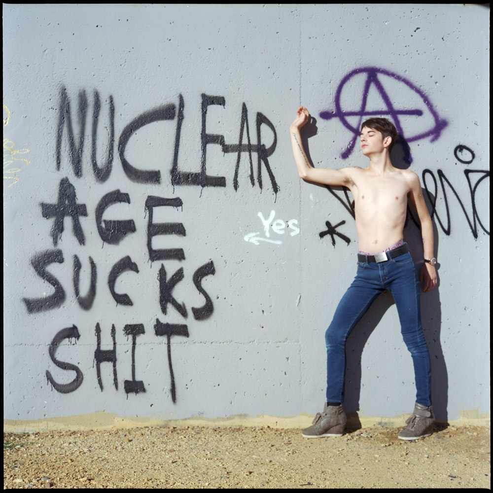
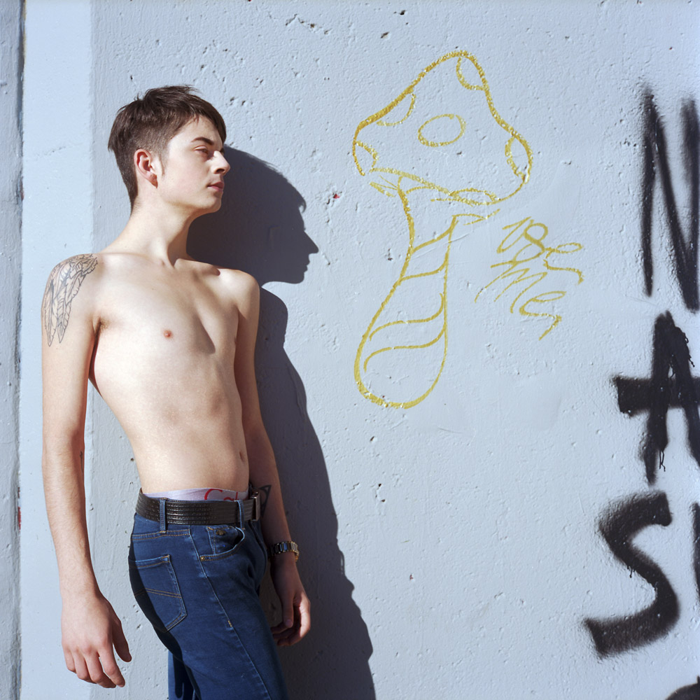
While we were out scouting a location, Grayson saw this bit of graffiti and said, “I want my picture taken next to a sign that says, ‘Nuclear Age Sucks Shit’. The colors were cool, the message edgy, and the model was inspired, so who was I to say no? I’m going to keep it on my list of places to shoot.
Grayson
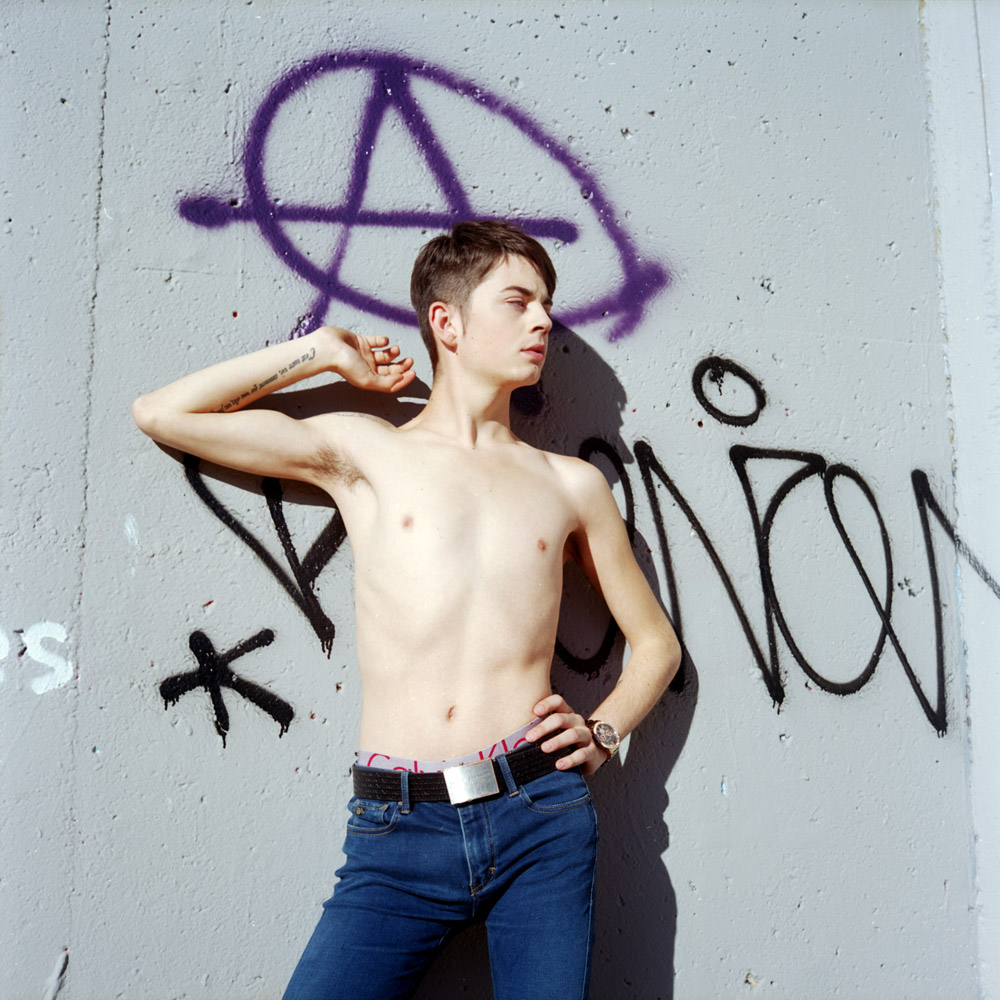
The Anarchy symbol made for a kind of halo in purple for Grayson.
Grayson
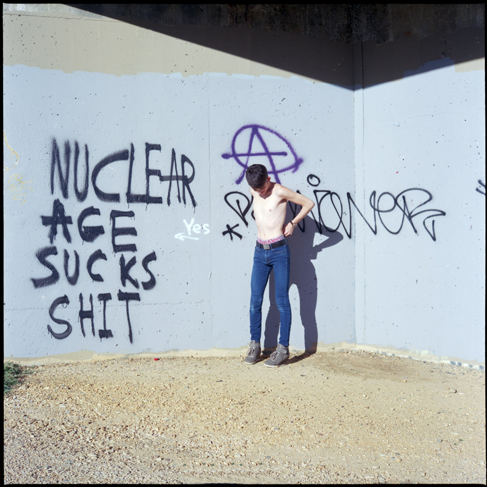
In this case, the diffuser wasn’t big enough to soften the light on the whole scene, and the hard-edged shadow on the wall made perfect sense given the message of the mural – the shadows recall the kind of shadows cast by the blast of a nuclear weapon.
Grayson
In this last shot, I moved in tight to get the golden mushroom stenciled on the wall. It just seemed a fitting counterpart to the rest of the graffiti.
Grayson
Again, all shots were taken on Kodak Ektar 100 in my Rolleiflex. It gives punchy saturation when you need it without being over-the-top.
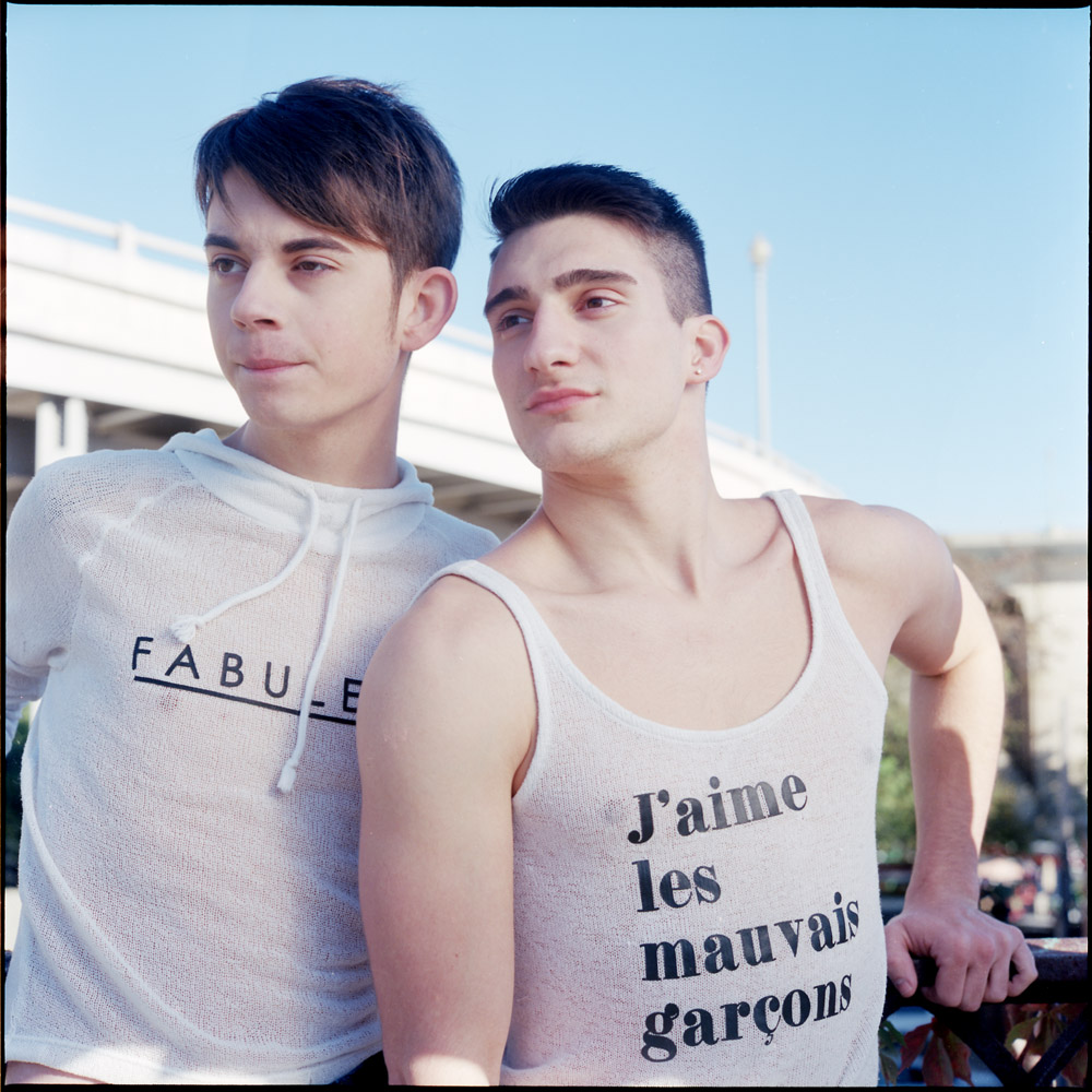
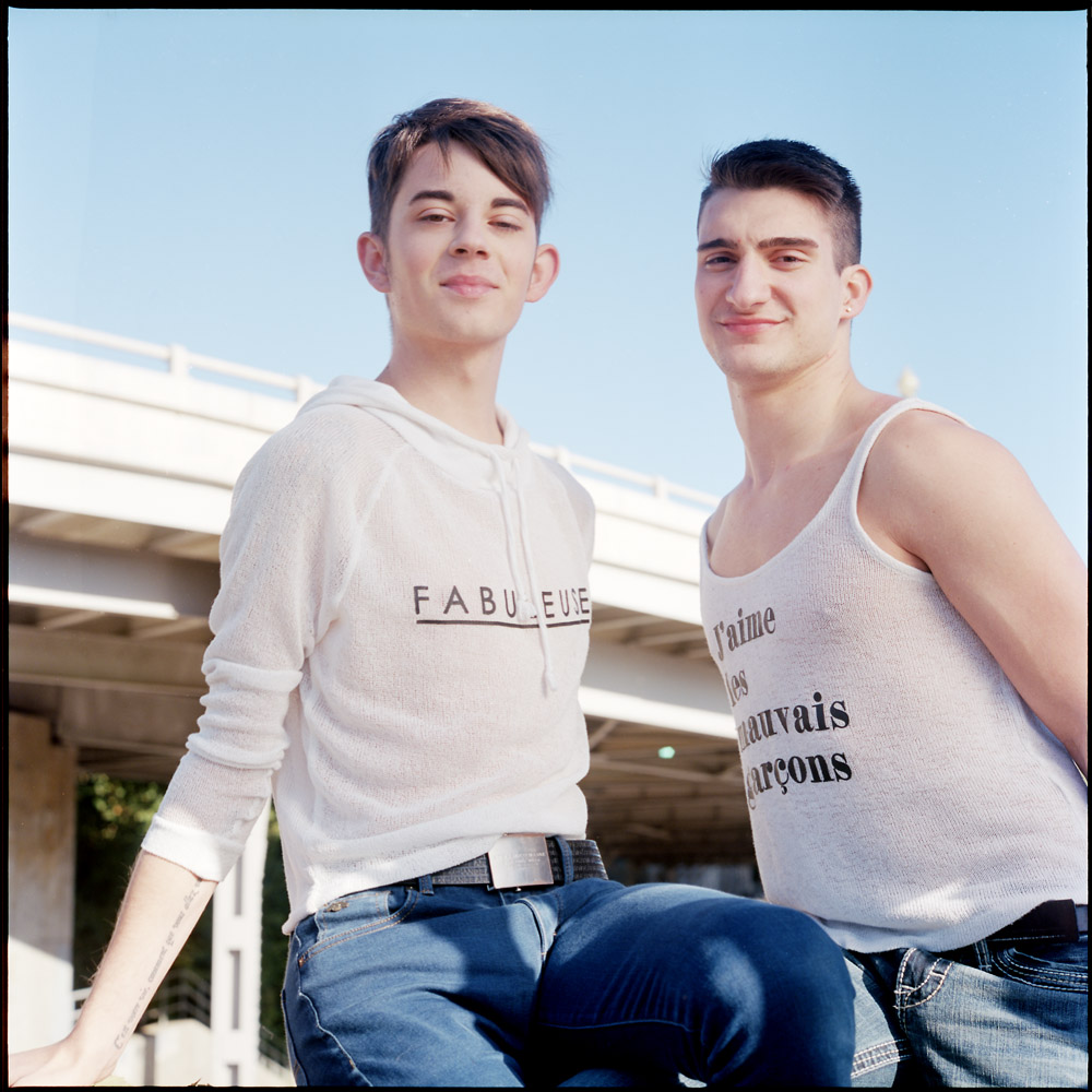
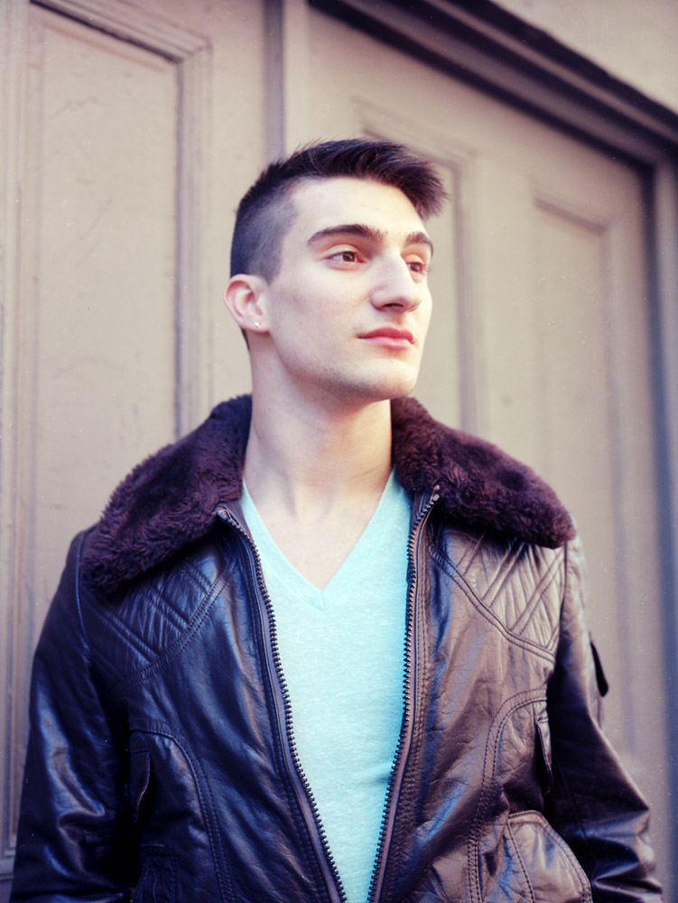
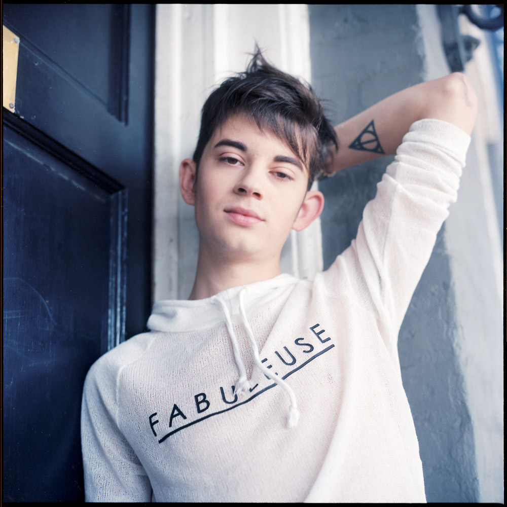
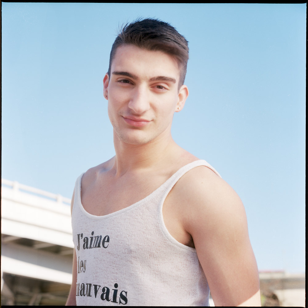
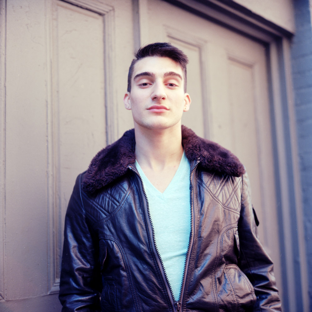
Here are five portraits I did of the models last Saturday. Trevor and Grayson were easy to work with, and I would be happy to give a reference for them to anyone who wants to work with them.
TrevorGraysonTrevorGraysonTrevor
All images were shot on Kodak Ektar 100 with my Rolleiflex 2.8E. I wanted to make a point out of this because I hear lots of people saying “I can’t get good portraits with Ektar – I don’t like the skin tones”. I haven’t had to do anything special to get these, other than the obvious minor retouch to remove a pimple or two (these guys are in their early 20s after all). For the shot of Trevor in bright direct sunlight, I used a white diffuser disc to soften the light on his face. Otherwise these were just natural light. The shots of Trevor in the aviator jacket were taken in open shade in an alley, so no diffuser was needed, as was the shot of Grayson wearing the black cotton top and the one in the white mesh hoodie.
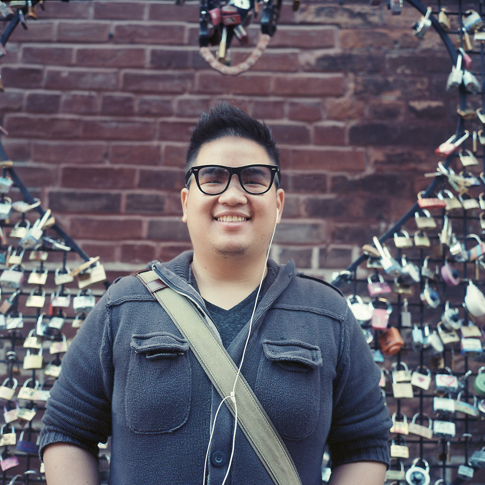
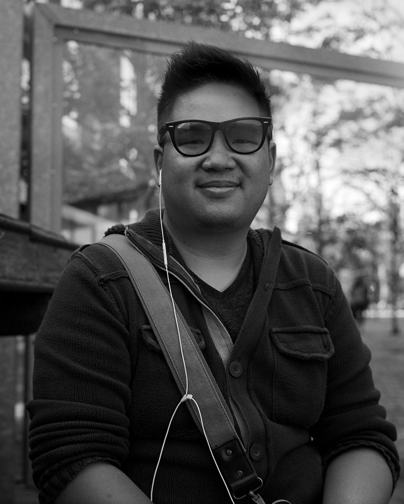
Two different portraits I took of my friend William, who toured me around Toronto on Sunday of my weekend visit. Both were taken at the Distillery District, one black-and-white, the other, color. I cropped the black-and-white one because there was some lens flare in the upper corner, and I think the vertical crop is not only complimentary to a portrait in general, it is flattering to the sitter.
William QuachWilliam Quach
Both images, of course, were shot on my Rolleiflex. It makes for a great environmental portraiture camera. One of these days I’m going to get the Tele-Rollei to do some tighter head shots, but for now, this is just fine. The b/w image was shot on Kodak Tri-X, and the color on Kodak Ektar 100. I’m normally brand agnostic when it comes to film – I shoot whatever produces the look I like. For a slower b/w emulsion, I’m happy with Ilford FP4+, and for a really slow emulsion, Ilford PanF. For years, until they discontinued it, I was a huge fan of Fuji Reala when it came to color. Since it went away, I’ve shot Kodak color emulsions almost exclusively, though. I used to like the super-saturated colors in Fuji slide films, but now I prefer a somewhat more subtle palette, which I get from Ektar (which is still a saturated, contrasty emulsion) or even moreso from Kodak Portra (mostly Portra 160, but the 400 and 800 also have their uses).
Ok- I’m getting better organized now, and here are my Toronto bike pictures. And trikes, if you count the pedicab, but it’s non-functional, so I’m not entirely sure it counts one way or the other.
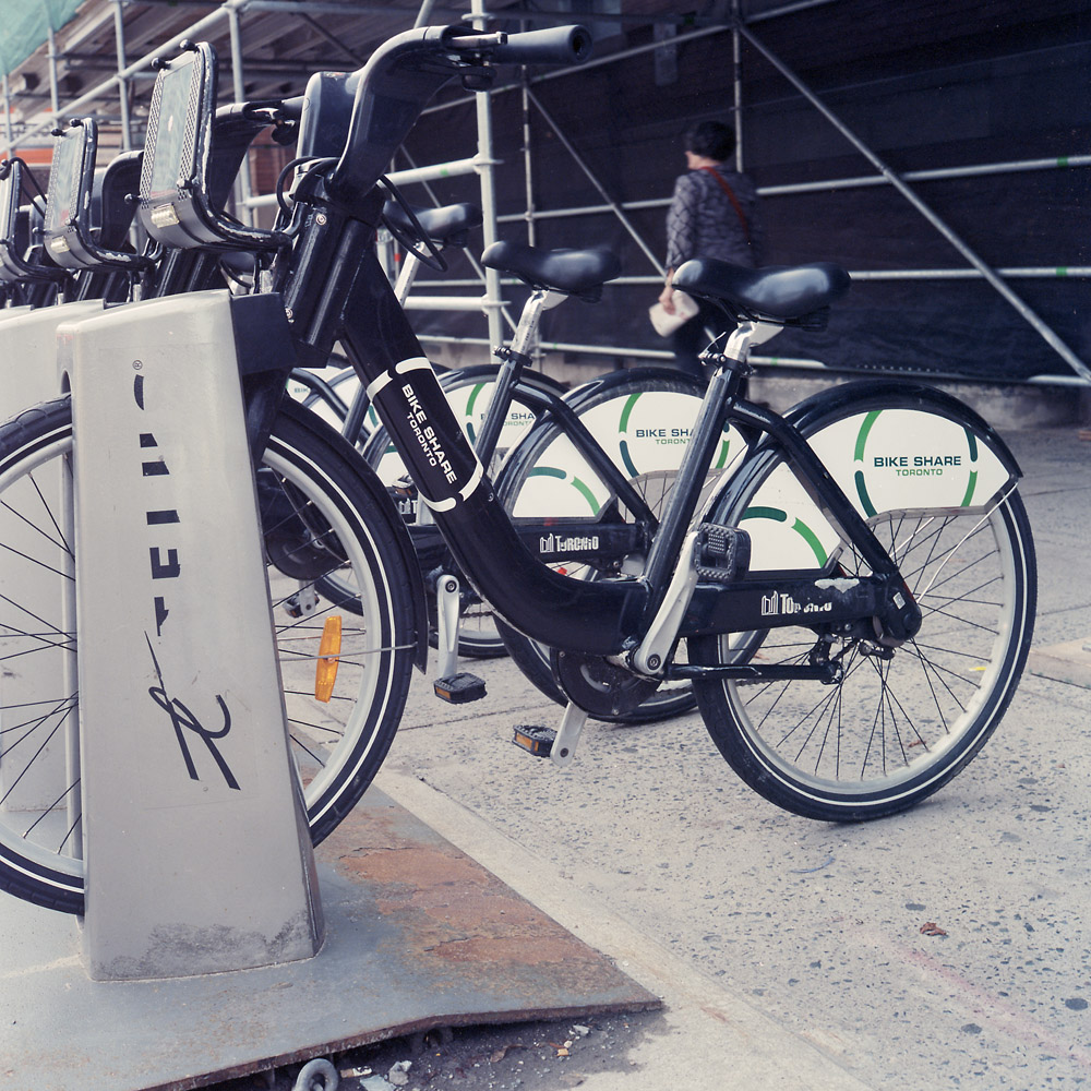
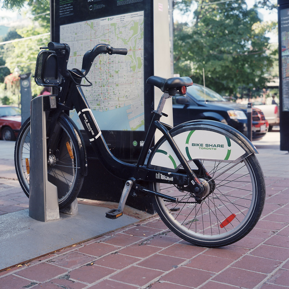
The Toronto Bikeshare program gets first on the playbill. They’re quite popular and fairly ubiquitous. I don’t know that it’s any cheaper than riding the streetcars, but it certainly is better exercise.
Toronto BikeshareToronto BikeShare, Solo
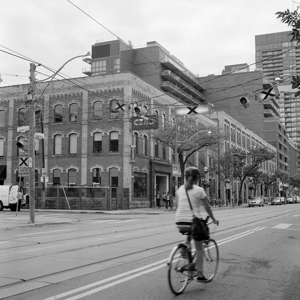
A lone cyclist on her way downtown, early in the morning. The overhead lights for street car traffic control are lit, because another block or so ahead and the normal King Street traffic is closed off due to the opening festivities for the Toronto International Film Festival.
Cyclist, King Street
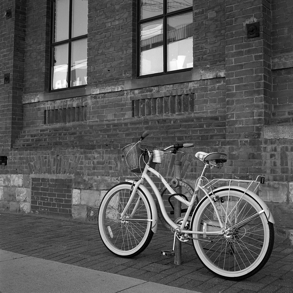
This bike was spotted locked to a bike stand over by the Ontario Opera Company headquarters. It had a suitably retro vibe to it, which both pairs and contrasts nicely with the brick former factory building behind it. It feels like it’s going somewhere on its own, just from the way it’s standing by itself.
Bike, Going Somewhere
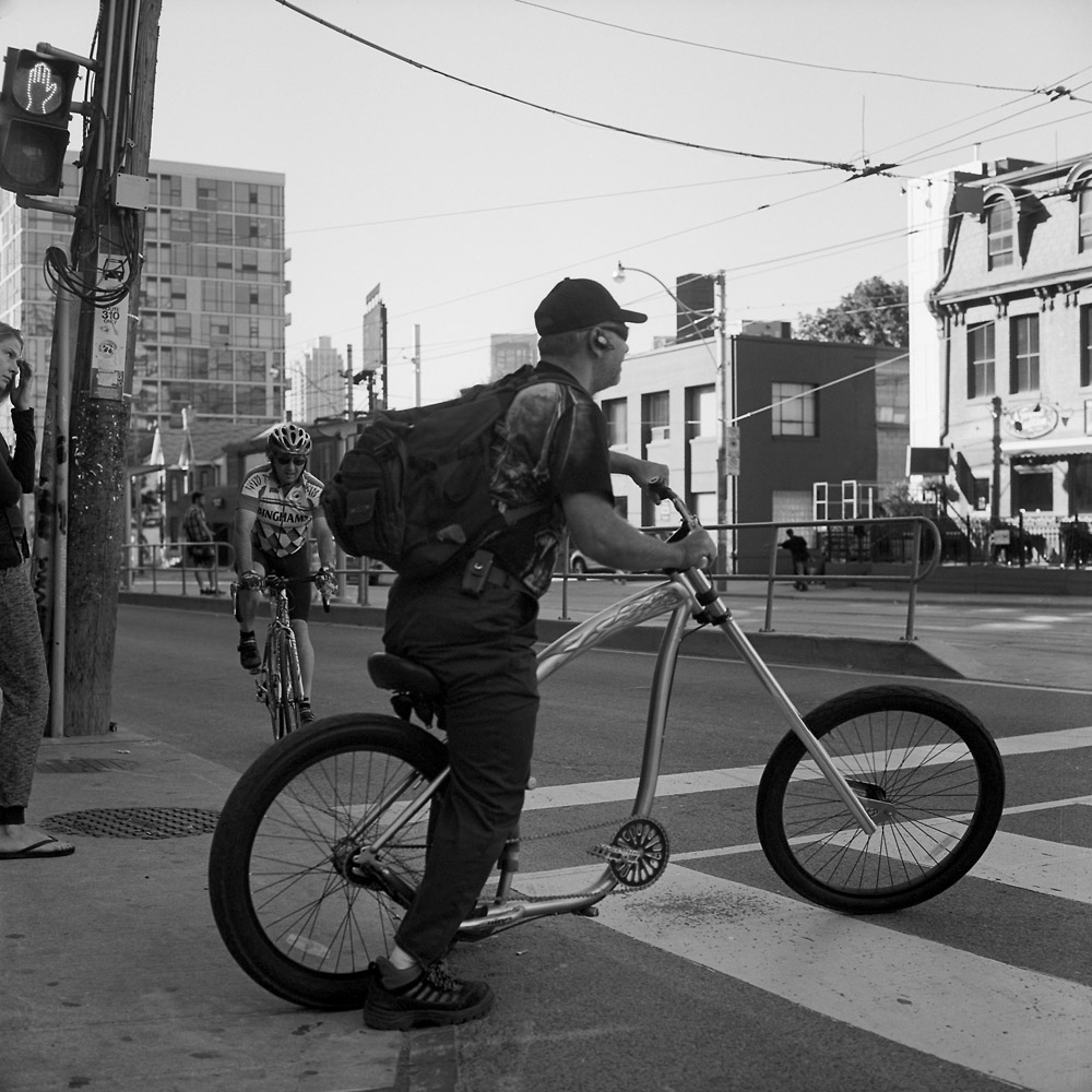
Here’s a study in contrasts – the cyclist on the road bike approaching the dude with the custom chopper bicycle.
Lowrider, Bathurst Street
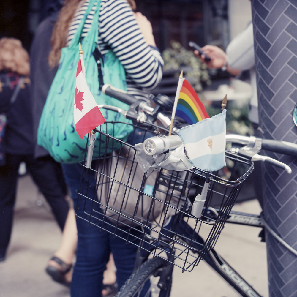
You saw this one before, but under a different heading. This bike with its multicultural basket was spotted outside the TIFF Bell Lightbox theater complex, headquarters for the Film Festival.
Three Flags, Bike Basket
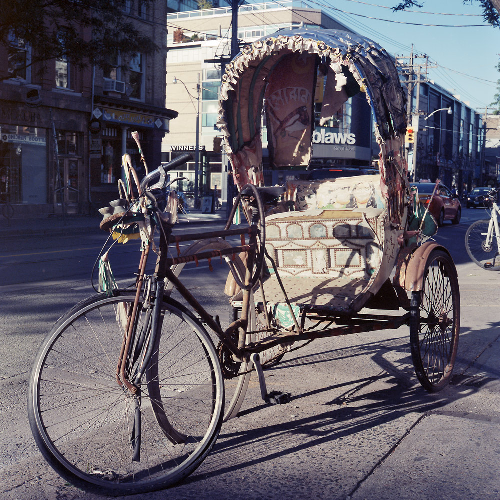
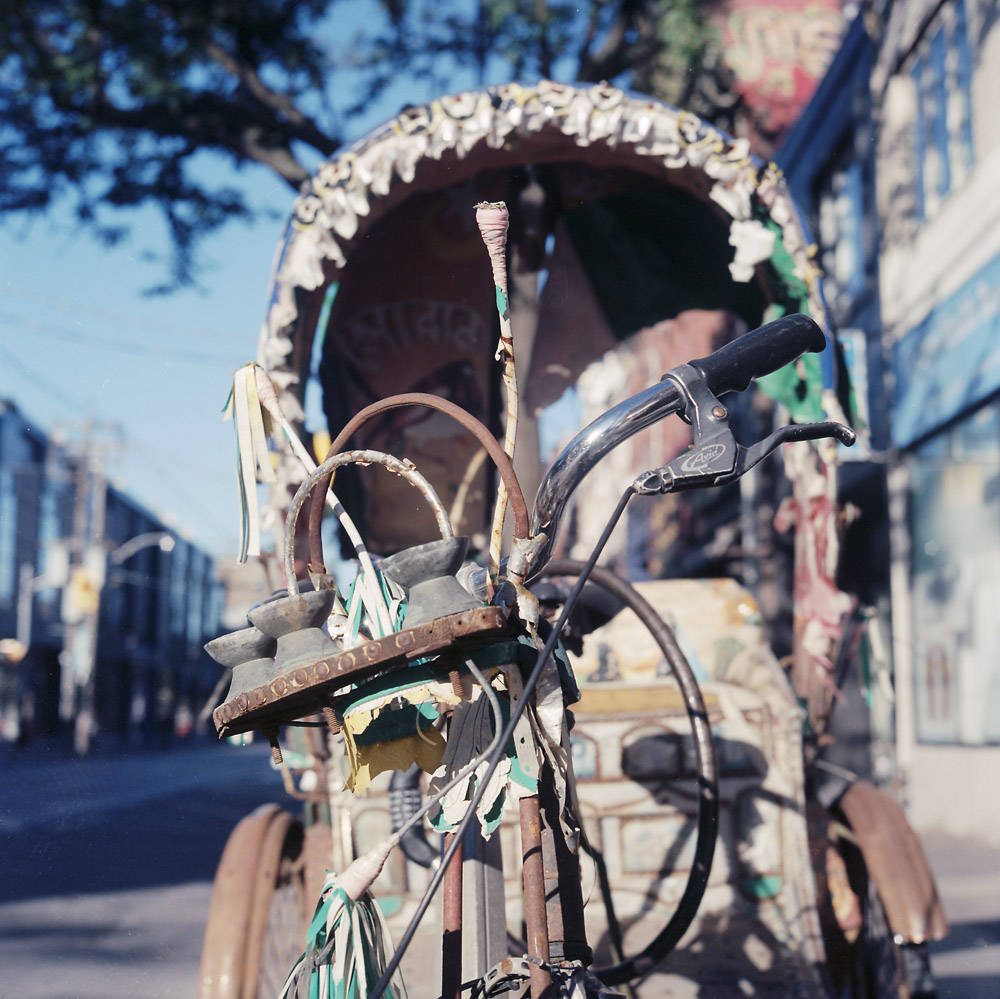
And two views of the pedicab, in all its rusted glory. I’m still baffled as to WHY it was where it was.
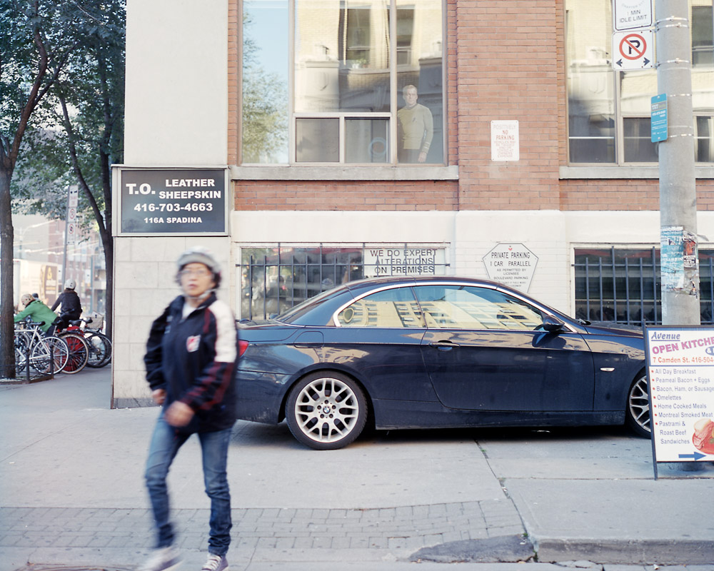
I’ve called this one “Because, William Shatner” because the woman on the street is striking a similar pose to the cardboard cutout of William Shatner in his Captain Kirk uniform in the second story window. Which is there for no apparent reason beyond the fact that William Shatner is Canadian. And the jerk in the BMW seemed to think it was ok to park on the sidewalk underneath the Captain Kirk cutout, despite the no parking sign on the pole. Because, William Shatner… you see where this is going.
Because, William Shatner
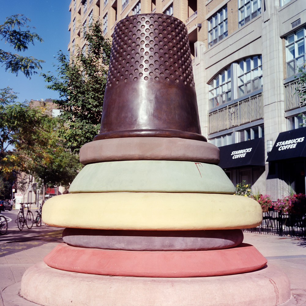
Across the street from the watchful gaze of the Cardboard Kirk, stands this sculpture. The first time I saw it, back in June, I thought it was an ice cream cone that had been dropped on its head. This time, I saw the tape measure embedded in the sidewalk and the signs proclaiming the area “Toronto’s Fashion District”, and I realized it is a thimble. But I still think whatever it’s sitting on looks nothing like anything relating to fashion, sewing, fabric, or otherwise so much as a stack of smashed ice cream scoops. Or maybe weird Italian cookies.
Ice Cream Thimble
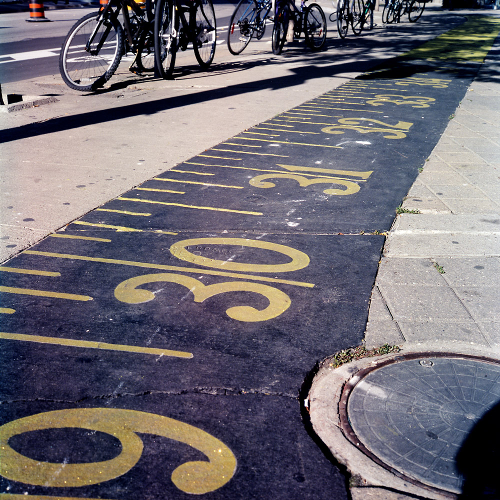
The aforementioned stylized tape measure, embedded in the sidewalk. I tried to capture the sparkly gold glitter in the tape measure, but it didn’t quite work – the glitter tends to record too bright and washes out.
Sidewalk Tape Measure
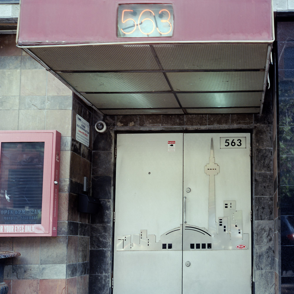
And over on King Street again, we have the For Your Eyes Only “Gentlemen’s” club, aka titty bar. At least they’re showing their civic pride with the skyline emblazoned on their front doors in steel cutouts.
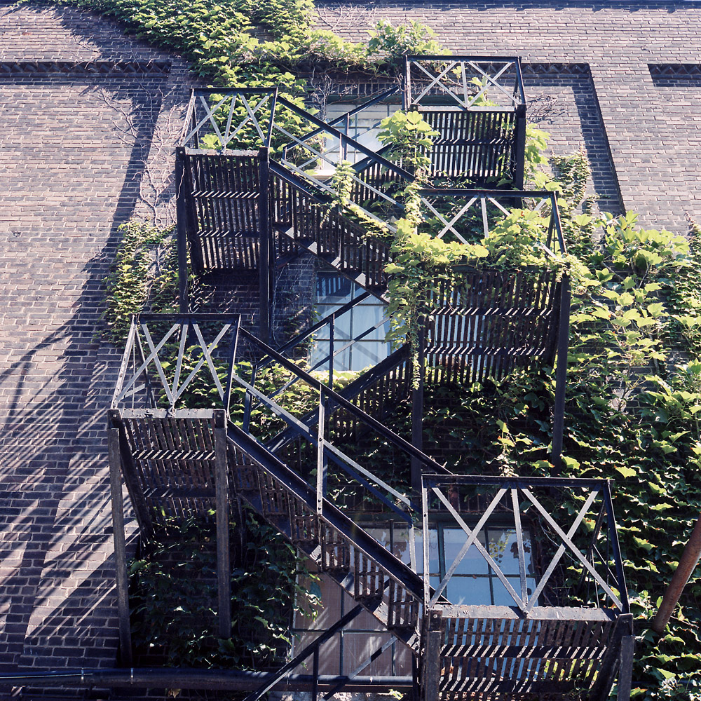
Some random photos of the buildings and spaces at the Distillery District in Toronto.
Ivy, Fire Escape, Distillery District
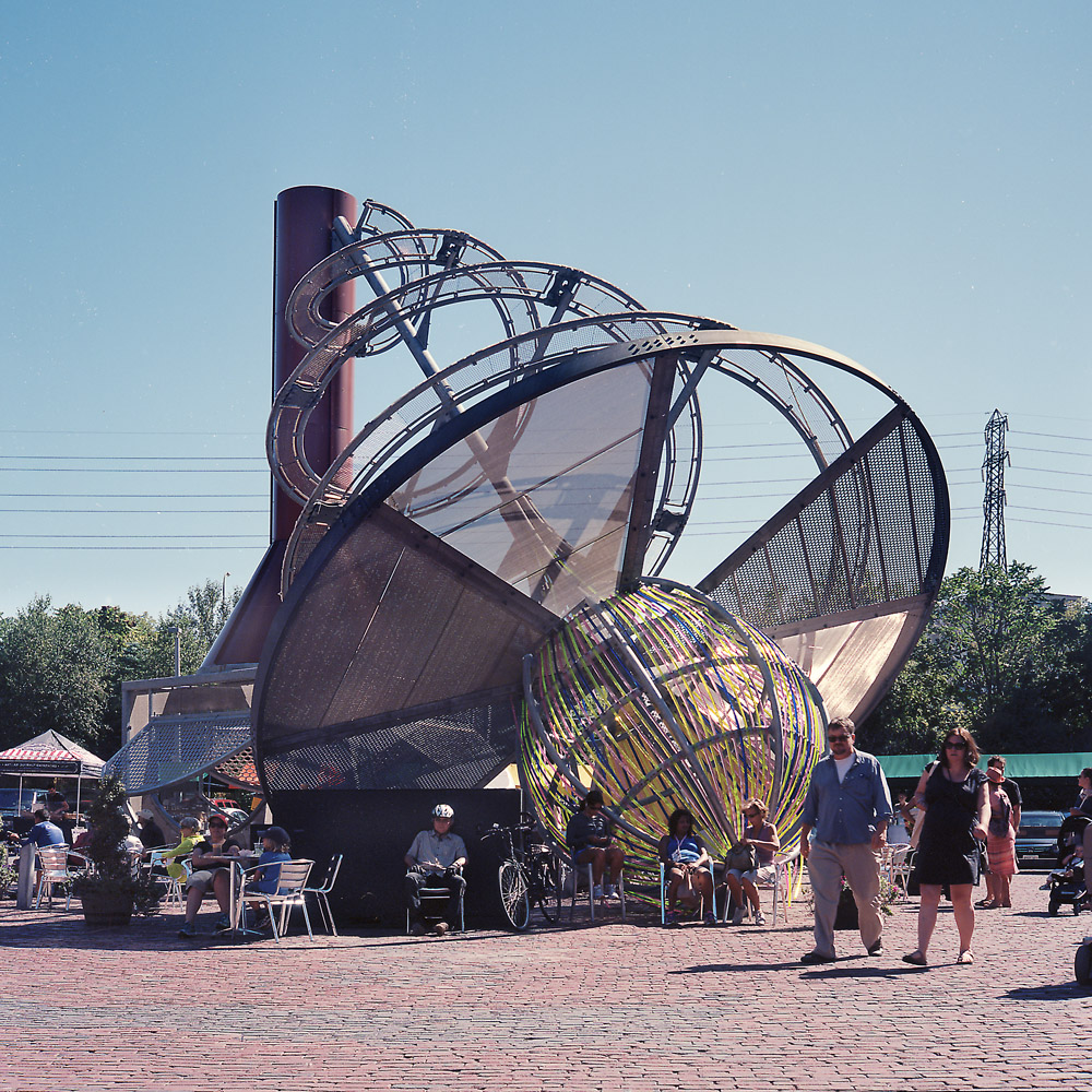
The central plaza in the middle of the distillery district is occupied by this interpretive sculpture designed to reflect the history of the complex, and provide a focal point for people to converge upon. I don’t know how comfortable it would be to sit beneath it; while it certainly provides shade, all that copper would make for a terrific radiator on a summer day.
Distillery Sculpture
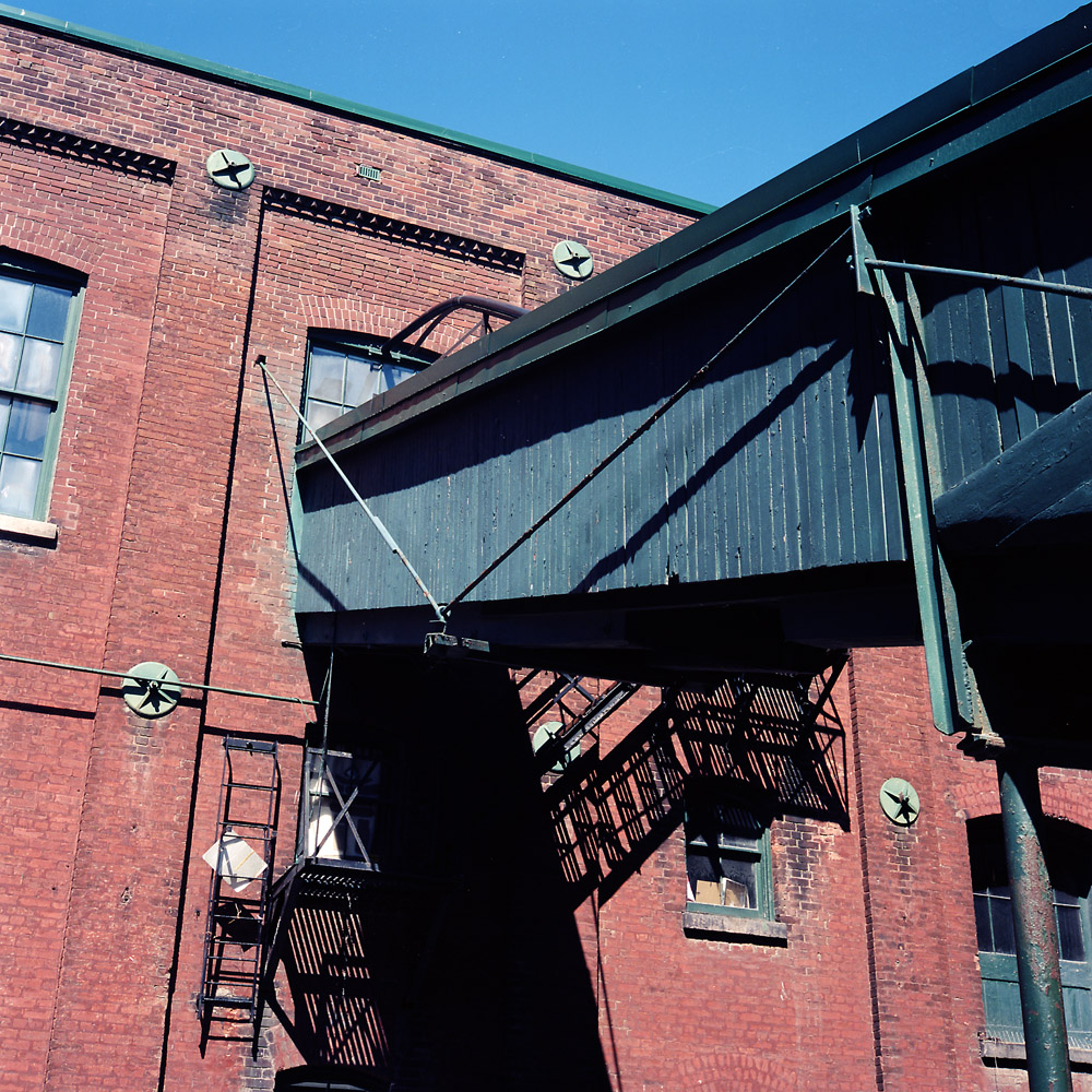
I went for a more abstract look with this composition – this is about angles and forms, and visually leading lines. The structure is a chute used to move barrels of liquor from the top floor of the distillery to the waiting trucks to be loaded and sent out.
Distillery Chute
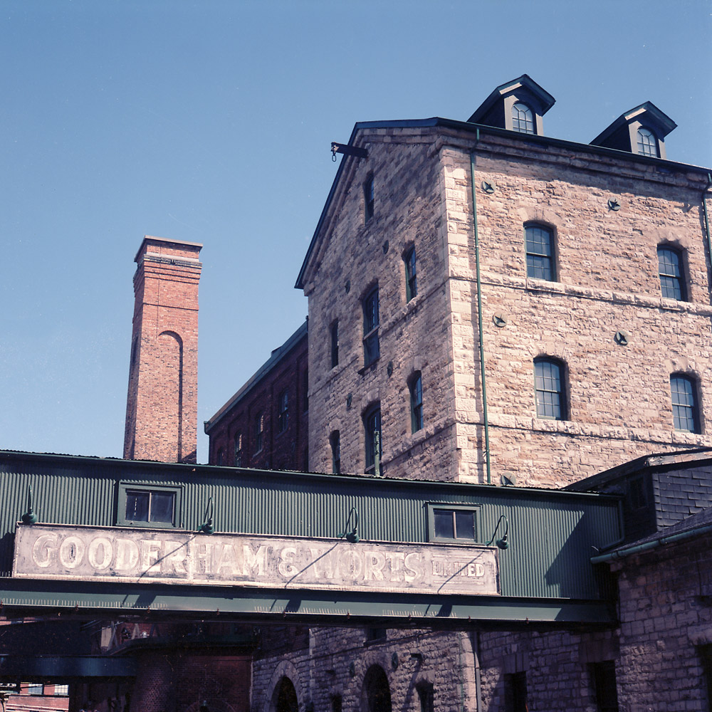
The sign of the distillery still graces the covered walkway between two brick and stone structures in the distillery complex.
Some random finds from around the urban center of Toronto. These were in the area of King and Queen Streets, between Bathurst and Spadina for the most part.
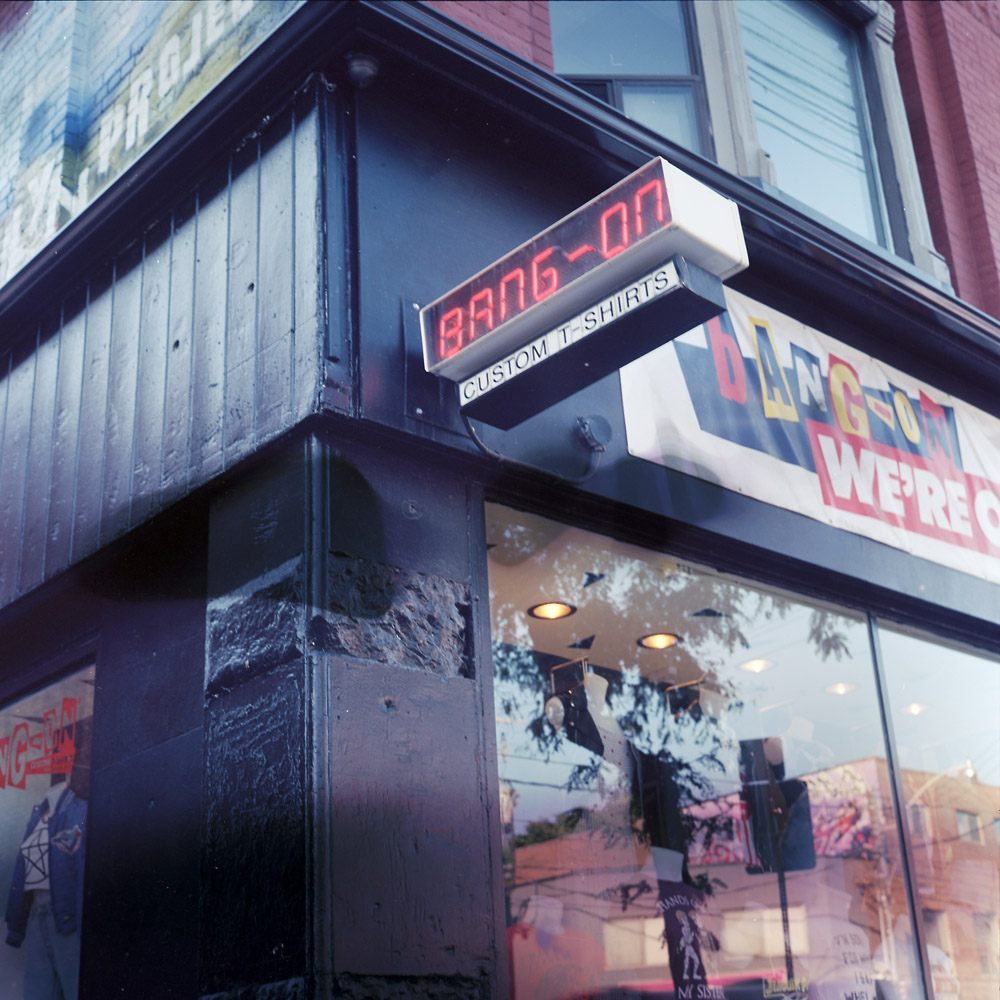
The first three were found on Queen Street. Queen Street is a bit rougher around the edges, but in a kind of hipster/grunge way. It looks worse than it is – I ran into a panhandling junkie getting set up for the morning, baby-sitting his friend’s Rottweiler puppy. We had a great chat about my Rolleiflex, he didn’t even ask me for money, and the Rotty came over to me of her own free will, licked my hand, and rubbed up against my legs. That’s pretty emblematic for how friendly Toronto is – even the panhandler’s dog is nice.
Bang-On T-shirts
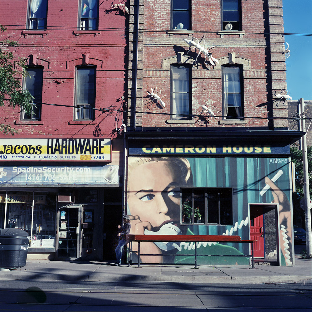
I think it’s the wildest coolest thing that a dive bar would decorate their wall with a mural of a face, smoking and talking on the phone, and giant
insect sculptures crawling over the upper floors. It makes me actually want to go in and find out what’s so special about the place – I bet they have some really funky live music.
Cameron House
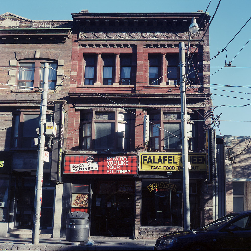
Isn’t this a terrific cultural contrast? Poutine next door to Falafel. About the only way you could outdo that is to put a Kosher deli next door to a Carolina Pulled Pork shop. But it wouldn’t surprise me if such a juxtaposition existed somewhere in Toronto.
Poutine Falafel
Over on King Street, we’re getting a bit more upscale with this pan-asian restaurant. This stretch of King was where all the beautiful people attending TIFF were hanging out.
Pan-Asian, King Street
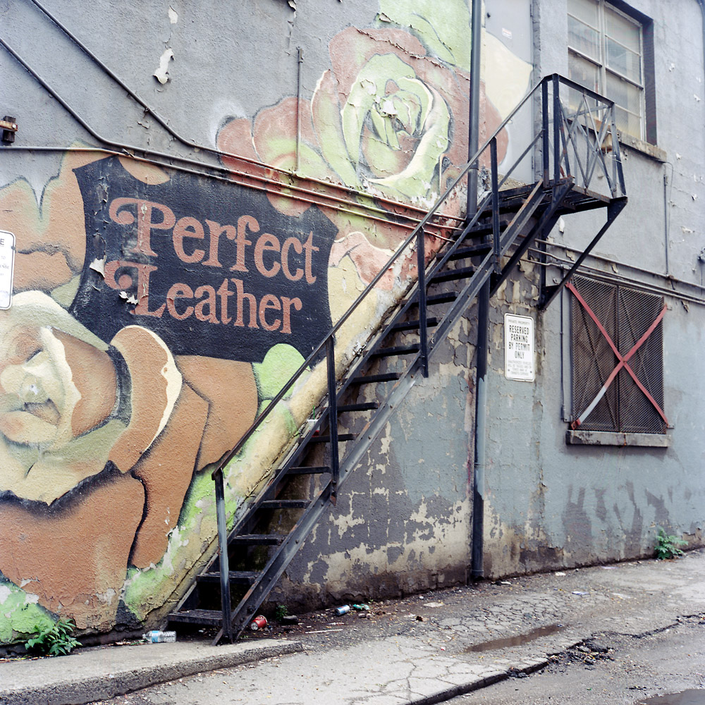
Perfect Leather looks sketchy on the outside, but from what I could see through their windows, this looks to be THE place to shop for leathers and fabrics if you’re in the garment trade in Toronto.