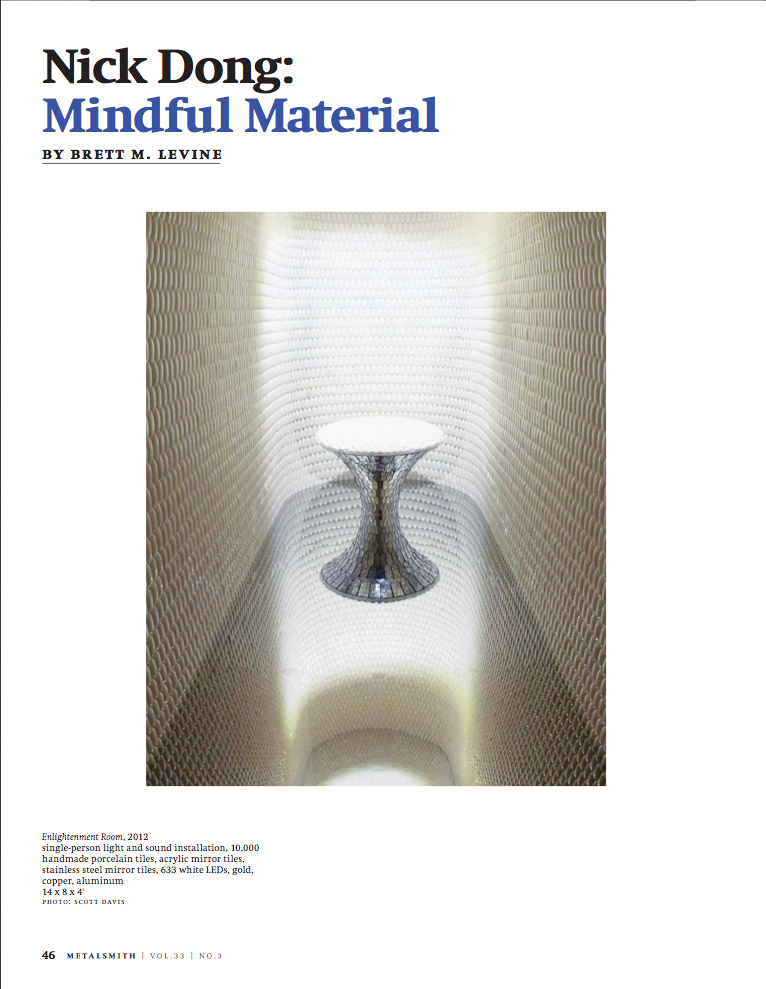
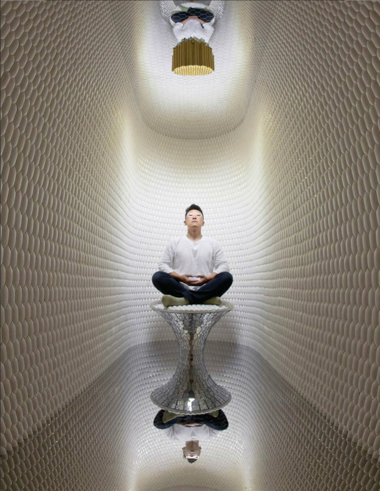
I got a two page spread in Metalsmith magazine in a feature article about my friend Nick Dong, whose installation piece was part of the “40 under 40” show at the Renwick Gallery here in Washington last year.
Metalsmith, June 2013, p.46Metalsmith, June 2013, p.47
If you want to get a copy for yourself, you can check it out on their website and order hard copies or PDF copies. Metalsmith Magazine
I’m also including a video I shot of Nick’s installation. My apologies for the video quality, but it was my first time shooting with that camera and I didn’t know about adjusting the video noise, so the low-light segments are rather grainy looking.
You can see more about Nick and his work on his website – Studio Dong. Nick is originally from Taiwan, and now lives and works in the San Francisco Bay area.
In honor of my latest acquisition for my collection (posted immediately below), I’m going to recap my 19th century Native American images collection.
The new image is a school class photo from Springfield, South Dakota. I find the image fascinating and remarkable by virtue of the racial diversity in the school group. Though the class is mostly Native American, there are white and African-American girls in the class as well. I think the teacher who inscribed the card on the verso is the woman in the center of the photograph.
Native American School Group, Springfield, South Dakota
The inscription reads: “With best wishes, Your loving teacher, Mary B. Benedict, North Walton, Delaware Co. New York. Alice & Lucy Cougar”. I’m assuming that Alice & Lucy Cougar are two of the Native American girls in the photo, but which two I’m not sure.
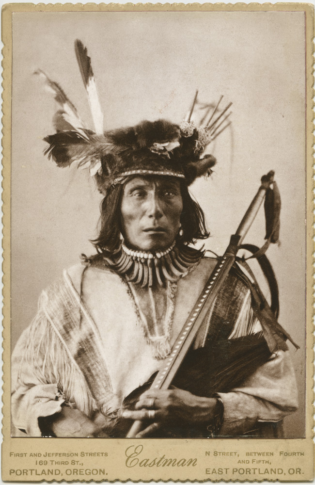
Native American by G.L. EastmanNative American and Friend,Klamath Falls, Oregon
I’m not sure on the date on this one – it could well be early 20th century, but I’m including it because it is non-exploitative. If anything it is similar in spirit to the school class group in depicting interaction between Native and non-Native Americans in apparent social equality.
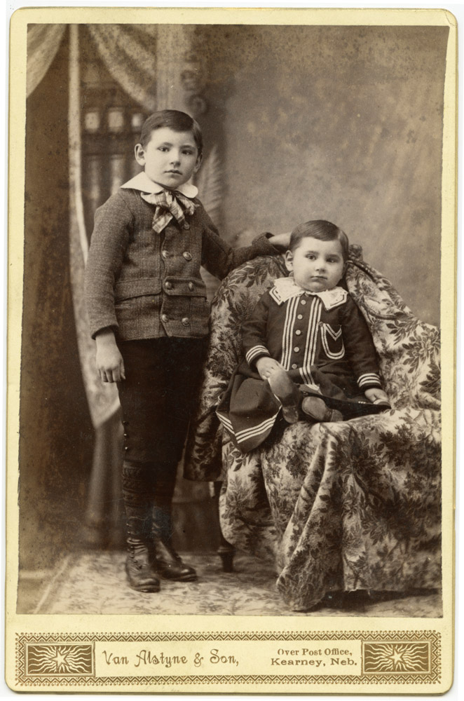
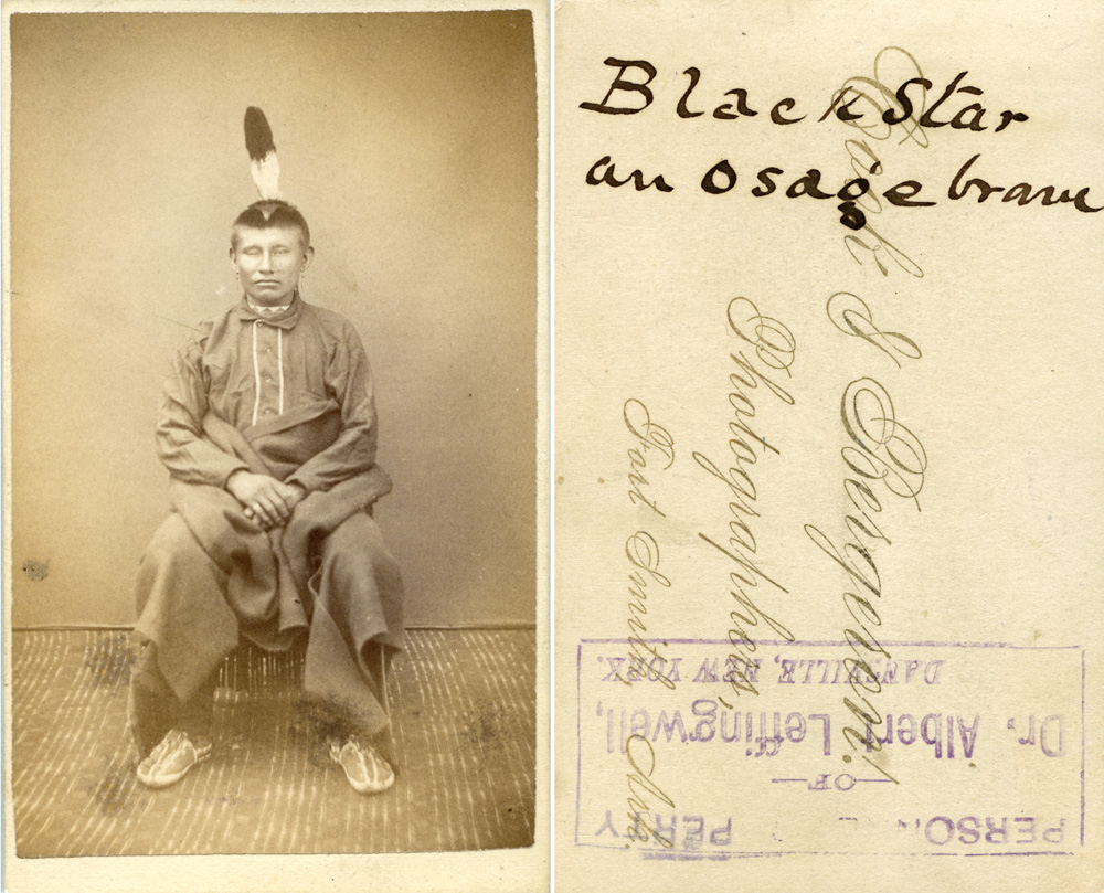
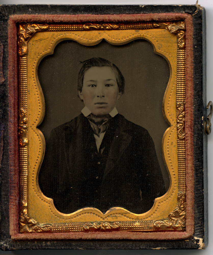
Two Native American Boys, Kearney, NebraskaRain-in-the-face, by Morse, San FranciscoBlack Star, an Osage BraveNew Mexican Native CoupleAmbrotype, Penobscot Boy, 1857
This last one is probably the oldest image of a Native American I own, and will most likely remain so, as images this old are quite rare. Most imagery of Native Americans is from the west and mid-west, as Native populations had been largely subsumed and/or eradicated from the east coast by the time photography arrived.
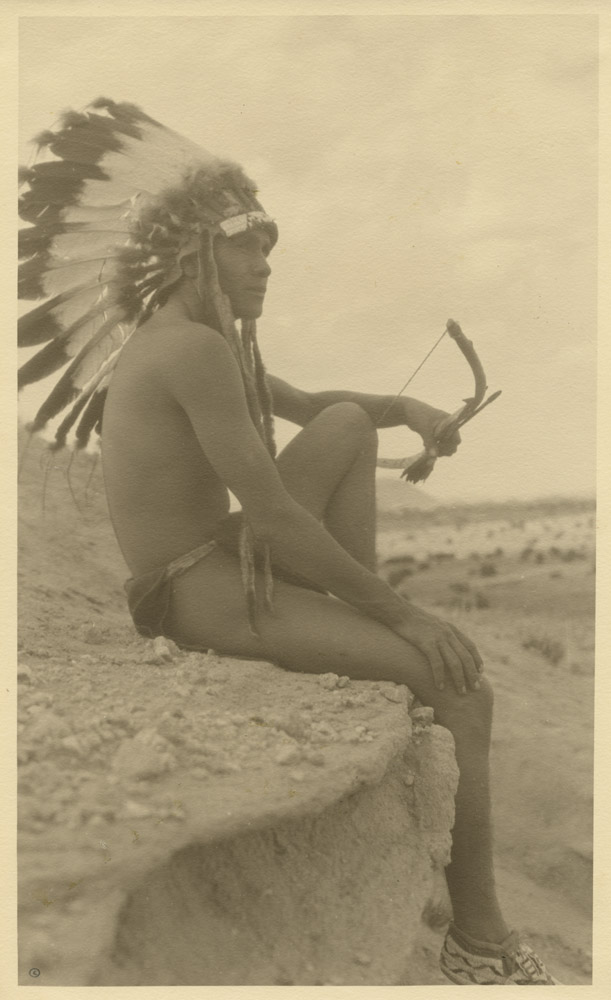
The other two “Art” photos of Native Americans I have are, albeit sympathetic, exploitative portrayals of Native American men in the line of “Noble Savage/Vanishing Tribe” imagery meant to play on the sympathies (and perhaps the subconscious erotic sentiments) of an Eastern, caucasian audience. The reason I say erotic sentiments is that they depict handsome young Native men wearing signals of exotic “nativeness” (headdress, jewelry), but little else. The signs of “nativeness” may or may not be any degree of authentic or relevant to the individual wearing them. The George Eastman photo here is heading that direction in that the costumery the subject wears may not be of any one particular tribe, much as Edward Curtis would do when he felt a photo needed a little something – he would hand his sitter some wardrobe accessory that they might never have otherwise worn and got them to don it for the picture. In that regard, photos like Curtis’ and Eastman’s work are not “documentary” in a strict sense, but they are often the only record that exists of a person or a culture, so they do have record value.
Navajo Brave, Grand Canyon, attributed to Karl MoonA Tewa Bowman, by W. Allen Cushman
While the Carl Moon “Navajo Brave” may be wearing authentic Navajo jewelry, he’s not wearing much else, and the loincloth is not exactly practical daily wear. I could be wrong, but the “New Mexican Native Couple” image shows what I believe would have been far more typical attire for that region of the country. Native Americans may be blessed with a higher melanin content in their skin, but that’s still not a good reason to run around near naked all day at 5000′ elevation under a blazing sun.
The “Tewa Bowman” is another in the same vein – what little accoutrements he wears may be authentic or may not, but to the intended audience for the image it is irrelevant because they neither know nor care; the bow and feathered headdress point to “Indian-ness” and the comeliness and physical condition of the sitter make him “noble” in the same spirit of a Grecian marble nude.
These images leave a complicated, conflicted legacy. They purport to be records of a vanishing culture, yet the record they leave is at best fuzzy and at worst totally inaccurate. The 20th century “save the noble savages” images took the problematic record images one step further. By the dawn of the 20th century, there was a growing awareness in Anglo civilization that Native cultures and peoples were truly vanishing, and the attitude began to shift from approval of that fact to a sense of loss and a desire to intervene in that downward spiral. These “art” images fed a market for Anglos who had no first-hand knowledge of Native culture and felt some degree of racial guilt. Even if the base motivation was in the right place, the images exploited Native subjects to feed a market, wether through distortion of identity, sexual exploitation, or both.
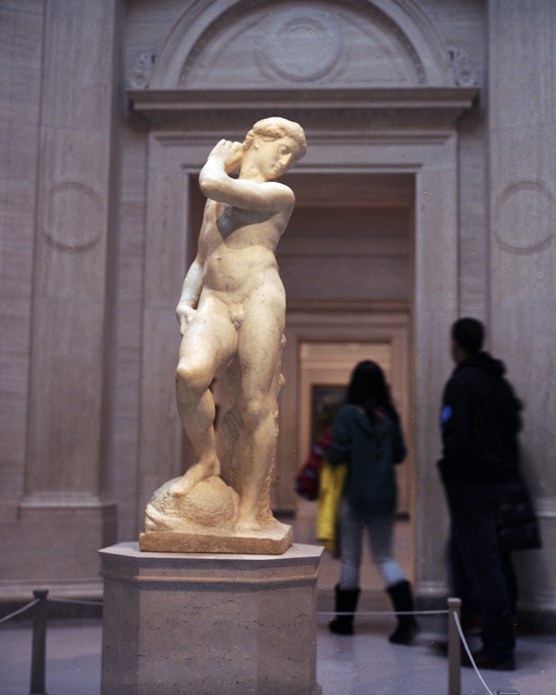
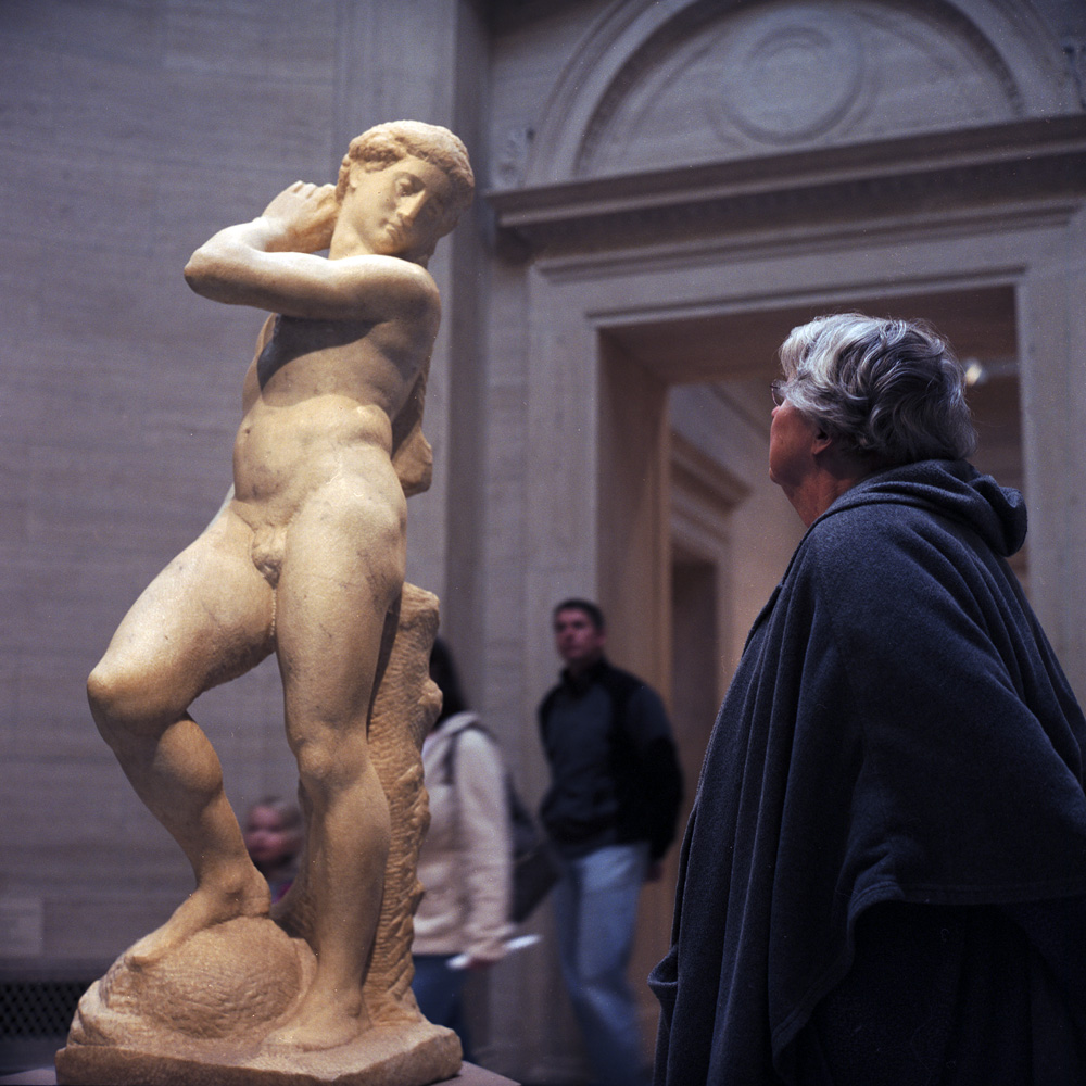
From January to March of this year, Michelangelo’s David/Apollo, normally resident in the Bargello museum in Florence, was on loan to the National Gallery of Art in DC. Being a huge Michelangelo fan, I had to go see it. The last time it was exhibited here in the US was during Harry Truman’s presidency. In fact, there are only three known or attributed works by Michelangelo in the United States (a drawing and two sculptures, one of which is in a private collection), so it’s a rare day when you can get to see something from his hand.
One of Michelangelo’s “unfinished” sculptures, much speculation exists around the entire series of the “unfinished” carvings – were they unfinished because Michelangelo was always biting off more than he could chew and didn’t have time, or did he deliberately leave them “unfinished” because he was making an artistic statement about the relationship between the image, the stone and the carving? Either way, they make for a tantalizing insight into the mind and the technique of one of the world’s greatest sculptors.
David/Apollo Admirer
I’m almost as fascinated by the people who come to look at art as I am the art itself. Sometimes (frequently, actually) I’m very annoyed with museum patrons because they’ll blithely traipse right between you and a work or the wall label for it that you’re trying to look at, rented headset on, completely oblivious to the fact that you now cannot read or see the exhibit. But when they’re not blocking your view, the way they look at art is endlessly interesting. Some will point, some will stand back and appraise, some will “print-sniff” and get close enough the guards have to warn them off. Some will ingest silently, others will pontificate to their audience of friends (and anyone else within earshot), often as not with art history textbook opinions and/or not entirely accurate “facts” about the artwork and/or the artist.
Where does inspiration come from for your personal work? For me, it comes not only from the world around me, but also from images I see, particularly in my journeys as a collector. I read voraciously (my house movers can attest to that when they brought 50-odd boxes of books up two flights of stairs), I collect vintage anonymous vernacular work, I go to openings, and I consume as much visual media as I can.
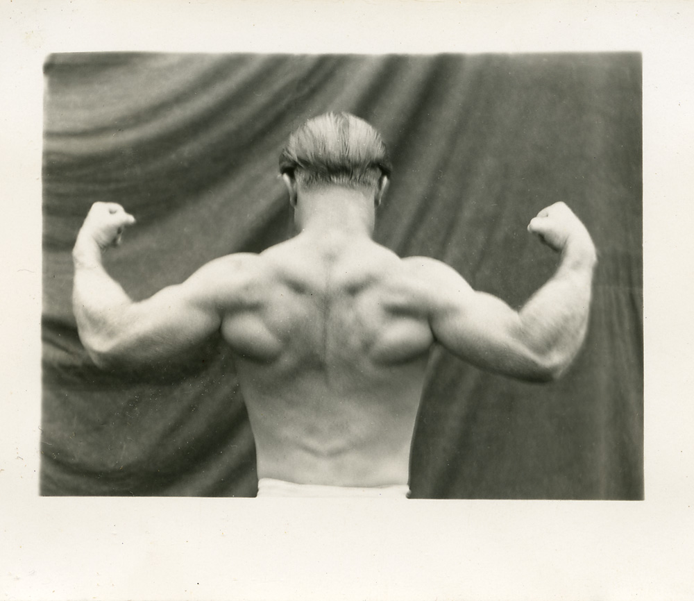
I was looking around for additional pieces to add to my collection of Tom Thumb images when I came across this little gem –
And by little I do mean little – it’s 3 x 2 1/2 inches, smaller than a carte-de-visite. I was fascinated by the brilliance of the composition – even though this was most likely taken with a little box camera using 127 size film. The photographer posed the subject in such a way as to achieve near perfect symmetry of the subject’s form, contrasting with the dynamic sweep of the backdrop fabric. The style and lighting reminded me of the modern work of a photographer I admire – Reuven Afanador.
Reuven’s work has a very ‘vintage’ feel to it, and this body of images is highly reminiscent of 19th century wet-plate work.
Finding this little photo of the bodybuilder inspired me to shoot a new series working with the same kind of backdrop and lighting. Ideally with a daylight studio, but I’ll take what I can find right now as I’m studio-less.
Over my lunch break today I caught a wonderful exhibit at the National Gallery of Art entitled Faking It: Manipulated Photography Before Photoshop. The exhibition opened in mid-February and runs through May 5th. It moves to Houston in July to October. One of the singular points the exhibit drives home is the fact that photography has always been subject to manipulation even from its earliest days when daguerreotypes were hand-colored to make them more ‘realistic’, and skies were printed in via multiple negatives to compensate for the shortcomings of early emulsion formulas. One of the coups of the exhibition is the inclusion of Steichen’s “The Pond – Moonlight” from the collection of the Metropolitan Museum of Art. Most people familiar with the work know it as a multi-layered gum bichromate over platinum print. What most don’t realize, however, is that the image may in fact be a composite with the moon having been added, and may also never have been photographed by moonlight (a feat that would have been difficult to achieve with the emulsions available even in 1904). The moon in the image may be an addition or otherwise a manipulation of the print, and the nighttime feel of the image merely an effect of the color choices in the gum layers of the print.
Images have been manipulated for a whole host of reasons, from a desire to make them more real (hand-colored daguerreotypes) to conveying an inner reality (surrealist photography) to evoking an emotional resonance (The Pond, Moonlight) to suggesting a reality that could exist (a Zeppelin docking at the docking tower of the Empire State building) to creating something that never existed (giant crickets consuming giant produce on the back of a wagon) to re-shaping reality for political ends (Nazi and Soviet propaganda posters and publicity photos). All of the above are represented in this exhibit, and placed in an historical and artistic continuum.
There has been much controversy lately over questions of photojournalistic integrity with regards to digital manipulation to include/exclude details to tell a story, from the Iranians photoshopping additional rockets into a picture of a missile test to Edgar Martins getting caught claiming his work was unmanipulated when in fact he was heavily altering his images. This is not new, but in fact the question of manipulative ethics is far more unsettled for far longer than most people realize. In 1906, Horace Nichols was photographing the Epsom Derby on a rainy day. There were gaps in the crowd, so to convey the feeling of the event he wanted to convey, he spliced in a whole sea of additional umbrellas. This was common practice for Mr. Nichols, and he rarely cited it in the captions of his images, but he sustained a career as a serious photo-journalist. It makes you think long and hard about your assumptions of photographic verissimilitude and the historical moment in which photography ‘ceased to tell the truth’.
The exhibition is well worth the visit if you have an interest in the history of photography and questions of honesty and integrity of the photographic medium.
I’ll be up in New York in April for a weekend and so I’ll try to catch it then and see the two shows as brackets for one another. The comparison should be very interesting.
Terrific summary and great dispelling of the constant upgrade myth. A great photographer can make great images with a pinhole or a Brownie box camera, in addition to a CaNikSonEikaBlad. A mediocre photographer gets caught up in an upgrade chase thinking gear is the solution to a skills problem. Don’t get me wrong, gear is fun, and its always nice to have the right tool for the job – there are photos you can take with a Canon 5D that you can’t take with a Hasselblad, and photos you can take with an 8×10 Sinar you can’t take with a Leica (the old “don’t use a hammer to do a screwdriver’s job” adage). But when it comes down to it, it’s far to easy to blame the tool when we don’t get what we were looking for (“I would have gotten the photo if only I had an xxxx”). This is part of why I’m fixating on my Rolleiflex. It’s just one camera, with just one lens – it’s forcing me to pay more attention to what I’m shooting and how I’m shooting it rather than running around with two or three bodies and half a dozen lenses in two or more formats. My Argentina trip of a few years ago was a prime example – I had the 5×7 with six (SIX!!!!) lenses, 13 film holders (13!!!!), and a tripod, along with my Contax G1 with 45mm and 28mm lenses. While I did take some wonderful photos in each format, I’m pretty sure both suffered as a result. Certainly, there were photos I could not have taken with one that I did with the other. My Recoleta cemetery photos would not have happened with the Contax, and my street scenes in San Telmo and La Boca would not have happened with the 5×7. But by dividing my attention between the two systems and two ways of thinking probably meant that I wasn’t fully in the mindset of either system and then tried (and failed) to make images with one that would have been better done with the other.
This is a blended platinum/palladium print (60% platinum, 40% palladium) print, on Bergger COT320 paper. This was by a student from my Intro class, but I reprinted it for this session (the student left the negative behind after the Intro class, and I happened to really like the shot anyway). This one was coated using a glass rod as opposed to a brush, to demonstrate the difference in the coating technique, and the final appearance of the print.
Crystal Pool, by Patrick Brown
This is a palladium print on light Kozo paper, by Patrick Brown, one of my students in Advanced Topics. He was also in my Intro class. It’s so nice to get follow-on students so you can see their progress!
Kozo paper is a Japanese paper made from tree bark, and it is surprisingly strong for as delicate as it is – this is perhaps a 90 lb paper. It does have a tendency to dissolve in aqueous solutions, but if properly masked when developing, the image area can be preserved, even if the edges do get fringed a bit. This is a perfect example. I included the paper margins to show more clearly what the paper texture looks like.
We had some challenges this class session – the original idea was to try out some different paper types, and I had obtained a sampler of several kinds. We started the morning with Stonehenge, which was supposed to be a good paper, but something was dramatically wrong with the batch we got, as we were making 30 minute exposures and still coming up weak and flat. After this is over, I’ll get a little more for myself and try pre-acidifying it to see if that helps, but no mention of acidification was made in the sample kit and I couldn’t find any reference to acidifying it online. Fortunately we didn’t waste too much time before figuring out it was the paper at fault and not the chemistry, and life moved on.
Just wanted to post a print made by one of my students, from my Advanced Topics in Platinum/Palladium printing. The advanced topics class covers contrast control techniques, working with different papers, making digital negatives, and gum-over-platinum prints. This was made from a digital negative we created in class from a medium-resolution JPEG! I’m impressed. Patrick will have a print to be proud of as a result of this class.
Orthodox Cathedral, by Patrick Brown
By the way, I will be re-running my Intro to Platinum/Palladium course at Photoworks, October 20-21. If you are interested, please sign up now, while there’s still room!
I discovered Melissa’s wet plate collodion work through a link someone posted on APUG, and I felt it was worth sharing. She has done a beautiful seet of wet plate portraits of the Mohawk Ironworkers who for the last century have been responsible for building the skyscrapers of New York City. The inspiration was the 9/11 10th anniversary last year, and the construction of Freedom Tower on the site of the old World Trade Center. I just felt her work was worth sharing. Please browse her website linked below to see more of her work and to find out more about her.