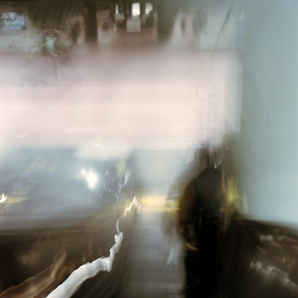
Looking down on the platform from the top of the escalator feels like you’re about to plunge over a precipice into an unknown below – will it be a deep pool, or full of jagged rocks? Will there be minnows, or will there be sharks?
Over The Precipice
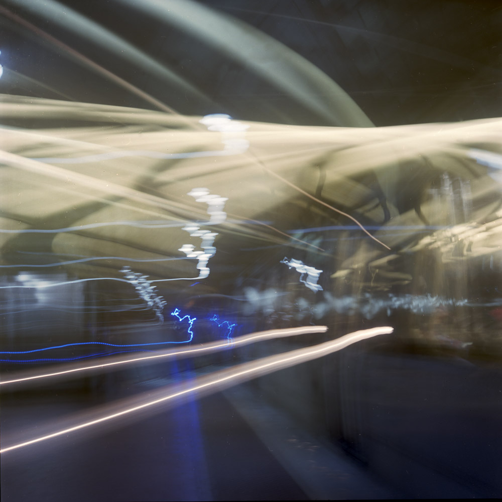
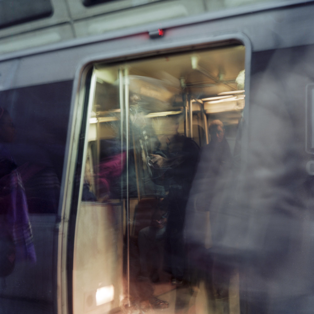
Perhaps the most interpretive, impressionistic image of my commuter diary so far. Another long exposure where I panned the camera along with the train as it pulled in to the station. The panning along with the motion blur and the different lengths of time moving vs still give a uniquely layered image that requires you to engage and investigate to understand. I’m getting more and more intrigued by this style of exposure – the truly non-literal photograph.
Arriving Train, Friendship Heights
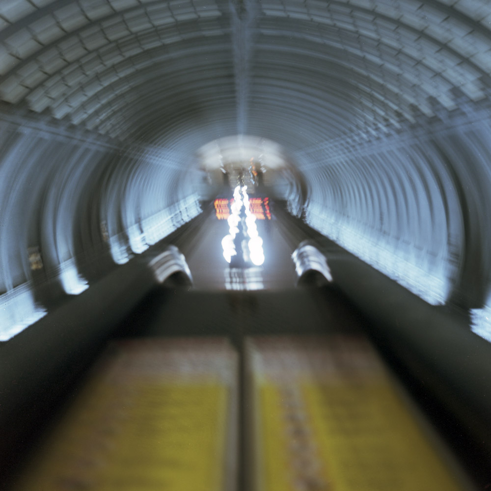
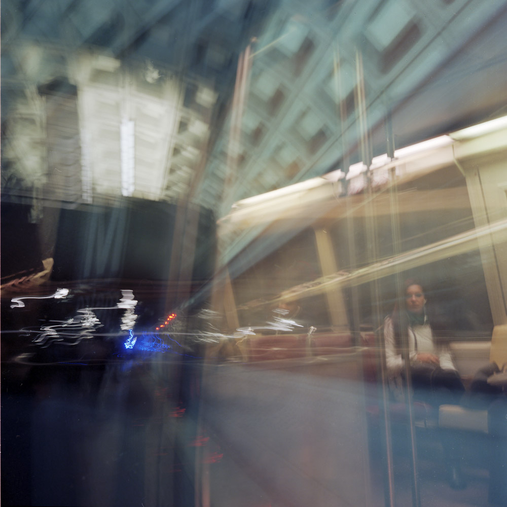
Riding the down escalator with the shutter held open leaves nothing constant except the passenger in front of me. The changing perspective of the descending escalator puts the station entrance above where you would expect it to be.
Riding The Escalator Down
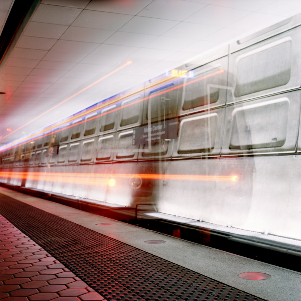
a far more literal, sharp, precise image of a departing train. This is the first image in this series I’ve done with a tripod, because I wanted to catch the back of the train with some clarity before it departed. I’ll try it again later handheld and see which I like more. This has its charms even with the sharpness because the lights moving in a straight line are in some ways more forceful and direct.
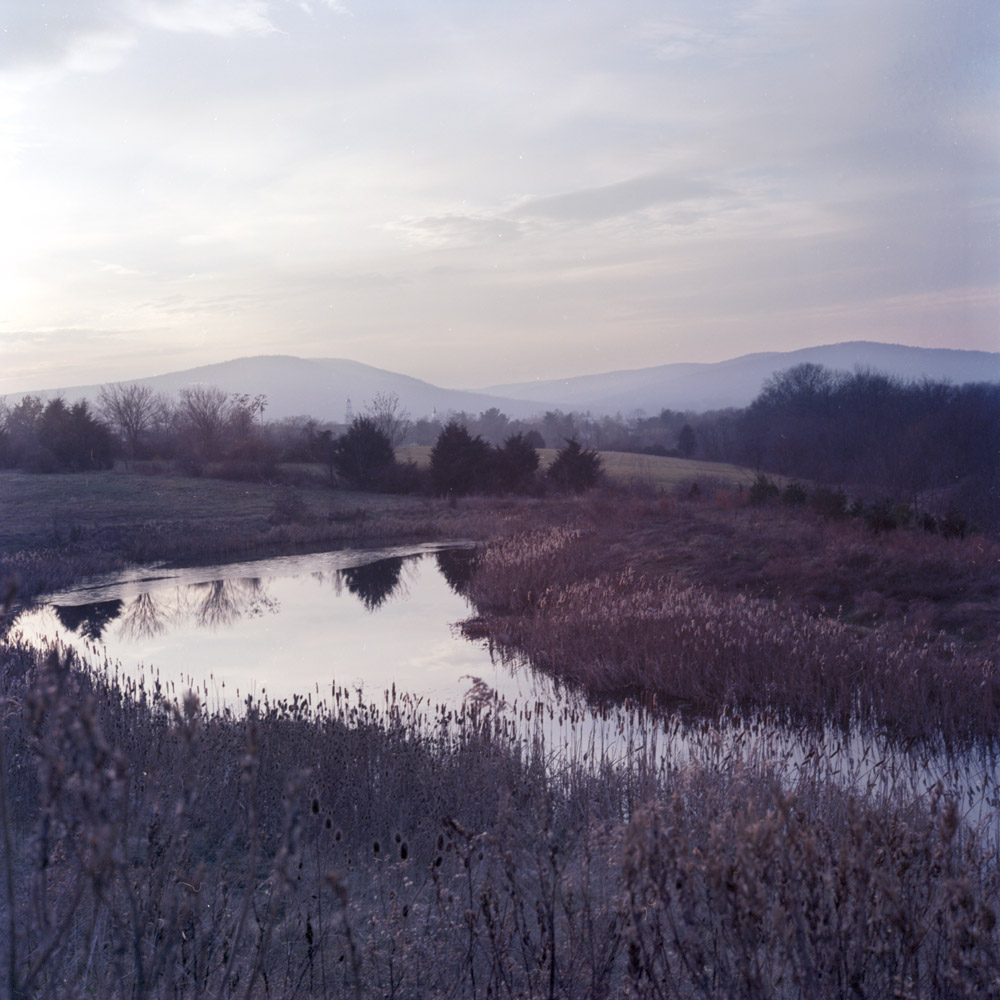
I’m not normally a landscape photographer. In a conversation on Facebook, I had posted this image and said that I didn’t normally think of the Rolleiflex as a landscape camera, mostly because that’s not the way I use it (street scenes, portraiture and architecture are what I shoot 99% of the time). Several people responded that it is a great landscape camera, and they’re right- no general-purpose camera is defined by/limited to one specific genre. I wouldn’t try and shoot landscapes with a Yashica Dental Eye, but it’s an extreme example of a specialist camera built to do one thing and one thing only. A Rolleiflex is NOT a Dental Eye, so it can, and does, do perfectly serviceable landscapes. In fact, as with most things photographic, the limiter is the operator of the camera, not the device itself.
This is a winter landscape, looking from a rest stop along Route 15 toward Emmitsburg, Maryland. If you look carefully, you’ll see two church steeples peeking over the tree line in the middle distant background. While I don’t know that those specific churches were there at the time of the Civil War, the landscape still looks and feels much as it would have in 1863 as soldiers marched to and from the Battle of Gettysburg, a scant 14 miles away.
Towards Emmitsburg
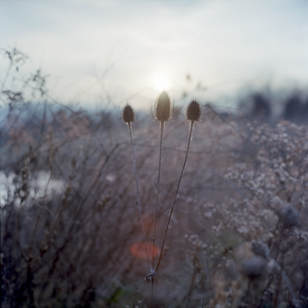
I had someone else comment that the image looks “washed out”, and asked if I was using outdated film. No, I’m using in-date film, properly processed. It’s a winter landscape, with just a few tones in the scene, and a color palette of grays and browns. That’s pretty much exactly how it looked that evening.
Winter Thistles
These thistles were part of the field you can see on the near edge of the pond. I saw the sun backlighting them and got up close to give them that silhouetted rim-light, with the lens flare from the sun coming directly into the lens. It would have been nice to actually get MORE lens flare, but that’s a testament to the lens design that it doesn’t.
Just a one-off from the series. This is looking out from the canopy over the McPherson Square Metro station at the intersection of 14th and I Streets NW. It was raining, and the cars and buses looked especially festive with their lights and signal indicators and illuminated signs.
McPherson In The Rain
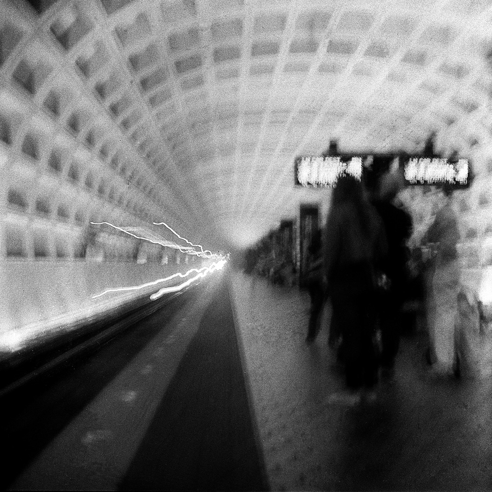
This is a rare one I cropped because the ceiling and floor didn’t add to the composition, and being able to crop so the curving lines of the floor and ceiling led to the edges of the frame made it a much more dynamic image.
Look at these which are very similar to some I’ve done in black and white and note how different they feel for one being in color the other monochrome.
Pulling In, GWUMetro Train Arriving, Archives Station
Don’t you relate to them differently?
Another example of the emotional effect of color- outside the train is dark, cold, and muted color, whereas inside is warm, glowing, alive and inviting. Wouldn’t you rather be inside the train than outside?
More of my Commuter Diary, this time in color. I like to go back and forth with the same subject in color and in black-and-white to see how they change both stylistically and emotively. As Edward Weston once said, “you can say things in color that you can’t say in black-and-white”. Truer words were never spoken – color photography has a totally different feel than black-and-white. I think black-and-white is more intellectual whereas color is more intuitive and emotional. Black-and-white, because it is an abstraction from reality, makes us look at a scene with a kind of detachment, whereas color draws us in and makes us experience the scene in a more visceral, less vicarious way.
This shot is, quite frankly, a bit of a mystery to me as to how I took it – I THINK it was one I panned with the train as it pulled into the platform, then held the camera still while the doors opened, but certain aspects of it feel like a multiple exposure (which I know I didn’t do, certainly not intentionally).
Train, Arriving
Using color implies or alleges reality (although as photographers and photo-savvy people we know that photographs can and do lie about the subjects they represent, especially as regards to the accuracy of color), so we identify more closely with color images and accept them as “more real”, to the point that we experience cognitive dissonance when we see color represented/manipulated as “different” from what we “know”. Some of this comes from a clash of expectation vs reality, and some of it comes from the way our brains work – we sit down in a room lit by fluorescent light and after the briefest of adjustments, we see “normal” colors despite the fact that we can objectively prove that the fluorescent light source is missing certain portions of the visible spectrum.
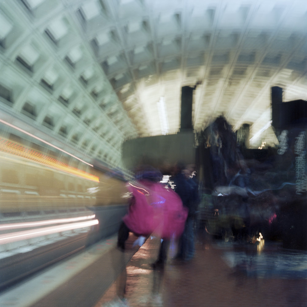
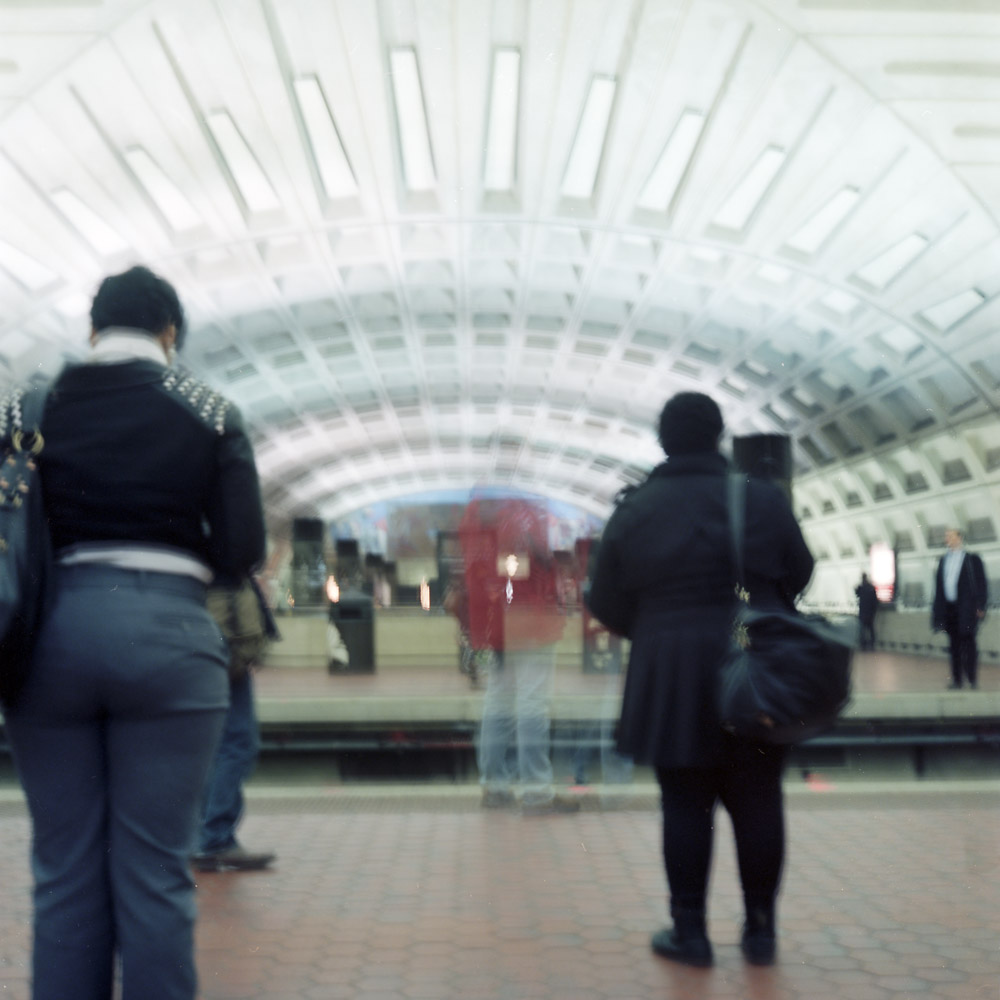
The commuting experience, especially on public transit, is as much about waiting as it is about traveling. Here is a view of Metro Center, one of the major transit hubs on the subway system in Washington DC. Four different rail lines pass through this station, so there is always activity. The two people standing mostly still in dark clothing frame the blurry person in the red jacket. The touch of color draws your eye to the center of the frame as much as the leading visual lines do, and it gives the scene an energy and intensity that would be missing in black-and-white.
Awaiting Train, Metro Center
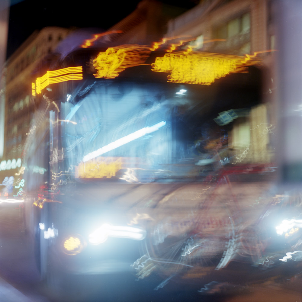
Riding the bus is a very different experience from riding the subway. For the most part, one is indoors and the other is outdoors. Even if they do run with comparable frequency, waiting for the bus feels like it takes longer than waiting for the subway, perhaps because in certain parts of the city, many bus routes visit the same stops, so there may be a bus coming every five minutes but it might be twenty-five before your bus arrives.
The S2, to SilverSpring
One of the things I’ve always liked about night photography is the effect of multiple color-temperature light sources in the same scene. The impact is thrown into high relief in a scene like the bus, where the background is lit with yellow incandescent lights, the streets are orange/pink from sodium vapor, and the bus interior is bluish-white from most likely LED lamps. The colors and their cognitive dissonance bring out emotional dissonance as we read back and forth between elements of the scene – the emptiness of the darkness, the warmth of the background, the alien color of the near-ground, the inviting orange of the bus signage, and the ghostly hospital white of the interior of the bus.
In my practice of all kinds of photography, problems arise that you don’t always expect. I’m used to humidity issues with antique and historic processes like gum bichromate and platinum. Of course, any light-sensitive material has to be treated with respect or you’ll ruin it. But digital photography was billed as a sort of end-all solution to everything that plagued wet darkroom photography. You just insert the paper in the printer, hit ‘print’ and a couple minutes later, out comes your perfect print, all in room light, no odor, no chemistry, no fuss.
Well… it turns out humidity (something unavoidable in Washington DC for 2/3 of the year) which is a big plus for antique and historic processes and a non-issue for silver-gelatin and RA-4 wet color printing, is a major enemy for inkjet printing. I had a box of Brilliant Museum SilverGloss White paper which I had been using to print my big exhibition prints. It turns out that over time, the paper had swollen from what I can only assume was moisture absorption and would not go through my printer without head strikes and smeared ink in the corners of the prints. I was trying to finish up a print job for a sale I made of four prints, and I ruined the remaining sheets of Brilliant I had. I was in a bad jam because Brilliant was Calumet’s house brand, and Calumet is no longer a serious player in the US (two remaining stores in Chicago, and an absolutely worthless single-page web page saying “call us for what you want!”). Ordering from Calumet UK, who does carry it, is a really bad idea as the shipping cost would probably equal the cost of a box of paper, AND in the UK and the rest of Europe, their paper sizes are all based on the A notation instead of inches.
I loved the paper, but it is effectively no longer available here. So off to B&H Photo I went (virtually) and found the new Harman by Hahnemuhle Gloss Art Fibre paper. It’s virtually identical in weight (a gorgeous 300gsm heavy-weight fiber paper) and paper brightness. Another upside- a 30 sheet box is cheaper than a 25 sheet box of Brilliant! After having made two prints on it this morning, I can rest happy that I can keep printing my existing series of prints with it without any loss of quality. I’m also glad I can support a major player in the analog market (Ilford/Harman) with my digital purchases.
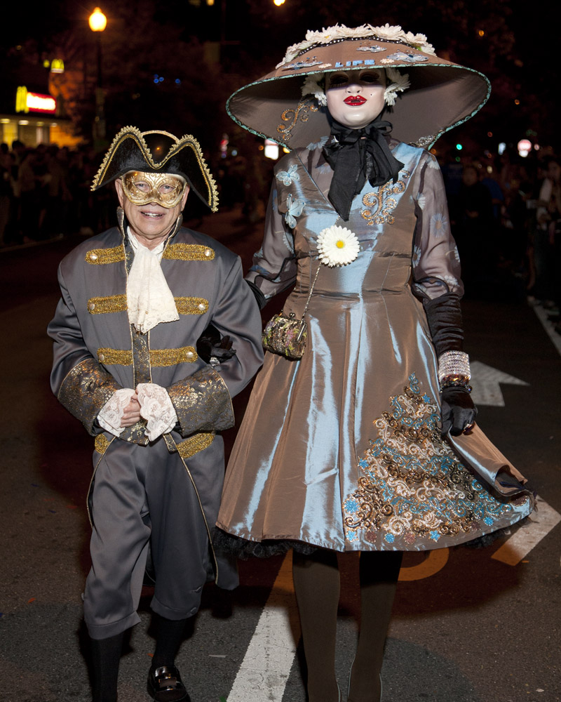
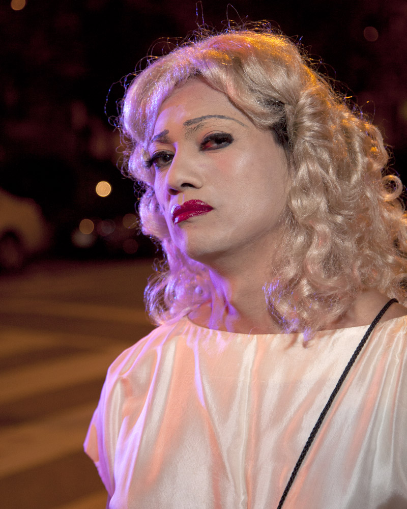
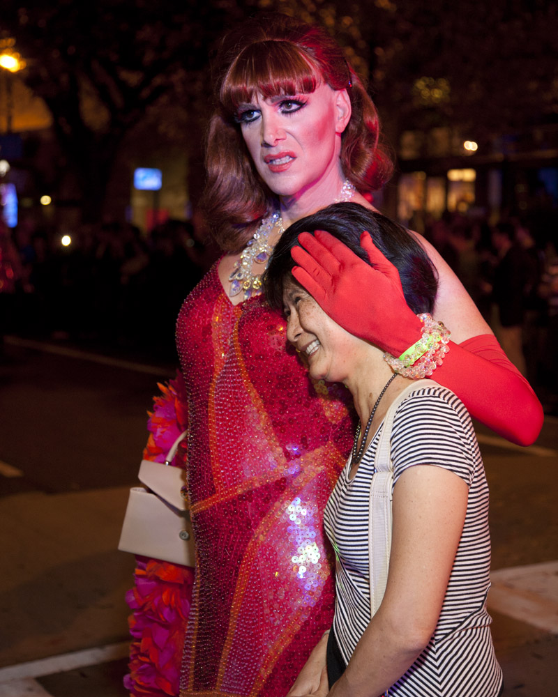
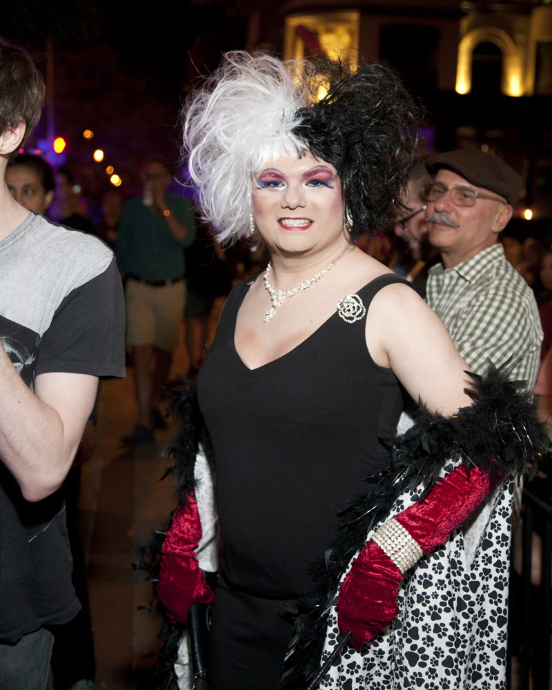
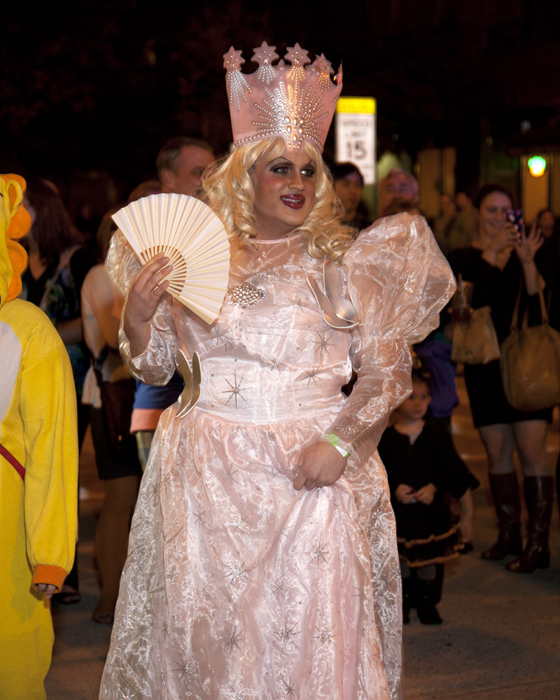
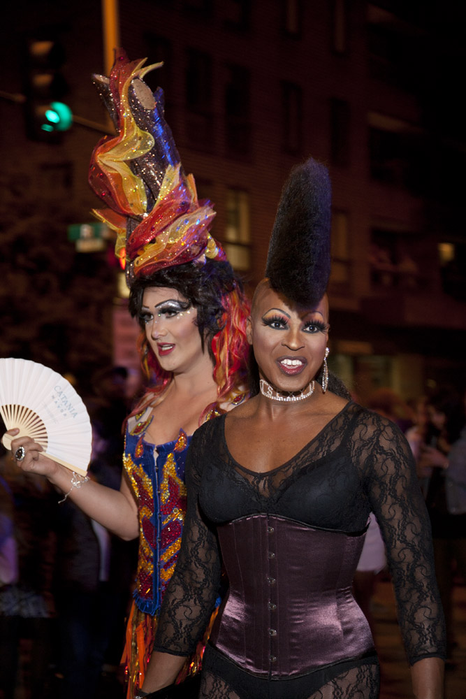
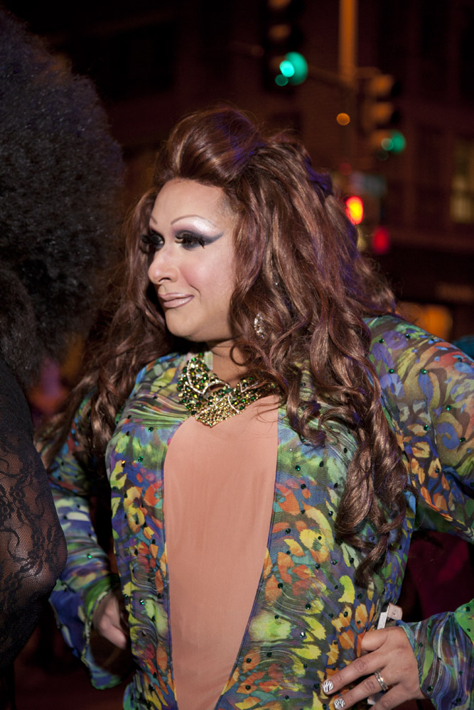
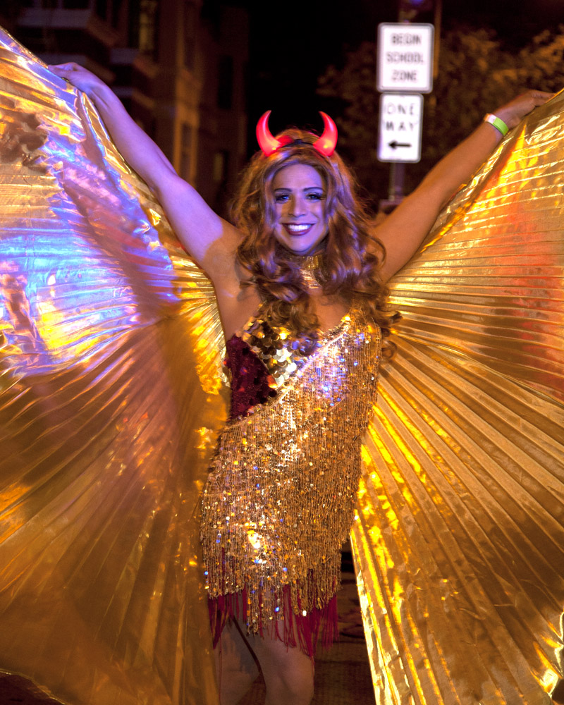
This “best of” is not intended to be a judgement on the participants, but rather a personal assessment of my favorite photos from the event. In no particular order:
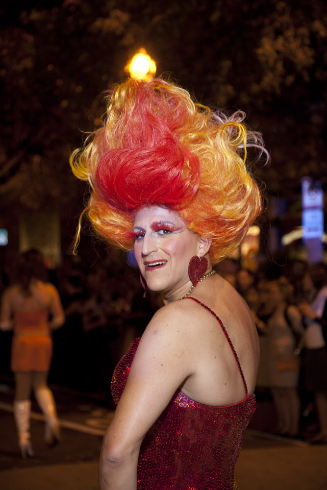
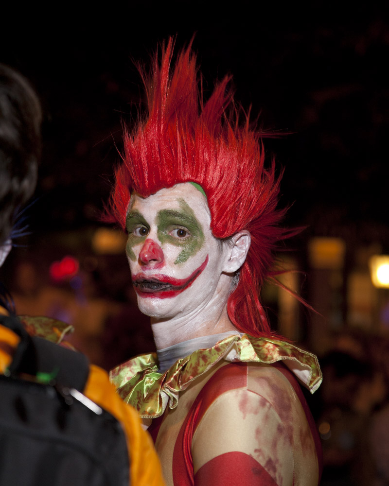
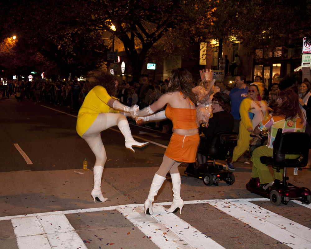
The last of the High Heel Race images from this year. Attending is fun, especially to see all the creativity that gets put into the outfits, most especially from the teams who invent a group theme costume. I swear there are some that start planning next years costume the day after this year’s race, like the fast food themed group or the Washington monuments group of a couple years ago.
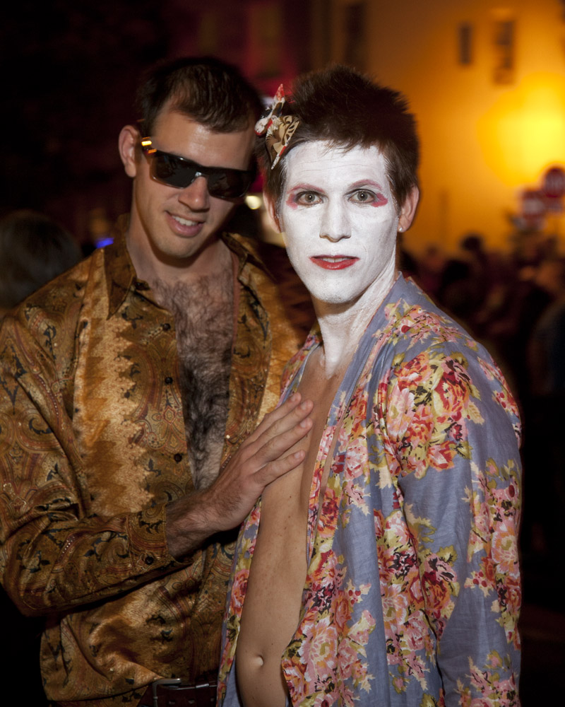
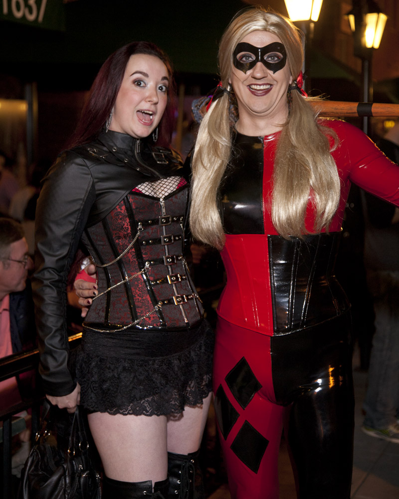
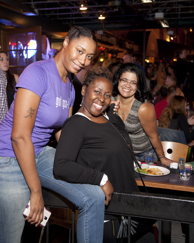
One of the most enjoyable parts of attending is the joie-de-vivre of the participants AND the attendees. These women were having a grand old time on the patio at Fox and Hounds. They also actively solicited me taking their photo.
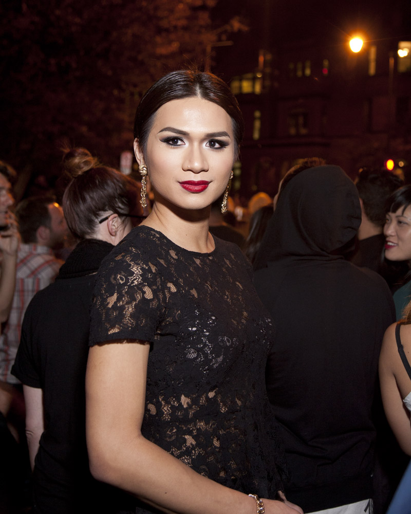
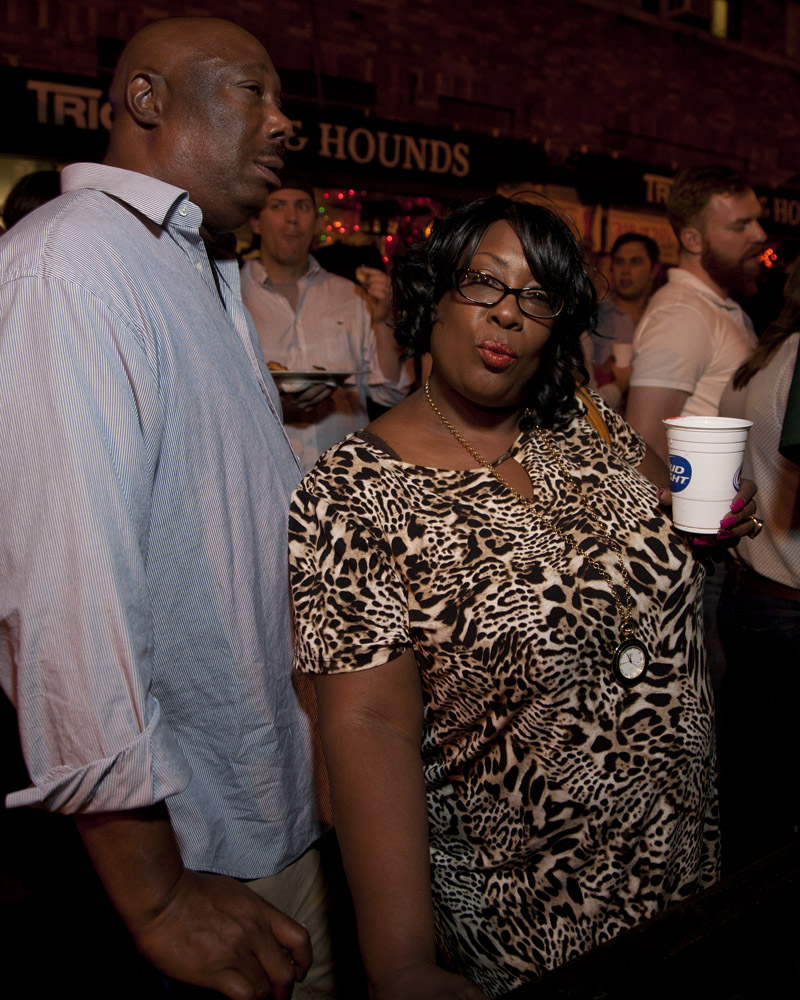
This lady also wanted her photo taken, and was directing me to take the picture of the drag queen in the photo above: “ooh, did you get her? You have to get her! She’s beautiful!”. Her boyfriend/husband was actually not so thrilled with the idea of being photographed, but when he heard it was not going to be in the newspaper, he relented. You can tell, though, from his expression here it was very much HER idea 🙂 .
One thing that is getting very frustrating about photographing the race, though, is the organizers. I realize they have a tough job to do, to keep a very large, and by the time the race kicks off, very drunk crowd under control. But for those of us not blessed with traditional media connections to obtain a press pass and for whom one of the primary reasons for attending is photography, they’re becoming killjoys. The organizers seem to be losing sight of the fact that this is a fun, free-spirited, countercultural event and that being control nazis and bullying photographers is just really uncool. You want good press, let us do our thing and we’ll reward you with great photos and great write-ups about the event. Keep stepping on us and we’ll stop coming, stop taking pictures, and stop showing the world what kind of fun event this is. .
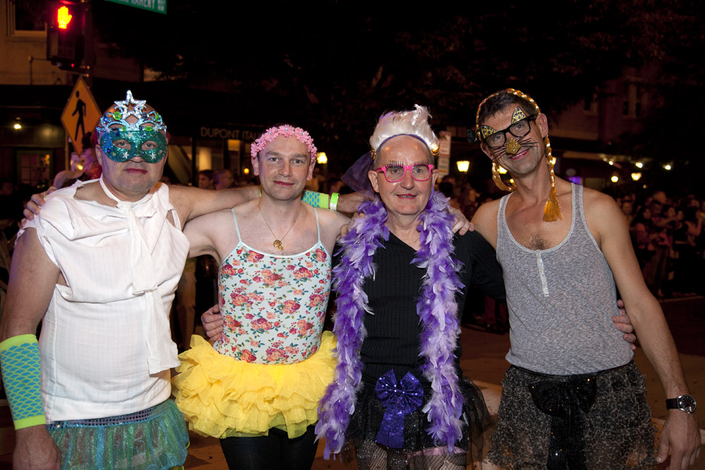
While the race seems to largely be a young man’s (or is it woman’s?) sport, it’s nice to see some gentlemen of a certain age participating, proof that it’s all in the attitude.
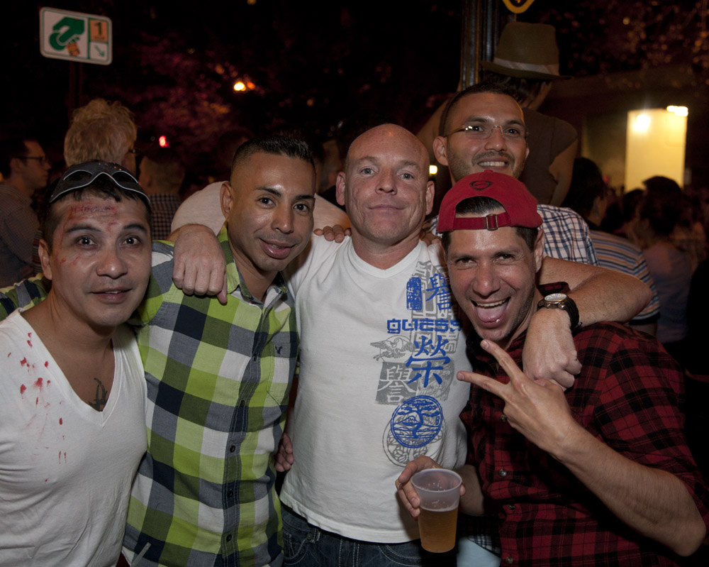
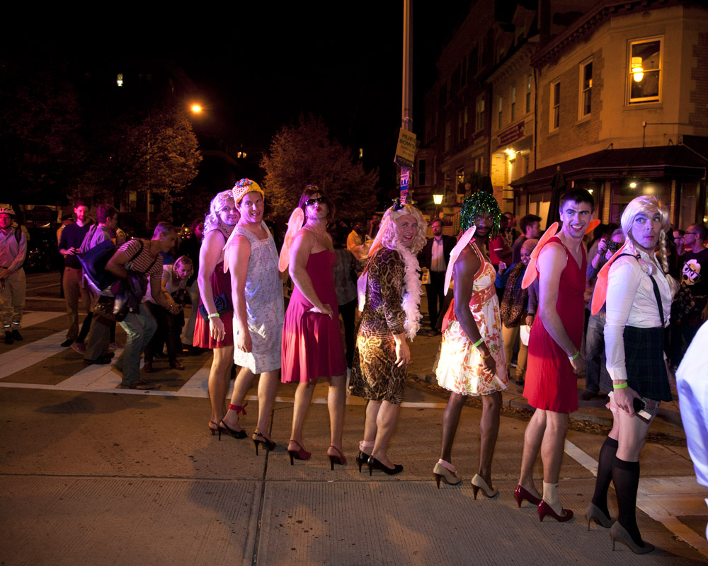
The complete MMRF crew posing in a line, showing off their “assets”.
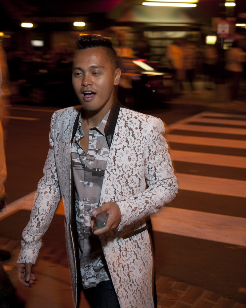
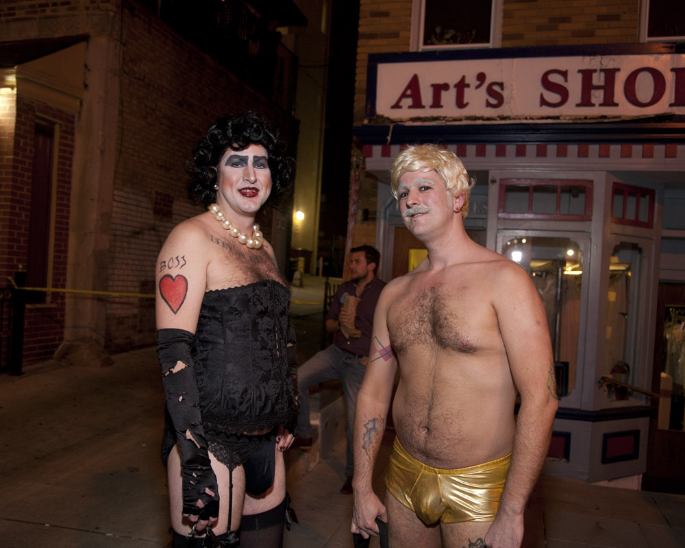
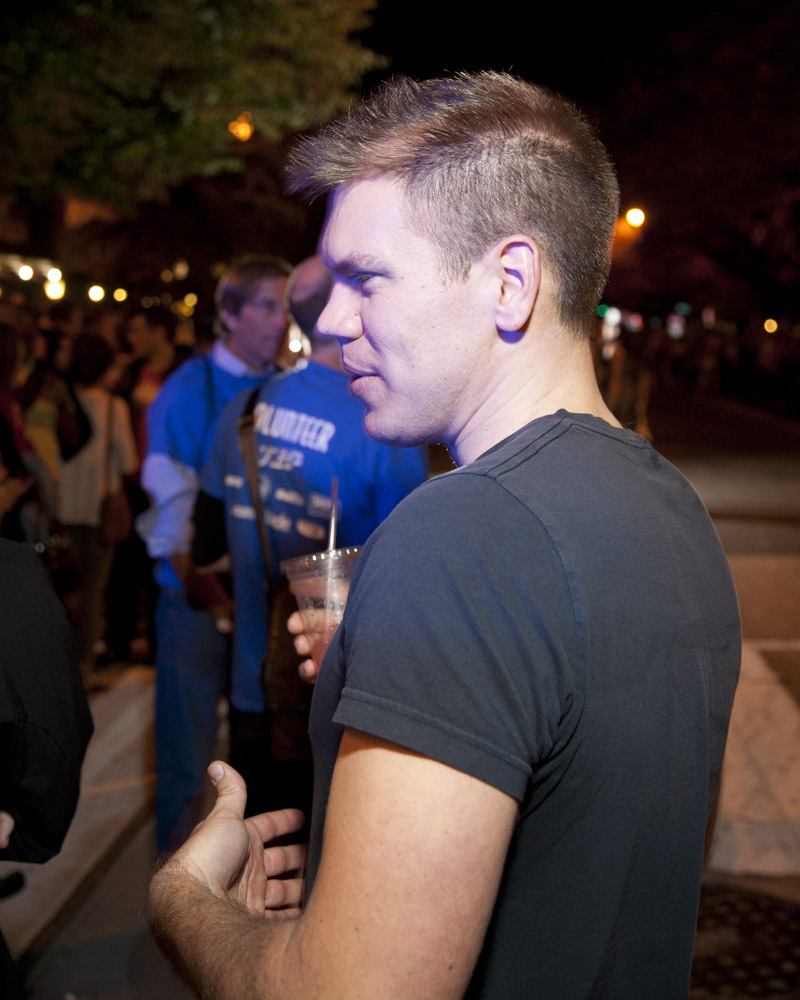
Sometimes it’s not about the drag… sometimes it’s just a cute guy. With a drink in hand.
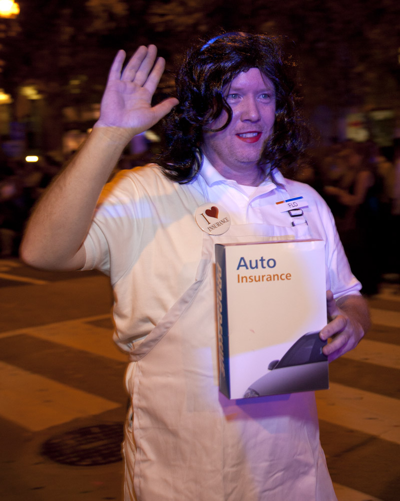
It’s FLO! Can I get a discount double-check?
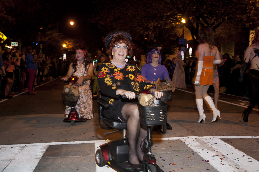
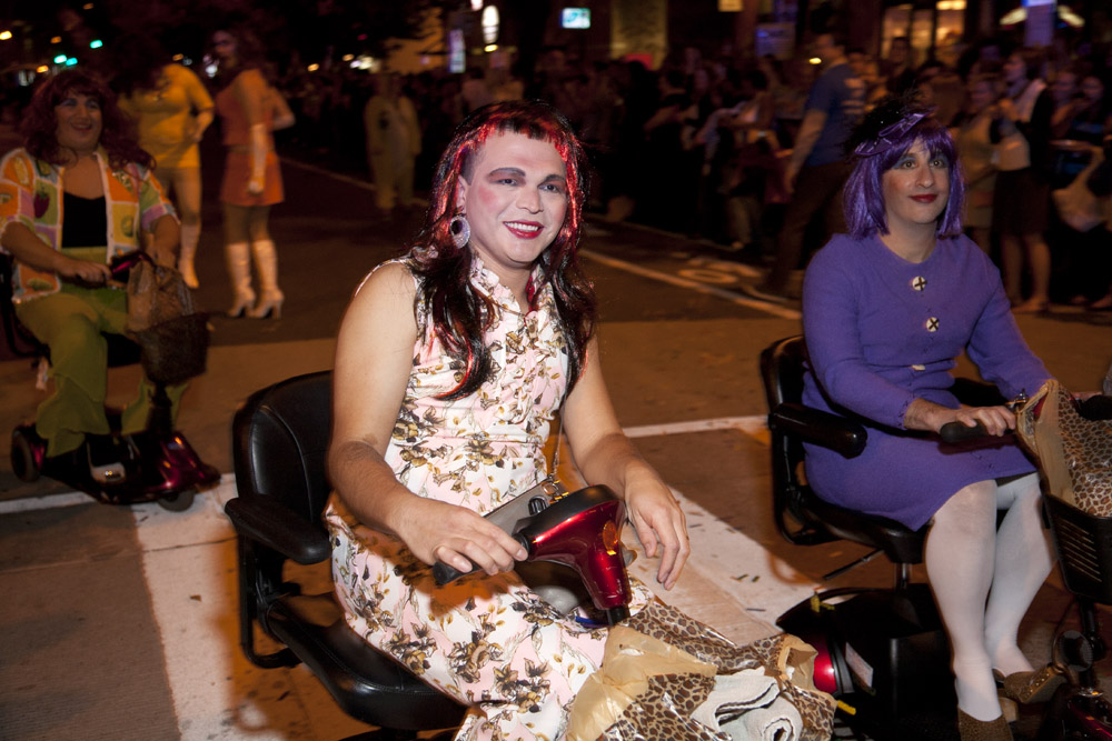
Church ladies on power scooters!
The Fanta girls made a comeback this year. Here two of them are mock fighting over their flavors. (see my pic of them in 2012 here)
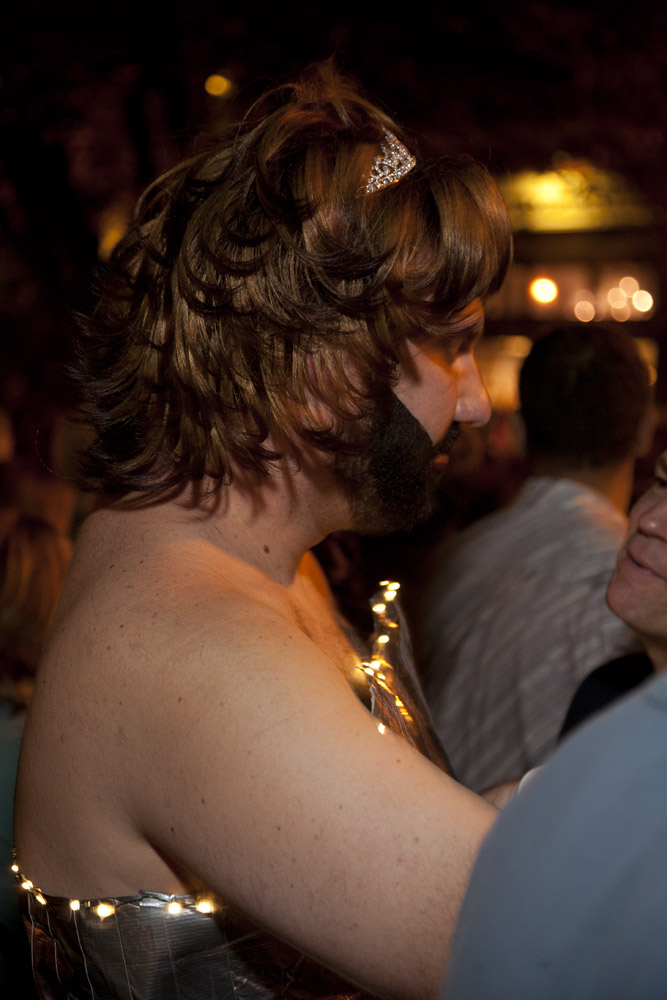
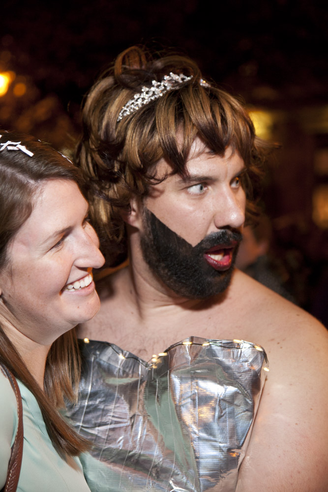
The higher the hair, the closer to… oh my god.
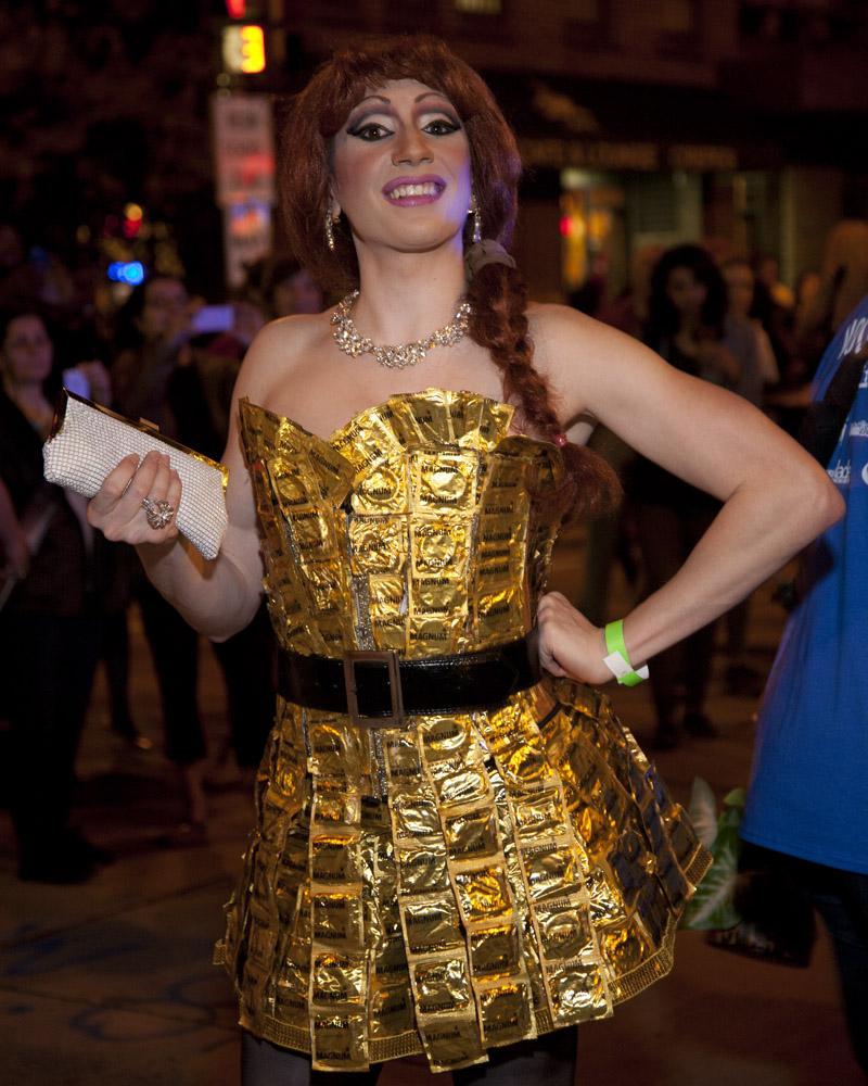
Don’t forget that safe sex can be fun… if you tear the dress getting it off, it’s ready to do double-duty!