If you haven’t yet read the book, Photo Work: 40 Photographers on Process and Practice, I highly recommend it. In the course of interviewing 40 different photographers with an identical set of questions about their creative process and how they conceive and execute long-term photographic projects, the book outlines several common approaches. It serves as a useful tool for self-reflection on how you as a photographer can approach your own projects, and encourages you to analyze your own working methods to better understand not only how but why you undertake a long-term photo project.
There has been over the course of the last 50 or so years a mythologizing of the photographer as a lone wolf, stalking the ever elusive Cartier-Bresson-esque magical ‘decisive moment’ image and somehow creating a body of work that will wow galleries and collectors and art historians through a catalog of utterly disjointed found moments on the street. While there certainly is potential to create a body of work this way, and there are a few famous photographers who have done this, to say that it is an uphill struggle would be putting it mildly.
Where the book Photo Work comes in is in pointing the reader to taking a more methodical, structured approach to creating images, especially a cohesive body of work that has a message. While it does not try to draw any definitive conclusions on photographic methodology, one observable trend amongst the artists interviewed is that they start out with a concept, work to produce images that support that concept, and if in the course of making those images, the images tell them that their original concept was flawed, or in need of refinement, or that the way they were making the images does not support the concept, they revise and adapt either the concept or the image-making process to refine the project.
This does not mean that they stop shooting images that don’t fit – in fact, the act of going out and photographing, of seeing through a camera, often informs the genesis of a project.
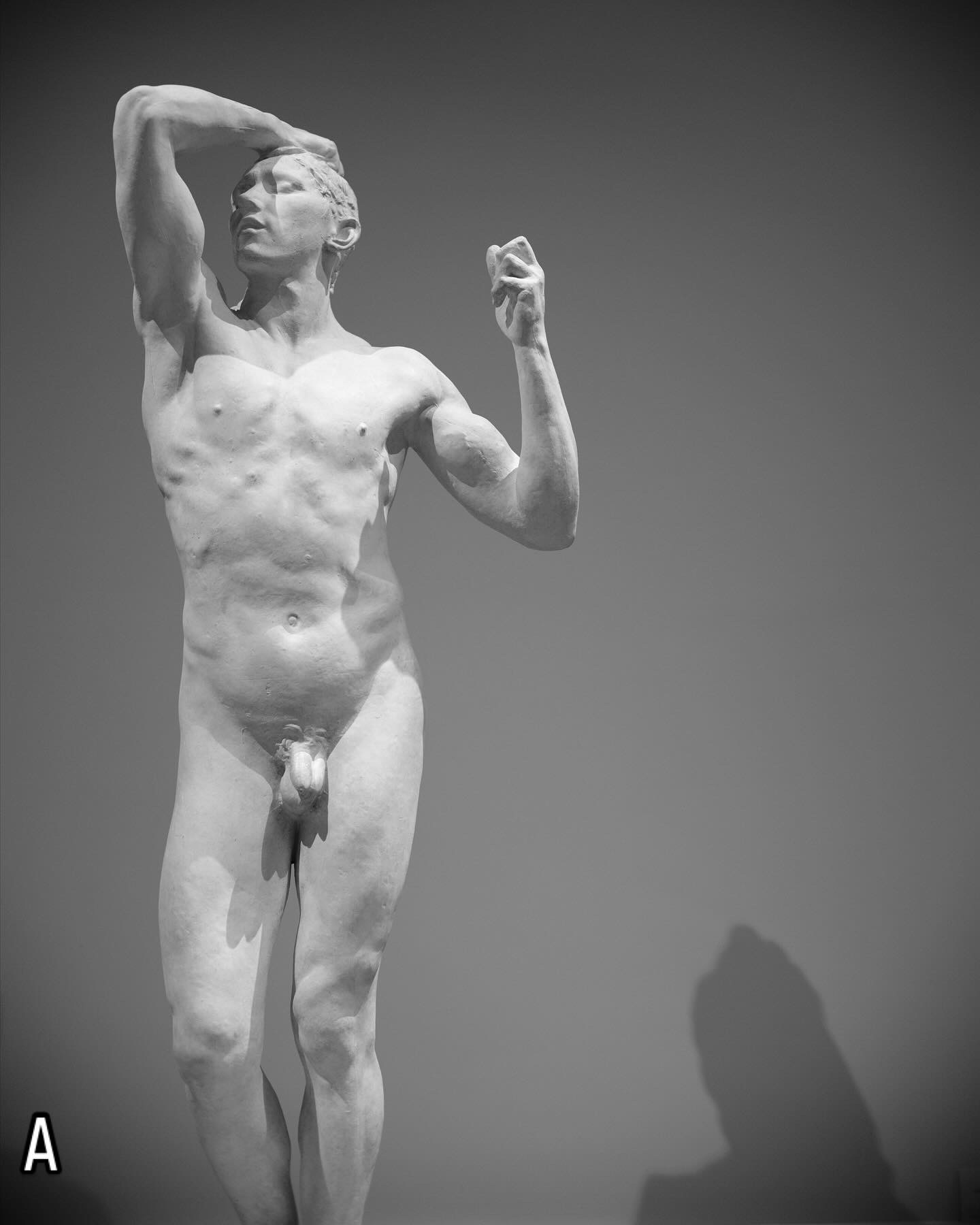
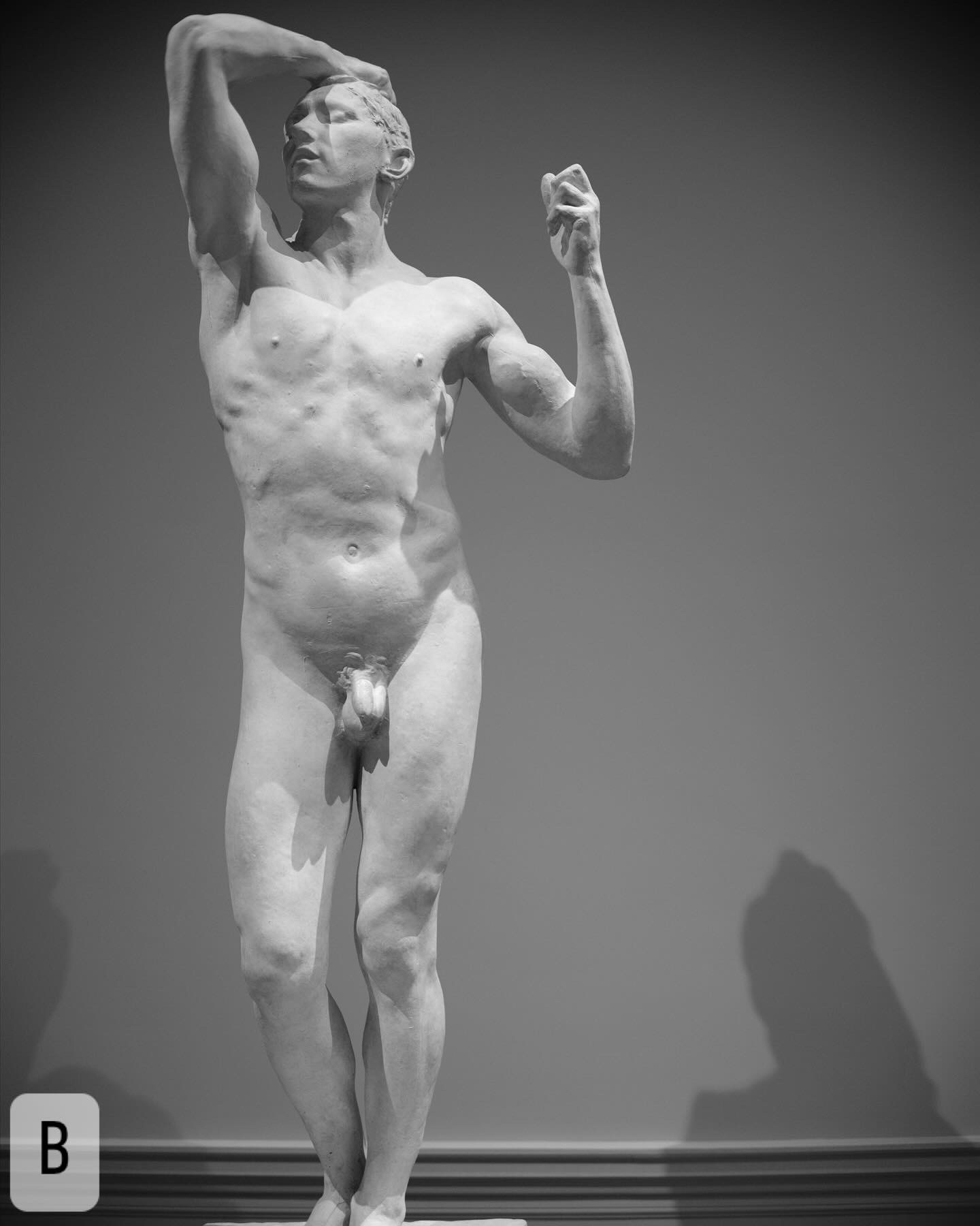
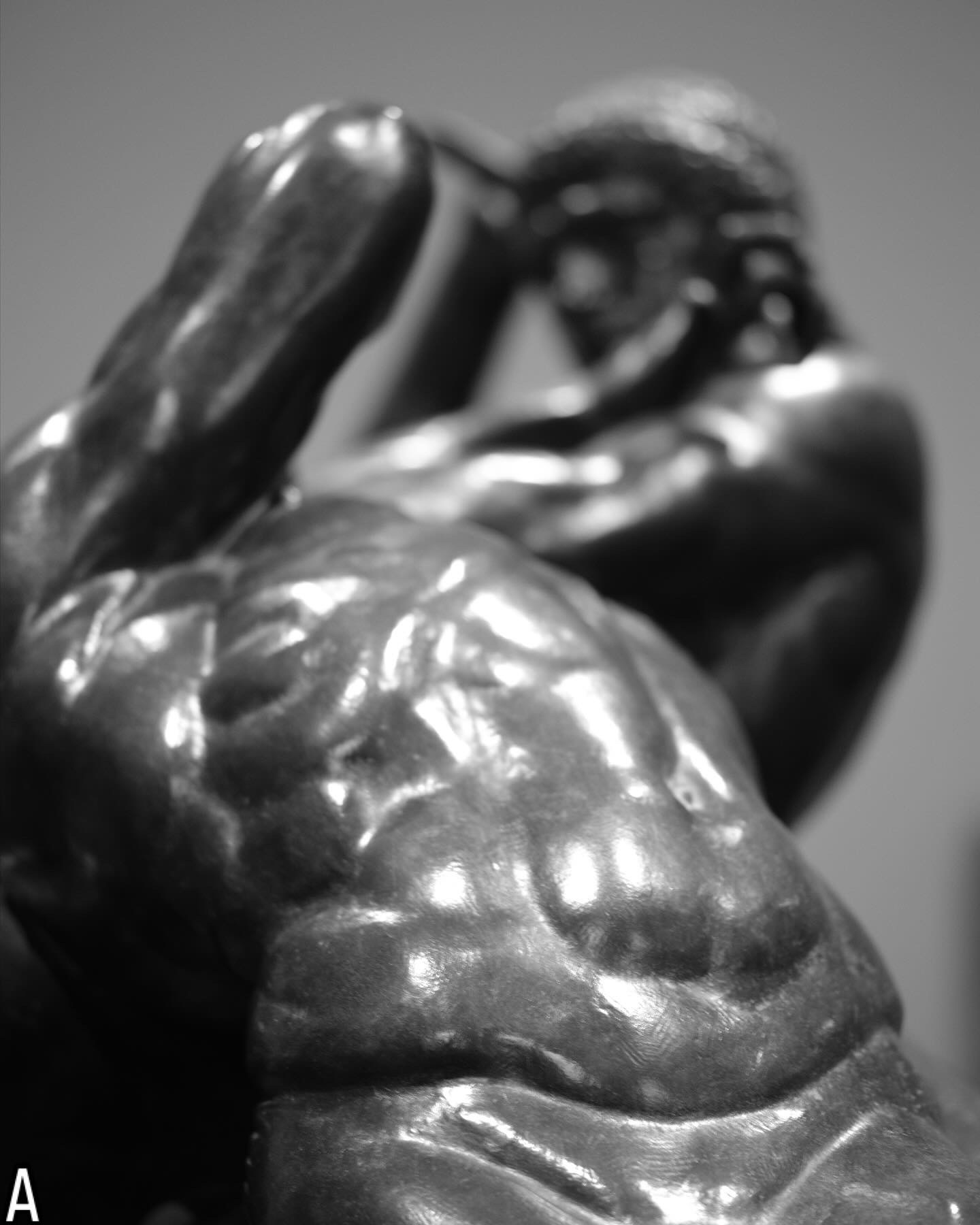
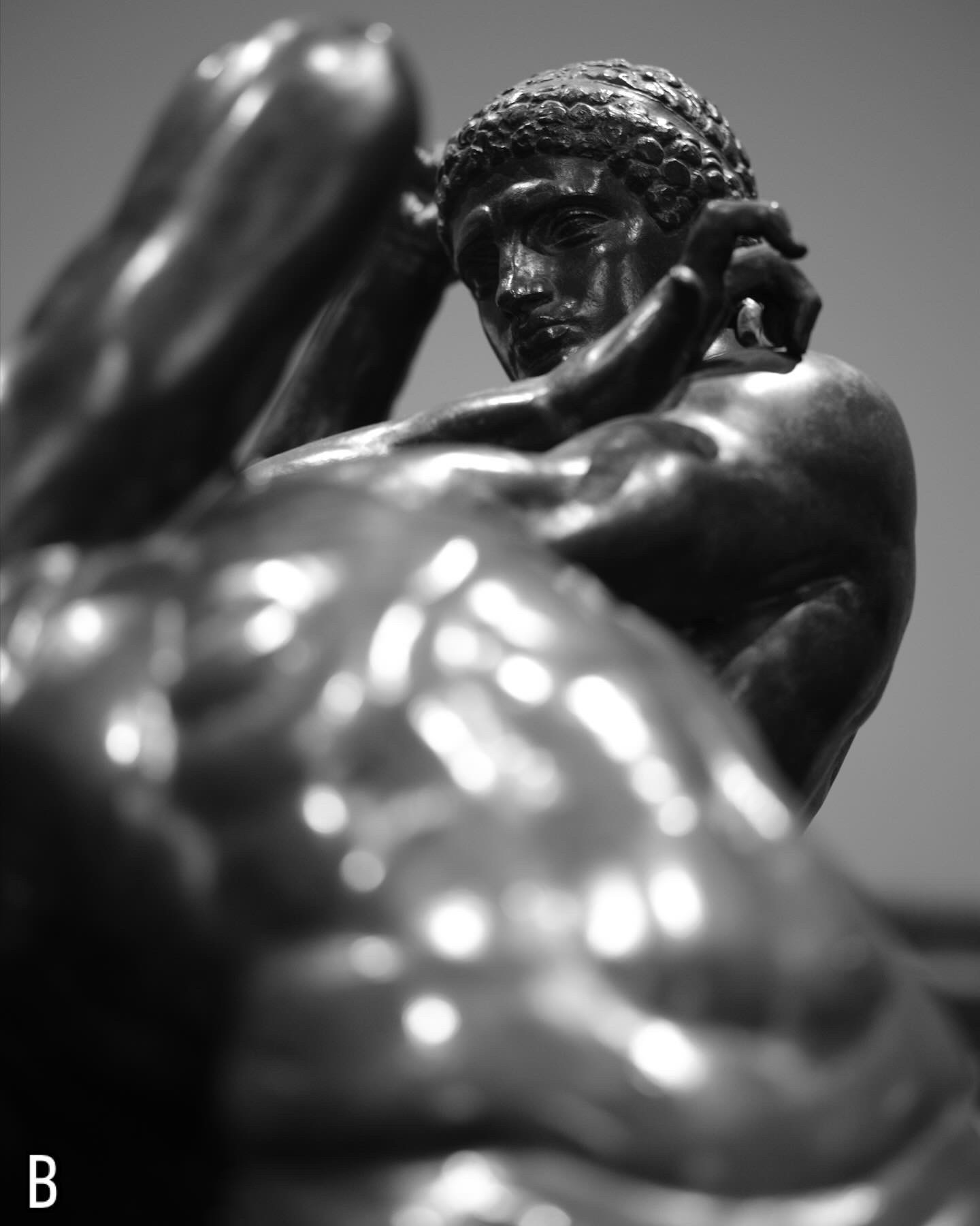
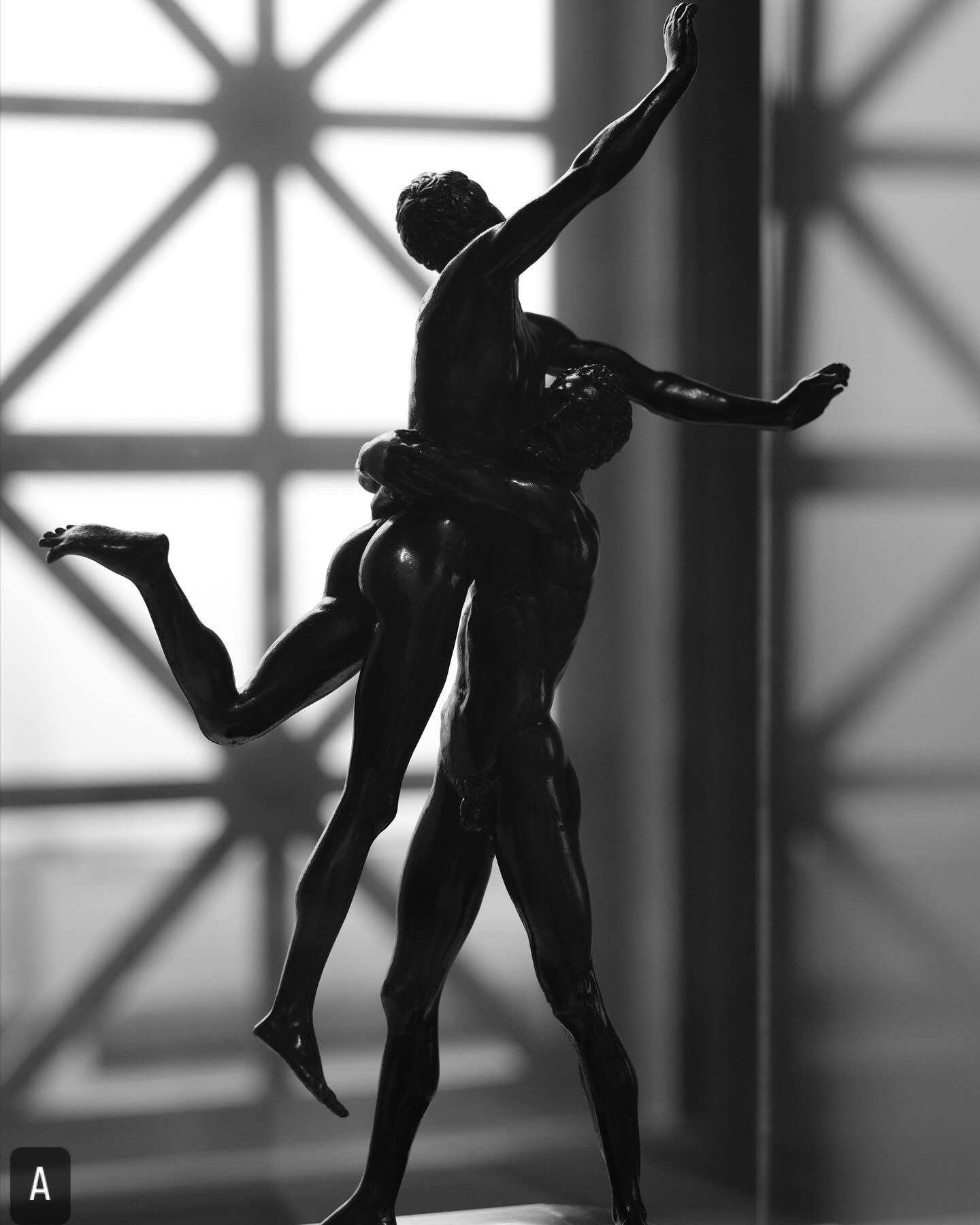
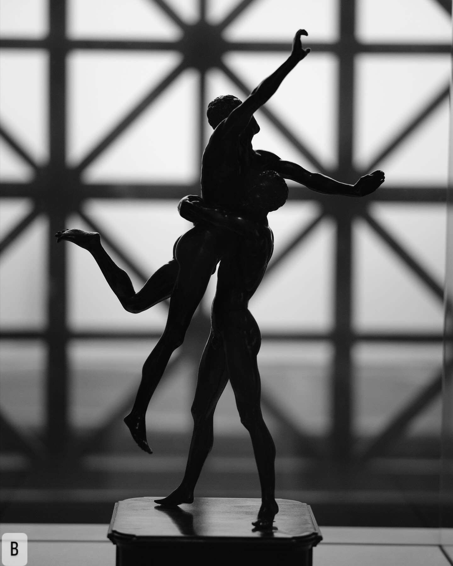
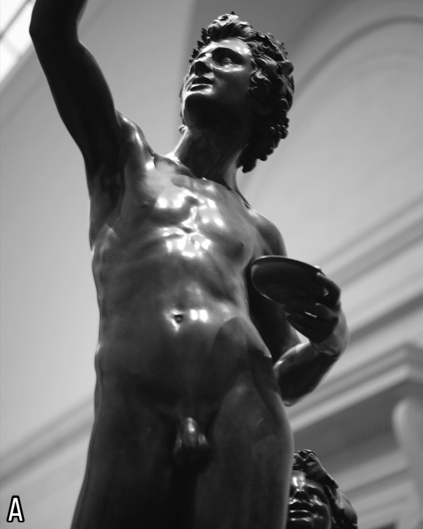
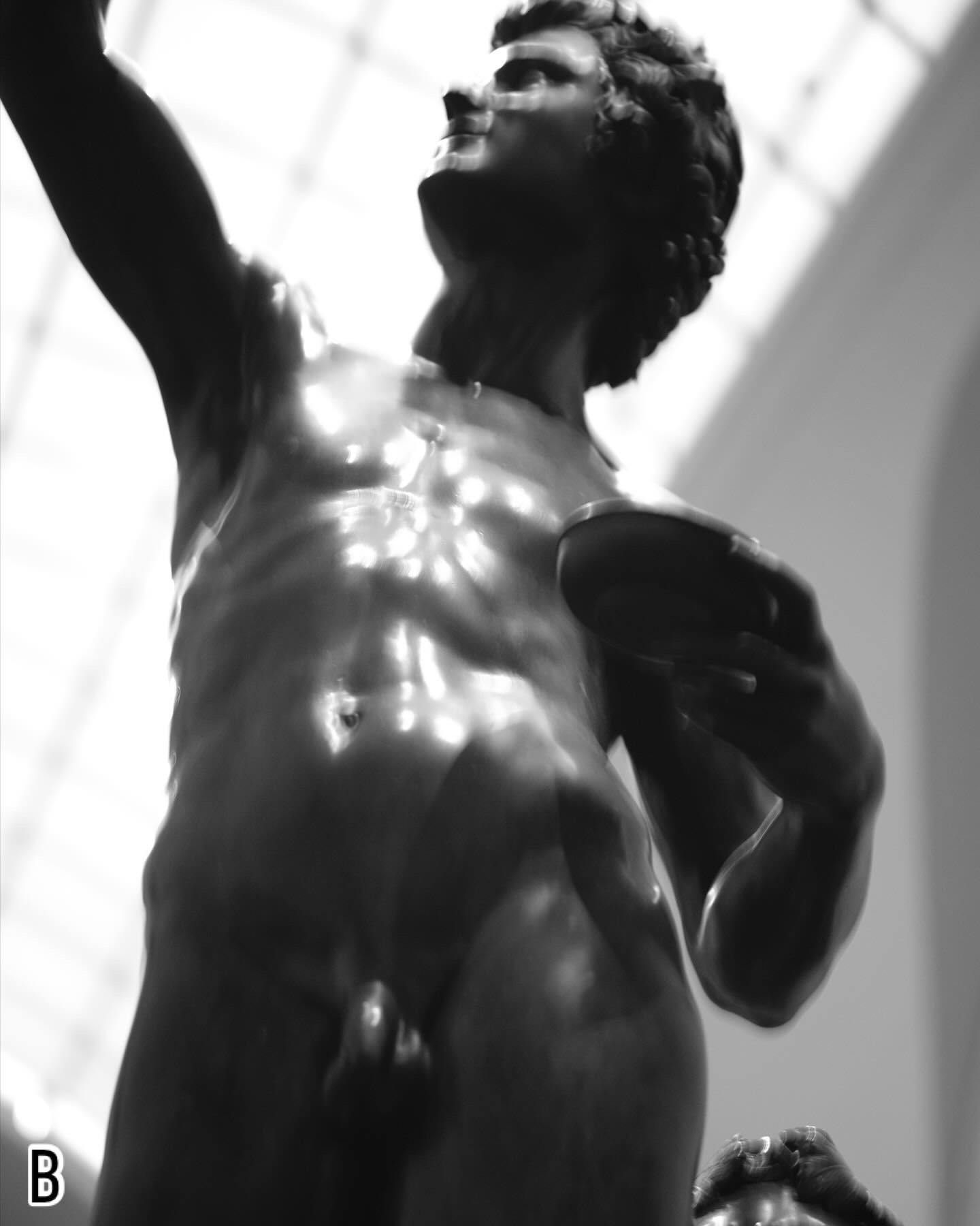
I’ve had a project idea burbling around in the back of my brain for a year now – I got started thinking about this after a trip to Richmond, Virginia to the Virginia Museum of Fine Art, and looking at the ancient bronze and marble sculptures, the Greek pottery, and even more modern artwork that carries an erotic subtext (or even overt eroticism). I wanted to do something that speaks to the role museums play in simultaneously preserving that and in whitewashing it – having work that has queer context in a museum permits the preservation and transmission of the queer gaze AND allows non-queer viewers to dismiss that quality of the work.
I have several theories as to how I am approaching this concept, so I’m going to just put some images out there for you all to respond to, if anyone is so inclined. I’m not going to articulate those concepts because I don’t want to prejudice the jury pool – just react to the A-B pairings and let me know your thoughts on them. There is no right or wrong answer, just react. I will block/delete any homophobic/hateful comments.
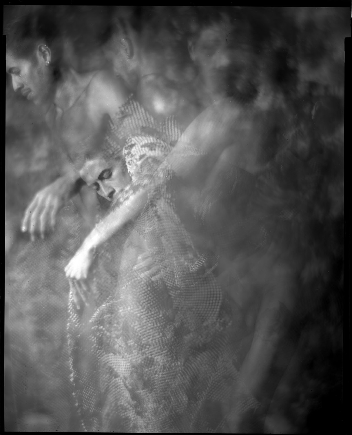
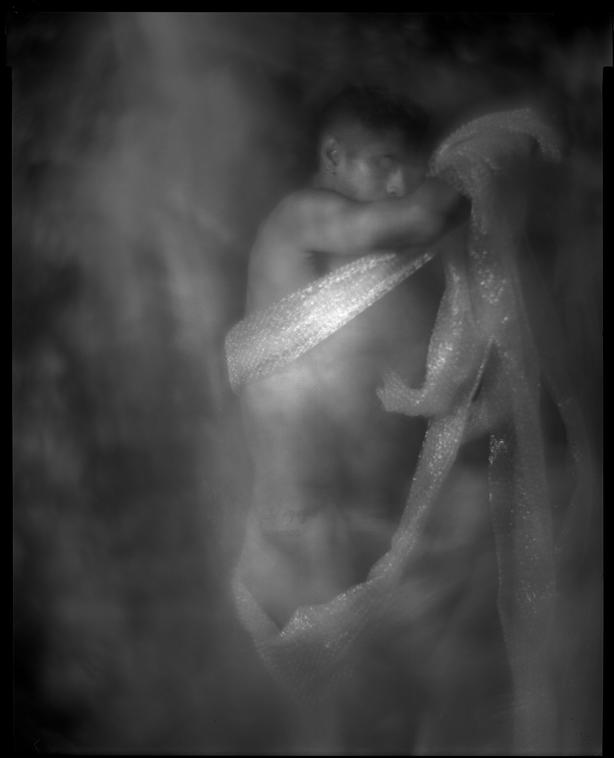
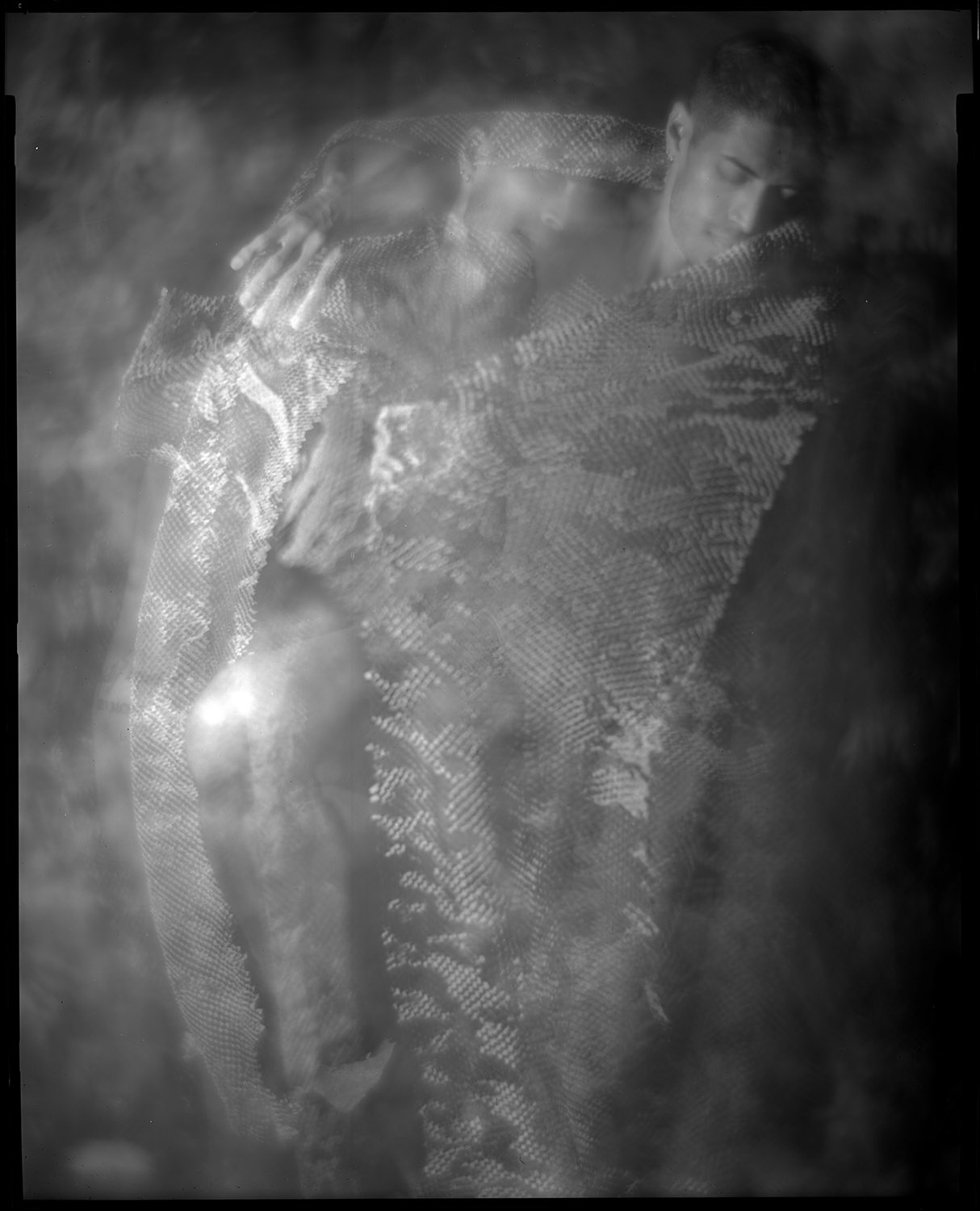
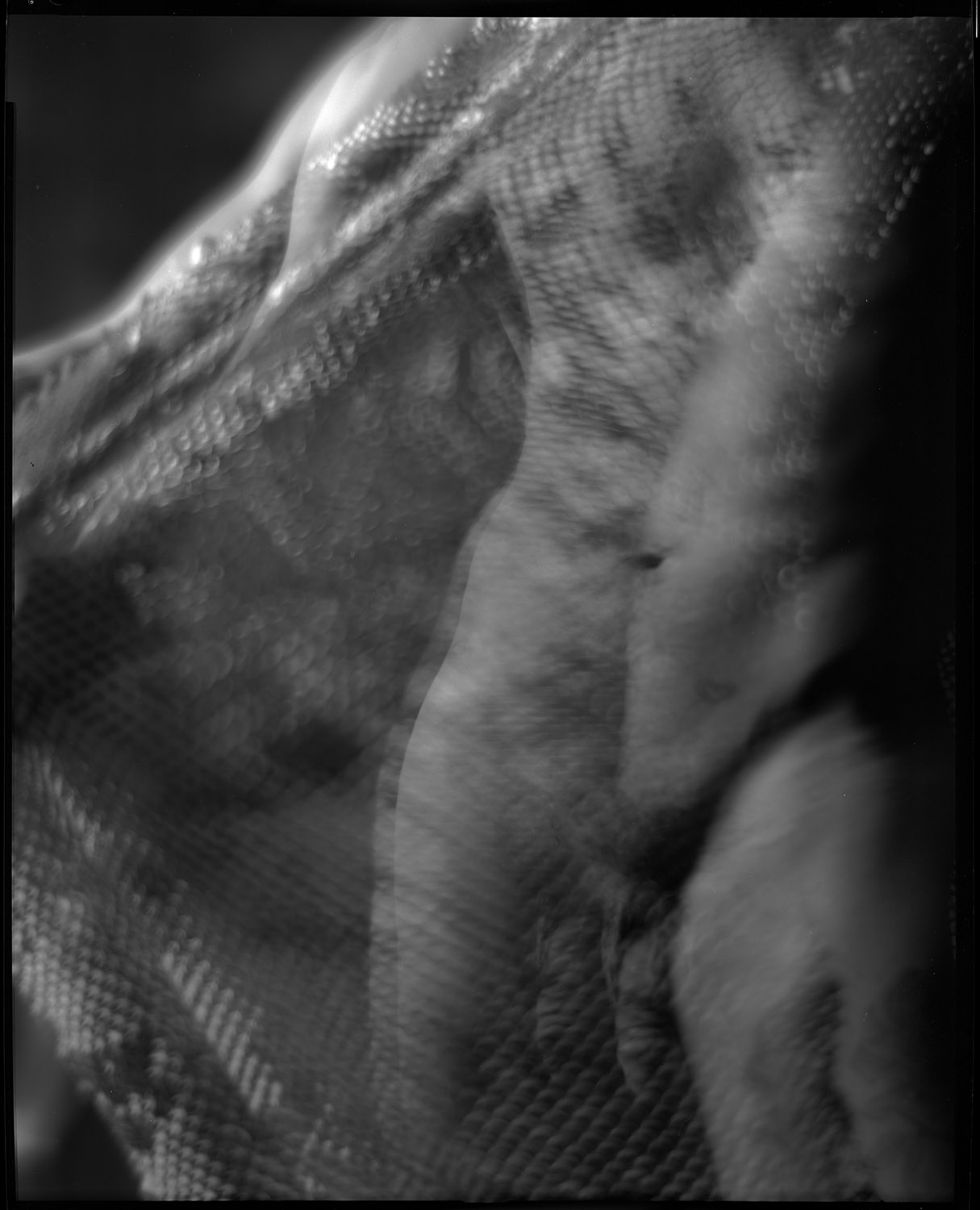
I’m getting started on a new series of human figure studies to go along with still life images. I arranged with a friend who is a professional dancer to be my model. One of the things he wanted to do was to try some movement studies. I had some pre-conceived shots I wanted to make, but I thought it would be good to push my comfort zone and try to do something different. I’m very much a collaborative photographer when it comes to working with models – I know I do NOT have all the ideas, and I love being inspired by and learning from the people I work with to create images.
I also enjoy using the limitations of my tools creatively and making them do things they aren’t necessarily intended for. We did this series with my 8×10 inch studio portrait camera, which is a big, heavy, relatively immobile beast. It has a Packard shutter to control exposure, which is a fairly crude, imprecise device (top speed is 1/30th-ish of a second). But what it does do is allow me to keep the shutter open for an extended period with the pneumatic squeeze bulb. So for these motion study shots, I opened the shutter, let Gabriel my model dance, and randomly popped my flash multiple times during the exposure. Very imprecise, very guesstimate, very subject to the whims of serendipity or disaster.
To make things more interesting, I had him dance with a piece of perforated craft paper that came in a box as packing material for something I bought online. The combination of the paper plus the swirly backdrop we worked in front of plus the use of a soft-focus lens on the camera gave the images an etherial, smoky look.
We also did some with bubble wrap.
We only did a few shots like this as it was experimental and I had no clear idea how it was going to come out. Having seen these, now I wish we had shot a whole bunch more of them! But that is the clarity of hindsight. Now, at least, I am inspired to try more of the same, and have a foundation of what to expect.
The great risk of course is, now that I have these shots, in trying to replicate them I will end up dissatisfied with the results because they will be too thought out and the element of serendipity will be lost, or I’ll go too far the other direction in trying to compensate for the serendipity loss and make a godawful mushy mess. But these are the risks we take when we make art – connecting with something emotionally is always risky.
This was inspired by an online discussion I was engaged in on a photography forum.
Photography occupies a unique niche in the arts. Because of its easy verisimilitude, its capacity to effortlessly record detail with precision, it presents the comfortable illusion that it is reality. I would argue that it is in fact no more reality than painting, and in some ways even less, precisely because of its easy verisimilitude.
Palacio de Bellas Artes, Mexico City. A seemingly hyper-realistic image.
Object Permanence
Why do I say that photography is less real than painting? Because it claims representational status when it is merely descriptive. When people look at an average photograph, because the subject of the photograph appears to be an exact likeness of the subject, they assume that it is a 1:1 correspondence because it is in their own personal interest to assume such. It is comforting to think that “this photograph IS the person in that moment the photograph was taken”.
In a way it allows us to reverse the childhood lesson of object permanence. When a child is very small, if you show them a toy, then you hide it, they will not understand that the toy is still there, just out of sight. A photograph allows you to imagine that something is there even when you know it is not. The subject of the photograph is not physically present at the moment of viewing the photograph, and may even be dead or transformed beyond recognition, but still exists in the mind of the viewer at the moment of viewing.
Dimensionality
Photographs render their subject from four dimensions (length, depth, height, time) to two. They also perform a selective removal of context. In reality, a subject exists in an omnidirectional, infinite context. Taking a photograph of that subject requires excluding a near-infinite amount of that context – you are viewing that subject from a single direction, from a fixed perspective, as it presents itself for the duration of the exposure. That duration of exposure is necessarily self-limiting and as such is not tied to the experience of the subject holistically – it is possible to make a subject appear dramatically different than it does 99.99% of the time, to the point of being unrecognizable, through the use of light, composition, color, and time.
Organ Grinder, Calle Madero
You are recording that subject in a single quantity and quality of light. And you are photographing it at a single moment in time (even if you are doing a solagraph that requires a year to expose, in the span of infinite time, it is a moment).
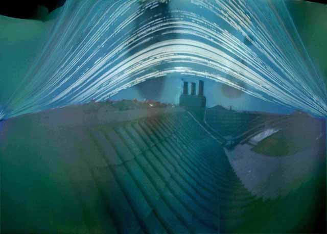
Because of the mechanics of making a photograph, while everything that appears in the above photograph was in front of the camera during the exposure, this scene in no way looks like this, ever. Yet it is a photograph. This was made by two separate exposures of twelve minutes each, moving the camera closer to the subject during the second exposure, utilizing a pinhole camera.
Verisimilitude
You are choosing to reproduce that subject using some method that is at best a precise simulacrum of that subject. Should you choose to reproduce the recorded image in any number of alternative media, then you have completely eschewed realism – while a photograph of a house may look like the house, the house has never ever appeared like the palladium print of the house.
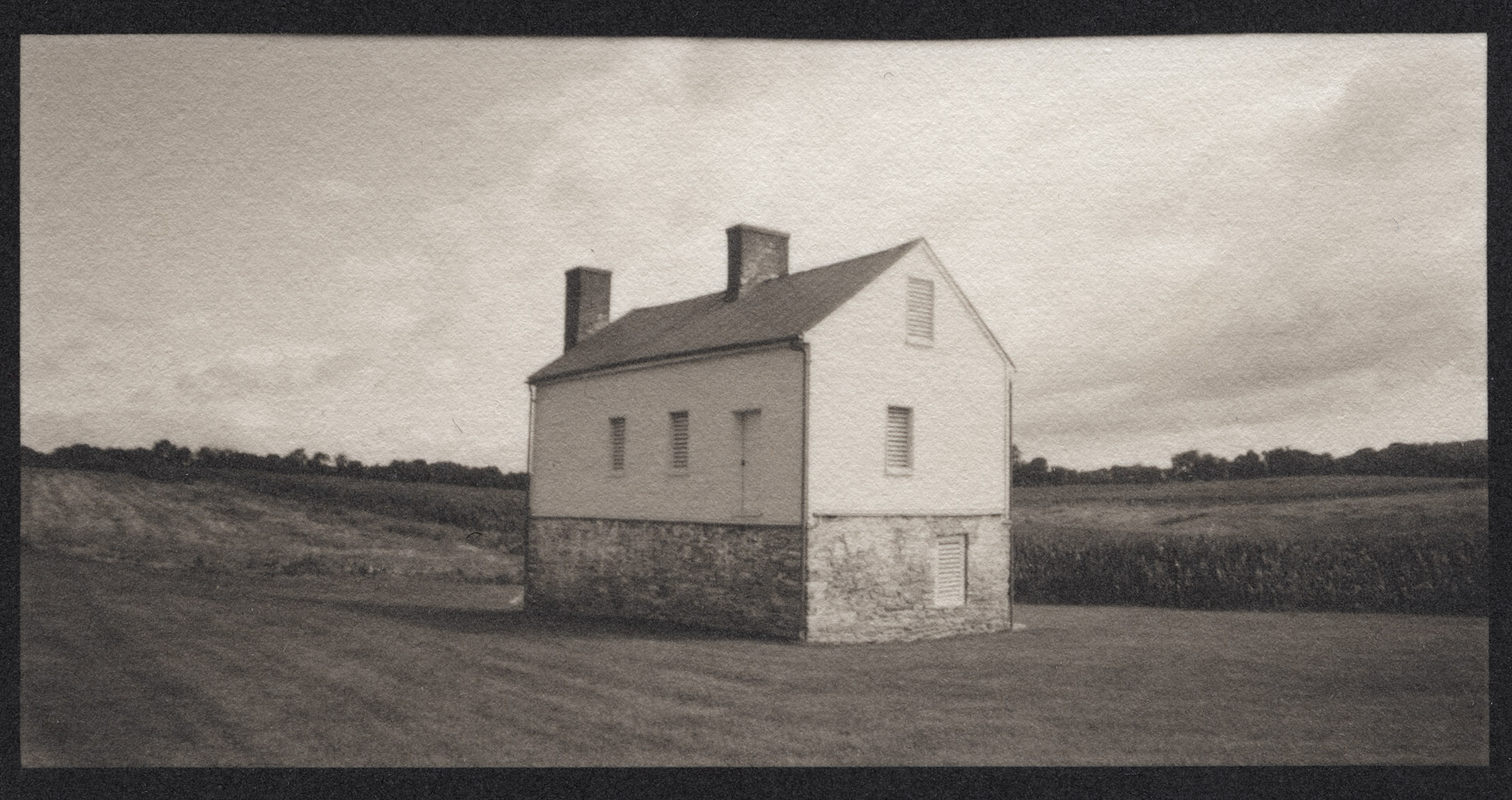
Bachelors House, Best Farm
The house is NOT that color, nor is it that texture, nor even that exact brightness – it is stone and brick and painted wood, not paper fiber. It is an interpretation by the photographer of the relative brightness of the objects in the scene rendered on a piece of film with its own spectral sensitivities, translated through chemistry onto a piece of paper. That chemistry has its own particular responsiveness to light, temperature, humidity, paper pH, and other factors that alter the appearance of the final image. Yet if you were to take this image and go to the place where it was taken, you would say, yes, this is that house. It is similarly delusional to talk about the permanence of the one versus the other. Both are subject to the vicissitudes of time, and there is no guarantee either one will outlast the other.
Photographs as Language
Let me start this section by prefacing it with a bit of academic theory. While I am thoroughly annoyed by one of the great bete noirs of 20th century academia, post-structuralism or deconstruction, the theory does have one very useful concept at its core: the understanding that language is NOT literal. Words are symbolic, abstract representations of the things they relate to. The word “rock” for example, is a vast generalization about rocks. When we read it, it conjures up in our mind a whole slew of associations with objects of geologic origin, and when YOU hear the word or read the word, the mental image you form is different from the mental image formed in MY head.
I can apply more and more words as modifiers to the word “rock” until you and I can both understand we are referring to the SAME rock (a chunk of granite, three centimeters in length, two in width, 1.3 in height, with reddish brown mottling and flecks of gold-like minerals contained within, whose surfaces have been polished to a mirror-like smoothness, on display in the Smithsonian Natural History Museum’s mineral collection), but even then, those words are NOT the actual rock.
Well, neither is a photograph of that rock. The photograph may represent the rock, and it may represent it with extreme accuracy (the rock in the photograph may be reproduced with the identical dimensions of the actual rock). But it is still two-dimensional, not three, and the colors of the rock in the photograph are composed of organic dyes, not the same minerals and elements of which the rock is composed.
And what of the fact that the photograph can be (re) produced in many different ways so that those aspects of verisimilitude are distorted or thrown out altogether? Perhaps my original capture of the image of the rock is a 1:1 scale representation of the rock, but I enlarge it to be twenty feet across, rather than three centimeters. Or I intentionally (or accidentally) alter the color balance so that the rock appears green rather than red. Or I reproduce it to be smaller than the actual rock. All these things are possible, and true.
If anything, a photograph that attempts to be a literal record represents a failure of the imagination and creativity because it is suppressing those acts through its verisimilitude. An “accurate” photo is encouraging the viewer NOT to think and NOT to interpret, but to take on face value the subject presented because there is the possibility that it mightbe accurate.
Photographs and Time
One of the great challenges of ascribing literal representation to a photograph is the factor of time in its creation. Because of the speed of production of a photograph, we assume that there is some literal truth and purity to the image. While it is more fundamentally assumed today due to the nature of photographic technology (there are digital cameras today that can record an image in less than 1/10,000th of a second even without the aid of stroboscopic light), even at the dawn of photography when a Daguerreotype could be made in minutes, rather than hours or days for a sketch or a painting, photographs were thought of as “instantaneous”. This can be seen in marketing for early portrait studios: “Instantaneous Likenesses” were the frequent topic of advertising.
But just because a photograph CAN be captured in fractions of a second does not mean that it can ONLY be captured that way, and cannot be ascribed as a fundamental character of a photograph. A pinhole image may be made over hours or days, or a solagraph can be recorded over an entire year. There is nothing literal in a one-year solagraph – it captures the movement of the sun through the scene every day, and the changing position of the sun in that scene every day. The effect on the film or paper is so profound as to not only cause chemical reactions but actual physical reactions – the sun will be sufficiently intense as to burn the film or paper.
If you view that scene where this image was taken, it would look nothing like that, ever. You would NEVER observe that. Yet it is a photograph. It is simultaneously literal and profoundly distorted.
At the moment I’m struggling to come up with a nice tidy academic conclusion to this essay. I don’t know that I have it in me at this time, because I’m not done thinking about this topic and I need to spend a healthy chunk of time organizing and re-organizing my thoughts. I will come back to this idea of the paradoxical simultaneous literalness and non-literalness of photographs and how we interpret them (or fail to interpret them).
I have a class coming up from March 4 to April 29, Understanding Your Practice – The Photo Project, at Glen Echo Photoworks. This course is about thinking about how we approach and execute photographic projects. The foundational text for the class is Photo Work: Forty Photographers on Process and Practice., edited by Sasha Wolf. The book consists of interviews with forty different photographers who work in long-term projects, asking each of them the same twelve questions.
We will use the text as a guide to introspection into our own process of working on projects – how we come up with projects, how we shoot those projects, how we decide when they’re done, how we edit those projects, and how we think of them as a body of work – will they be prints on a wall, a book, a website, or some combination thereof.
We will execute our own mini-project over the duration of the class, using the ideas we discuss to help us guide our project and get a better understanding of our own working methods. There are no “right” answers here – this is just an exercise to help bring clarity to your own working techniques, to refine them and hopefully bring success to your ongoing long-term projects (or help you get started on them!).
The images following here are illustrations from my ongoing project about The Day of the Dead in Mexico City. Day of the Dead is a far-reaching cultural institution across not just Mexico but much of Latin America. It has regional and even local variations – Mexico City was, until very recently, somewhat blasé about the event, with celebrations being held more on the personal level. Thanks to the 2015 James Bond film Spectre, Mexico City decided that they needed to have the big public parade (desfile in Spanish) depicted in the film.
The event has its roots in traditions predating the arrival of the Spanish conquistadors, which were co-opted by the Catholic church. Today, the tradition adapts with the times and competes with Halloween (and its Hollywood inspirations), but also serves as a mirror of contemporary cultural and political events.
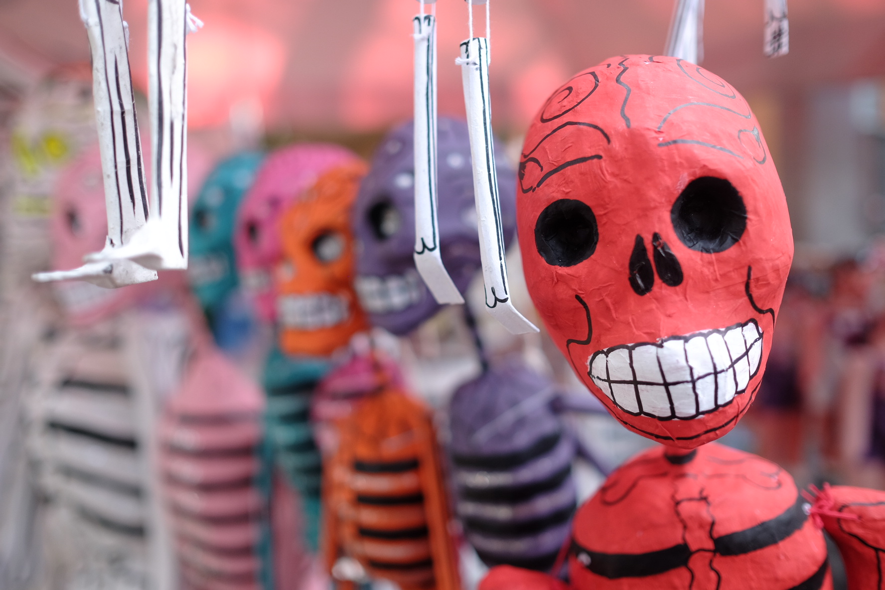
Papier-mache skeletons for sale from a street vendor.
More papier-mache skeletons for sale on the sidewalk in Coyoacan, an historic neighborhood in Mexico City
Businesses getting into the spirit – El Moro Churreria, one of the most famous churro shops in Mexico City, has their own mesero (waiter) ready to serve the spirits of the dead!
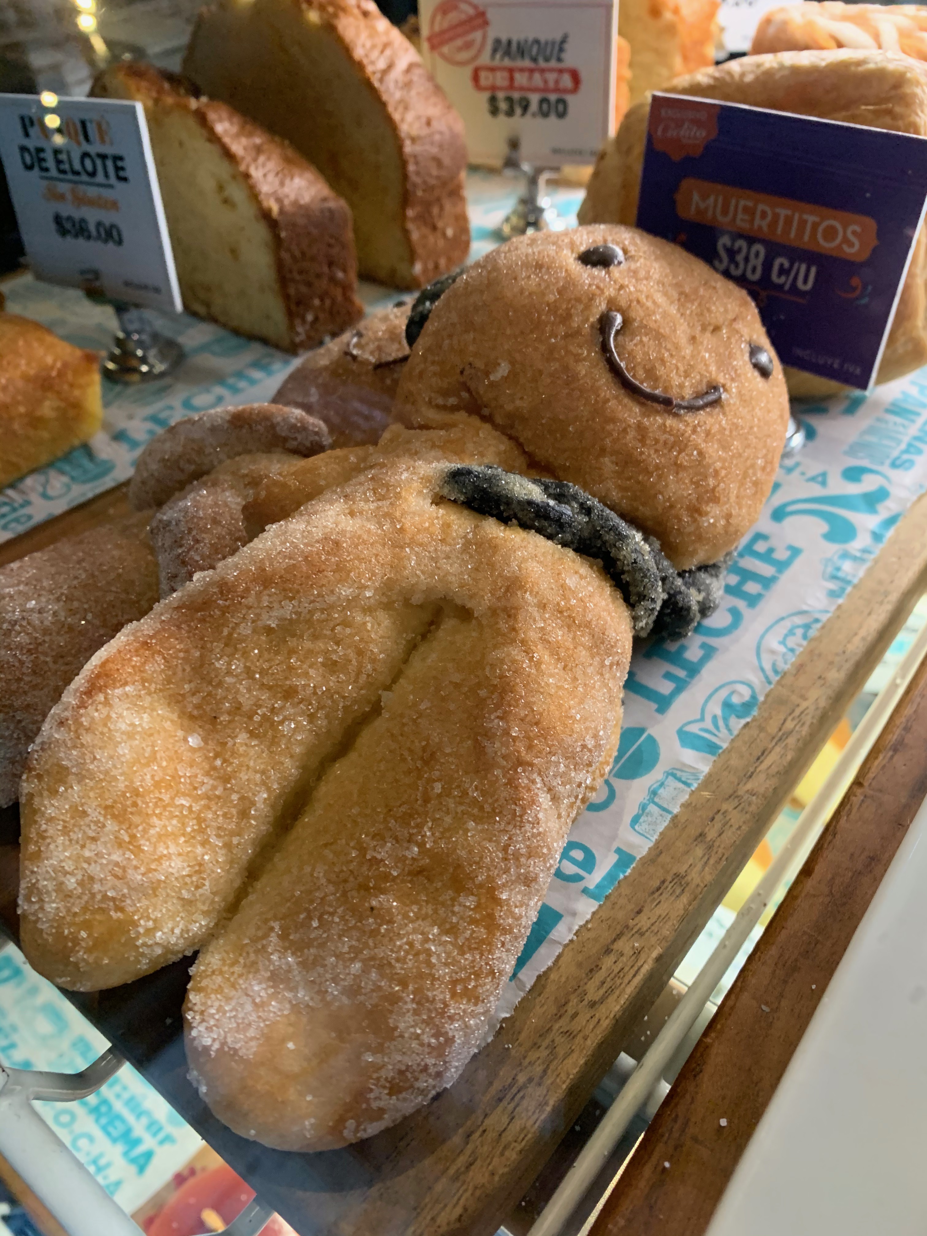
Muertitos – pastry for day of the dead in the shape of boy and girl dead.
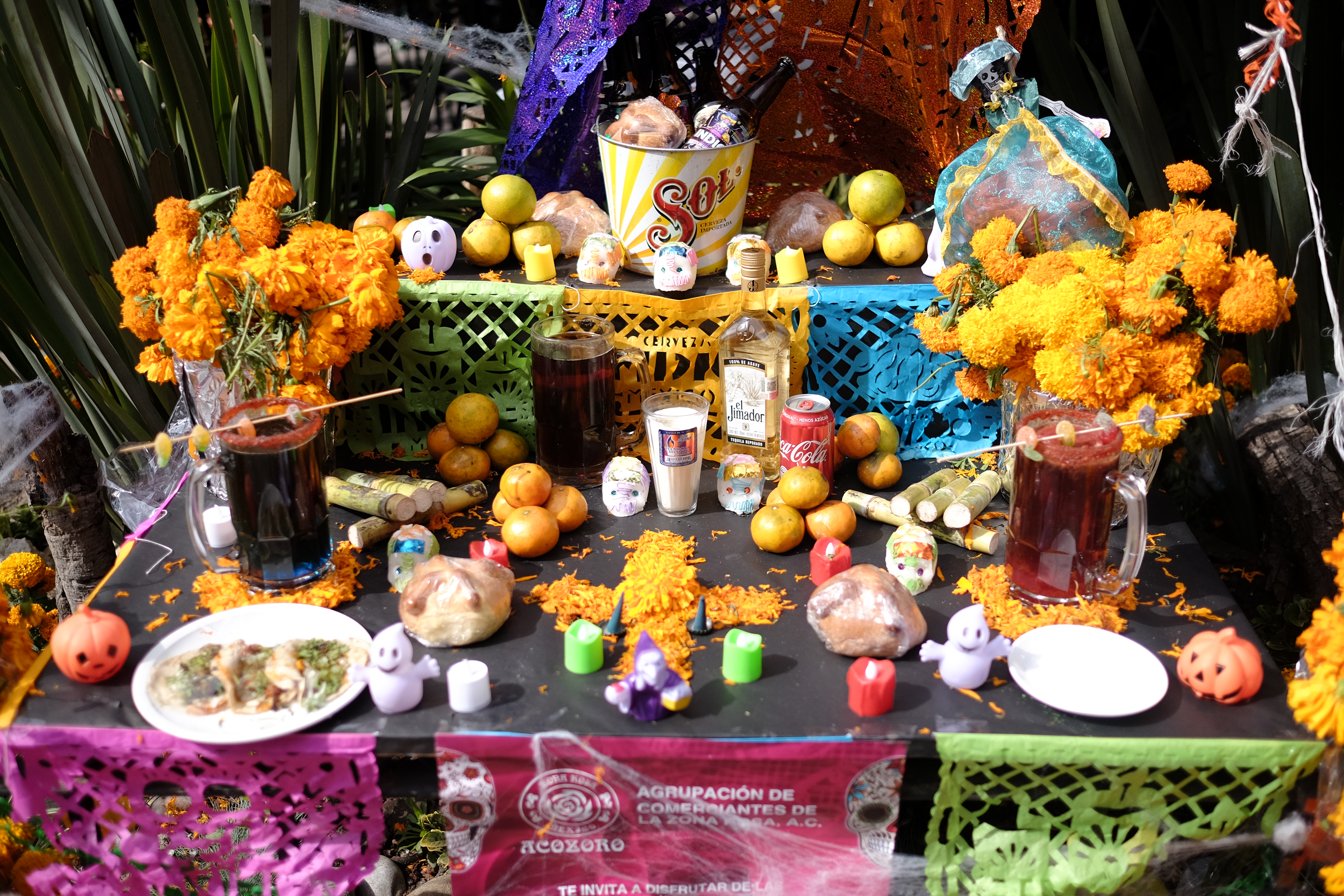
a typical offend altar set up outside a bar in the Zona Rosa
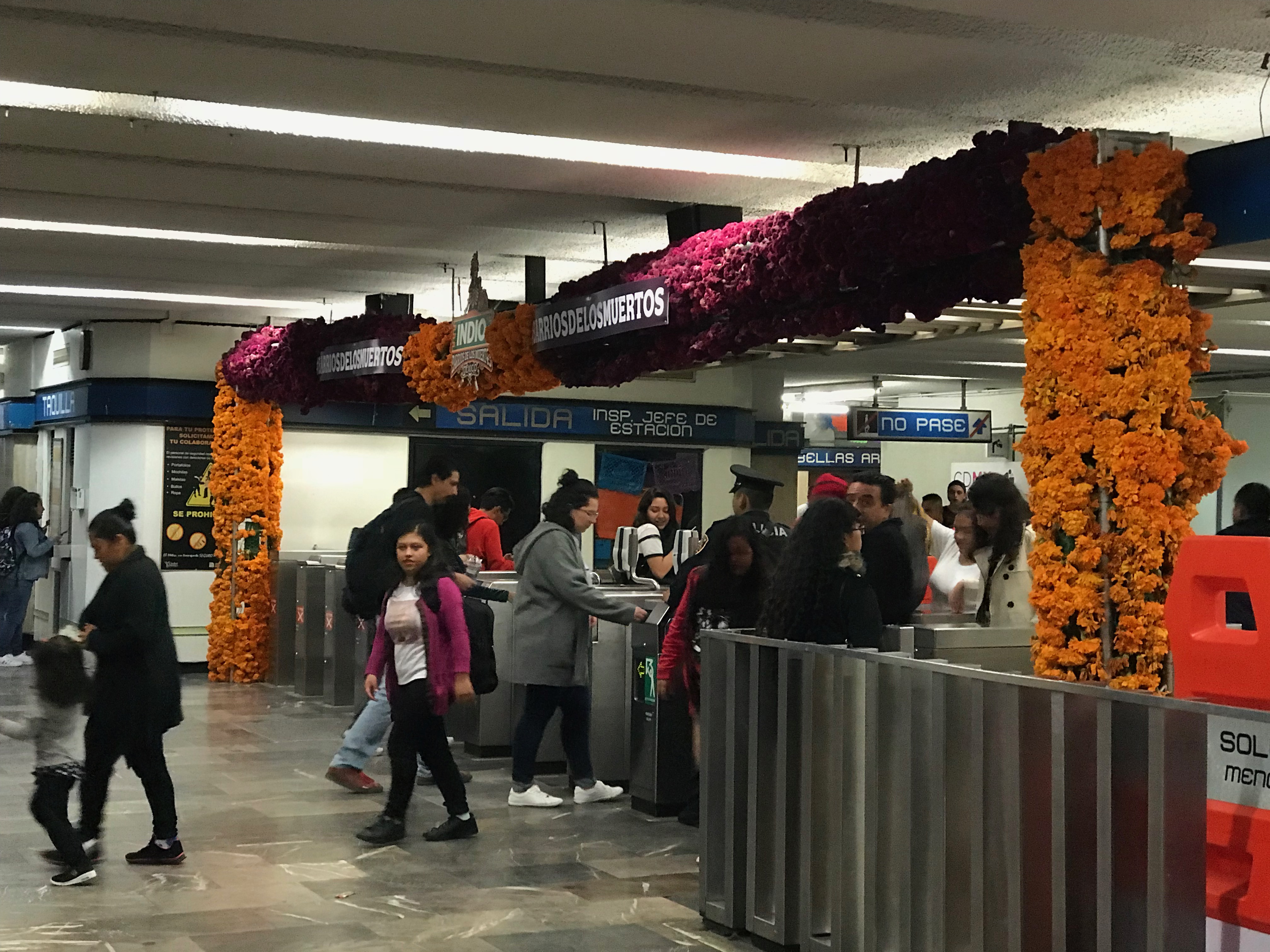
Even the Mexico City metro system gets into the spirit. Turnstiles decorated with the traditional orange cempasuchitl (marigolds).
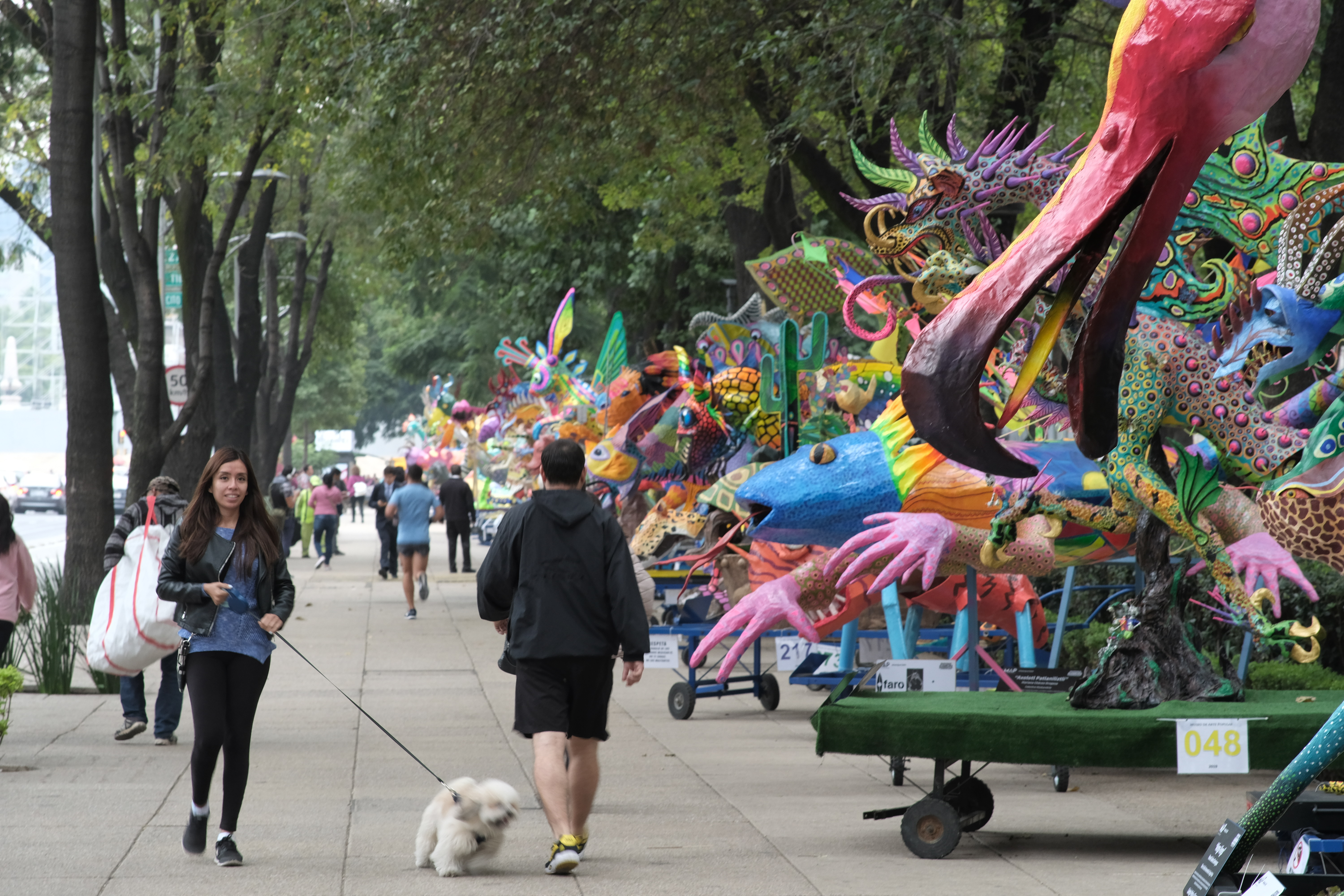
The avenue of Alebrijes (fantastical spirit animals) along Reforma, each one commemorating a person who has passed on. These Alebrijes line both sides of Avenida Reforma for over a mile.
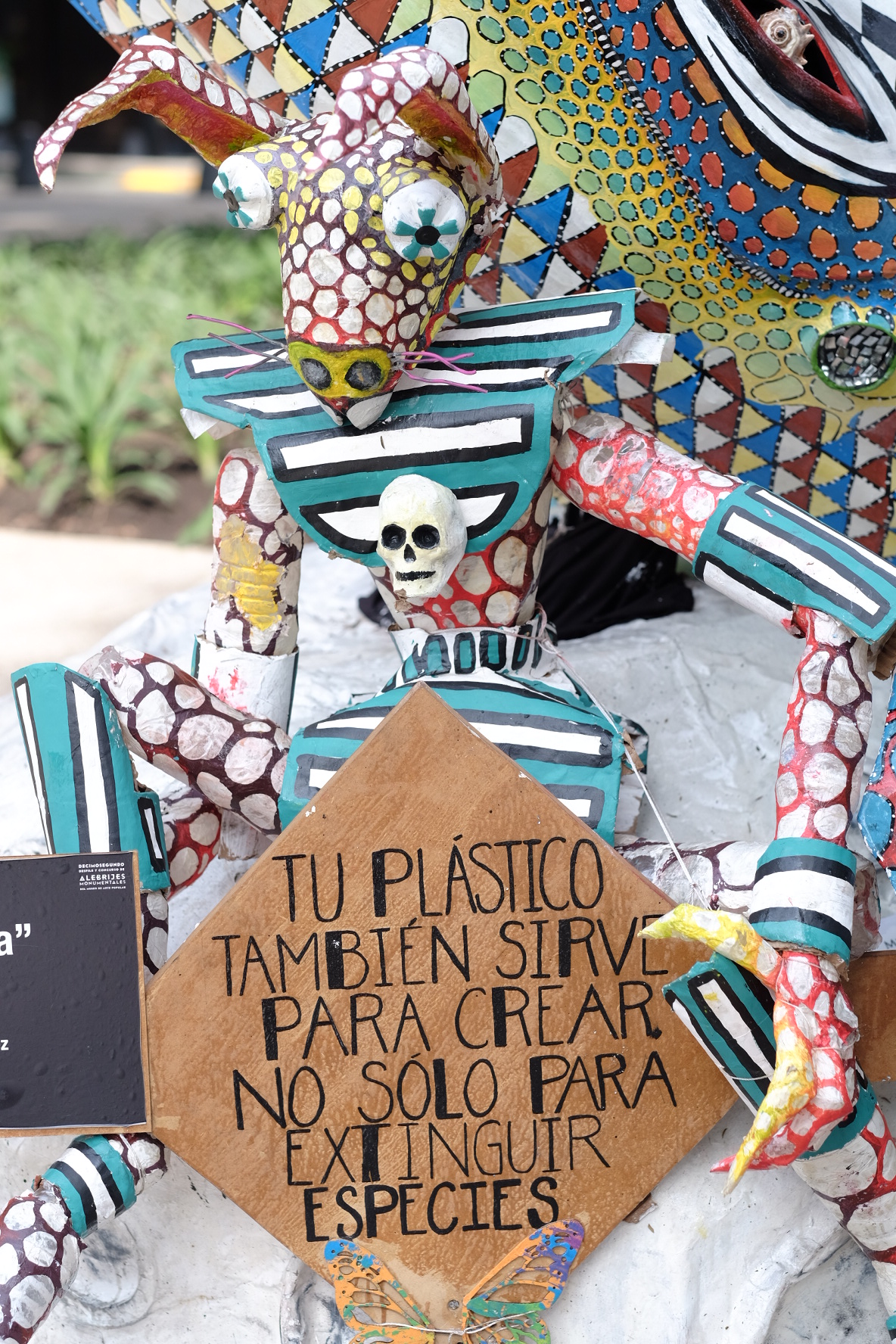
The cultural is political – an Alebrije on Avenida Reforma reminding us that plastic can create and it can destroy.
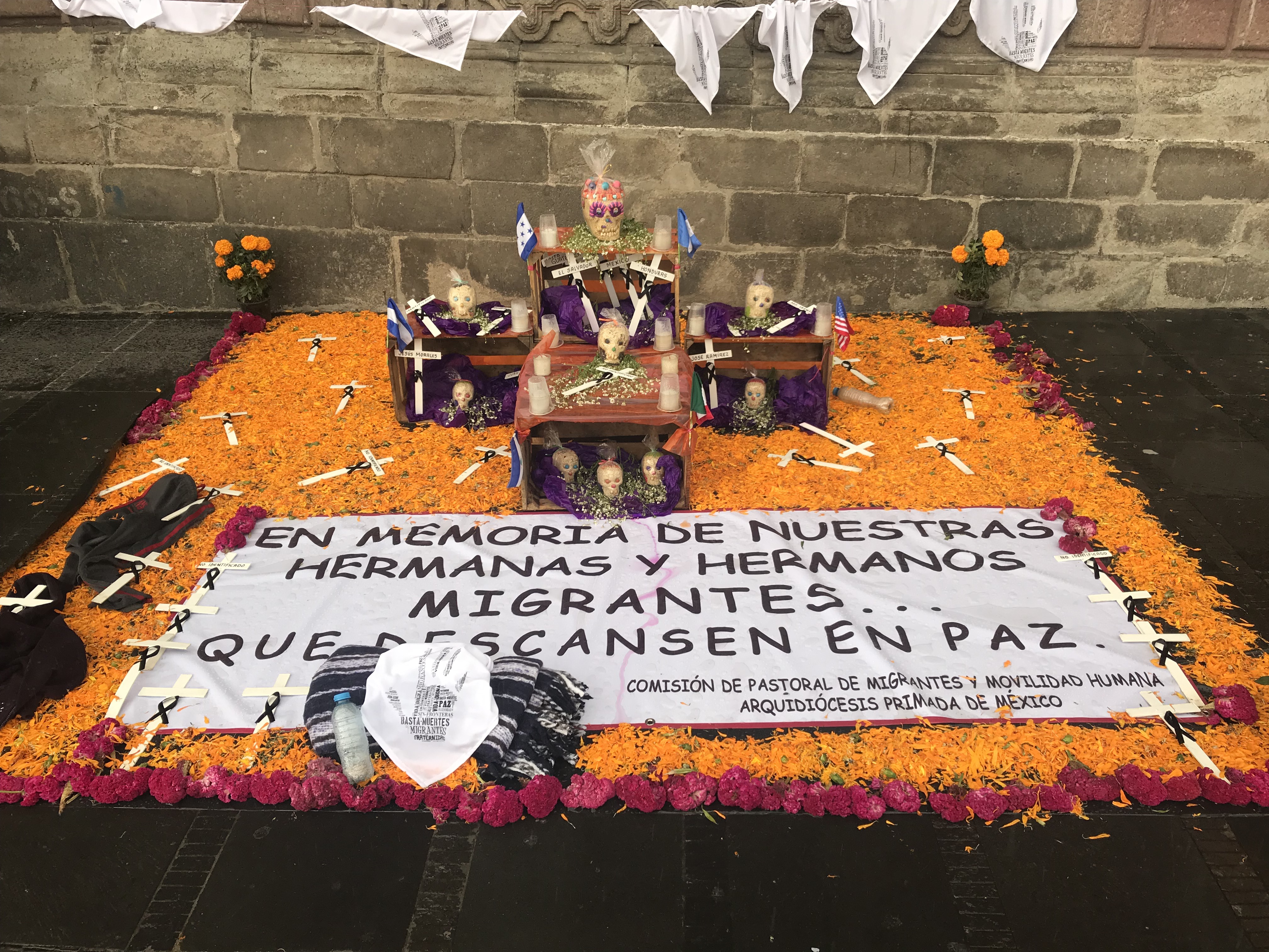
A memorial altar or ofrenda at the front wall of the Metropolitan Cathedral in Mexico City in memory of migrants who died fleeing violence and poverty in Central America.
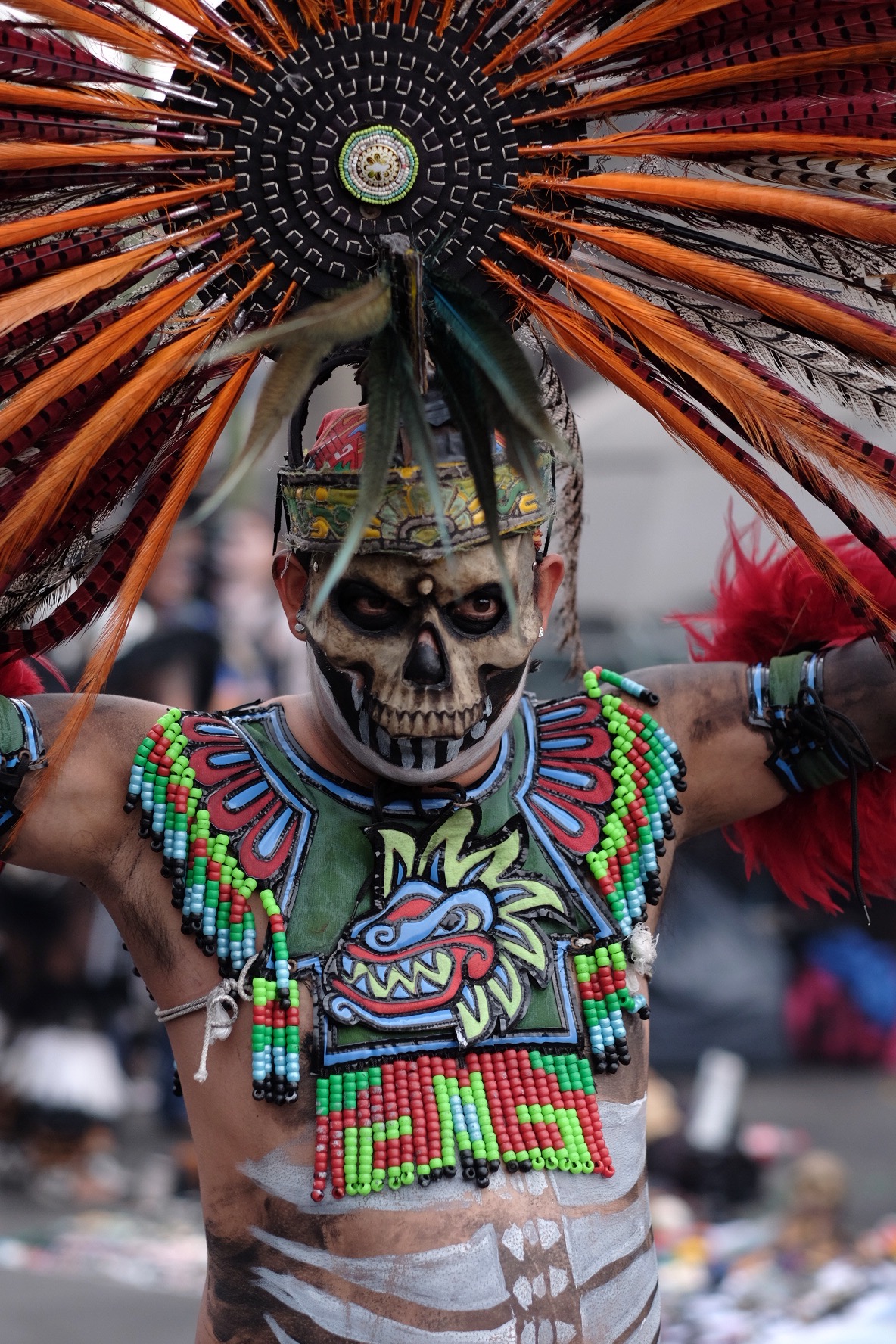
Traditional Aztec dancer performing on the plaza in front of the Metropolitan Cathedral
A painted Catrina accompanied by the abuelita Coco from the Disney movie of the same name.
Young woman with face painted.
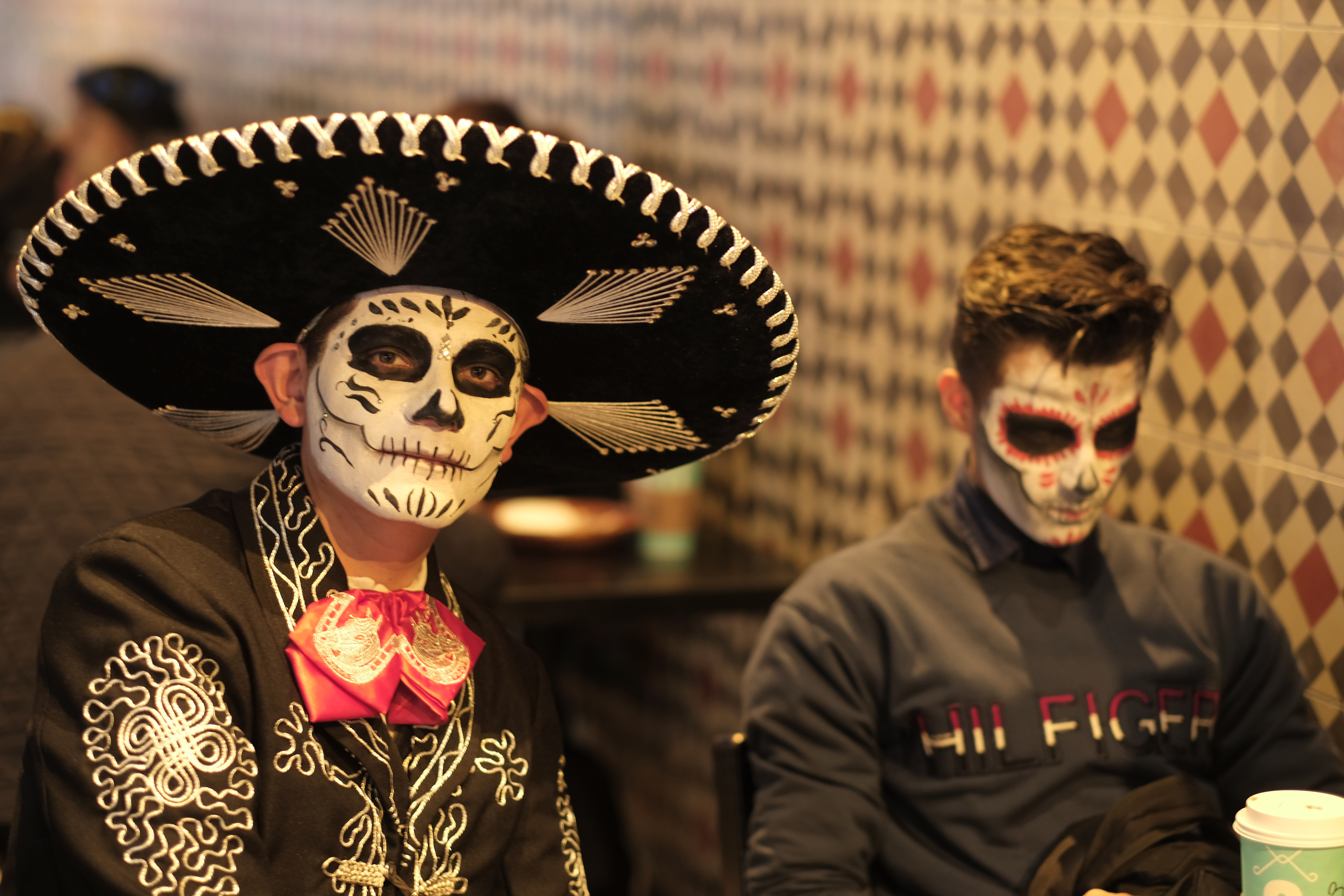
Mariachi and friend in the Cielito Querido Cafe on Avenida Reforma.
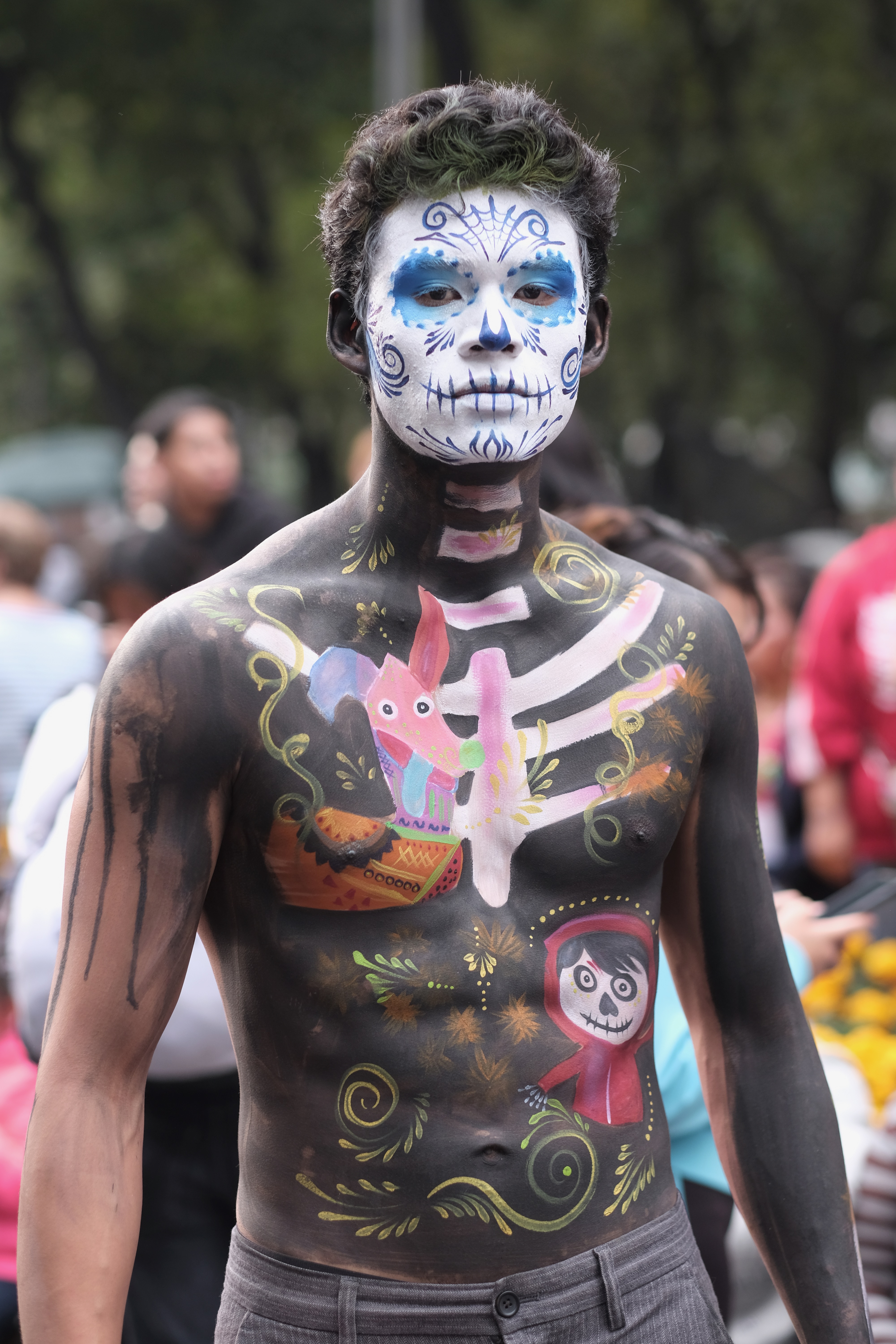
The traditional meets pop culture meets artistic expression. Full body paint that shows not only the huesos (bones) of a skeleton to remind us we are all mortal, but interconnected with the little boy and his dog from Coco, the Disney movie.
To sign up for the course, click on the link below. Tuition is $350 for 8 sessions. No class will be held on April 1.
(I’m calling this Part 1 because I’m sure I will want to revisit and/or expand upon this at a later date, perhaps multiple times)
Perhaps surprisingly, there are still debates to this day as to what exactly photography IS – is it art, is it a mechanical reproduction tool, is it truth, is it false? And this debate continues to roil without conclusion one hundred eighty-one years after its public debut.
Today I would like to tackle the question of photography and its relationship with truth. I would lay claim to the statement that photography now, and historically, has never really been about truth. It is barely about facts.
To define some terms before we go farther – there is a great deal of confusion about the difference between truth and facts. The use of the Boolean binary of True or False (positive or negative) leads many people to believe that Truth is equally binary – something is True, or it is not. Quite the opposite – Truth is very closely tied to faith. Truth is an absolute belief in the correctness of something, either without proof or even in the face of proof to the contrary. An example of this is that many contemporary practitioners of religion will argue that even if the historical facts surrounding the founding of their religion fall somewhere between muddy and non-existent, there is a greater Truth to the writings of their religious texts that extends beyond any need for factual accuracy. Facts are things that are provable – there is a rock on my desk. I own one hundred daguerreotypes. I live in Washington DC.
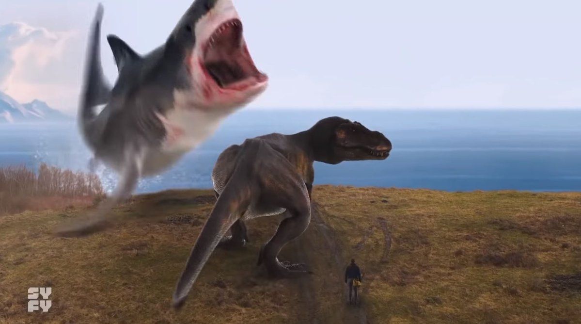
So what does this have to do with photography? I read many discussions among people with passionate feelings regarding the nature of photography. Many will assert that there is such a thing as “pure”, “true” photography, and that the specialness of photography as a medium is its fundamental relationship with truth. They make statements such as photographs are accurate, true representations of the things photographed, they cannot lie because the objects photographed had to be in the same place at the same time in the same light in order to appear in the frame together. They make this argument especially when arguing for an analog, chemical-based photography and against digitally generated photographs. They claim a superiority of the analog, chemical photograph because it is un-manipulated and therefore demonstrably “true”, whereas digitally generated photographs are untrustworthy because they can be easily manipulated into appearing to be true but in fact the things depicted never appeared in the same place at the same time in the same light when the exposure was made.
Bad Photoshop- sharks, T-rex, and man…
The Great White, the T-Rex, and the man at the edge of the cliff certainly never existed in the same space at the same time. It’s a ridiculous example, to make an exaggerated point. It is a photograph, but a heavily manipulated one that bears only the most tangential relationship to reality.
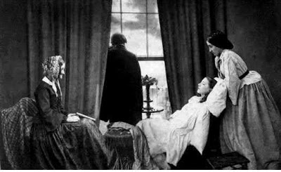
Fading Away, Henry Peach Robinson, 1858
But what about this image? “Fading Away” by Henry Peach Robinson, is far more emotionally “true” than the shark and the T-Rex, but as a photograph, it is no more true- this 1858 image is every bit as manipulated as the photoshop fantasy. None of the people in the photograph were in the same room at the same time. It is a hand-assembled collage of at least six different images (each of the people, the room, and the view out the window were all distinct exposures on different plates). It is every bit as factually false, yet the scene, a young woman being comforted by her family as she dies of tuberculosis, is so emotionally resonant that we WANT to believe in the truth of it.
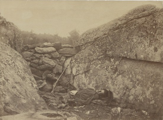
The Home of a Rebel Sharpshooter, by Alexander Gardner, Gettysburg, PA 1863
What about this image? While everything in this photograph was in the same location at the same time in the same light when the single exposure was taken, the entire scene is manipulated. Alexander Gardner and Timothy O’Sullivan were walking the battlefield at Gettysburg on July 6, 1863. They saw the body of a Rebel sharpshooter, and photographed it where they found it. As they continued walking, they came across this spot and felt it was where the sharpshooter must have been positioned earlier, so they picked up his gun and his body and moved it 40 yards to this location, in the name of making a more emotionally resonant photograph. They certainly succeeded, as this is one of the most recognizable photographs of the entire Civil War. But there is not an ounce of factual accuracy in the scene. As journalism or documentary photography, it is a fraud and would have no value as evidence in a court of law.
Yes, photographs can be taken for the purposes of showing evidence, be it to an engineer troubleshooting a part failure, a court determining guilt or innocence in a trial, or even more prosaically, that I in fact did visit Niagara Falls on June 17, 2013. But the fact that a photograph CAN have evidentiary value does not mean that all photographs MUST have evidentiary value, and that in order to make a photograph, one is required to have a one-to-one correspondence between representations of objects within the frame of the image at the time of making a single exposure. Just as a tea kettle can also be an object of art, and it can also be functional. Neither art nor functional object have exclusive domain over a tea kettle.
And even within the confines of “straight” photography, there is not a literal absolute truth to a photograph. The tea kettle above, as photographed, is absolutely unmanipulated via software. But I doubt anyone looking at the image would say that that kettle looks just like that – with a basic understanding of the mechanics of photography, a viewer knows that the lens used to make the recording was operated at a large aperture that created a shallow depth of field, rendering only the spigot sharp. While this looks LIKE the tea kettle, nobody would argue that it is a 1:1 representation of the actual kettle, or that they could be deceived into thinking there was a kettle before them that they could pick up.
It is an illusion of an illusion – we know it is a distorted representation, but it bears minimally sufficient verisimilitude that we imagine that we can interpret the actual object from the photograph.
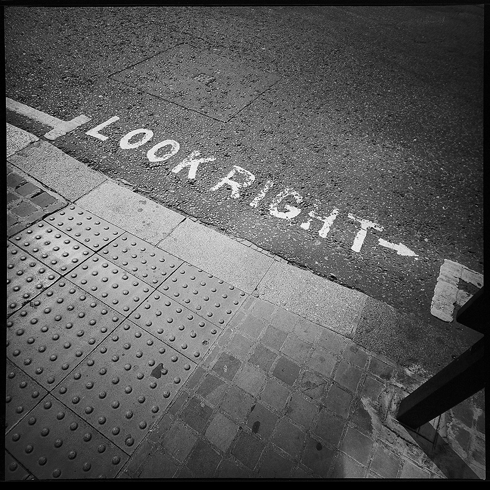
I happened to look down, and then saw this admonition to “Look Right ->”. I found it mildly amusing that traffic flow was considered so confusing that it was necessary to tell people which direction to look before crossing the street. And I love the crunchy texture of the pavement and sidewalk. This is at the corner of Finsbury Square where it abuts City Road in central London.
This is another image from the Lomo LC-A 120. The only real reason I ever mention the cameras I use nowadays is to prove a point about there being little to no correlation between the “quality” of camera you use and the quality of the images you make. I have very little control over the LC-A beyond what I point it at, when I choose to trip the shutter, the film I load in it, and the rough guesstimate of the distance between me and the subject. Everything else is really out of my control. But the decisions that are most important are the ones I do have control over – what to point it at and when to trip the shutter.
Knowing my camera and how it records images is also helpful to getting what I want out of the image, of course. But this image above would have not been any more successful if I shot it with a Hasselblad Superwide, a Rolleiflex TLR, or my Fuji XT-1, each of which offer far more control and precision than the LC-A.
Today was my session of the “Meet & Shoot” class I co-teach with several other instructors at Photoworks. The class is a five or six session workshop on street photography where each instructor takes a group of students out for a guided photography excursion to a location of their choosing. Students can sign up for all sessions, or pick and choose which ones they want as their schedule and/or instructor preference dictates.
This time, I had three new students and three repeat students from the last time I taught this class. Due to some last-minute scheduling snafus, three of the students were unable to make it, so it was a very intimate walkabout, and I was able to teach as much as I was playing shepherd.
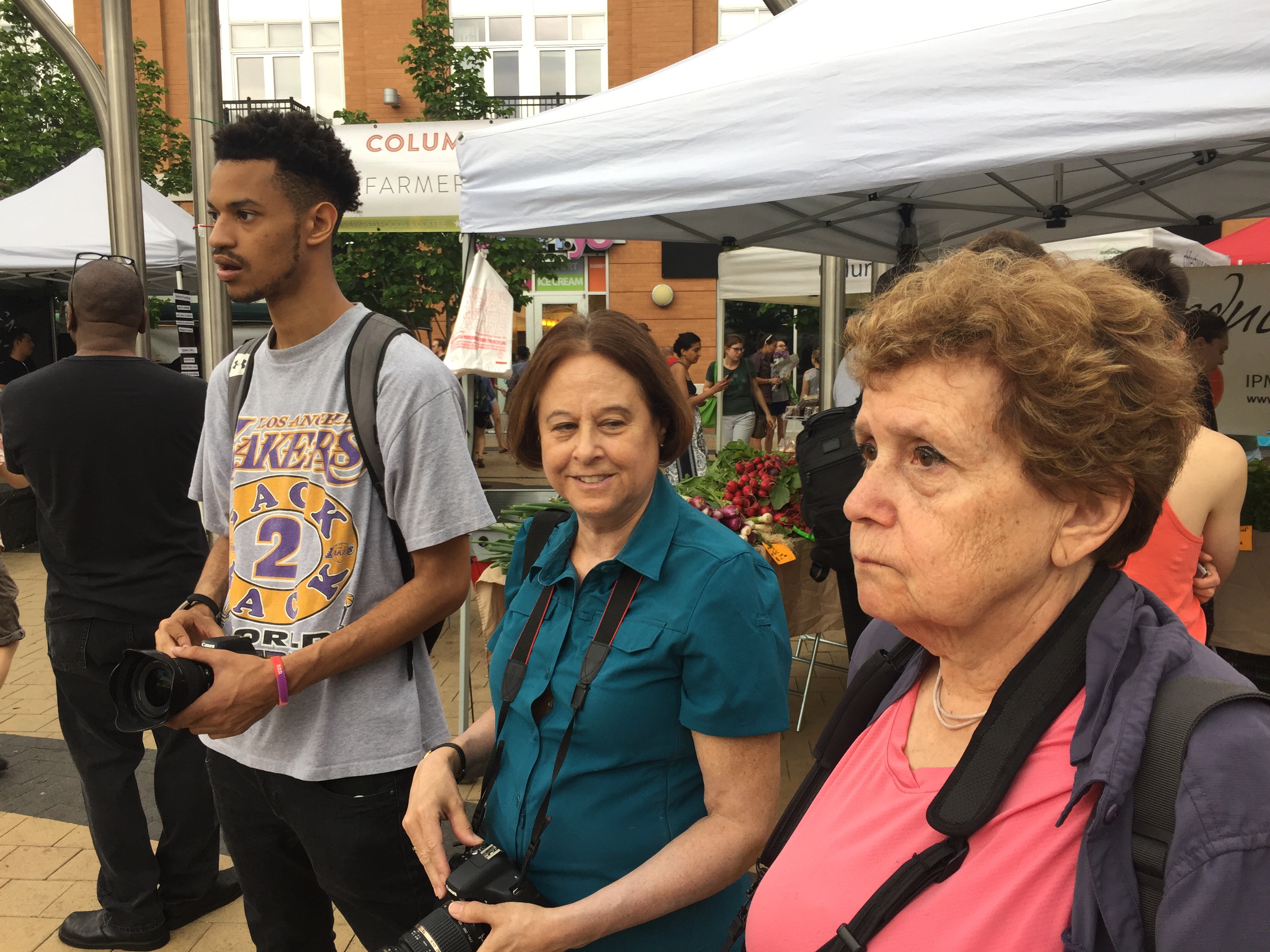
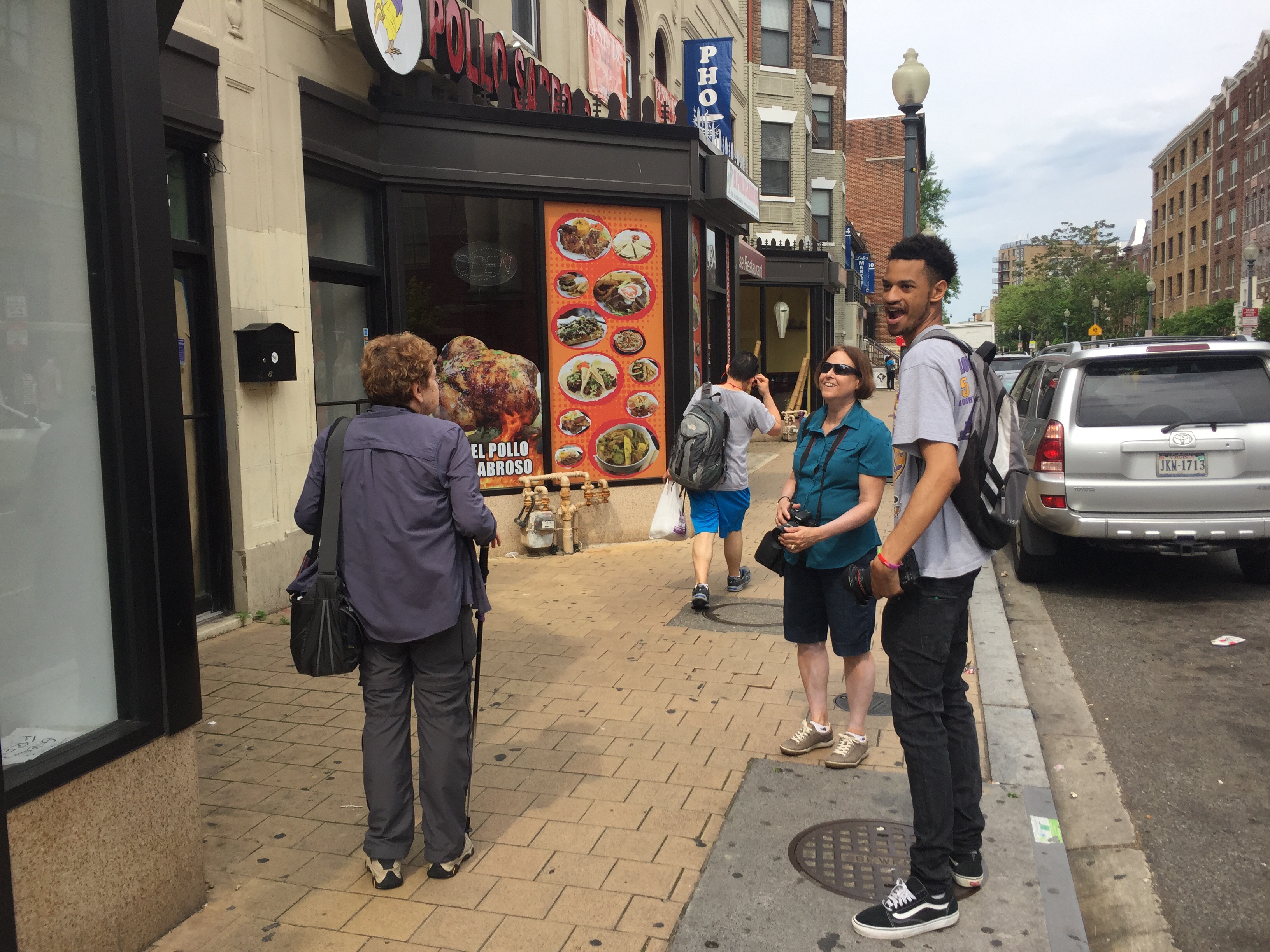
We met at the Columbia Heights Metro station, and once the crew was collected, we took a walk up to the little plaza in front of the Tivoli Theater where a saturday farmers market was in full swing. My three students, seen below (L to R: Matthew, Suzan and Bobbi) wandered around and took full advantage of my guidance for the session to use color as a foundational theme. The farmers market was a perfect opportunity, with all the fruit and vegetables on display.
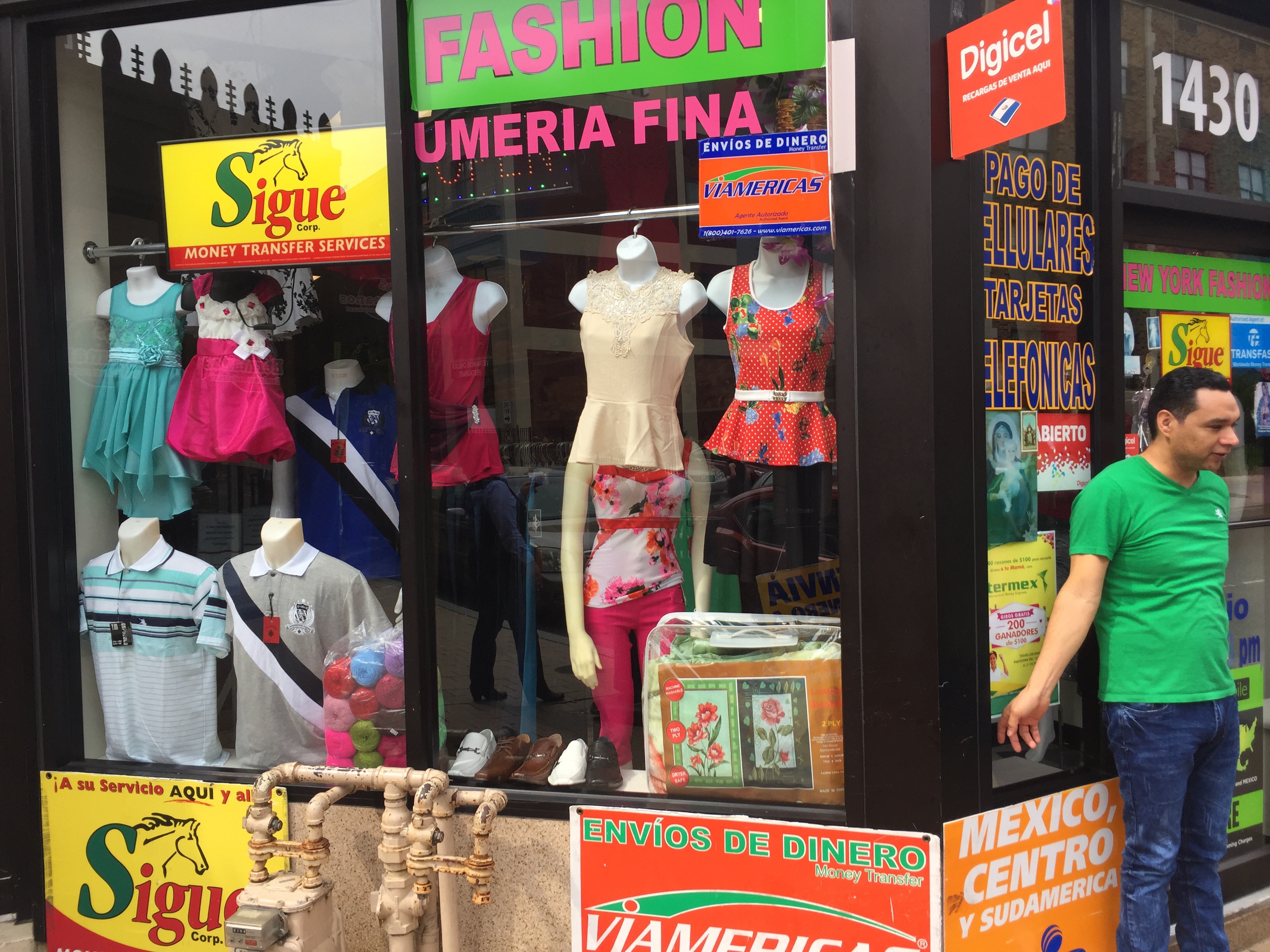
Columbia Heights is an ethnically diverse neighborhood, with a strong Latin-American presence. This is very obvious in the colors and styles of signage on shops and restaurants, and makes for a great subject for a color-based exercise.
Here Bobbi, Suzan and Matthew are examining some signage on a Dominican restaurant on Park Road.
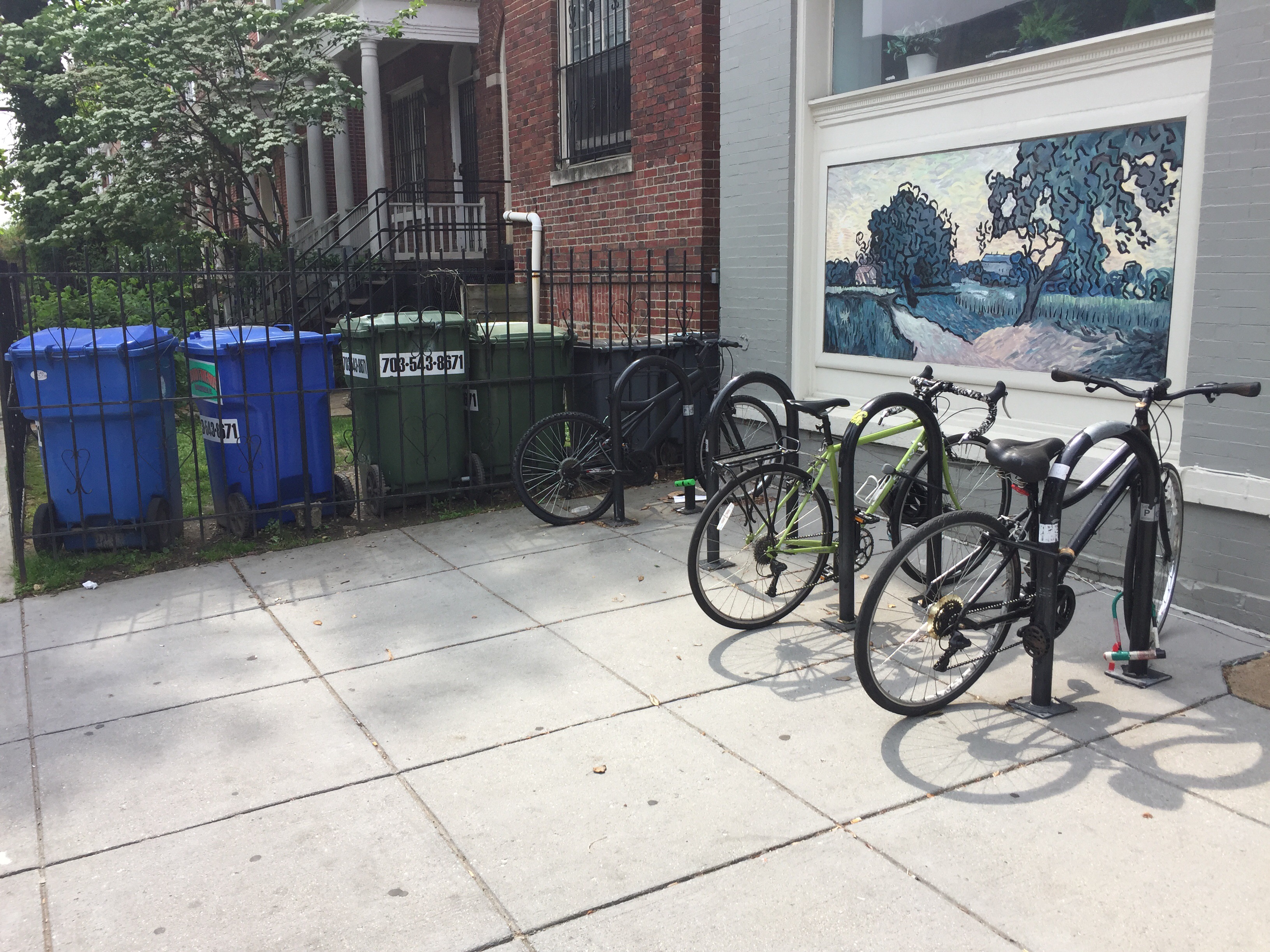
We continued along Park Road over to Mount Pleasant, another neighborhood in Washington DC that also has a significant Latino presence. I took the opportunity to discuss including graffiti and public sculpture in your work as a “street” photographer. If you’re going to include other peoples’ art in your photography, make sure that you have a solid reason for doing so- it’s fair game as documentary, or if your capture and interpretation is transformative (abstract/close-up, for example), but if you’re planning to exhibit and market photos of other peoples’ art, even if it is displayed in public, you’re at best in an ethical gray area, and potentially in a copyright violation scenario.
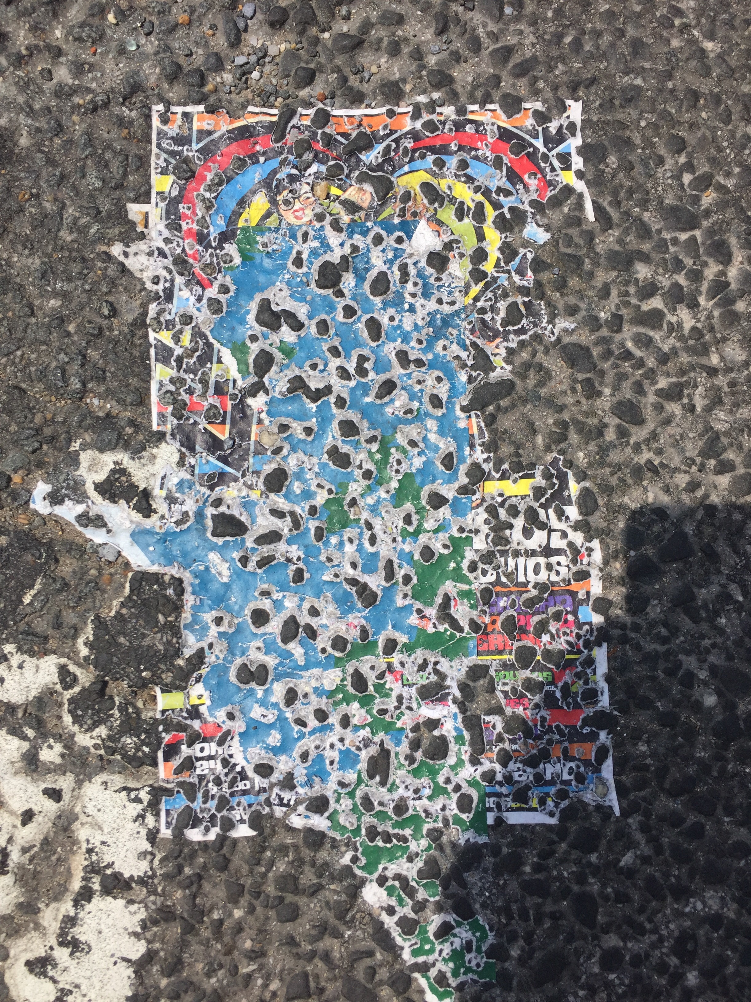
Street photography is very much about found images – you’re not setting out to intentionally create compositions, but rather responding and reacting to things you encounter, like this poster that fell into the street and got run over until the rough pavement surface pierced through turning the whole thing into an abstract composition.
We had a great morning of shooting, and wrapped up for a chat at a cafe on Columbia Road in Adams Morgan (another neighborhood bordering on Mount Pleasant and Columbia Heights). I’m very pleased with my students, and I’m looking forward to seeing their images from today at our recap class in three weeks.
For those unaware of it, fslashd (f/D) is a website devoted to pinhole photography. I’ve had one of my images published on their site as part of their Inspiration of the Week page –
Kier, the editor of the site, also included a few remarks by me about my photography and why I appreciate and enjoy alternative/lensless image-making tools.
Scott Davis is an experienced photographer in historic printing processes, and has recently started to work in pinhole for additional inspiration. He’s developed an appreciation for the simplicity of pinhole and how it lets him focus on the image, not the equipment. As he states: “Working with cameras that don’t have lenses or shutters per se, or at least that have primitive ones, means that serendipity becomes important in my work…What interests me is the capture of whole seconds, minutes and even hours of time in a frame, contrasting the things that move in the scene with things that remain static.”
For anyone interested, he’s also running a call for entries for pinhole work – http://fslashd.com/call-for-entry/. This is your chance to get published not just on a webpage but in an actual physical book.
Over the weekend I went to see the Pier 24 exhibit space in San Francisco. It has only been open for a year or so (the current exhibit is their third ever, I believe). It represents a novel approach to the museum experience in general and photography exhibits in particular. The facility itself is located in one of the old waterfront warehouses along the Embarcadero (thus the name), directly beneath the Oakland Bay Bridge. The interior is divided up into roughly 20 rooms. Admission is FREE, but by appointment only. They allow twenty people at a time for a two hour block, so your distractions during your visit are minimized. Another way they minimize distractions is by having NO wall text – the floor plan flyer you get upon entering has the only labels for the exhibits, consisting of the photographers names who are hung in a given room. Absolutely maddening if you’re not familiar with everyone in a given room, but at the same time, quite liberating because it frees you from having to accept the curator’s “authoritative” context. The current exhibition, up through December 16, is entitled simply “HERE”. The theme is work that in some way connects to San Francisco – either taken in or near the Bay area or by photographers who called it home. Work exhibited spans the range from 19th century mammoth plate collodion images printed on albumen paper by Eadward Muybridge and Carleton Watkins to 20th century Modernist masters like Edward Weston and Ruth Bernhard to color mural prints by Richard Misrach and Larry Sultan, and even a five-minute video clip of the car chase scene in Bullitt with Steve McQueen.
Much of the work on display was not to my taste – I don’t like what has been derisively labeled “hedge fund wallpaper” by some New York gallerists referring to recent deadpan posed-snapshot color mural prints. However, there was enough early imagery to satisfy my inner antiquarian, and now that I’ve seen enough of that kind of work, I’m starting to appreciate it for what it is. I still wouldn’t accept money to hang in my house, but one example finally struck home as to what was going on in the photograph. There was a room with a series of VERY large color prints by Anthony Hernandez of vacant interiors. On the literal surface, they’re incredibly ugly, showing abandoned and/or ruined interior spaces with industrial carpets, missing drop ceilings, and junky furniture. One thing that did catch my eye though was the use of color itself. If you stepped back and looked through a defocused eye, the images became all about abstract color fields, geometric forms, and intersecting planes. The graphic abstract geometry creates a contrast with and tension against the literal detail of the photographic image, making your brain switch back and forth between the two characteristics of the image – the texture of the purple carpet, the gray popcorn ceiling and the white-washed faux-wood paneling in the hallway against the receding, intersecting planes of colors converging on a vanishing point in the far rear of the image. I think it’s this kind of tension in a photograph that has too often repelled me from post-modernist photography – it’s too easy to be fixated on and distracted by the details and not see the whole picture. I still don’t like the “posed deadpan snapshot”, whether it’s printed 4″x6″ or 40″ x 60″. But at least I can start to “get” another genre.