Well, I just got finished loading up film holders in preparation for the next few days’ shooting. I have one shoot scheduled for tomorrow evening after work, and another for Saturday evening. I may well be certifiably crazy for the amount of darkroom work this will have me doing – I’ve got 10 sheets of 14×17, 20 sheets of whole plate (6.5×8.5 inch), and 16 sheets of 5×12 loaded and ready to shoot. I may be even more insane for even considering the jumps between formats. I’ll risk it though because I have so many ideas – I want to try and shoot my three-panel “folding screen” idea on the 14×17 with at least one of my models, I’ve got some more ideas for the “human commodities” series, and I also have ideas for the body panoramas. I’ve got to remember to bring some of my costume pieces from my RenFest outfit tomorrow as well as the shopping bags for the Human Commodities bit. See what I mean about crazy? At least this is a GOOD crazy.
All posts by dcphotoartist
Glen Echo PhotoWorks press release for FotoWeekDC 2011 events
Here is the press release about the Glen Echo Photoworks events coming up for FotoWeek DC. I will be participating in the “Celebration of Alternative Processes Symposium” on Sunday, November 6 and running a demo of Platinum/Palladium printing on Wednesday, November 9. I know a lot of the other presenters and they’re really great people and great artists. This will be a terrific event and I’m really looking forward to it.
|


Reinventing the Victorian Portrait Parlor
Having been a big collecting fan of 19th century studio portraits, I thought it would be interesting to take on the genre and see if I could manipulate the conventions and subvert them while preserving enough visual continuity that you could visually trace the lineage. Here are my first two efforts. I chose diptychs of my models nude and clothed to inaugurate the series; placing the nude image to the left means the nude reads first in a western left-right reading order, giving primacy of meaning, a naturalness, to the nude, which conflicts with conventional social notions of the nude as an un-natural state. It questions the construction of identity through the construction of the clothed figure. I have printed them in palladium, again, to reinforce the stylistic referent to the Victorian era studio portrait through the look and feel of the image tone. Granted the vintage originals would have been printed in albumen, but this is certainly close enough.


Human Panoramas
Here’s a couple of shots I did of Justin, a model from New York, with my 5×12 “banquet” camera. I was playing around with the “panoramic” format for photographing the human body as I think it’s an interesting take on the subject. The human body is after all a pretty good fit for a vertical 1:3 proportion image. I also like breaking “the rules” of composition when trying out some of these ideas, like the horizontal portrait where the head is exiting the frame at the top, and approaches the center of the image. I think I can get away with that one in this shot because the lighting on the background expands the area of the eye’s focus beyond just the face and so it isn’t dead center in the frame.


The Tattoo says “AGAPI” in Greek, which means “Love”.

All the above were printed in palladium on Bergger COT320 paper, a specially formulated paper made specifically to cater to alternative photographic process printers. I’ve got a couple more of Justin that I may post at a later date but I’m happiest with these for now. Justin was a great model to work with, and brought his own challenges (he’s 6’4″ for starters). I really liked working with him and would highly recommend him to others. He understood how to move and pose and create dynamic tension in a still image, which many models don’t understand, and he was willing to strike a pose and hold it unlike many would-be fashion divas who can’t sit still for more than 30 seconds.
New Fixer, and Other Darkroom Topics
A long time ago, back when I was still printing enlarged silver gelatin prints from small negatives, I bought this multi-gallon cube of Kodak Rapid Fixer. I noticed recently that it seemed to have shiny particles in it that I couldn’t filter out, and that used fixer that should have had plenty of life left in it was silvering out on the insides of the working strength bottles I use when processing. This, combined with the sulphur smell it always had, pushed me to try a new fixer. I ordered a couple bottles of TF4 from Photographers Formulary. This stuff is a revelation – minimal odor, faster acting than Rapid Fixer, and they say on the bottle how many square inches of film one liter of fixer is good for.
And here’s a snapshot of my darkroom in action, for the curious:
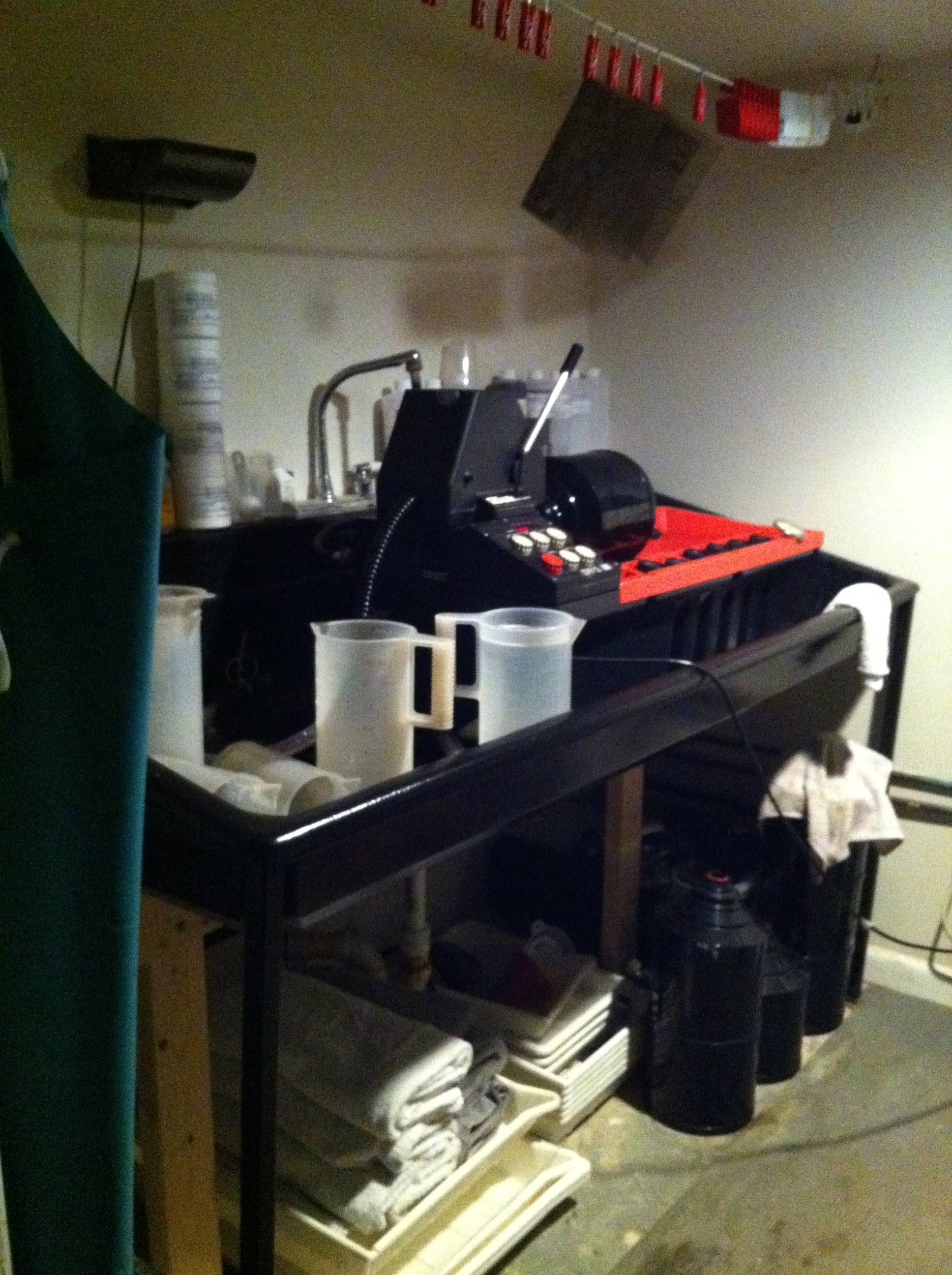
That’s the wet side, with my Jobo CPP2 processor, with the last of the b/w negatives from the San Francisco sojourn in the drum. Tomorrow starts the printing.
Making progress (isn’t this my most common post title?)
Well, I have half of the black-and-white shots from the San Francisco Sojourn developed already, and I also got my UV printing unit re-configured while I was souping film. I discovered the last time I tried to print a 14×17 negative that I didn’t have quite enough coverage and one edge was getting a little under-exposed. I had gone to Home Depot to find another blacklight lamp like the ones I’m using but they don’t stock them in the same size anymore. Fortunately I did have a regular fluorescent lamp in the same size that I can always get a blacklight bulb for, so I got down on the floor on my back and added it to the array (the home-brew UV exposure unit I use is a series of fluorescent fixtures screwed to the bottom of a shelf in an IKEA Ivar shelving unit). Now I just need to find a surge strip that takes 8 outlets instead of the 6 I currently have, and I’ll be good to go again. I also realized that after cleaning out the darkroom the other weekend, I have more storage space for my contact printing frames, so now they’re not sitting out on the floor or leaning up against something when not in use.
Updating the website
It’s been a very long time since I updated my own website, in part because this blog has kept me busy with keyboard time. I finally sat down and made some updates, including adding a link to this site on it. I also did some serious editing of the work on the site as I noticed there were a lot of older images there that didn’t really fit with what I’m doing now. I’m also feeling that I’m not crazy about the site’s look and feel overall, and want to gut the thing and start over. It is fairly clean, but I’m still not loving it. I don’t know if I should stay with the current hosting service or if I should switch. The current site uses Flash, which is becoming more of an issue when dealing with mobile devices as more and more of them are dropping Flash support. Please take a look at it and provide feedback!
San Francisco Sojourn Part 3
Even MORE of my San Francisco images.


All of these were shot with my 240mm Voigtlander Heliar f4.5 lens. It is fast becoming one of my favorite lenses for its rendition of out-of-focus areas. I knew it was a legendary lens for black-and-white shooting, but was unsure how it would render color. As you can see here, it does a beautiful job with color, despite being uncoated. It does give a slightly vintage look to the color palette, but some of that might also be the film I’m using – Kodak Portra 160 NC.
Pier 24 museum in San Francisco – a photographic education
Over the weekend I went to see the Pier 24 exhibit space in San Francisco. It has only been open for a year or so (the current exhibit is their third ever, I believe). It represents a novel approach to the museum experience in general and photography exhibits in particular. The facility itself is located in one of the old waterfront warehouses along the Embarcadero (thus the name), directly beneath the Oakland Bay Bridge. The interior is divided up into roughly 20 rooms. Admission is FREE, but by appointment only. They allow twenty people at a time for a two hour block, so your distractions during your visit are minimized. Another way they minimize distractions is by having NO wall text – the floor plan flyer you get upon entering has the only labels for the exhibits, consisting of the photographers names who are hung in a given room. Absolutely maddening if you’re not familiar with everyone in a given room, but at the same time, quite liberating because it frees you from having to accept the curator’s “authoritative” context. The current exhibition, up through December 16, is entitled simply “HERE”. The theme is work that in some way connects to San Francisco – either taken in or near the Bay area or by photographers who called it home. Work exhibited spans the range from 19th century mammoth plate collodion images printed on albumen paper by Eadward Muybridge and Carleton Watkins to 20th century Modernist masters like Edward Weston and Ruth Bernhard to color mural prints by Richard Misrach and Larry Sultan, and even a five-minute video clip of the car chase scene in Bullitt with Steve McQueen.
Much of the work on display was not to my taste – I don’t like what has been derisively labeled “hedge fund wallpaper” by some New York gallerists referring to recent deadpan posed-snapshot color mural prints. However, there was enough early imagery to satisfy my inner antiquarian, and now that I’ve seen enough of that kind of work, I’m starting to appreciate it for what it is. I still wouldn’t accept money to hang in my house, but one example finally struck home as to what was going on in the photograph. There was a room with a series of VERY large color prints by Anthony Hernandez of vacant interiors. On the literal surface, they’re incredibly ugly, showing abandoned and/or ruined interior spaces with industrial carpets, missing drop ceilings, and junky furniture. One thing that did catch my eye though was the use of color itself. If you stepped back and looked through a defocused eye, the images became all about abstract color fields, geometric forms, and intersecting planes. The graphic abstract geometry creates a contrast with and tension against the literal detail of the photographic image, making your brain switch back and forth between the two characteristics of the image – the texture of the purple carpet, the gray popcorn ceiling and the white-washed faux-wood paneling in the hallway against the receding, intersecting planes of colors converging on a vanishing point in the far rear of the image. I think it’s this kind of tension in a photograph that has too often repelled me from post-modernist photography – it’s too easy to be fixated on and distracted by the details and not see the whole picture. I still don’t like the “posed deadpan snapshot”, whether it’s printed 4″x6″ or 40″ x 60″. But at least I can start to “get” another genre.
For more information about Pier 24, visit their website: http://www.pier24.org
San Francisco Sojourn Part 2
More of my San Francisco images.


While I was out shooting these photos, I was approached by a number of people to talk about the camera, which I’ve come to expect. ALMOST all of them are very interested in what I’m doing, what’s the story of the camera, how old is it, etc. And then you get the occasional joker, like the fools driving past me in their Porsche sedan who had to roll down the window and shout, “Haven’t you heard of a thing called digital? Why haven’t you gotten with the program yet?” To which I responded – ” This (my 5×7) is a half a Gigapixel”. I smiled politely, turned my back, and muttered to myself, “so bite me”. Which is actually a bit of an understatement – a 2000 dpi scan of a 5×7 negative is 1.4 gigapixels.

