Here’s the first print in the wash from the 14×17 still-life shoot I did a week ago. Looking at the negative I was worried it would be too thin to print well in palladium. My fears as you can see were totally unfounded. This was a straight palladium print with 33 drops of Pd, 33 drops of Ferric Oxalate (FeOx), and 2 drops of NA2 (sodium platinum) as a contrast agent. The paper is Bergger COT 320.
Category Archives: Antique Processes
Happy birthday, Daguerreotype!
Just a quick note – today marks the 172nd birthday of the Daguerreotype. It was on this day in 1839 that the French government declared the Daguerreotype process “free to the world” (after buying the patent rights from Daguerre in exchange for a life pension). Vive la France!!!
New Daguerreotypes coming!
Well, new to me that is…
I’ve been off the collecting kick lately because I had some more gear and supplies to buy for my own photography. I found a pair of 14×17 inch film holders that fit my Canham 14×17, and although they’re not a color match for the other three, they’re more than good enough – the external dimensions are identical, so they
re an exact fit, which is the most critical factor when looking for such things. Oh, and they’re less than half the price of new ones that do match my existing holders.
So, with that holdup out of the way, it’s on to more collecting. Two daguerreotypes and a milk glass ambrotype are en route. Daguerreotypes are much more familiar to most people, so I’ll save further commentary until I have them to show. A milk glass ambrotype though- you might wonder what is it? Simply, it’s an ambrotype on a piece of white, opaque glass. Not so simply, to get the image to show, you create a collodion negative the same way you would if you were planning to make albumen or salt prints. You coat a second wet plate onto a piece of milk glass (a white/opalescent glass), then separate the negative from the milk glass with a thin wire or shim or anything that will keep the collodion original very close to but not in contact with the new wet plate. Expose and process as normal for collodion. You end up with a positive on the milk glass (a negative of a negative is a positive). Because of the extra labor involved, they’re somewhat rare. The one I’ve got coming is a very small (1/9th plate size) oval portrait of a young woman, done with a very attractively executed vignette, in a red velvet case. I’ll post pictures as soon as I get it in my own hands. I have no idea who she is or what she did for a living, but something about the outfit feels like a nurse’s habit. Maybe it’s the vignette giving a subliminal halo to the woman adding to the impression – who knows? It probably is a civil war era image, but if that’s true, she’s probably not a nurse, as most of the official requirements for nurses during the civil war requested that they be doughy, extremely plain of looks, and past marriageable age. This girl is none of the above.
A Non-Silver Manual now available for free
I just needed to put in a good plug for this book. It’s what I learned gum printing from, and contains some very useful information on other alt processes. The book is “A Non-Silver Manual: Cyanotype, Vandyke Brown, Palladium & Gum Bichromate with instructions for making light-resists including pinhole photography”. It was available for sale for many years in a soft-cover spiral bound edition directly from the author, Sarah Van Keuren. Mrs. Van Keuren has decided that she no longer wants to maintain the book and deal with the printing and shipping, so she is making it available chapter by chapter for free to download on www.alternativephotography.com If you want a hard copy, you can contact the publisher of AlternativePhotography.com and see about remaining stock.
Upcoming classes/exhibits/jurying
I’ve gotten some further confirmation, so I can post more information about this now:
I’ll be showing work at PhotoWorks in Glen Echo, Maryland as part of PhotoWeek DC 2011. I’ll be displaying my platinum/palladium prints and talking about the process as part of a show-and-tell event on Sunday, November 6. I’ll update with links when they have a schedule of events published. I’ll also probably be doing a process demo some evening that week or the following weekend, November 12-13, and a full-fledged workshop in the spring of 2012.
On a separate note, I’ve been asked to be a judge next weekend at the Howard County Fair’s Home Arts department photography contest. If you’re going to be in the neighborhood, stop by and say hello and see the entries in the contest.
The Last Full Measure: Tintypes/Ambrotypes from the Civil War. Liljenquist Collection at the Library of Congress
For those who haven’t been following this, a few years ago the Liljenquist family (father and three sons) began collecting civil war cased tintypes and ambrotypes. They amassed a collection of over 700 images, of which approximately 10% have been identified. They range in size from 1/9th plate to 1/2 plate, and in subject matter from Union and Confederate soldiers to children, wives, mothers and family members in mourning, officers and enlisted and both slaves and freedmen. The collection is currently on display at the Thomas Jefferson building of the Library of Congress. Although small, the display encompasses some 300 images: some two hundred and fifty Union soldiers and their families and some fifty Confederates. One of the most striking images in the collection is the former slave and his family, a wife and two daughters, posed with him in Union uniform. It makes an interesting parallel that 150 years ago, this man was fighting for his freedom, and today, a very similar man with a very similar family sits in the White House, President of a nation radically remade by the sacrifices of that African-American soldier. Other highlights include the little girl dressed in mourning attire, holding a photo of her father who quite possibly she never knew, and the picture of the confederate soldier accompanied by a letter back home to his family describing how he died on the field of battle. A mourning necklace is also on display: the pendant is an oval gutta-percha case containing the photograph while the chain supporting it is woven of human hair, most likely from the woman who made it and whose husband is depicted inside the case.
The collection is astonishing in its scope and specificity, as well as for the collecting acumen displayed by the Liljenquist family. The family still collects at a furious pace, and so the Library has asked them to make their donations quarterly, instead of weekly as they had been doing, to give the curators time to catalog and preserve their donations. The collection in its entirety will be available online through the Library of Congress’ website in the near future.
Link to the collection: The Last Full Measure: The Liljenquist Collection at the Library of Congress
They also have the collection on display on the LoC Flickr feed entitled “Civil War Faces“. They welcome input from the general public as part of the effort to identify the subjects of the photographs.
More photos from the Connecticut weekend
I don’t think it is obvious from these pictures, but one of the most striking qualities of carbon prints is the high relief surface. They look as much like etchings or engravings as they do photographs. This is caused by the hardening of the gelatin during exposure. Gelatin areas hardened retain their pigment and maintain density. Areas unexposed dissolve during development, leaving a void in the surface.
Photo Weekend in Connecticut
This past weekend I went up to Rocky Hill, Connecticut (just outside Hartford) to attend a two-day, three evening seminar and get-together, sponsored by the New England Large Format Photography Collective (NELFPC). The main theme of the weekend was to learn about digital negative making and carbon printing. The side benefit was most people brought examples of their current work to share and show after hours. What a terrific weekend! Our instructor for the weekend was Sandy King, an elder statesman for the chemical wet darkroom. A specialist in carbon printing, he is also the inventor of Pyrocat-HD (and its variants), a film developer with special benefit for people working in antique and historic photo processes.
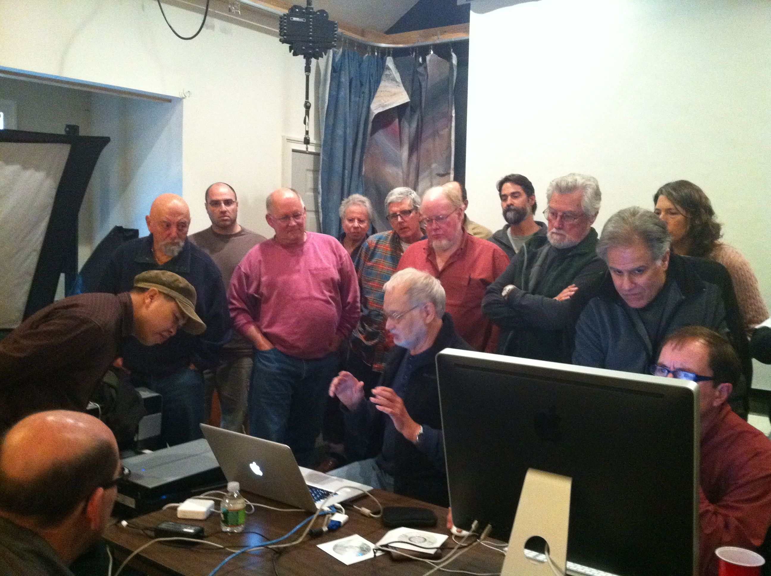
Day one began with displays of some of Sandy’s carbon prints, and a discussion of digital negative making. Sandy does still use ultra-large format cameras from time to time (he has a 20×24 with 12×20 and 10×24 reducing backs), but he mostly travels with medium format gear and then scans his film to enlarge it digitally. He demonstrated the Precision Digital Negatives system for making digitally enlarged negatives, and discussed the benefits and flaws. He then discussed the QTR (Quad Tone RIP) method which has significant advantages over the PDN system, but is far more user-unfriendly to configure. We then scanned some film and made digital negatives to print from the next day.
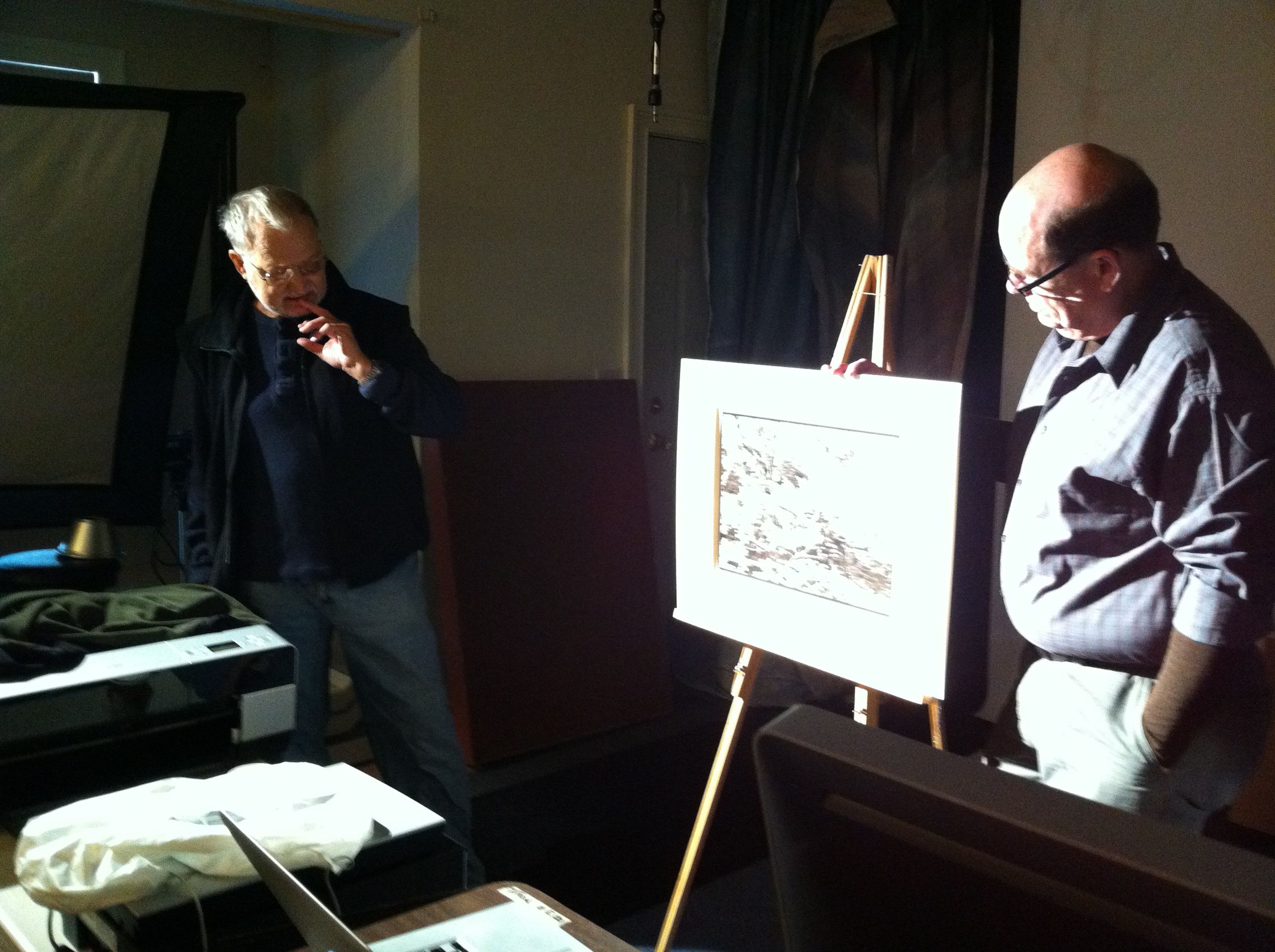
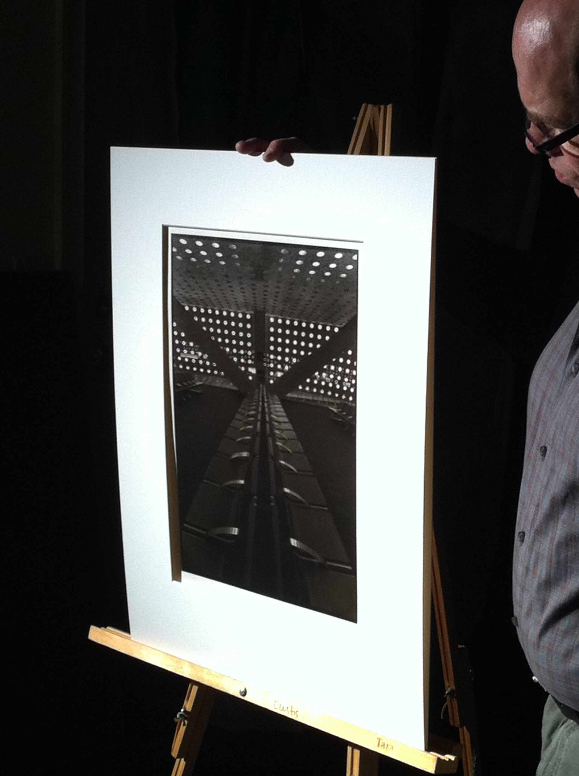
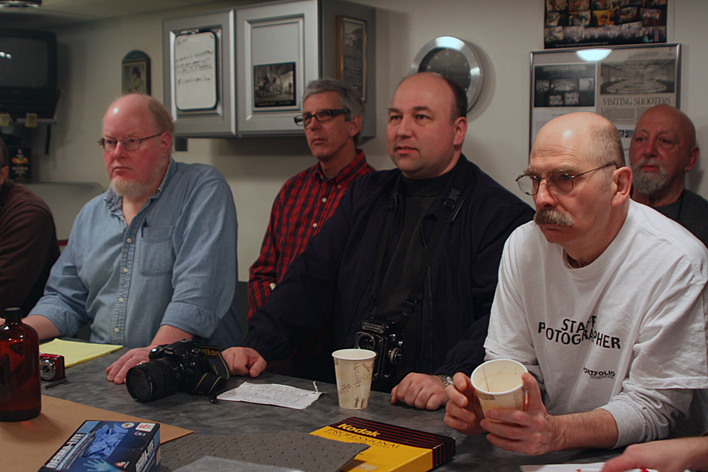
After all the computer wonkery was finished for the day, dinner was served and the prints to show came out. I showed my two bodies of work, the platinum/palladium travel shots and the male nudes in gum and platinum I’ve been working on. Both series drew a lot of comments and praise, which was very nice. I was especially tickled when certain individuals who I hold in very high esteem made a point of complimenting me in private.
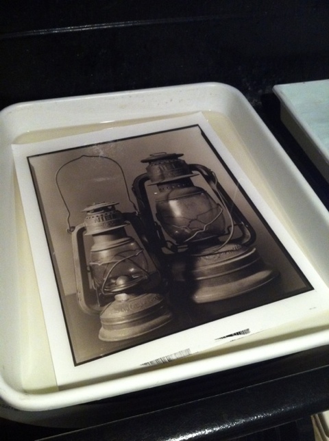
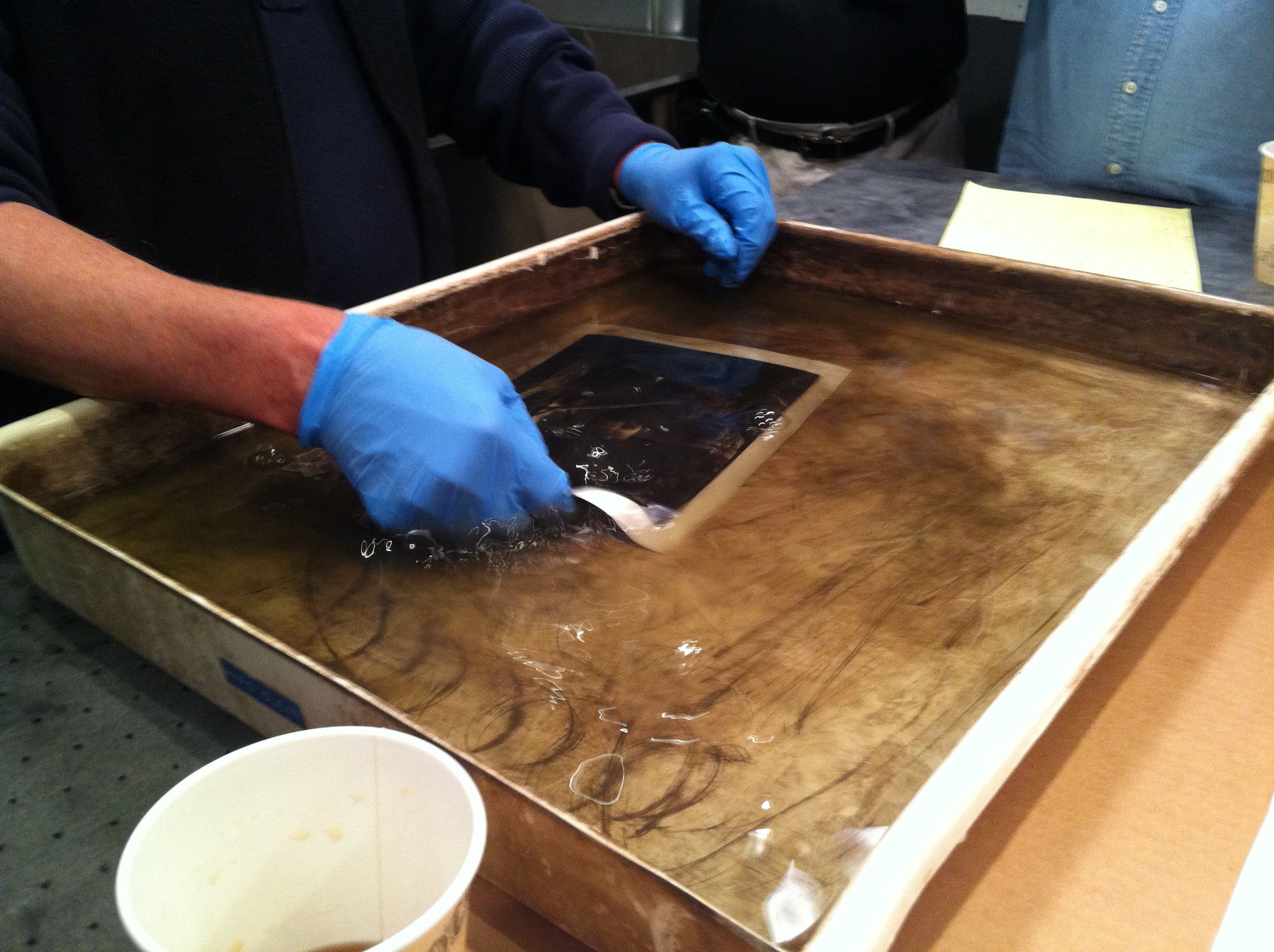
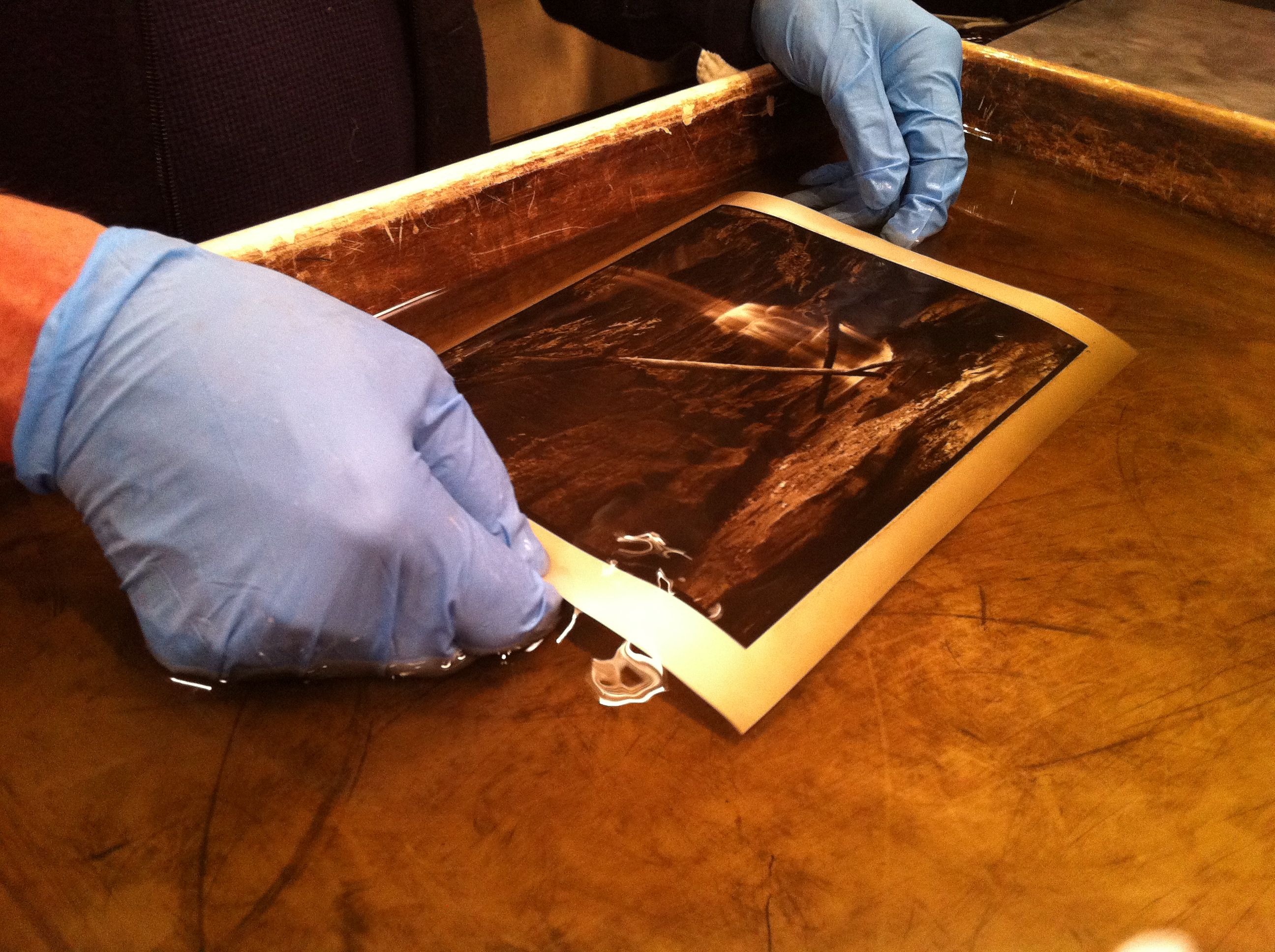
The next day we got down to the business of printing. Carbon is water-activated, like gum bichromate, and uses the same dichromate as a sensitizer. To make a carbon print, you first coat a gelatin and pigment (india ink mixed to taste with other pigment(s) to adjust the tone warmer or cooler) layer on a thin, flexible but non-absorbent medium (mylar or other similar material). This is your donor tissue. You then sensitize it with an ammonium dichromate and alcohol mix, dry it in a cool, dark place, then sandwich it with your negative, emulsion to emulsion, then expose to UV light. After exposing, you put your receiver paper (it can be anything from art papers to fixed-out silver gelatin paper) in a water bath, allow it to swell. After a minute, put the exposed carbon tissue in the water and sandwich it to the receiver paper. continue for another minute and a half or so, then take it out of the water. GENTLY separate the two, then place the receiver in another bath of warm water. You’ll see the image come up in the water bath. You can use a clearing bath as well, but it is not required. The clearing bath will greatly reduce washing time though, so it is a good idea.
To me, while learning carbon printing from a master printer was an awesome reason to travel 400 miles, the bonus that made it worth the effort was meeting the people who attended. Steve Sherman (the beyond generous host – we used his gigantic and brilliantly designed darkroom for the printing sessions and his living room for the show-and-tell sessions, general hanging out, and consuming all the amazing food), Gene LaFord, Dave Matuszek, Jack Holowitz, Glenn and Marie Curtis, Sandy King, Jim Shanesy and Diwan Bhathal (fellow Washingtonians and my travel pals for the trek up and back), Alex Wei, Armando Vergara, Robert Seto, Tim Jones, Paul Paletti just to name a few all made the weekend a really enjoyable experience and I am dying for the next one!
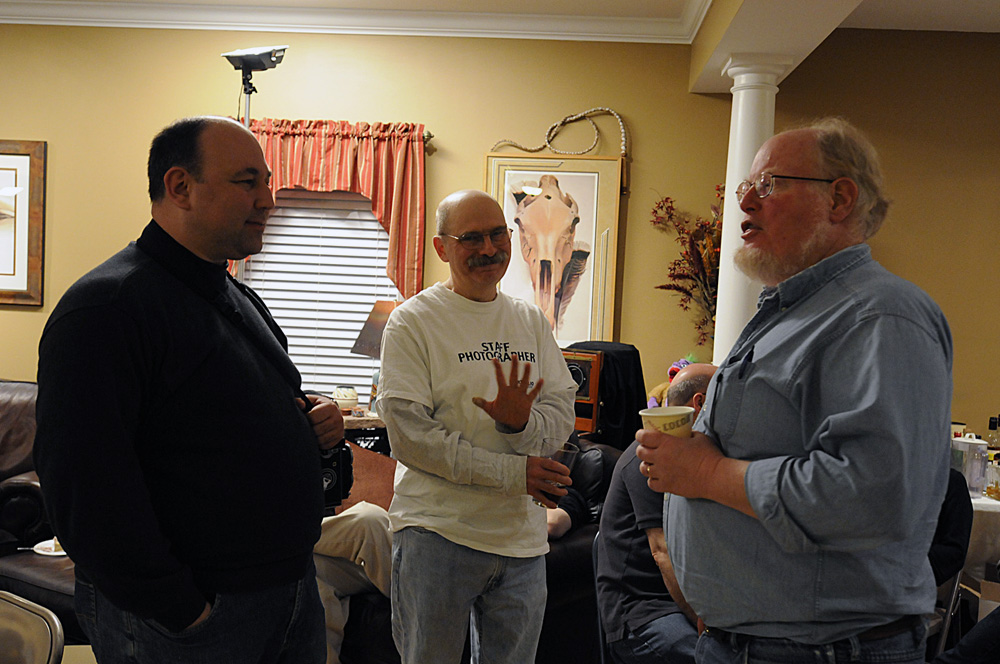
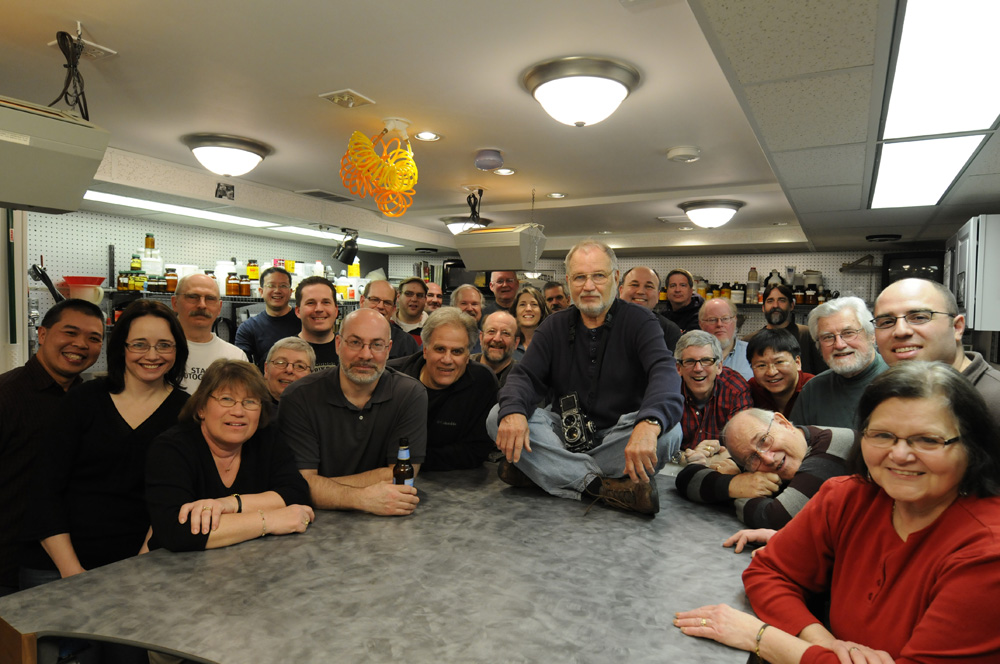
In the group photo, the one on the right, Sandy King is the one with the rolleiflex in his lap – which happens to be my rolleiflex. When I can get the negatives from the trip scanned, I’ll post some shots here.
Katherine Thayer passes away.
Katherine Thayer passed away this week. She was a major figure in the alternative process photographic community, and a great source of wisdom and knowledge when it comes to gum bichromate printing. Her loss will be felt around the world. I never met the great lady myself, but we did have several exchanges online and via email about alternative process printing, and I know that I miss the opportunity to have met her. Fortunately, her website is still up, and so even though she is gone, her knowledge does not vanish with her. It can be found at http://pacifier.com/~kthayer/.
Stieglitz Steichen Strand at the Metropolitan Museum
Over this past weekend I went up to New York to see the Steiglitz, Steichen and Strand exhibit at the Metropolitan Museum of Art. I had been hearing about the show from a number of people and wanted very much to see it based on their comments, but approached with some apprehension, as rumor had it that the show was too darkly lit and hard to see. That assertion was patently not the case – the only reason it was hard to see the show was the milling hordes in the exhibition salons. Bad for me, good for the museum, as it means attendance is at healthy levels.
The show features three seminal figures in early 20th century American photography – Alfred Stieglitz, Edward Steichen and Paul Strand. Stieglitz is the connection between Steichen and Strand, as it was through his gallery and publications such as Camera Notes and Camera Work that both other artists were launched to the public. Steichen and Strand represent opposite ends of the art photography spectrum in many ways – Steichen was very much in the photography-as-painting school of soft focus lenses and heavily manipulated prints, whereas Strand, who got his beginnings in the same theoretical approach, represents the “new” photography-as-photography idiom that declared photography should be accepted as an art form for its own merits, rather than try to emulate painting or drawing.
Stieglitz’s work in this show bridges both schools. Works ranging from his early New York street scenes and his Equivalents through his Georgia O’Keefe nudes and his late “straight” photography which returned to New York City as viewed from his gallery and apartment windows. The Strand work on display did little for me – they had a limited selection of his Mexico portfolio, which is his most interesting work to my taste.
As an aspiring gum bichromate printer and quasi neo-pictorialist, the work of greatest interest to me was the Steichen segment of the exhibit. Were it not for the constant need to evade elbows and heels, I could easily have spent an entire day looking at just the Steichen room, studying the prints. On one wall, they had Steichen’s “The Pond – Moonlight”, and three variations of the Flatiron building, representing the descent into twilight and nightfall. I had only ever seen these prints reproduced in books before, and so no book reproduction can do them justice. Previously, I had no idea the scale of the originals – I envisioned them to be at most 8×10 inches in size. In fact, the “Pond – Moonlight” and Flatiron prints were something in the 12×15 to 14×17 inch size range – quite dramatic. Not only is the paper surface wrong, but the subtlety of the color palette is lost to the printers’ inks. I have yet to figure out how Steichen did it, but the gum image itself had a surface to it that was as if they had in fact been lacquered, not formed from multiple exposures in sensitized chemicals. In other images, notably some nudes, brush strokes were clearly visible, adding texture and movement to the figures. It made me wish that Steichen were still alive or that I could go back in time to interrogate him about his gum materials and techniques.
Unlike the Steichen work, Paul Strand’s images were very much in the scale I was used to seeing them reproduced. However, the majority of his work whether silver gelatin or platinum/palladium was a rich brown color, printed dark and low in contrast. Most reproductions tend to boost the contrast and render his work in black/white/gray tones, which gives a very different impression of his work.It is perhaps the Strand work at the show that made people feel that the exhibit was under-lit, as his work is printed dark enough that it is hard to view in anything other than brilliant illumination. The rationale for this difference between original prints and reproductions I can guess at – people are expecting “black-and-white” photography to look, well, black-and-white, and even vintage work is expected to be somewhat contrasty. It is entirely possible that Strand went on to print his work with more modern silver-gelatin papers that have the cool-tone black-and-white look we think of today, and this was merely a sampling of his early prints from early images, therefore the book reproductions are not deliberate manipluations of his work – I have not seen enough vintage Strand prints to know.
One last aside – I saw a number of Stieglitz prints marked “Silver-Platinum prints”. I’ve never seen or heard of this particular medium before, so if any of the assembled ears here have any input on what makes a “Silver-Platinum Print”, please pass that along!


