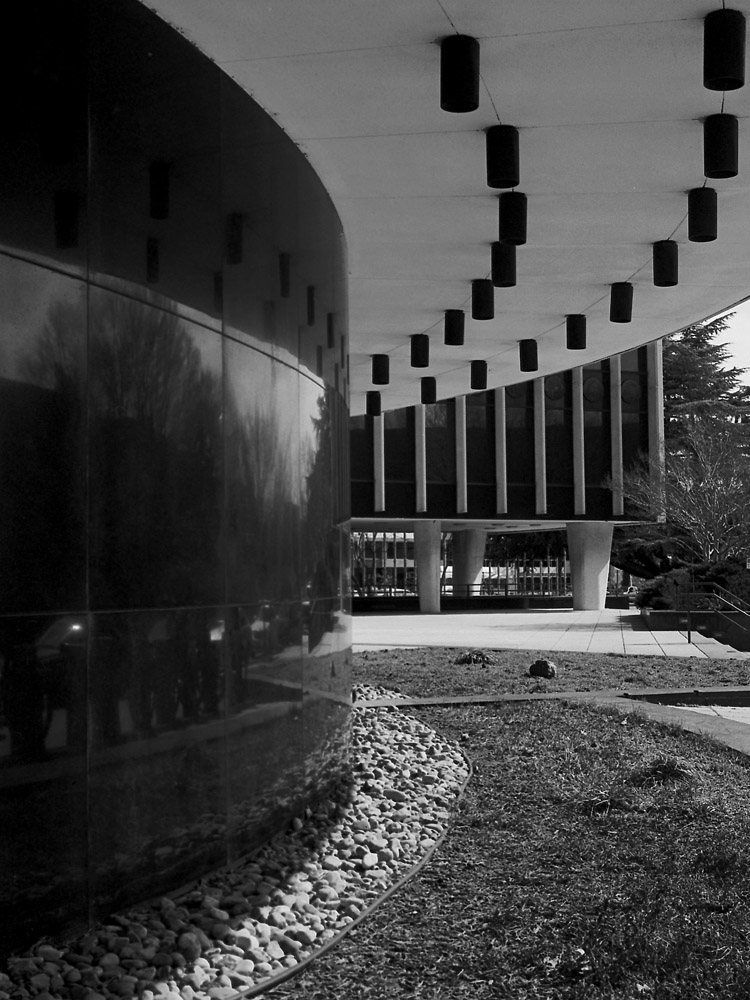
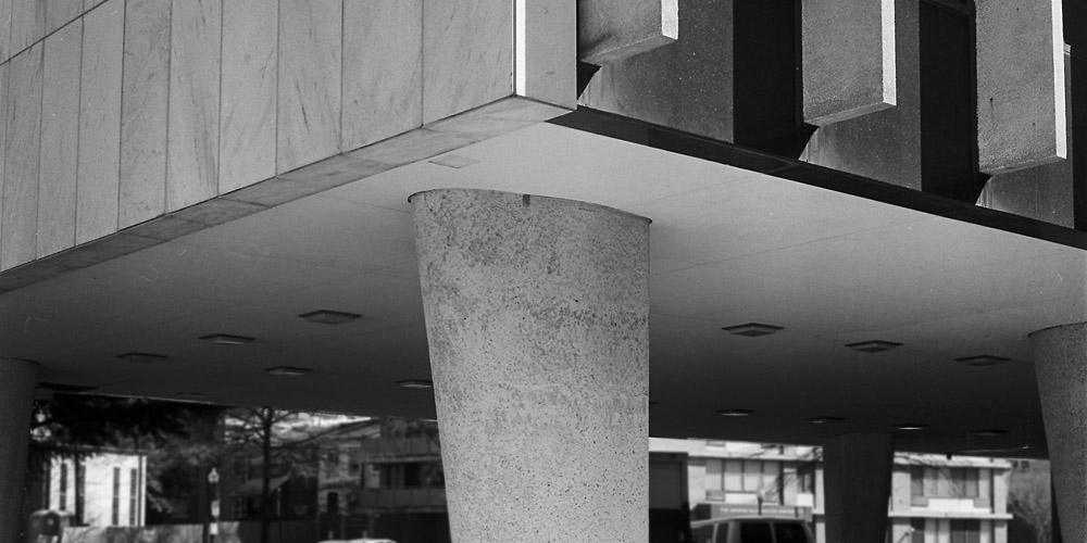
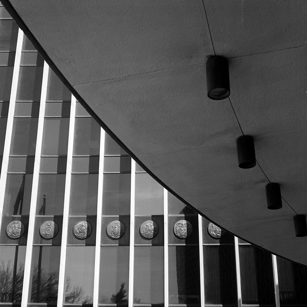
A few more from the World Health Organization building. These I cropped more than I normally do for compositional purposes. I mostly compose and print full frame, but in these cases, including everything the camera saw didn’t match what I was thinking and feeling when I shot the image.
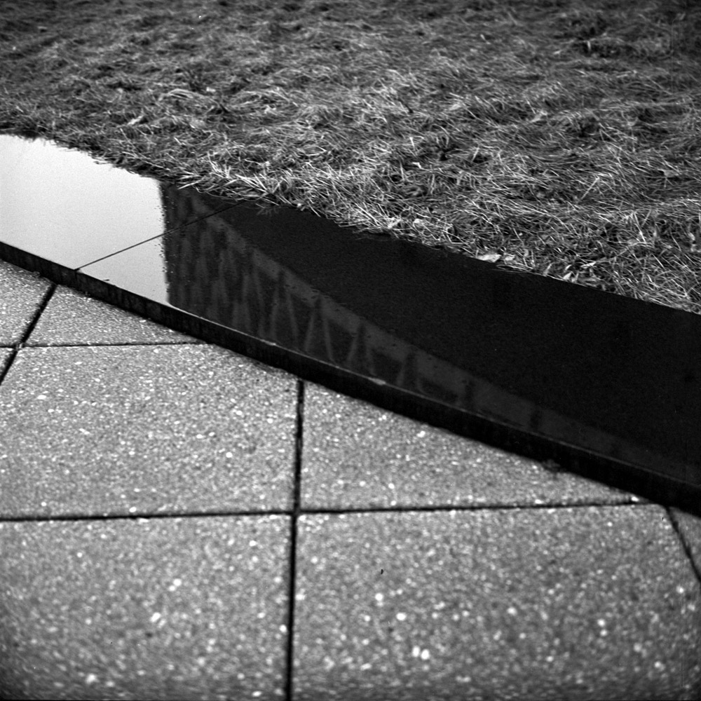
With the Curves image, I wanted the reflection of what’s across the sidewalk from the building showing in the black granite slabs, but I didn’t want much of the vegetation in the background to intrude and directly conflict with the geometry of the building. The grass in the foreground stays in because it is bordered and bounded by the curved lines that echo the shape of the building and the can lights above.
World Health Organization Curves
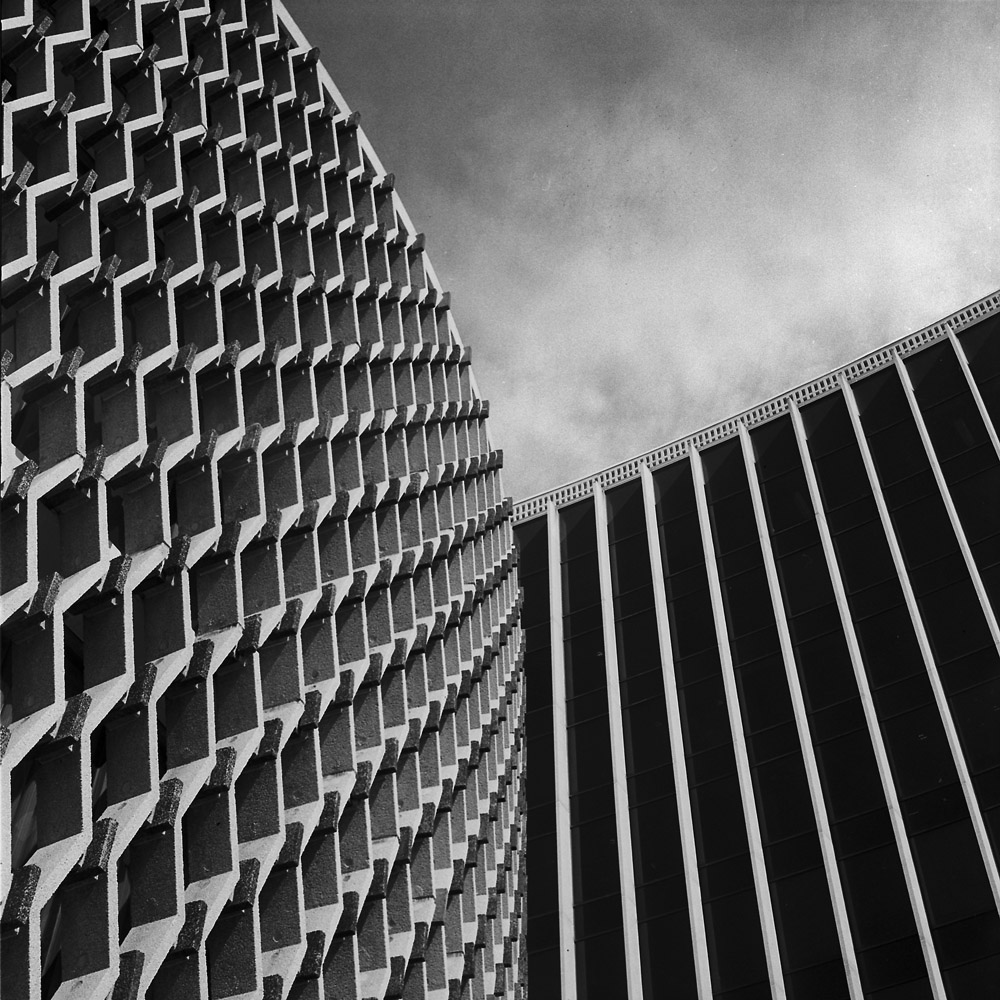
I was mostly interested in the organically shaped column supporting the building, and the dynamic angles of the superstructure it points to. Keeping in too much foreground robs the energy of the image, and including more of the superstructure overweights the top.
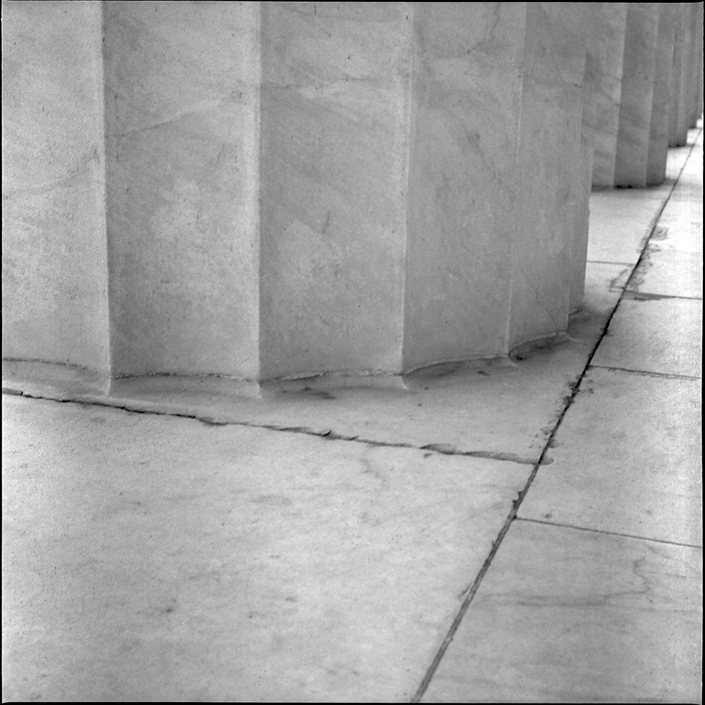
As part of a monthly (well, bi-monthly, in reality) group photography exercise, I and the other participants go out and take pictures on a theme. Whoever picks the theme judges the submissions, and the winner gets to pick the next theme. The current group theme is “Stone”. Therewith, here are two entries I submitted. I still have until the end of the month of April to submit, so I may get out and take a few more that are perhaps more literal.
Lincoln Memorial Column
My first submission is this column and the plaza beneath it on the side of the Lincoln Memorial. I went for a challenge of the white marble because white-on-white is tough to photograph well.
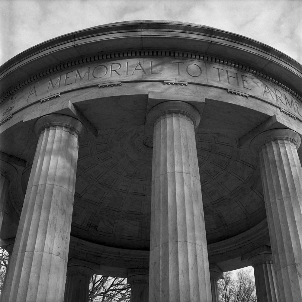
WW I Memorial, Washington DC
This is a tight shot of the Washington DC World War I memorial. Did you know that there is NO national WW I memorial? There is a national Korean War memorial, a national Vietnam War memorial, and a national World War II memorial, but the WW I memorial on the National Mall is for veterans and the dead of WW I from the District of Columbia. It is on the south side of the National Mall, between the Korean and WW II memorials, tucked back in the trees, and overlooked by most tourists and visitors, and probably even most natives of Washington DC. I like the elegant simplicity of the WW I memorial – none of the architectural and symbolic bombasticism of the WW II or the stilted drama of the Korean War monument. I hold this one up with the Vietnam wall as one of the best. It is very much a piece of its time – the end of a psychological era when death could still be dignified.
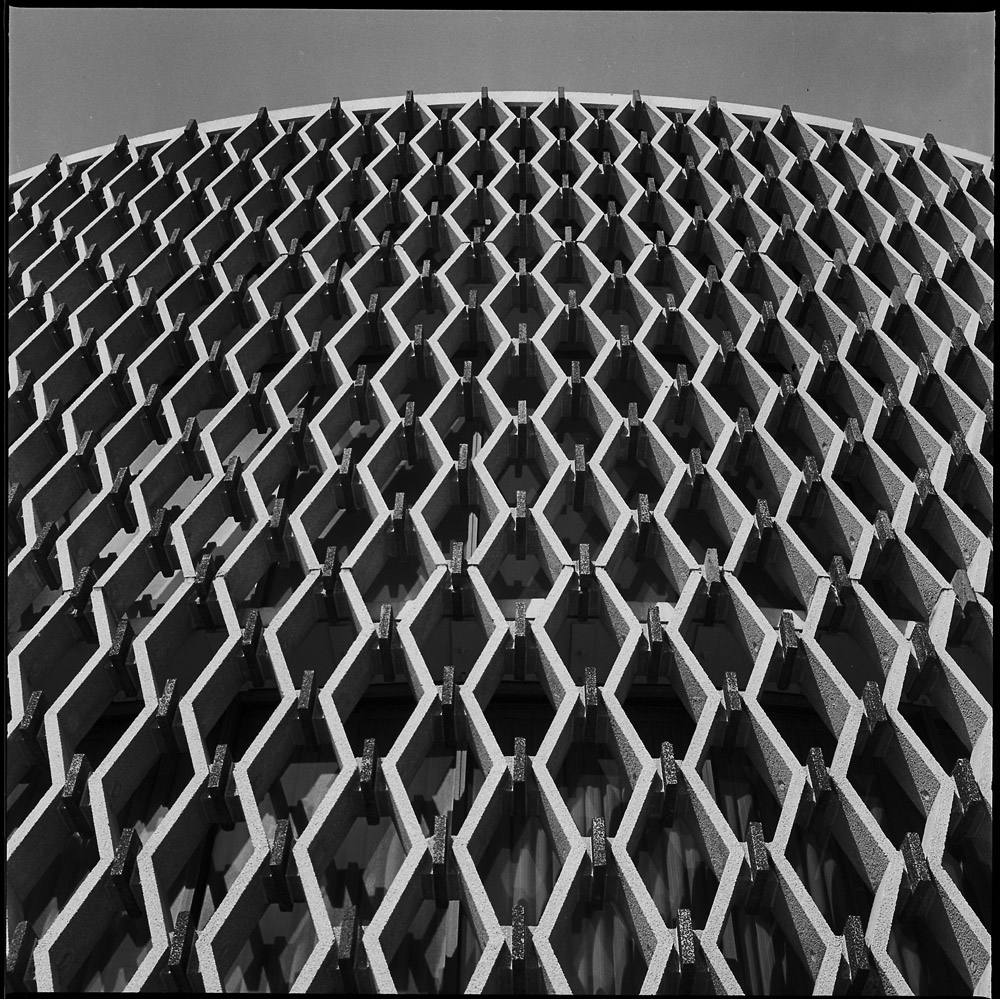
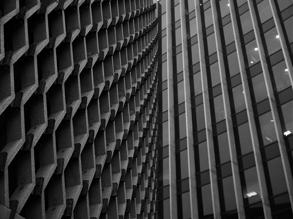
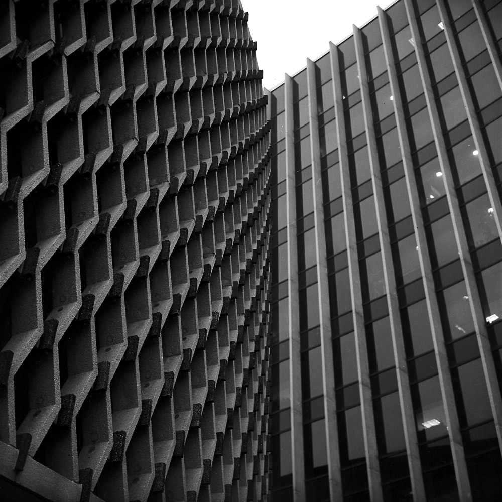
A different perspective on the World Health Organization building, looking up from under the cylinder at the tower. Not quite as abstract as the other two, but nonetheless.
Two different takes on the WHO building downtown DC. This time shot in bright, strong, contrasty sunlight. Due to the geometry of the building I was aiming for geometric abstractions, composing so the context of the structure was absent and what is visible has to be taken non-literally.
World Health Organization, Cylinder
Pointing the camera vertically to create these images really pushes the perception into unreality – you’re dealing with three texture sets, not anything particularly identifiable. Mid-century architecture like this is a rare commodity in DC – most buildings are either glass-and-steel cubes, neoclassical faux-palaces, or Art Deco boxes of varying degrees of interest and value, so this really stands out.
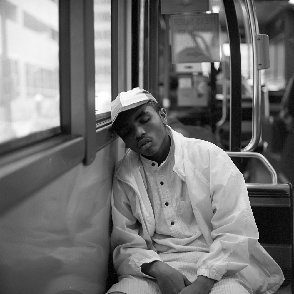
This is a one-off, as it stylistically doesn’t really fit with the rest of the Commuter Diary series. But it’s a really great image, so I’m posting it. I saw this young man dozing off on the bus on my way home from work the other day. It’s very representative of that kind of moment all of us have had when riding public transit – you’re tired, in need of a rest, and hoping you won’t oversleep your stop.
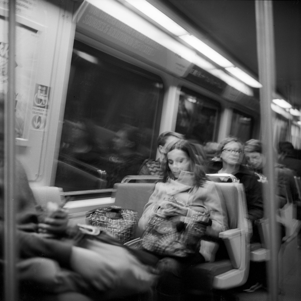
So far I’ve mostly been focusing on the infrastructure of commuting – the trains, the buses, the buildings, the mechanical bits. Here are a few shots of the human side – the reason the infrastructure exists in the first place.
It’s an all-too-common sight on the train or the bus – someone taking up two seats with their stuff. It doesn’t really matter when the train is more empty than not, but on a busy, full train during rush hour, well… it’s downright rude. Thus, the question gets asked, even if only in an internal monologue – “did your bag also buy a ticket?”. Did Your Bag Buy a Ticket?
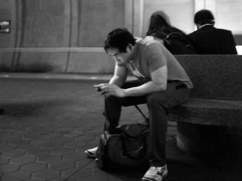
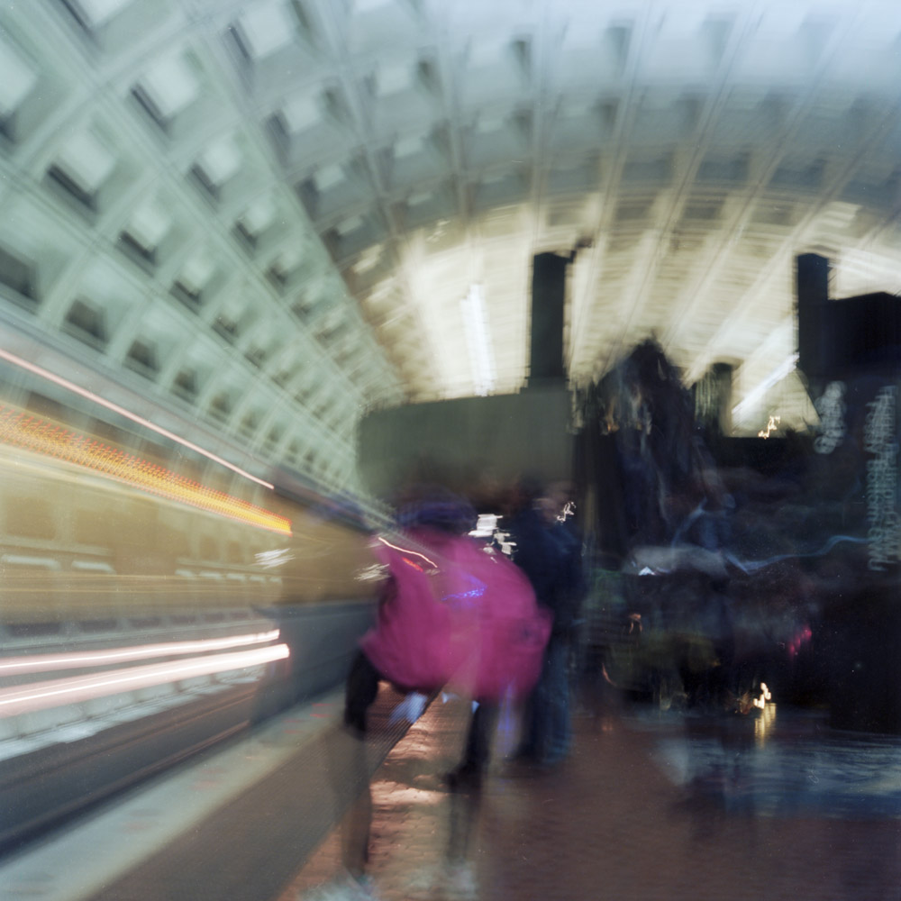
Another very common part of the commuting experience is waiting. Waiting for the bus, waiting for the train, waiting for someone to come pick you up at the bus stop or train station. With the omnipresence of smartphones, nobody reads books or newspapers any more – instead it’s little glowing screens that light up their face with a deathly pallor as they hone in with a zombie-like intensity on the images and text being fed to them by an iSomething.
Waiting With Phone
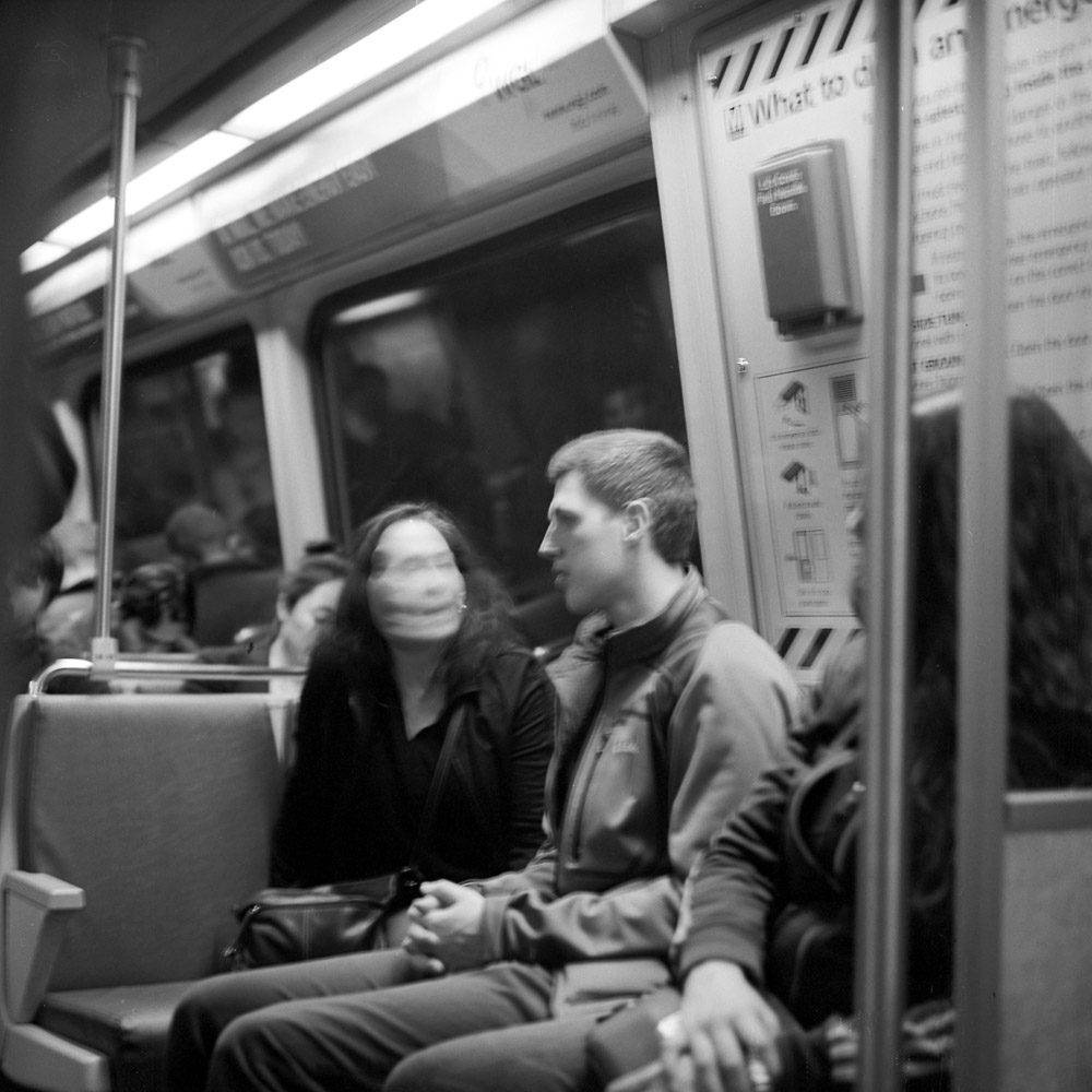
An interesting side effect of the way I take these photos is seeing what does and doesn’t move over time. This poor woman looks like she has hair of concrete as her face moves but her hair doesn’t.
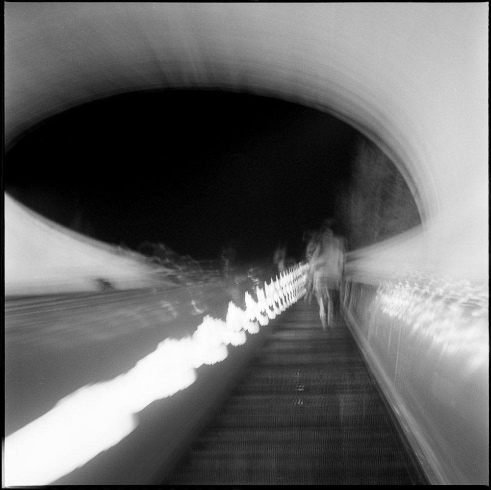
I often use the Dupont Circle metro station not so much as a part of my commute but for going out on weekends or after work. These images are actually in a bit of a reverse order from how they were taken, going from streetside to platform. Dupont Circle’s escalator is legendary for its length – it is a very steep, very long escalator, but NOT, all legends to the contrary, the longest in the Metro system. The longest is actually at one of the outer suburban stations, Glenmont. Bethesda is also very long and very steep, longer than Dupont. Once I timed it to prove to a friend that Bethesda is longer, and it takes some 30 seconds longer to ride the Bethesda escalator to the top than the Dupont Circle escalator.
The entrance to the Dupont Circle station on the Q Street side is the one that has the long, deep escalators. It also has a relatively unique architecture with a circular aperture. Inscribed in the marble around the entrance shaft is a quote from Walt Whitman about the soldiers he nursed in the Civil War hospitals of Washington DC. The inscription was added in 2006 to honor the caregivers who gave so much of themselves in the fight against AIDS – Dupont Circle was particularly ravaged by that scourge, having been the heart of the gay community in DC. While perhaps no longer the geographic center of the gay community (it has moved to other, cheaper, and more geographically dispersed locations as times and attitudes have changed), Dupont Circle is still the spiritual home.
Dupont Escalator, Topside
The quotation reads:
Thus in silence in dreams’ projections,
Returning, resuming, I thread my way through the hospitals;
The hurt and wounded I pacify with soothing hand,
I sit by the restless all the dark night — some are so young;
Some suffer so much — I recall the experience sweet and sad . . .
The poem in question, first published in 1865 as part of a collection called “Drum-Tips”, was originally titled “The Dresser”, and re-named “The Wound-Dresser” in later publications. In my image, the inscription is not legible, but the escalator tops plunge over the precipice of the entrance like a waterfall into a cavern, taking you down into the unknown.
The view looking up the escalator is equally vertiginous. Exiting at night you emerge from the confined but bright space of the underground into a dark circle of the open night sky. You’re falling UP into a different unknown.
Dupont, Looking Up
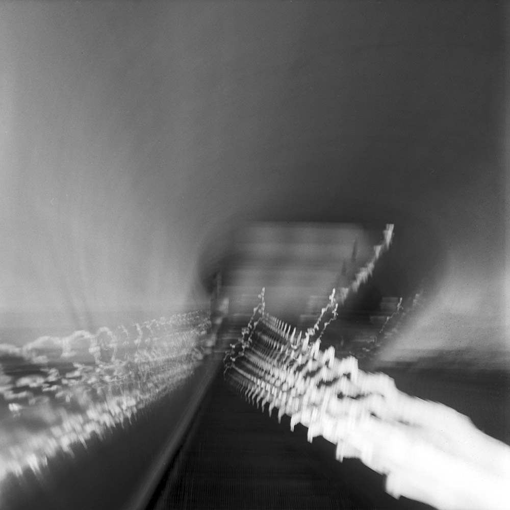
Turning around and looking back down at where you came from, it’s a bit like Orpheus and Eurydice or Lot’s Wife, looking back at whence you came. Fortunately, the only time there’s instant regret is in the depth of winter when it’s 15 degrees F outside and the wind is whipping your face. And you don’t turn into a pillar of salt.
Looking Down, Dupont
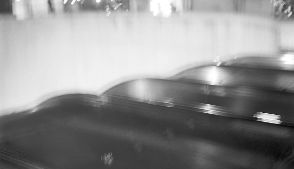
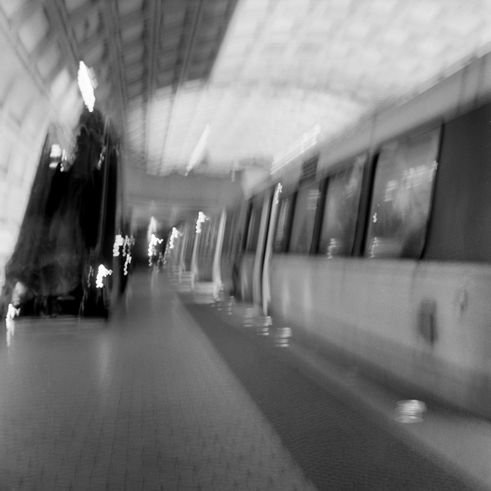
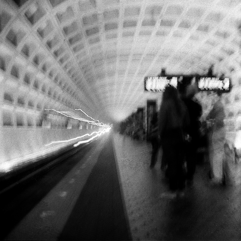
The flow of traffic up the escalator at the Dupont Circle platform:
Dupont Circle Platform
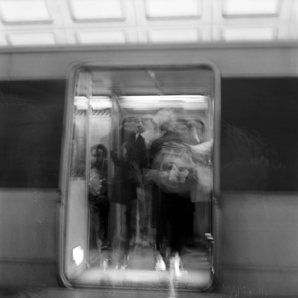
Boarding the train:
Entering Car
Sorry if I can’t wax poetic for every image. It’s just as the mood strikes and the juices flow. Maybe if I have a show of this work I’ll edit my better bits of commentary out of the blog into quotes on the wall as captions for the images.
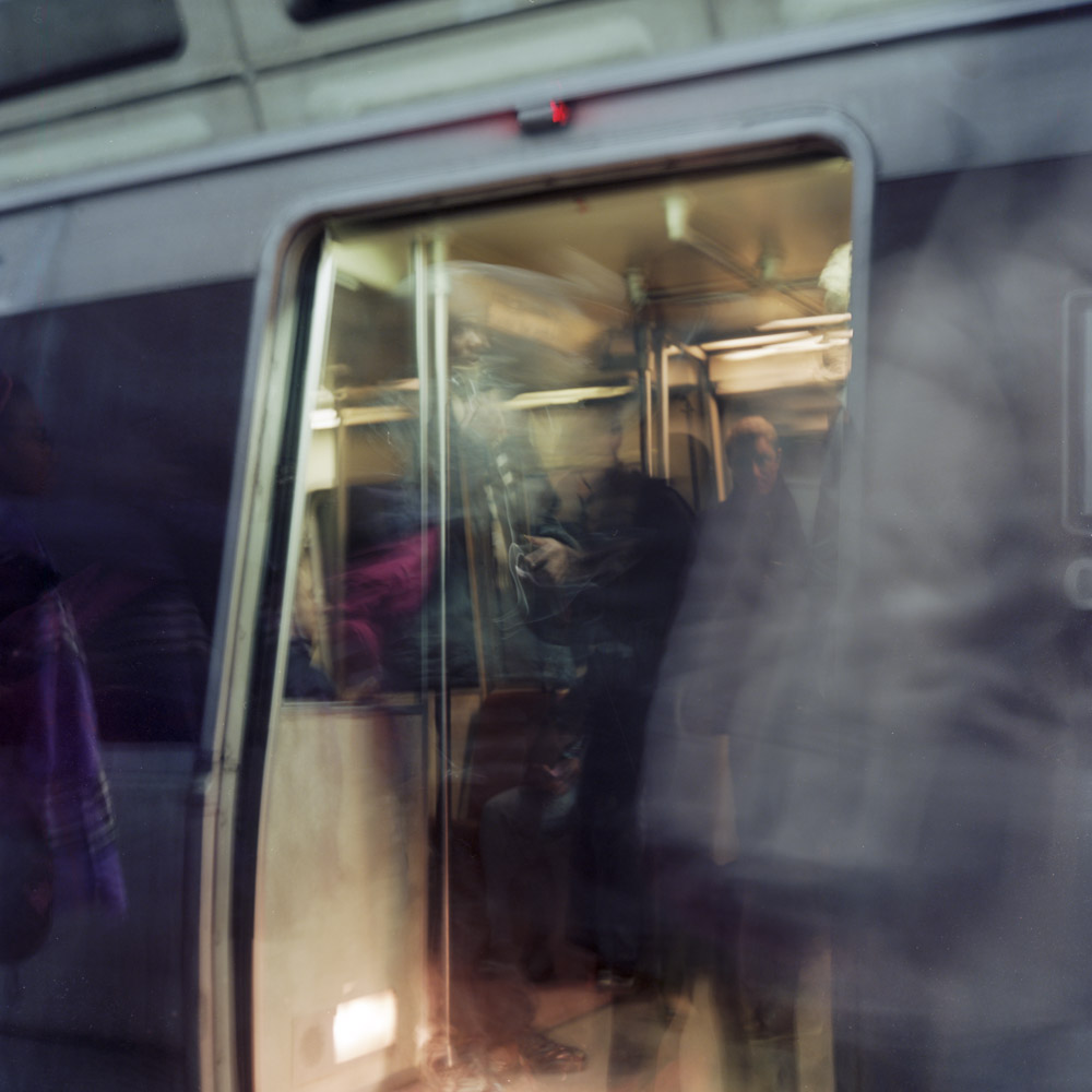
Look at these which are very similar to some I’ve done in black and white and note how different they feel for one being in color the other monochrome.
Pulling In, GWUMetro Train Arriving, Archives Station
Don’t you relate to them differently?
Another example of the emotional effect of color- outside the train is dark, cold, and muted color, whereas inside is warm, glowing, alive and inviting. Wouldn’t you rather be inside the train than outside?
Tangentially related to my commuter diary in that it’s something I pass frequently, here are some shots of the World Health Organization’s offices in DC. The mid-century design lends itself extremely well to composing abstracts.
At the edge of the lawn, there is a ring of black polished marble creating a border with the concrete pavers of the plaza. It was raining that day, and the marble was particularly reflective, so I composed a frame that shows the cylindrical drum structure reflected at a tangential curve running through the marble band bisecting the frame. It’s a presentation of contrasts in textures, organic vs man-made, structure and chaos.
Pavers, Reflection, Grass
Many people feel that you can only take photos in certain weather/lighting conditions. Except for the getting wet/cold bit, I like photographing in the weather – it’s a different kind of light, creating different textures and volumes from the same subjects. I plan on heading back with my camera on a nice sunny day and shooting the building again with deep, long shadows making the structure much more abstract and contrasty. I like being versatile in my photographic style, and I like recording light on subjects as I see it when I see it – if that means photographing at noon on a bright sunny day, so be it. Now, I may be out somewhere at noon on a cloudless sunny day and see something and say, wow- that’s an interesting subject, but I can’t get the shot I want because the contrast is too harsh. If that’s the case I won’t waste the film and I’ll come back another day. But by the same token, I’m not going to play refusenik and leave my camera at home between the hours of 9 am and 5 pm because the light is ‘too harsh’. Ditto cloudy days, rainy days, snowy days… there’s something to be seen and photographed 24 hours a day, 7 days a week, and you can’t do it if you don’t have your camera.
Here are two different crops of the drum and tower structures of the WHO building.
WHO building
On the one hand, the tighter crop is more abstract, being only about contrasts of pattern and texture, sharp focus and soft-focus, but the square uncropped image has more breathing room and gives you more of a sense of what you’re looking at. I don’t know that you need to be able to read the buildings as buildings in order to get the most out of the image – it could even be distracting/attenuating because you stop thinking about what you’re seeing once you KNOW what you’re looking at.
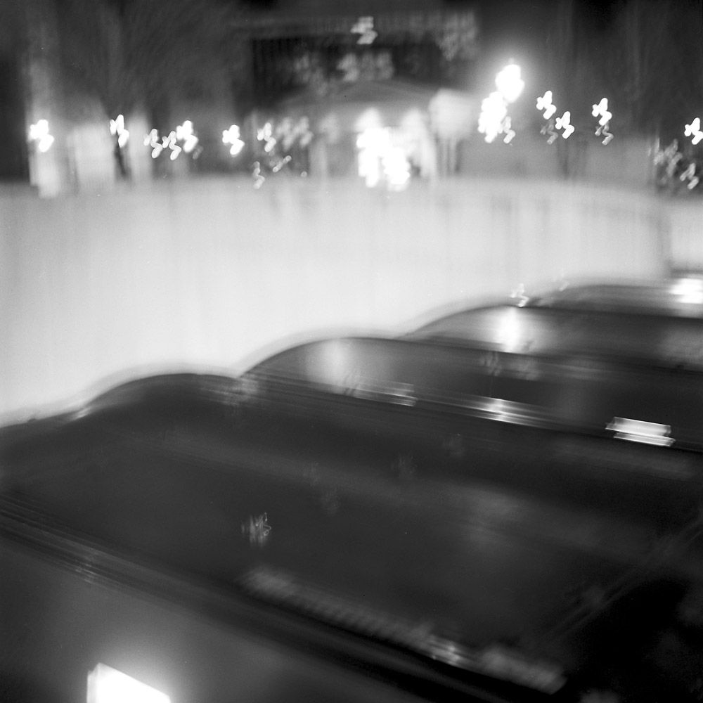
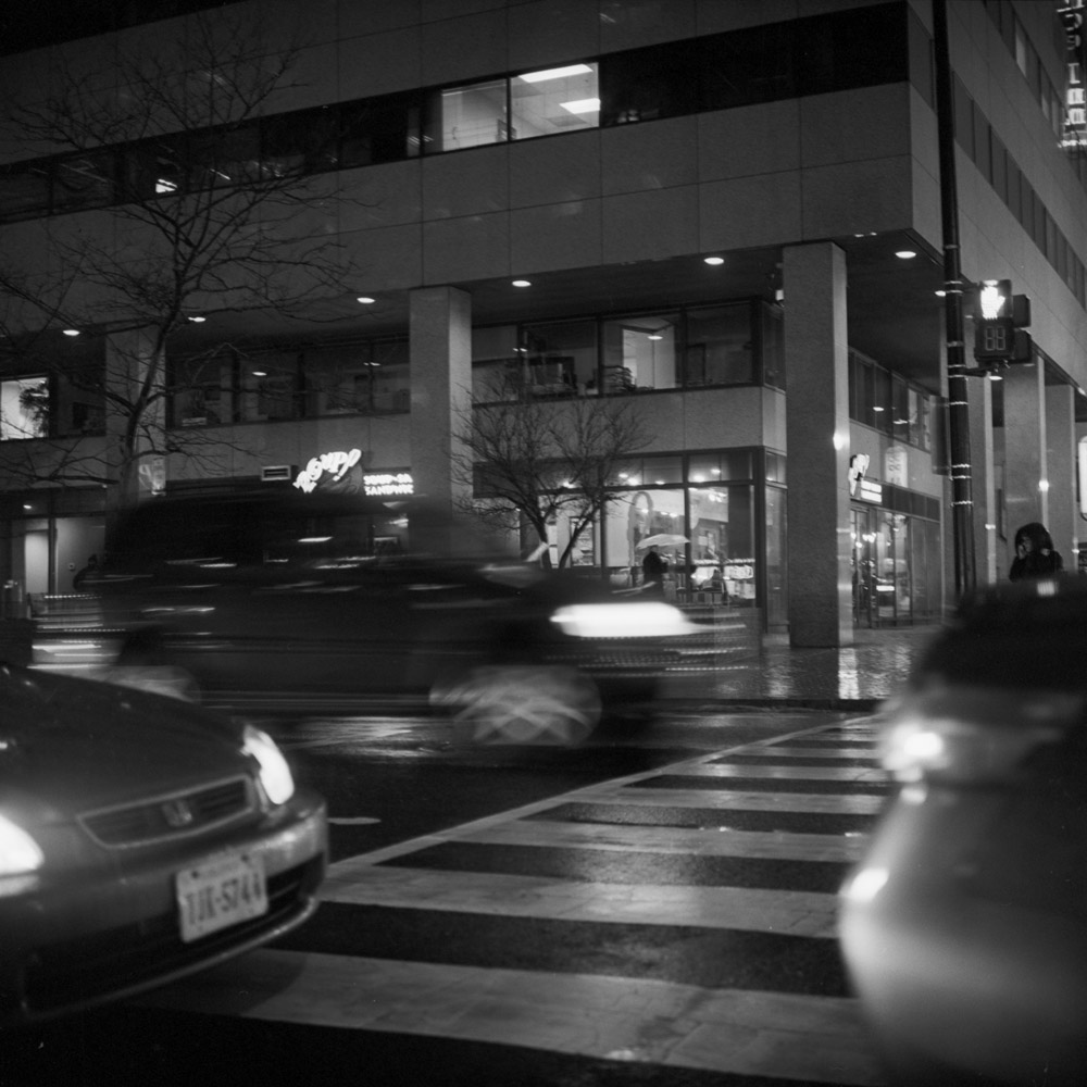
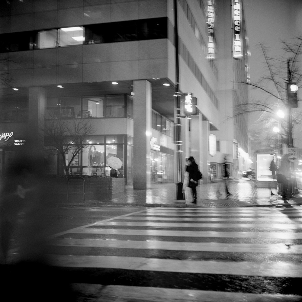
Another installment in the commuter diary. I’m debating if they really belong in the series because there are some things (the buildings and other static structures) that are relatively sharp, and it’s just the moving objects (people and cars) that are less distinct. They are also not so much from a public transit perspective as they are a pedestrian perspective. For now, while I build the project, they’re in, but they may come out later.
Street Crossing, Rain
These two definitely belong together, and they definitely feel like walking home at night in the rain. Waiting for the light to change, traffic zipping by.
Lone Pedestrian
Here a lone pedestrian waits for the light on the other side of the street, while the ghostly blurs of other pedestrians pass by on their way to other places and times. But even she is not clear, because she waits resonant with expectation for the changing of the signal.