Well, I have half of the black-and-white shots from the San Francisco Sojourn developed already, and I also got my UV printing unit re-configured while I was souping film. I discovered the last time I tried to print a 14×17 negative that I didn’t have quite enough coverage and one edge was getting a little under-exposed. I had gone to Home Depot to find another blacklight lamp like the ones I’m using but they don’t stock them in the same size anymore. Fortunately I did have a regular fluorescent lamp in the same size that I can always get a blacklight bulb for, so I got down on the floor on my back and added it to the array (the home-brew UV exposure unit I use is a series of fluorescent fixtures screwed to the bottom of a shelf in an IKEA Ivar shelving unit). Now I just need to find a surge strip that takes 8 outlets instead of the 6 I currently have, and I’ll be good to go again. I also realized that after cleaning out the darkroom the other weekend, I have more storage space for my contact printing frames, so now they’re not sitting out on the floor or leaning up against something when not in use.
Category Archives: Photography
San Francisco Sojourn Part 3
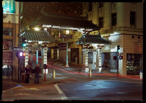
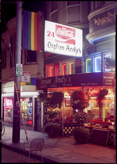
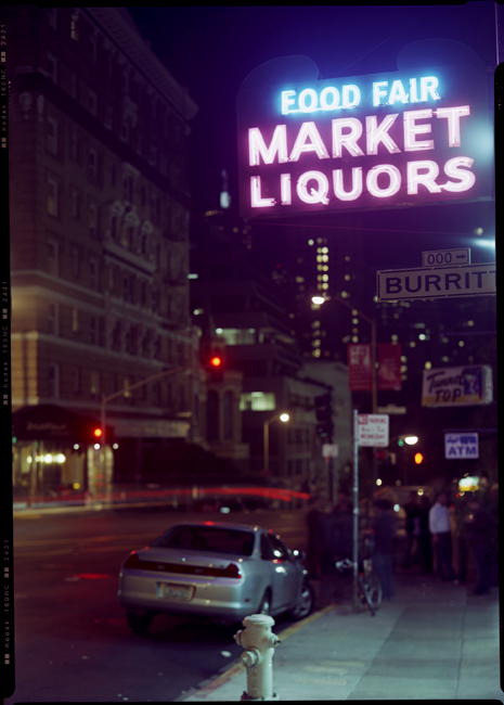
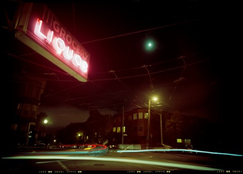
Even MORE of my San Francisco images.


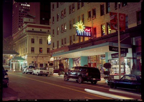
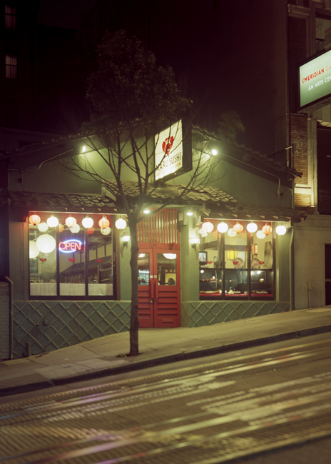
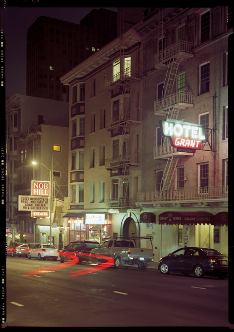
All of these were shot with my 240mm Voigtlander Heliar f4.5 lens. It is fast becoming one of my favorite lenses for its rendition of out-of-focus areas. I knew it was a legendary lens for black-and-white shooting, but was unsure how it would render color. As you can see here, it does a beautiful job with color, despite being uncoated. It does give a slightly vintage look to the color palette, but some of that might also be the film I’m using – Kodak Portra 160 NC.
Pier 24 museum in San Francisco – a photographic education
Over the weekend I went to see the Pier 24 exhibit space in San Francisco. It has only been open for a year or so (the current exhibit is their third ever, I believe). It represents a novel approach to the museum experience in general and photography exhibits in particular. The facility itself is located in one of the old waterfront warehouses along the Embarcadero (thus the name), directly beneath the Oakland Bay Bridge. The interior is divided up into roughly 20 rooms. Admission is FREE, but by appointment only. They allow twenty people at a time for a two hour block, so your distractions during your visit are minimized. Another way they minimize distractions is by having NO wall text – the floor plan flyer you get upon entering has the only labels for the exhibits, consisting of the photographers names who are hung in a given room. Absolutely maddening if you’re not familiar with everyone in a given room, but at the same time, quite liberating because it frees you from having to accept the curator’s “authoritative” context. The current exhibition, up through December 16, is entitled simply “HERE”. The theme is work that in some way connects to San Francisco – either taken in or near the Bay area or by photographers who called it home. Work exhibited spans the range from 19th century mammoth plate collodion images printed on albumen paper by Eadward Muybridge and Carleton Watkins to 20th century Modernist masters like Edward Weston and Ruth Bernhard to color mural prints by Richard Misrach and Larry Sultan, and even a five-minute video clip of the car chase scene in Bullitt with Steve McQueen.
Much of the work on display was not to my taste – I don’t like what has been derisively labeled “hedge fund wallpaper” by some New York gallerists referring to recent deadpan posed-snapshot color mural prints. However, there was enough early imagery to satisfy my inner antiquarian, and now that I’ve seen enough of that kind of work, I’m starting to appreciate it for what it is. I still wouldn’t accept money to hang in my house, but one example finally struck home as to what was going on in the photograph. There was a room with a series of VERY large color prints by Anthony Hernandez of vacant interiors. On the literal surface, they’re incredibly ugly, showing abandoned and/or ruined interior spaces with industrial carpets, missing drop ceilings, and junky furniture. One thing that did catch my eye though was the use of color itself. If you stepped back and looked through a defocused eye, the images became all about abstract color fields, geometric forms, and intersecting planes. The graphic abstract geometry creates a contrast with and tension against the literal detail of the photographic image, making your brain switch back and forth between the two characteristics of the image – the texture of the purple carpet, the gray popcorn ceiling and the white-washed faux-wood paneling in the hallway against the receding, intersecting planes of colors converging on a vanishing point in the far rear of the image. I think it’s this kind of tension in a photograph that has too often repelled me from post-modernist photography – it’s too easy to be fixated on and distracted by the details and not see the whole picture. I still don’t like the “posed deadpan snapshot”, whether it’s printed 4″x6″ or 40″ x 60″. But at least I can start to “get” another genre.
For more information about Pier 24, visit their website: http://www.pier24.org
San Francisco Sojourn Part 2
More of my San Francisco images.


While I was out shooting these photos, I was approached by a number of people to talk about the camera, which I’ve come to expect. ALMOST all of them are very interested in what I’m doing, what’s the story of the camera, how old is it, etc. And then you get the occasional joker, like the fools driving past me in their Porsche sedan who had to roll down the window and shout, “Haven’t you heard of a thing called digital? Why haven’t you gotten with the program yet?” To which I responded – ” This (my 5×7) is a half a Gigapixel”. I smiled politely, turned my back, and muttered to myself, “so bite me”. Which is actually a bit of an understatement – a 2000 dpi scan of a 5×7 negative is 1.4 gigapixels.

San Francisco Sojourn
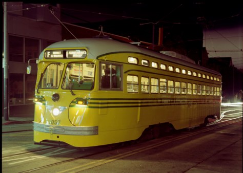
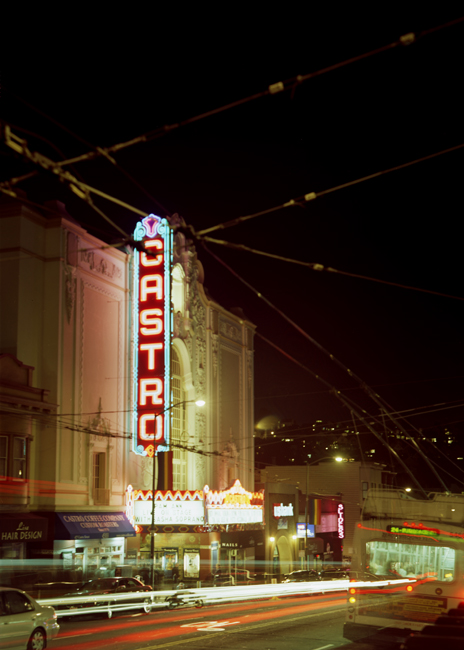
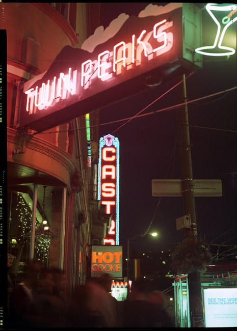
I just got home from a well-deserved, long overdue vacation to San Francisco. It’s one of my favorite cities on earth. I love the geography of the place, the architecture, and how they’ve managed to balance proximity of a highly developed urban environment to wide open natural environment. You get the best of both worlds there. Tonight’s posting will be a bit of a departure for me as I mostly shoot black and white. These are large-format color images, shot at night. One night I wandered around the neighborhood of my hotel, shooting whatever struck my fancy, and another I took a side-trip up to the Castro to shoot some street scenes. Here are some first scans of the images.
Busy photo weekend
This was another really busy photo weekend. Yesterday was a shoot with two models in the studio. Today was darkroom work. Yesterday was interesting – I went in to the studio in the morning to help out one of my studio-mates by shooting with two models he had brought in from New York and Philly to do some portfolio development work with them. The first one to arrive was a bouncing ball of unfocused energy. I suspected there would be trouble as short attention spans and I don’t get along well. Things worked out ok in the end because I got some decent shots with him, but getting there was, well, challenging. Knowing what I know now, would I hire him as an art model? NO. Would he be fine for a fashion shoot or as a fitness model where poses only last 3-5 seconds each? Sure. I hate to stereotype, but this guy lived up to the male equivalent of Cameron’s supermodel girlfriend in In & Out who couldn’t figure out how to use a rotary phone.
The second model arrived shortly afterward, and he and I shot while the first guy pumped up with some resistance bands. Mr. Fitness (I’ll call him that to distinguish him from the second model) wanted to shoot second even though he was there first because he wanted to get pumped up first. That was the first strike against him.
I generally keep a quiet set so I can concentrate on the work and communicate with my model. Mr. Fitness decided he was bored, so bored I had to stop, dig out the iPod speaker dock that belongs to the studio and plug it in for him so he could have some music. He promptly selected some very obnoxious hip-hop that he then played at an intrusive volume level. Not impressive.
My set that day was my first attempt at re-creating after a fashion the old Victorian photo parlor feel, with some IKEA drapes and tie-backs I found at Bed Bath & Beyond pulled out a couple feet from a backdrop. Since my studio is shared, I can’t build anything permanent, but instead the whole thing gets pulled together with some Manfrotto Auto-Poles which just happen to reach the ceiling of the studio with a couple inches to spare. I think the effect is working, although I’d still like some bigger tassels on the tie-backs. See some of my previous posts here from my collection of CDVs for examples. Images from the shoot will follow. One set of images I did of each model had them posing clothed and nude in the same pose. It’s a visual riff on the standard CDV portrait concept, but with of course modern attire, and then pairing it with nudity, certainly something you wouldn’t see in most Victorian CDVs. I also had some fun posing one model with a neat Art Deco floor lamp we have sitting around the studio.
I did run into some major frustration with gear, as the shutter on my preferred lens, the 240mm Heliar, decided it wasn’t going to trigger my studio strobes anymore. Adapt and overcome, a-la the US Marines – I pulled out another lens I have of the same focal length, but mounted in a modern shutter that never refuses to trigger my strobes, and carried on. Can I entirely fault the Heliar? Not really – perhaps it’s too much to expect that it trigger the strobes reliably, after all the shutter is nearly 70 years old. I’ll feel lucky if I work as well as that shutter when I’m 70.
Mr. Fitness capped the day off by not listening to directions while helping me strike the set so my studio-mate could get his backdrop and lighting arranged. He managed to completely release the background support on his side of the background, dropping it from maximum extension to fully collapsed in the blink of an eye, wrinkling the seamless paper and bending the pin on the other background support. To his credit, he did apologize for wrinkling the seamless.
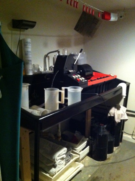
Today was a big darkroom day. I started the morning off doing a major cleaning in the darkroom. I had been accumulating all these chemical storage bottles from back in the day when I did enlarging onto silver gelatin paper. I went through all of them, pouring the thoroughly exhausted remains of several batches of Dektol and Ansco 130 down the drain, followed by copious amounts of water. Most of the other bottles were fortunately empty. They all got packed up in plastic storage bins and put in the downstairs bathroom. Now I have enough space that I can put all my print developing trays under the sink when I’m running film in the Jobo, and the Jobo has a place to live other than the hall floor when I’m printing. Have I said before how tiny my darkroom is? It’s about 7′ by 8′, with a 6’3″ ceiling. It works quite well under the circumstances. Having gotten that out of the way, I ran four batches of sheet film in the Jobo. 15 sheets of 5×7 and four sheets of whole plate. I’ve got one more batch of 5×7 from Saturday to run, then I’m all caught up, and ready for NEXT weekend! I’ll go from a souping fiend to a printing fiend for the rest of October.
CarbonWorks Blog by Richard Sullivan, FRPS
I wanted to put in a good mention for Richard Sullivan’s new blog, CarbonWorks. Richard is a brilliant photographer and photo chemist, co-founder of Bostick & Sullivan, the premier source for all things alt-process. I found his blog today and was reading up on some innovations he has discovered and published, including the Athenatype (a silver-based printing technique that yields a near-platinum print look) and a fumed silica treatment for alt process printing that helps boost dmax (maximum black density) a common shortcoming of many antique processes. Richard has been honored as a Fellow of the Royal Photographic Society for his work in reviving alternative/antique photographic processes and for inventing new variations on the same, specifically the Ziatype, a printing-out process variant on Platinum/Palladium. He is a master carbon printer (thus the blog title). He also teaches non-silver processes at Santa Fe Community College. Give the blog a read, and follow it if you’re interested in anything antique photo process related!
Dates announced for Platinum/Palladium printing Demo, 11-09-2011 at Photoworks Glen Echo
I will be doing a live demonstration of the platinum/palladium printing process at Photoworks in Glen Echo, Maryland as part of the FotoWeek festival. The date and time has been finalized – Wednesday, November 9, from 7-9 PM. Topics to be covered include: tools, paper, chemistry, coating techniques, processing, contrast control and altering image color. The session fee is $40. The session will be held in the upstairs classroom in the Photoworks facility.
Busy weekend in the studio
This weekend was a really busy weekend in my studio. I was supposed to have a shoot on Saturday. The model I had made arrangements with cancelled on me, but with more than reasonable advance notice, so I’m not pissed off about it – he gave me two days heads up. I’ve had some models flake out two hours ahead, some an hour after the shoot was supposed to start, and some who never bothered to call or cancel (that was the previous weekend, for example). I was talking to my studio-mate who had the studio booked for Sunday, and he said, “I’ve got two models coming in on Sunday, why don’t you work with them before I get there? I need someone to keep them occupied, and it’ll be a big help giving them a chance to work with someone who has a very different style of shooting, because they’re new to the business”. I was more than happy to help out, as it meant free models for me, and I’d be helping out a friend anyway. Since I had the studio booked for Saturday anyway, I went in and did some still life work using a flower I bought whose name escapes me but looks like a cross between a leafy cactus and a gigantic q-tip. I left my stage setup I had created (I took the old curtains I had from the previous studio and made a little ‘stage’ setup for a backdrop) for Sunday, as I thought it would be great to work with the models as well.
WELL, thus go the best laid plans of mice and men. I get in to the studio Sunday morning, meet the first model, Justin, a 6’4″ ex- football player, and get ready to shoot. On the third test pop of my flash, what happens but one of the capacitors in the power pack goes tits up. And I don’t have my own backup. I call my studio mate who is coming later, and he says just use his, which happens to be compatible with my accessories. So another half-hour goes by digging out his flash unit and setting it up. We do get on with the shoot, and once things get moving, it goes well. Justin is a good model and understands how to create dynamism in his body – I had no trouble setting him in poses that accentuated his physique and worked well with the somewhat exotic format I was shooting in – I was trying out the 5×12 for human figure work, mostly shooting verticals. Working with me, from a models’ perspective, is a real challenge and a physical workout because I need them to hold poses for an extended period of time while I compose each shot. I’m not shooting like a typical fashion photographer who likes to ‘run-n-gun’ and fire off hundreds of photos in an hour. I think with Justin, in about 1 1/2 hours, we took 8. I had him holding a pose for sometimes four or five minutes while I played around under the dark cloth.
My studio mate is a good friend (loaning me his strobes is an instant qualification!), but he’s a bit frantic. He’s a fashion photographer and likes to run-n-gun, for one thing, and he’s just a bit keyed up all the time anyway. Fortunately Justin and I wrapped our shoot just before he and the other model got there. The other model is a college student named Peter, (only) 6’2″, and about 2/3 the body mass of Justin. Peter was tragically late because of traffic and poor directional sense. What he lacks in timeliness, he makes up for in facial features. He’s one of those models who looks relatively ordinary when you pass him on the street, but when you see him through the camera lens, his face just screams High Fashion (that’s actually a good thing). They set up and shot while I went to the Nationals game with my father. When I got back, they were still there, and since my set had been taken down, we did a few shots in the air shaft outside the studio, which has a really cool steel security door and lots of exposed brick. Another great thing about shooting in the air shaft is that because it has these nice tall walls, you get beautiful soft indirect light from overhead – like a north light window. It’s very even, very consistent – you can meter once and not have to re-meter for hours. Reflectors are very helpful though because it is a top-down light and makes people into sunken-eyed zombies if you don’t bounce a little fill on their faces.
In talking to Peter about the poses I was looking for, I asked him to do a nude. I knew because he was agency represented that frontal nudity was a no-no, so I explained the pose would keep his intimate parts covered, and he was fine with it, but then he asked if he could cover himself with a sock. I find the whole ‘hide it in a sock’ business to be laughable – I’m not there to stare at your anatomy, and if someone IS nude in real life, do they ever run around with a sock on their penis? NO. We got that out of the way and went on. I did some head-shots of him with the 5×7 Canham, getting to put some film behind the 240mm Heliar I have for the first time with a human subject. The image on the ground-glass positively glowed! The shallow depth-of-field at f5.6 just made the features that were sharp SNAP, and the brick wall in the background looked like a painting seen through running water, it was so smooth. I’m DEFINITELY taking this outfit with me when I go out west for some figure-in-the-landscape shooting!
When I shoot, I’m used to shooting all by myself, no assistants, no “creative input” from other photographers. Sometimes having the helping hand is very welcome (adjusting lights, etc). Other times, not so much. My studio mate was watching the shoot with Peter, and while I was still arranging a pose, he had to jump in and start directing the model because he had this love handle that showed up only when in a certain kind of pose. I would have seen it and adjusted his pose, but I didn’t get the chance. GRRRR. And then, to make matters worse, I wasn’t done shooting before my studio mate mentioned a shot he wanted to do in the air shaft as well, and boom, the two of them were off doing their own shot. Moral lesson here – assistants are fine, but two principal photographers probably shouldn’t share the set – too many chefs end up putting someone’s finger in the chili.
Busy Week in Collecting, Part 3 – more “Gay Interest” tintypes
As I’ve said before, you can’t really call these images that get sold as “Gay Interest” “gay” because the concept as we know it today didn’t exist in the 19th century. Men have always been physically and emotionally intimate with each other but the concept of two men (or women) living together in an emotionally intimate bonded relationship for life (or at least serially to the exclusion of the opposite sex) is very much a late 20th century concept. They are interesting though because they suggest possibilities – the absolute anonymity of the images leaves open the questions and suggestions to the modern imagination of what might have motivated the sitters to pose together, and particularly in the very openly affectionate and intimate way that they did.

These two men are very affectionate with each other. Their very similar appearance suggests they may be brothers, or they could just be very close friends. Quite possibly they were battlefield friends – the one on the right appears to be wearing a Grand Army of the Republic campaign ribbon. This may well have been taken at a unit reunion in the years following the war – note the photo was taken out of doors, on the grass, in front of a painted backdrop. I’m always interested to find images like this because it says so much more about the sitters than does a strictly studio portrait – there was some event occurring at which they wanted to record and remember their presence, and document their relationship. What was this event? Why use the painted backdrop instead of the landscape scene at the location?
This next image is even more ambiguous than the first one. Obviously from the fashions, a later image (end of the 19th/beginning of the 20th century). 
Again most likely just three friends, but the possibilities and suggestions are more ripe with potential for a late 20th century interpretation. The most interesting bit is the juxtaposition of the very fashionable dandy with the light suit with the staid middle-class burghers to his right and behind. Who was the dapper dandy, and what was his relationship to these gentlemen? Was he a foreign friend, visiting from overseas? Some exotic celebrity they had the good fortune to corral into posing with them, the 19th century equivalent of the cell-phone snap on the red carpet with a movie star? Certainly, the posing would have largely been the result of the photographer’s efforts to fit all three of them in the frame together, but the contrast between the dandy and the seated burgher couldn’t be more striking than if he were naked.