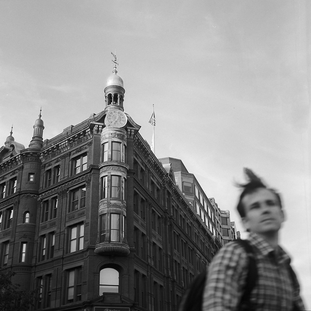
While this shot is at least as much about the SunTrust Bank building in the background, I love how the cyclist passing through the shot turned out – he’s obviously in motion, with a lock of hair blown up and back as he moves. The blurred face makes it somewhat anonymous, an everyman on his way somewhere quickly, turning his head just long enough to look back at the camera looking at him. Actually kind of a rarity these days.
Cyclist, SunTrust Building
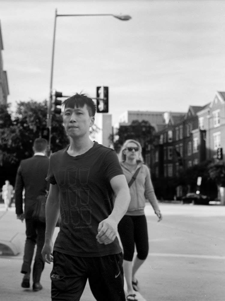
I liked the graphic design of his t-shirt so I set up my camera before he started crossing the street and waited until he was in “the zone” to snap the picture. He’s not tack-sharp because we were both moving at the time, but I think the slight softness of him and the people around him give a sense of movement as well as depth.
Nine Cups T-shirt
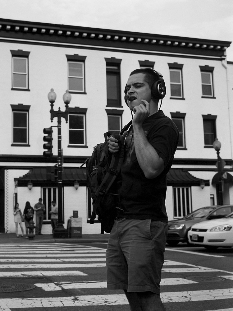
When I saw this character I had to photograph him – giant headphones combined with the fat stogie? How could you NOT?
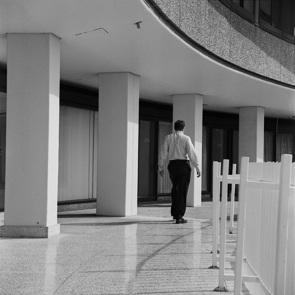
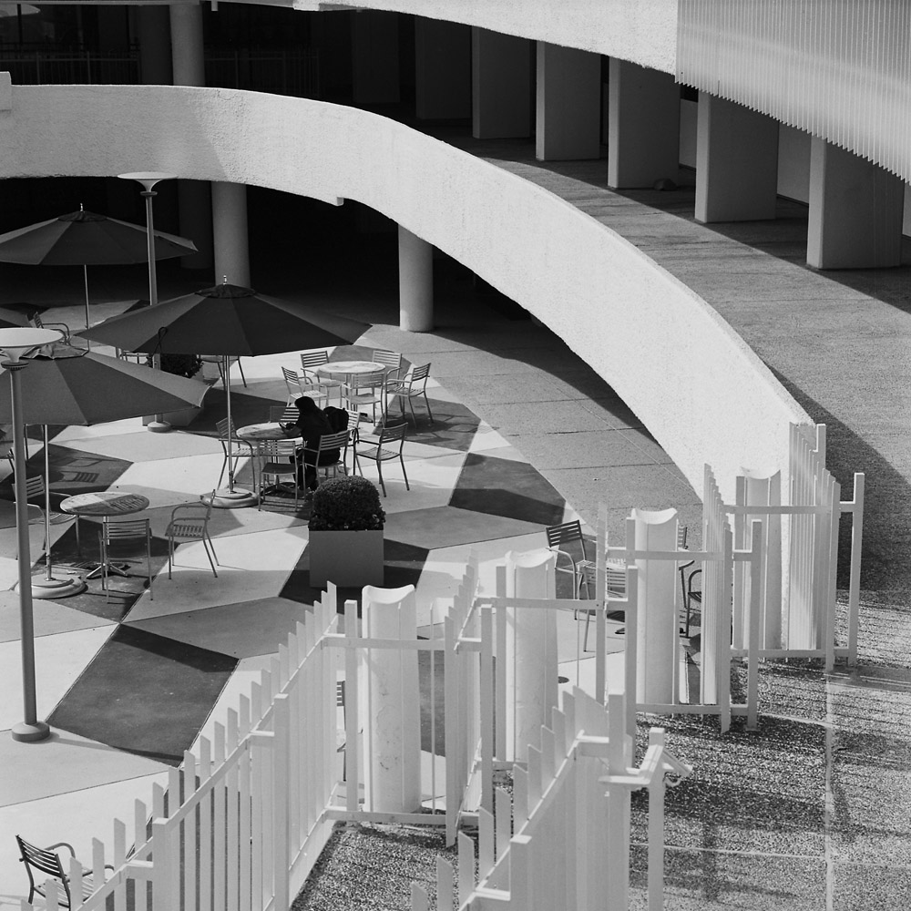
Given the looming Watergate break-in anniversary in June, I thought it apropos to post some images of the historic complex to let folks get an idea of what the place looks like. The name itself is so iconic, so much larger-than-life, I think it tends to overwhelm all thoughts of what the place actually is. This was not some garden-variety office tower. Even back-in-the-day, this was a very high-end residential, hotel and office complex, with views of the Potomac River, Georgetown and the Kennedy Center. It is across the street from the Saudi Embassy and a scant several blocks to the State Department headquarters. The place positively reeks of old money – it’s quiet as a tomb at all hours of the day and night.
Watergate Terrace
There are people around, as you can see in the image above, but they never seem to be coming or going in groups, or with any volume. Spaces where you’d expect to see lots of people, like around the fountain, or in the courtyard, are usually very quiet.
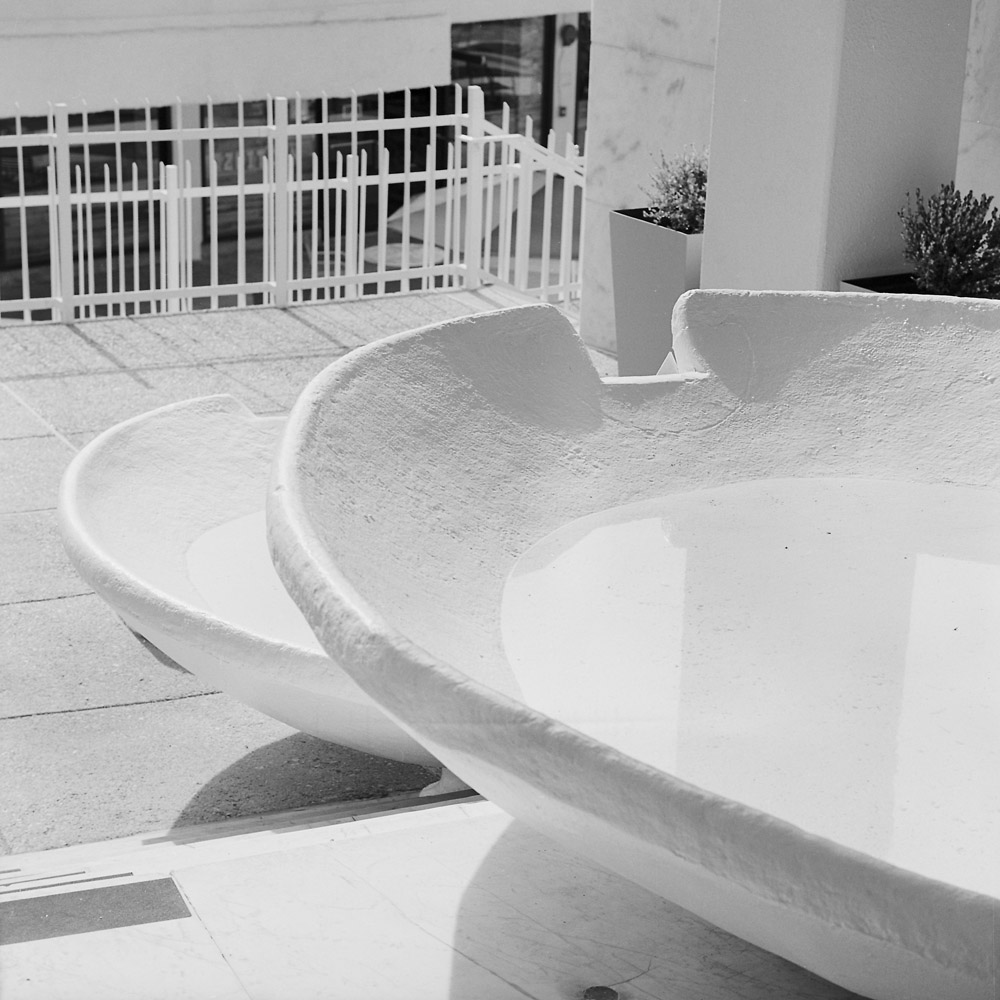
I’m particularly pleased at how well the first fountain shot turned out because of the white-on-white challenge. I was able to photograph it so that the white stayed bright but retained detail. It’s kind of like the egg challenge often assigned in studio photography classes – put an egg on a white backdrop and photograph the egg so the shell texture retains detail but is still white.
Watergate Fountain
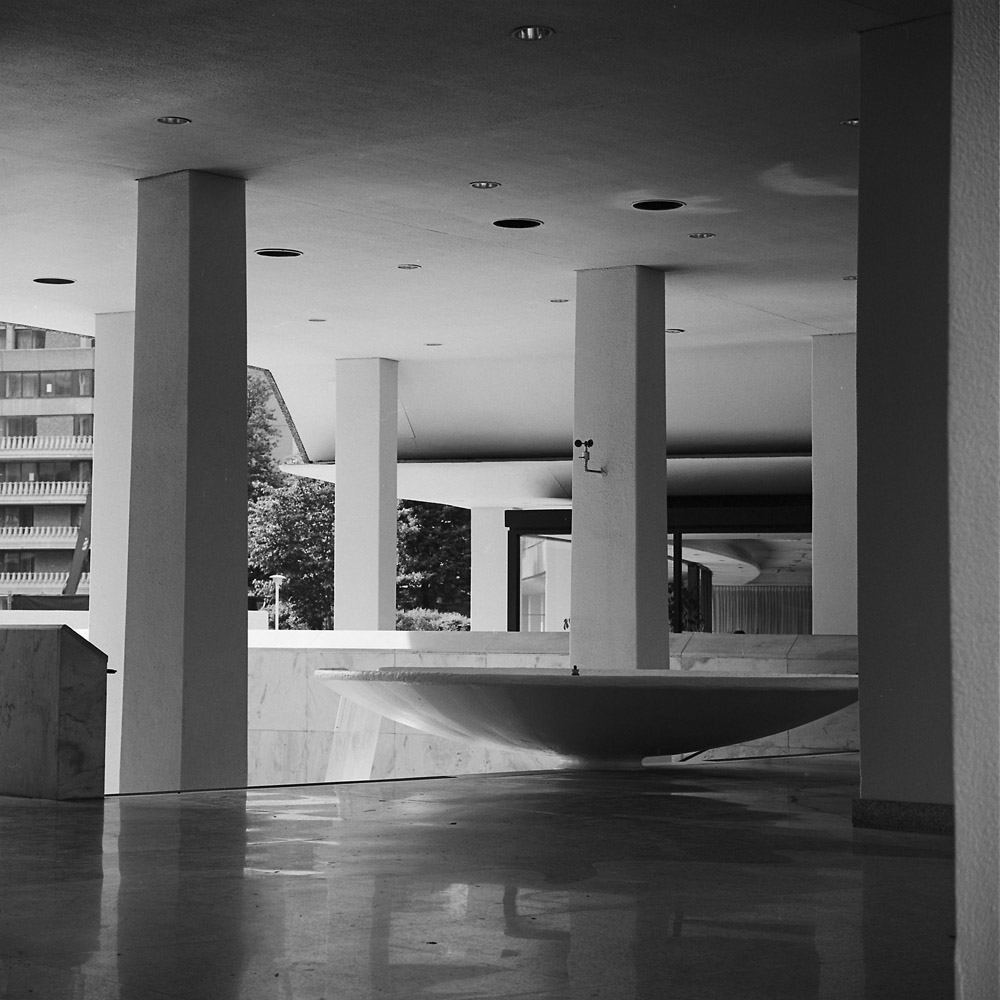
A very different mood for the same subject, just by changing the camera position and therefore the lighting on the subject.
Watergate Fountain
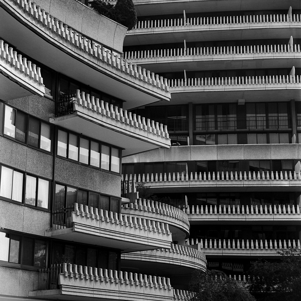
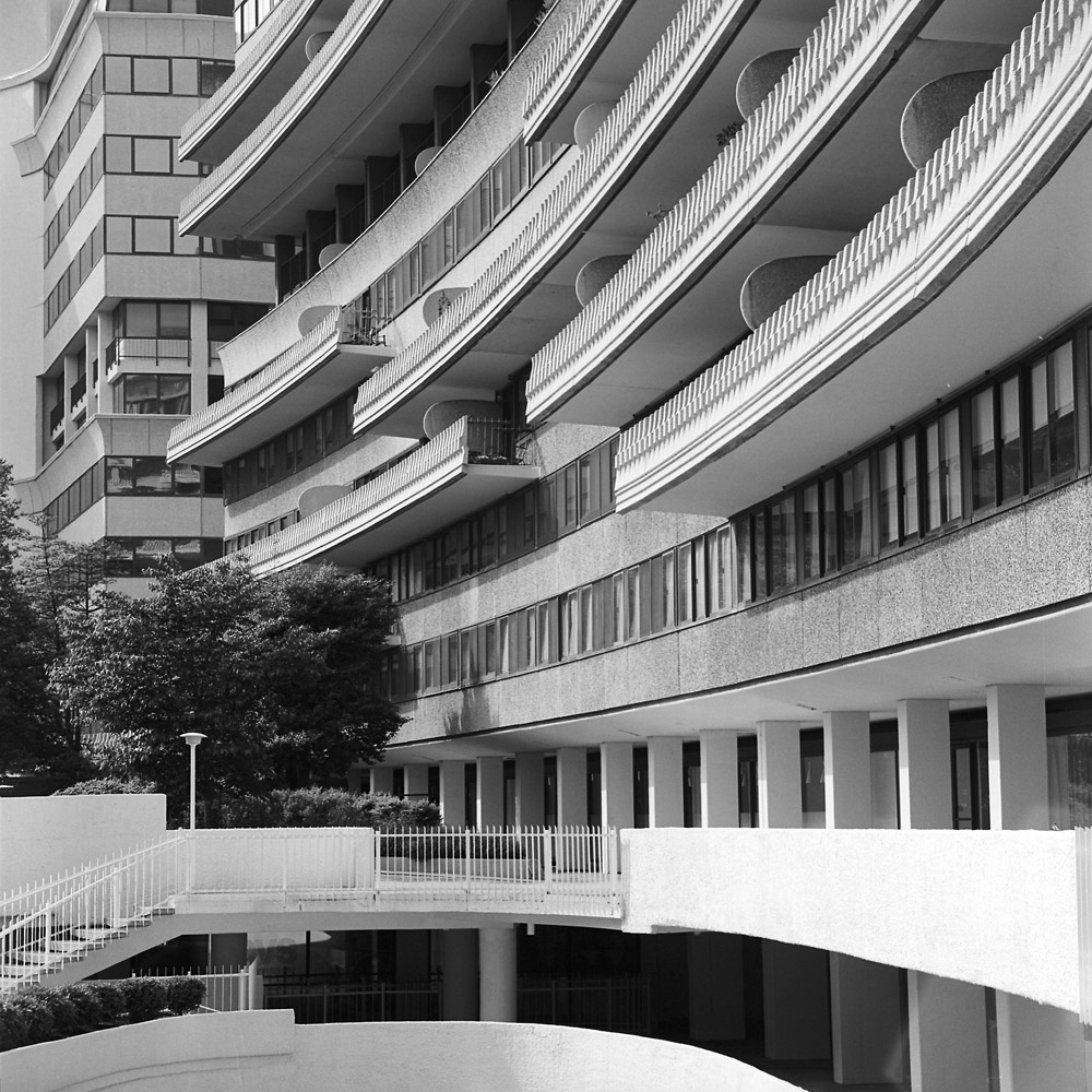
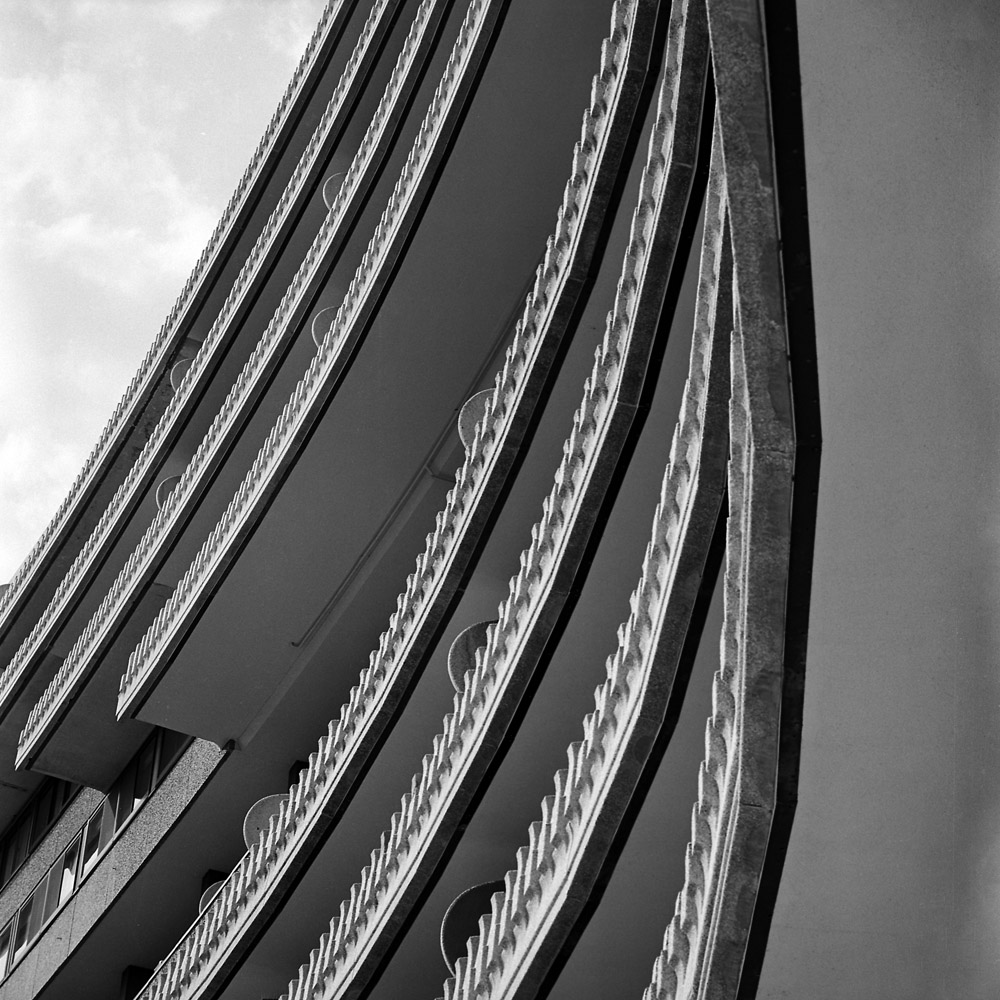
I love the balconies on the Watergate complex – they wrap around it in undulating curves and add texture to what would otherwise be an extremely plain building. Seen from a distance, as a colleague of mine put it, the Watergate does look a bit like a cruise ship the 1960s forgot.
Watergate BalconiesWatergate Balconies
Another view of the courtyard. Again, just one person sitting alone at a table. There’s a restaurant down there, believe it or not.
Watergate Courtyard
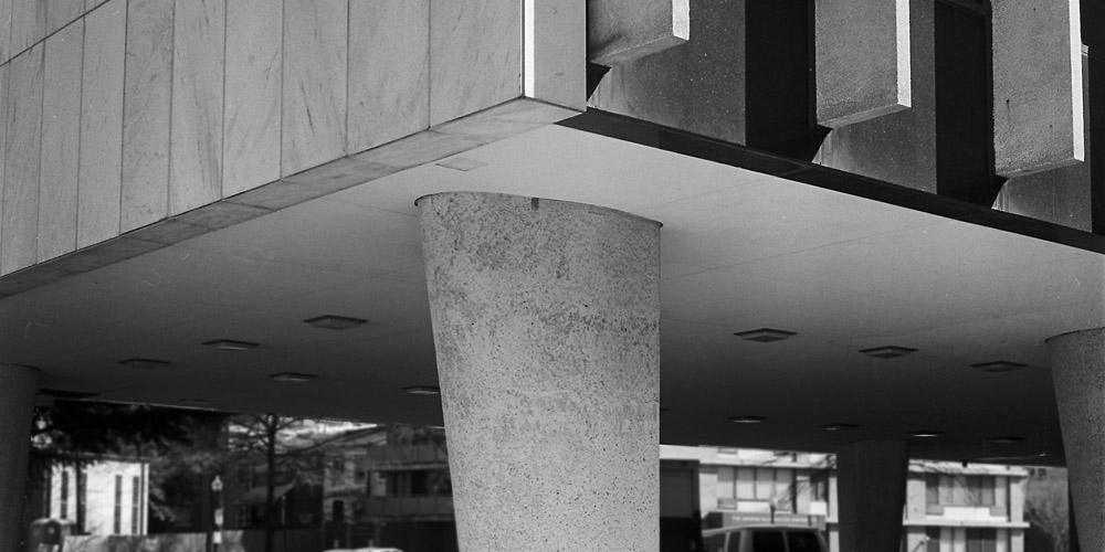
The Watergate is a great place to practice architectural abstraction because of its size, shape and textures. This view feels like a whole bunch of zippers fanning out in a display.
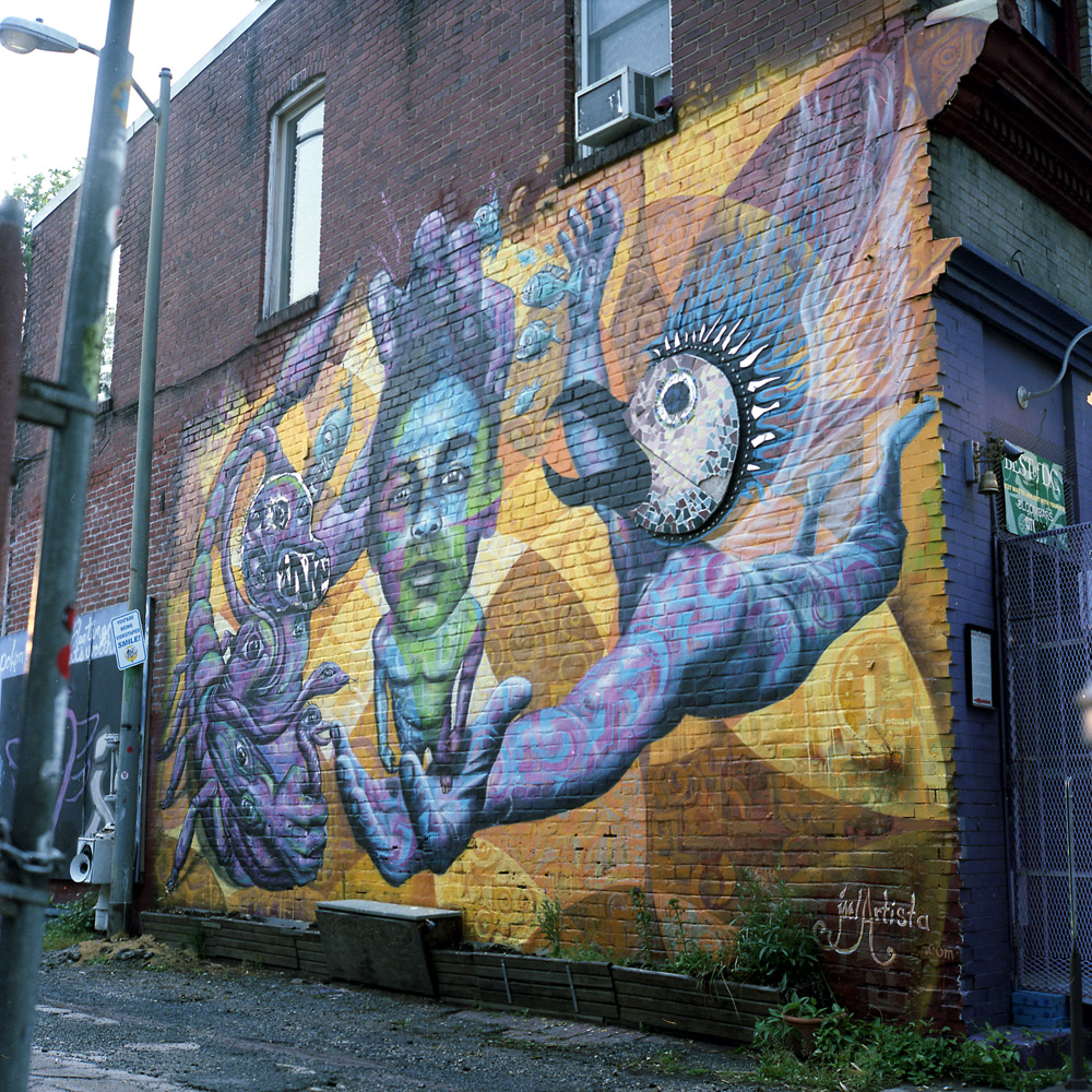
I had photographed this mural before. The other day I was doing a walkabout in my neighborhood and passed it again, to see that the artist had re-worked the mural in new colors with new designs.
here are the original photos I took, in color and black-and-white.
Black Boy, Garuda, ColorBlack Boy, Garuda, B/W
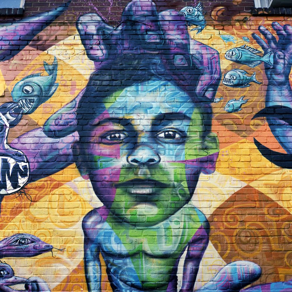
The artist came back and re-worked the piece, keeping only the head of Garuda and the head of the black boy as compositional elements, and completely re-working the color palette.
Black Boy, GarudaBlack Boy, Garuda (Detail)
This is one thing a traditional photograph can’t do – it can’t evolve over time being reworked into a totally different yet fundamentally similar image. At the point you transform a photograph this much, it’s no longer a photograph. It’s figurative and not literal. Part of the intrinsic quality of a photograph that makes it valuable and meaningful as a photograph as opposed to a painting is its relative immutability and the appearance of a binary 1:1 relationship with reality. We know of course that photographs CAN lie, and that they have figurative, non-literal properties, but the descriptive quality of a photograph is so powerful that we WANT to view them as purely, literally descriptive and non-figurative – “Photos don’t lie” and the visual equivalent of “if it wasn’t true, they couldn’t print it”.
So the question to you is, is this the same mural, or is it a different mural entirely, now that it’s been reworked?
Just some random captures of people out and about. I want to get better at street candids, so I’m practicing. These are a few good examples, at least I think they’re good, for me.
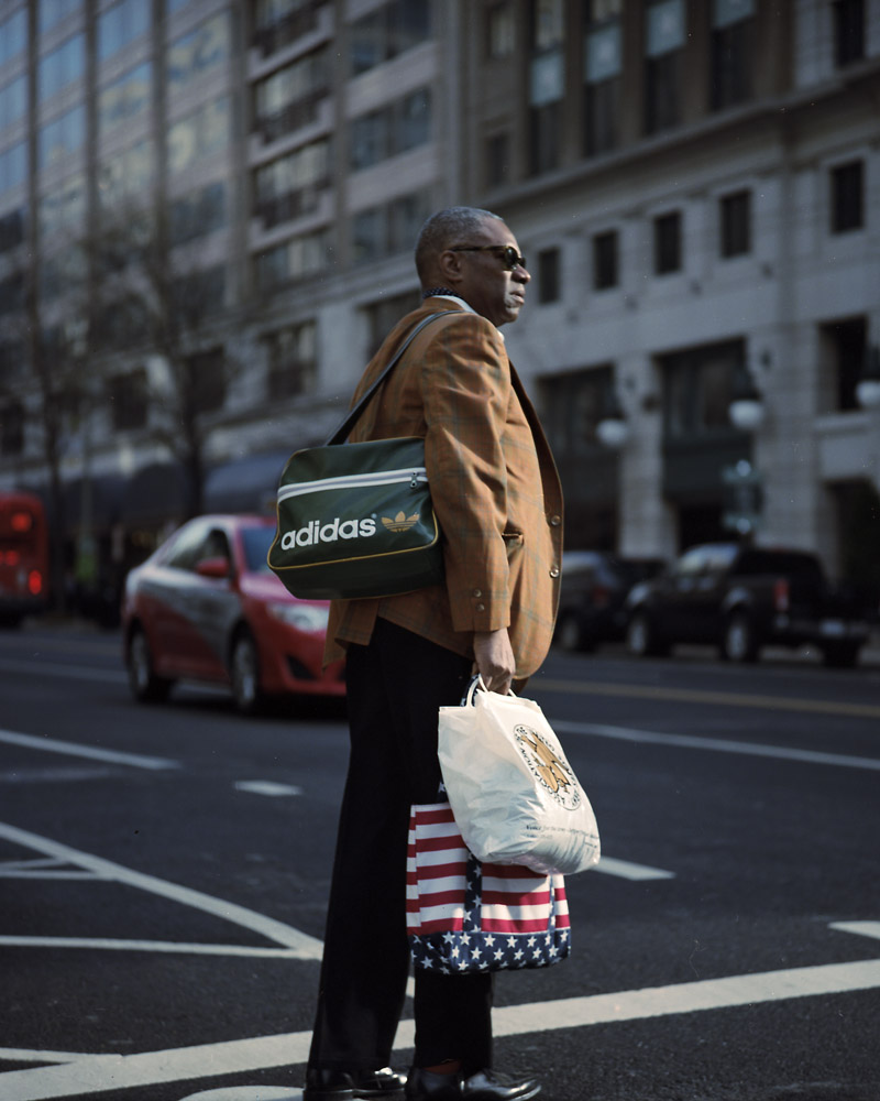
I saw this man crossing the street early in the morning, loaded down with his bags. I don’t think this shot would have worked in black-and-white – the hodgepodge of tweed jacket, American flag logo bag, Adidas bag, and the plastic shopping bag wouldn’t pop if they were tonally similar.
Man Crossing with Bags
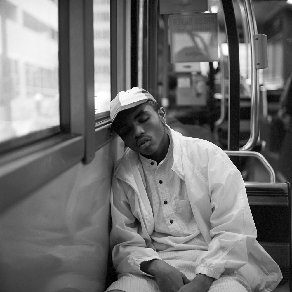
I’ve posted the boy on the bus sleeping before. This one DOES work better in black-and-white because the brightness of his hat and shirt contrast with his skin color and give him a very peaceful, almost angelic look.
Boy Sleeping On Bus
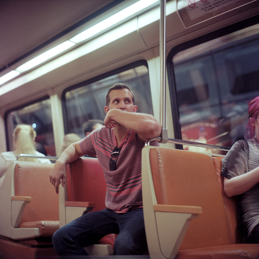
This man is watching the overhead sign announcing the upcoming station. I caught him in an unguarded moment, doing what everyone does on the train. Hard to tell if he’s a tourist or a local.
A recap of the World Health Organization images I’ve made. There are more coming, but they’re on several rolls I haven’t had a chance to process yet (I’ve got to get a couple more shot to run a batch).
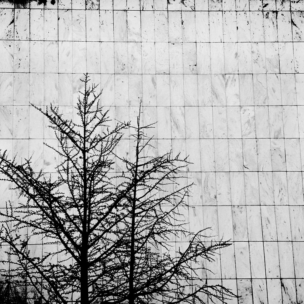
This first one is in some ways the most graphic of the bunch, if not the most abstract. In winter, near sundown, you can see this bare tree in front of the white marble wall on the end of the building. There’s the contrast between the black organic shape of the tree against the white rectilinear grid of the wall.
Tree, Stone WallThe rest of these don’t bear commentary because you’ve seen them before here on my blog. Go back and re-read the posts ( here, here, here, here, here, and here) for the details of my thoughts and ideas about the images.
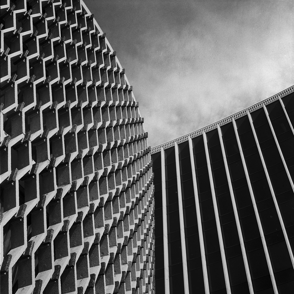
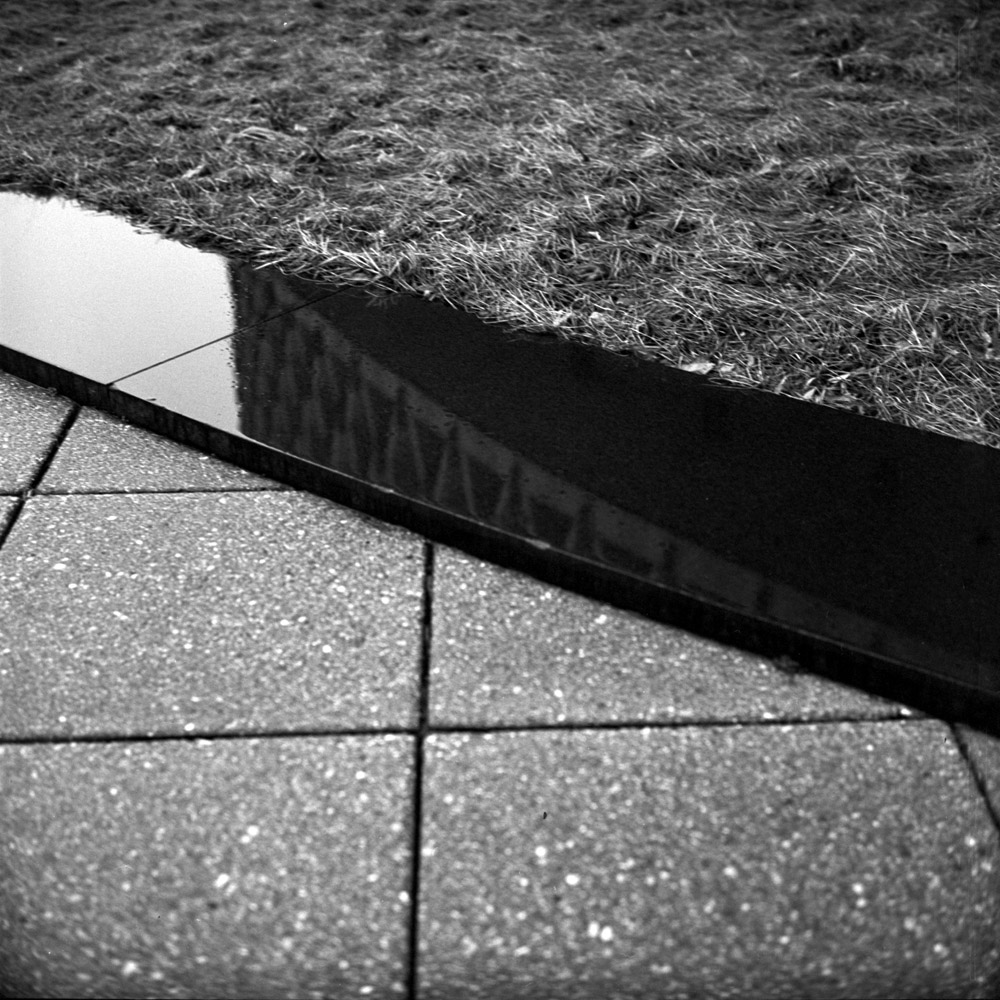
Underneath the WHO Columns Handrail Flagpoles WHO Column, Angle World Health Organization Curves Eaves, World Health Organization World Health Organization, Thirds World Health Organization, Cylinder PAHO/WHO Building WHO building WHO building Pavers, Reflection, Grass
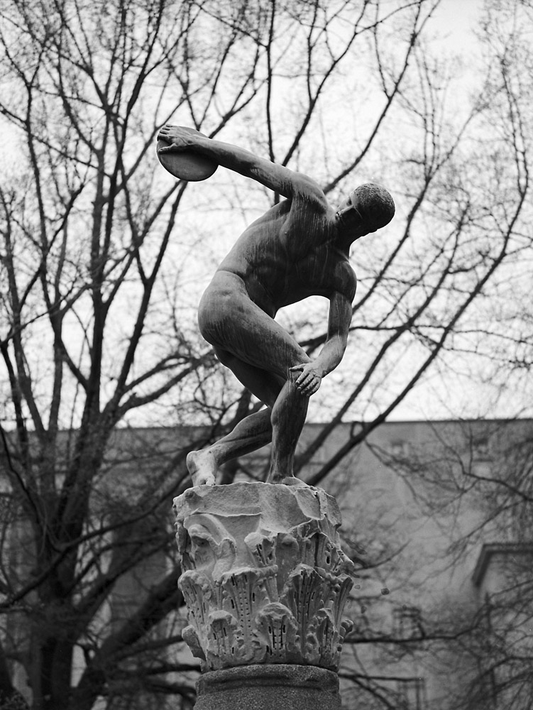
The Federal Reserve Board of Governors buildings in Washington DC have an incredible art collection inside. Most of it is not accessible to the public, as it is displayed throughout the working areas of the facilities. There is, however, an exhibition space inside one of the buildings that can be viewed by appointment – The Federal Reserve Art Collection. There are some pieces, however, that are on permanent public display. There is a gorgeous fountain that operates from April to November-ish (depending on weather) and on the north side of the Martin building, there is the baseball sculpture and the Italian bronze Discus Thrower sculpture. It’s not entirely clear from my reading that the baseball sculpture, entitled Full Count, is part of the Federal Reserve collection, but I believe it to be so from this article. The Discus Thrower, however, is not. It is a replica of the Discobolos of Myrmon, an ancient Roman bronze, given to the people of the United States by the nation of Italy in commemoration of the United States’ assistance in returning Nazi looted art after World War II.
Here is the discus thrower statue. He stands atop a marble column head carved to mimic an ancient Corinthian capital. The discus thrower is located in a city park which also houses a tennis court.
Discus Thrower, Kelley Park
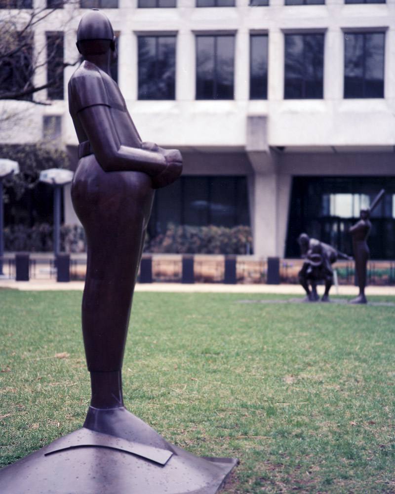
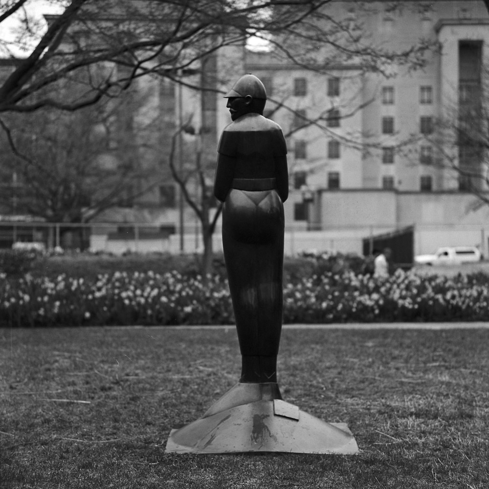
I have two different takes on Full Count – one in color and one in b/w, each from a different perspective. The color image is viewing the sculptural group from over the pitcher’s shoulder. The white marble building in the background is the Martin building of the Federal Reserve.
Full Count, from the Pitcher’s View
The black-and-white image is my take on just the pitcher, from a profile view. Both were shot on the same rainy, overcast day.
Pitcher, Full Count
I think the two images side-by-side really brings out what I was talking about yesterday regarding emotional impact of an image in one medium vs the other. There’s no judgment value being placed on that difference – each one has its own equally valid resonance, and there’s no need to prefer one medium over the other, just as joy and sadness are equal emotional partners.
All three images were shot with my Tele-Rolleiflex. As I’m getting used to shooting with it, I’m really liking the images it makes. It just takes a bit of practice to get to know when to use it and how best to use it to take advantage of its strengths.
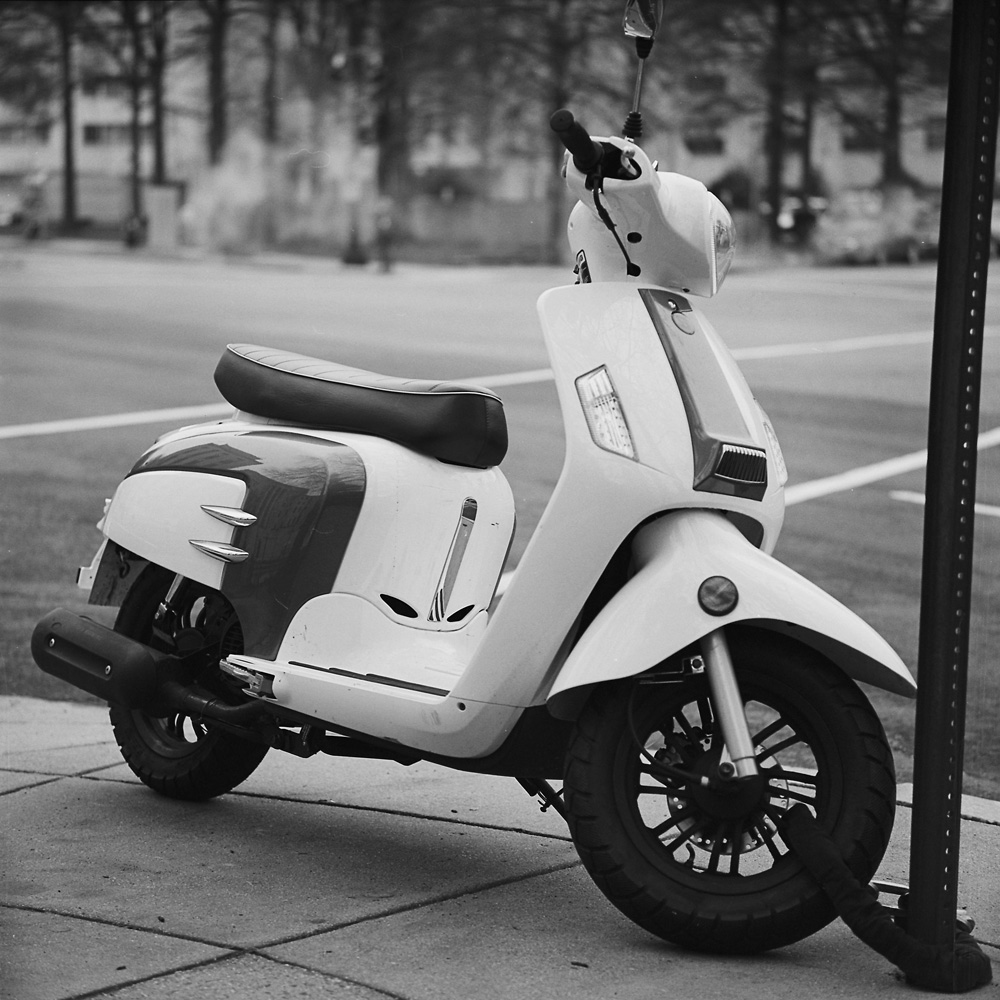
I had stopped in this wine and beer shop on my way home from work yesterday to pick up a six-pack of Mahou, a Spanish beer I have been dying to find since I had one on a very hot afternoon in Salamanca years ago, and as usual, I had the Rolleiflex around my neck. The owner’s eyes lit up when he saw it and we had a long chat about photography in between his customers. I mentioned that I do all my own darkroom work, both black-and-white and color. He remarked that he never did get into color, but was very much in love with black-and-white. This brought to mind the old Edward Weston quote, “there are things you can say in color that you can’t say in black-and-white”. Very true- the two media have different emotional resonance frequencies. This photo is a great example of the difference.
Badass Scooter
It’s a cute scooter that when photographed in color, is white with a medium-blue splash on the rear fender, and reads as cheerful and fun. In black-and-white, it has a much more serious edge to it, and it reads almost macho, for a scooter. Like a member of the Sons of Anarchy wouldn’t feel compelled to commit suicide if forced to ride it. Thus the semi-ironic caption – “badass scooter”. No scooter ever really is menacing, but in black-and-white, this one is respectable at least. I’m sure some of my motorcycle enthusiast friends will disagree with me on this and tell me in no uncertain terms that it is impossible for a scooter to be butch.
This was also a lens test of sorts for my new-to-me 1959 Tele-Rolleiflex. I wanted to see not only how smooth the out-of-focus areas are with it, but how much telephoto perspective compression it gives – the “3-D effect”, in other words. I’d say it pops more than the standard, but it’s still subtle as the lens is not even twice the focal length of the Standard lens (135mm vs 80mm for the standard).
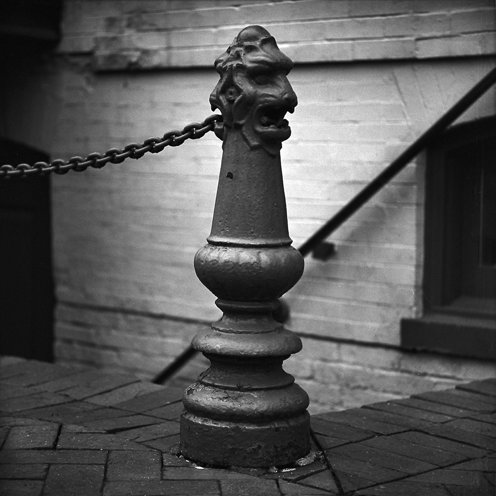
I shot this as another test of the Tele-Rolleiflex, to see what it could do as far as separating the background and foreground. This cast-iron bollard with the dual lions’ heads is on the sidewalk outside ProPhoto, one of the last remaining real camera stores in DC now that Penn Camera/Calumet is gone.
Lion-Head Bollard
ProPhoto is tiny. They relocated from their old store location on I Street to new digs on Pennsylvania Avenue, and cut their space by 2/3rds. But the important thing is that they’re still in business, and now at least the photo paper stock they do carry is all in-date. The most critical thing for me is that they have a repair service on-site, and their repair tech is qualified to work on Rolleiflexes.
First and foremost this was a test of my new toy, my Tele-Rolleiflex. I wanted to see what it could do in terms of depth-of-field compression and the look of out-of-focus areas. Then I noticed something in the photo itself – the repetition of a gesture. There are three hands holding cellphones in this scene, all in the middle of the same activity.
Cacophony of the Modern World
This inspired the title for this piece – The Cacophony of the Modern World – because it’s somewhat ironic. There is an entire civilization living vicariously through their smartphones, wandering through beautiful spring days staring and pecking at screens not much bigger than a business card, never stopping to look up, never engaging the people around them, staggering zombie-style through life. Except for cars and machinery, the world is becoming eerily silent.
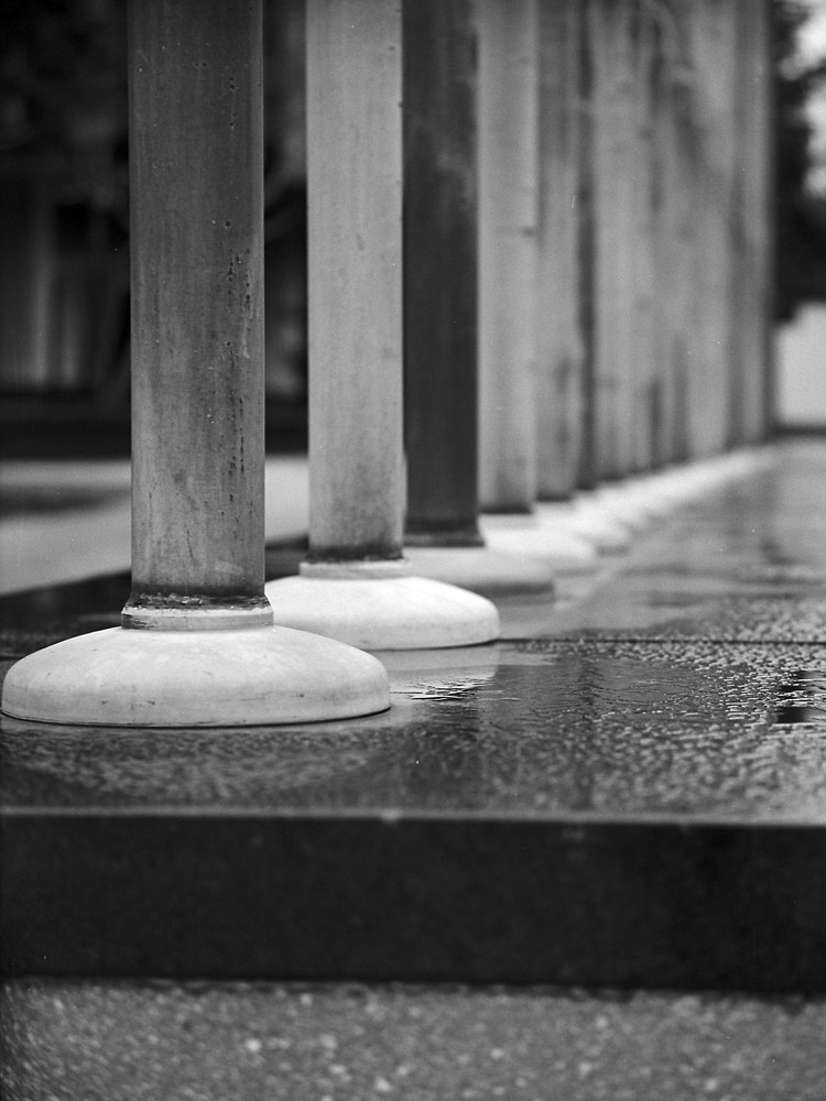
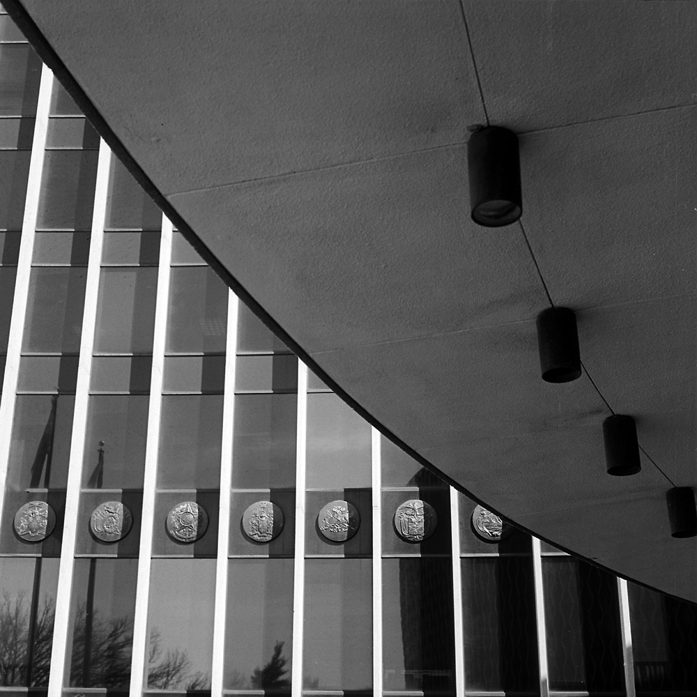
Outside the WHO building, there is a series of flagpoles, most in bronze, with a few at the far end that appear to be bronze-ish aluminum (probably modern replacements). I wanted to capture something of the receding-to-infinity effect of the line of them. All winter they’ve been barren, but yesterday for the first time I’ve seen them flying flags of all the American nations (from the US and Canada through the Caribbean nations to Argentina). I will have color images of that coming soon.
Flagpoles
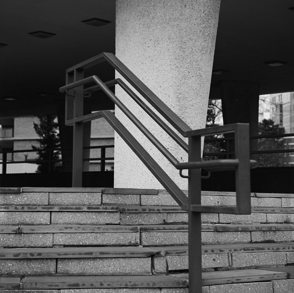
I think I need to go back and re-shoot the handrail, as the near end seems a touch out-of-focus when it should be totally sharp. Part of the reason for this is that I’m still getting used to my new-to-me Tele-Rolleiflex (it has a 135mm Zeiss Sonnar f4 lens on it, as opposed to the normal 80mm Planar f2.8 on my standard Rolleiflex). The Tele has a shallower depth-of-field, and it also has a relatively far minimum focus of about 7.5 feet.
Handrail
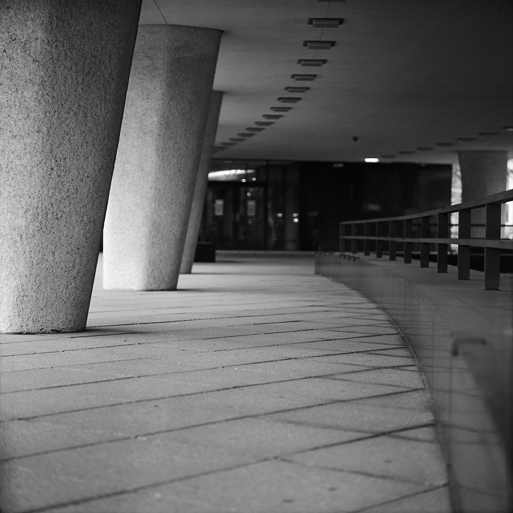
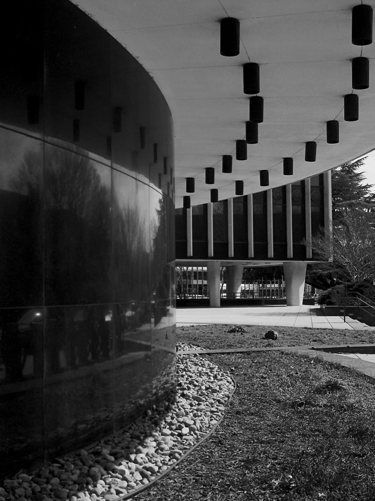
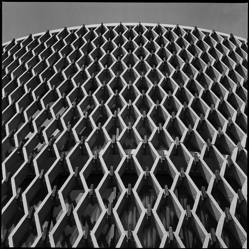
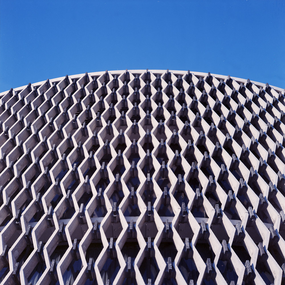
Perhaps my favorite shot of this series- I love the repetition of the columns and the arc of the building with the related but contrasting vertical stripes.
Columns
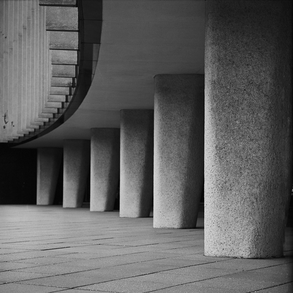
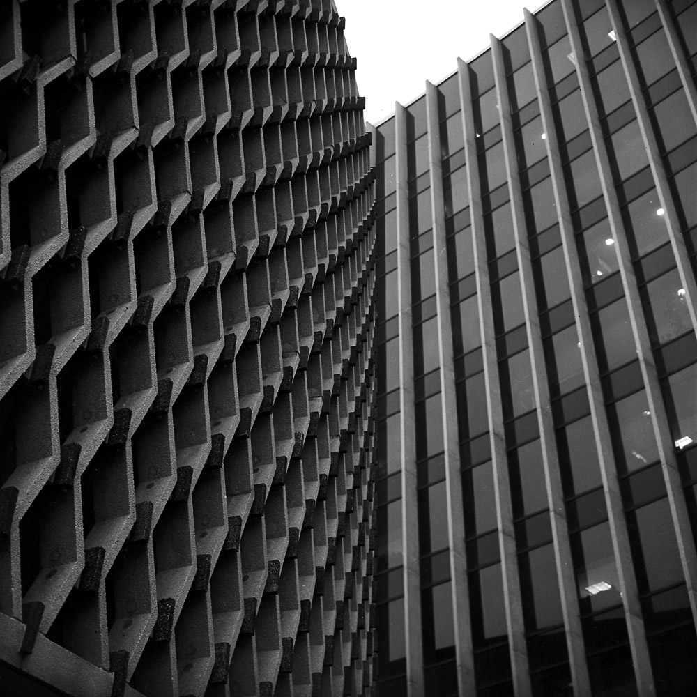
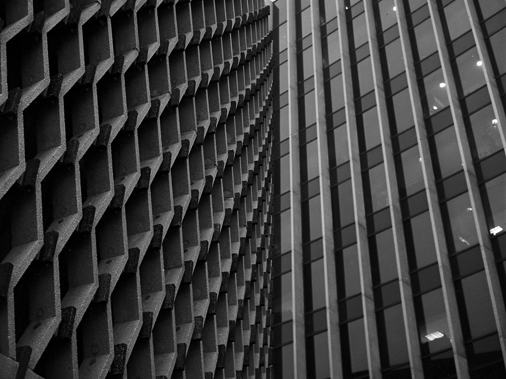
A different view of the columns, from behind.
Underneath the WHO
As a side note, I keep short-handing the name of the building to the World Health Organization, but in reality it is the World Health Organization/Pan-American Health Organization building, but WHO/PAHO is a bit unwieldy, and the full name even moreso.