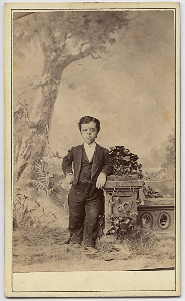
Another addition to the collection of 19th century “freaks”. This one is totally anonymous – no label of who the subject is, or blind stamp on the verso from the photographer. But it’s clearly an original image from the overall quality – not a copy made from someone else’s CDV or stereo view, which makes it a little surprising to see. Oftentimes when photographers were stealing images of another photographer to reprint and sell, they would leave the back of the carte blank so if the copyright holder tried to track them down it would be much harder, and provide them with a degree of plausible deniability “I was merely selling these on consignment – I didn’t illegally copy them! And by the way, I don’t know who it was that sold me the copies…I think he said his name was Smith… yeah, that’s the ticket”. The subject looks familiar to me but I’m not sure – I bet he can be identified though. He’s quite handsome, bordering on just unusually short, and very well proportioned, unlike some of the circus freak little people performers of the day.
Little Person, by Eisenmann
Apologies for the long delay in posting. I just needed a bit of a break from blogging. I’ve been on a bit of a collecting hiatus, but this was a good deal that I didn’t want to pass up. It’s a nice CDV of a circus midget, whose identity, while at the moment remains undetermined, I’m sure I can figure out- I think I’ve seen him before, and I’m sure others would know.
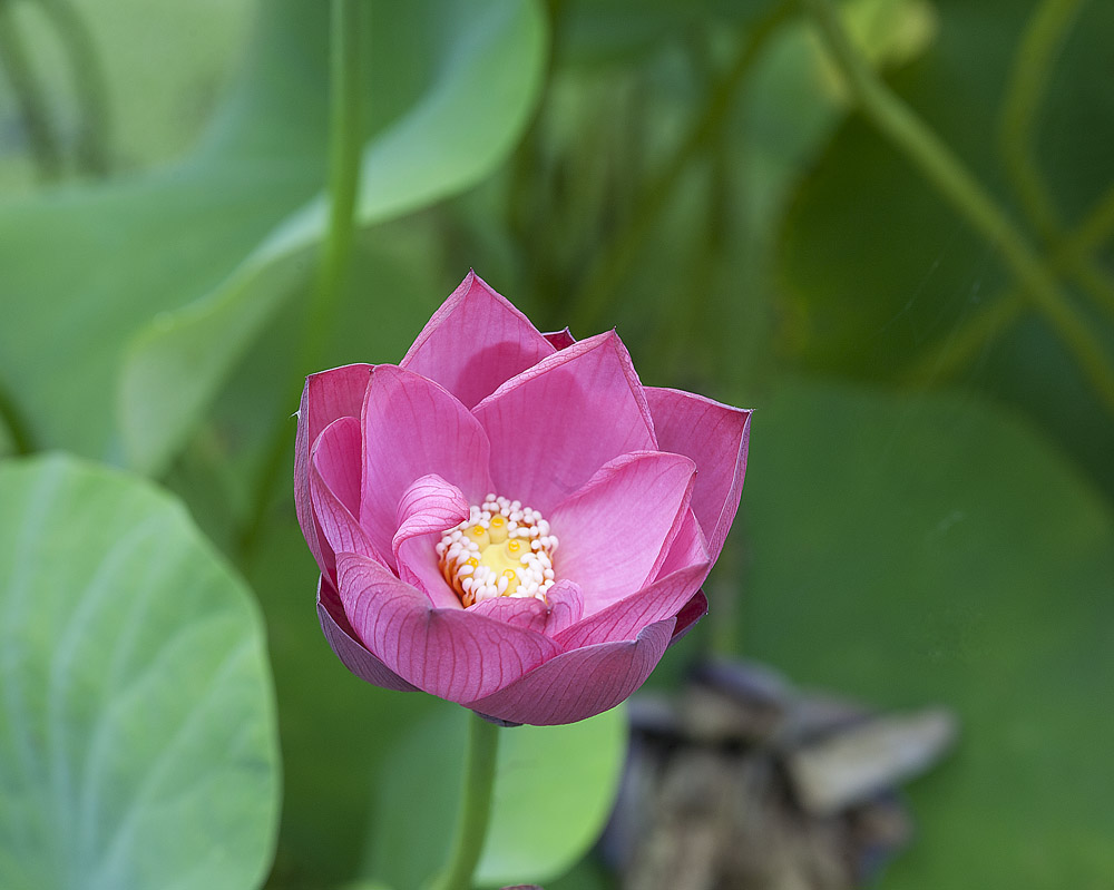
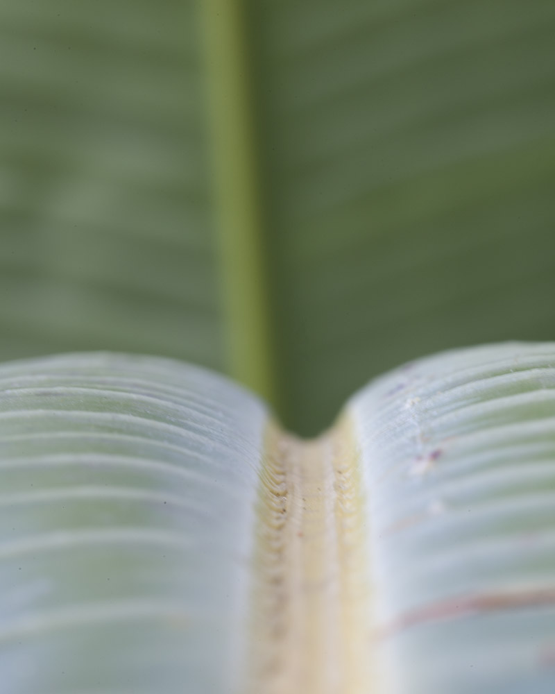
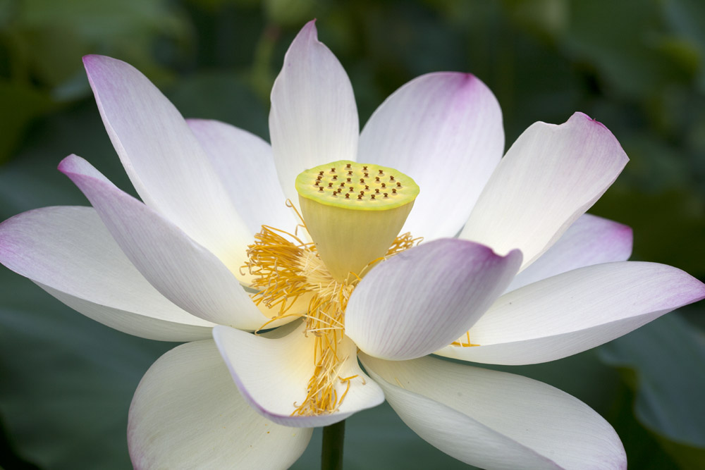
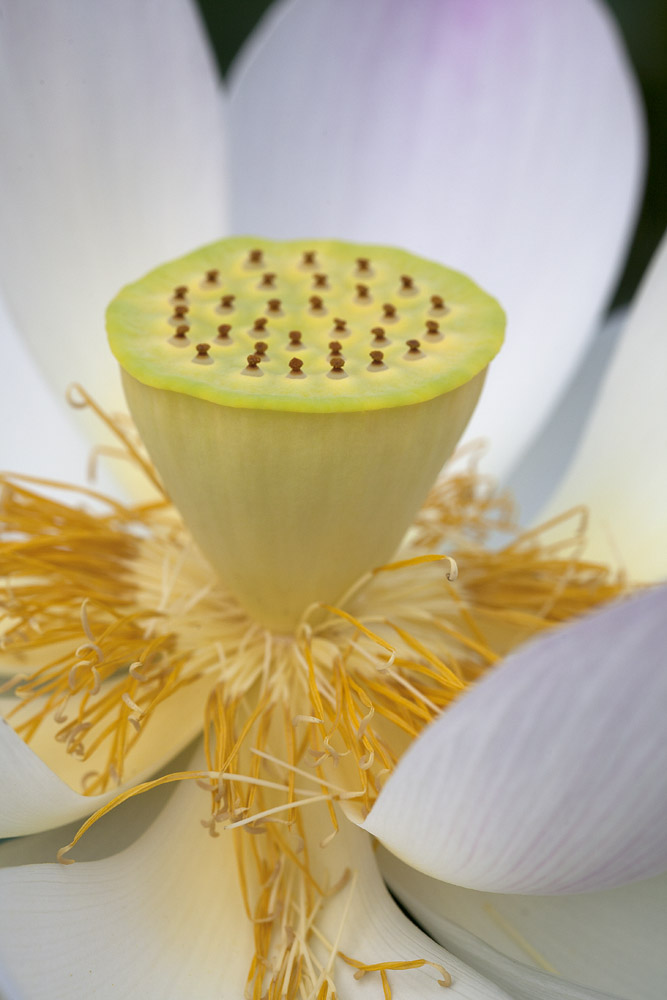
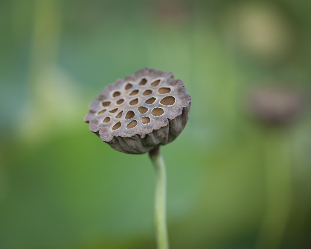
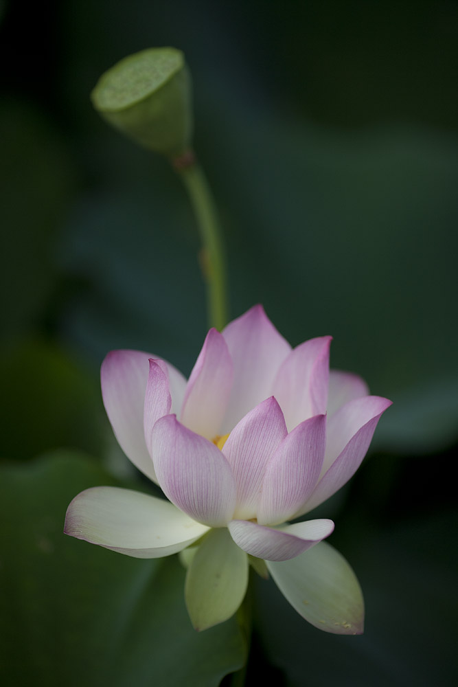
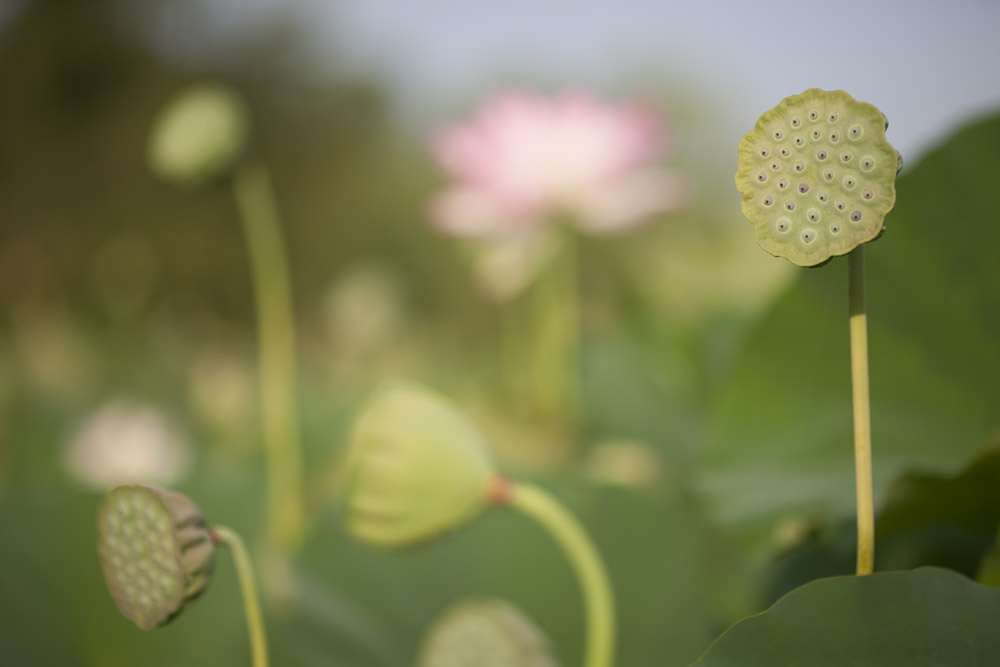
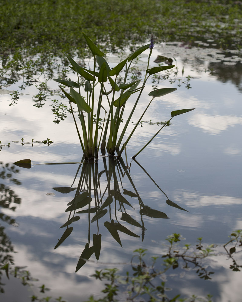
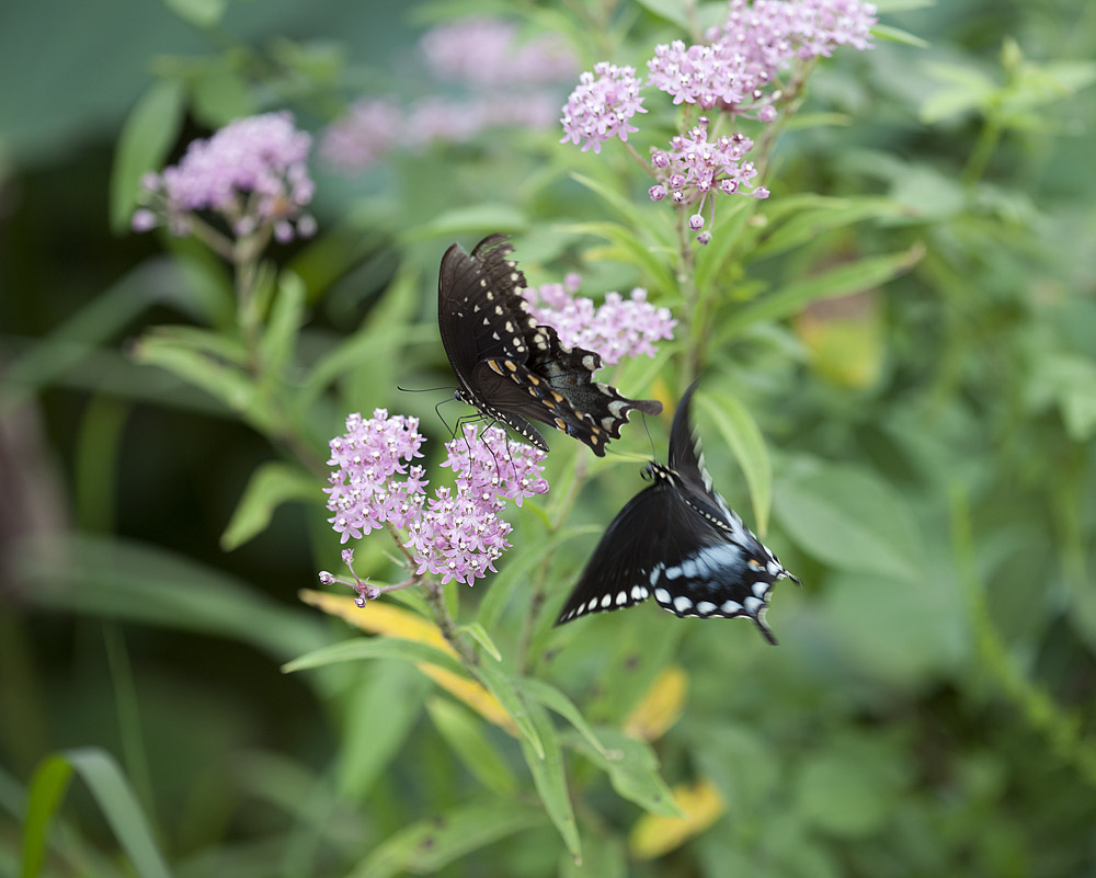
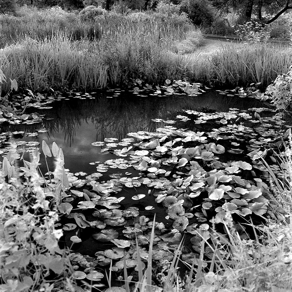
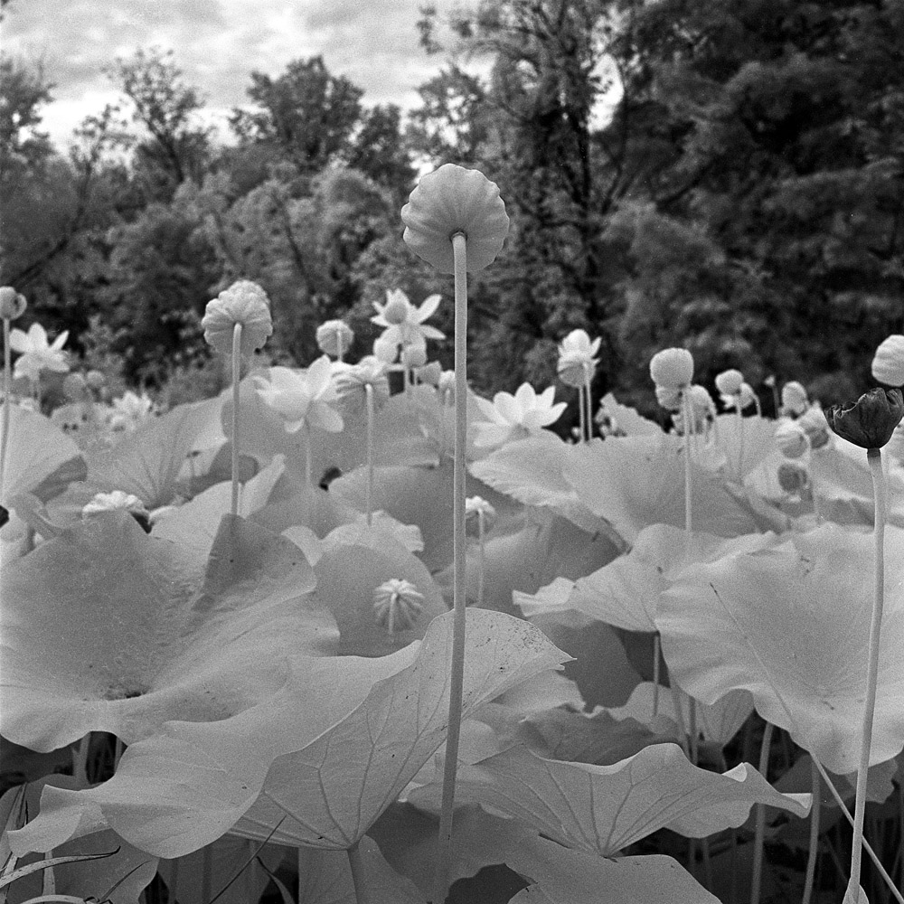
Kenilworth Aquatic Gardens in color
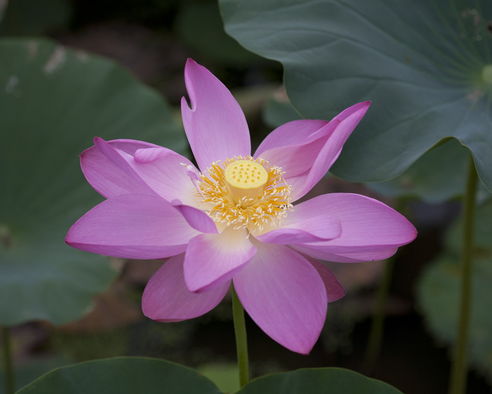
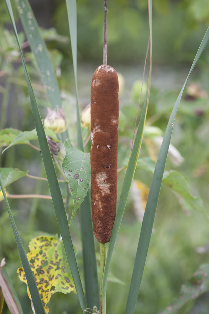
I’m feeling incredibly lazy this morning so I’m just going to let these photos speak for themselves. These are various scenes from around Kenilworth Aquatic Gardens, which as I mentioned in an earlier post, are a 30-ish acre park on the eastern bank of the Anacostia River in Washington DC. Part of the National Park system, Kenilworth is a generally un-heralded and underutilized public park, a true hidden gem of Washington. Part of what I like about visiting is the psychological tension of knowing that just outside the gates of the park is a truly rough urban environment in one direction, and major hustle and bustle in the other, but while you are in the park you have zero awareness of this – a veritable oasis of calm and quiet.

Street Scenes – 14th Street after work
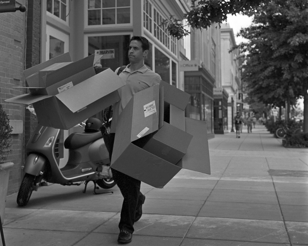
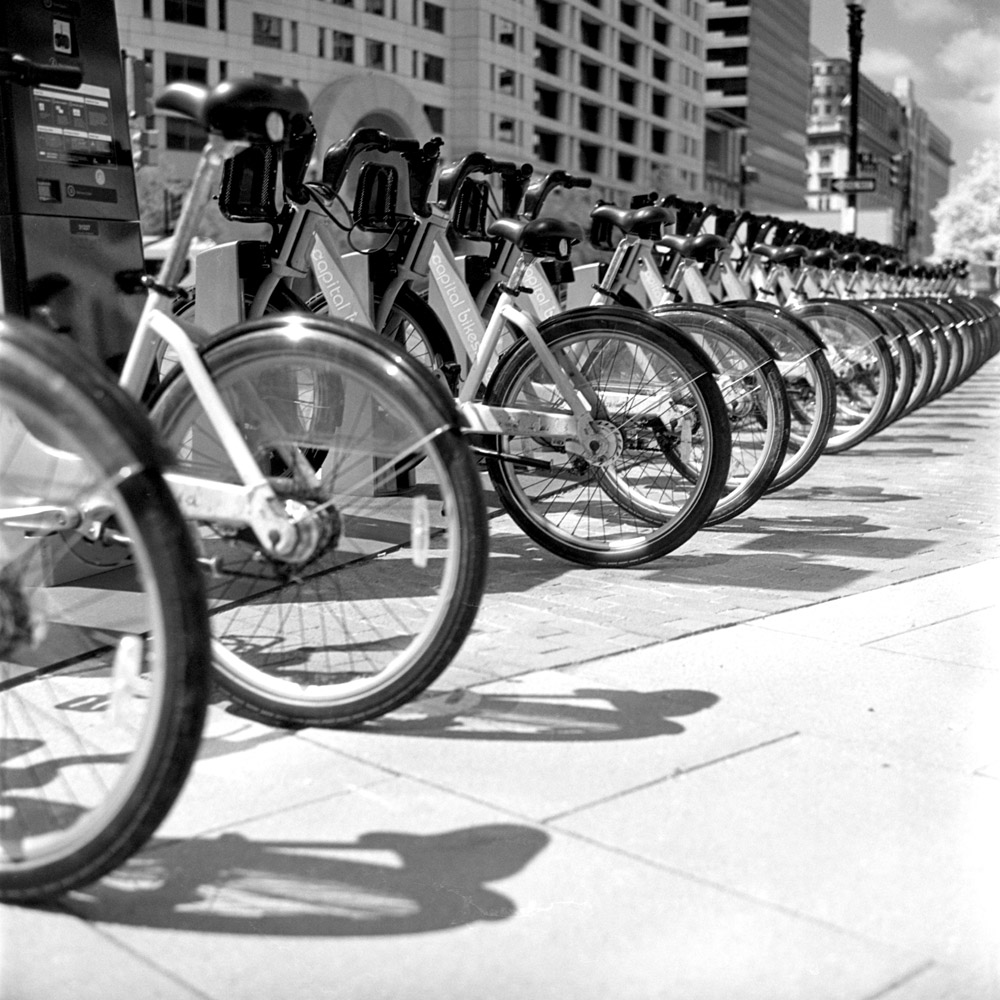
A couple quick snapshots from a street ramble after work.
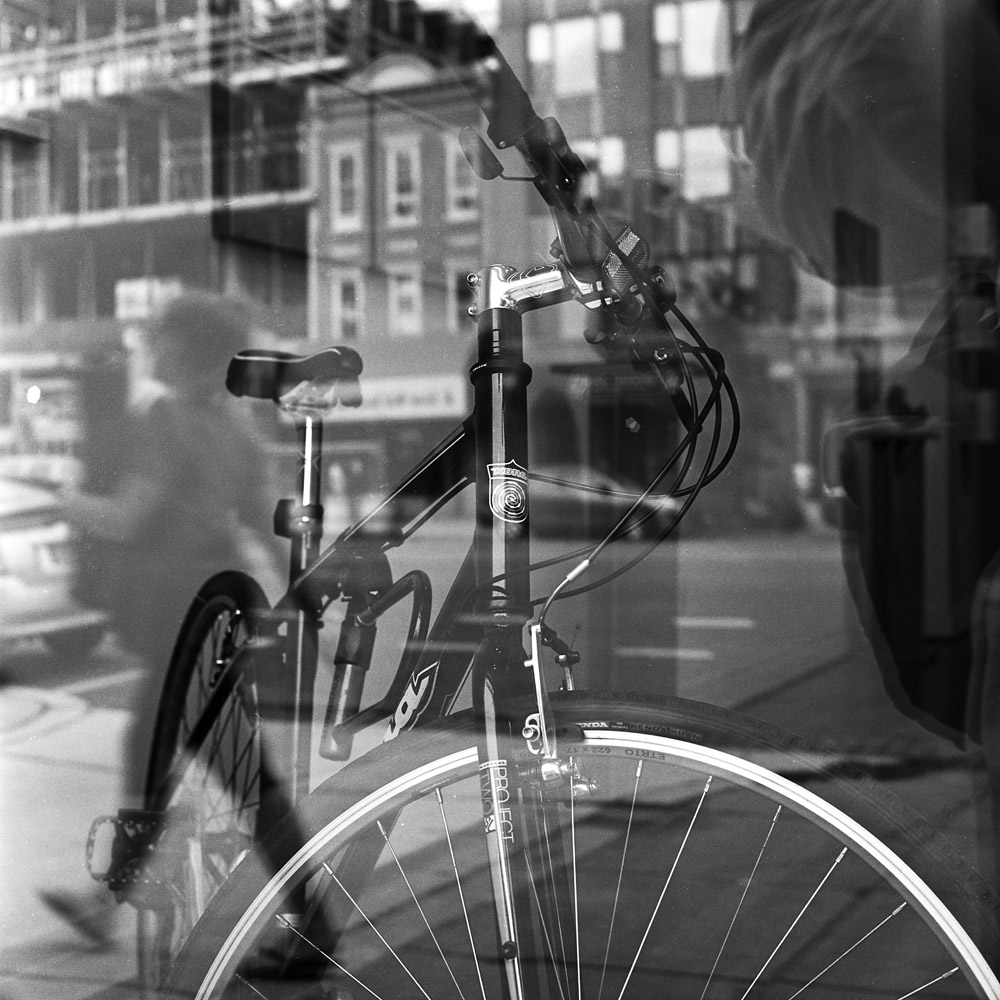
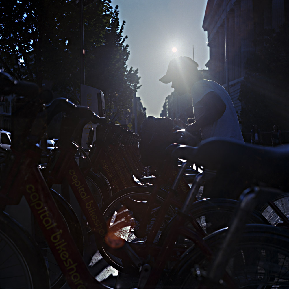
I happened upon this scene on my walk home from work the other day. I’ve developed a thing for photographing bikes and other means of transport, thanks to seeing the bikeshare stations all over and watching people riding them. I like the multiple layers happening in the scene with the contents of the gallery merging with the scene behind. The bike is still the main emphasis, but you have the cars, the pedestrian, the interior volume of the gallery with art on the walls, and then the fractional self-portrait of me on the right side (mostly just camera bag in the reflection, but I’m still in the picture).
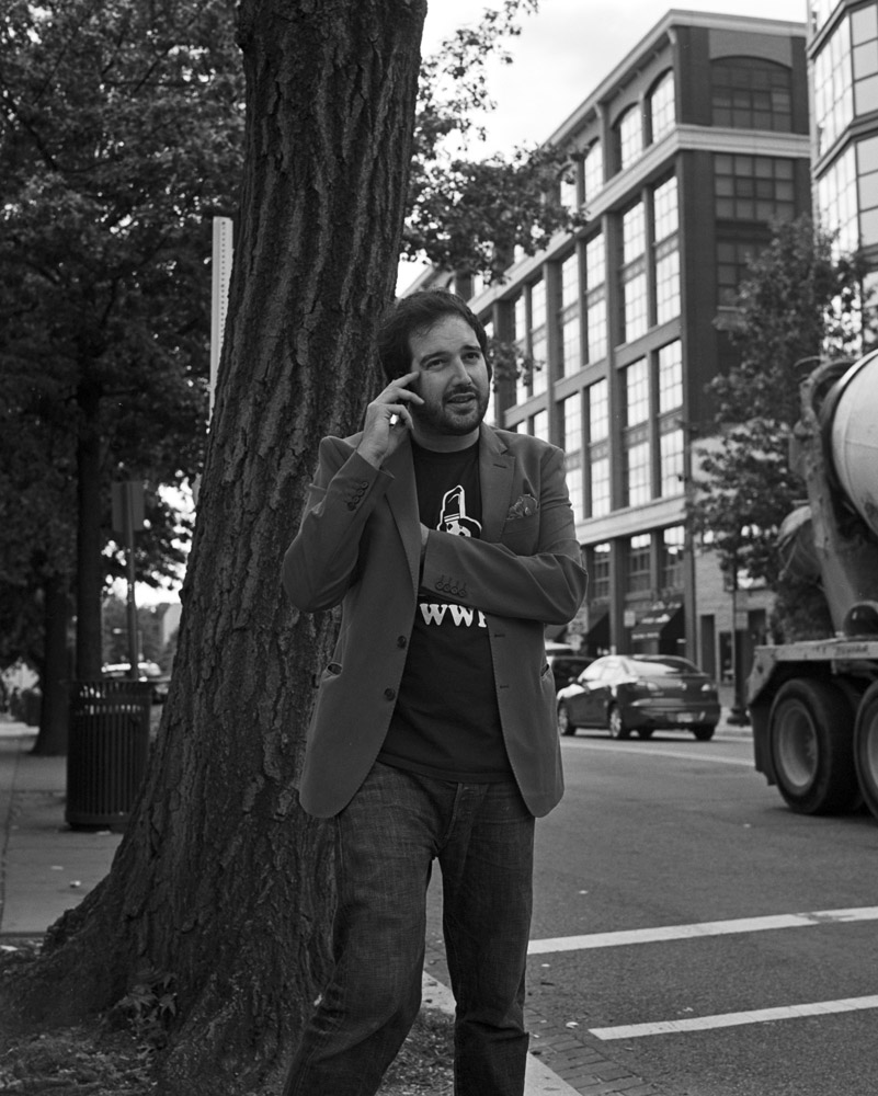
These two were just practice shots, really, trying to get better at people photography on the street. They’re part of the mood of 14th Street, though- emblematic of the energy of the place.
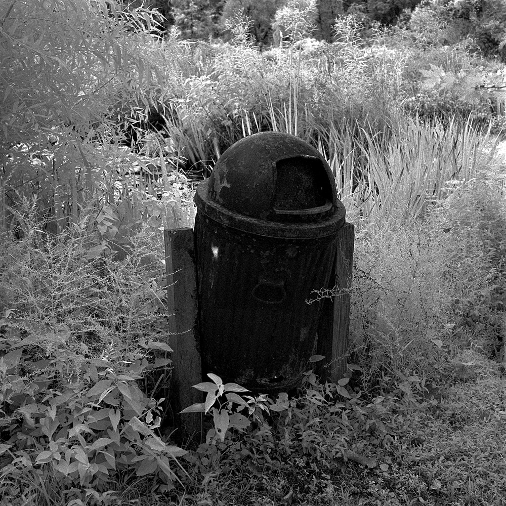
Konica Infrared
Apologies all for the long pause from my last posting – I just needed a little break, and to recharge my creative juices after getting the show up on the wall. Perhaps this weekend I’ll post the pictures from the opening reception.
Anyway, here’s some stuff I shot last weekend and earlier this week. I lucked into a modest stash of Konica Infrared film, which hasn’t been made in probably 8-10 years. The stuff I have is older than that. I needed to find out how well it had kept in the meantime – IR films in general seem to age much faster than regular b/w film, and for all I knew, the IR-sensitizing dyes had faded and it would be just another slow b/w emulsion with tons of base fog, but grainy from the degradation (I shot some Kodak HIE 35mm that was from the last batch they did, and it had degraded to horribly foggy and grainy, despite the fact that it was only perhaps 4-5 years out of date). The results are in – while they do have noticeable base fog, the negatives are still quite fine-grained and do exhibit the infrared effect nicely, with very little overall degradation.
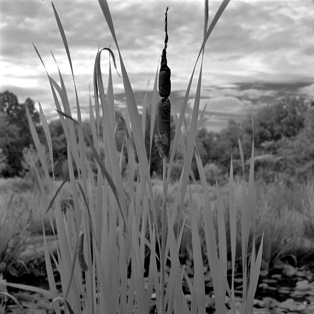
Here are results from two rolls worth, shot on a lunchtime walkabout near my office, and on an early saturday morning excursion to Kenilworth Aquatic Gardens.
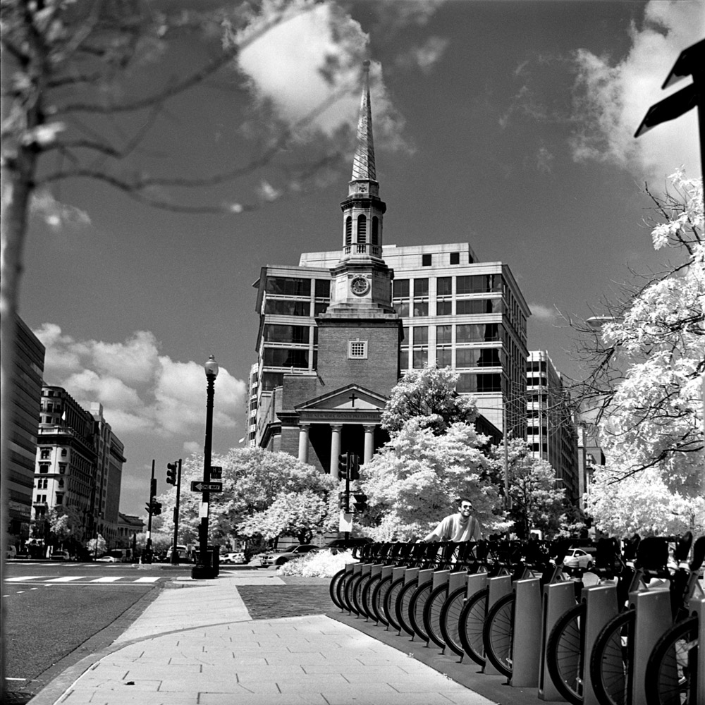
The infrared effect is somewhat subtle in these first two – the foliage is white, but the sky is not particularly black or contrasty. The red bikeshare bikes though are much lighter than they appear on regular b/w or color film. Also the wheel guards on the back wheels are completely translucent, but in real life they are dark smoked and/or black plastic.
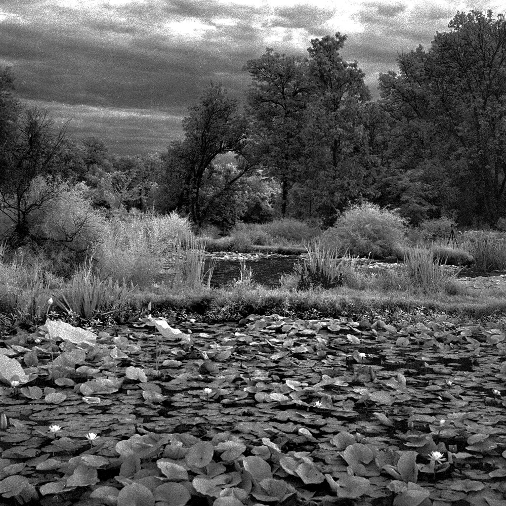
The Rollei is a perfect camera for Infrared photography because you can focus and compose your images with the unfiltered viewing lens, so you don’t have to keep taking the filter on and off (the strong infrared filters like the Hoya RM72 I used are anywhere from nearly to completely opaque to the visible spectrum, making it very difficult at best to operate the camera with the filter installed on a single lens reflex camera).
Kenilworth Aquatic Gardens is a 37 acre plot on the east/south bank of the Anacostia River which runs through Washington DC. Owned and operated by the US Park Service, it is one of the hidden gems of Washington DC. The neighborhood around it is still quite rough, which deters casual visitors not familiar with the area. I went looking for the giant lily pads they usually have, but they were nowhere to be found. One of the park rangers informed me that they had to skip the Victoria Lily pads this year due to budget cuts – they normally import them from the Amazon fresh each year.
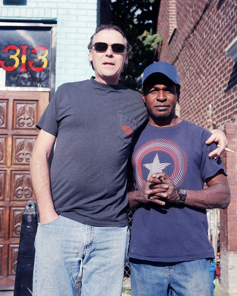
First in a Series: People Who Ask About the Rolleiflex
Truth be told, I’m a bit of an anxious street photographer: I’m not terribly good at asking total strangers to pose for me. So I’m getting started as an exercise by setting a new rule: if you see me out and ask me about my Rollei, you have to pose for me. We’ve already broken the ice by talking about the camera, so now we’re not total strangers anymore. This is the very first in that series. These two guys saw me out with the camera, and started asking about it. They even asked me to photograph them, which made it easier. The black guy was interesting; even though he was smoking, he asked if he should get rid of his cigarette for the photo. I told him to keep it.
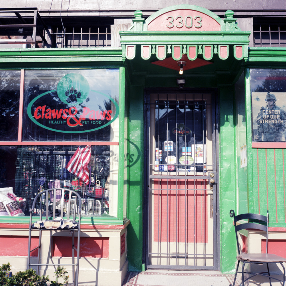
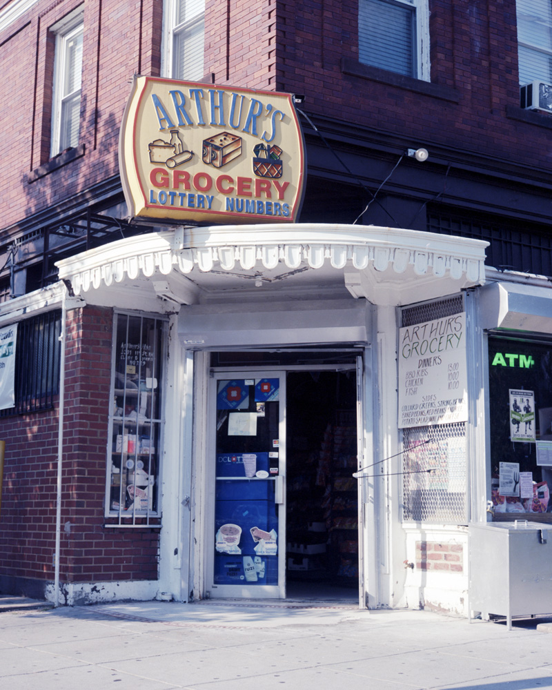
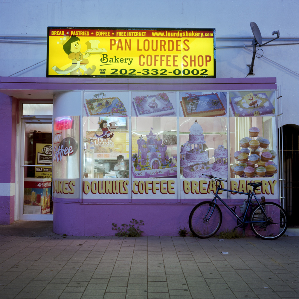
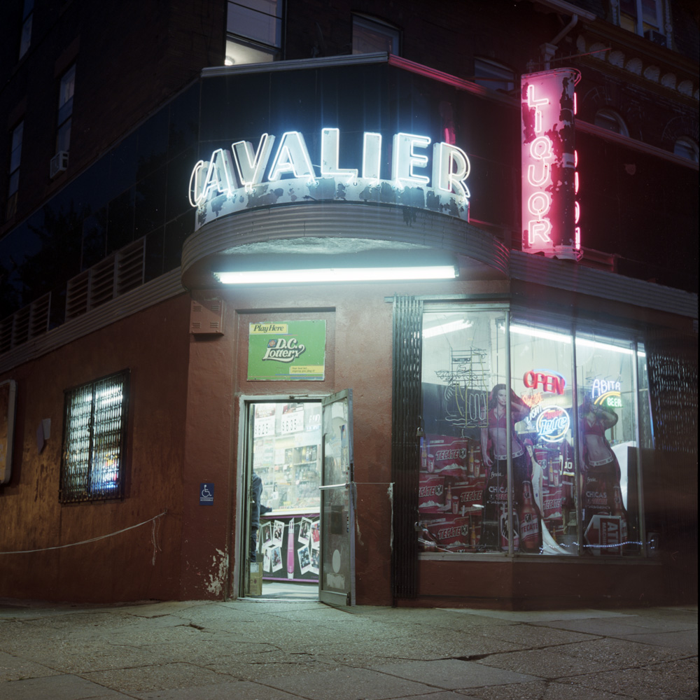
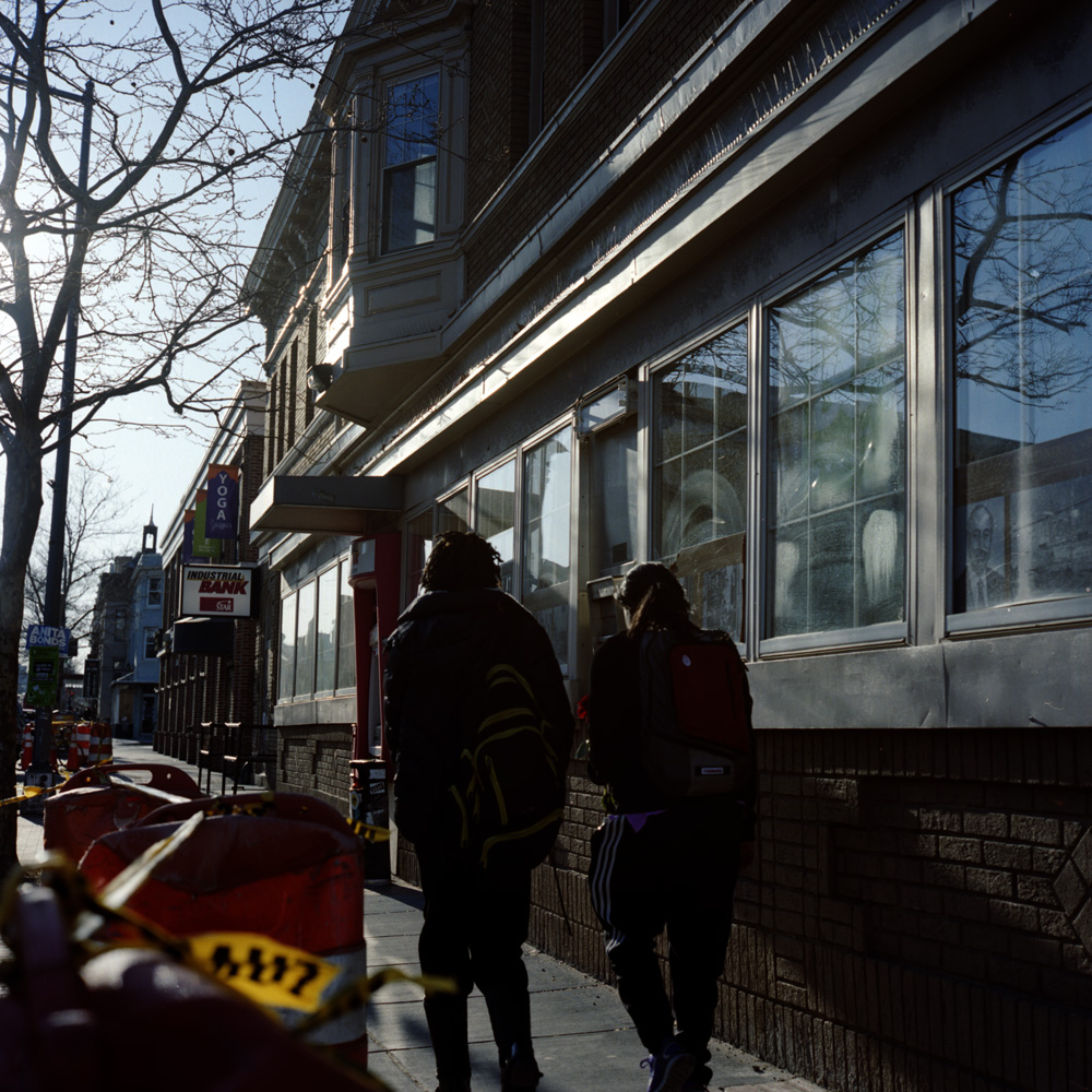
Another Neighborhood Walkabout
Just four random shots from around the neighborhood. These first three are small local businesses managing to hang on in the face of growing gentrification.
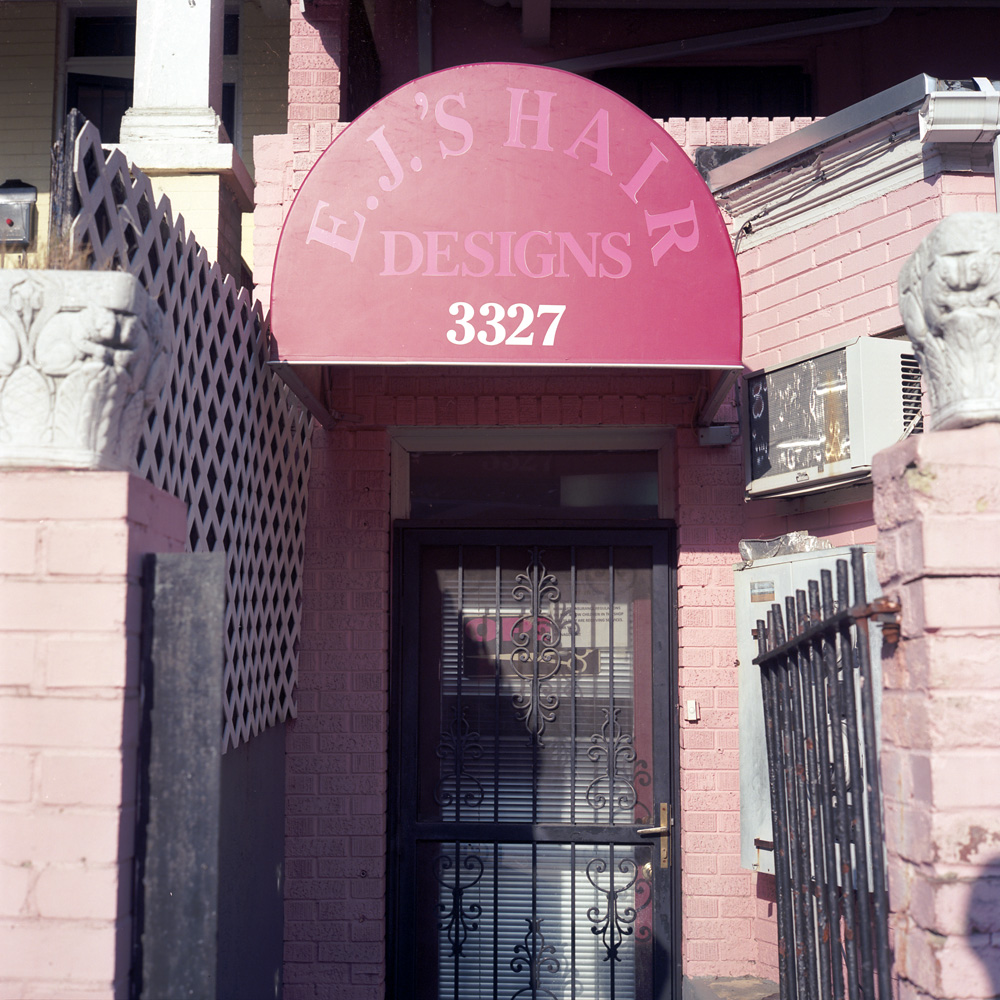
I don’t know what’s going on with EJ’s. Every time I walk past (which may be heavily influenced by when I’m going by – weekday evenings and/or weekends) it appears closed. I know the sign says “open” in the door, but you tell me what closed miniblinds means… I love the sign on the door (which is probably too small to read in the JPEG version of this shot): “We love children. However, insurance regulations do not allow children in the shop unless they are receiving services. Thank you, The Management”.
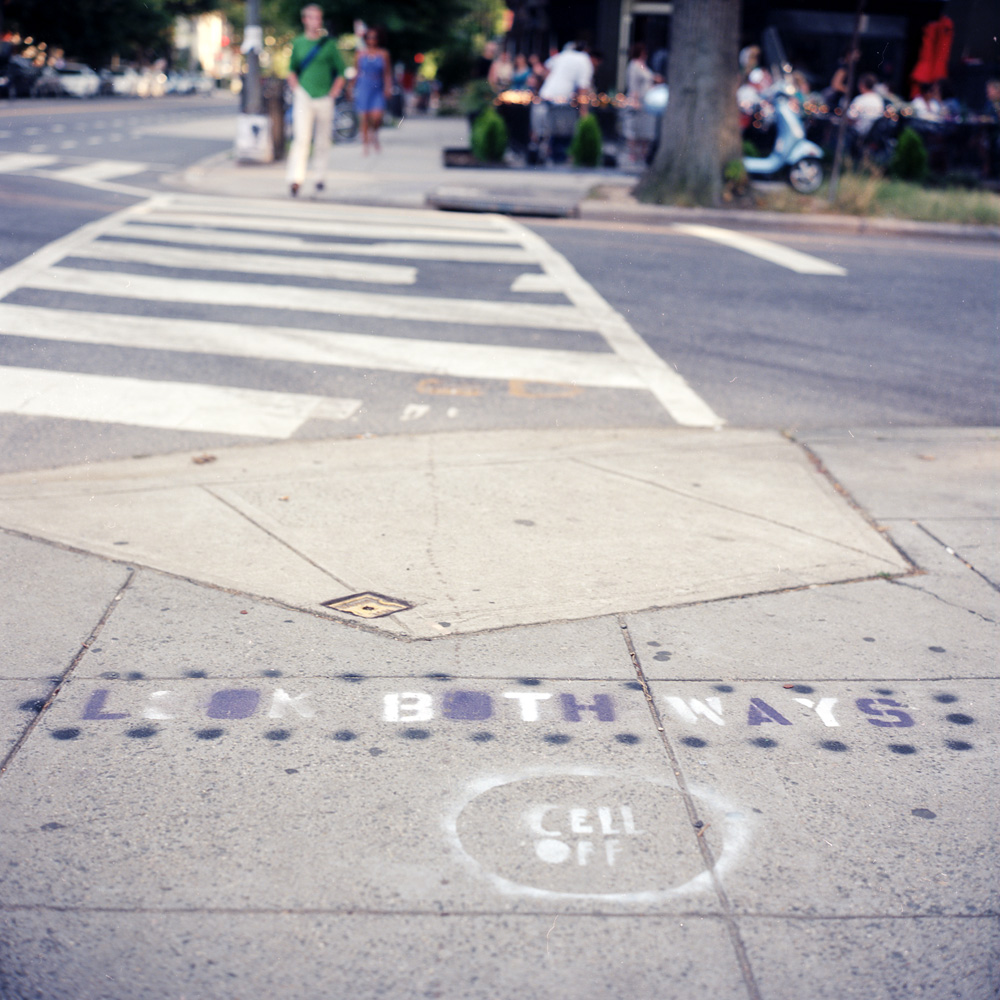
A sign of the times. General hipsterization plus the general trend of people being so absorbed by their mobile devices that they do stupid stuff like walk into traffic has inspired these signs spray-painted at the crosswalks of a number of intersections in the Upper 11th Trend Strip (don’t know what else to call it- North-East Columbia Heights Business District? NoECoHiBD? …that stretch of 11th where all the new restaurants have proliferated amidst old-time bodegas and coin laundries? How about just Hipster Velcro? (can’t call it a hipster magnet because that would imply something about hipsters that’s just not true. Velcro sounds about right because it sticks well to things like scruffy beards and ironic flannel). Of course, it NEEDS to be painted on the sidewalk, for it to stand a chance of registering with the phone-focused.
From my Platinum/Palladium Master Class
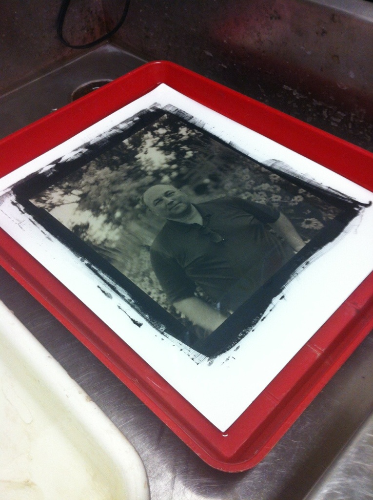
If you’ve been following my blog long enough, you know I teach antique and historic processes at Glen Echo Photoworks. I have been teaching a one-on-one master class for the last several weeks. Last session we shot some negatives and processed them in Pyrocat HD, a staining developer. This week, we printed some of the negatives we shot, as well as an old negative Anh, my student, had in his portfolio.
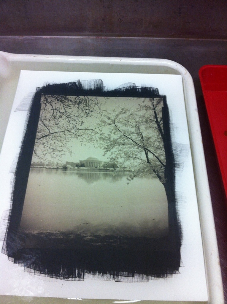
The Jefferson Memorial shot was his existing negative – in the silver gelatin print, the dome of the Jefferson was blended in to the sky at the brightest highlight. You can see even from this phone-cam snapshot that there is tonal separation between the dome and the sky, where the dome is actually the brighter highlight, but still retains detail. THAT is what printing in palladium is all about – that rich, delicate level of detail it is capable of recording in highlights and midtones. And the cherry blossoms have an extra delicacy about them too.
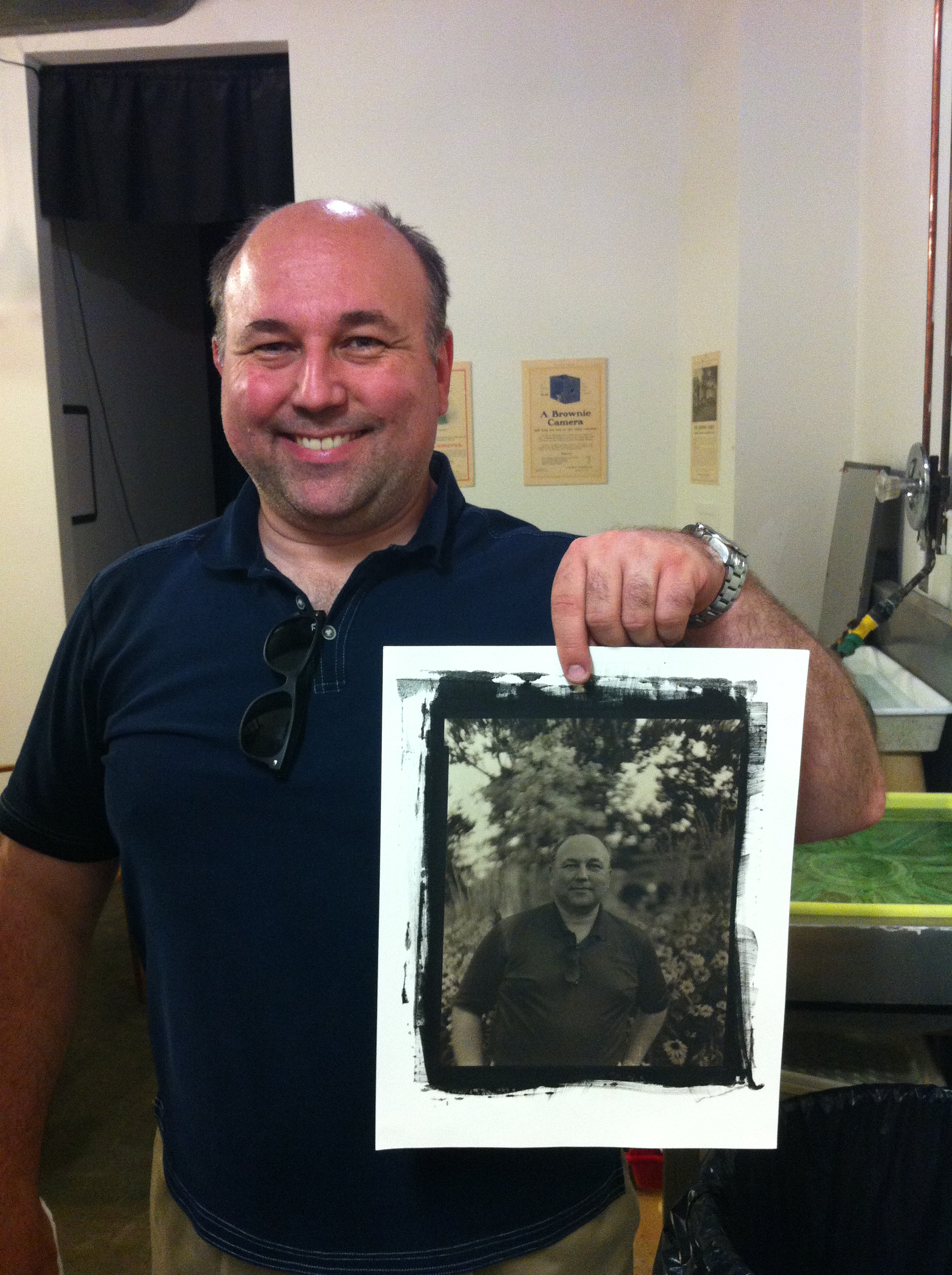
Here’s a shot he took of me holding the portrait he did last week. This could probably use just a little more contrast, but not bad for his say 5th ever palladium print 🙂
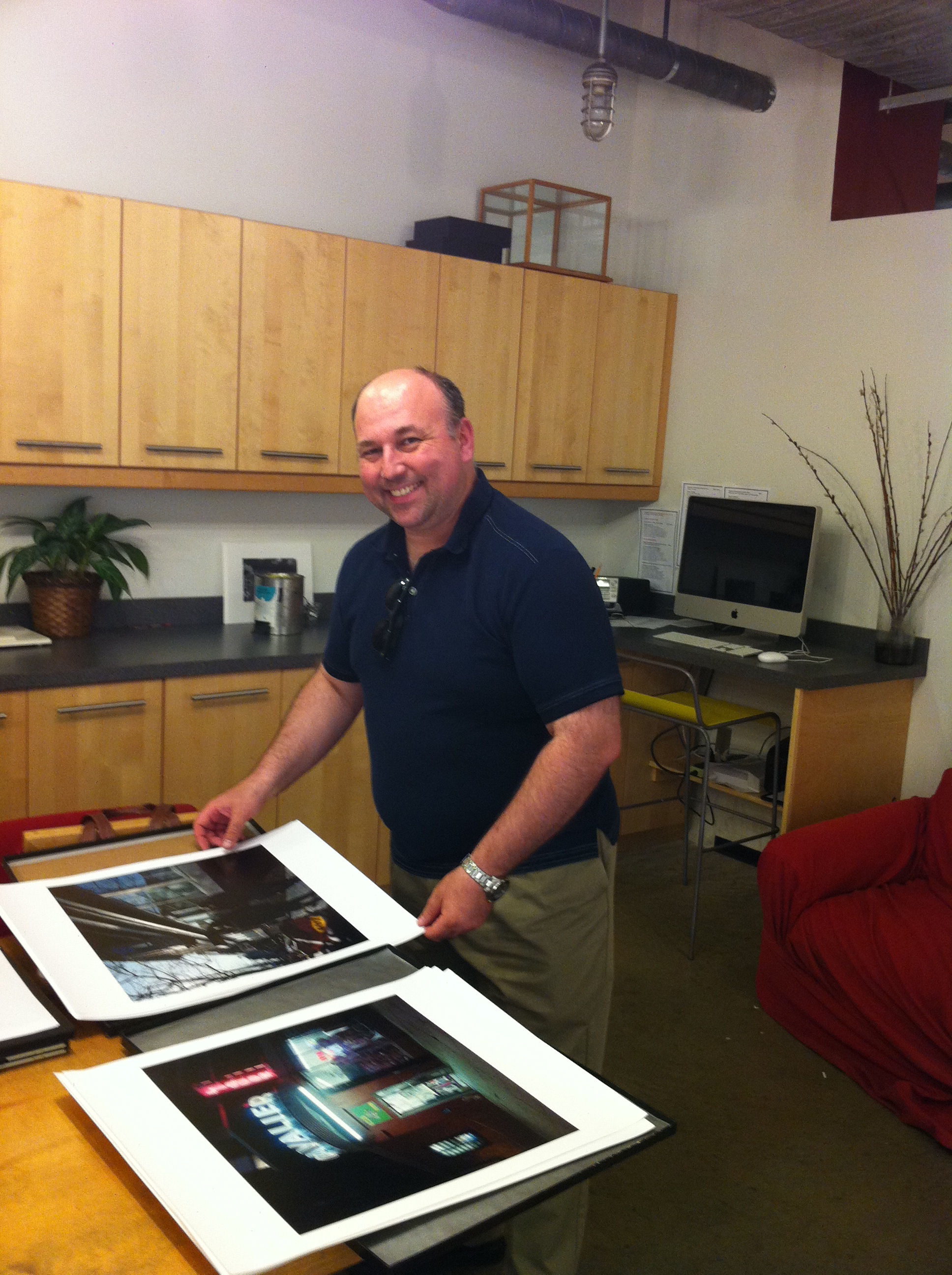
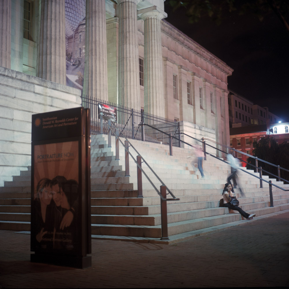
I brought along my portfolio of the actual prints I’m putting in the Colors of Night show for him to take a peek at. Here I am showing the prints.
The Difference Between Color and Black and White
Here are two images of the same scene, one in color, one in black and white. I’m sharing them together to demonstrate how the change from one to the other totally changes the way we feel about the image.
First, the black and white:

Notice the visual emphasis – how the tones draw your eye to specific parts of the scene. What do you find yourself looking at, and relating to? What compels you? What emotions does this evoke?
Now the color:

This has a very different balance. The colors change the emotional timbre of the image, as well as the focus point for the viewer, even though both photos were taken from essentially the same vantage point. I think it’s fair to say that in the black and white version, your eye and attention keep coming back to the boy. The image has a more stark, somber feel to it whereas the color image is much more lively, and balanced – it’s easier to view both sides equally. To be entirely fair, some of the impact of the black and white version is due to the way in which it was exposed and processed. This version is fairly high contrast, which makes the dark areas very rich and the whites very pure white. Were it done differently, there would be a greater balance between the boy and the garuda in terms of tones, and it would have a different resonance.
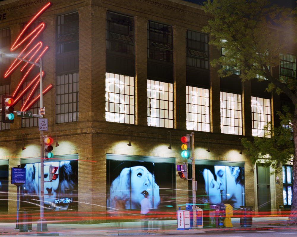
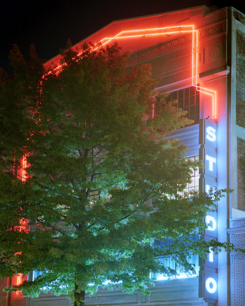
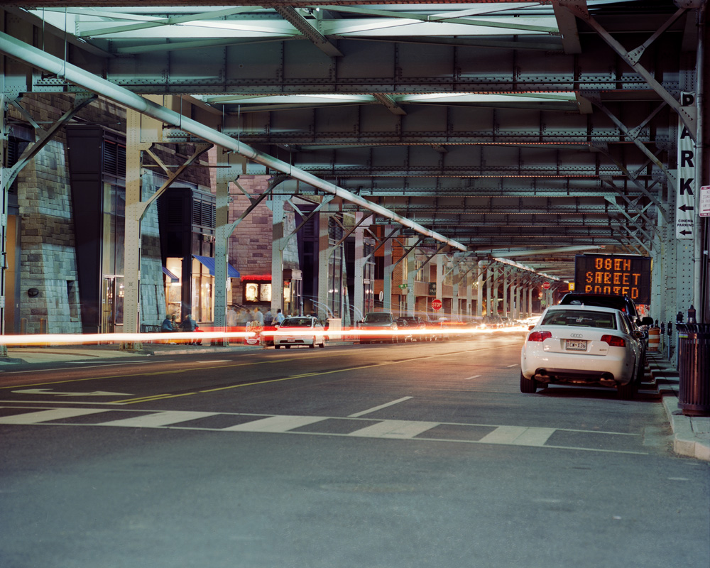
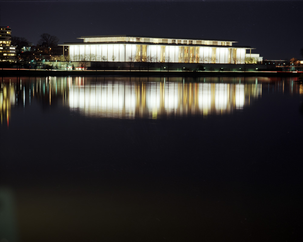
Finished!!!
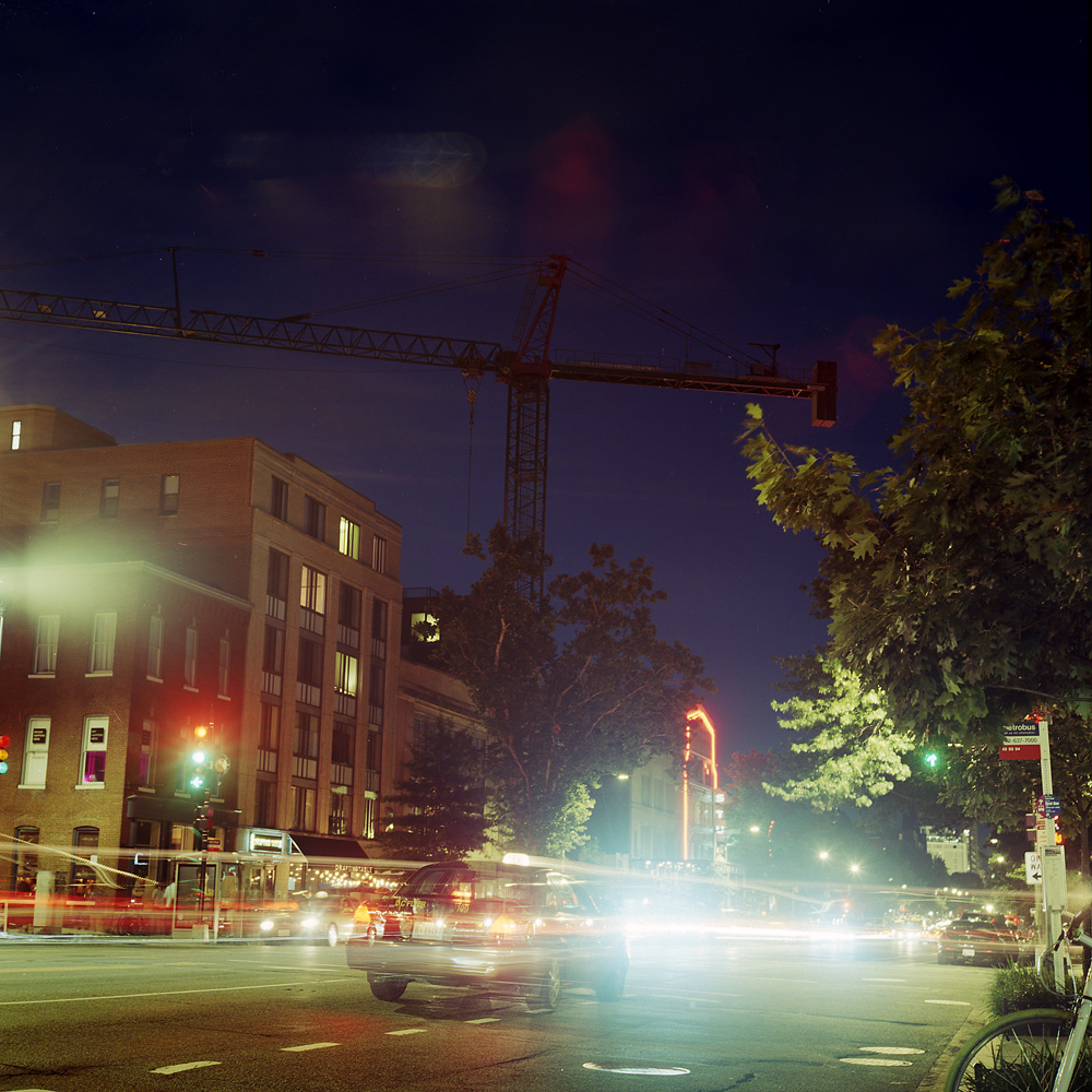
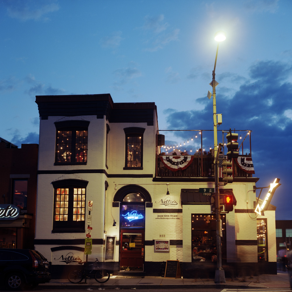
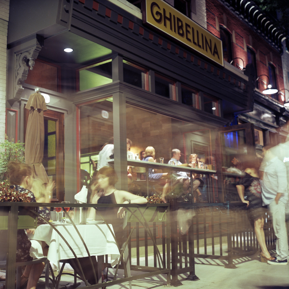
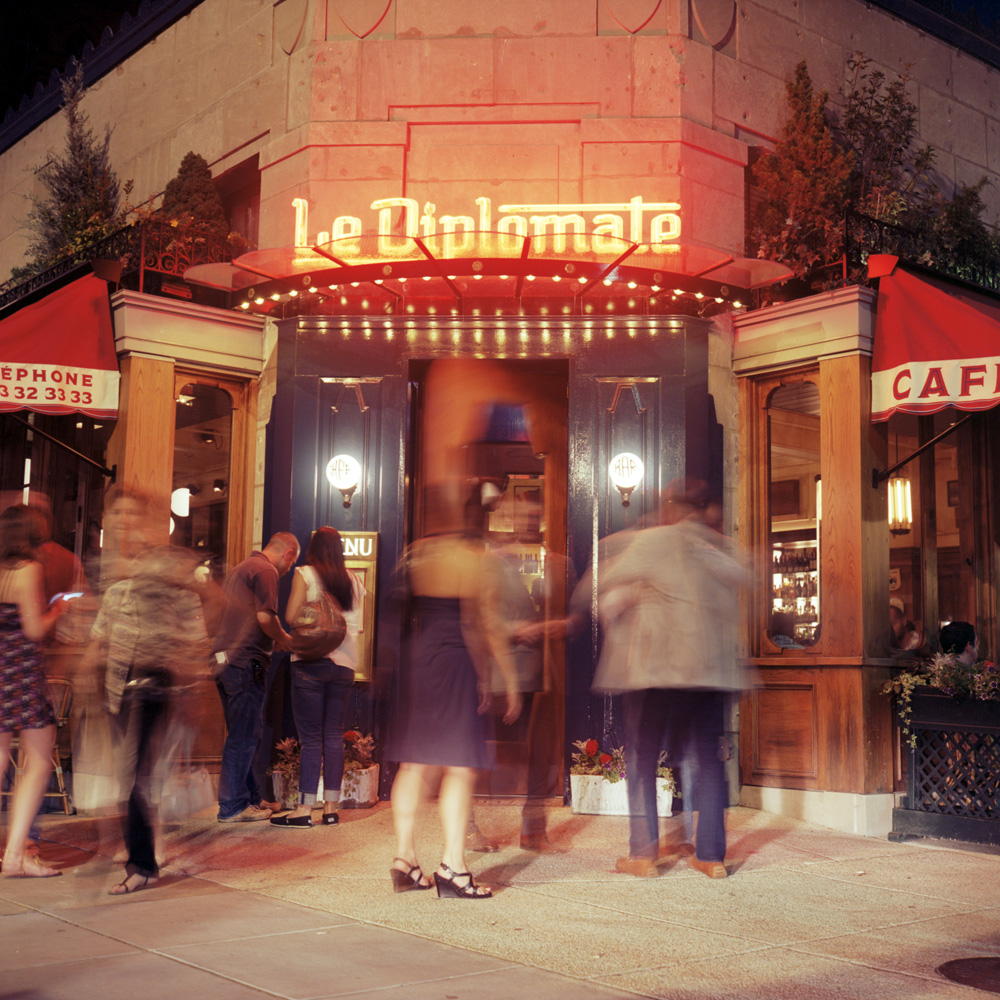
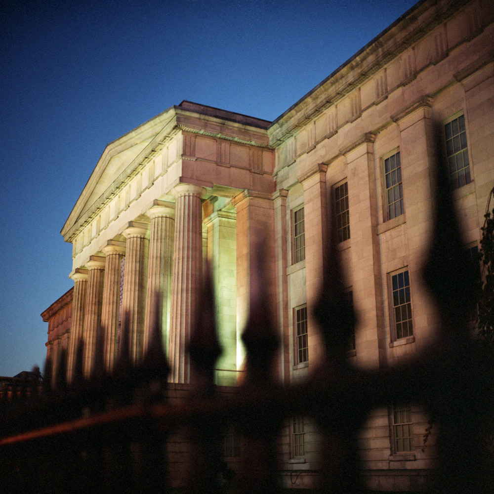
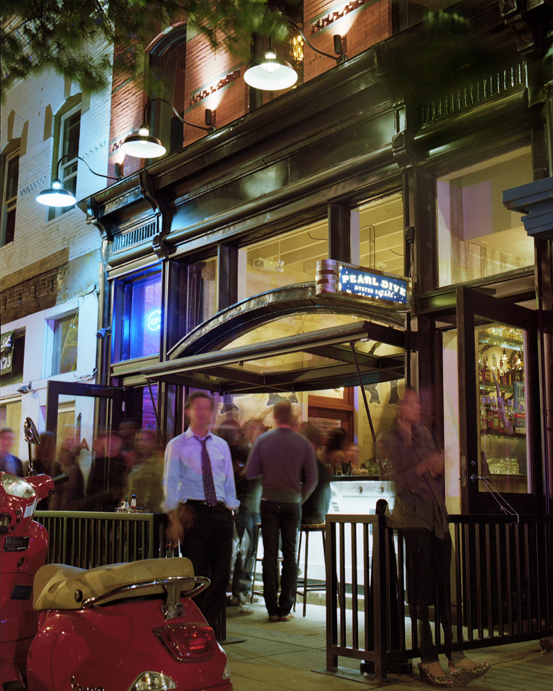
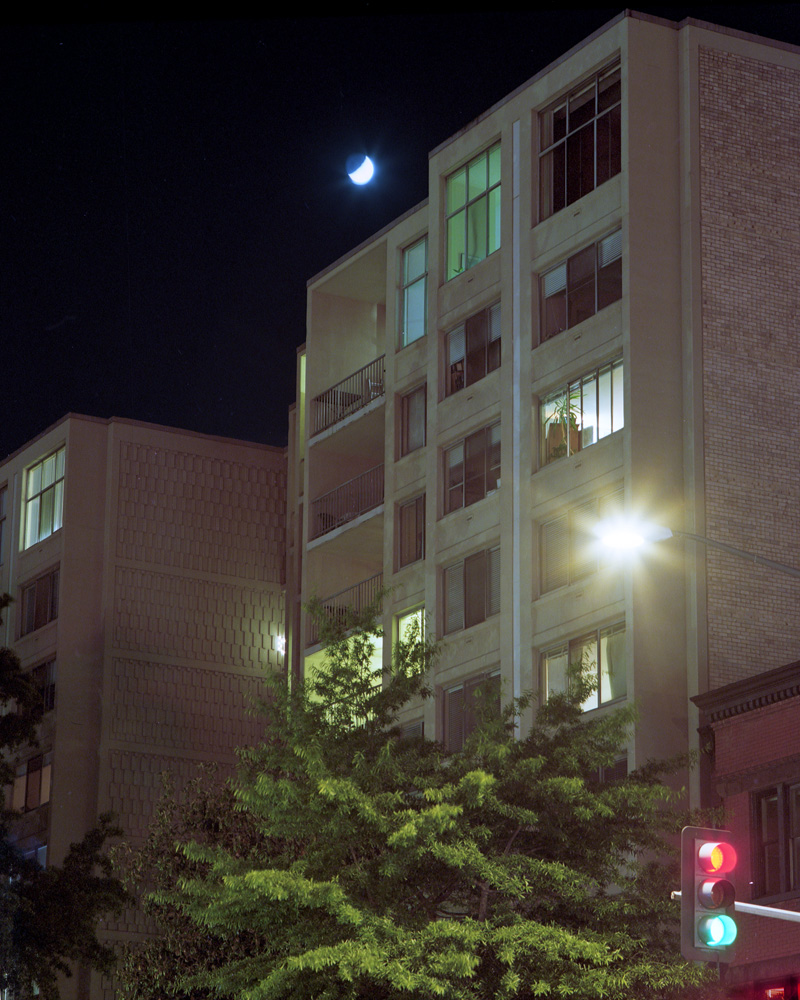
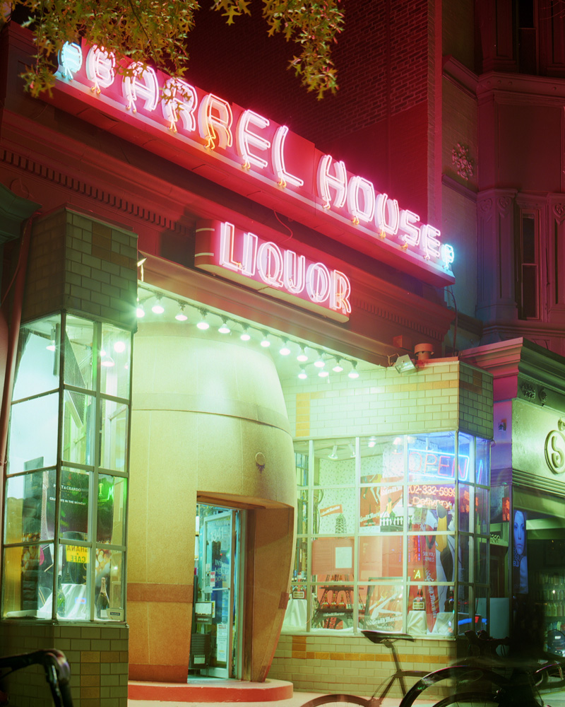
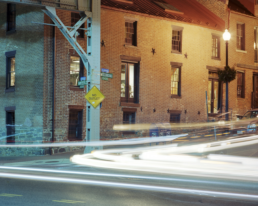
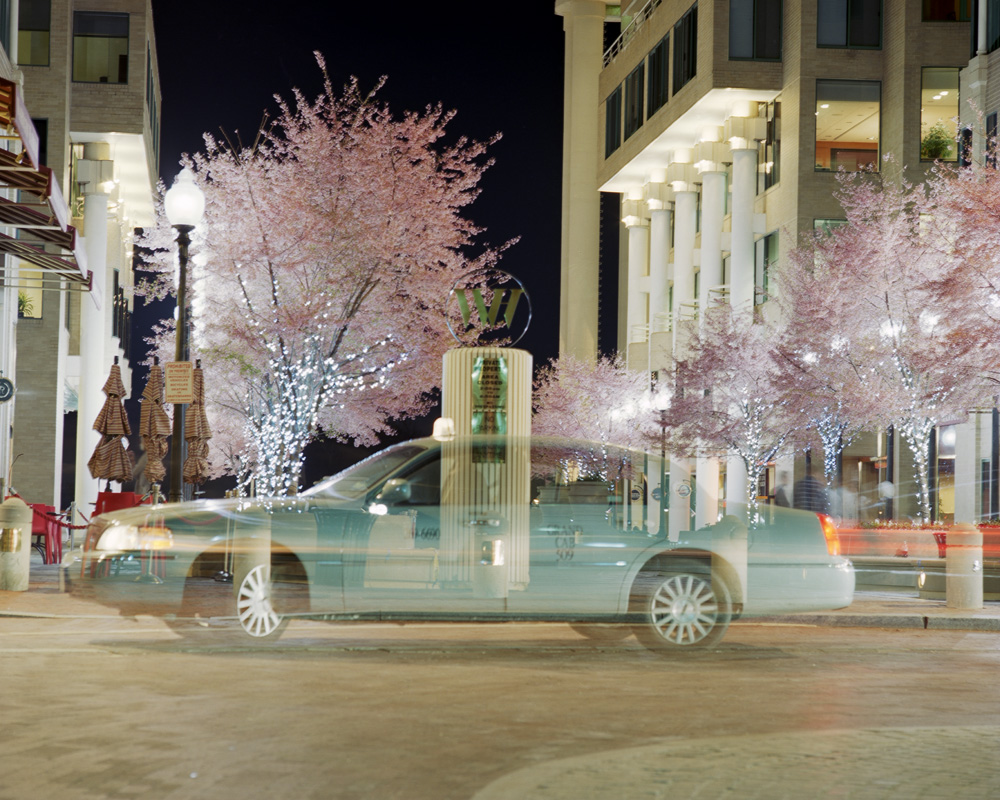
After a LOONG weekend of playing with my printer to get it to cooperate (running out of four different inks @ $60/cartridge, figuring out how to solve problems with head strikes on my prints, running out of paper at $115/box thanks to the aforementioned ink shortages and head strikes), I now have my show completely printed. Eight prints are already framed and ready to go, the remaining 12 are going to be framed tomorrow, and the show hung on Tuesday after work. I’ve done shows before, and of course it’s always hard work, but this is the biggest show I’ve done in terms of volume. Even my biggest past Artomatic was probably 12 prints. I’m very psyched about the show. Here’s a recap for those who can’t make it to the opening (REMINDER: August 2, 7-10 PM, Mad Momos Restaurant, 3605 14th Street NW, Washington DC). This exhibit pays tribute to the parts of Washington I pass through on a regular if not daily basis. I want to show what this town looks like to a resident, as well as showing it in an unfamiliar way even to those folks who do see these things all the time. As I mentioned in my blurb about the reception, I love the way color distorts and transforms at night because we no longer have a single, unidirectional light source of uniform color and quality. I’ve started these photos with late evening/sunset/twilight and progress into deep night to capture the feeling of that time of day. I hope these photos express that sense of drawn out time and transformed space, be it through blurred motion or the interplay of lights.
If any of you have ever produced a photography exhibit, or any other art exhibit for that matter, you’ll have an understanding of just how complicated an effort this is. I’m lucky in that I am able to do my promotional work online for the most part (this blog, email blasts, internet forums, etc), and I already have promotional postcards printed from the last time I exhibited some of this work. It would not surprise me if I did a truly serious accounting of what it cost to put this show up on the wall and the bill came in somewhere north of $2500. I know the framing bill alone is in the region of $1100-$1200. Postcards? about $200 for good quality printing from Modern Postcard. Paper and ink? $300. And that’s just the obvious, not counting the two years it took to shoot the images, the film and processing, the editing process, the dinner bribe for my friend who helped with the editing, and all the hardware and software (21.5″ iMac, Epson V750 scanner, Epson 3880 printer, Photoshop CS5, SilverFast AI 8, Gretag-Macbeth EyeOne calibration software and hockey-puck). To say nothing of 20 years of accumulated experience required to produce images like these.
